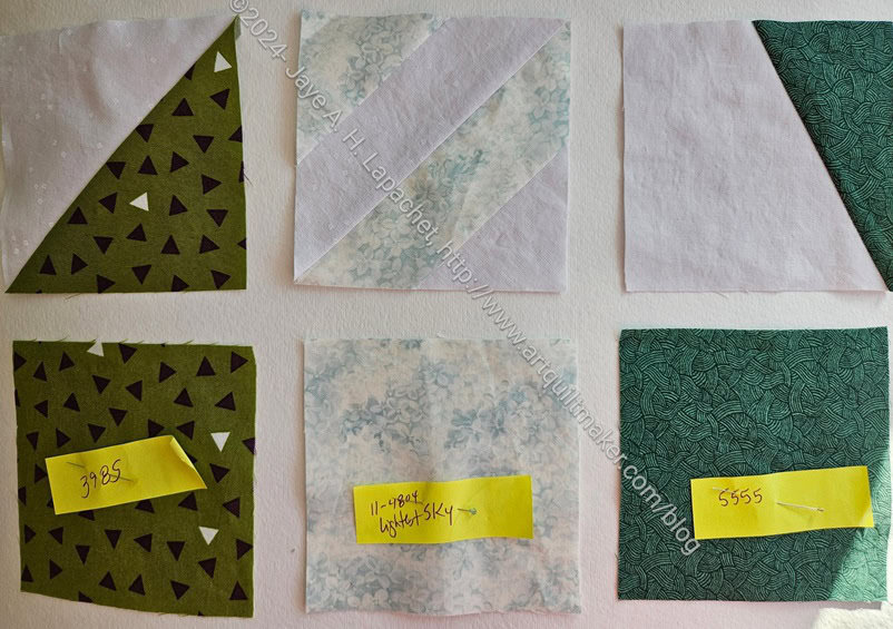
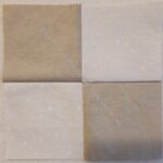
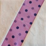
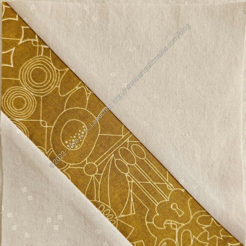
As you probably noticed, I haven’t mentioned the Pantone Project recently. I have had a lot going on, but I have also been stressed out about this project. I like the design I have and was stressed that I might not be able to execute it as is. I was afraid I would run out of background fabric.
Finally, I decided to buy more. I wasn’t sure if this is strictly in the rules of our project, but I did it anyway and Julie told me not to worry. I was pleased to find the fabric is still available. This is a load off my mind.

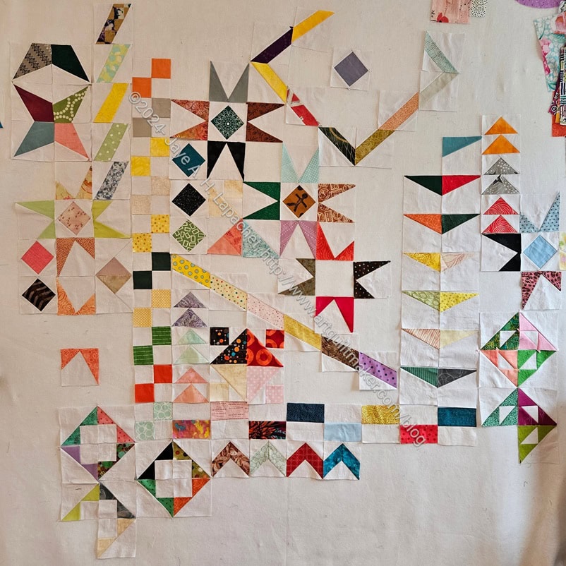
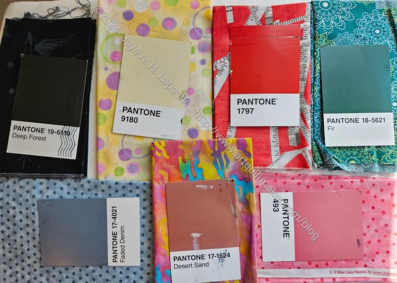
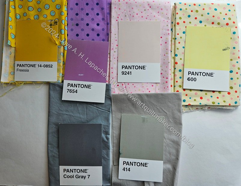
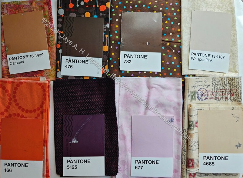
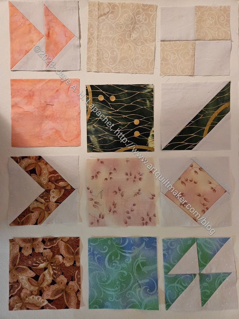
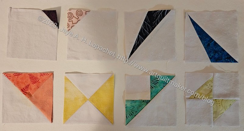
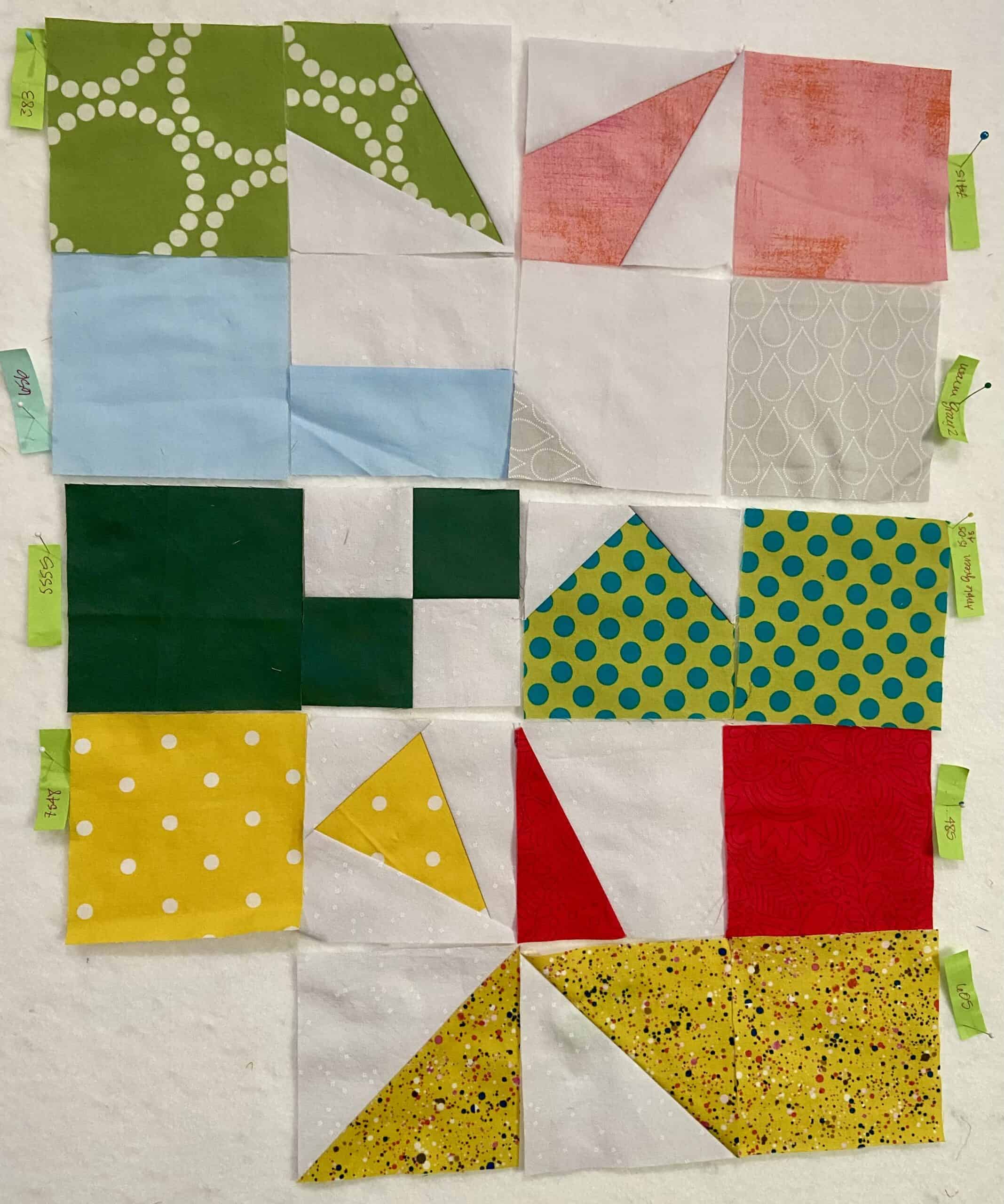
The other day, I took all of the blocks off the design wall. As mentioned, I needed to clear my workroom and my head a bit and the Pantone blocks were taking up a whole design wall and preventing me from finishing some donation tops.
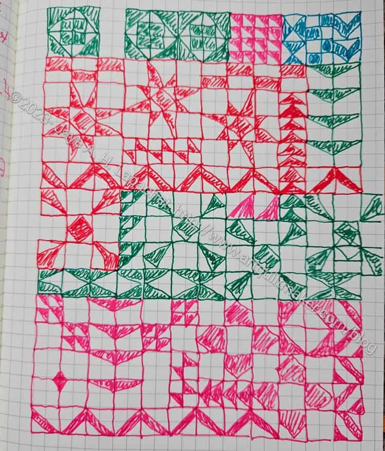
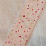
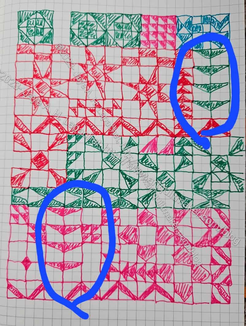
This was a good exercise, because it forced me to really look at it as I was taking it down. This design is almost right. I think the top is a little too heavy, so I will see about lightening it up a bit. That middle diamond will probably move to the bottom.


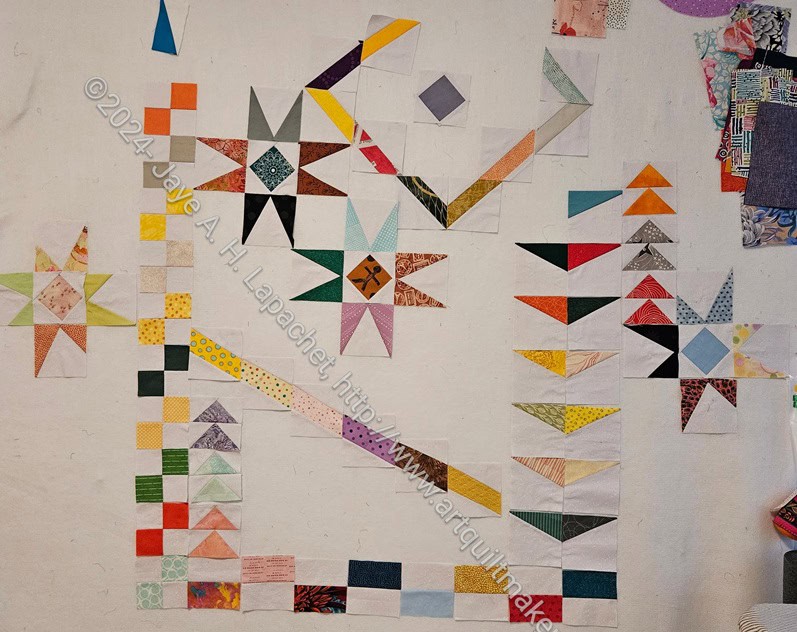
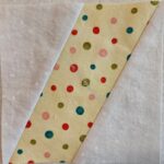
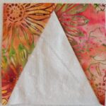
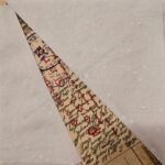
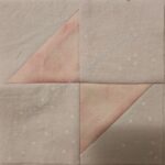
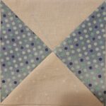
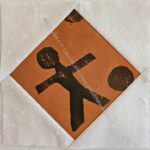
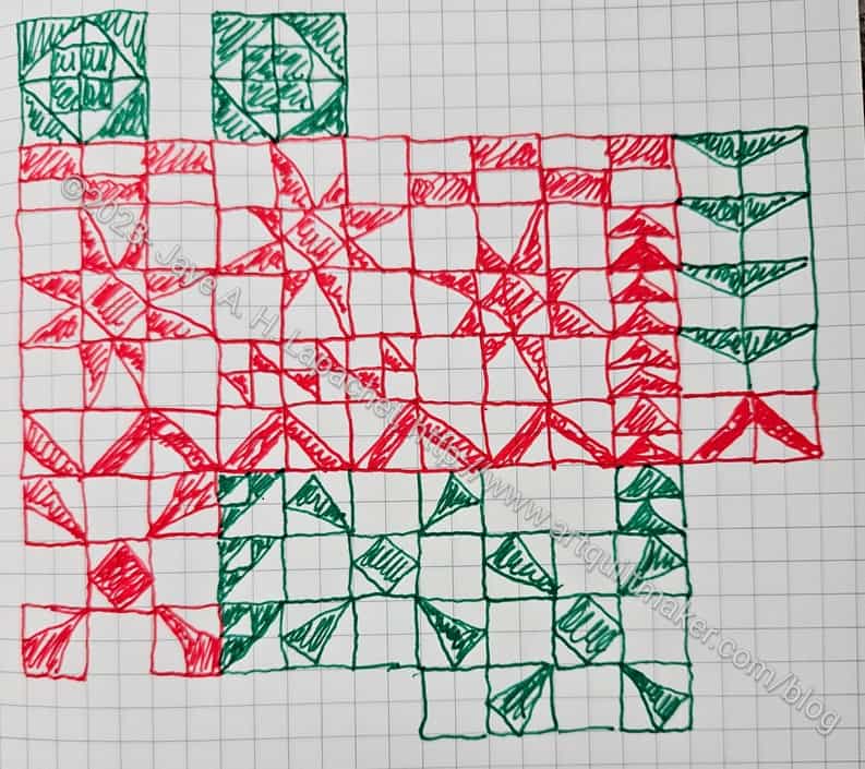
There are some sections I really like, such as the stars.


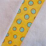
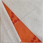
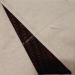
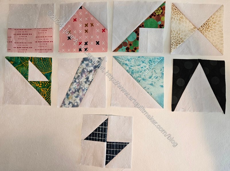
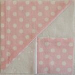
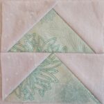
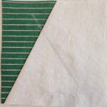
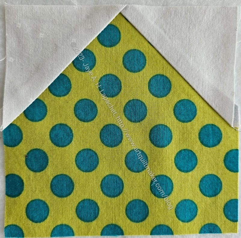
I also like these wing shapes. I might try turning the section on the left 180 degrees.
I thought about sewing some of the sections I liked together, but decided the overall construction would be easier if I didn’t.