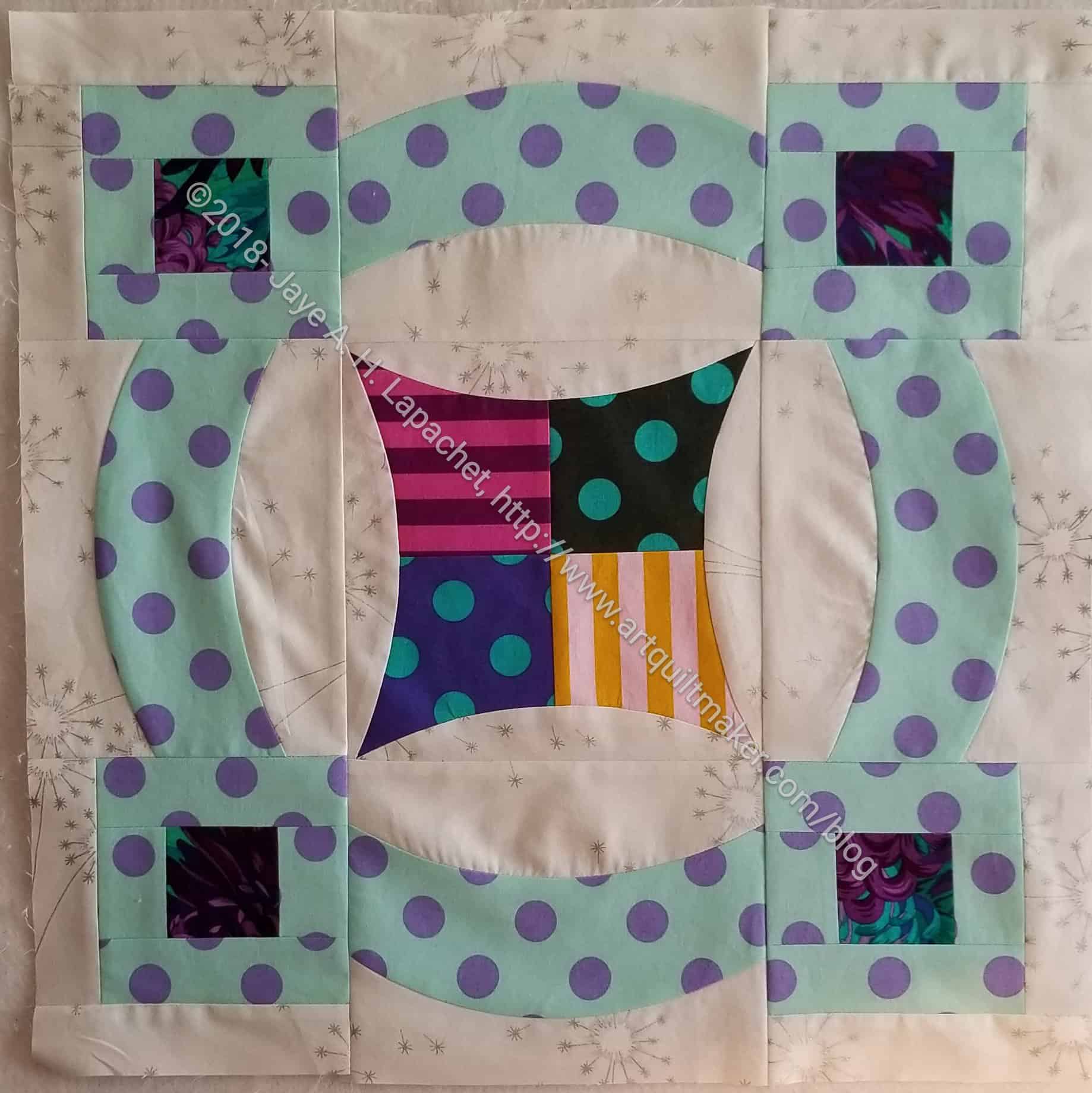
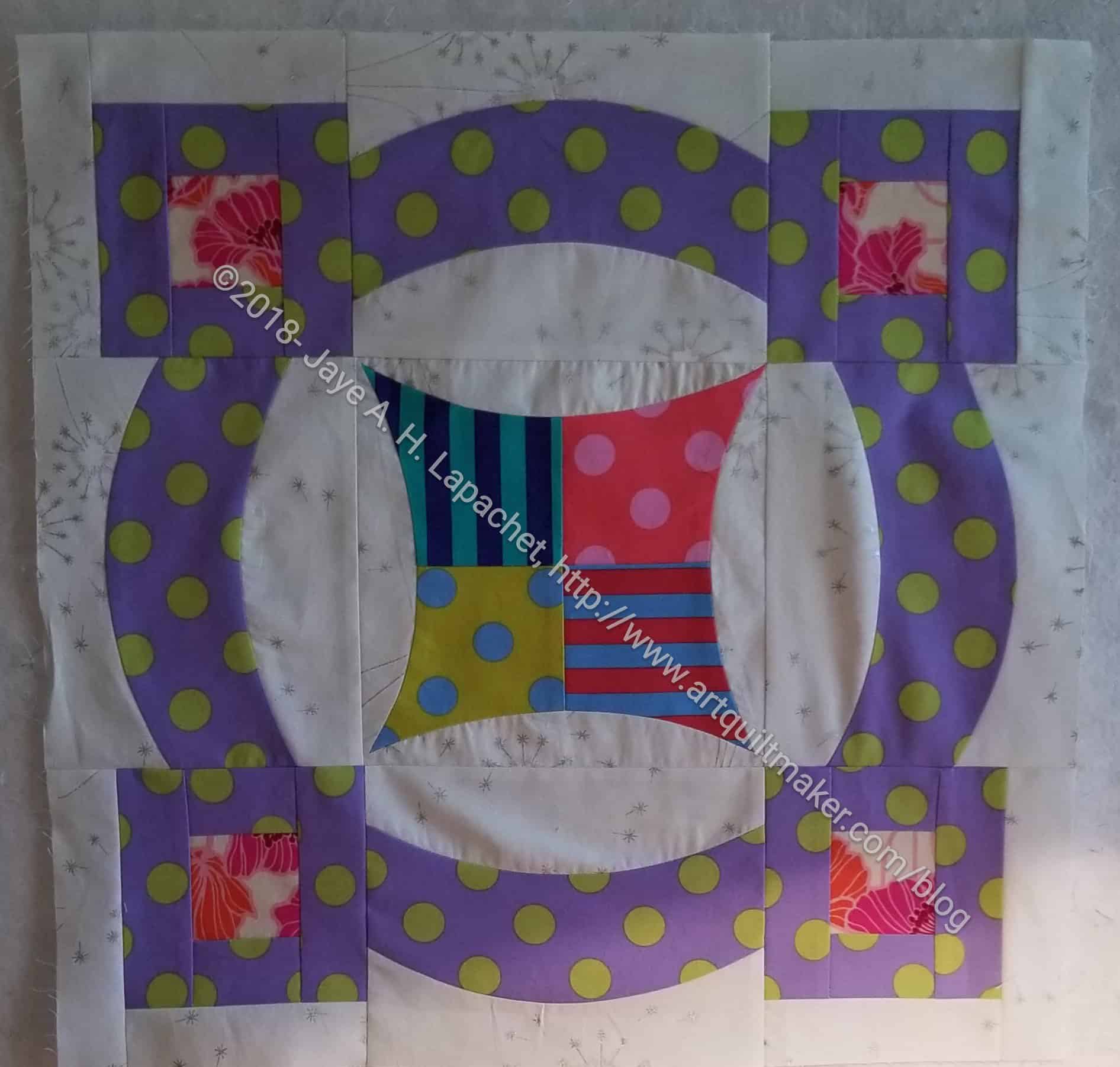
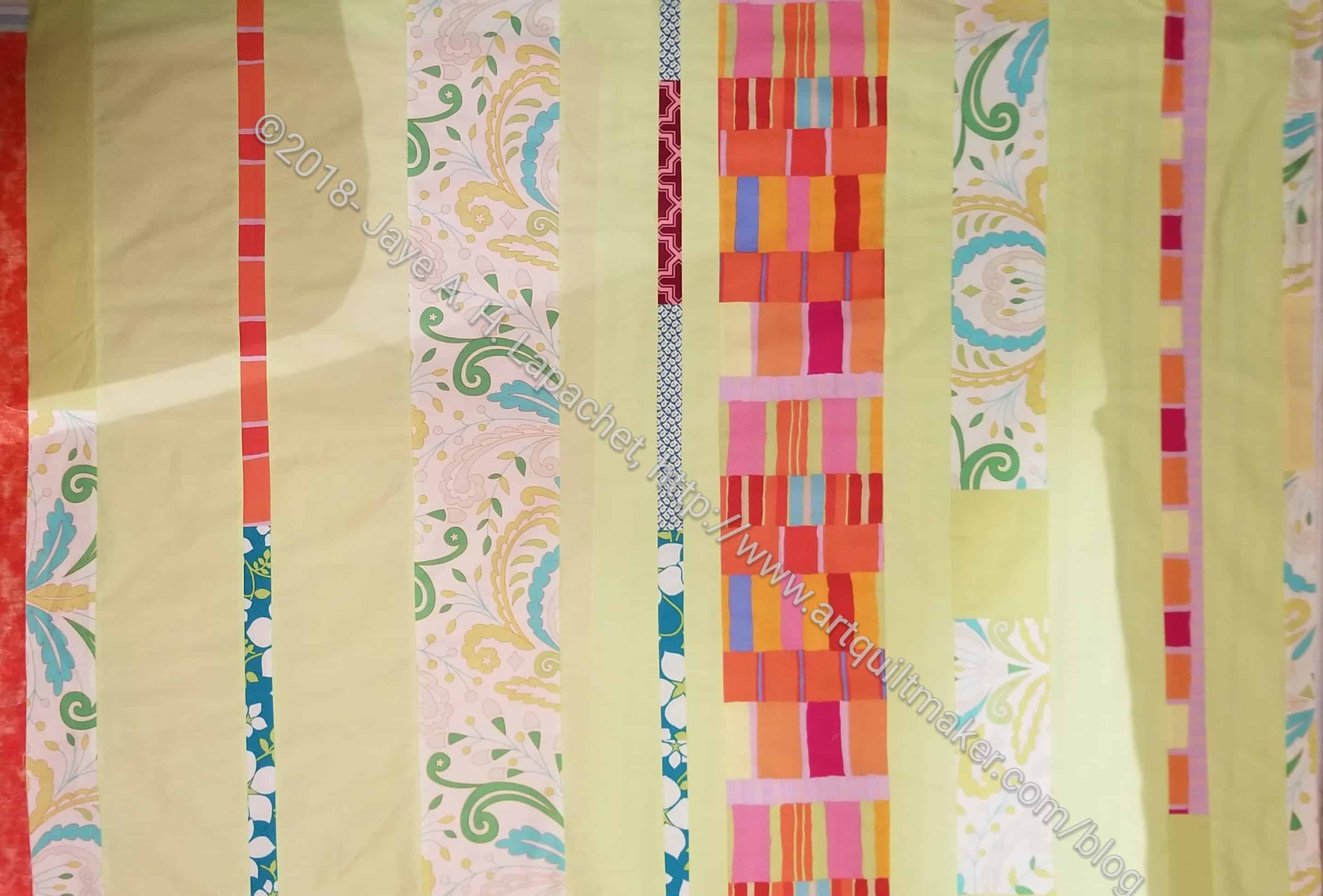
I finished another block over the weekend. I like the foreground fabric. That light green (sage or light aqua??) is really nice and unusual.
I have 8 of these now and cut the rest of the foregrounds, so I could spread out the colors. I have enough of the dots so that each foreground will be unique unless I decide to make extra blocks. We’ll see how large I want this quilt to be.
As mentioned the other day, Nicole over at Lillyella’s World is leading a Sew-a-long making the Undercover Maker Mat. I’ll be heading out for a few days of sewing next week, so I wanted to get a few of the fiddly bits done and lessen the amount of stuff I needed to bring.
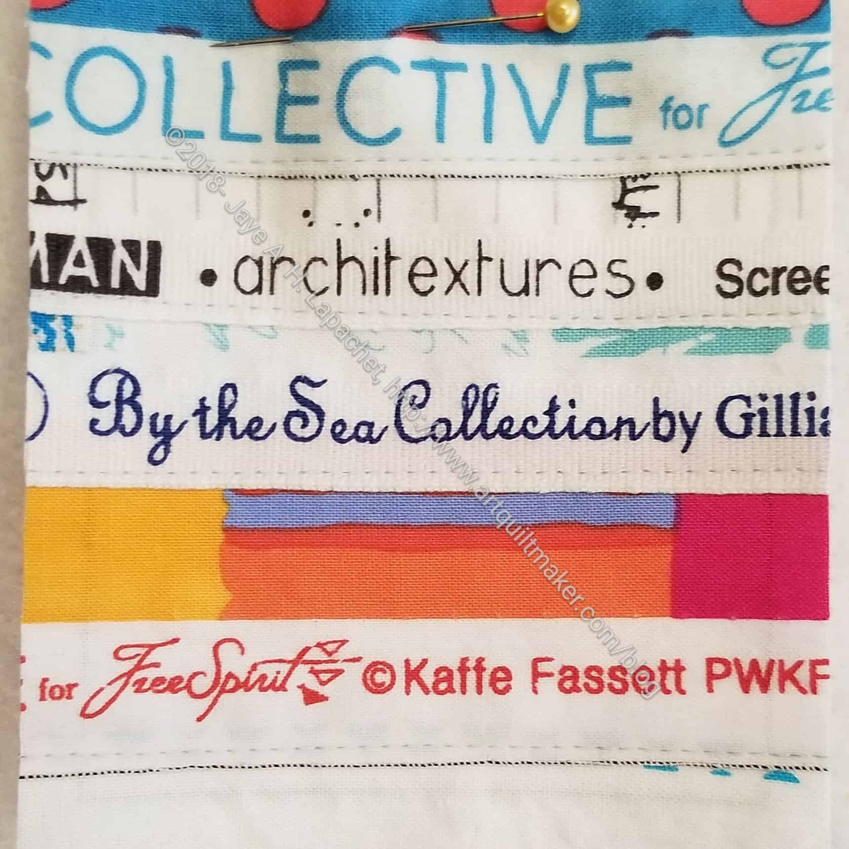
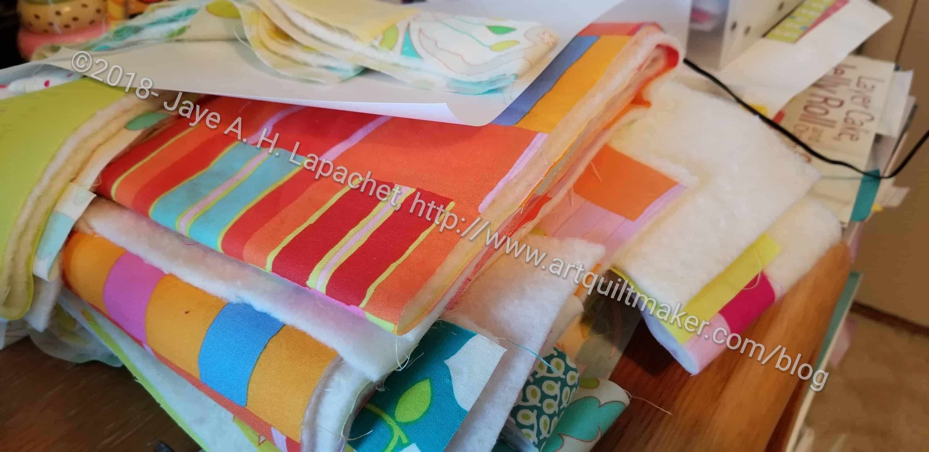
Undercover Maker Mat small pocket
I started making the selvedege pockets. I am not sure I wanted to use selvedges, but the pockets on the sample look really cute. I thought I would try it out. I can always cut some fabric and use that if I decide I don’t like it.
I am still on the fence about selvedges. They can be pretty and fun, but I don’t see myself making a selvedge quilt or using them in a large way. Small touches, yes.
For the small pocket, I tried to pick selvedges that I really liked or meant something to me. I also wanted a little bit of color. I don’t know what I will get when I sew the pocket into the whole piece.
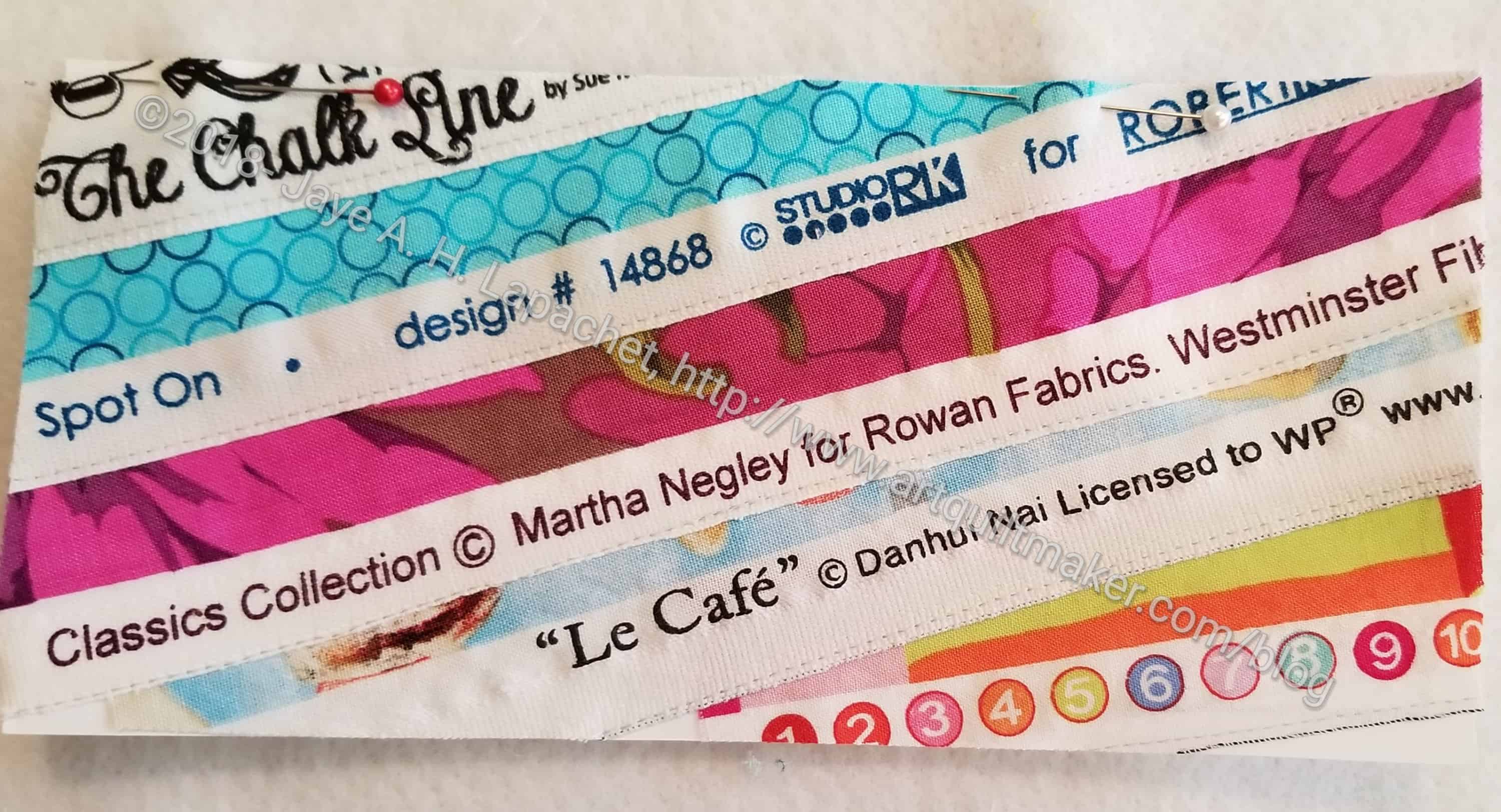
Undercover Maker Mat large pocket
For the large pocket, I followed the directions and put the selvedges on the diagonal.
Now both pockets are on the design wall and I am looking at them. I want to make sure I like them both.
The other thing is the size. I think I need to make mine a little bigger, because my machine is 19 inches wide. I think it would better just slightly bigger. I am thinking about how to do that.
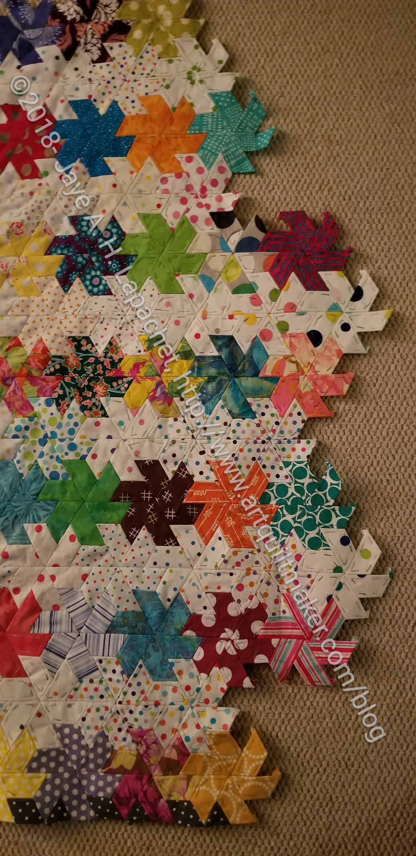
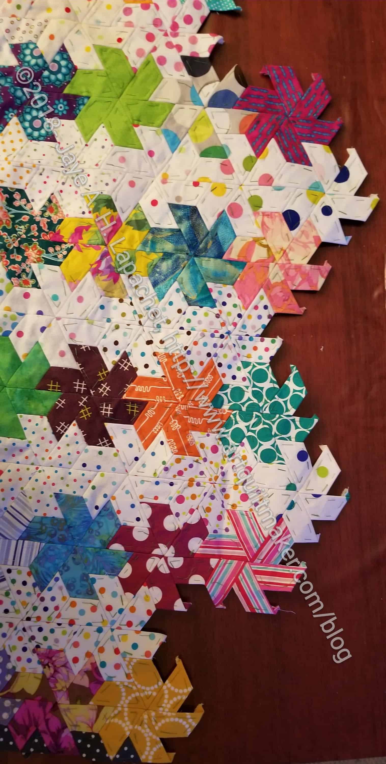
I haven’t talked about this project in a long time. I have been working on bunches of EPP stars. It wasn’t until last week that I actually put some of them together in groups and then attached them to my big piece.
I also laid the whole piece out on the bed and found that I have to double the size to make it even begin to fit our bed. I am feeling a little daunted by that effort with all of the other hand projects I have. Still, my friend Faye said that I have to think about this project as a long term, slow project.
Hexie Stars -Big Piece detail
There is a certain amount of satisfaction in getting even a few bits of this top done. When I add 4 stars to the larger piece, it feels good. It feels like I am making progress.
This is another project where I find that there are not enough colors in the rainbow. I guess I’ll have to think of it as a design challenge.
On Instagram, @Lillyellasworld has a sew-a-long happening for the Undercover Maker’s Mat. The pattern is free. People have made the whole mat and they are showing some great versions of this pattern. I also saw one with a heart instead of a butterfly. Despite the foundation piecing, I am thinking of making one for retreats. I can’t see using it at home, but it would be really useful to keep everything organized while I am away.
As a result, I was thinking about sewing machine mats in general. Before I madethe Undercover Maker’s Mat, I wanted to see what else what out there. As I am wont to do, I did an image search. I found a lot. Still, after sifting through the duplicates, I found a few that were interesting.
I know you are wondering about the Crafty Gemini Sewing Machine Table Mat & Organizer. I made it (and am not showing it to you yet, because it will be a gift, so stay tuned) and am not super happy with it. I didn’t do a crappy job and it isn’t ugly, but it isn’t for me. It’s possible I won’t like the Undercover Maker’s Mat either in which case I will try one of the other free tutorials that are available.
One that was interesting was a tutorial from Michelle of Creatively Blonde. I like the way it looks tailored and hangs down in the front of the machine.
I also like the way the We All Sew tutorial has a long length. I also like the rainbow.
Katie from Katie’s Quilting Corner has a tutorial that clearly shows how to customize the tutorial for the size of your sewing machine.
I like the pattern in issue 35 of Love Patchwork & Quilting – free pattern not available. I like the way the front hangs down. I don’t know that I would put all vinyl in the front, but I know why the vinyl is used.
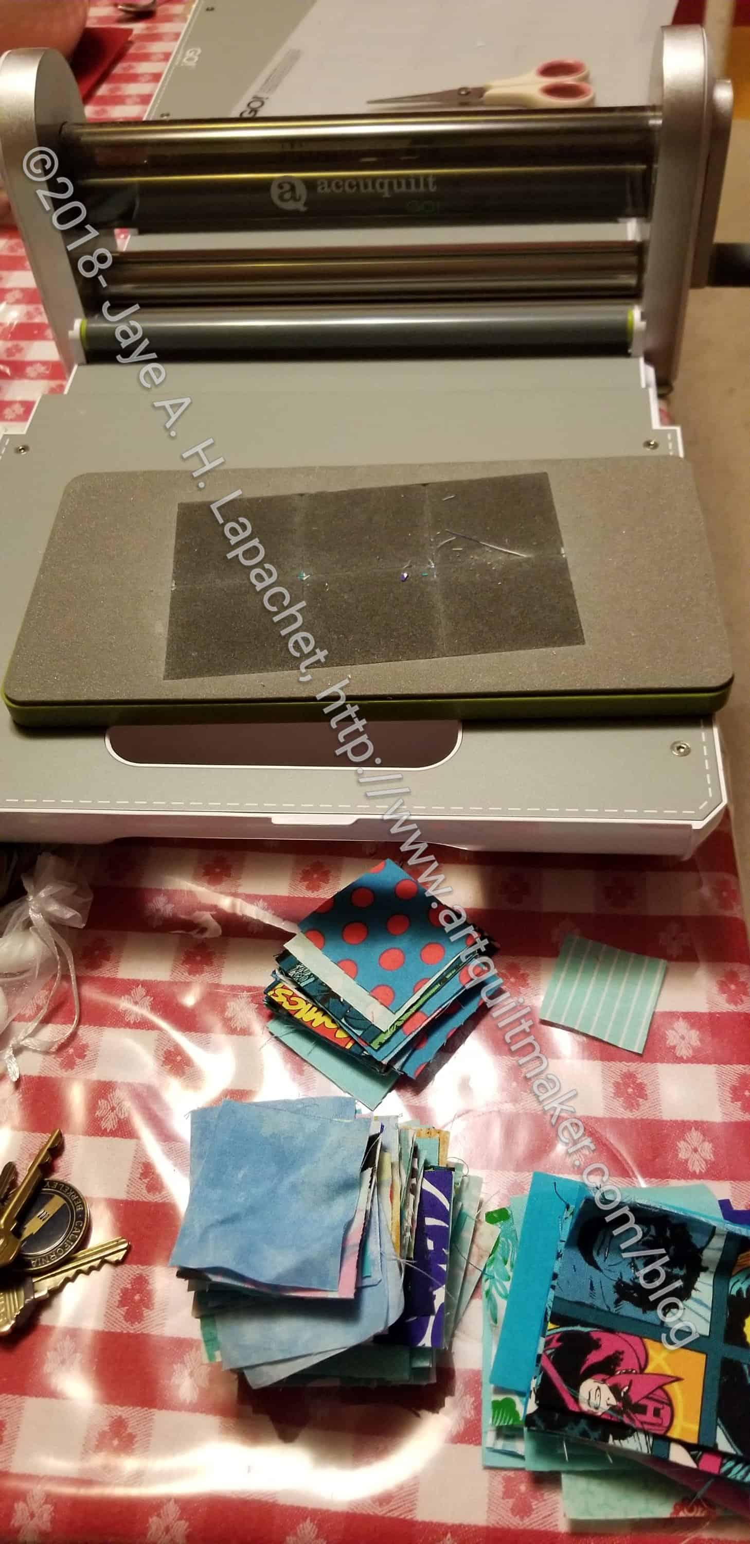
Craft Night was at my house again on Monday. Nothing about my scrap bins has changed. They are still overflowing and I need to refresh my Blue Lemonade stash of squares. That meant that I hauled the Accuquilt downstairs and cut up scraps.
I didn’t get through my entire bin of blue, which was a disappointment, but not a surprise. Still I made good progress in adding to the 2 inch and 2.5 inch squares.
I found that I saved a lot of really tiny scraps. They went into the pet bed.
Allison’s Blocks
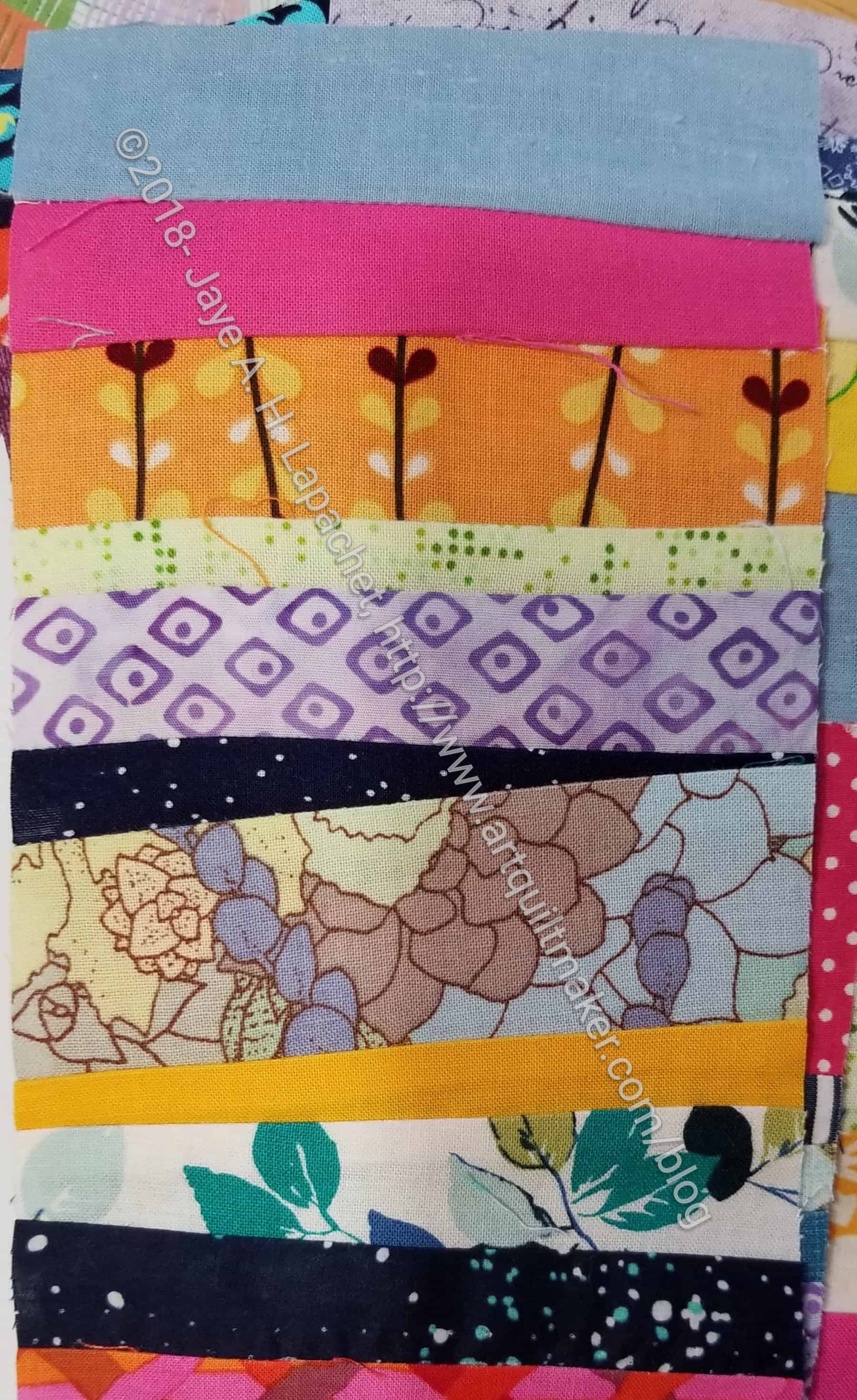
I also found that I had a lot of strips. Alison showed some blocks a few months ago made from strips. I want to make some of them to make a donation quilt, but now it is not the time.
With Spark #30, we finished working our way through Carrie Bloomston’s book, The Little Spark. Buy it. Support the artist. Our journey here is done, but the posts will remain and you can work through the book and my comments at your own pace. There is much more to each spark than what I wrote. The original chapters will help you.
Included on the very last page of the book was a list of books and movies that Carrie suggests we read. I am listing some of them:
I haven’t read any of the books listed above. I have seen a couple of the books she lists, but would watch them again. Go buy Carrie Bloomston’s book, so you get the full benefit of her fabulousness!
Now that I seem to be okay with starting new projects, quilts are being thrown in my path in such a way that I can’t seem to say no.
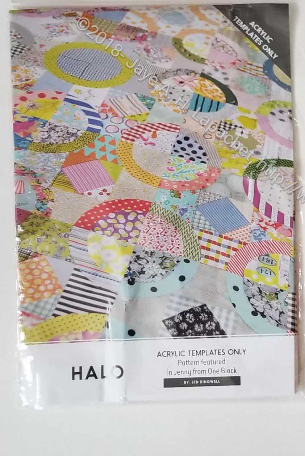
The official name of this quilt is Halo Top. I plan to call this quilt Ring Toss, once I get around to making it. I am not a fan of the word Halo in very many contexts and this is one I don’t like. Ring Toss sounds like a circus and fun.
The other thing is that the pattern is referred to as “Jenny from One Block.” I really don’t know what that means and haven’t had any luck with Google yet.
There is a lot of cutting to do, which, as I said, requires some Hunting & Gathering, so I might not get to it immediately.
I went out and searched the web for photos of the blocks to get some ideas. I came up with one from A Crafty Fox that was helpful. It is easy to see the block structure from this photo.
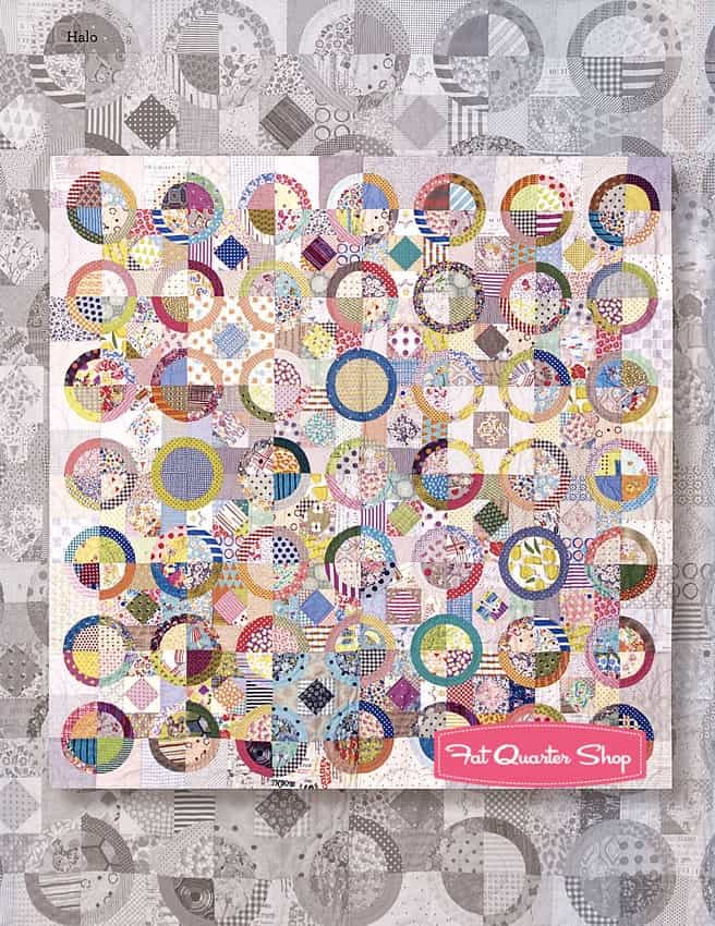
FQS Halo top example
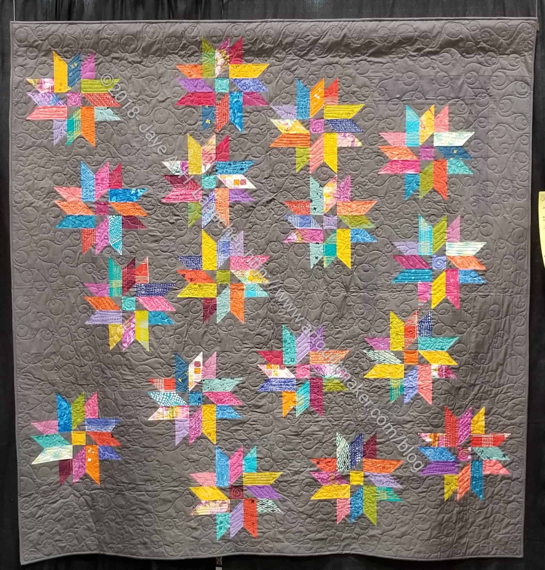
Fat Quarter Shop had a photo, which was interesting as well. It showed a grey quilt in the same pattern under the brightly colored scrap quilt. It made me think that a monochromatic border might be interesting. I’d have to work hard at showing contrast.
I still have a lot to write about PIQF. My post about my quilts barely scratched the surface of my experience. Writing about the MetroScape block n.5 yesterday made me think about all the other things I wanted to talk about.
Vendors
There were noticeable changes to the vendors, as there were last year. The Mancusos has moved some of the vendors to new locations. Others were no longer vending. SIL said that there were changes to the offerings of longarm vendors as well. She is still in the market for a longarm and was pleased at the changes.
I tried to stick to a list of items I really needed for projects or had a purpose. I bought more than I planned, but almost everything has a project attached to it.
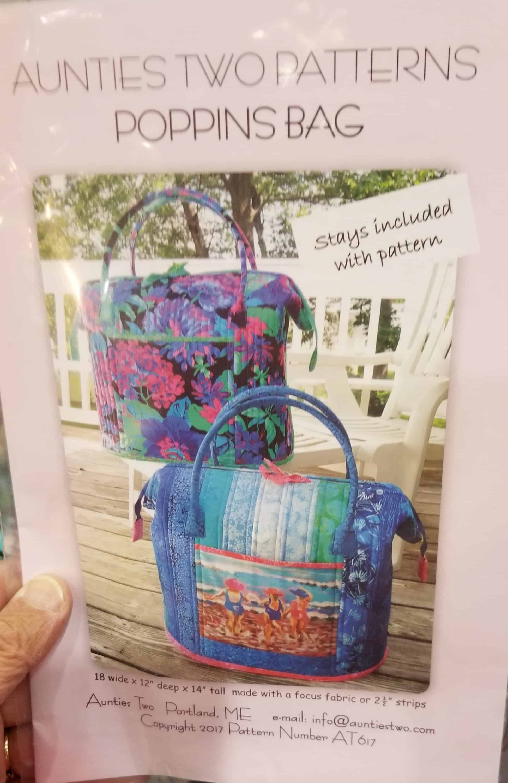
Aunties Two Poppins Bag Pattern
I saw a new (to me?) line of bag patterns and really wanted to buy the Poppins pattern. I loved the shape and the style, but I resisted. I have another carpet bag type pattern AND the stays and must make that one first. One of the booths, Monica’s, had the pattern with all of the interfacing (they use Bosal) cut and available for purchase with the pattern. It was sooooo tempting. As mentioned, I resisted.
On my list was a roll of 2.5 inch batting strips. I want to make a Jelly Roll rug with the jelly roll I won at QuiltCon. No dice. I didn’t see any. I saw a roll of fusible batting strips and emailed Gretchen from 120 Blocks to ask if that was what she used. She said that product would be overkill and I didn’t buy it.
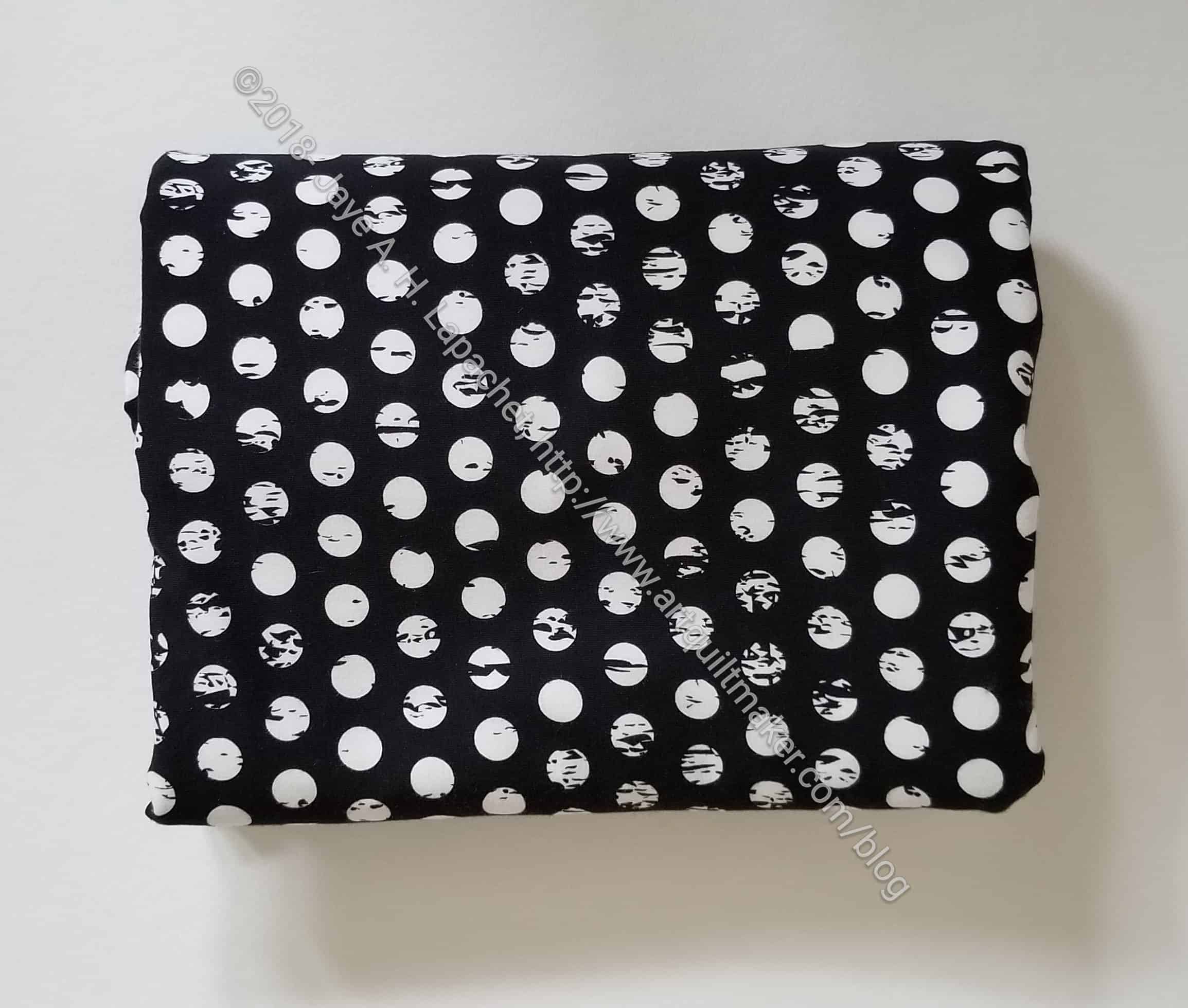
Art Gallery Knit for Westchester Dolman top
I found some fabulous fabric for the Westchester Dolman top. Crafty Gemini has a free PDF pattern of that top, but the link above leads you to the bundle of video and print pattern.
Buying fabric for this pattern has been on my mind, but wasn’t on my list for PIQF. Still, I was thrilled to see fabric I liked that was also of good quality. I didn’t really want to buy something online. I wanted to be able to feel the fabric. Julie pointed out that I needed to see how sheer a knit was, as well, because some knits were very sheer which means you have wear a camisole or something under it. This is an Art Gallery knit and thick enough to not be see through.
I have run out of solid white background fabric, which I like to have around, especially for donation projects. I wanted the Art Gallery Pure Elements Snow fabrics, but Colleen was there and carries American Made Brands. I bought 5 yards of their white, which I do like. She is one of the few vendors that brings bolts to the show.
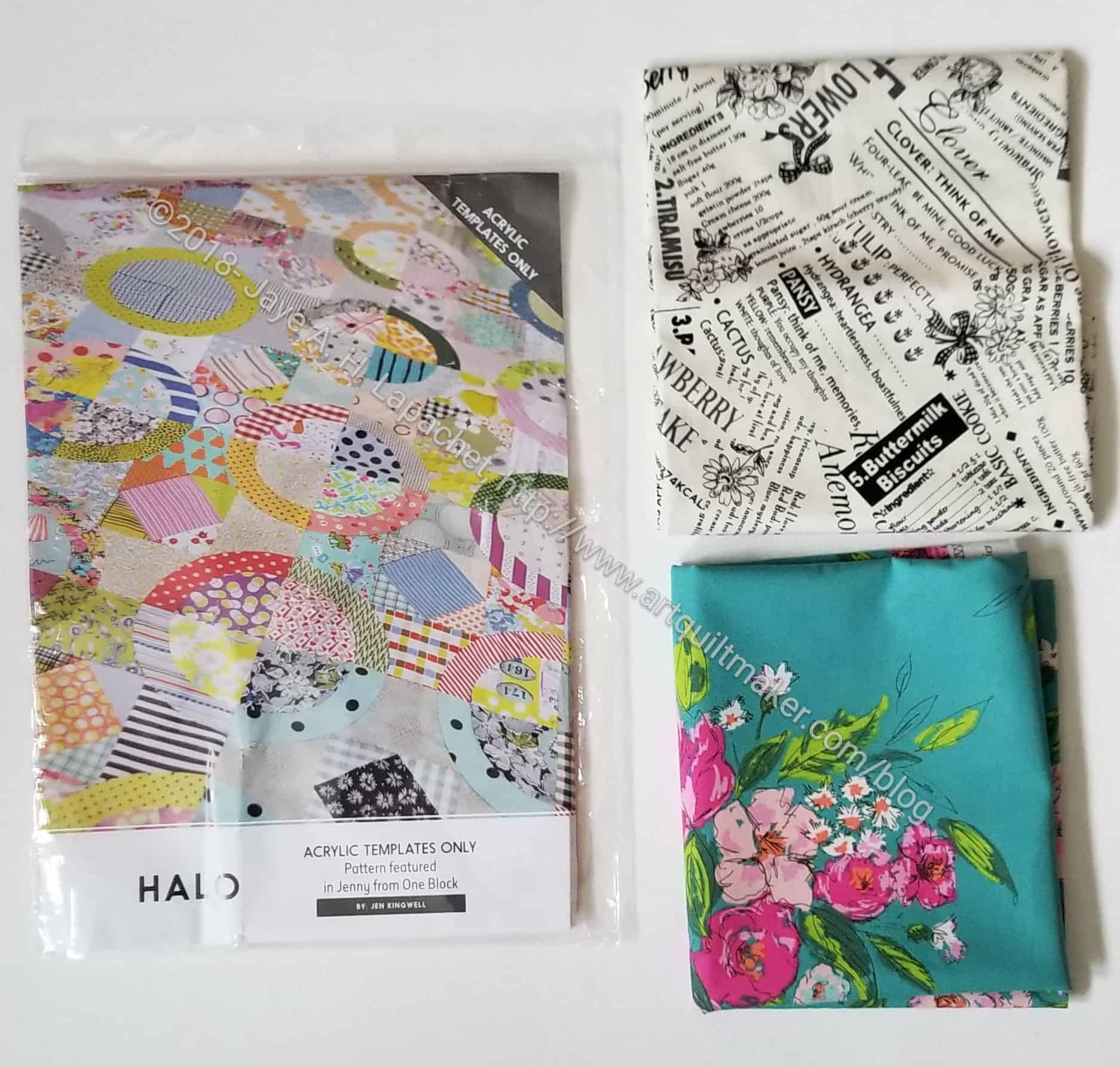
Sewing Party purchases
My big impulse buy was from Sewing Party, a shop that I almost didn’t enter, because the woman looked so dour. I think she was tired and her resting face was not attractive. As soon as we entered the booth, she cheered right up and was very sweet.
I bought two FQs and a template set. I’ll use the text fabric for En Provence n.2. The Halo Top templates were not on the list, but they were so attractive. My friend, Sue Arnold, made a ring quilt years and years ago. Since then, I have wanted to make one. I seem to be getting into the sewing curves groove , so I wasn’t daunted by the curves in the block. The weird thing was that the shop did not have the pattern. When I asked about it, the lady said that I didn’t need the pattern. She was very confident of that even though I don’t think I have ever seen her before. 😉 She said with the templates, I could figure out the piecing. It is a Jen Kingwell pattern and I have heard from reliable sources that her patterns are not very well written. I’d like to take a look at the pattern, but I think the vendor is right. I don’t want to spend $28 on a pattern when I can figure out the piecing for myself. If someone I know has it, I will take a look (not copy, don’t worry). If not, I will figure it out for myself.
I plan to use the green in the Halo top and I will need to do some hunting and gathering for fabric in order to make it scrappy.
Threads & Ewe Yarn 2018
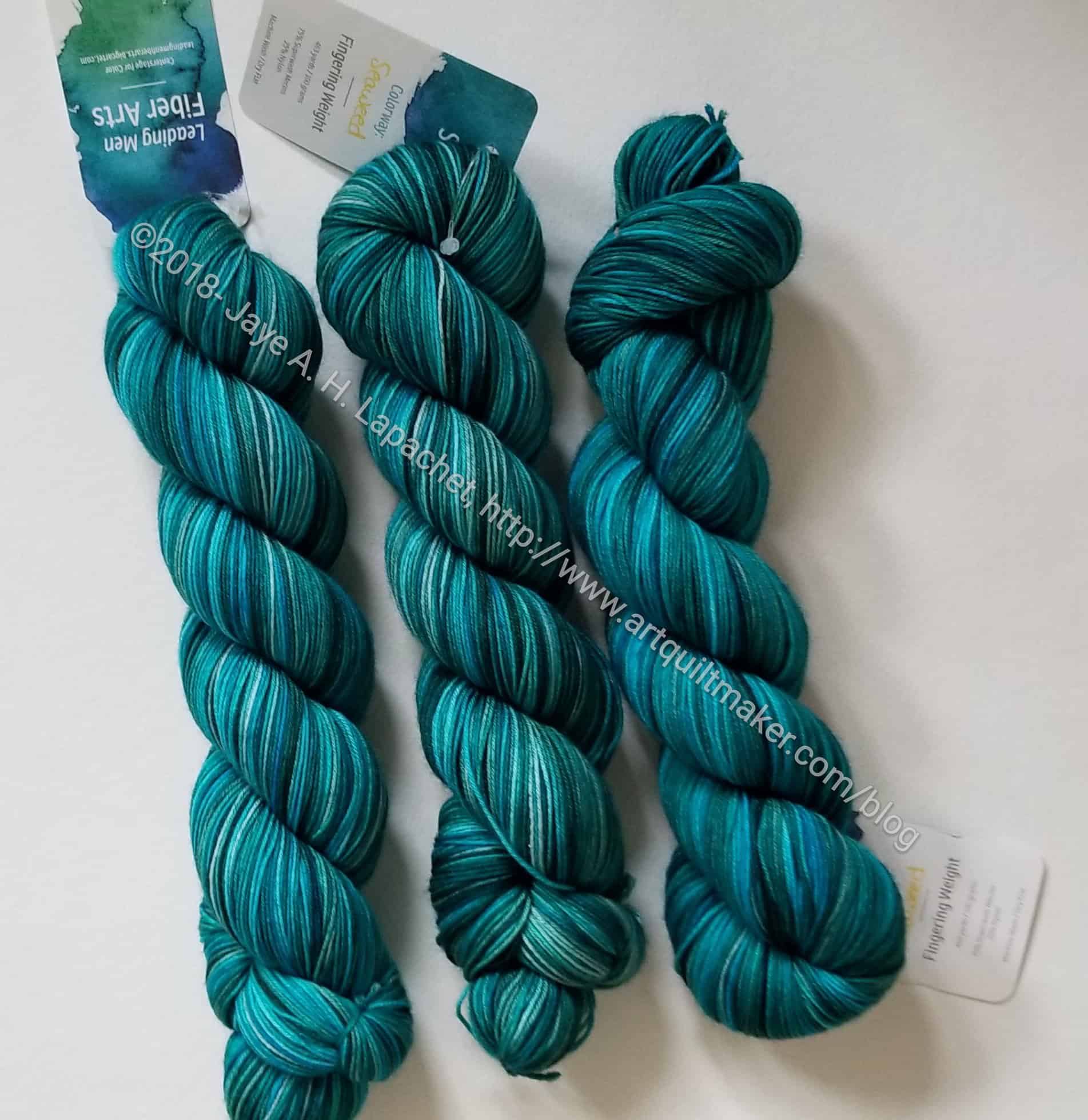
I also bought some yarn from Threads & Ewe. I love that booth. They have nice yarn, but the ladies are so friendly and helpful. They also wanted to see the scarf I made from the yarn I bought from them last year. I bought three skeins to make a shawl. I may have to finally get on Ravelry to find a free pattern. I have to finish my other project first, though. And NO MORE YARN!
Quilt Show
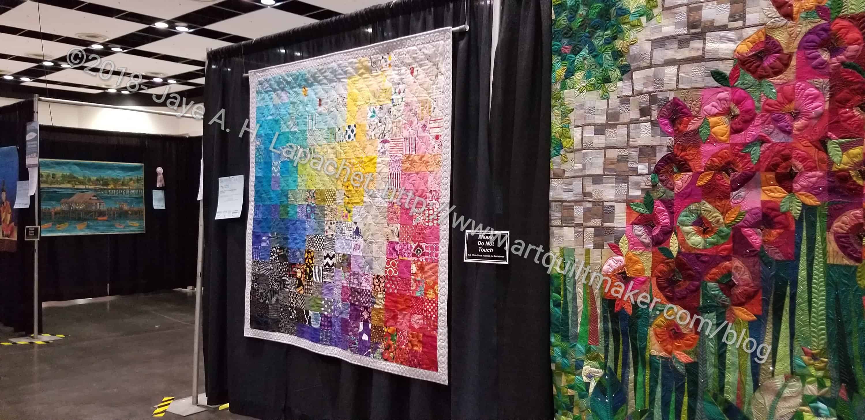
The best part of the quilt show was wandering around it with Friend Julie and looking at everything.
The quilt show, generally, looked the same as it has in years past. They still use the black drapes, which just looks depressing too me.
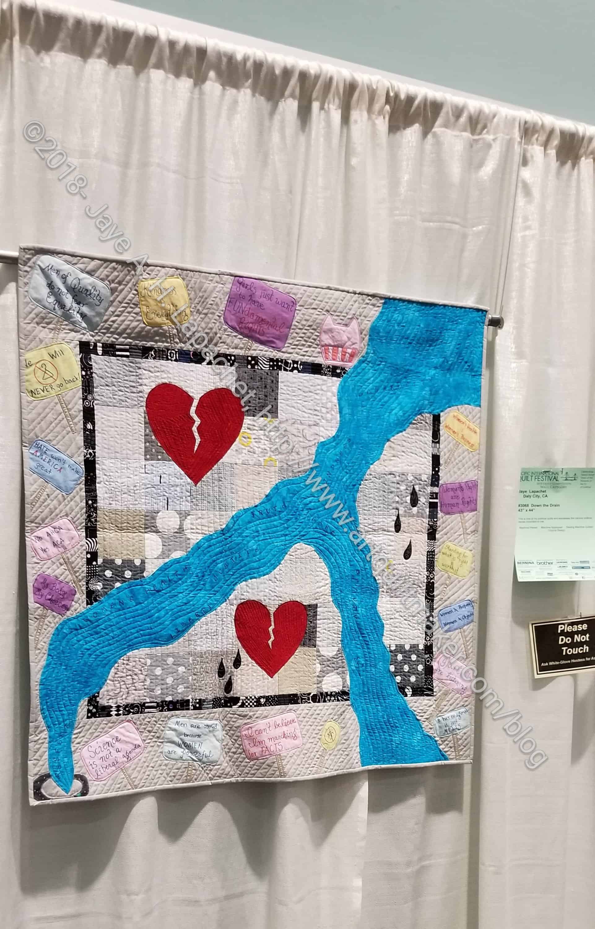
I was, again, disappointed by the New Quilts of Northern California exhibit. I didn’t see very many quilts (perhaps one or two) that were new, fresh or exciting. I must not understand that point of that exhibit anymore. I would have liked Down the Drain to be in that exhibit, but missed the deadline.
I didn’t see any Quick Curve Ruler projects, which was interesting. I wonder if people consider curves to be too hard. I am not finding my MetroScape project too difficult. It has gotten easier the more blocks I have made and I pin like a demon, which helps.
We met up with Kathleen late in the day and walked around with her a bit. She commented on how much “bedazzling” was on the quilts. I had to agree with her. The show winners were all covered in sparkling gems (Swarovski crystals?).
I was glad to be able to spend Friday at the show and not have to cram everything into a Sunday visit as originally planned.
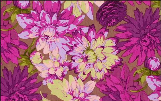
Remember I made a Sew Together Bag and the Tool Tote and a One Hour Basket with this Martha Negley Classics Dahlia Plum Cotton Fabric (PWMN063)? I think I want to make some more accessories for myself with it and I need yardage. Of course, the fabric is old and out of print. I have scoured the web. I keep coming up against a promising lead that, once followed, turns out to be sold out. If you have a real lead or some of this print that you don’t want or need, let me know.
Other Artists
I dip my toe into garment sewing periodically. I am not very good at it and having my SIL nearby to help is a lifesaver. Recently, Laura Kemshall posted about a t-shirt she made, which has a very nice shoulder design. It also looks like it fits well – or can be made to fit well. I like my t-shirts (and clothes, in general) to be fitted – not tarty. Crafty Gemini (Vanessa Vargas Wilson) also has the Westchester Dolman shirt. This is also fitted and the PDF is a free pattern on her site. You can buy a hard copy (no affiliation) and the video series talking about making the shirt. I have the pattern, but haven’t made it yet.
Charlotte, the Slightly Mad Quilt Lady posted this great quote on her blog “So I could easily make excuses. And sometimes I do. But excuses do not make good art.”
Amy Butler is leaving the quilting industry. The article doesn’t say what she will do next, but this seems so strange to me. Why announce you are leaving? Why not just quietly move on to other things?
Projects, Classes & Tutorials
Gretchen has some great tips on making a Jelly Roll Rug (yes, on my list, too) on her recent post in addition to posting links about the various tutorials that have been created to help making it.
Vanessa, the Crafty Gemini, has a free video on interfacings – when to use which and the usefulness of others.
Amy Butler has patterns on her website. The appearance of the patterns look really good on the page. the branding fits in with her other branding. Very professional.
The International Quilt Study Center’s quilt of the month for October is a Pine Burr piece. I’d love to make a quilt like this using brighter colors. It isn’t an easy quilt to make and this example is masterful. I think it would need some paper piecing, though not all paper piecing. It definitely isn’t a pattern for the faint of heart.
Around the Web
Sarah pointed me to a Beauty Pageant linky. Is that a fun name? It is an opportunity to show off your beautiful finishes. I looked at a few of the posts (only 3 available so far) and the author has posted some interesting projects – pillows, tote bags – no quilts yet. Link up and get some love on your projects.
Laura Kemshall is being treated for bowel cancer. She wants to contribute to the Lingen Davis Ruby Appeal to raise £1.25m by June 2019. She has a variety of ways she is raising the money including a Just Giving page, if you want contribute.
I got this via email as part of my entry of three quilts. I am not sure what it means, whether it actually means I am in the running for any kind of prize.
As mentioned, I spent a lot of time Saturday afternoon and evening working on the Ends n.6 donation top and back. Before I got to work on that project. I finished the MetroScape block n.5.
I had done most of the work last week, but hadn’t quite has the time to finish.
I am pleased with the way it came out and am liking the look of the Quick Curve Ruler pieces more and more.
A pile of trimmings from the Octagon 9 Patch have been laying around my workroom for a few weeks bugging me. I didn’t want to throw them away, but I also wasn’t thrilled about putting them ‘somewhere’ to be forgotten.
Finally, yesterday, I decided enough was enough and I would whip a donation quilt. A donation quilt would accomplish a couple of things. I would have something to show at BAM. I would be able to add some fabric to my fabric usage, but most importantly, those trimmings would be off my desk.
Ends donation top n.6
I found a light green Art Gallery solid that I thought would work pretty well and got to work. The quilt top when together pretty easily and I found a couple of fabrics I could use for the back, so the whole thing was done in a couple of hours.
PIQF started Wednesday night and goes until Sunday. I went Wednesday night to scope everything out.
Wednesday night is preview night, so the floor is only open for an hour and a half. I try and go when I can to scope out the new vendors and to find my quilts.
Fabric of the Year 2016: PIQF display location
This year I entered 3 quilts into the show: Fabric of the Year 2016, Triple Star and Down the Drain. No prizes, but I wasn’t expecting any prizes. Two of them had good locations and one had good lighting, but was in a bad location.
FOTY 2016 was in one of the ‘hallway’ locations. It had good lighting, which Julie pointed out, but I didn’t like it being in one of the hallways. People barely look at those quilts and just walk by.
Triple Star: PIQF display location
Triple Star probably had the best location. It was in the back of one of the display section, so people could stand in the aisle and look at it.
My picture is a little washed out, but it is a good photo in terms of seeing the quilt straight on.
Down the Drain: PIQF display location
Down the Drain had a good location in the back of the front hall, but nobody was looking at it.
I don’t know that I’ll enter quilts in PIQF again. I try never to say never, but that is how I am thinking right now. It was really expensive and I don’t really have any hope of ever winning a prize. The prize winners are so large and bedazzled and quilted within an inch of their lives. I don’t really quilt for prizes, but it is still a disappointment when a quilt with an important message like Down the Drain doesn’t get any kind of acknowledgement.
This is the last spark of the book and it is incredibly short. Carrie Blooms ton writes “Now that you have read this book, let me tell you one last thing to take with you on your adventure:
NOTHING YOU NEED
TO KNOW IS IN THIS
BOOK OR ANY OTHER.
Nothing you need is in a class or at the museum or at the art supply store. Everything you need is within you” (pg.124).
This is hard for me. I always think that if I get a better machine, or that new fabric, or a variety of zippers, my work will be better. I have to learn that my work is good enough with what I have and if I keep striving as discussed last week, then I will move towards perfection.
The author ends with “Trust yourself and you will awaken to the potential inside you. You already have everything you need (pg.124).
You can see the last post on this topic from last week.
Nota bene: we are working through Carrie Bloomston’s book, The Little Spark. Buy it. Support the artist. Play along. There is much more to each spark than what I am writing. The original chapters will help you. Go buy Carrie Bloomston’s book, so you get the full benefit of her fabulousness! You can see my book review, which is what started this flight of fancy.
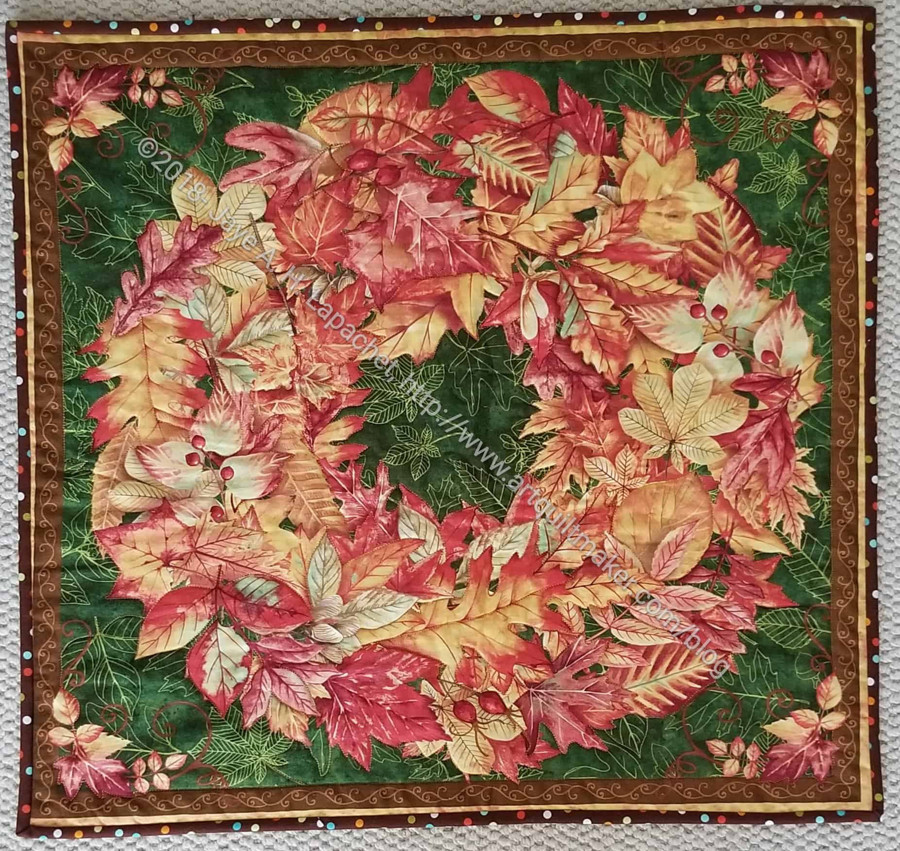
Last week was a week of finishes and I am just getting around to reporting on them. I am finally finished with the Thanksgiving tablemat. I bought the fabric in August of 2015 as I came back from dropping the YM off for his freshman year at college. I started working on it sometime around the end of 2016, worked on it at the retreat in 2017 and finally finished it a few days ago. It is 23 x 24 inches and fits perfectly (whew!) on my coffee table.
This is the final piece in Thanksgiving decorations. I may make more, but for now I am finished and I am glad to cross this project off my To Do list.
Yes, the second finish I am reporting this week. The BAM (BAMaQG) Color Round Robin is now also finished.
It is definitely cheerful and fun, but I am not a fan of the overall piece. It has nothing to do with anyone’s contribution. Everyone did a fantastic job.
I am not sure what I don’t like about it. I certainly don’t hate it.
It will go off to it’s new home as soon as I finish the Sealife quilt-let and can find someone heading to the EU.