Making Cross Blocks (Flowering Snowballs) Tutorial

Judith asked about making the Flowering Snowball blocks, so here is a visual tutorial. Please note that this is the “Jaye-Way” and may not get you an prizes at Houston.

I would suggest that you read the book by Jinny Beyer on handpiecing, as she has a lot of good tips, though she doesn’t recommend using a felt tip. You can use a mechanical pencil to mark, if you want.

I am using templates and handpiecing them. I use a black or red Pilot (formerly SCUF) ultrafine point felt tip pen to mark around the templates. I use grey Aurifil thread and a thimble. Sometimes I put wax on the thread to keep it from tangling. Use whatever needles you like. I use betweens for piecing.

Practice with the felt tip on fabric. You want a thin line with no blobs at the end. I usually run over the end of the template a little and start lessening pressure on the tip right at the end of the template. If you leave it in one place too long, you get a blob. Blobs are bad for precise handpiecing and they look ugly, too.

Trace around the templates on a hard surface. In this case, I am using the book as hard surface. Trace on the back/wrong side of the fabric.

That tiny print says to flip the template 180 in order to get the most pieces out of your fabric. I was cutting 4 pieces from each fabric, but found that to be too many. I will use the ones I have, but am now only cutting one or two. I am trying to keep this quilt to a reasonable size (HA!) and to have as much variety in the fabrics as possible. If I like the fabric, I can always go back and cut more of it, right?

I trim around the templates by eye. I don’t measure the seam allowance. I try to keep it to arounda quarter of an inch and not to get too close.

Detail of trimming.

Here are the pieces cut out.

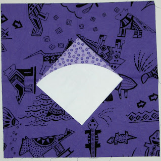
Here is the pinning. First, I pin right in the corner just inside the drawn line. I poke it through the foreground (colored) fabric first.
This is the back of the pinning. Same deal goes here. I come up through the back. Get the pin right in the corner where the drawn lines intersect and just inside. Remember you have drawn around the template, so the drawn line is a little larger than the template. This is why I try to pin AND sew just inside the drawn line.

Here (above), the pinning is done. Note that I put two pins close together at the beginning, but I take the first one out right when I am ready to sew, so I can start. The second one holds the pieces together while I get started. I try to make small, even stitches that are evenly spaced. Remember to look at the back as you sew so that you are poking through the back right inside the drawn line.

It is ok that the piece is wrinkly, because you want to match up two curves that are going in opposite directions. Use the bias to make them match.

How the Pieces Go Together

My whole philosophy, which I am pretty sure is a general quiltmaking philosophy, is to go from smaller to larger. This means to build the blocks by making the smallest patches into larger units and then putting the larger units together to make a whole block.

First, take one corner piece and one background piece and sew them together. Sew/pin with right sides together. Curves require, at least for me, a lot of pinning. For pinning, start at each corner and put pins in by lining up the corners of each piece with each other.

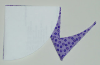
When you sew the corner and background together you will have a unit that looks like the above unit. You can see how the felt tip lines show through, which is another reason to sew just inside the drawn lines. They won’t show on the front of the quilt if you keep them in the seam allowance.

Seeing the felt tips lines here also allows you to see how they line up, if you do the piecing correctly.

Add another background unit. Note: I am trying to use all different fabrics in each position in the block, but you don’t have to do that.

Now you have quite a large unit. You will need two of these units per block.

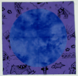
Sew the center patch to one of the corner (foreground) units.

Here is how he unit looks once the middle patch is attached to a corner.

Sew a second corner to the center patch.

With this unit complete, you are ready to attach the side unit to the center.

So, just do it. Attach a side unit to the center.

Once you add that unit to the middle piece you are nearly there. The above piecing is the hardest part (but not like you are taking the SATs without a prep course), because the seam is long and the middle section is quite floopy. It also takes a LOT of pins. Make sure you sew through where the seams match several times to keep it strong and make sure the seams line up. I care about that stuff, but you don’t have to match your seams.

I don’t always press the patches after I sew them, because I am sitting on the couch watching TV while I sew (why do you think I have a hand project?) and am too lazy to trudge upstairs to press. It makes the piecing a lot nicer if you press as you go.

Add the last unit and you are done!

Completed square. I usually trim the block after I am done with the hand piecing. Make sure you don’t cut over any of your seam lines, because your piecing will unravel if you do. This is not machine piecing.

New Inspiration

The seasons are changing here. I think we are past late summer and entering early Fall. The clouds are changing and the air feels different. Work got me a new device, which has a camera. It is not as good a camera as my regular one, but for quick shots while I am out and about, it is fantastic! I would often want to take a quick pic and not have my camera with me. Now I have something with which to record things as I wander through the City.


Morning. Thursday. Looking East.

Afternoon/Early Evening. Thursday. Looking West.

Afternoon/Early Evening. Thursday. Looking West.

Coffee Art. My barista does great coffee art. I have long admired it. Finally, I have a way to record it.

Go and Make Stuff!

Project Progress


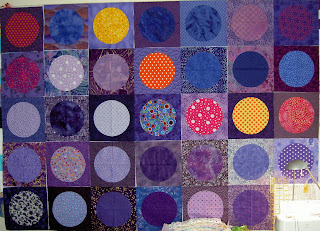
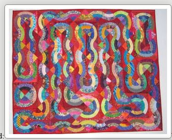
I now have 15 Cross Blocks (Flowering Snowball). I could have laid them out in a 3×5 grid, but it didn’t look that good.
MavMomMary and I took the Pineapple Quilt Class together back in January. She is already putting her quilt together. I haven’t seen it since she had only done a few blocks and was thrilled to see it today. I think it looks fantastic. And very different from mine.

And a detail.


New Fabrics. Again.


I couldn’t manage to finish entire blocks over the weekend (remember? I was staring at the screen all day Sunday hoping a blog post would magically appear?). I did get part way through these, though, and it will be a good start for next weekend.

Lamenting my lack of background dots, I was pleased to find that eQuilter had these dots on her site. When I wanted to get Quilter’s Home badly enough, I bought them to make the shipping worthwhile. Unfortunately, QH was not included in my order! What a disappointment! Not sure if it was a shipping error or user error eQuilter is very good and I have never had a problem, so I am betting user error, but I will check in with them. Regardless, I need to find a copy somewhere as I understand there is a SUBSCRIPTION now available YAY!

St. JCN received her fabric, so I can tell you all about Superbuzzy! It is an online fabric ‘store’ (DUH! What else would it be???) that carries Japanese fabrics. St. JCN and I were drooling over the red in basket blocks Jan showed in one of her posts on Be*Mused blog. I left a comment and Jan was kind enough to e-mail me about Superbuzzy. I had never heard of it, but I went there and found that they have cool fabric! It is mostly, if not all, Japanese fabric, yet not all quilting fabric (buyer beware). I managed to find, as you can see, some wonderful dots. I got pieces of the bottom three for St. JCN as well as I knew she was having a tough week and could use a pick me up. One of the reasons that I like the site is that, although it has a small footprint, you can see everything on the screen you are on: your cart, the search box and items. Much less clicking. Check out Superbuzzy!

Thr3fold Journal Articles Review Part 4

The last part of the journal is what I would call the how-to section. I can accept this section as it does not tell me how to do a certain project. I don’t want to do someone else’s project. I want to learn how they achieved a certain look and then use it to make my own project. Thr3fold has respect for their readers; thank yo for not treating me like a moron!

There are five parts to this section:

  1. One Hit Wonders: Monoprinting, pg.30-33
  2. Shadow Play, pg. 34-37
  3. Working on the Edge, pg.38-41
  4. Drawn to Pen and Ink, pg.42-45
  5. Dyeing for Color, pg.46-51

And the journal ends up with the The Last Word, pg.52.

I began reading the One Hit Wonders: Monoprinting, pg.30-33 article and my eyes started to glaze over. I put Thr3fold down and went and did something else for awhile. When I came back to it, I was in a better frame of mind and really became intrigued by the process, because the article shows you how to get words onto your quilt in your own handwriting!

The article tells you very clearly what a monoprint is and the different ways that it can be used in fiber arts. I also liked the way, once the basics were taken care of, that they suggested variations on the theme.

Just a note about supplies: I think they forgot to mention the brayer in the supply list.

Shadow Play, pg. 34-37 has absolutely gorgeous pictures associated with the article. Shadow applique’ is the technique they teach in this article, which is a combination of digital printing and applique’. Linda starts the article by saying that this technique is a way of building up layers in a quilt. You can clearly see in the examples, the layering of fabric, embroidery stitches, embellishments and quilting to achieve a rich look.

One section talks about digital printing in fairly specific detail. Once that hurdle is crossed, Linda moves on to designing the piece and discusses auditioning fabrics as well as rummaging through her scrapbasket.

The final piece is gorgeous. I love the quilting pattern and have seen it enough in this journal to attempt it next time I have a small piece to quilt.

While I can’t imagine ever having enough time to work on the binding in a way that would make the Thr3fold girls proud, I love the ideas espoused in Working on the Edge, pg.38-41. The article discusses embellishing your binding. They touch ever so briefly on attaching the binding (no step by step details – HOORAY!), but spend most of the article on choosing the right color for the binding and embellishing it. These are seriously creative women. I would never have thought of continuing a line of beading out into the binding, but it makes perfect sense. A few beads and a little blanket stitching would add some interest that might take judges’ eyes away from less that stellar sections of the binding. The article discusses it all. It is really a catalog of ways to dress up your binding.

Drawn to Pen and Ink, pg.42-45 really stuck in my mind because of one of the photographs. They use a maple leaf as an example of drawing with pen and ink on your fabric (or paper). The photo that got me thinking was the one where they had traced around the leaf on a light table and cut it out of white paper or cardstock. Since leaves can be fragile, this is an excellent way to use the leaf over and over to try new ways of embellishing it. It also mitigates the whining of “I can’t draw that!”

The article talks about implements and makes me want to try one of those Koh-i-noor pens. They look carefully at the actual leaf to find areas that need to be a little darker. They also use the leaf to find the veins. I think that this idea combined with the idea of tracing over designs to get the major lines that we discussed in the Liz Berg class in January of 2006. BTW, Liz Berg discusses keeping a sketchbook as well. I really need to get to an art store!

As I may have mentioned, dyeing fabric is not my thing, but the Dyeing for Color, pg.46-51 article has such gorgeous illustrations and pictures of the gorgeous fabric they produce that it makes me want to take up a new hobby. They discuss the various ways you can dye and what to do when you are just starting out. All of the supplies and safety requirements are touched on. The authors also point out what dyeing you can do when you don’t have a dye studio. The article discusses the various products and different types of dyes. I also liked the sections on how to achieve different results, e.g. bag dyeing and layered dyeing.

Finally, the Last Word got me excited about the next issue by telling me what to look for (more challenges with slight variations on the theme, which made me think about a house quilt) and what they believe about their work.

My overall take: the photos in this journal alone are worth the price of admission.

Yes, I’ll look at the CD and review that as well…later.

Thoughts on Visual Journals

I stared at the screen all day yesterday and was amazed when no new posts materialized.

Today Deirdre got me thinking with her post mentioning a new box of crayons. This dovetailed with me finding two sets of felt tip markers that I have had for years (yes, they still work). No longer my implement of choice, they have been languishing.

I am still thinking about visual journals so Deirdre’s post made me think of the “visual work” I did when I was a kid. Doodleart were black and white posters you bought in a tube and then colored with felt tips. I loved Doodleart posters and am amazed that they are still in business! I see the aquarium and think I did that one way back when.

I was also thinking about coloring books. I used to go to TG&Y on my bike and buy coloring books and paper doll punch out books. I think coloring books may have been the original visual journals for me.

This Disneyland coloring book is copyright 1975 by Walt Disney Productions. It is called a Whitman Book, Western Publishing Company, Inc., Racine, Wisconsin. There is a history of this company online.

I really thought a lot about color when I was coloring. Notice how Minnie’s shoes carefully match her dress?

It should come as no surprise that I was extremely neat in my coloring. I also DID NOT share. I didn’t want anyone messing up my work of art. 😉

Still no movement on actually creating a modern visual journal, but it is still rolling around in my head. I think I need to find a good art store.

Sharing with Like Minded Creative People

Today was the CQFA meeting. There are six meetings per year and they are held in Santa Clara, which is about an hour from my house. It is always a big effort (I usually stay up too late the previous night and am tired from the week of racing around) for me to get the to the meetings and I have missed a number of them this year. I was richly rewarded by attending today as the show and tell was fantastic. Also, nobody was being an attention hog or annoying me. Everyone was wonderfully supportive of one woman who is experiencing a series of losses in her life. Not only was the work wonderful, but inspirational as well. Check the website for the meeting and I am sure the photos will be posted soon.

The workshop was put on by Virginia Schnalle, who is a wonderfully creative quiltmaker. I admire her work, her fearlessness in art and her quiet manner. She has taught a couple of workshops for the group and they always yield wonderful results for me. It was in her class that I made the Eye of God. That quilt is now in the collection of another quiltmaker, but I consider it to be one of my most successful quilts.

Today we worked on getting started when your muse has gone on vacation or your well has run dry. First VS gave out a basket of words, from which we each chose three. We weren’t able to tell what the words were before we chose them. From these words we had to draw simple drawings that came to mind when we saw the words. My words were:

wisdom
release
freedom

I thought the words were good choices for me at this point in time and space. The drawings I made were not very satisfactory, but I think if I were stuck, I would be able to use them to get the muse.

The good thing about this exercise (and my lack of organization) is that, in looking for supplies on the supply list, I found two wonderful pencils. They are very smooth and easy to use. They are called Berol Karismacolor. I have no memory of buying them, but must have sometime in the distant past of my art days. I am putting them in the pile of possible supplies for my visual journal.


After discussing different kinds of balance: symmetrical/formal, assymetrical/informal, horizontal, circular or radial balance and crystallographic balance and the Rule of Thirds, we went to work on our own pieces. My first one is above. It is made out of cut up magazine pictures. I didn’t pay attention to the subject of the pictures…much, but concentrated mostly on the color and the pattern. The first one wasn’t terribly successful IMO.

I didn’t pay attention to the Rule of Thirds direction and just made the one above because I was inspired to do so. Very symmetrical.Same as above. I didn’t have any red to start out with, but scrounged some from the garbage pile and made this piece. Again, very symmetrical. I can see working with this design to make other pieces.
And TA DA! Here is the piece d’resistance. I think this one came out the best. I added the words (see first exercise) at the end on a whim as well as the #1. I like to mix characters and imagery. I am not sure what I would do with this, but I can see tracing the main lines and going on from there with it.

During show and tell and the announcements, I also worked on this piece from the Laura Wasilowski class. I worked on the handwork using Laura’s hand-dyed thread. Adding the thread is similar to Pamela’s techniques. I like the process, but I also like making progress. I have a few too many handwork projects in the pipeline right at the moment and would like to move a couple of them out. Goals are good!

More Various and Sundry


These are the two hand pieced blocks that I made last week. Different sort of look. Not so cheerful, but not depressing, either. I am not sure what I was thinking when I put the two dot fabrics in the same block? I thought I wasn’t using dots in this piece. Oh well. It is a scrap quilt, so who cares?


More dots.

I went to Britex today to get some fabric for pants. I was on the second floor and remembered that they have quiltmaking fabric. While the girl was cutting my pants fabric, I took a quick peek at the quilt fabrics. Lo and behold! They had dots! Hooray! I picked up the two above. They also had the Robert Kaufman Tropical Pimatex dots in both sizes. I have enough so I didn’t buy any, but it was good to be reminded that they are downtown and do have fabric. DUH!
I also stopped at the Container Store and found these project cases. I have been thinking about something like this since I read Be*mused‘s piece on the scrapbook project cases she found (I looked for the article, but couldn’t find it and can’t find her search button either-DUH!). They are 12 1/2 wide and 17 and something long. I bought two of them just to see how they would work. I filled up one with the Cross Blocks (Flowering Snowballs) + the fabric for the center pieces, which I don’t want to “put away” and never be able to find it again.

I was told today to look at other kinds of art besides quilts to see what I am inspired by. I have some books. I guess I will look at those and see what I see.

I am still thinking about black and white line drawings in a new visual journal. I haven’t done anything about it yet.

The photos of some of the quilts to which I linked (to Artquiltmaker.com) in the past week looked really crappy and I was embarrassed after I posted them. I took 4 quilts including Ocean Ave, Get the Red Out, the Punk Rock Quilt and the Mary Whitehead quilt to be photographed. I want to put better pictures on my website.

The latest baby quilt, which my mom made and I paid to have quilted, is done. It has to be picked up from the quilter soon. She is quilting the Nosegay next.

More Weekend Work

Making strange mixed media works all weekend didn’t feel comfortable to me, so I sewed on Pineapples while the paint and various layers dried. I completed three more side border blocks. I wanted to make three more on Monday, and think I could have done it, but I had to work on the house a bit, so I did that: 2 days fun-work; 1 day: work-work.

More new fabrics. The two on the top left are replacements, but the others are new. Enjoy.

What a Messy Day!

After reading Cloth Paper Scissors all week, I got a bug in my ear to paint and layer stuff. It had been germinating for awhile and the CPS just put all the pieces together. I used to make book covers and postcards by cutting out pictures from magazines, gluing them down and covering them with contact paper. I still have at least one bookcover with such a collage. Not as sophisticated a process as the ones CPS describes, but creative nonetheless. I like to make things that are useful, I guess.

The World’s Finest Chocolate boxes are cool. Darling Boy sells chocolate from them every year and I love the shape. They are like little suitcases and I just couldn’t toss them out. I thought I could decorate them and make something.

First, I went through my supply closet and pulled out all of the possible supplies.

I am embarrassed to say that a number of the items were unopened. Some of the rubber stamps had never been mounted. It took some time to do all that.

Then I carted everything downstairs, covered the table DH had set up for me with newspaper and set out for the craft store. I knew, from reading CPS, that I needed Diamond Gel Medium. I don’t have a good art store nearby and the craft store didn’t have it so I reverted to some dark depths from my painting past and bought Gesso. On a whim, I also bought some Sparkle Glaze and some dotted scrapbook papers as well as a pack of cheap brushes.

Next, I covered the box with Gesso and let it dry.


Drying was a problem. I didn’t factor that into the whole process. Not only did the drying take a long time, but the layers weren’t completely dry even after I waited. I have to admit that I was impatient to engage in the process.
First I used a Stampin’ Up roller wheel and I stamped/rolled dots all over it in purple ink. I didn’t do that well, because I didn’t know how to ink the roller and roll at the same time. I wish I had paid more attention in Karenlee’s classes!

Next I ripped up some of the scrapbook paper and applied it with decoupage medium. I had some around from when I wanted to make a type of prayer box (still have the stuff, except for some of the decoupage medium).

After the first layer, I began to feel some confidence and added some more scrapbook paper (see the yellow ripped into circles?) and began to add other pictures.

I started to apply some magazine sayings and pictures. The decoupage medium gave the piece a bit of a shine.


The glitter I added didn’t turn out as nice as I had hope. I know it had to do with my inexperience. I didn’t really know how to apply the glue the right way to make the glitter spread evenly.

I also stamped the large cups and flowers on it. Some of the rubberstamping smeared after I put a layer of Sparkle Glaze on to finish the piece. This is pretty much how the outside of the finished piece looks.

This is the inside of the box. I just painted it with the Gesso just to make it a little nicer looking. My painting skills aren’t great, but maybe I will put some fabric inside or something.

I was really out of my comfort zone doing this project, which I think is good. I thought it was fun. It was good to have enough time, though I know now that I need to leave the piece to dry longer. It didn’t come out as well as I would have liked, but I am not ashamed of it either. I have some more of these boxes and might like to try this project again. It got something out of my system.

Creative Journals

I have been feeling, for a long time, how I would like to work on a visual journal – painting, sketching, colored pencils…something. I am an inveterate journal keeper. I have been keeping a journal since about 1980. Perhaps earlier. I have scads of them everywhere. I used to put snippets of things in them and they would get quite fat and I would have to keep it in a big ziploc bag in order to ensure that the bits and pieces wouldn’t fall out. An old boyfriend spent the day reading my journals once and that was the end of him. Jerk. My journals are for my mental health and NOT for sharing. They are not nice, not always pretty, but they are a fantastic exercise.

Anyway, enough boring background.

Lately I have been writing bits and notes in my journal about Thr3fold journal in order to remind myself what I want to write in the review. Putting the notes in my journal keeps all the parts together. Today, I was reading an article in Cloth Paper Scissors. Jane Lafazio, Keeping Creative Sketchbooks, pg.24-27, March/April 2007 issue, writes a little lesson on drawing and the whole article is illustrated with pages from her notebooks. The images are fresh, alive, colorful drawings. They make me want to get closer, to know more. She also writes “The journaling makes my sketchbook more than a series of paintings; it becomes my illustrated personal story.” What a lovely thought. I love the thought of something being my personal story.

Darling Boy made a deal with me to draw every day. This is his picture. Of course it is about war, but I love the little alien in the upper right hand corner. I am tempted to enlarge it and paint it. Something about it appeals to me, perhaps the googly eyes.

Tonya showed a picture of one of her visual sketchbooks, so I have been reinspired all day to figure out how to do this.

And finally, I finished another Cross Block (Flowering Snowball). Two in one week! I am thrilled!

How do you like the fabric with the faces?

Thinking Pink


Today, I was directed to the Connecticut Piecemaker’s site, which showed this quilt, a raffle quilt for their 2008 show. You all know that I am a sucker for samplers and this one is a particularly fine example. I really like the variety of blocks and the fine use of red. The reds are very similar and I wish I could see the individual blocks closer to see if they are the same red, but such is life.

At the Fair last weekend, I was thinking about pink fabrics. The Sampler above brought the thoughts back to my mind. I have over the past year or so had a bug in my ear about pink fabrics, so I have been buying them up – not like crazy, but selectively, just in glorious quantities. Now I have quite a lot of them, so naturally my thoughts turn to what I will do with them. This quilt got me thinking about a pink and white sampler:


It looked better in person, but you get the idea. I am not thrilled about the contrast of a couple of the pinks, but all I need is a spark of an idea and I go off in my own direction anyway.


This quilt has the look of the red quilt above in terms of a consistent value. All the fabrics are the same, so, of course, it would have consistent values. If I go forward with this idea, I would like to achieve this look, but with a variety of different fabrics. I’ll have to work hard at it.

Thr3fold Journal Articles Review Part 3

Food for Thought p17

“…if you are anything like me you never have everything that’s listed in the recipe but you’re so impatient to start that very minute you decide to go ahead and do it anyway.”

The article is about finding inspiration in Thr3fold and their hopes for the mag. It is basically a mini-ad where Linda compares finding inspiration in cooking to finding inspiration in quiltmaking.

I like it that she used the word impatient rather than excited or some other word. I think it describes the way I feel about starting a new project exactly.

My first thought after reading the article was: is Linda in my head?
______________________________

Twisted Knits p18-21
Remember the fiber cupcakes from the fair? Friend Claudia, with whom I had lunch on Wednesday, is knitting some like them and I am delirious over them. Hers sound so gorgeous. Knitting is something that I have had to give up 🙁 because of my hands, but I long to make 15 or 20 of these cupcakes to decorate and give as gifts and amuse (imagine them on a tray in the living room or dining room!). I long to try out the fabulous yarns available and decorate them with beads just to get a little taste of knitting and beading.

LLC must have sensed my lust for yarn, because they give the pattern and tips for this easy twisted scarf. One tip is to make the tassels first, so you don’t have to worry about running out of tassel yarn. What a great idea! I wonder how this could be translated to quiltmaking? Make the border first?
__________________________________________
Diary of a Quilt p22-25

Diaries are nice because they get you into the head of the writer, which is a bit of self serving comment as I am writing a blog here! I am a journal junkie. I love reading people’s journals (with permission!), because of the … rawness, though I am not sure if that is the right word. Still journals, diaries and blogs are all about process, not about product. Sometimes exhaustively so. This article is, I assume, a much edited, fairly sanitized version of Catherine’s journal of her quiltmaking process. I would expect nothing less from a publication. In a way, it is too edited. I would have liked a bit more detail, but the editing doesn’t detract from the description of the process. It also accurately depicts, without whining, the frenzied feeling of having quilt deadlines to meet while trying to enjoy part of the process that she finds fun.

This is the fine line that I desperately try to avoid; wanting recognition via quilt shows and events/exhibits while trying not to imbue quiltmaking with the hated aspects of a job.

The quilt that is the center of the article is one of seals (or maybe sea otters – I have no idea what the difference is and only a passing interest) and it is wonderful. There is such a sense of peace in the quilt when I look at it. She talks about missing her seals and a Sedna quilt, which I haven’t seen and wasn’t able to find on the web. I hope it is on the CD, but it is a reference I would have liked to have seen as a picture in the article.

This brings up a tangential point about multimedia journals. What exactly does that mean? Are they truly multimedia if I can’t click on a link like “Sedna” in the actual text of the print journal and be taken to the image or description on my cell phone or PDA or a screen that is projected form my glasses and pops up in front of my face? Or is it just multimedia because they include a CD? What about weblinks in magazines? If QNM includes a URL, does that make it a multimedia magazine? I guess this is a new frontier.

Anyway, the seals look playful and happy. The brown part on the right of the quilt is not something I would have thought to add, but it really adds to the quilt. It could be cliffs or an undersea ridge. I am not sure how I feel about the quilting. There is a delicacy about the quilt that the quilting doesn’t fit with. However, it does give the idea of swirling water. The shell (abalone?) buttons that she used for the bubbles are great. They add a little texture and shine to the quilt without overpowering it.

I liked the pictures of painting the faces. Until I looked carefully at the detail of one face I didn’t realize they were painted. I though that the faces had been fussy cut out of some hand dyed fabric to take advantage of the coloring. Looking at the whole quilt (not the detail) more closely, I can see the delicacy in the coloration that certainly cannot be achieved with a dye process (that I know of – being such an expert on dyeing and all NOT) JulieZS will have to weigh in here and set me straight.

Big annoyance: the article basically stops in the middle and tells me to go to the CD to see the rest. I guess they are forcing me to look at the CD on their timeframe rather than my own, which leads me to believe that they want the CD to be considered an integral part of the package. Not necessarily a bad thing. They are teaching me in more ways than one.

43/47

In order to complete a Pineapple block, including the corners, I need 47 fabrics. In an ideal world they would all be different. Without the corners, which, in this project, I have not yet applied, I need only 43 fabrics. As a result, the Pineapple side blocks are really causing me fits. I need so many more background fabrics than I did with the center blocks. I just don’t feel like I have enough.

In reality, I may actually have enough. Currently I have 32 background fabrics in active use. This means I should only have to use some of them twice. But someway, it is not working out out for me.

Contributing to this problem are the marginal fabrics. Of those 32 active background fabrics, 5 are what I would call marginal. If I had more background fabrics, I wouldn’t use them. The marginal fabrics are defined in my head as having too much color or too much concentrated or prominent color. They stand out much more in these background blocks that are merely supposed to frame the piece.

Also contributing to the problem was the arrangement of the strips. I had arranged them so duplicate strips were dispersed throughout the pile. This wasn’t working, because I would come across a fabric that I had just used. I could certainly skip it, but I felt like I was skipping too many fabrics. I rearranged them today so all like fabrics are together. Hopefully, this arrangement will work better.

I keep looking for more background fabrics, but I have found that I need to shop for these in person or I end up with fabrics that I already have. I am tempted by three or four on eQuilter today, such as Lots-A-Dots’ collection from Santee Print Works, but because I am looking for more subtle differences than online shopping can generally show, I am reluctant to click the buy button. I don’t know when these came out so I will have to see. I put them on my wish list, so I don’t have to go hunting for them again.

Despite the trials and tribulations of backgrounds, I managed to make the last two corner blocks today.
Hooray for me! This leaves me 14 straight side blocks to sew. I doubt I will get the block sewing done by the end of the year, but I want to try. I was desperate to start the Chocolate box quilt this weekend. I just wanted something fresh to work on. Instead I got Thoughts on Dots back from the fair and put it on my bed. That seems to have assuaged my need for something new and fresh for the moment.

Other Asides~~

I was looking at Artquiltmaker.com yesterday and thinking about updating it with Thoughts on Dots as a finished project when I realized how bad some of the photos are. I think I will give my mom an armload of quilts to take to the photographer next time I see her. If I don’t see her before the 7th, then I will take them myself. I don’t want crappy photos on my website and don’t have the equipment to take good photos of my larger projects. Thoughts on Dots will be in that batch as well.

Serendipity Puzzle came back from the quilter and it is fantastic!
Here is the whole thing. You can’t see much of the quilting, but this is a reminder of what the quilt looks like.

Here is a detail (sorry for the blur) of the corner and the border. Notice the slight spiral in the white corner flower (just inside the blue border).

Not sure how it shows up for you, but I like the way she did the quilting so the Dutchman’s Puzzle blocks still show up.

Detail of back. Notice how she used at least a couple of different thread colors.

Now I have a second quilt to bind.