ColorPlay: Tile

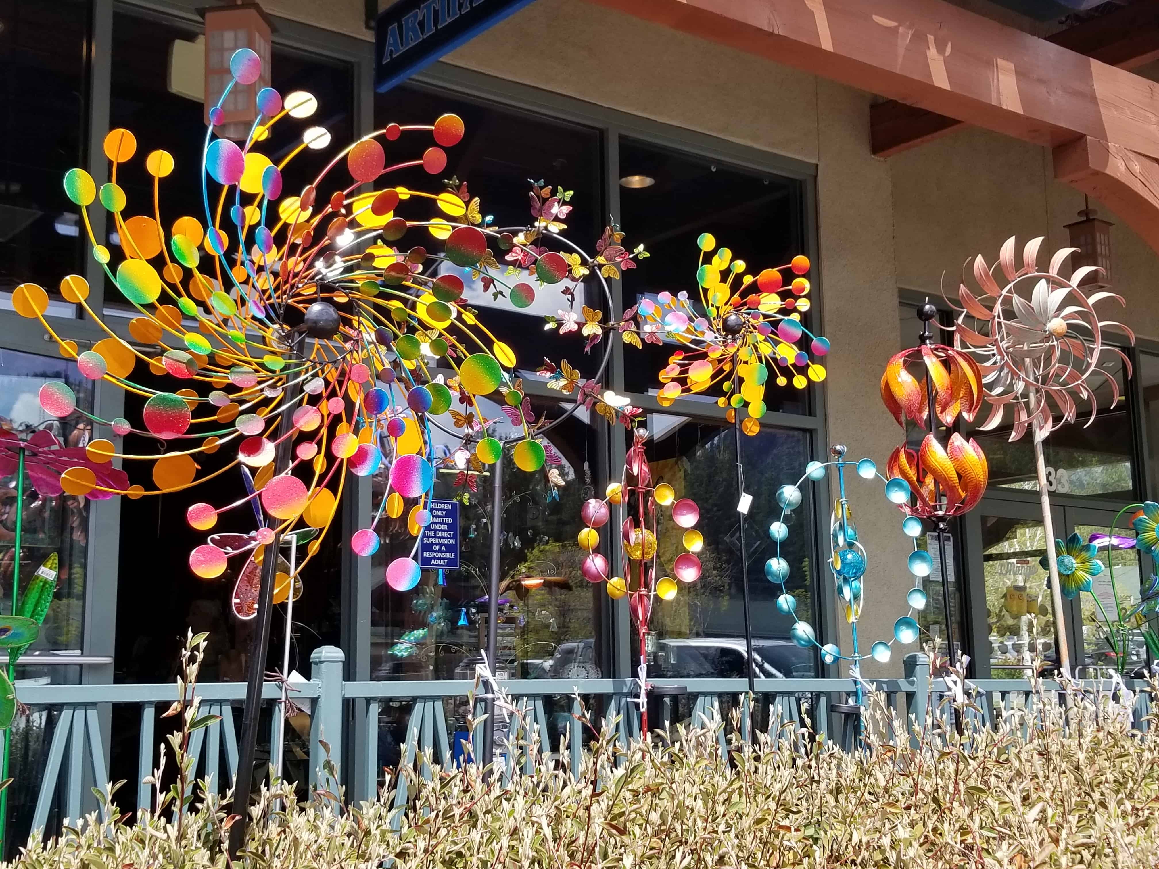
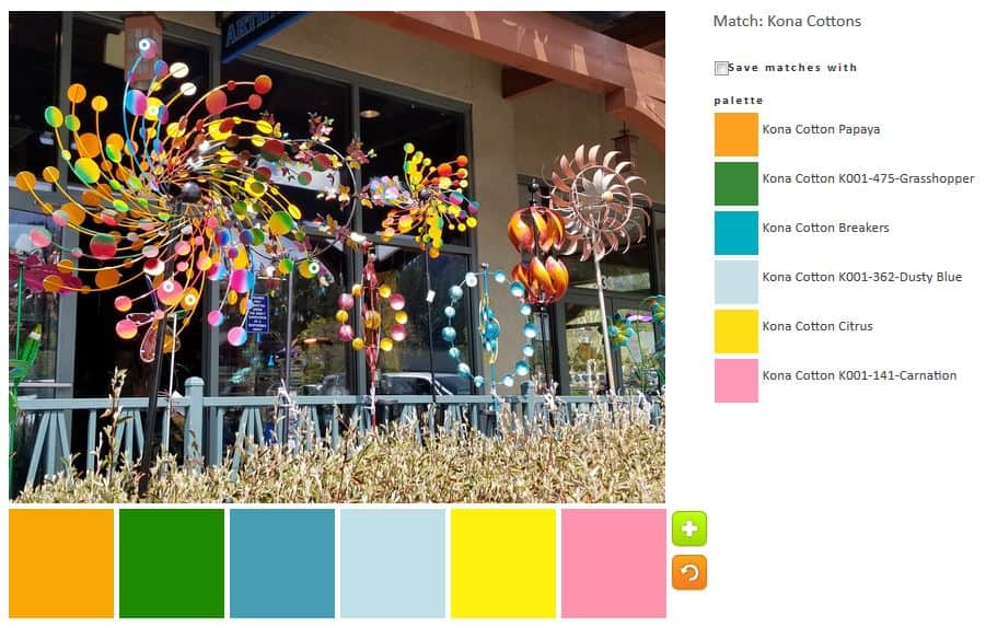
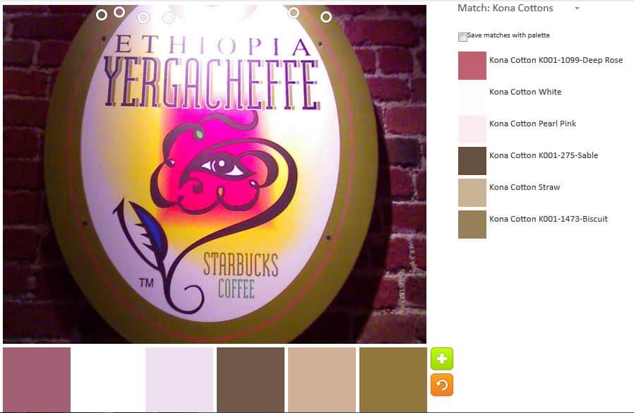
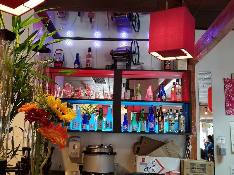
I got back from a trip with my SILs and nieces to Disneyland and California Adventure on Sunday. As usual, I was overwhelmed by visual stimulation. I have previously written in couple of places about the colors and motifs I see at the parks.

California Adventure Mosaic/Tile

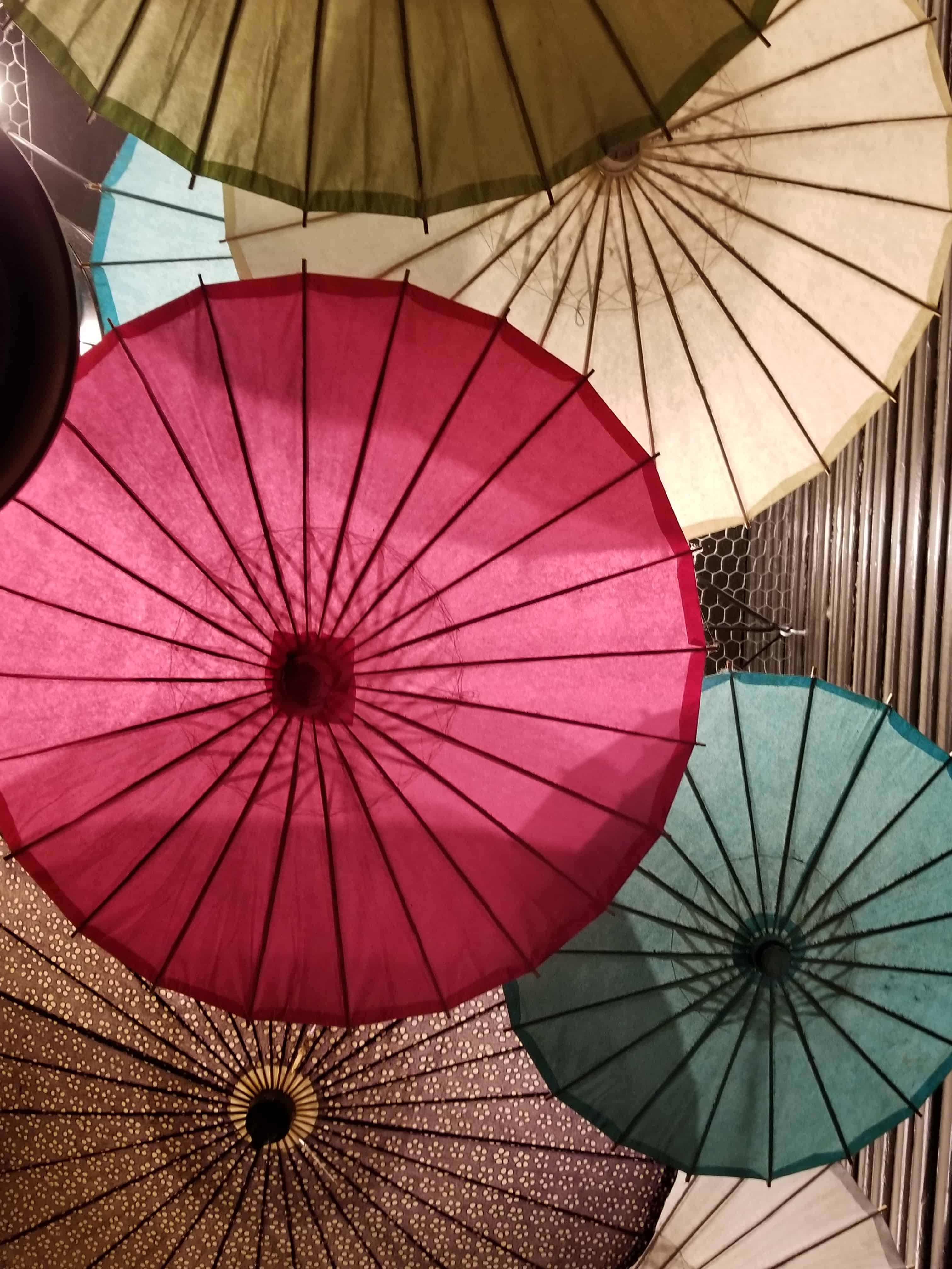
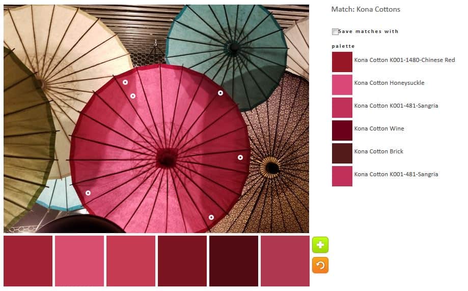
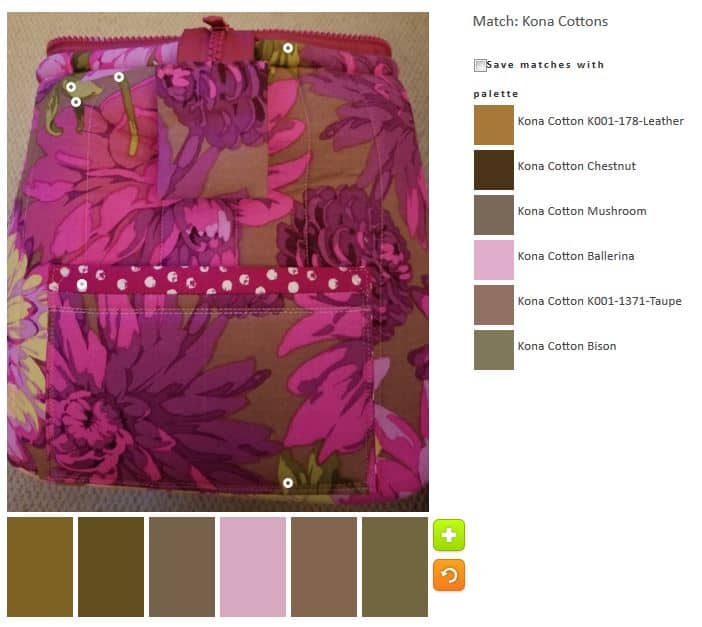
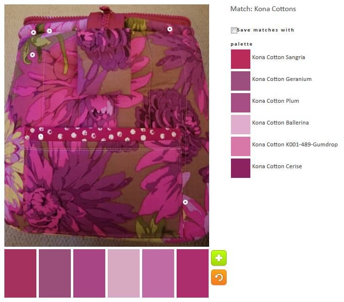
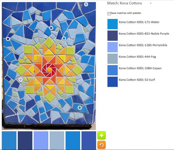
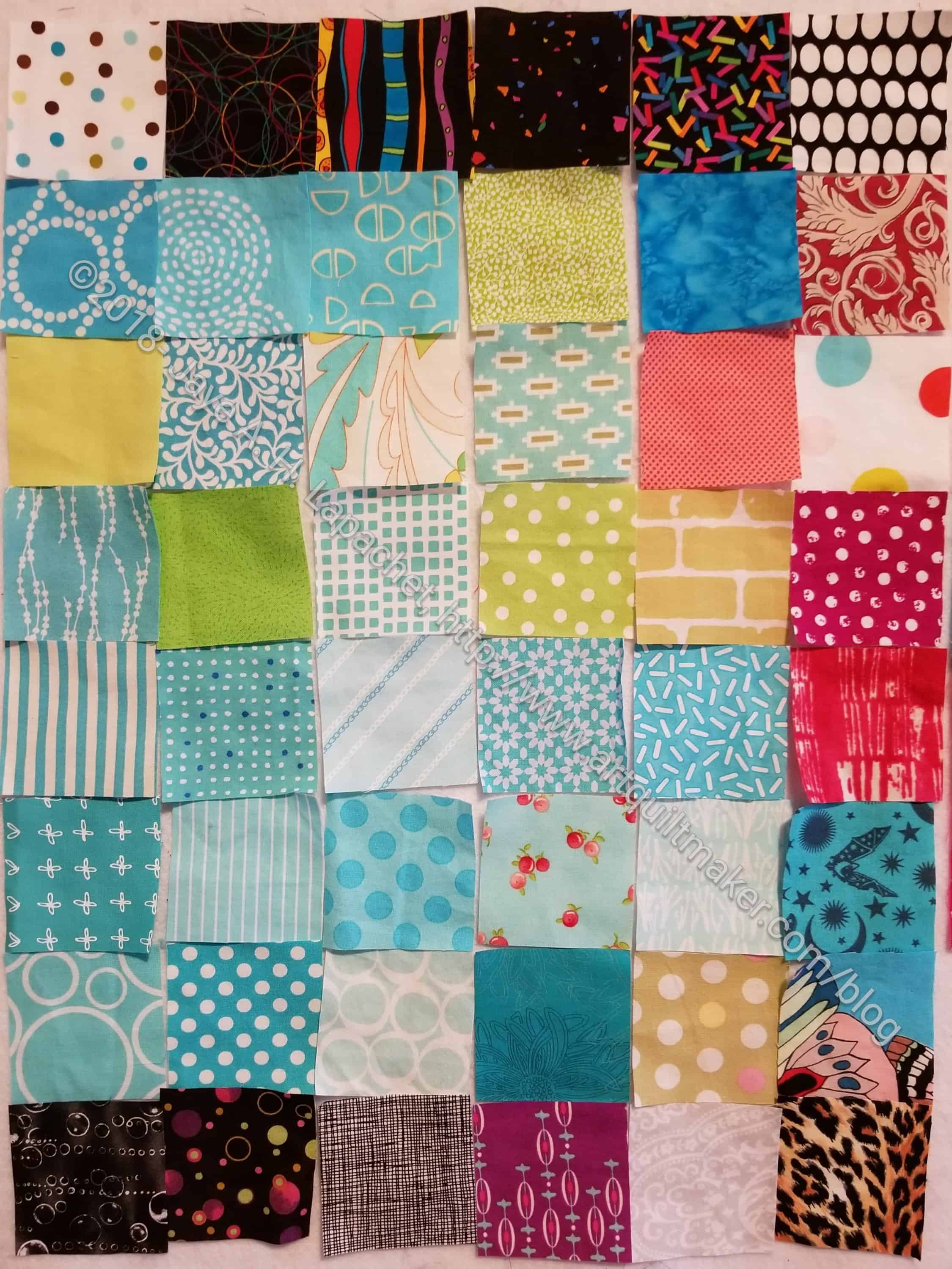
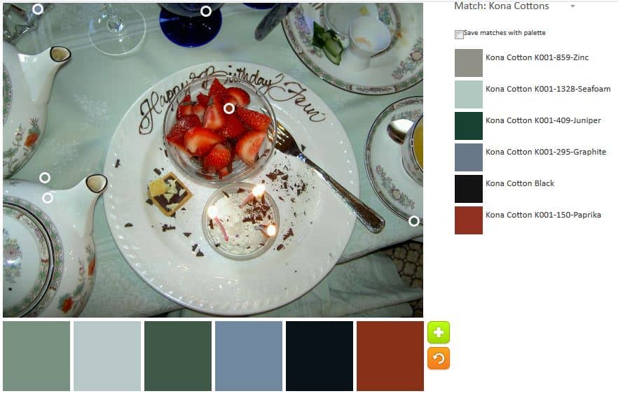
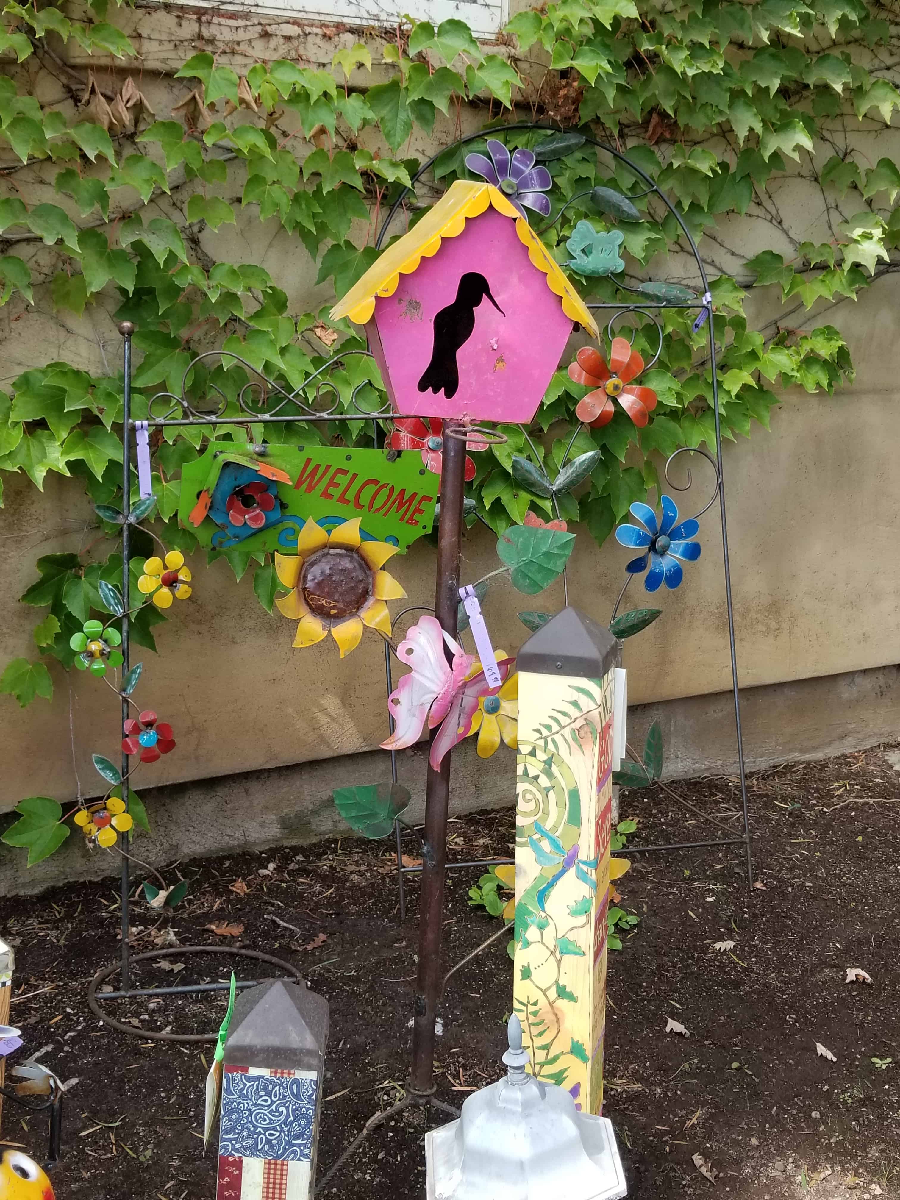
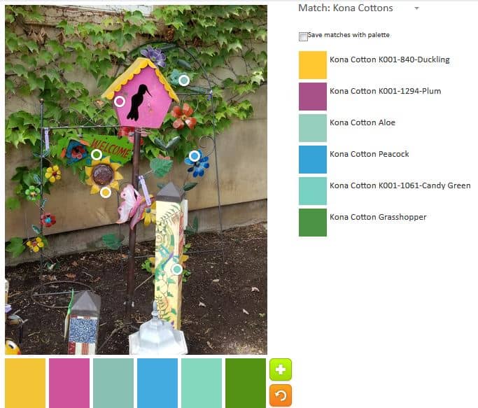
I do think I posted a photo of this mosaic/tile before, but I can’t find it, so we are doing it again with PlayCrafts, though we will just be using a small piece as I may need to use another piece in the future.

California Adventure "The Grapefruit Experience" (anno)
California Adventure “The Grapefruit Experience” (anno)

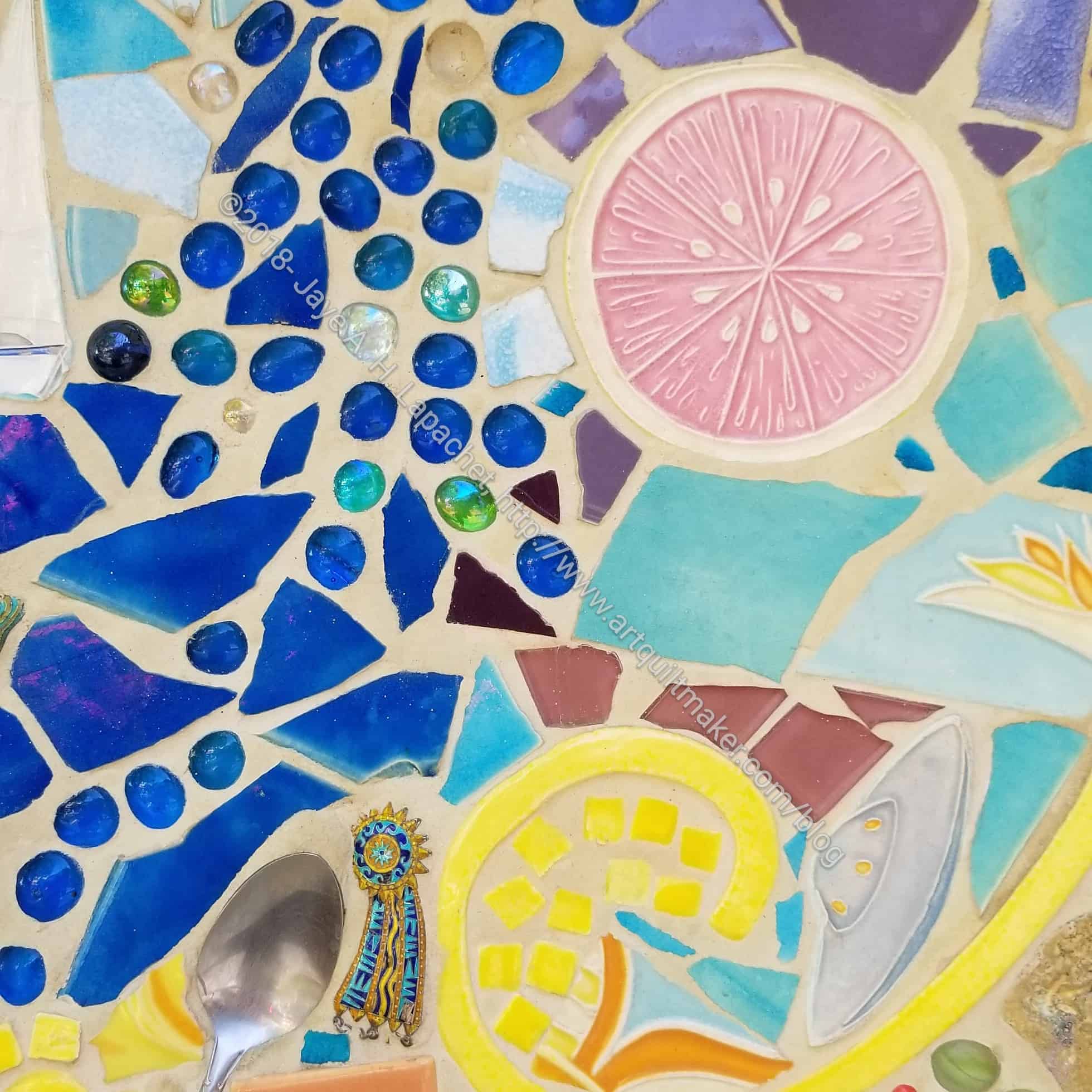
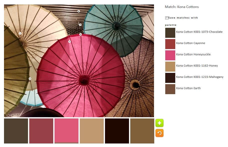
I will call the piece we are using the ‘Grapefruit Experience’.

ColorPlay default - Mosaics/Tile
ColorPlay default – Mosaics/Tile

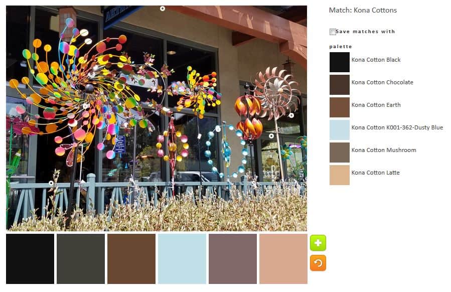
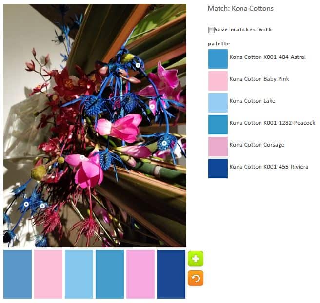
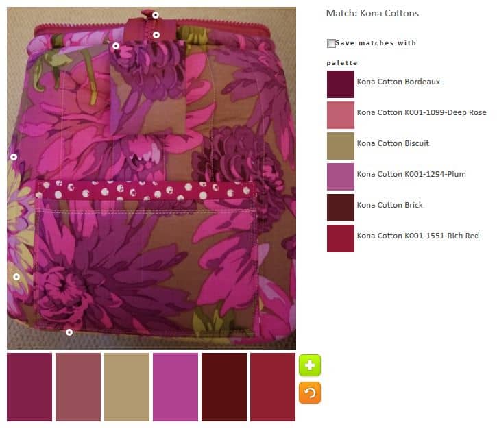
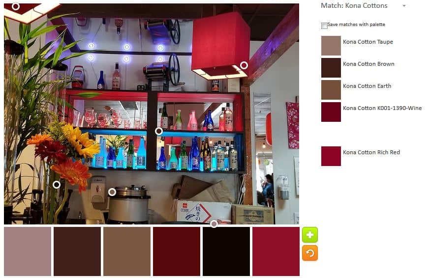
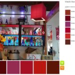
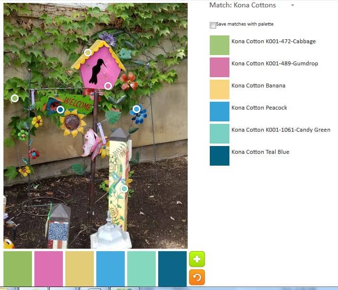
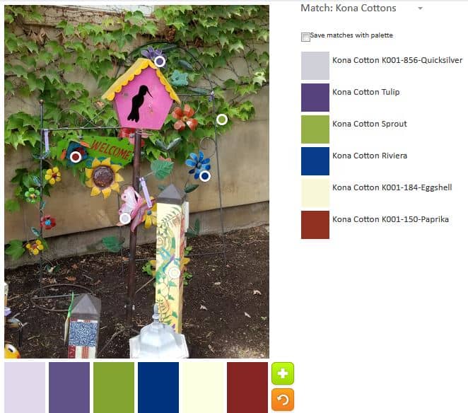
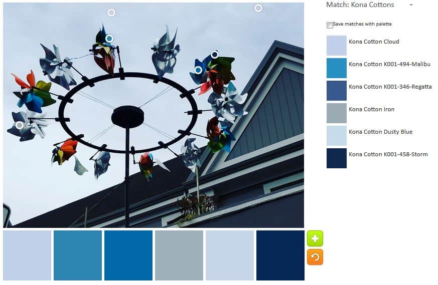
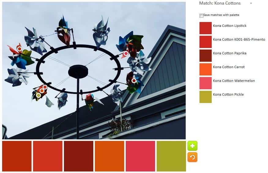
The default, surprisingly, was not all neutrals and included some quite lovely blues.

ColorPlay n.1 - Mosaics/Tile
ColorPlay n.1 – Mosaics/Tile

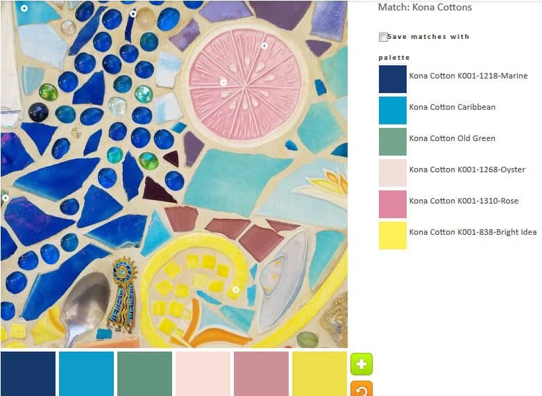
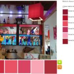
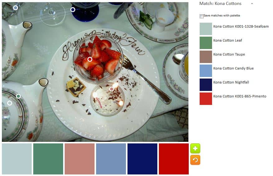
The first palette was created with just a few tweaks to the default palette.  I like the Kona Marine and Caribbean combination. I am not very fond of the other colors, though Bright Idea is interesting.

ColorPlay n.2 - Mosaics/Tile
ColorPlay n.2 – Mosaics/Tile

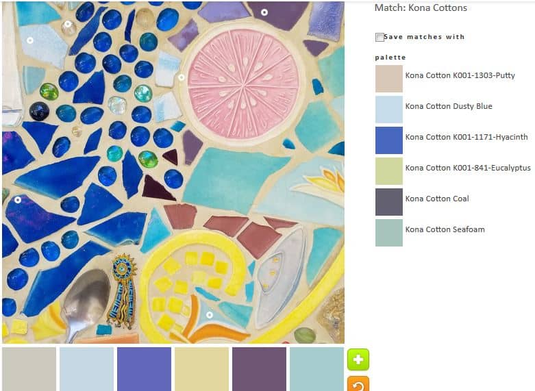
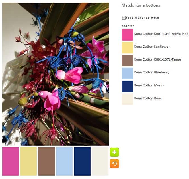
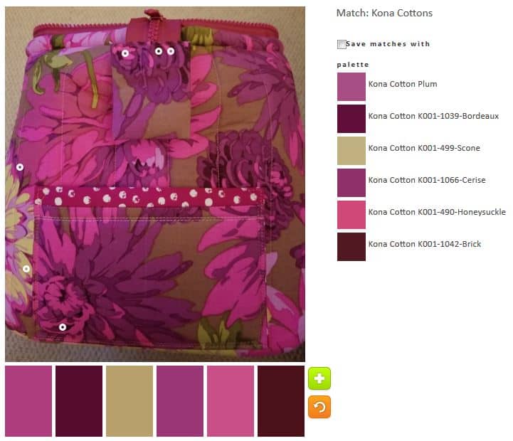
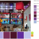
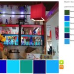
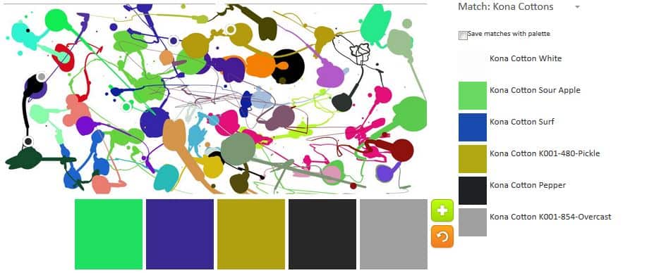
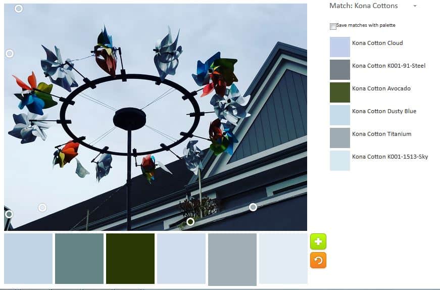
In palette n.2, I tried to go for a light palette without being a  neutral palette. In the end I kept the Hyacinth and Coal. I like both of those hues, which look like tones of purple to me.

ColorPlay n.3 Mosaics/Tile
ColorPlay n.3 – Mosaics/Tile

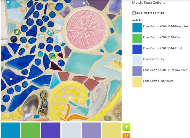
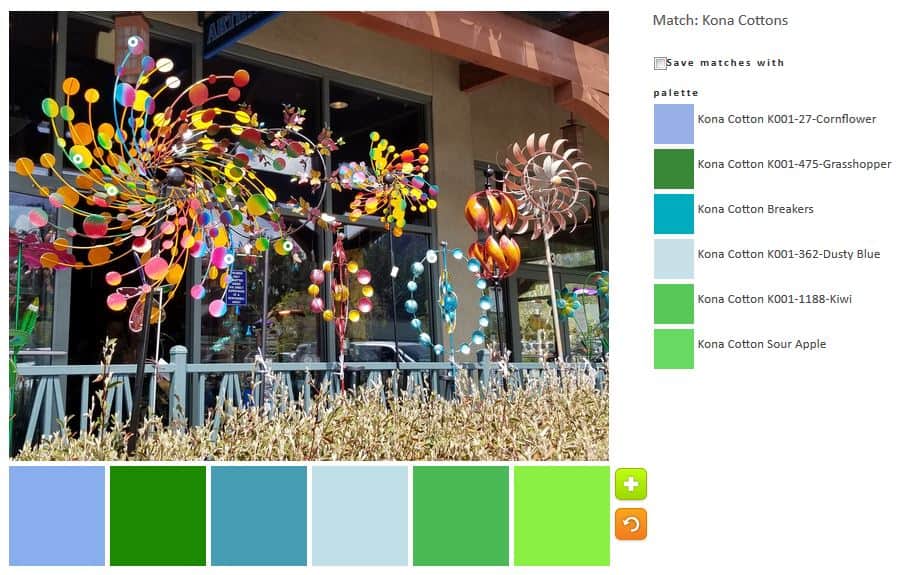
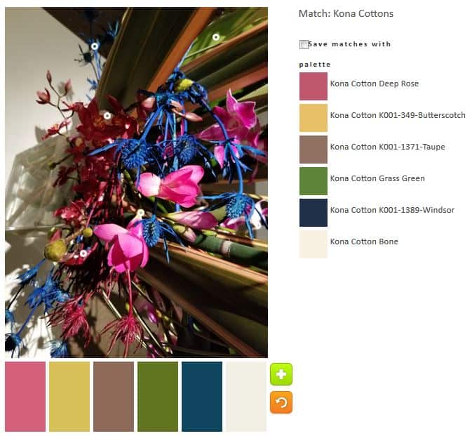
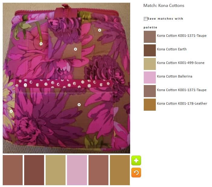
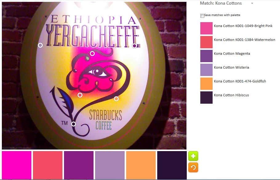
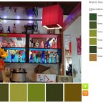
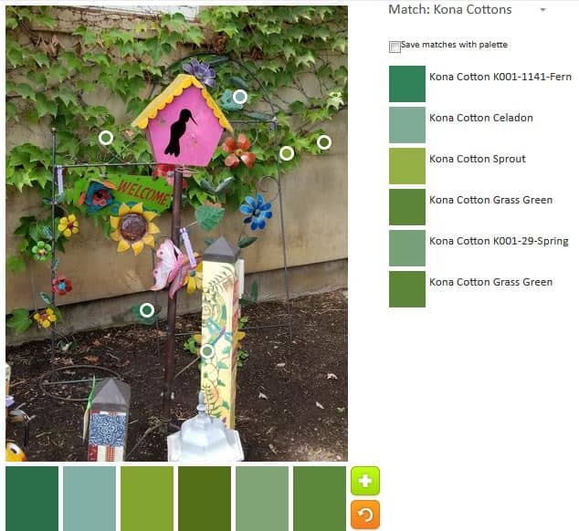
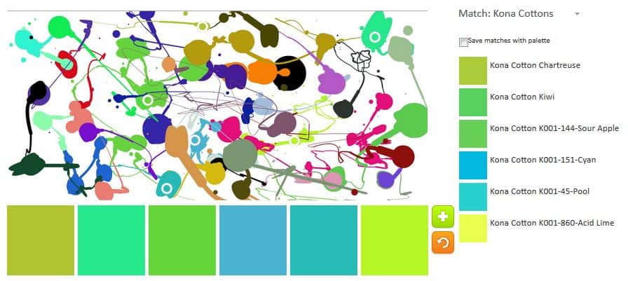
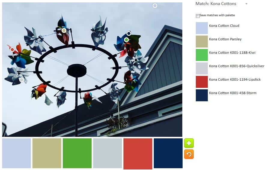
The green I added to palette n.3 was inspired by the #GirlScoutHearts project on Instagram. I am not much of a green fan, but this palette might be a favorite. I like the Turquoise, the Royal and the Lavender, especially. I think the whole palette hangs together well.

ColorPlay n.4 - Mosaics/Tile
ColorPlay n.4 – Mosaics/Tile

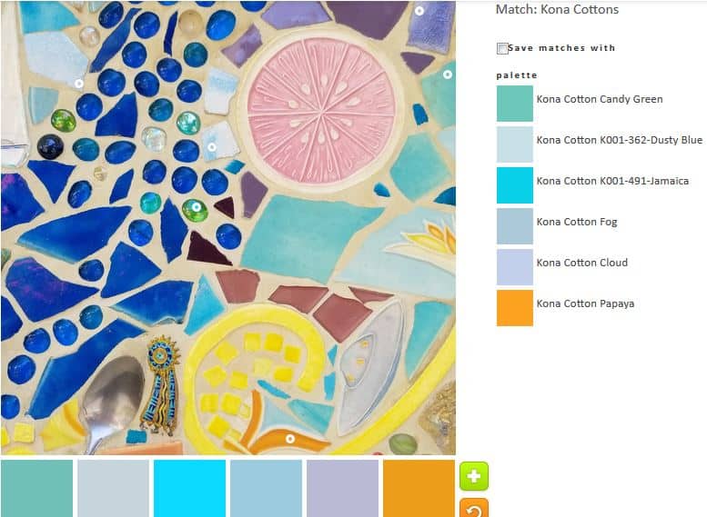
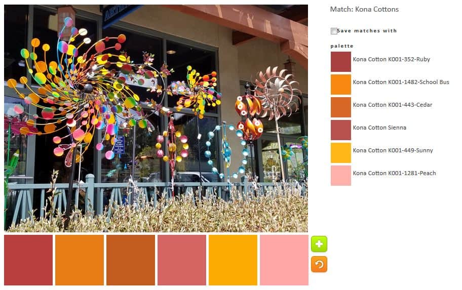
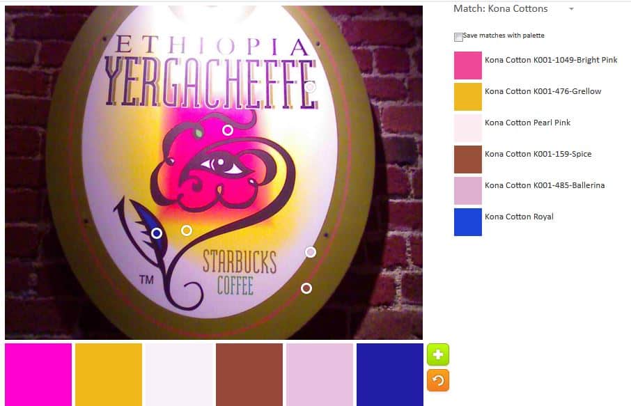
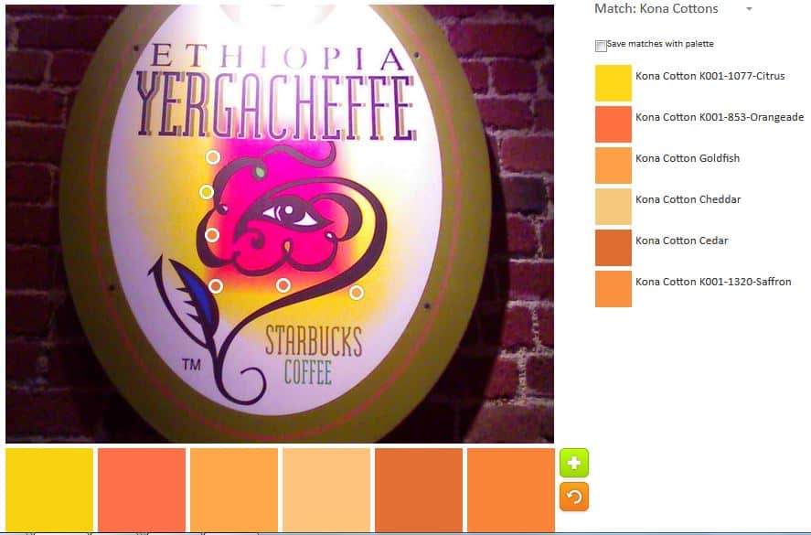
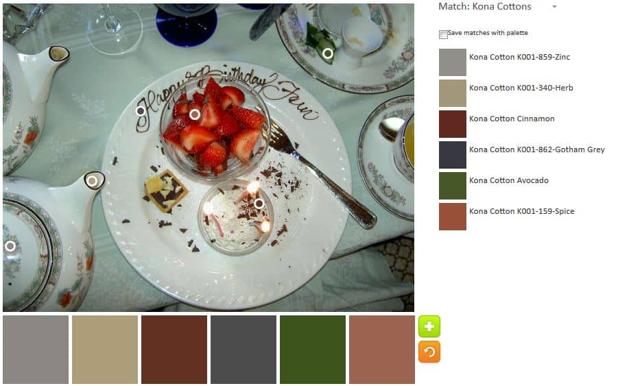
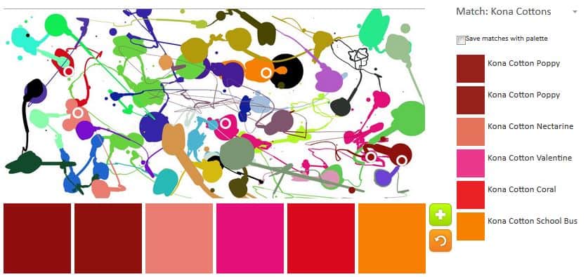
With a little tweaking, I got a nice golden yellow. It goes well with the Kona Jamaica, which is one of my favorite tones.

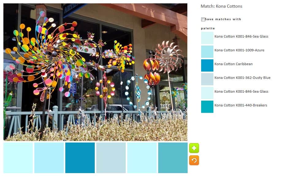
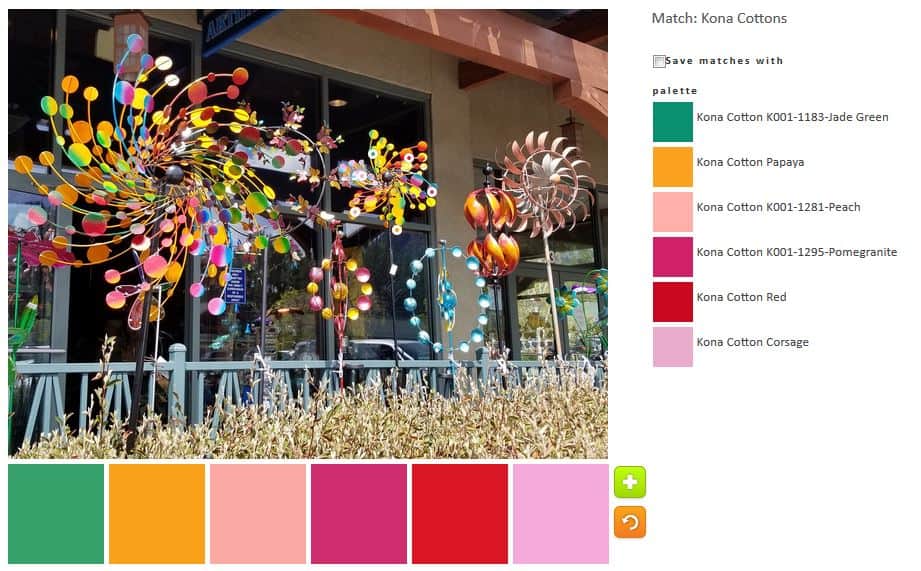
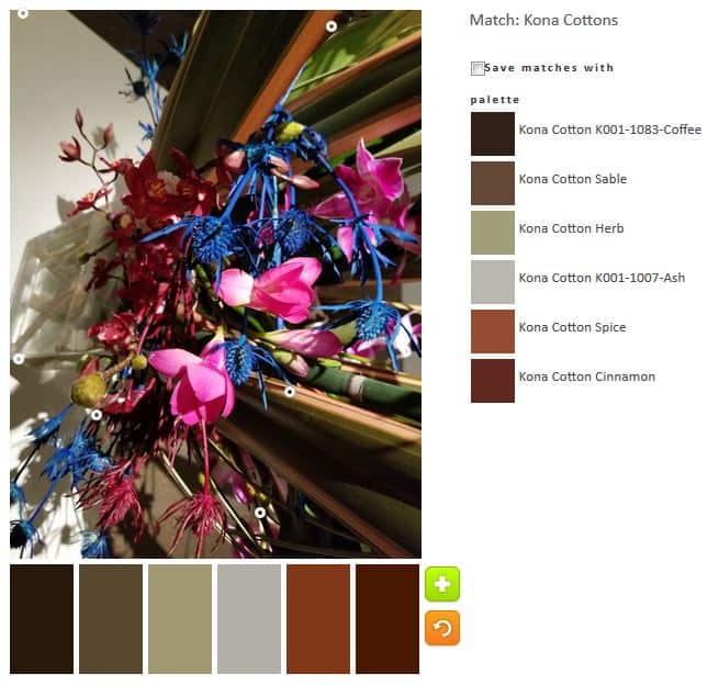
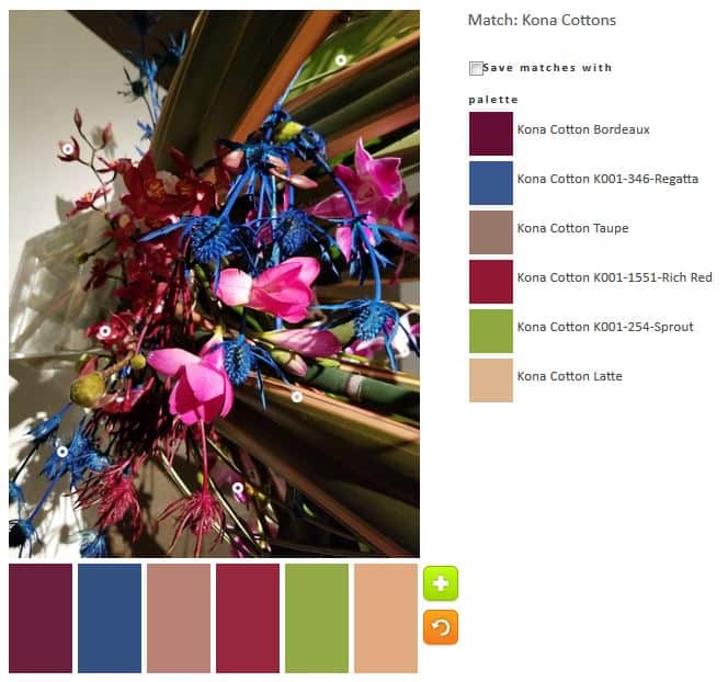
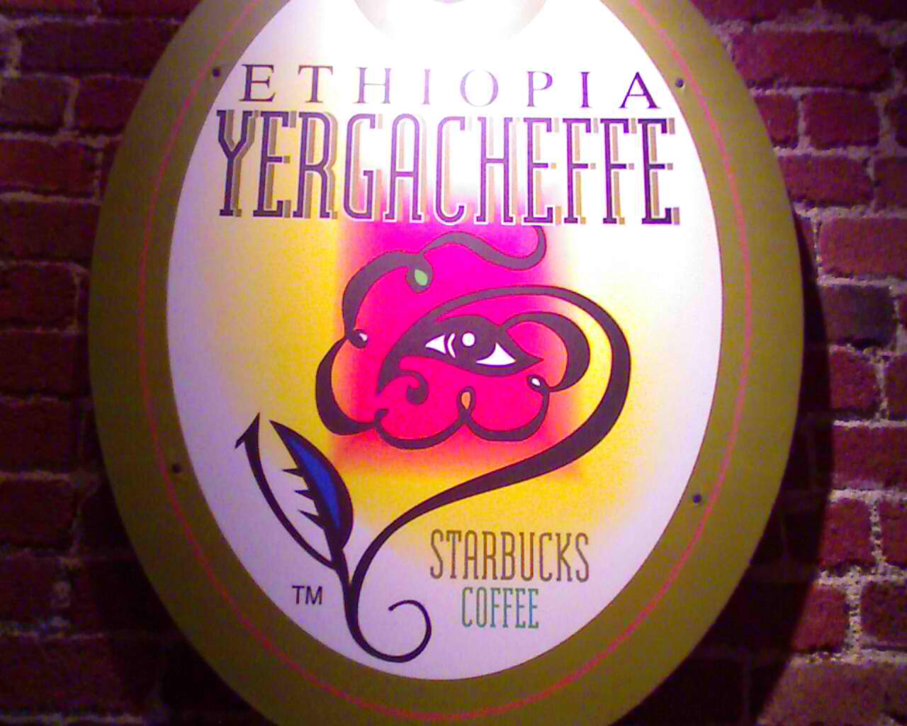
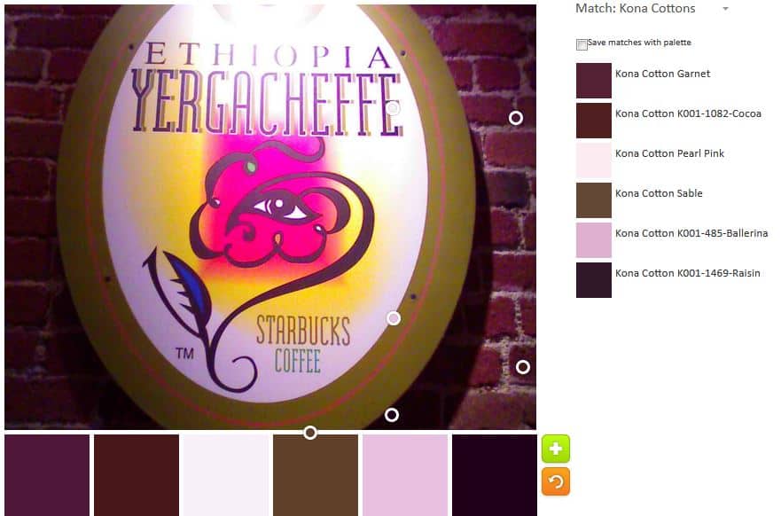
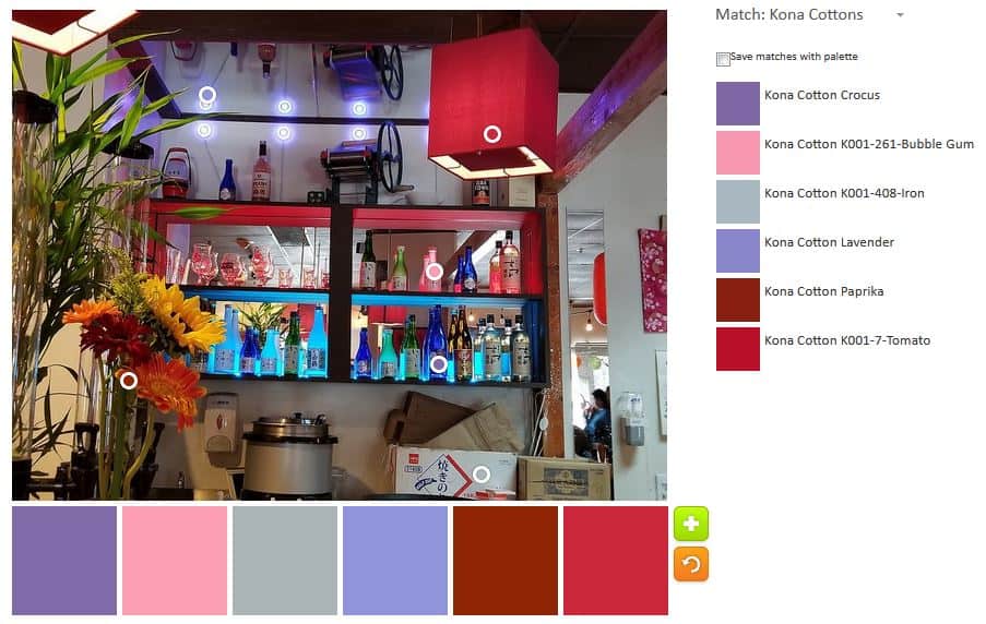
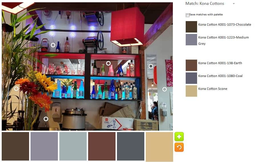
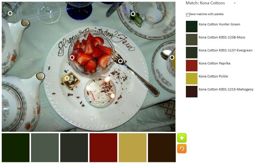
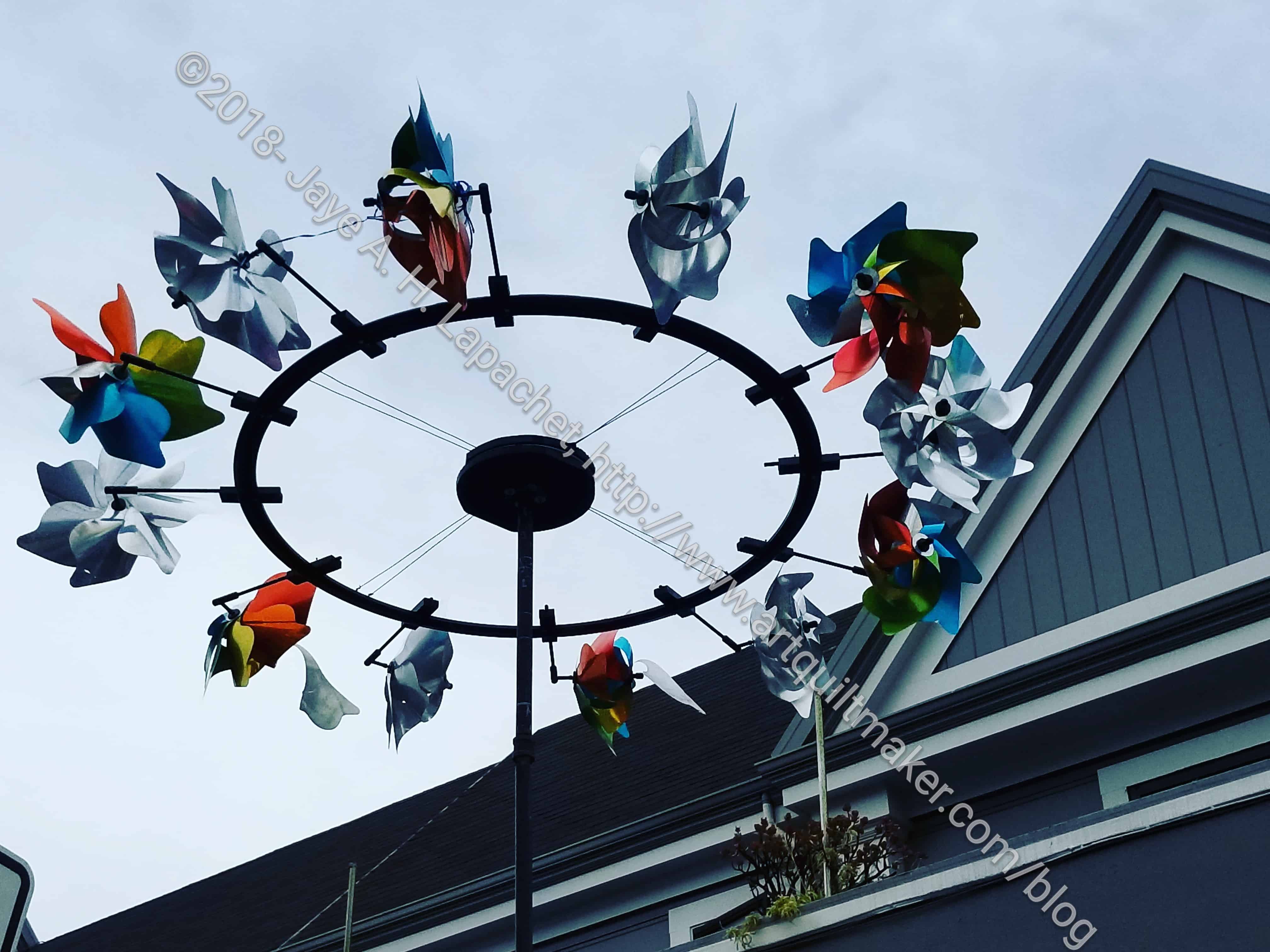
This image had just the right amount of opportunity for playing with color.

ColorPlay n-5 - Mosaics/Tile
ColorPlay n-5 – Mosaics/Tile

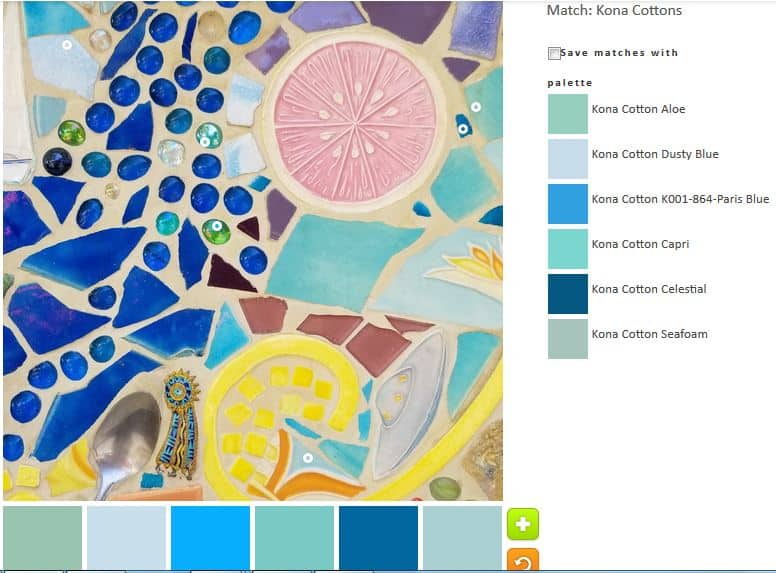
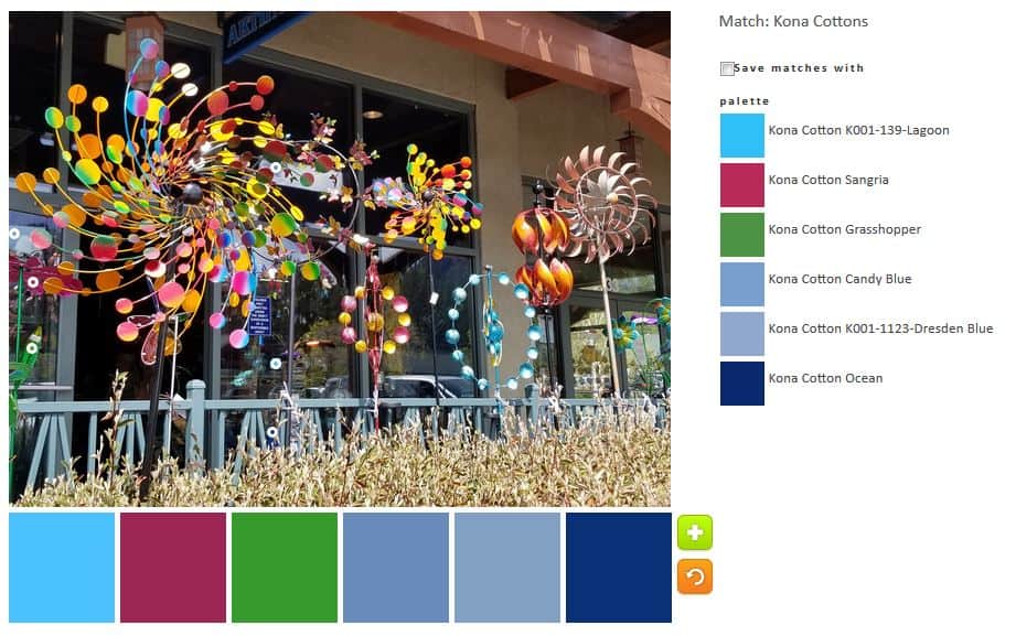
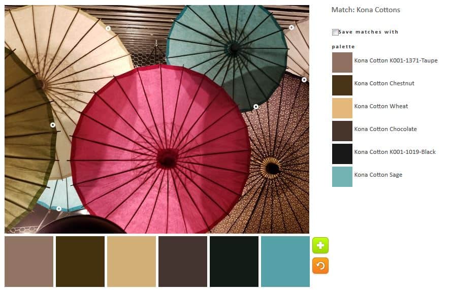
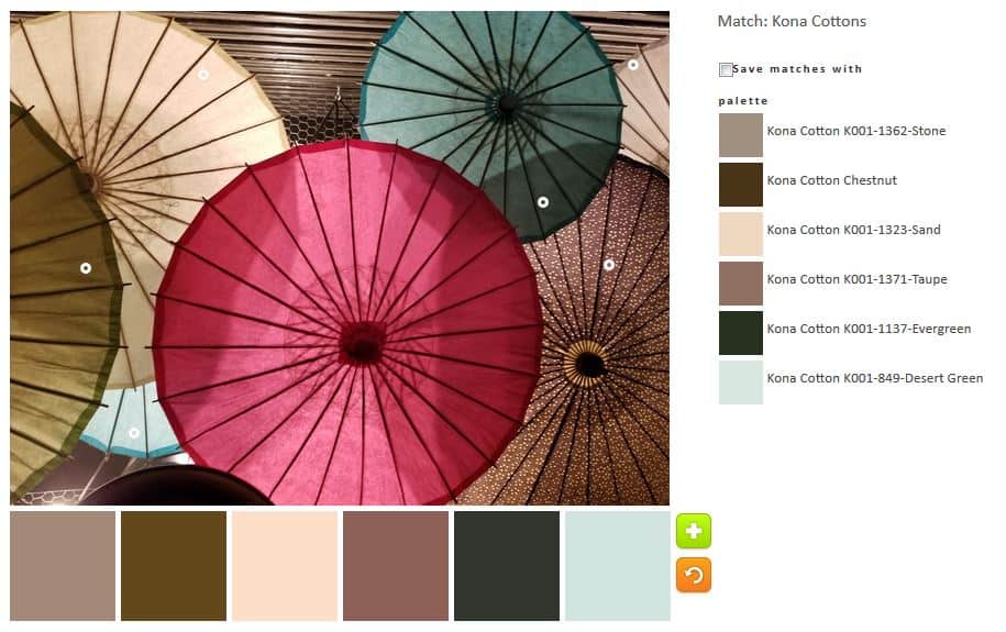
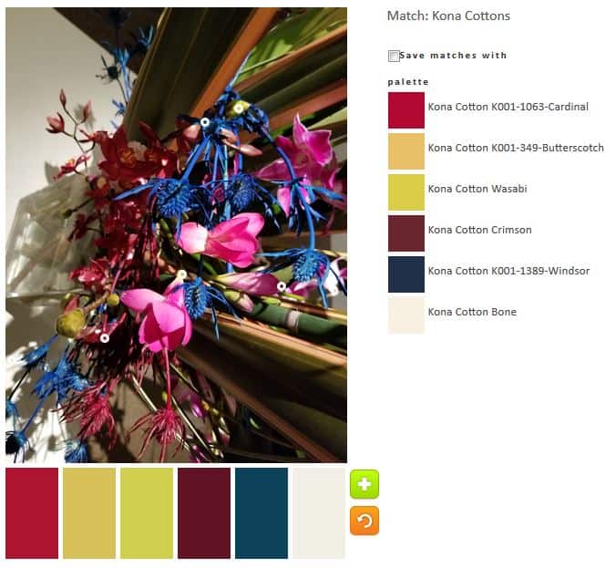
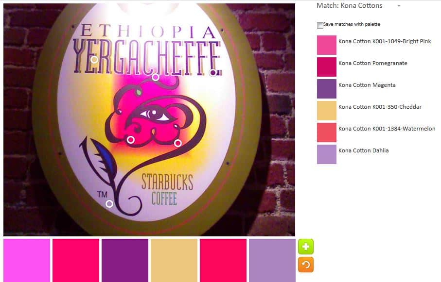
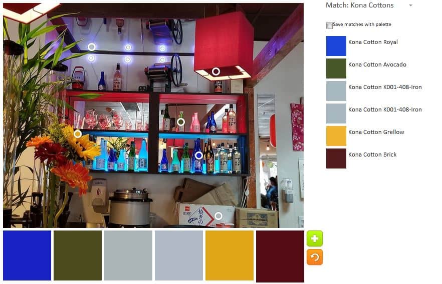
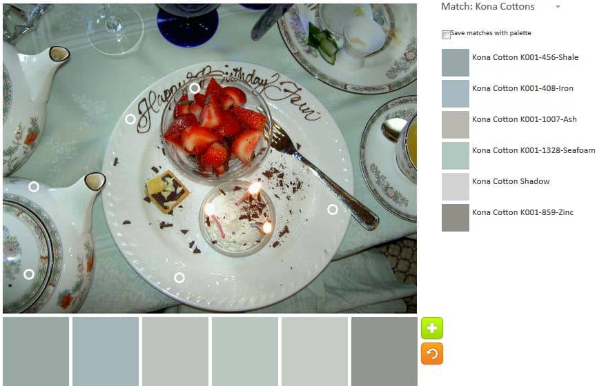
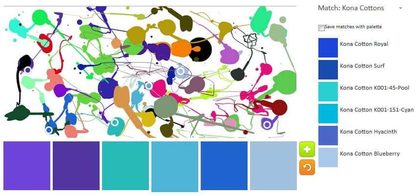
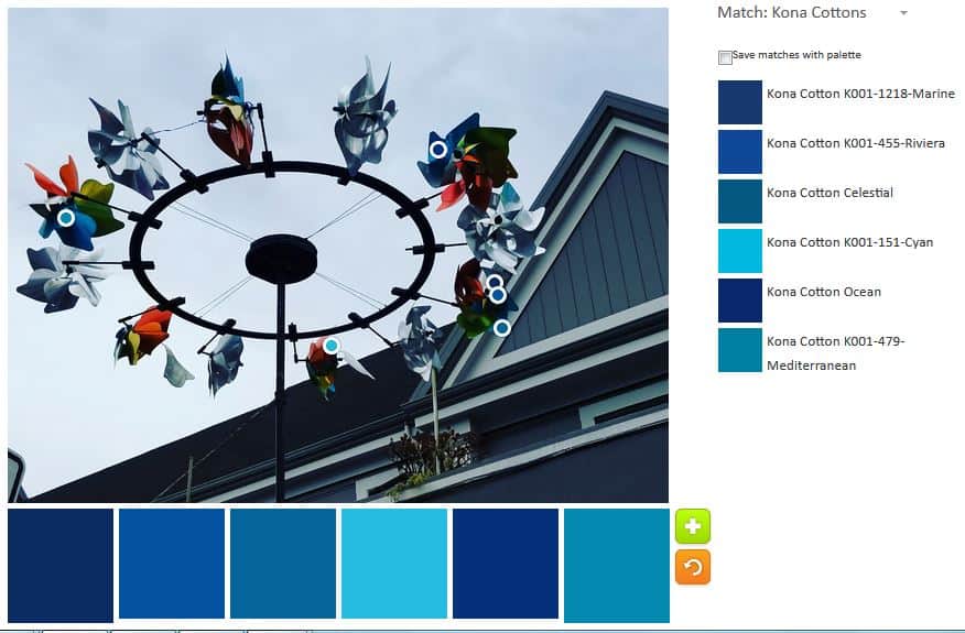
I really, REALLY wish Kona had less ravely greige goods. some of their blues are fantastic, even adjusting for computer differences. N.5 is the monochromatic effort.

ColorPlay n.7 - Mosaics/Tile
ColorPlay n.7 – Mosaics/Tile

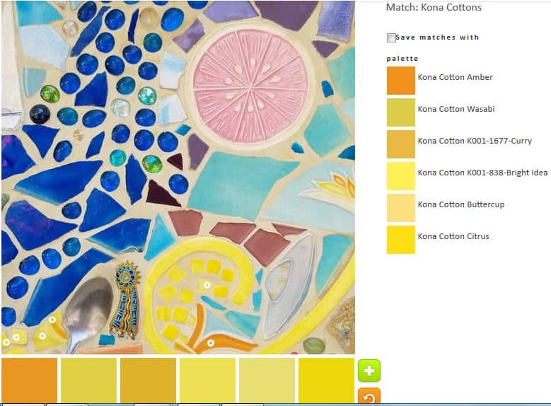
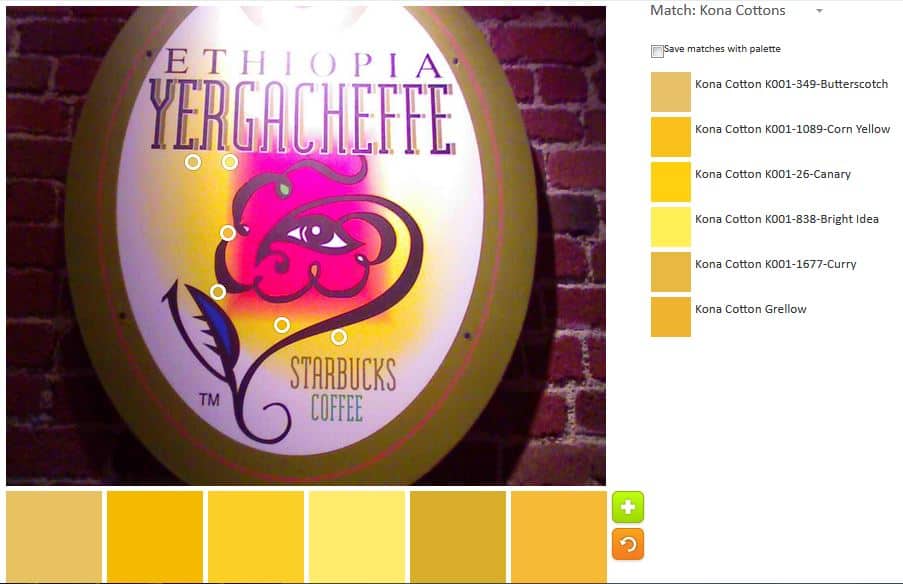
I realized I would be able to create a yellow palette as well.

ColorPlay n.6 - Mosaics/Tile
ColorPlay n.6 – Mosaics/Tile

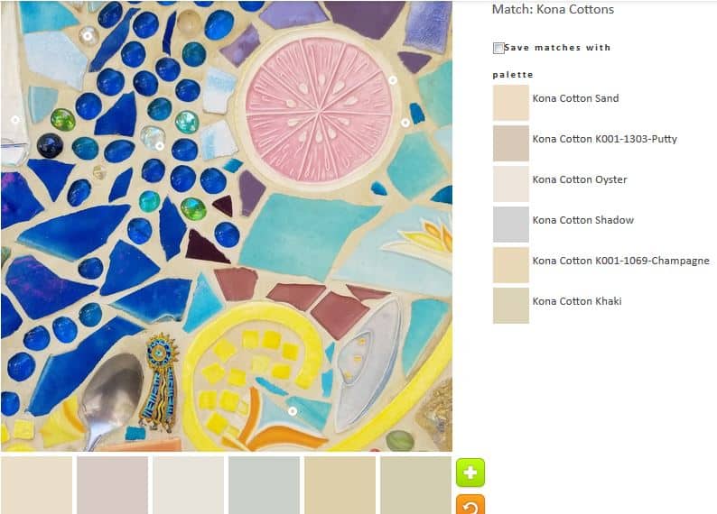
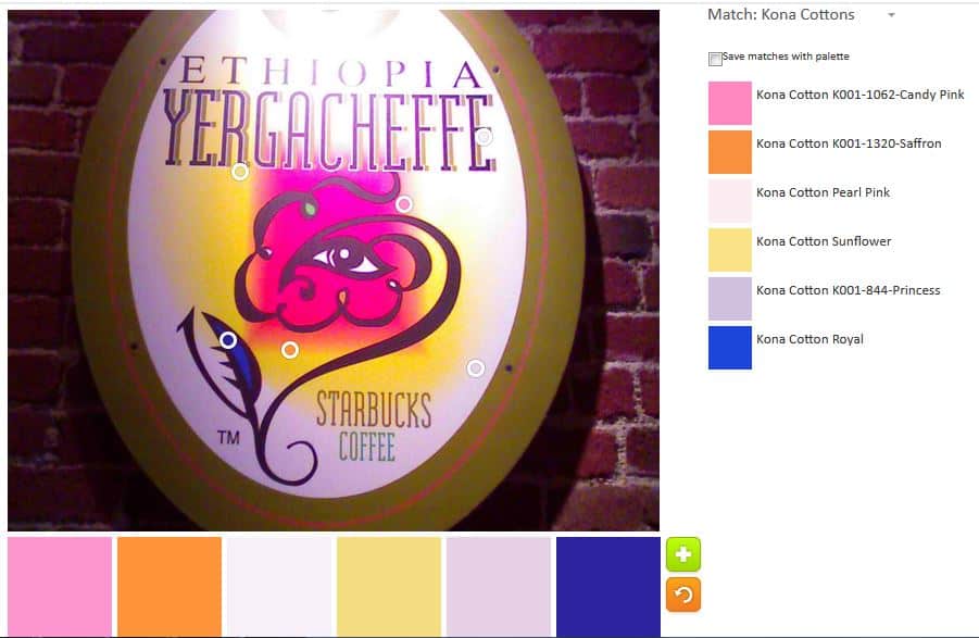
I also tried on a neutral palette. I could resist.


What will you make?


FOTY 2018 – early November

FOTY 2018 squares - early November 2018
FOTY 2018 squares – early November 2018

I cut all of the fabric that was waiting on my ironing board to be cut. I tend to press fabric when I am stressed, but I don’t always get to cutting up the pieces I need for future projects.

I really should have been packing for two trips I was taking, but instead I cut fabric. Now I have a completely empty ironing board and a lot more pieces to add to my various boxes. Future projects: here I come!

FOTY 2018 AGAIN…Finally

FOTY 2018 -October 2018

I finally got enough squares to make an interesting post for you. The last time I posted was in August, so not horrific, but long enough. I am not cutting up fabric and the pace I should be. I keep just piecing.

You’ll notice the MetroScape fabrics mostly missing. I am waiting to finish the top before I cut up many squares, because I’d rather have those fabrics missing from FOTY 2018 than not be able to finish the MetroScape quilt. I think I’ll have plenty.

ColorPlay: Windspinner

ColorPlay: Windspinner original

I took this photo in Tahoe. I really like those Windspinners.I can’t buy one, because DH gets sick.

There are a lot of colors, if a person is careful with the little Palette Builder circles. I had fun looking for them.

ColorPlay-Windspinners-default

Despite my efforts, the default palette is still a bunch of neutrals.  It is really dark, but somehow strangely appealing. The Kona Earth is a nice brown.

ACK! I can’t believe I said that about brown.

ColorPlay: Windspinner-n.1

I went for totally bright and cheerful in the first palette. The green in this palette is really a good addition. I like the Grasshopper with the Papaya even though I am not much of a green person.

ColorPlay: Windspinner-n.2

I went for a cool colors palette. Isn’t it fun? I kept the Grasshopper. It is a nice dark with the other colors.

ColorPlay: Windspinner-n.3

Palette number 3 is the monochromatic palette that weighs heavily towards turquoise. 😉 I did add in the darks to make it a little different. The Kona Carribean and Breakers are two great darks.

ColorPlay: Windspinner-n.4

I had to get out of my favorite cool colors, so I went with warms. This is a nice combinations of pinks and golds, I think.

ColorPlay: Windspinner-n.5

I couldn’t get away from the cools, even though I tried. I added some lavender and those greens – more mossy and sagey – add something, especially with the Breakers.

ColorPlay: Windspinner-n.6

I dragged myself away from the cools again and went back to warms, though I couldn’t stay completely away and that Jade Green combined with the Kona Cotton Red and the Pomegranate is awesome.

ColorPlay: Windspinner-n.7

I did a backwards version of n.6 in that I used mostly cools with a warm.

What will you make?


ColorPlay: Umbrellas

ColorPlay-umbrellas-Original

I’m always looking for photos with the most color possibilities. This week is no exception. I took this photo in Portland. The umbrellas were hanging down from the ceiling, covering the ceiling.

It doesn’t have as many colors as I would like, but until I start playing with the Palette Builder, I always think the photo I chose has more colors than it really does.

ColorPlay-Umbrellas-default

The Kona Earth looks like a cocoa color to me. Surprisingly the tool put some color into the default palette. I suppose it would have been really weird if it ignored the pink umbrella completely. It didn’t do much with the green umbrella.

ColorPlay-Umbrellas-n1

I took charge of the pink to see how much pink I could get out of the one photo. I was surprised that I got quite a lot. You can see all the dots are only on the pink umbrella.

ColorPlay-Umbrellas-n2

I went a little broader in my second palette. I like that Cotton Sage blue. Sage is green to me, but whatever that color is, it lends a brightness to an otherwise neutral palette.

ColorPlay-Umbrellas-n3

This 3rd palette is virtually the same as the one above except for a few tweaks. I wanted to just move the circles a little bit and see what came up. The green created Evergreen, which really looks black. I suppose I agree with the Desert Green name. Colors in the desert can be very pale, bleaches looking. The neutral palette is softer, I think.

ColorPlay-Umbrellas-n4

The fourth palette reminds me of dessert. The neutrals have a richness to them, especially the Kona Cinnamon.

In general, this photo is primarily generating neutral palettes with me teasing out the least bit of color to make them my own.


ColorPlay: deYoung Flowers

ColorPlay: DeYoung Flower - original
ColorPlay: DeYoung Flower – original

I took a few photos at a special exhibit held at the deYoung in late March.

I can’t remember the name of the exhibit. They do it every year and it is up for a very short time. Someone chooses artworks and matches them up with floral designers who create a floral arrangement that matches, reflects, goes with – or something – the artworks. I had a hard time seeing how the floral designs went with the artwork. You never know what the artist sees. I find that with my own work.

I have many pictures from the show, but the pink in this one intrigued me. I really created a lot of palettes and could have created more. There is a lot of scope for color in that arrangements. I had to stop because I knew you wouldn’t read about 50 palettes. I also didn’t want to write that much.

ColorPlay: DeYoung Flowers-default

The first palette, as usual is the default palette. This one is seriously neutral and somewhat depressing considering the vibrant colors in the bouquet. I noticed that the circles tend to be placed towards the edges.

ColorPlay: DeYoung Flowers n.1

I made sure my first palette included some brights, or at least cheerful solids. I kept in some of the neutral feel as I was trying to show progression. I don’t like that Kona Cotton Latte much. It sticks out like a sore thumb.

I have up on progression when making my first monochromatic palette, the pink. I was able to make two (yes, TWO) monochromatic palettes this time: a blue and a pink. I went for broke since that Kona Latte fabric really bugged me.

ColorPlay: DeYoung Flowers n.3

I went back to progression when I made palette n.3. I thought blue would look great with pink, so I kept some of the pinks and added some blues. I put more blues in as I didn’t want to make the palette exactly equal. I probably couldn’t have done another one that had more pinks than blues, too.

This one led to the monochromatic blue palette pictured above.

ColorPlay: DeYoung Flowers n.5

I tried to get away from my default blues and do something different. I think the anchor fabric in this palette is the Kona Cardinal. I didn’t completely succeed with this effort, because the Wasabi and Butterscotch are very similar. I am not sure the arrangement has need of that much of those tones.

ColorPlay: DeYoung Flowers n.6

I wanted to improve on the palette above, so I made minor adjustments. Chestnut Palm and Spice are not favorites. This is not my kind of palette.

ColorPlay: DeYoung Flowers n.7

I tried to improve the palette above again. I think I did a better job. The Grass Green and Deep Rose are much better.

ColorPlay: DeYoung Flowers n.8

I think n.8 is the best iteration of the last few. The palette reflects my personality. The pink brings out the best in the Sunflower. I think Taupe is a supporting actor and I wouldn’t put a lot of that in a quilt.

You may see other arrangements from this show in the future.

ColorPlay: Tool Tote

ColorPlay: Tool Tote

I really like the Philip Jacobs fabric in the Tool Tote and decided to do a ColorPlay using one of the photos from the post.

ColorPlay: Tool Tote -default

Again, the default is not all neutral. There are quite a number of violets.

ColorPlay: Tool Tote -n.1

This palette provides another group of violets with some neutrals included. It is kind of dark palette, but the Honeysuckle makes it slightly more cheerful.

ColorPlay: Tool Tote -n.2

I am not sure how different n.2 is from the two above. I like the Lupine in the palette above.

ColorPlay: Tool Tote -n.3

I couldn’t go without a neutral palette. I still got a lavender.

ColorPlay: Tool Tote -n.4

I really tried to make this one green. I think the greens look uglier in the palette than they do in the fabric. Granted there isn’t much green in the fabric.

ColorPlay: Tool Tote -n.5

Different grouping of colors, but the same colors as the first couple of palettes.

Surprisingly, this group of fabric offered up fewer opportunities for interesting palettes than I would have expected.


ColorPlay: Yergacheffe

ColorPlay: Yergacheffe original

I was really happy to find this photo. I was looking for it for some reason a little while ago. I saw this sign in a coffee shop years ago and the motif sticks in my mind as some interesting and different. The colors are interesting, too.

ColorPlay: Yergacheffe -default

The default colors this time tend towards purple, which I like. This palette would make a good outfit.

ColorPlay: Yergacheffe -n.1

In my first palette, I went for brights and the image did not disappoint. The palette itself doesn’t hang together very well, but the colors are bright and that is something.

ColorPlay: Yergacheffe - n.2
ColorPlay: Yergacheffe – n.2

I wanted to refine my first palette and try to get it to hang together better. This is, mostly, softer and tends towards warm colors, except for the Kona Royal, which doesn’t really fit.

ColorPlay: Yergacheffe - n.3
ColorPlay: Yergacheffe – n.3

I tweaked the colors from above a little and this palette is much more cohesive. That bright pink and the Kona Magenta (which looks more like purple/violet to me) really dominate, but not in an awful way.

ColorPlay: Yergacheffe - n.4
ColorPlay: Yergacheffe – n.4

I decided to focus even more on the pink and purple. Except for the Cheddar, which I must have forgotten about, the pink and purple are the stars. Many of the colors showed up in n.3 and show up in n.6.

ColorPlay: Yergacheffe - n.5
ColorPlay: Yergacheffe – n.5

The default palette wasn’t a neutral palette so, in the spirit of the Palette Builder, I created one.

ColorPlay: Yergacheffe -n.6

I had to try a monochromatic palette and this time I went for pink. I had a hard time finding different pinks as the Bright Pink dominated.

ColorPlay: Yergacheffe - n.7
ColorPlay: Yergacheffe – n.7

Yellow doesn’t show up much in the images I choose, so I wanted to take advantage of the yellow in this image and try to create another monochromatic palette using yellow.

ColorPlay: Yergacheffe -n.8

In another attempt to make a monochromatic palette, I chose the orange area. It is small, between the pink and the yellow, but I thought I might be able to get a range of peachy-oranges. I did sort-of.

ColorPlay: Tile

ColorPlay: Tile - original
ColorPlay: Tile – original

I saw this quilt-like pattern of tile on one of my daily walks.

ColorPlay: Tile -default

The default is less neutral than normal. It actually looks somewhat beachy.

ColorPlay: Tile -n.1

I went for my usual monochromatic palette and came up with a series of blues.

Sadly, the website was having a problem despite me switching browsers, so there are only two palettes today.

What will you make?

I use the Palette Builder Tool on the Play-Crafts site. Thanks to Anne Sullivan for making it available.

ColorPlay: Bar Color

Sobo Ramen Bar
Sobo Ramen Bar

I took a picture of this bar area before this restaurant stopped carrying gluten free noodles. I finally dug the photo out, because of the bright and cheerful nature and had some fun creating palettes.

ColorPlay: Bar default

The default palette was less neutral-y than usual, which was a pleasant surprise. The red tones are an interesting addition. I also noticed that the program didn’t stick exclusively to the edges.

The monochromatic palettes were interesting. Yes, I made more than one this time. As you can see there are both cools and warms. I know the green is not warm, but it has a kind of warm feel to it – a bit mossy, I guess. Perhaps there is a yellow undertone giving it a bit of a warm feel.

I like some of the blues in the blue palette quite a bit.

The two pink-red palates are similar, but a little different. As usual, I was really surprised at the colors that came out of the tool.

ColorPlay: Bar n.2
ColorPlay: Bar n.2

I really played around with the other palettes. I really like the blue and gold in palette n.2. The rest of the colors are kind of meh, though the greys alone or as a background would probably be great.

ColorPlay: Bar n.1
ColorPlay: Bar n.1

The one above looks like a Japanese stationery store or a bag of sweets or a girl’s party when she is just getting out of the pink stage.

ColorPlay: Bar n.8
ColorPlay: Bar n.8

I thought I had better create a palette of neutrals. I know there are some of you out there who love neutrals (well done they can be great). I think this one is much more interesting than some I have seen. I won’t make a quilt – or anything – from the colors, though.

What will you make?

I use the Palette Builder Tool on the Play-Crafts site. Thanks to Anne Sullivan for making it available.

FOTY 2018 – August

FOTY 2018 - August 2018
FOTY 2018 – August 2018

It took me awhile to cut enough squares to make a good post. I did it and am still making progress.You can see that many of the fabrics are from the Stepping Stones n.2 piece. There are a few from Ends n.5 and also some from the Tool Tote. It is fun to see the fabrics I used in projects in this quilt.

There are also some new fabrics, which makes me feel happy, because I am getting fabrics cut and organized for future projects.

This is making me think of putting together FOTY 2017. I really need to get to that. Should I finish the Aqua-Red Sampler first or put that project back on the back burner and move to FOTY 2017?

I have so many projects!!! I need more time to sew.

ColorPlay: Afternoon Tea

Afternoon Tea: September 2004

I came across this photo as I was perusing possible ColorPlay photos. In 2004 I went to afternoon tea at the Ritz with my mom, grandmother and mother-in-law. It was nominally for my grandmother’s birthday and one of the first times she had come to see me.

This was not a great photo choice as the colors aren’t the tropical paradise I like.

ColorPlay: Afternoon Tea- default

The default is more colorful than I expected. There are lots of dull colors, but that reddish-brown, Paprika, isn’t terrible.

ColorPlay: Afternoon Tea- 1

I moved the bubbles around slightly and came up with a slightly brighter palette. I don’t think the colors go together that well, but the Pimento and Nightfall look pretty nice.

ColorPlay: Afternoon Tea- 2

Palette number 2 is where I gave in to neutrals. I didn’t want to do a monochromatic neutral palette out of the gate, but I admitted that most of the colors in the photo would be some kind of neutral.

ColorPlay: Afternoon Tea- 3

Palette number 3 is a slight variation of palette number 2. More and darker neutrals.

ColorPlay: Afternoon Tea- 4

The grey palette is my monochromatic attempt.

ColorPlay: Afternoon Tea- 5

I thought I would finish up with palette n.4, but then I saw a bit of yellow and wanted to use that in a palette. The first attempt at adding the yellow resulted in Kona Moss. For whatever weird technological issue, I couldn’t get close enough to the edge to capture the yellow. I tried again and Pickle based on the little pastry on the plate. I was going for scarlett from the strawberries, but ended up with Paprika again.

Let me know what you think of these palettes and if you make anything.

(L to R) MIL, Me, Mom, Grama

ColorPlay: Birdhouse

ColorPlay: Birdhouse - original
ColorPlay: Birdhouse – original

This is a photo from the Alden Lane Quilt show from last September. I picked it because it is so cheerful looking.

ColorPlay: Birdhouse-n.1

First, I had to pick out the candy colors. You know I love the brights.

ColorPlay: Birdhouse-n.2

I did another palette of brights, because I thought I could. I think this palette is a little brighter. There are a lot of greens in this image, so it is a challenge.

ColorPlay: Birdhouse-n.3

This is sort of an ode to a more traditional palette. Perhaps 4th of July palette?

ColorPlay: Birdhouse-n.4

And I seem to have to do a monochromatic palette. This week’s is green.

What’s your favorite palette?


ColorPlay: Splatter Art

ColorPlay: Original
ColorPlay: Original

I am revisiting old posts and came up with this Dose of Daily Art post. I thought it would be a good ColorPlay – kind of revisiting old friends.

ColorPlay: Splatter Art-default

The default is, for once, not all neutrals.

ColorPlay: Splatter Art - 1
ColorPlay: Splatter Art – 1

I like this one. It reminds me of the circus, but not a primary circus.

ColorPlay: Splatter Art n.2

I wasn’t quite done with that fuchsia. I like it with the various violets and blues. I can see actually using this palette for something very cheerful. I also noticed that one of the colors was white. I hadn’t seen it before.

ColorPlay: Splatter Art n.3

I had to try a blue and green palette. The two greens on the end are bit much, but I am not much of a fan of green so that could be part of the problem.

ColorPlay: Splatter Art n.4

This is a warm palette I felt I needed to try.

I wanted to try a monochromatic palettes. First was blue.

ColorPlay: Splatter Art n.5

I felt like I needed to make a neutral palette, so I gave up. This was a great picture to use. Although there was no variations in the colors used in different parts of the painting, there were a lot of colors and that was fun.


ColorPlay: Wind Sculpture

Wind Sculpture, San Francisco

I saw this wind sculpture when I went to get my hair cut on Saturday. I have walked by it numerous times and finally stopped to take a photo.

ColorPlay Wind Sculpture-default

The default was great! NO neutrals this time. I found it to be a very appealing palette, if a little too monochromatic.

ColorPlay: Wind Sculpture n.1

I took the opportunity of a great default to try a monochromatic palette. I tried to go for sea tones and I think I got a blustery day sort of look.

ColorPlay: Wind Sculpture n.2

With the second palette, I tried to pull out the colors in the image. There are quite a few colors and I wanted a variety. The only one I don’t like is the Kona Parsley. It doesn’t look like parsley at all to me. It looks like one of those life-sucking beige relatives.

ColorPlay: Wind Sculpture n.3

In the third palette, I went back to blues, but expanded to darks. I like the colors together. In a quilt, however, I don’t think there would be enough contrast.

ColorPlay: Wind Sculpture n.4

I really got a lot of mileage out of the default blue-centric palette. I continued with the monochromatic theme in the fourth palette, but went with brighter and happier blues. There are some darks and it was hard to find places in the images where the tool registered the location as a different color/fabric.

ColorPlay Wind Sculpture-n.5

With n.5 I tried to find every spec of warm colors in the whole image. The pickle is the only cool color, but it has a tinge of warmth to it, I think.

ColorPlay: Wind Sculpture n.6

With the last palette, I decided to stick with blue, but go light, even venturing into grey. The Avocado was kind of a desperation choice, but the others stuck with my idea.

What will you make?