The Problem with Grey

Bolts of Grey
Bolts of Grey

I went to The Granary the other day and Friend Julie pointed out a row of greys. She called it the “problem with greys.” I thought the photo explained the ‘problem’ beautifully.

The colors in the photo look different from when I saw them with my eyes, but it doesn’t matter, because you, dear Reader, can still see the difference.

None of the colors would be called anything but grey. The bolt on the far right looks black but was a charcoal (you’ll have to trust me). The shelf sports a wide variety.

Background detail - Flying Around
Background detail – Flying Around

I like using a variety of greys as background on my quilts and it is a happy chore to find the right ones. You can see the variety in Flying Around. Mostly I like to use greys that are very close in tone to each other so there is no grey that obviously stands out. Also, I don’t like the taupe based greys. I am sure I have said that before.

In the photo of the Flying Around background, I have more variety. It might be because I want the eye to move around the background as well as the foreground or it might be laziness. Not sure or not admitting to anything. 😉

This is an example of why my rule of ‘make visual decisions visually’ is so important. It is impossible to match any color, perhaps particularly greys, without putting the bolts or pieces next to each other.

Red Scrap Journal Cover

Red made fabric pieces

As mentioned, I have been working with red scraps. As I dived into the drawer, I found several pieces of fabric that had already been made from scraps.

Since I have a few Miquelrius journals that need covers, I decided to use some of the scraps to make a journal cover. It was fun to look at all of the made fabric and decide which pieces to use. I felt like I was picking out commercial fabric. It was nice to have a choice.

Red journal cover closed - May 2019
Red journal cover closed – May 2019

Because I had already done the hard work of making the fabric, I just had to make the piece large enough to fit the journal. (Sizing info can be found in the journal covers tutorial). It went really quick, which was great, because I was in need of a quick finish. I am pleased with the chair print on the front as well as the disbursement of dot fabrics.

Red journal cover front open - May 2019
Red journal cover front open – May 2019

I use flannel instead of batting for the center of the journal covers. It gives the cover a little bit of body, but doesn’t make it bulky. I’d like to just use ShapeFlex, but it doesn’t stick very well to made fabric because of all the seams. If I am using a favorite commercial fabric and there aren’t a lot of seams, then I will use ShapeFlex.

Red journal cover back open - May 2019
Red journal cover back open – May 2019

I always cover the batting the another cotton fabric, but I forgot to do that this time, so the flannel serves as batting and backing. It is on the inside and doesn’t show much, so I think it will be ok. I haven’t been carting my journals around as much as I have in the past, so I think the flannel will stay clean. I am glad, however, this is just for me. I think I will need to read the tutorial again before I make the next one.


Red Chunk Donation Top

Red Chunk donation top

I finished the Red Chunk Donation Top and back on Monday morning. Hooray!

I am pleased with how it came out. I thought the border was rather perfect. I would have preferred to have enough fabric, so I didn’t have to have different corners, but it looks nice, so it is all good.

Another top for the BAM Community Quilt Project and another 3 yards used up this year.

Red Improv Donation Top Progresses

Red Improv Donation Top, mid-May

I spent a happy afternoon on Sunday working on the Flying Geese Exchange quilt and the Red Improv Donation Top. The latter has exploded in size from the small piece it was when I last wrote about it to about 30 inches now.

I am thrilled to say that I am seeing the bottom of the red scrap drawer, too!

I used this project as leaders and enders for the Flying Geese Exchange. I wanted to concentrate on that one, but can’t work on it without leaders and enders.

FOTY 2017 Top Finished!

FOTY 2017 Top - finished
FOTY 2017 Top – finished

Well, I did it. After what seemed like a lot of trauma, I finished the top last Wednesday in a couple of hours of free time after I finished my chores and work.

I thought I would just sew more chunks together, but it turned out that the quiltmaking goddess smiled on me and all my seams were straight and there was no (or minimal) ripping required.

Now we can really see the gradation and I make no bones about how hard I worked at it this time. It is interesting to see some areas that appear lighter IRL appear darker in the photo (check on the blues next to the bird in the middle of the quilt). I do like the way it looks like the columns are fading in and out. It also has that skyline effect, which is great.

FOTY 2017 Back - ready to quilt
FOTY 2017 Back – ready to quilt

I buckled down and made the back, binding and sleeve on Sunday. Yep! Even the sleeve. I feel quite virtuous.

This is a really hard exercise and I challenge you to do something similar.

More Progress on FOTY 2017

There are a lot of pieces to sew for FOTY 2017, but I have, slowly, but surely, been making progress. I thought I could finish the top this past weekend. Even if I hadn’t worked with DH to replace our horrendous jerry-rigged, 20+ year old living room curtain rod, I wouldn’t have had enough time. There are just too many seams.

FOTY 2017 - very early April 2019
FOTY 2017 – very early April 2019

I am not being super precious about placement this time. I would never have started if I held myself to that standard this time around. I do still tweak placement as I go along, for better or for worse.

I am really looking forward to the whole thing being together as I want to see if it looks like a skyline.

The creativity posts will resume at some point.

More Purple Improv

Purple Improv mid-March

I made quite a bit of progress during the last little while using this piece as leaders and enders for the FOTY 2017. I started out with some largish chunks and grew it.

I am not a huge fan of improv piecing, as you have heard a million times. I have to admit, however, it is fairly mindless and a good way to use up random scraps.

When I come across a larger piece, I am cutting it up into some of the shapes I am Hunting and Gathering for other projects. I especially need to beef up my collection of 2″ cool colors after the En Provence quilt.

Purple Improv - late March
Purple Improv – late March

So I am still beavering away to make something large enough for a baby quilt. The pieces are much more square, but I still have work to do.

FOTY 2017 Progressing

FOTYY 2017 - end of March in process
FOTYY 2017 – end of March in process

I have been tired all week, but FOTY 2017 is progressing. I am sewing so I can arrange further. As per usual, the design wall is too small, though I think DH is happy otherwise I might make a quilt as large as the house. 😉

The piece shrinks a lot due to some trimming and also the seam allowances.

I hope to finish the top this weekend.

Sewing FOTY 2017

Yes, I started to sew. Yes, I started to sew even though not all of the patches are on the design wall. I don’t have the space and am letting go of a little bit of the control.

FOTY 2017 - Sewing start
FOTY 2017 – Sewing start

I am fairly pleased with the overall layout. I think the colors are pretty much in the right place except for the light blue/blue-green. The gradation seems ok at the bottom, but might not work towards the top. I still have time.

I do end up having to trim blocks. It is fine as I will do it a little at a time. I am still figuring out the math on this one – what size to cut, so I don’t ruin anything.

FOTY 2017 Feeling Better

FOTY 2017-mid March layout

I rearranged all of the patches for FOTY 2017 and am feeling much better about the layout. I still have some design problems, but I feel like I am finally making good progress and am not feeling so much design despair.

The white and light patches will fill in the top of the piece to make it square.

Yes, colors need to be rearranged a bit and I need to slip in a column of turquoise, but otherwise I think this is basically the layout I will use. It is much better than my previous idea.

I know Angela loved the subway tile layout, but as a design concept, it wasn’t working. I may try that layout with smaller patches.

Again, my design wall cannot contain this series of quilts. I can’t tell you how frustrating this is. I have to figure out how to add 3 more columns to this piece without design wall support.

Next FOTY?

First FOTY 2019??
First FOTY 2019??

This might be the beginning of FOTY 2019. The pieces are the same size as FOTY 2018 as I have the Ellsworth Kelly idea and I might want to do one with black squares and one with slate squares. I could also combine the two and do a FOTY 2018/19. I am getting behind now that FOTY 2017 is not jelling. I could probably skip FOTY 2017 and get to FOTY 2018, but that seems wrong to me.

FOTY 2017 Back on the Design Wall

FOTY 2017 - second effort on the design wall
FOTY 2017 – second effort on the design wall

I resorted the patches and have started to arrange FOTY 2017 on the design wall. It isn’t going well.

Why? I don’t know. It just isn’t working.

I did some math and am thinking I need to make the piece 18 rows by 18 columns to make it square, though that does not use all of the patches. I could make it a little off square and make it 19 rows by 18 columns, but that would use more patches, which is my goal.

I have another idea to try.

Finally Some Value

Sonja gave a short presentation on Composition at the CQFA meeting on Feb. 2. Sonja is a really good artist and works very hard to get better.  In 15-20 minutes, I learned so much about composition that my head was reeling. I talked about it with a number of people that I know. I was really excited.

First she talked about 8 Common Armatures. I had no idea what this means, but she showed us examples of the different armatures, which are arrangements of art on a page. The 8 are:

  • S curve
  • L
  • Diagonal
  • Triangle
  • Radial
  • Fulcrum
    • O-Frame focal point
    • O-Path around
  • Horizontals and verticals
  • Cruciform

Each of the above armatures can have subcategories. I talked a little bit about this in my Design Series post on Balance.

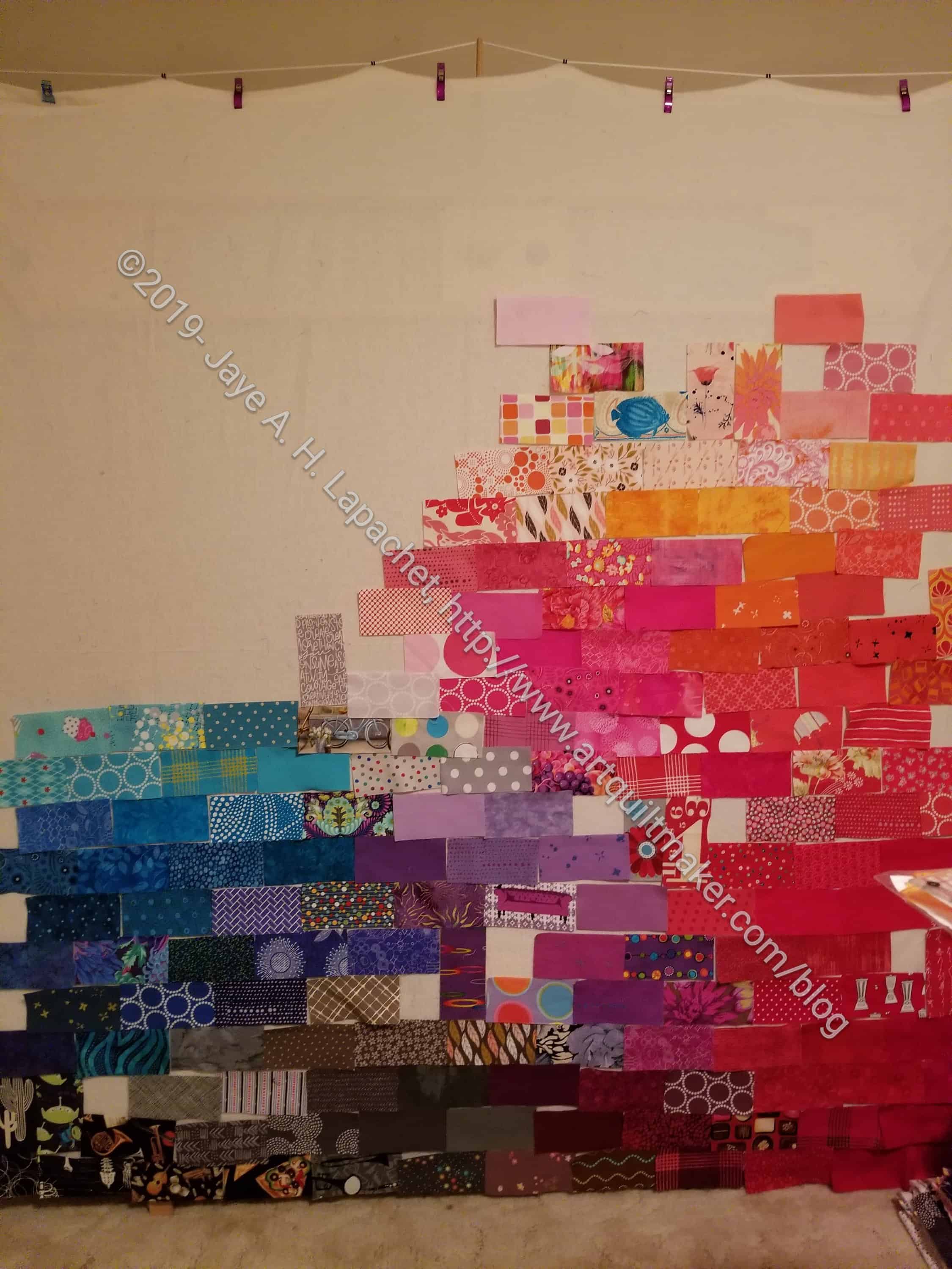
She also told us to work with intention. I took that to mean don’t just slap anything up on the quilt. She said to identify a center of interest and emphasize it, then she told us how.

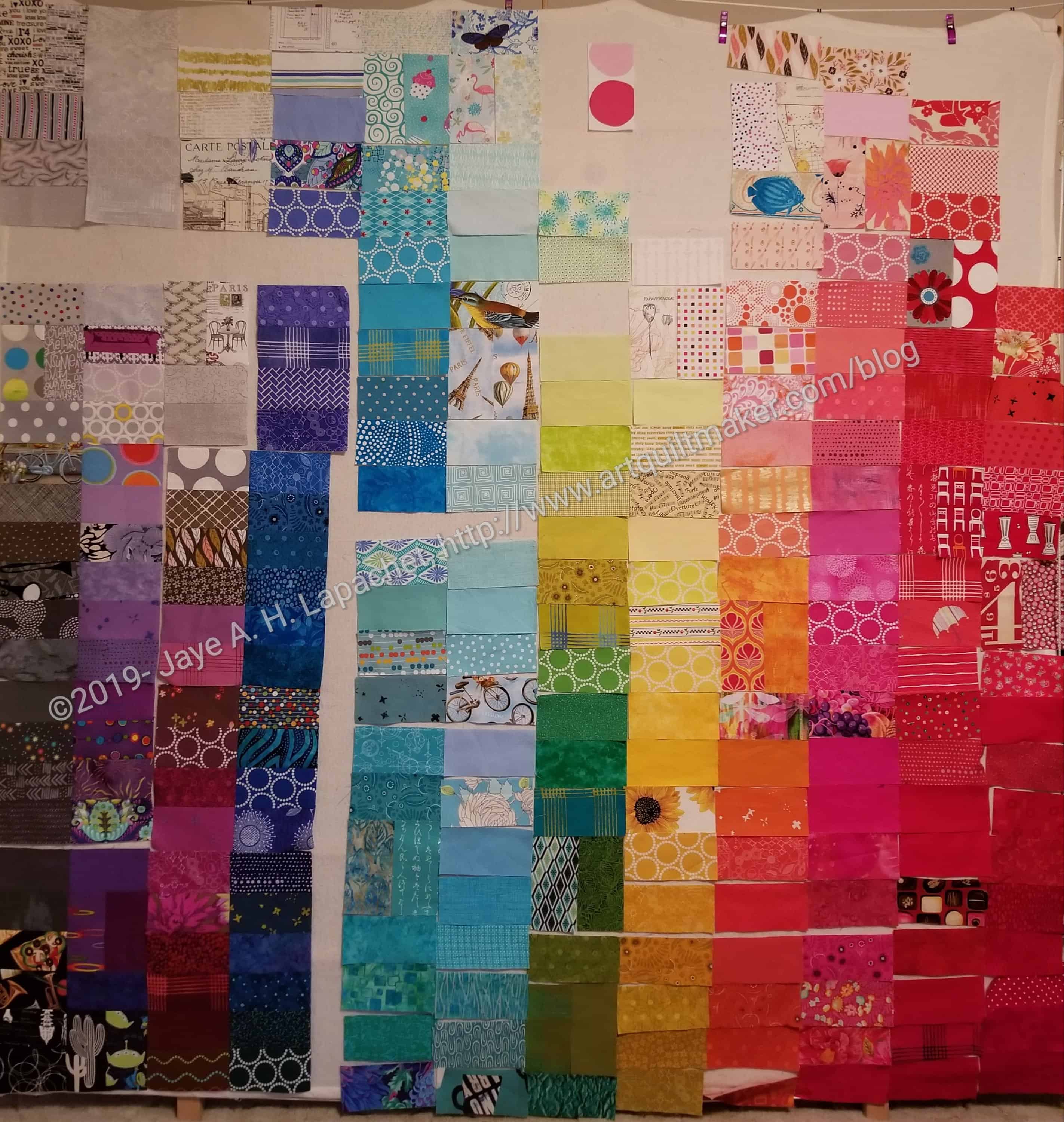
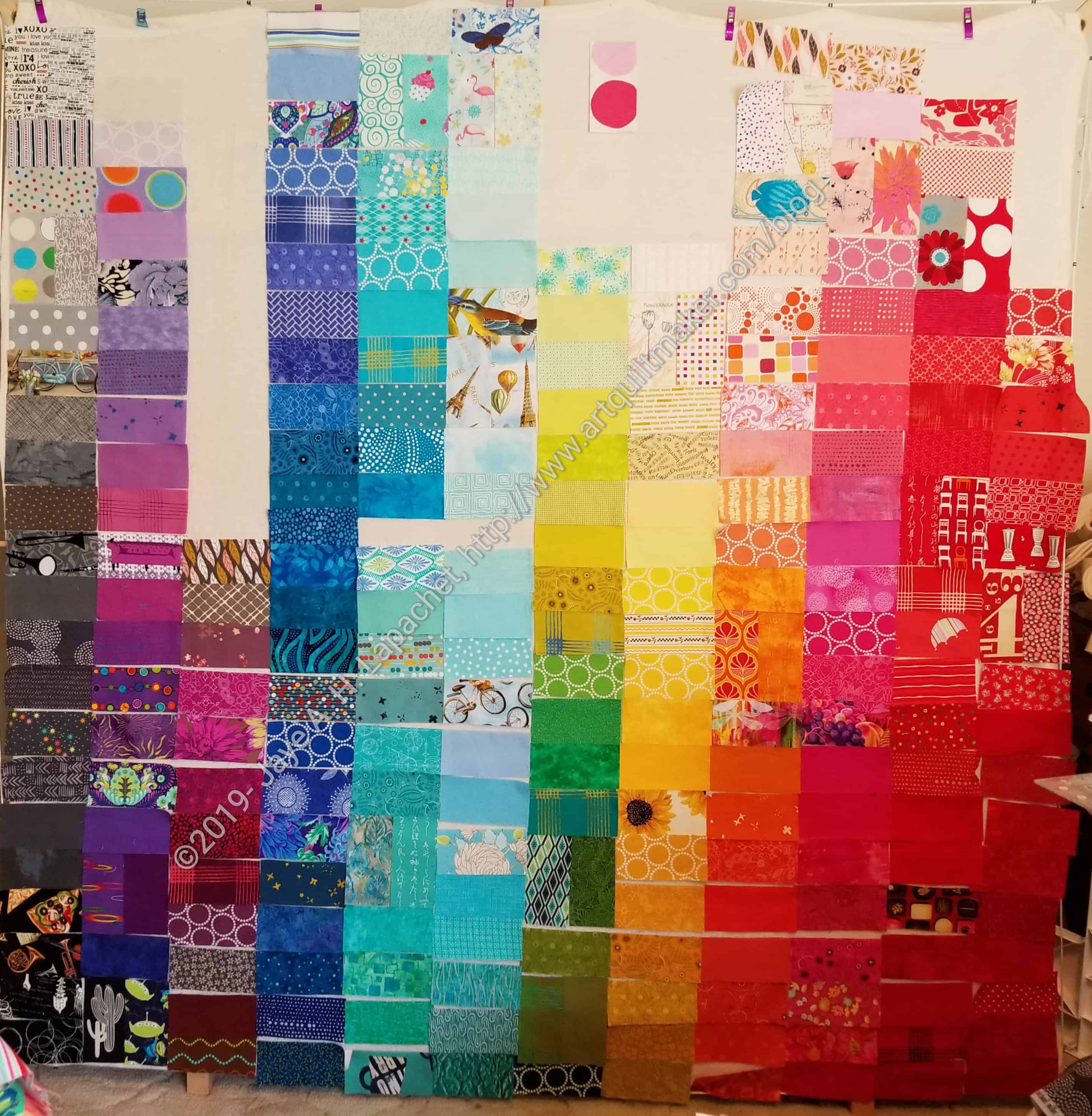
Most of the class was taken up with Value. This started out to be a problem for me. For some time I have been irritated when people have said “Value does all the work and color gets all the glory.” Mostly, this saying has irritated me because nobody who said it could tell me why. I have ignored that saying since the first time I heard it.

Actually, I haven’t, but I was doing it intuitively and just using contrast. Contrast has a lot more to it than only value. You can review it in the design series episode on contrast.

First, we have to define value and contrast:

Definition of Value: Graduations of light and dark.  All colors have an inherent value.

Definition of Contrast: Difference in light and dark.  Or light vs dark. (See The Sharpened Artist).

The difference is a mind bender, but there is a difference.

Now we can get on to my epiphany.

In this presentation she talked about value patterns. She showed a diagram of 14 different examples of values in a composition. Each diagram shows 3 rectangles on a larger rectangular surface (presumably the paper or canvas or quilt). Each rectangle is either black, medium gray, light gray or white. In show different arrangements of these rectangles. Sonja showed us a page in Strengthen Your Paintings with Dynamic Composition. You can see what I am talking about a little bit in the arrangement of rectangles in the example on Jacob Bromeo’s site. You can see how the darker rectangles come forward.

There is a lot more I could say about this class. I have some books from the Library. I have some articles to read. I have some blogs posts to update.

Sonja recommended the following books. I got some of them from the library and am powering my way through them.

Resources:

Sonja does watercolors as well as make quilts. The above list is from her watercolor class, so there are things you have to ignore. The material on composition and value cross over from watercolor to quilts and are relevant.

ColorPlay: Compass

Disney Compass
Disney Compass

More imagery from my Disney trip. This was a new image that I had never seen before and it really appealed. The detail is fabulous. In hunting around for an image for today, I thought of this. It didn’t turn out to be great for color, but I think some of the palettes are interesting.

ColorPlay-Compass-default

Of course the default palette is neutral heavy! Still there is that Sea Glass (great name, don’t you think?) fabric that lightens up the piece. Also some of the other colors have blue and purple twinges (undertones?), which makes the palette look at little less dark and depressing.

ColorPlay-Compass-n1

The first palette I made is a little all over the place. It isn’t very cohesive. Of course, I like the Lake and Niagra fabrics. It is interesting that the color names are related to water, though perhaps not surprising. I am not a fan of the Rose. It looks sick to me.

ColorPlay-Compass-n2

I went straight to monochromatic, which was marginally successful. I ended up with two of the same fabrics. C’est la vie. I do like the blues. I think my favorite is the Azure, but the Robin’s Egg is nice, too.

ColorPlay-Compass-n3

Palette n.3 is all over the place as well, though not a mess, I think. I don’t remember seeing Natural before. I have done a lot of palettes, so I could just not be remembering. The Wasabi looks like sunshine yellow on the bottom, which I like. It has more a green tinge on the side. The Garnet does not have enough red to look Garnet to me. I think it looks more plummy.

ColorPlay-Compass-n4

N.4 might be my favorite. It isn’t quite monochromatic, but stays well in the cool shades realm. I like the way Surf looks more purple on the bottom. I think it adds to the palette even though I think one of  the websites used to create this might be off. I think the lights look really good.

ColorPlay-Compass-n5

Finally, I decided to get out of my comfort zone and create something with more gold. Palette n.5 heads into the neutrals pretty quickly. I am not a very big fan of this particular palette, but it is different and it does remind me of Mrs. K’s gold Spiky 16 Patch.


What will inspire you today?