Fat Quail Quilt Shop Again

Fat Quail Quilt Shop

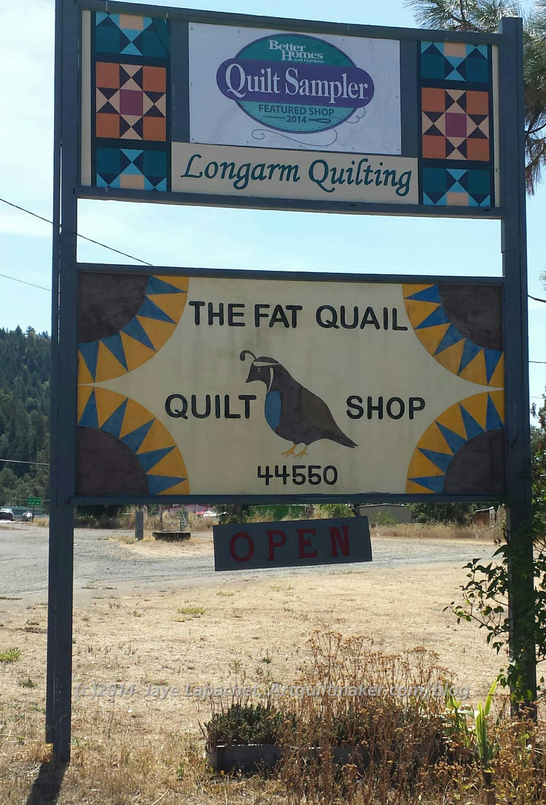
I have visited the Fat Quail Quilt Shop before. The last few times DH and I have driven to the North Coast, we haven’t stopped. Absence makes the heart grow fonder? As Mom and I drove south from Portland it turned out to be a good place to stop for a stretch. Laytonville is a small town after Leggett and before Willets as you drive south on Hwy 101.

When we visited several ladies were having a sew-in. The ladies were sewing away on their own projects and asking for advice as needed (by their own words). I was glad to see that they were there. Those small towns look so small, I always wonder how they can support a quilt population. My mom and I discussed this quite a bit in the car and her theory is that crafts are popular because of the lack of big city distractions. She could be right.

Fat Quail interior
Fat Quail interior

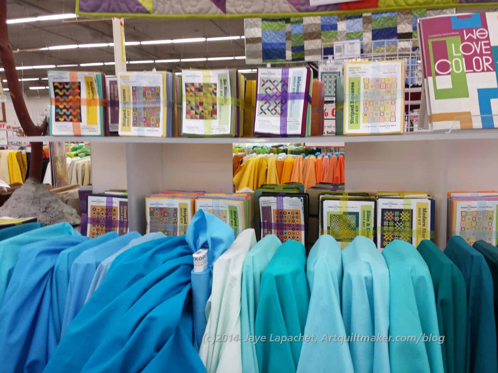
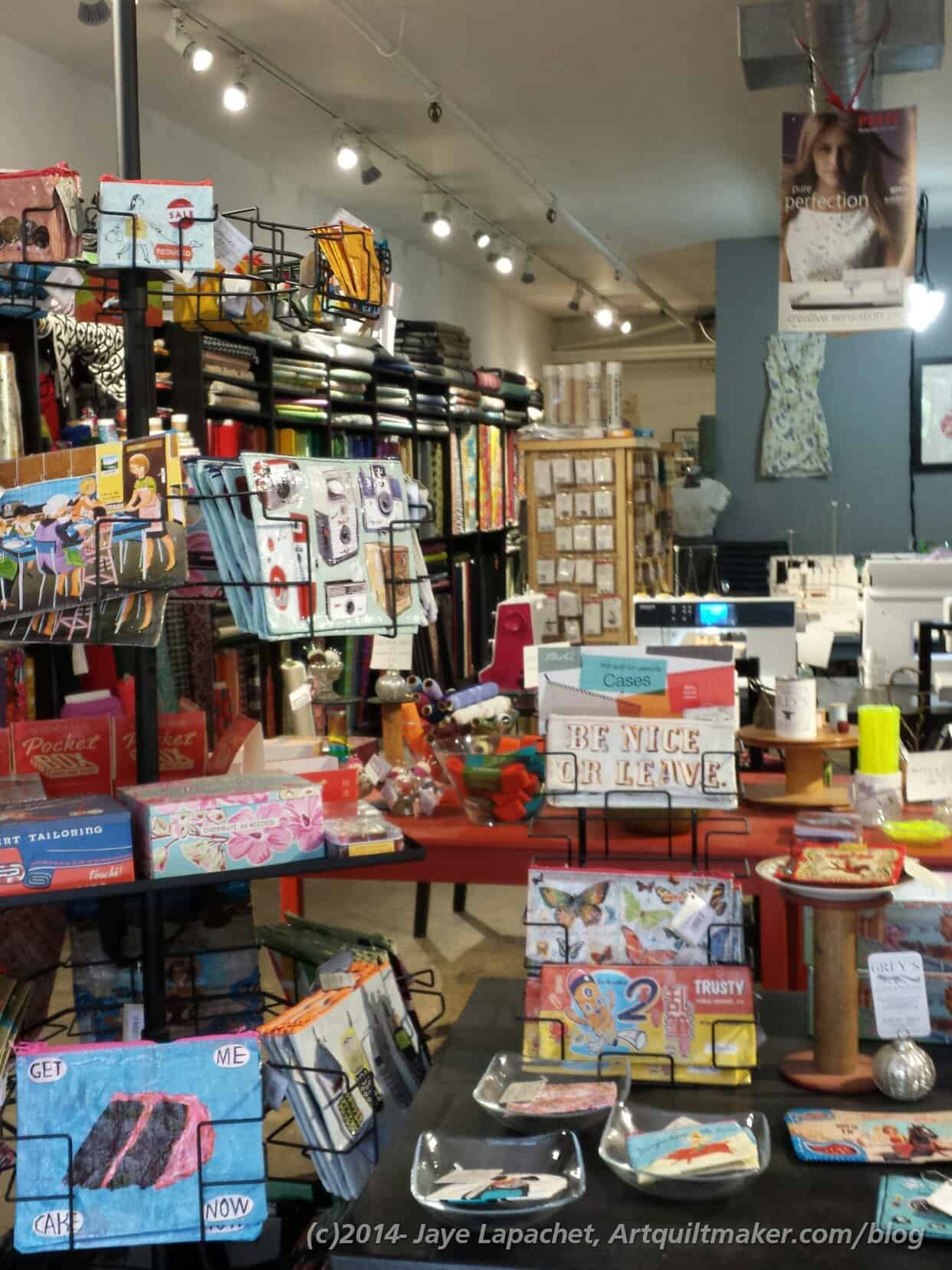
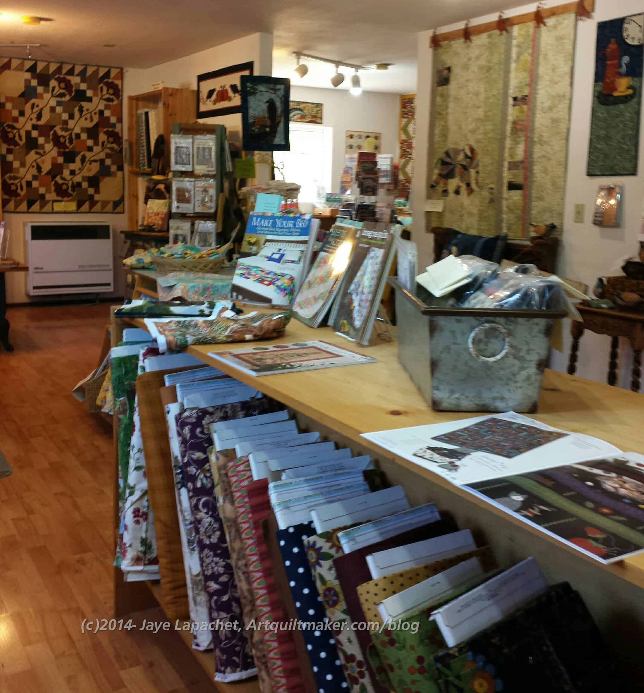
Fat Quail probably has the most ‘country’ style of the stores we visited. The colors of the decor tend more towards sage, beige, cream and rust. The shop is light filled and there are plenty of pinks and turquoises for people like me. They also have some more modern patterns, such as the Time for Tea pattern, which makes me think of the Mad Hatter.

"Time for Tea"
“Time for Tea”

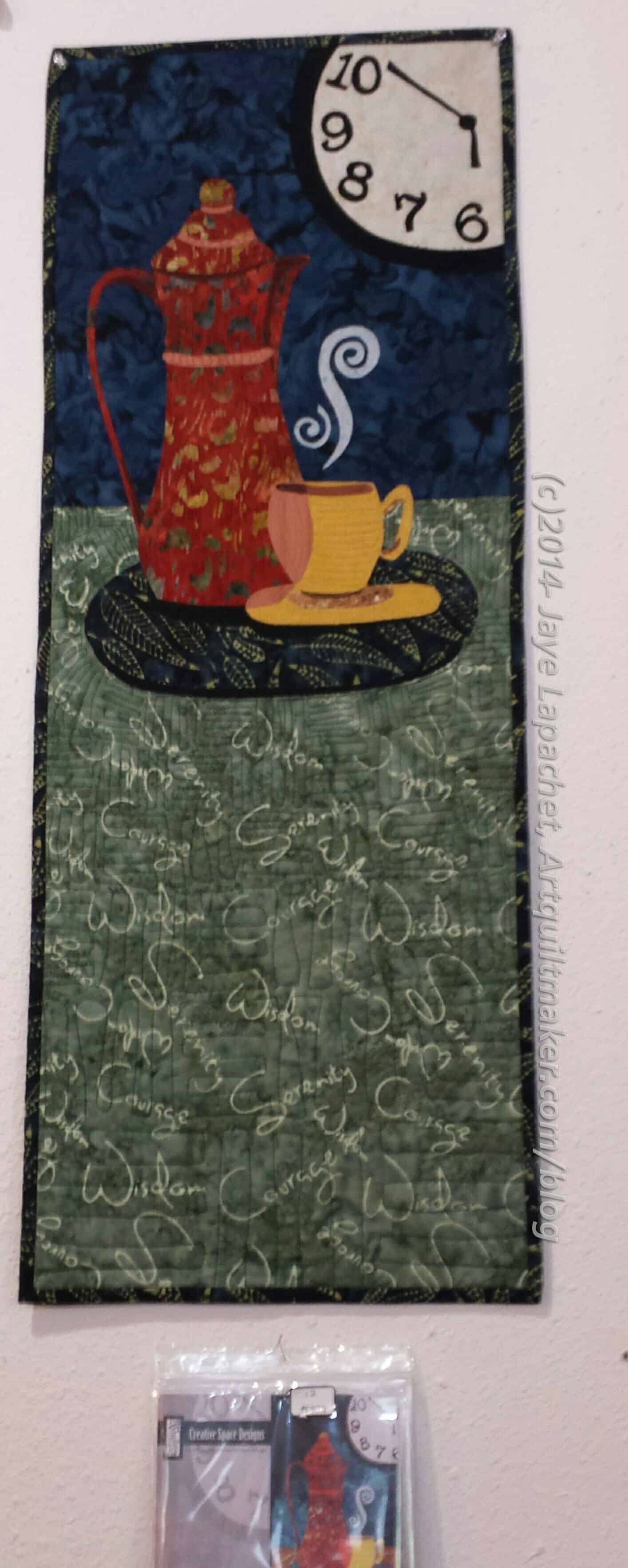
I don’t know that I will make it as a quilt, but I do like the clock being half off the quilt. It is a good reminder that design elements do not need to be complete. I also like the stylized coffee pot. Both are interesting design elements. The pattern is Time For Tea (CSD-110- 13″x 35″) from Creative Space Designs. They have other interesting, including more Mad Hatter-ish, patterns as well as flowers and animals. You can buy it from their website or call Fat Quail.

Fat Quail interior
Fat Quail interior


They brightened things up quite a bit from last time. The room with the card catalog drawers holding fat quarters held a lot of Stonehenge last time. This time there was the cat quilt and that green, cream and rust quilt. The room was a lot brighter. No Stonehenge. Sorry Sandy!

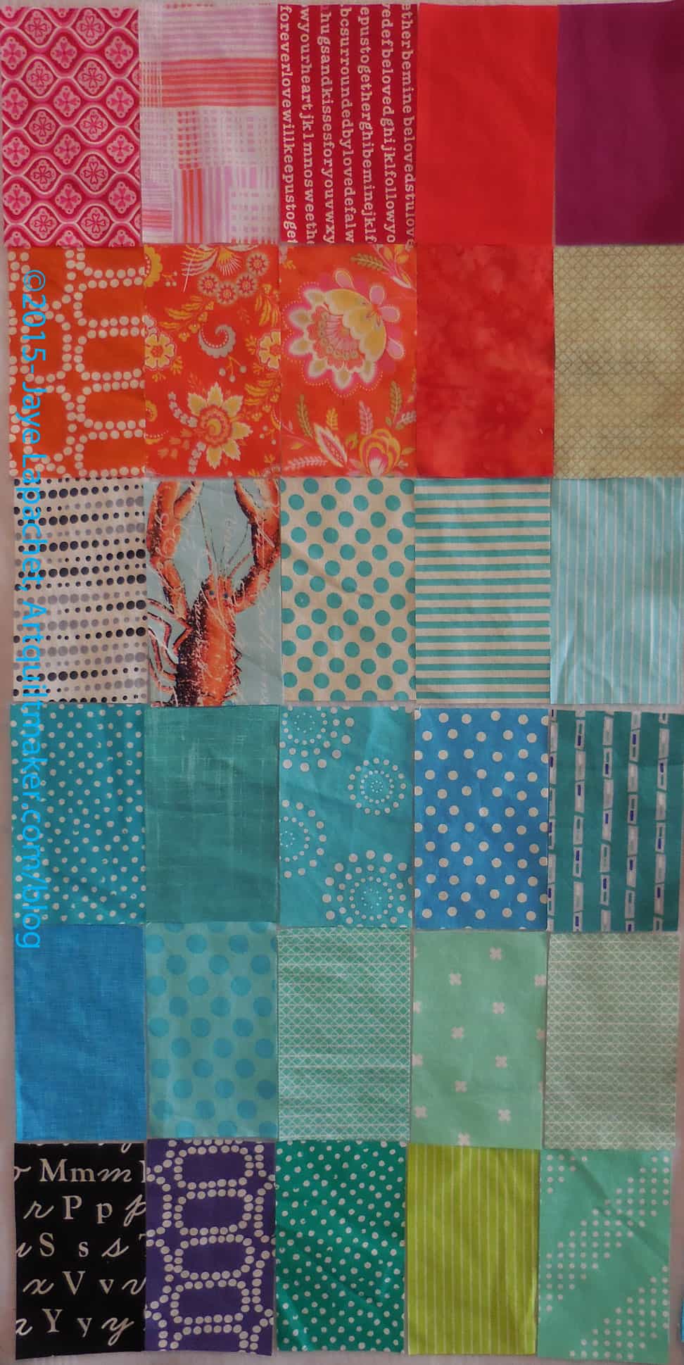
I also saw some 1930s fabrics as well as some aqua and turquoise hiding in that room. 😉

Fat Quail front room


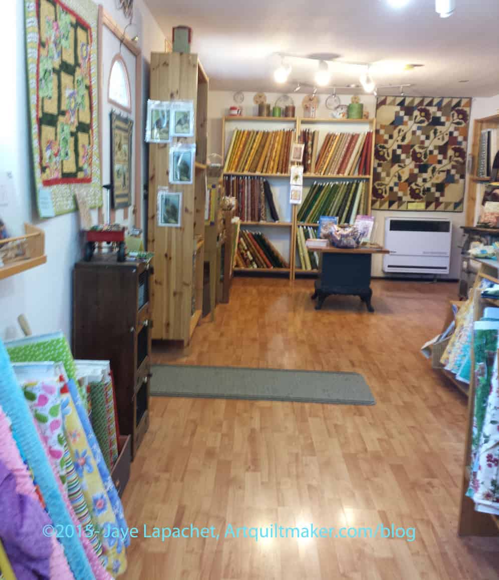
As at the Quilter’s Corner, this shop had some specialty quail items. The quail is the state bird of California and this shop had a pattern for s stuffed version and some prints that could be added to a quilt. You can see them hanging on the fabric shelf to the left in the middle of the picture.

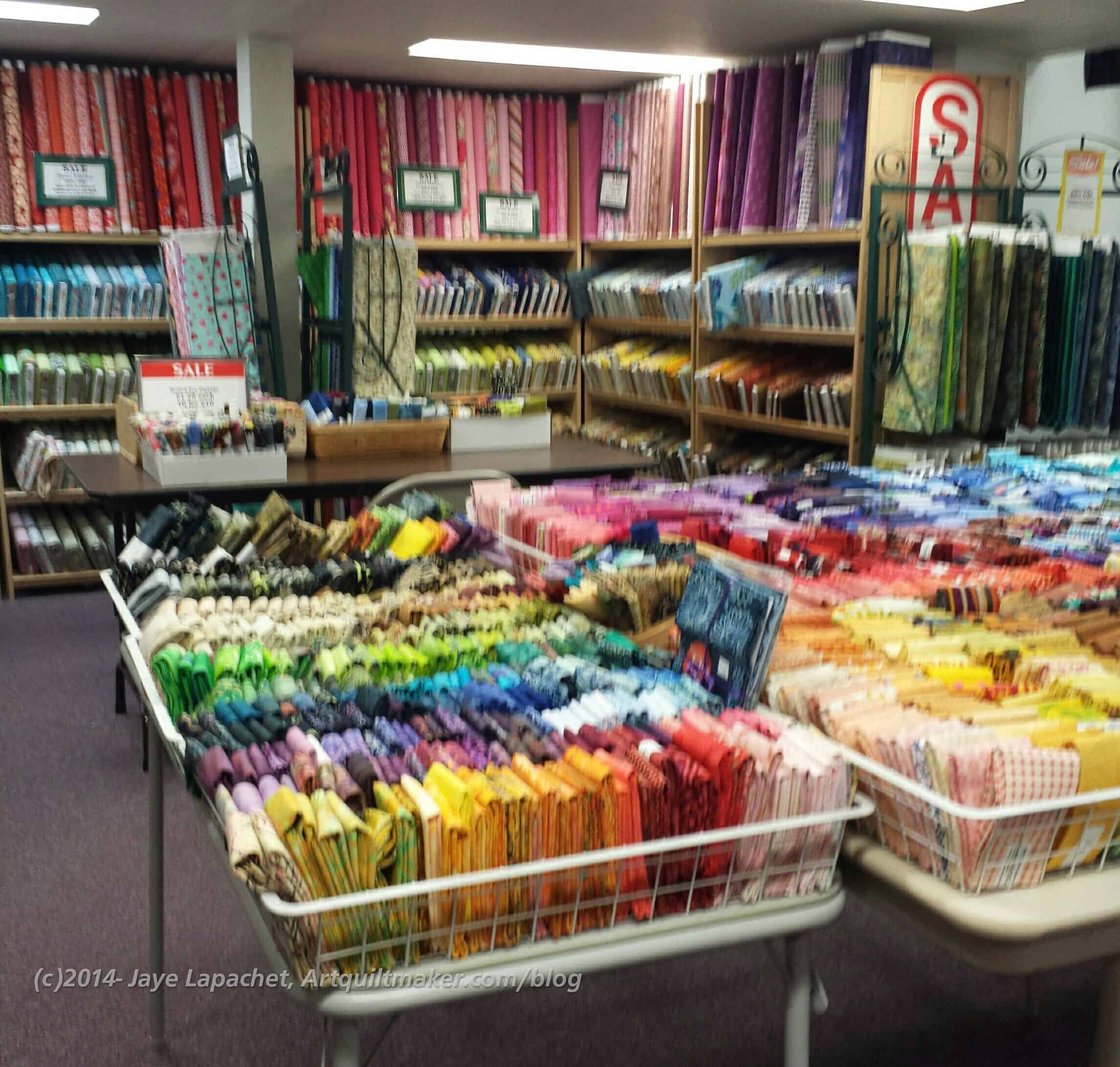
Autumn was in full swing in all of these quilt shops so there was a lot of Thanksgiving: reds, golds and browns. You can see those fabrics on the left in the back of the picture.

Fat Quail front room

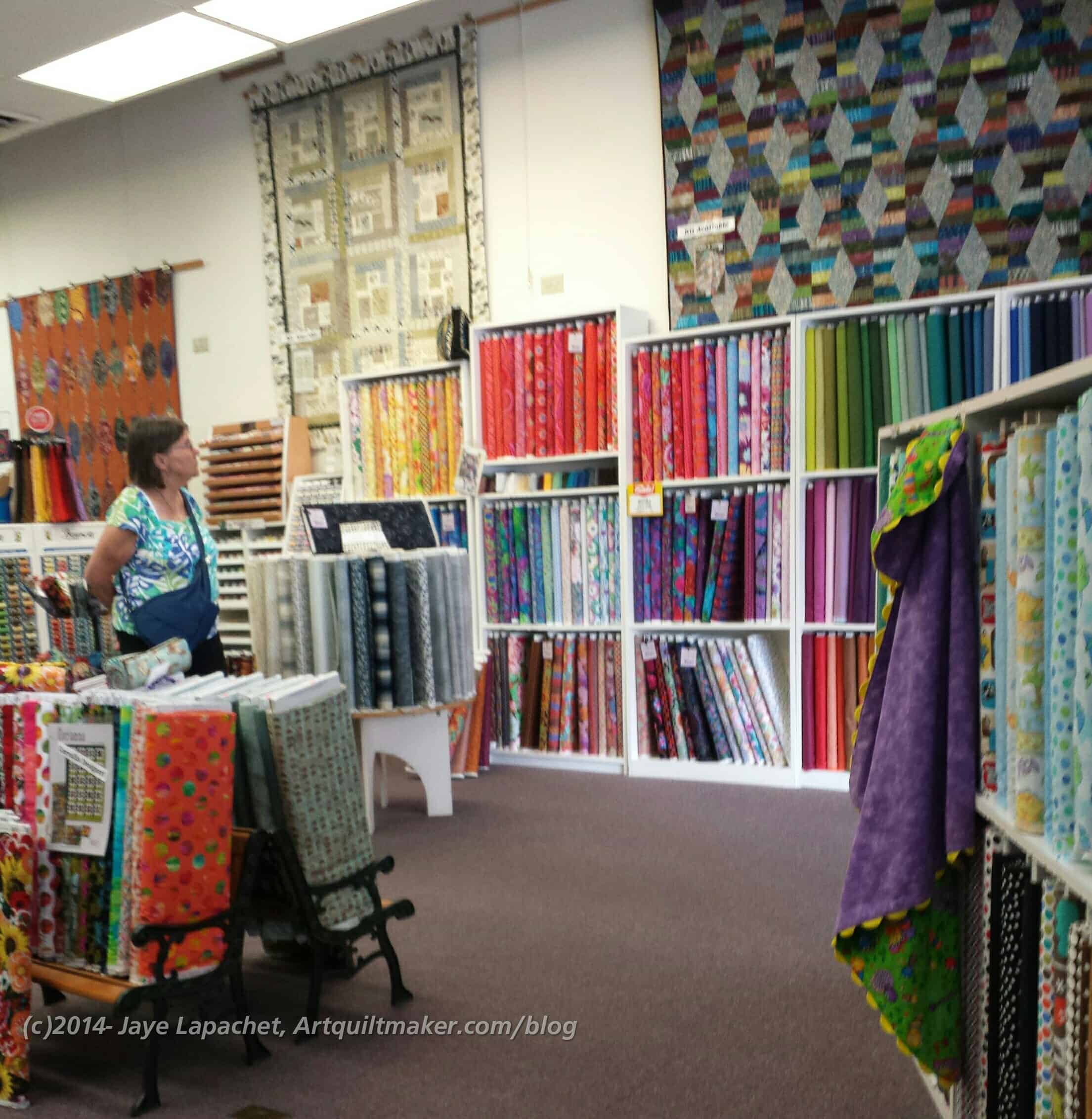
While fabric wasn’t everywhere, which I didn’t see in any shop I visited, there was plenty to choose from. I also found that a lot of different styles were represented even if there weren’t samples using every fabric.

I still think this shop is worth a visit and there is a coffee shop down the road a little where the family can relax while you look at fabric

Location:
44550 US-101, Laytonville, CA 95454
(707) 984-6966

FOTY 2014 Frustration

I have almost had enough of this piece. Something drastic has to happen.

FOTY 2014 -Early September

I had a couple of choices on projects to work on and FOTY 2014 was one of them. I took this picture on Thursday as a baseline for the weekend.

The piece has looked like this for a long time and it isn’t a bad look, but it isn’t finished either.

The red and pink look pretty good. The green area needs a lot of work and the purple is simply missing.

I decided to do one small thing as one small thing often leads to larger things, so I counted up all the patches, then I worked on figuring out how large the piece needed to be. I *think* the piece needs to be 16 rows tall by 26 rows wide. At the moment the piece is 15 rows tall by 24 rows wide. Easy to add two more rows?

No.

Some FOTY 2014 Work - early Sept.
Some FOTY 2014 Work – early Sept.

I got busy and started moving things around until I got to this point. The whole piece is filled in, which is a good thing. The green area still looks terrible, but it could be worse. The bad part is that there are 40+ patches on the floor. I have crammed some into the bottom rows, which is fine, but also not fine. I had to face reality that 26 x16 rows does not fit on this does wall and I need to do something else.

I really need all the pieces on the design wall in order to arrange the pieces the way I want them. I can’t just put the pieces up on the wall and sew them together and have a piece that I like.

I don’t seem to be able to think of very many options except to trim all the piece. The rectangles are large (5″x3″) and if I trim a 1/4″ off each side that will cut the size down and, perhaps, enable me to get all the pieces on the wall. I cut the rectangles that size to have them be 4.5″ x 2.5″ once sewn together and I kind of want them to be that size. I could cut them down to squares and forget my rectangle idea all together. I did squares for FOTY 2013 and I don’t think I want to do them again another year in a row.

Sigh.

Quiltwork Patches

Quiltwork Patches
Quiltwork Patches

I stopped in Corvallis, Oregon on my way home at a shop called Quiltwork Patches. This wasn’t the largest store I visited, but it was one with a very good selection of fabric etc. Their excellent selection of fabric also included colorways that I hadn’t seen. They had some of the latest Moda charm packs and mini charm packs and really great selection of sale fabrics.

The ladies in the shop were friendly, but not too pushy, so I felt ok looking around, which was great, because I wasn’t feeling that well*.

There was a ton of fabric in this shop and half of it was sale fabric. The other part was really different, as I mentioned.

Quiltwork Patches front to back of the store

I liked the displays as well. They weren’t too cutesy and didn’t get in the way of the fabric. The displays facilitated the display of the fabric.

This was the first time I really liked those little benches in a quilt store. They, again, facilitated the display rather than overwhelming the display.

Quiltwork Patches back to front of store


Quiltwork Patches FQs and Sale Fabric

If this looks like a lot of fabric, it is because there was a lot of fabric in this store. Their website says 4000 bolts and I believe it.


Quiltwork Patches across the front of the store


Location:
212 SW 3rd St, Corvallis, OR 97333
(541) 752-4820


I kept catching Mom in my photos!


*Nota bene: Mom and I ended up with what we think was food poisoning. We can’t figure out where we got it, but I was sicker than she and it was unpleasant.


Fabric Depot

If you have been playing along you know that I was in Portland (Oregon) with my DH over the weekend dropping our Y.M. off at college. It was a whirlwind adventure filled with moving in, then 2 days of orientation, some picking up the slack and then letting him go off on his new adventure living somewhere else and fending for himself. Sending children off to college is weird! One day they live with you and you are telling them to pick up their socks and the next day they live somewhere else.

Fabric Depot, Portland, Oregon

My mom flew up to drive back with me and while I was waiting to pick her up at the airport, I went to a shop that Tanesha mentioned, in one of her podcasts, called Fabric Depot.

OMG! This place is so enormous, I couldn’t even, while I was in the store, understand how large it was. Conservatively it was the size of 3 Safeways. I think. It was so big that I couldn’t even begin to think about seeing everything. Truly. I am not exaggerating.

Truly enormous
Truly enormous
Truly enormous
Truly enormous
Truly enormous
Truly enormous


The three pictures above are the view from where I was standing when I walked in and got past the husband area. The three pictures show the vastness of the space. It is a store you have to go to with a bag lunch and plan out to look at one corner, then go back that next week with the same idea in mind.

They had everything new that I have been hearing about. I saw April Rosenthal’s Meadowbrook line, which I thought I would buy, but I ended up not buying any. They had charm packs and layer cakes, but I didn’t like it enough to have the desire to make something with it.

Draping fabric
Draping fabric

The other thing I noticed is that they drape the fabric like House of Fabrics, etc used to do. It is a great idea, because you can really see a lot of the motifs on the fabric.

The fabric shown left is a row of batiks. There were about 10 rows of batiks that I saw.

Hallowe'en fabrics
Hallowe’en fabrics

Julie would be thrilled with the Hallowe’en selection they had. I never saw so many interesting Hallowe’en fabrics! I bought some panels to make the Young Man and his two (yes, TWO, count ’em two!) college roommates Hallowe’en pillowcases. I already made the YM a Hallowe’en pillowcase, but hopefully he will change his sheets more than once in October.

There was a little boy with a 4 week old puppy walking around the store showing off his puppy. He wanted everyone to pat the puppy. I got to pat the puppy twice. The boy was about 4. OMG! They were both so cute.

Color Kits
Color Kits

In addition to a zillion pre-cuts, they also kits made up from their own designs or from local designers.

There were a lot of different ideas in this area and they all used solids.

The store had an excellent selection of solids. They had the ubiquitous Moda Bella solids as well as the Kona Solids.  They also had the Michael Miller Cotton Couture solids and a few of the American Made Brands solids. It was great to see such a selection of solids.

There were also packs of solid colors with color related patterns prepackaged and ready to grab and go.

Moda Modern Mixers
Moda Modern Mixers

I saw a group of fabrics called Modern Mixers. I love the name of these fabrics and wanted them all. They reminded me of Half Moon Modern (and that I have to find something to do with those fabrics!). There may have been some that were in the Half Moon Modern group.

I did buy a couple for some more Political Wifery/work outfits.

The store also had some great displays. I loved the quilts they had hanging up including one from Dr. Who.

Dr. Who etc Display Quilts
Fabric Depot Display Quilts

I have noticed the Jack’s Chain pattern (above quilt with green background) showing up in shops and on the web lately. I have loved that pattern since I saw it in the Cotton Patch a thousand years ago. Perhaps it is time to make it?

Fabric Depot Purchases

I didn’t have a lot of time, but it is probably good since I would have spent more money. I bought a few things, mostly they are earmarked for projects. Fabric Depot had a great selection of zippers, which were on sale. I took the opportunity to stock up on a few for dresses so I don’t have to go rushing around when I need them.

The store was definitely worth a visit and I will go there again when I am in Portland another time.

FOTY 2014 Progress

FOTY 2014 - August 2015
FOTY 2014 – August 2015

The end of July has come and gone, which means that I didn’t make my original deadline. Still, I got back to the design wall over the weekend and worked on this piece. I decided to move all of the reds down towards the bottom, which meant touching almost every piece as I shifted the rectangles clockwise.

The biggest problem I have now is that I have a stack of blues that don’t fit on the design wall. I need to add them to the 9 o’clock position and there are many more than the 10 or so that look like they will fit. I need all of the pieces on the design wall so I can work with them all at once.

I may do some overlapping, but I definitely have to count the patches I have and figure out the size of quilt I need to make. Then I can figure out what I need to add to my design wall to design this quilt.

FOTY 2015

FOTY 2015 - July 2015
FOTY 2015 – July 2015

The other night after starting to arrange the patches for FOTY 2014, I was laying in bed and thinking about the arrangement and wondering what it would look like if I alternated light and dark for the whole thing instead of gradating the colors? This is where my mind goes when I am trying to go to sleep.

I didn’t have an equal amount of lights and darks in this batch, but I made an effort to do the light and dark arrangement just to see what it would look like. To get an idea.

FOTY 2014 Arrangement

I am finally starting on FOTY 2014. After finishing the “triplets”**, Field Day, the Food Quilt #2 and Box Full of Letters, I looked around to try and decide what to do. I cut a few pieces for FOTY 2015, put in a new rotary cutter blade and decided not to dither. I took out the piece of FOTY 2014 and started in.

Sorting FOTY 2014
Sorting FOTY 2014

First off was sorting. I took the two bins out and sorted the colors into general stacks. I had only two bins and was worried that I had lost some patches, but after taking out all the pieces, I realized I had a lot of patches with which to work.

As I have mentioned many times, even sorting is a challenging part of this project. You can’t dilute a fabric’s color or hue. It is what it is. Of course, I could paint that fabric, or color it with markers, but that is not the point of the exercise.

I am often a little disheartened by the sorting, because I think I will never be able to blend the colors. Somehow I do it and get a wonderful finished quilt.

FOTY 2014 Arranging
FOTY 2014 Arranging

After a general sorting, I started arranging. Like 2013’s piece, I decided to start with white in the middle. I used and bought very little white in 2014, so all of the ‘white’ I have has another color on it. That is fine. Again, it is one of the challenges of this project.

I wanted to get all the colors on the design wall on Sunday night when I started, but that was not to be. I found out a few things:

  • There are a lot of green patches
  • There are a LOT of pink and red patches
  • There are a lot of patches in general and now I am concerned that I won’t be able to fit them all on the design wall

Still, I have started and I am determined to make good progress and get this piece off the design wall and sewn together by the end of the month. We’ll see how that goes! Stay tuned.


**I call the three quilts the triplets because I worked on them simultaneously and finished them all within about a week of each other.

FOTY 2015 – June 2015

FOTY 2015 - June 2015
FOTY 2015 – June 2015

Shockingly this is the first FOTY 2015 post. I have been cutting squares and rectangles, but, clearly, have not posted them.

I am not sure why since I have been cutting since late March or early April. I know the problem hasn’t been too much content. I guess I must have forgotten to post.

I have to admit that I am behind in the FOTY projects. This has been a weird year and I am ok with my slow progress. I think I’ll pick up speed later. A girl can dream anyway.

FOTY 2015 - April 2015
FOTY 2015 – April 2015


I know that you see some food fabrics in the top photo, but not all. I didn’t have enough of some of them to cut pieces. Sad, but not a complete tragedy. I might get more.

Lots of orange and pink, too. Don’t you love it?

Onward!


Thoughts on Solids

Happy Father’s Day to all those fathers, dads, step-dads and all the guys who act like dads and make a difference.

We are not talking about dads today, though, we are talking about fabric. Again. There is no doubt about it. I have fabric on the mind. First, I admonish you to use your good fabric. Now I am talking to you about solids. What is going on?

I guess I have fabric topics on the mind, one of which is solid fabrics

Solids have become popular again (No duh, right?). When I started making quilts, the Amish style was popular and we all bought solids. I was actually kind of scared of prints! My first quilt project was mostly solids, but I did throw some prints in as I became more confident. The Cotton Patch, in Lafayette, California, where I bought most of my beginning class fabrics, had a whole room of solids!! Brands and designers were not important or known then so I have no idea what kind of solids they were. Due to the longevity of  the Kona brand, some of them could very well have been Kona.

The brands I have thought about recently are:

  • American Made Brands
  • Art Gallery Solids
  • Bella Solids by Moda
  • Kona Cotton Solids by Robert Kaufman

Some thoughts on these brands — and don’t get me wrong, I know there are other brands by other makers such as Michael Miller Cotton Couture and the Timeless Treasures Soho Limited Edition solids brand. I just don’t find those in my local area very often. I haven’t used them. I’ll have more to say about the Timeless Treasures Soho after I make the Peacock One Block Wonder piece. I, also, could do an update someday after someone sends me some and I use them. 😉

American Made Brands: the thing I like most about these fabrics is that they are completely made in the US – from growing through processing (ginning?) to weaving. I am not a rampant protectionist, but I would rather pay a little more and know that someone in the US is contributing to their household because of fabric I buy.

There aren’t as many color choices in this line thought they do keep coming out with more. I do love their turquoise!

A color card is available at selected retailers.

The colors also glow. We saw an exhibit of quilts made from these fabrics at Houston and the color combinations were amazing, not because of the fabric choices, but because the colors glowed. It was amazing to see.

The fabric is a little thinner than some of the other brands.

Art Gallery Solids: the brand/collection is sometimes called Pure Elements. They are very tightly woven. They have a beautiful hand.

A color card is available at selected retailers.

While there are some very clear colors, many of the colors are shades of pure colors.

This brand does not fray. Hallelujah!!!!!!

Bella Solids by Moda: Moda is a powerhouse around fabric design. They have the best designers, the freshest colors and the most up to date designs. Their solids are no exception.

There about 400 different solids in the line, with many shades and tints in each hue’s range. There are several different colors of white, making it relatively easy to find the exact color for your project.

A color card is available at selected retailers.

My biggest problem with Moda fabrics, including the solids, is that they fray like crazy. I assume this ‘problem’ has to do with the quality of the greige goods. The fabrics feel good, and the designs are gorgeous (Zen Chic! Bonnie & Camille!). The fraying, however, makes me crazy and I find I hard to keep my work area tidy and to piece with precision. Yes, Fray Check keeps the fabric from fraying, but is messy.

Kona Cotton Solids by Robert Kaufman: these are probably the most popular solids available. Websites match Kona solids to patterns. Playcrafts creates color stories using Kona Solids. Robert Kaufman, via the Kona Solids, has good marketing when they play nicely with other websites, designers and patterns.

The collection currently has 303 different colors. A color card is available at selected retailers.

The fabrics feel thick to me and I like that substantial feel. However, they also fray and seem to be loosely woven in a different way than the Bella Solids. I still buy them, because they sell them at a store to which I can walk and I have the color card.

All of these have uses, especially in the color department. Sometimes you need the perfect color whether it frays or not. I have been experimenting with Soak Flatter and Mary Ellen’s Best Press to see if these products will help with fraying.

Boston Fabric Shop

I was in Boston for the Special Libraries Association conference. On my last day in Boston, I walked over to a fabric store called Grey’s Fabric and Notions. I had looked at their website and saw a number of blog posts on garment making including lingerie, so I was on the fence about visiting.

image
Building with interesting colored windows

My conference buddy encouraged me so we walked over there together. We got there off of Summer, A Street, 4th and finally Harrison.

Summer Street was a main road and to get to A Street we had to go down a set of metal stairs to the street below. It was kind of like the Stockton Tunnel street madness here in SF. The neighborhood looked yup and coming, but also very much in transition.

It was a bit of a long walk, but we enjoyed it. We took pictures of interesting architecture and things we don’t see at home or interested us. The neighborhood is definitely changing.

Pretty alley housing Grey's Fabrics
Pretty alley housing Grey’s Fabrics

Grey’s was a little hard to find, but worth the trip and in a charming little alley with other art galleries and creative spaces, including a bead and fiber store.

The store itself is great. It is a good size without being huge. They had plenty of quilt fabric; a very respectable selection and I liked what they had. I indulged in a couple of pieces. One will be a dress for a future NSGW event.  They had a fair selection of Philip Jacobs (my man!!!), considering the size of the store. They also had notions, patterns, embroidery floss and a lot of gift items.

Front of Grey's
Front of Grey’s

One thing I really liked was the table in the front with lots of little things, including gifts. If that “Be Nice or Leave” pouch had been a sign I would have bought it. I need to tape such a sign to my forehead.

I bought a piece of flannel to make future receiving blankets. Ashley, the store manager, introduced me to double gauze, which she said fluffs up a little after it is washed. It came up after I told her about the receiving blankets I make as gifts for babies. The double gauze, apparently, makes very soft receiving blankets. I didn’t buy any, though it might be good for lighter weight receiving blankets. They have an online shop and it is made by Cotton + Steel so I maybe able to find it locally as well.

The store had lots and LOTS of the independent pattern company garment patterns, such as Colette. I was tempted by one, but restrained myself because I want to look at the Vogue patterns before I buy any other patterns.

The other thing I saw that I liked were the Sublime Stitching embroidery patterns. Of course, I have heard about them and seen them online, but I have never seen them in person. There was one called Sexy Librarian that would make a great raffle prize for my library association, if made up into a pillow or something.

All in all, visiting Grey’s was a worthwhile activity and I would visit again. I wish it was near my house as I would love to take classes there.

You can find Grey’s Fabric and Notions at:
450 Harrison Ave, Boston, MA 02118
(617) 338-4739

Use Your Good Fabric!!!

Here is the short version of this post: Use the Good Stuff! 😉

The other day I posted about the Enchanted Plume panels I bought and SherriD commented that she had a panel she was “saving.” This comment made me think about my fabric, what I have to use and what pieces I love. As I have also mentioned, there is no shortage.

If you use your favorite fabrics, you will see your favorite fabrics more regularly. The yardage won’t be folded up in a cupboard or closet waiting for the perfect project.

If you use your favorite fabrics you will enjoy and use the quilt more.

If you use your favorite fabrics, it will be easier to take pride in your quilt and show it off.

If you use your favorite fabrics, you will want to make more quilts.

Win-win for everyone.

One issue I have run into is needing more of a fabric I love when I want to make a slight variation on the project. This happens a lot with bags, particularly bag linings. Generally, I am out of luck. I do make the FOTY quilts so I can try and figure out if I like a fabric enough to get more before it goes out of print, but, still, generally, I am out of luck.

In 2007 or 2008, I made a quilt called Thoughts on Dots. This is a quilt made from all dot fabrics. I had some beiges that I thought “would be fine” for the back. The quilt lives on my bed and now I have to live with beige. I love the dots on the front, but I don’t like the beige.  The beige isn’t even depressing beige, but it is still beige and I would have much rather put a color or one of my Philip Jacobs fabrics on the back. If I had, I would be much happier.

Scrapitude Carnavale, on the other hand, is a masterpiece**. I love the quilt, because I used fabrics I love throughout the quilt. It makes me happy every time I look at it. The back has fabrics I love on it, too, so I don’t mind if the back is showing.

Fabrics get Dated

The sad part of saving fabrics you love is that they will get old and dated and you won’t love them any more. I feel bad about this because I used to love these fabrics so much and now they just inspire a Meh kind of reaction when I see them. I should have used them right away. Live and learn.

There is always more fabric

The good part of using fabrics that you love is that fabric companies are churning out new designs every day and they are bound to have a new design you also love!

What is the Good Stuff?

What the good stuff is depends on you. What do you like? What do you like today? Some weeks ago, I bought a FQ pack of Alison Glass fabric. This pack was not in my normal colors. I thought I had better use it right away in case the colors and designs lost their appeal. Already the love is waning, but the quilt is in process and will be done soon. No problem.

I think “The Good Stuff” changes depending on our mood and influences, though the underlying favorite colors (e.g. turquoise and red for me) or motifs (e.g Dots) will remain consistent. I think we all, at certain points, expand our horizons or veer off in a new direction like I did with the Alison Glass fabrics, but will veer back when push comes to shove.

I have decided that the perfect project never comes along. Projects come along that are more perfect than the last, but I have not yet come across THE perfect project. I think we find projects that are perfect for us at the time. In order to make each new project the best project we can, we need to use our best fabric.

The good news is that there is always more fabric.


**Ok, ‘masterpiece’ is in the eye of the beholder. This quilt will not win best of show anywhere except at my house. I love the colors, the fabric and the quilting, so, for me, this is a masterpiece.

Origami Starburst

A long time ago, I met up with a friend and she taught me to make folded paper stars. Later, I found out that they are actually called starbursts.

Back in the day, I only had copy paper and I made a practice star from that. You need 16 squares of paper to make one starburst, so it is not an insignificant amount of paper and I didn’t have that much pretty paper on hand. I was pretty proud of that simple white star. At some point, I glued it together.

It was a good technique and the results are impressive, so one Christmas, not long after, DH and I folded up bunches of legs to make ornaments for gifts. We also made some larger ones as gifts and Christmas passed. Then the process kind of fell off my radar and I forgot how to make these starbursts. Sadly, I couldn’t figure out how to make them by reengineering, because I glued the one I had left together.

So, time passed, but I kept looking at that star at the top of my design wall. I started to become obsessed by making one again. I searched the web and couldn’t find instructions. I was infuriated. I am a librarian, for goodness sake, I should have been able to find one measley set of instrustions.

I firmly put the problem into the back of my mind to torture me there – uh, rumble around – and let my subconscious work on it.

One day I was on a boring call and clicked over to Pinterest to peruse while I listened. Suddenly, I saw a folded paper star!!! It finally dawned on me to search Pinterest and after trying ‘starburst’, within moments, I found instructions on a blog!!! I know I reported on this in the last V& S post.

For awhile I basked in the knowledge that I had the instructions and could make a starburst anytime I wanted.

Last week, I decided to make one to see if works. Now I can’t really stop. I haven’t been doing much scrapbooking lately, so I took some paper and made a first star. I cut the paper to 8.5″ squares and made a pretty big starburst.

Origami Starburst
Origami Starburst

Next I went, coupon in hand, and bought some special pieces of 12″x12″ scrapbook paper and make them into another even more giant starburst. The paper I picked wasn’t matchy-matchy, but it reminded me of a line of fabric that kind of had a Paris theme with lots of pink and black. I just felt like these were the right patterns and motifs.

Paper is fun and everything, but I have a lot of fabric and I began wondering if I could make a starburst from fabric. I let the idea rattle around in my head and decided that one big problem was cutting 32 pieces of square fabric – well 16 pieces of fabric and 16 pieces of interfacing. Regardless of how much I cut in other projects, it seemed daunting for this starburst. I think it was a problem in my mind, because of the uncertainty of whether it would work.

Finally, I came up with charm squares. I got a Fresh Cuts charm pack out of my drawer and picked out 16 squares that I thought would work together. I worked on it at Sew Day and then finished it at home. You need Flatter or Best Press to make the pieces really flat.

Fresh Cuts Origami Starburst

The idea worked. I think the starburst came out really well. It is a little bright and cheerful. The only thing I need to think about is how to keep it together. Normally, the tension keeps them together, but the starburst wreath is kind of fragile if it gets handled too much. Sewing or gluing are my options.

FOTY 2015 Begins

FOTY 2015 Begins
FOTY 2015 Begins

Yes, I have cut off FOTY 2014 and started in on FOTY 2015. I have yet to put FOTY 2014 together, but that task is coming soon. I have to clear off some of the ‘debris’ before I start on another project as design wall intensive as the FOTY quilts tend to be. At the moment, both design walls are filled with other projects.

The important part is that it is 2015 and FOTY 2015 is in progress. I had a number of pieces of fabric that I had pressed, but hadn’t cut into, so those fabrics were the start of this version of the series. Also, with all of the sewing I did on Sunday, I had a lot of squares of ‘previous’ fabrics to add to the stack.

FOTY 2015 Annotated
FOTY 2015 Annotated

I decided that I liked the idea I used in FOTY 2012 where I had smaller patches for fabrics already in my stash that I pulled out in that year. This time, the sizes will be a little different: 5.5″ x 3″ rectangles and 3″ x 3″ squares. They should fit together nicely.

I have already had the first batch of patches on the design wall and taken them off again and started on the second. We are off to an excellent start!

Finished: Fabric of the Year 2013

Finished: FOTY 2013
Finished: FOTY 2013

I brought this quilt to the last BAMQG meeting and someone was shocked that I had only finished 2013 not 2014. I have barely finished cutting for Fabric of the Year 2014 and have not yet begun to arrange the pieces. Fabric of the Year 2015 is now a glimmer in my sight as well. I seem to have two or three of these going at once. I wonder how I keep them all straight?

Anyway, the process is a bit arduous. Cutting the fabric patches takes me all year. I take the time to get a sense of what I bought and used during the year. Then I have to arrange the patches into the top I want, then I have to sew, make the back, binding & sleeve and get the piece quilted. This all takes time. So, yes, just now this is Fabric of the Year 2013 finished. Stay tuned for the others. 😉

There were a lot of firsts in this quilt. This was the first time I arranged the pieces from the center out starting with white/lights. This process was also the first time I heavily used my camera as a tool to arrange the patches. I took a lot of pictures, converted them to black and white and rearranged according to the value indicated in the black & white photo. If a patch stuck out, I moved it. Of course, I didn’t move purple patches into the green section. Some of the patches look odd if you look at the piece close, but standing back the placement works. The gradation is a big improvement.

Fabric of the Year 2013 (back)

The back is a couple of Philip Jacobs prints. I got some comments that they clashed, but I like the boldness. I also used the wrong fabric for the sleeve! I got two quilts back at the same time and used the edge of the Russian Rubix, that was cut off to square up the quilt, instead of the edge of the Fabric of the Year 2013. Oh well. At least people can see the sleeve.

I am pleased that this one is done. As of this quilt, I have no (yes, NONE) quilts at the quilter. Of course, the Tarts Come to Tea is still in the process, but that is a story for another day…

FOTY 2014 – End of the Road?

I think I might be ready to start cutting for FOTY 2015. I know. It is nearly March and finally I am getting in gear for 2015. 😉 Sometimes you have to let the process guide you.

I said last time that I wasn’t sure how much more I should cut. I think that I made that comment because I didn’t have a clear view in my mind of how to start FOTY 2015. I hadn’t decided on a shape. I have a better idea now.

As mentioned previously (or, maybe, on Twitter), I have been ironing fabric. when my sewing chair starts to fall over because I have too much washed, but unironed fabric hanging on the back, I have to iron. I ironed a lot while listening to Outlander (long LONG audiobook) and let it stack up on my ironing board, but finally I was ready to cut.

FOTY 2014 - Late February 2015
FOTY 2014 – Late February 2015

I still have a stack on my ironing board, but Voila! These are the patches I have cut in the past few weeks. I thought there were more, but if there were I lost the photo.

Yes, I cannot help attempting to gradate the patches.