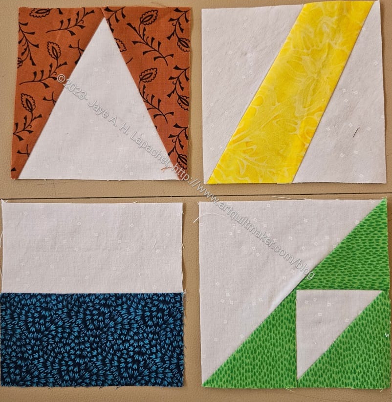
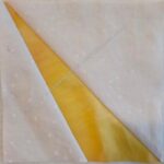
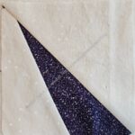
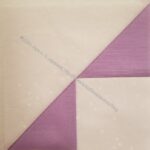
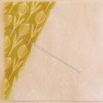
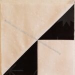
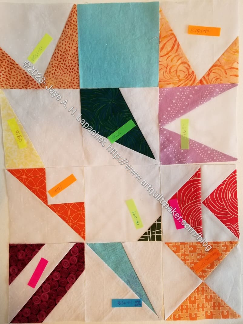
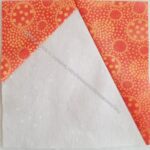
Julie handed over a couple more blocks at Sew Day. These give the impression of primary colors to me, though I can clearly see they aren’t.
Commentary about works in progress, design & creativity
Julie handed over a couple more blocks at Sew Day. These give the impression of primary colors to me, though I can clearly see they aren’t.
I decided I needed to be diligent about the Pantone Project blocks. I put my nose to the machine and started working hard on them. I want to have another group to give to Julie on Sew Day. I don’t know that I will be able to make them all. I can try.
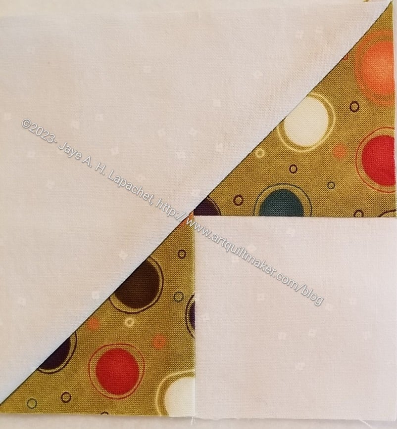
I am in the process of making a second batch. On New Year’s Day, I got all the postcards together and selected fabrics for each of the cards, then, interspersed with sashing the Grey Strip donation top, I started making blocks. I did change out the light blue, Pantone 9044, in the middle on the left. You can see the replacement fabric above in the Peaky & Spike block.
I am selecting blocks to make based what I have already made. I have a sort of plan in mind for the final quilt that requires even numbers of blocks.
Julie had a few more Pantone blocks for me at Sew Day last week. I have made a couple, but I don’t know if I took photos and I still have a stack of fabrics I need to use to make blocks.
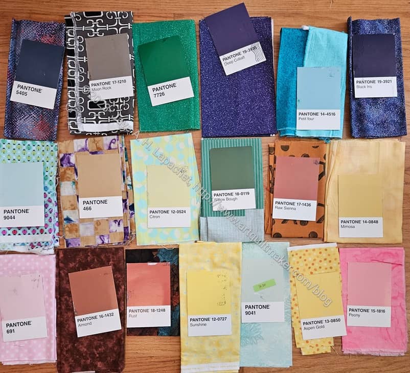
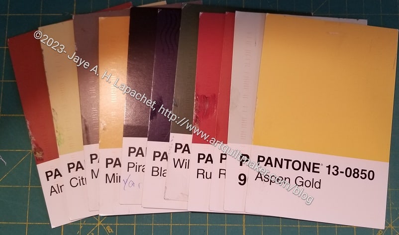
Before I started working on the Disco Double Zip Pouch last Sunday, I decided I needed to select some fabrics for The Pantone Project. I felt like I had about 20 cards, but I could only find 8.
I think I brought down at least 20 fabric boxes, which is always the thing that keeps me from picking out fabrics as the postcards arrive. It always ends up being fun, however and I seem to have a hard time remembering that. I always find fabrics that I remember buying, but had forgotten about.
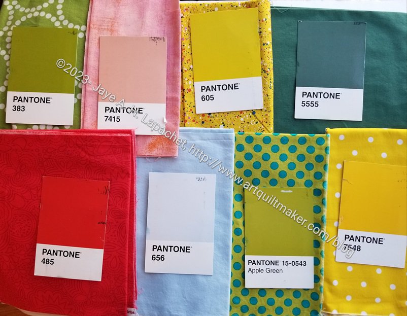
I was only able to choose the fabrics. I didn’t have a chance to make the blocks yet. I might be able to make them before the next Sew Day.
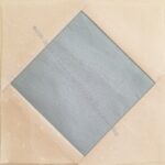
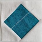
I am only a little sure about the Apple Green. The background is perfect, but I don’t know what the blue dots do to the overall effect.
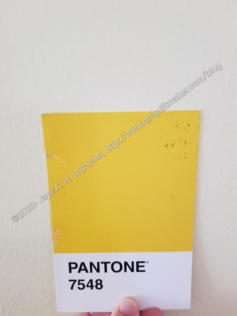
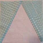
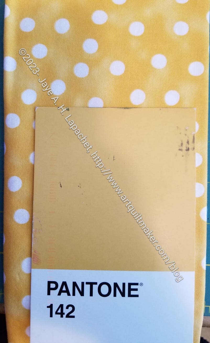
Friend Julie sent me another Pantone Project color postcard last week. On the reverse she wrote that she thought of the color as ‘butter’. I completely lost my mind. I started thinking I was in line for cataract surgery or something, because to me the color looked more like margarine.
As a result, I started running around the house taking photos. I know that all sorts of things -lighting, weather, etc – affect how the camera sees the color, but I have to say that the color in the photo (left) looks pretty true to the color on the postcard.
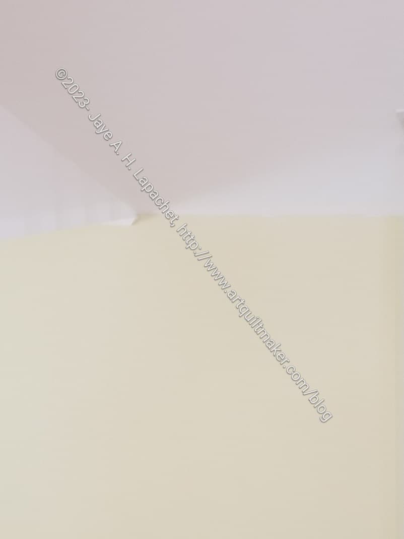
My living room has, what I think of as, butter colored walls. It was hard to tell unless I took a photo of the ceiling (white) and the wall (butter yellow). I was pleased to see that I could see a contrast.
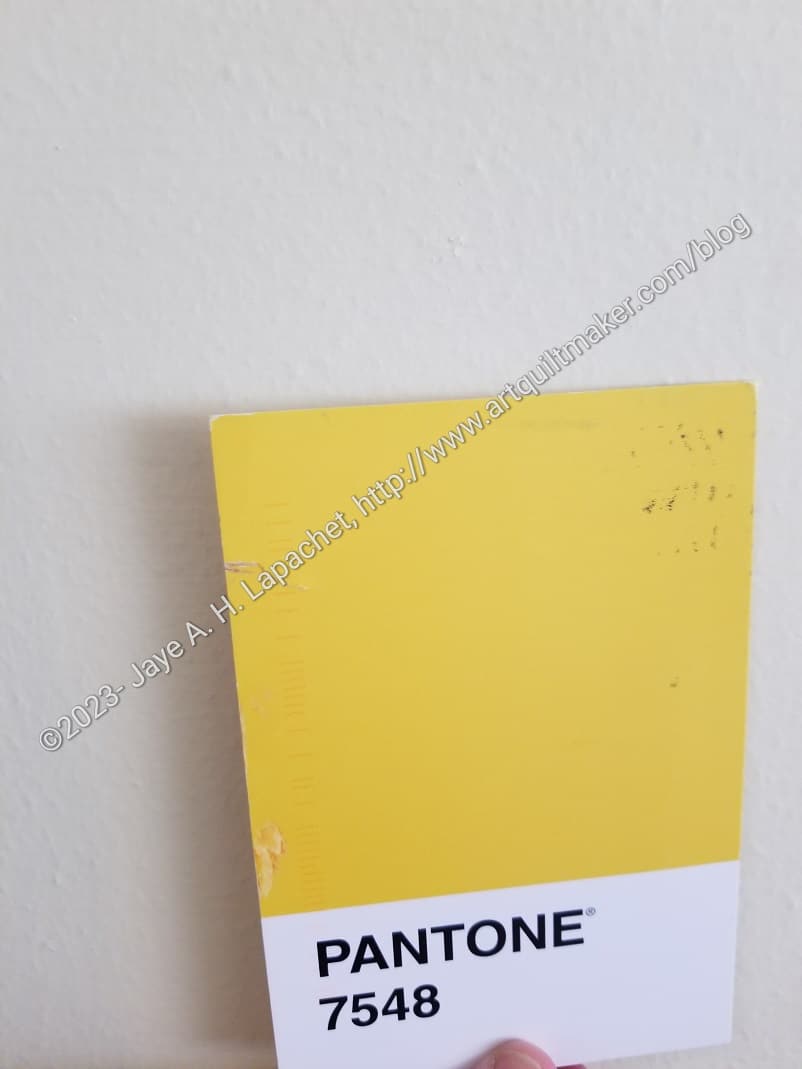
Then I took a photo of the Pantone postcard against the wall. I wasn’t thrilled with the way the paint looked in the second photo. The yellow/butter paint looked white compared to Pantone 7548, but what can a person do? I wasn’t about to set up studio lighting.
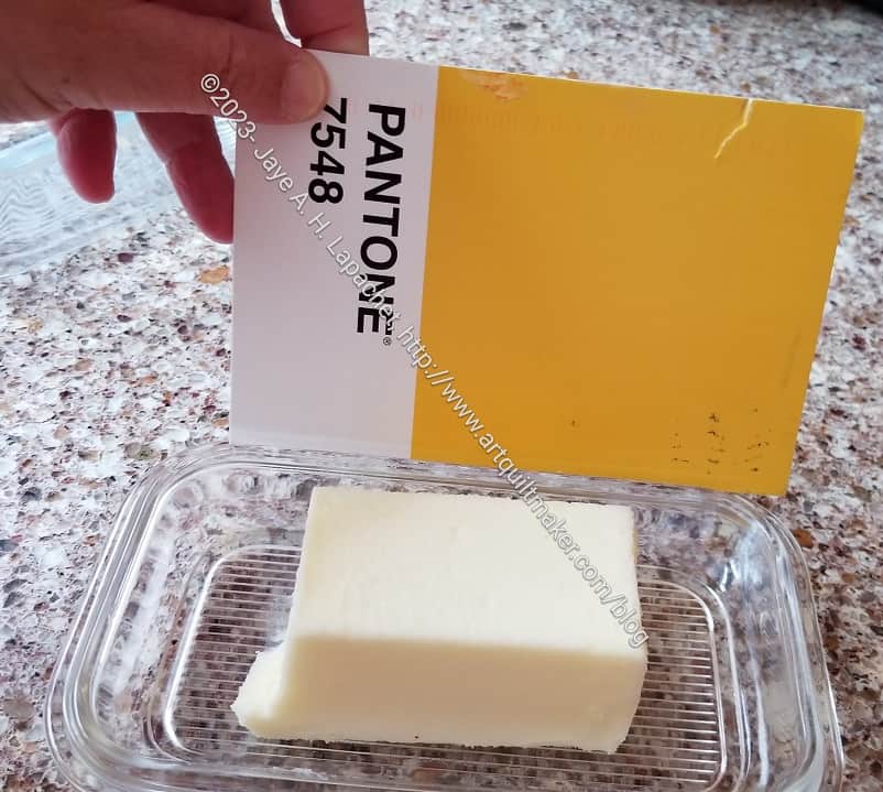
I actually have butter (as in the food), so I went into my kitchen and compared the postcard to actual butter. Unless I am in need of cataract surgery, I think the yellow in the postcard is brighter.
I don’t mind Friend Julie calling this butter. I am just glad I don’t have any eye problem at the moment.

One reason I am making so much progress, aside from taking the time to select the fabrics, is that I don’t mind the (almost) paperless foundation piecing as much as I mind regular foundation piecing.
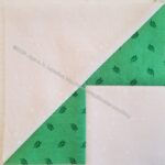
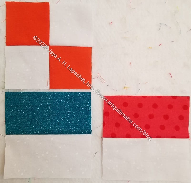
You can see also that the fabrics are relatively bright and cheerful.
Friend Julie has been diligently handing me groups of blocks whenever I see her.
Here is the latest batch. While it may look paltry compared to my bonanza, keep in mind that she has been keeping up and I haven’t. She gives me a few at a time whereas I procrastinate by making bags. I tried to work on a block or two during my lunch hours and after work. That works pretty well when I have the colors already matched to the postcards.
I took a break from making bags, Metro Twist and Scrappy Celebration to make some progress. Thus, I made some good progress over the weekend on making Pantone blocks.
I had already chosen quite a few fabrics, which made the task easier. Foundation piecing, not my strength, gave me pains on the first block.
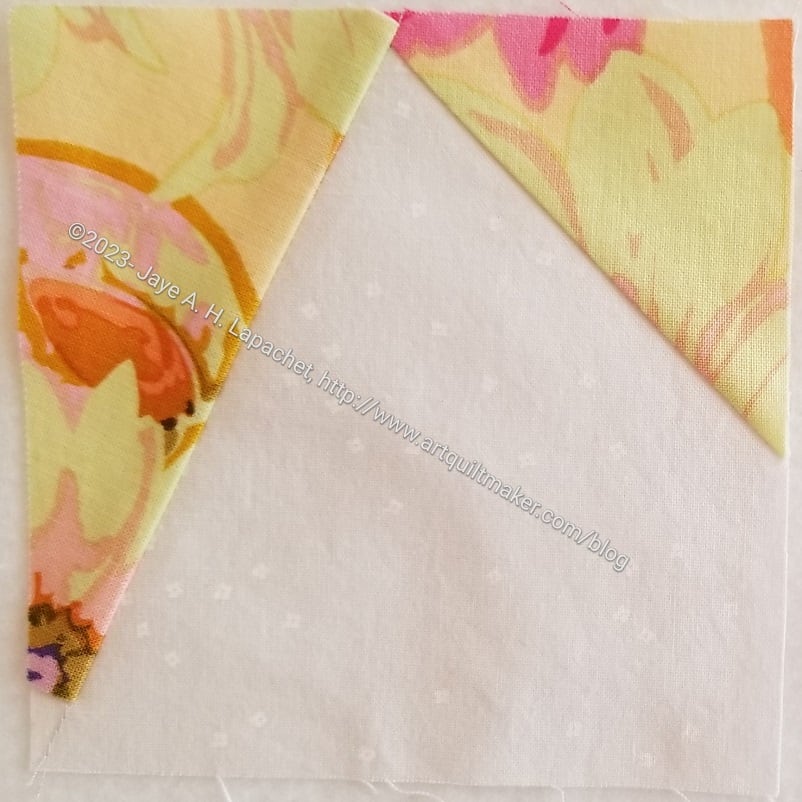
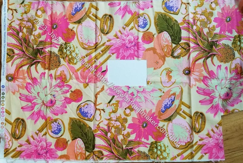
The background of this fabric, a Martha Negley fruit and floral print from a few years ago, was the right hue for Pantone 4545 (not all the colors have names. Some only have numbers, which is a little annoying). I only had a half yard of this fabric and these fruit and florals don’t always have a lot of background. In this case, I only had a few bits to work with.
Of course, I cut a piece that was the wrong shape (remember: foundation piecing needs backwards and upside down pieces), so I had to Swiss cheese cut the last bit of background. Sigh. Fortunately, I don’t have enough of this to use for a back or a bag, so it really shouldn’t matter. Still it is painful to see one of these prints with a hunk out of the middle. Fortunately, this project (and Friend Julie) are worth it.
As an aside, you know how Tula Pink is doing Deja Vu prints? I wish Free Spirit would do them for Martha Negley as well. Maybe I should start fan club for Martha? I love those fruit and veg prints.
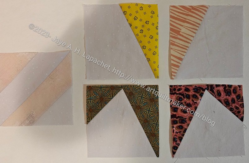
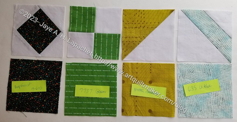
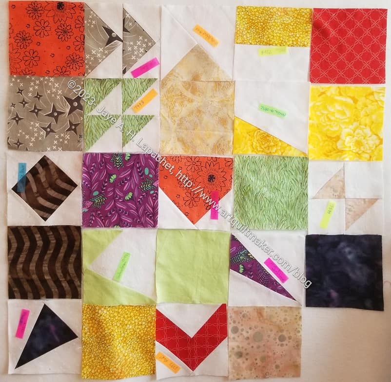
I went to town making blocks. I got into a rhythm that was only interrupted by not having selected anymore fabric. I thought I made a wider variety, but, looking at them like this, apparently not.
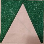
I was planning to make Flying Geese for Pantone 3985, a kind of olive green, but ran out of fabric. When I selected the fabric, I didn’t realize I only had about half of a fat quarter, so mid-block, I pivoted and made another Storm Center, which would work with the size triangles I had already cut.
I needed a template, so I cut the Pirate Black Storm Corner so I could use the triangles as a template, thus I ended up with four of these. In the grand scheme of the whole quilt it will be ok. It just looks a little odd now.
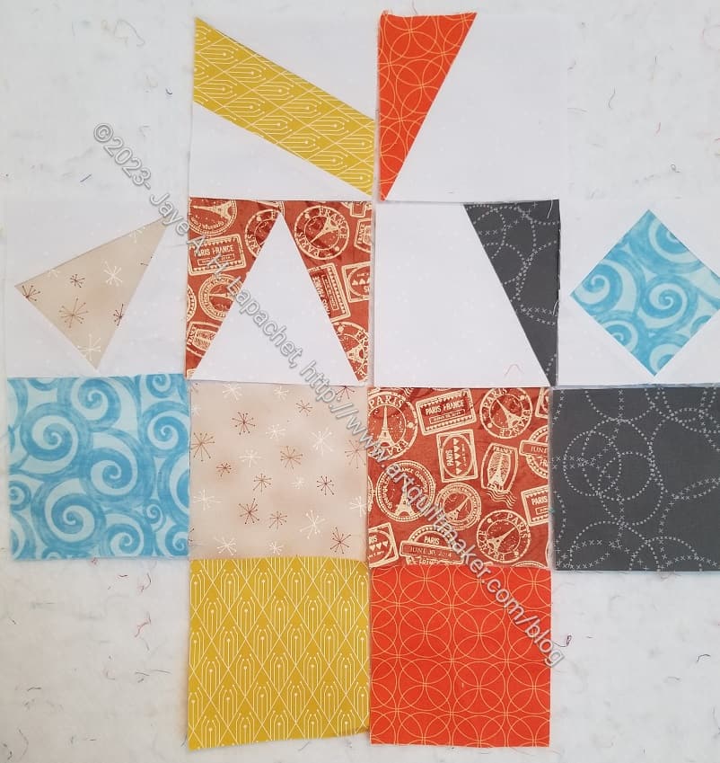
I suppose I shouldn’t have called this “August Progress” as it assumes I won’t make any additional progress, though I hope I do. I still have a number of colors to match and turn into blocks. Note they are all kind of dull, though looking at them like this reminds me they are not all beige.
I am also happy I made some good progress as I was feeling quite guilty at my tardiness. The hardest part of this project is selecting the fabrics. Aside from hauling the fabric bins down from the top of the fabric closet, the inks on the postcards seem to be different from the dyes used in fabric. I know that is true, however the actual hues and shades seem to be really different.
I received more Pantone blocks from Julie. Fortunately, I am not completely lame, because I have also been making some blocks for her.
I did not include the squares of fabric that came along with these blocks in the photo.
There are a nice variety and very cheerful, unlike the fabrics I have been selecting, which are dark and depressing.
Hooray! I finally made some Pantone blocks! I’ll be able to give some to Julie next time I see her.
Julie told me about foundation paper piecing where you don’t sew through the paper. I meant to have her show me at the last Sew Day, but somehow we didn’t get around to it.
As my stack of postcards grew, I knew I needed to do something, so I watched a video called My FPP (Foundation Paper Piecing) No Sew Paper Method and was able to get started.
WOW!
What a game changer! I might actually start to use FPP more.
I am not doing a tutorial right now, but might in the future. It would be a good technique to teach in my Sampler class.
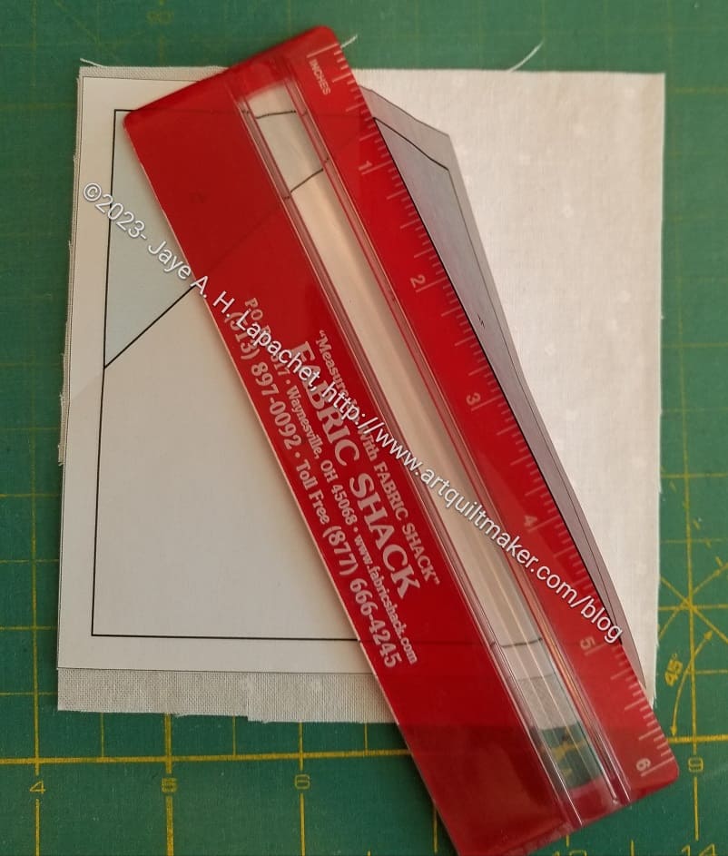
One of the keys is folding the paper back. The video I watched show using the Add-a-Quarter** ruler to fold the paper back. I have that ruler, but it didn’t work the way I expected. I have a very thin Bernina ruler I got somewhere and that worked very well for me.
I also have a thin plastic grid ruler**, which I haven’t tried that might work well also.
There are a few different videos on this technique. Julie said she uses this technique in a little different way, but that what it shows is basically the same.
One good thing about this technique is that I don’t have to print paper patterns all the time, use them once and then print another. Great reuse!!
**Obviously, you should shop at local quilt shops and small businesses. However, if you are too busy or can’t find what you need there, I use Amazon affiliate links and may be paid for your purchase of an item when you click on an item’s link in my post. There is no additional cost to you for clicking or purchasing items I recommend. I appreciate your clicks and purchases as it helps support this blog.
After the meeting on the weekend, I cleaned out the Chubby Charmer I take to the meeting and found a bunch of stuff leftover from Retreat in the bottom. Among the items was a bunch of Pantone Project blocks that Julie made. She must have handed them over at the Retreat.
This group looks very Fallish/Autumn-like to me.
I feel terrible that they have languished unremarked upon for weeks. My only explanation is that I left for a business trip only a few days after I returned from the Retreat and really didn’t do a great job of putting everything away.
I have some fabrics chosen for some blocks for Julie and I am determined to get some done.
I have decided (today) that waiting for a chunk of time to select fabrics for the Pantone Project isn’t getting selections made, which means I cannot make blocks for Julie. I think that if I select even one fabric I am much closer to handing more blocks over.
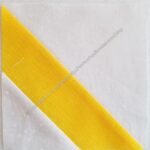
I am pretty pleased with the yellow selection. I know it doesn’t look exact int he picture, but the card is more of the same color in real life.
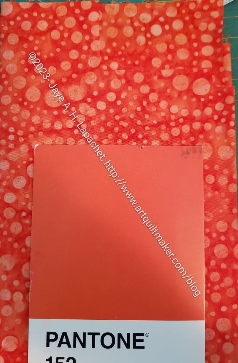
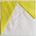
Last week, on my lunch hours, I selected one or two fabrics. This orange is also a better match in person.
Julie and I both acknowledge that this is more challenging than we thought it would be. Still, I think doing it in small chunks is worth a try. I hope I can make some progress using this strategy.
Julie and I meant to go over her technique for foundation paper piecing and we didn’t get around to it. That lack gives me a reason to get together with her soon.
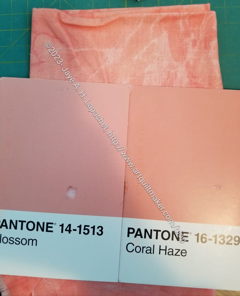
These two are pretty similar. I remembered this peachy fabric, but had to get it out to see which one works better. I think I will use this fabric for the Coral Haze and find something else for the Blossom.
I sat down and sewed a few more blocks for Julie. I also picked out more fabrics to make more blocks. I just haven’t made them yet.
I am really happy I made some progress, but annoyed I haven’t made MORE progress.
As I have said, it takes time to choose the fabrics. If I can do that, then sewing the blocks isn’t difficult. One thing at a time!
I received some more blocks from Julie a week or so ago.
These are the result of the postcards I sent to her. It is interesting to think about the choices I made and the result that I see in the blocks Julie made.
I can’t imagine how the blocks the blocks will come together as a whole but I am excited to see how they come together.
I have not made any other blocks since my last batch. I need to get one that.