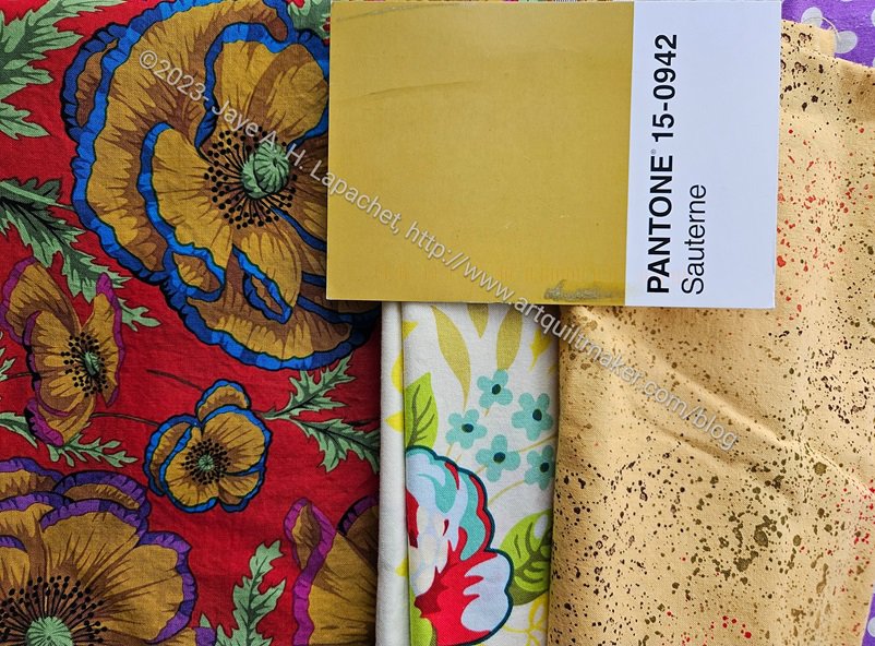
I received Sauterne with a heavy heart. Not for the message, which I always anticipate, but for the color. Another color I almost never use and never buy. Amazingly, I found a Philip Jacobs print with that color used for some flowers. It was almost perfect.
This print was the third one I found. The speckle gold is a good type to use for this project, but definitely the wrong color.
In the middle is a Heather Bailey print. Again, those tiny leaves right under the postcard are the perfect color, but so small. I didn’t think it was right.
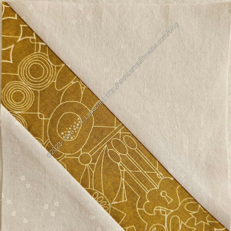
Finally, I found a 10×10 square (I wonder where that came from?) of an Alison Glass print that actually was the perfect color and also the perfect type of print – a tone-on-tone.
I received another postcard today, so back to the fabric closet for more hunting and gathering.
Ah, you made it work! I personally love that color and use it a lot as I love “jewel” tones. Looks especially nice against a cream as a neutral.
Thank you!
It is an odd color for sure, but you found two fabrics that worked. I like that AG print, I think I have it in another color.
I have it in a couple of colors. For some weird reason I only had a 10″ square. Maybe I once had a layer cake of all the fabrics?