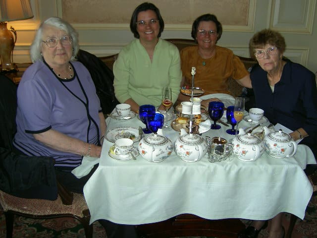
I came across this photo as I was perusing possible ColorPlay photos. In 2004 I went to afternoon tea at the Ritz with my mom, grandmother and mother-in-law. It was nominally for my grandmother’s birthday and one of the first times she had come to see me.
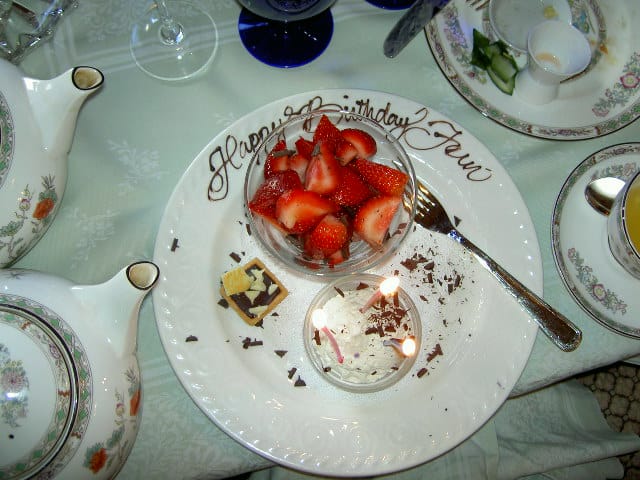
This was not a great photo choice as the colors aren’t the tropical paradise I like.
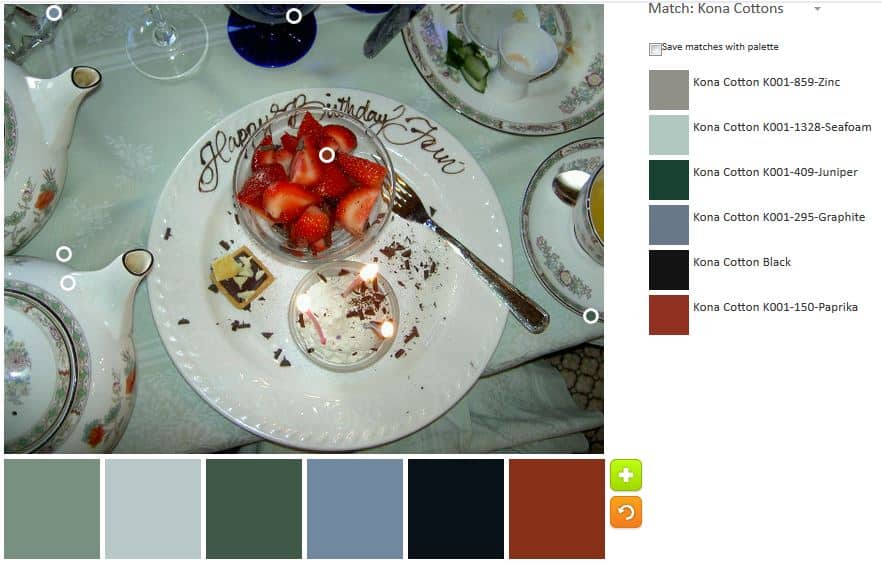
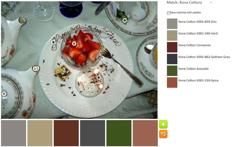
The default is more colorful than I expected. There are lots of dull colors, but that reddish-brown, Paprika, isn’t terrible.
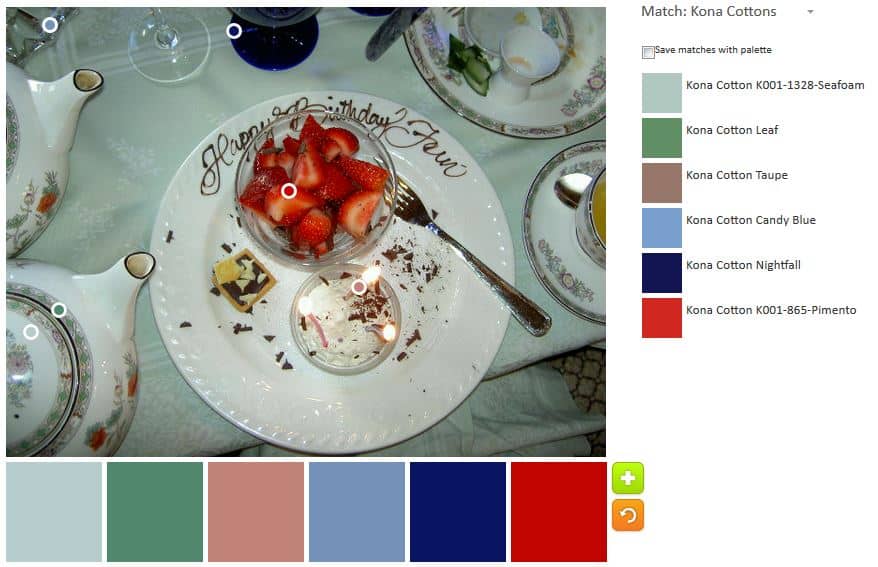
I moved the bubbles around slightly and came up with a slightly brighter palette. I don’t think the colors go together that well, but the Pimento and Nightfall look pretty nice.

Palette number 2 is where I gave in to neutrals. I didn’t want to do a monochromatic neutral palette out of the gate, but I admitted that most of the colors in the photo would be some kind of neutral.
Palette number 3 is a slight variation of palette number 2. More and darker neutrals.
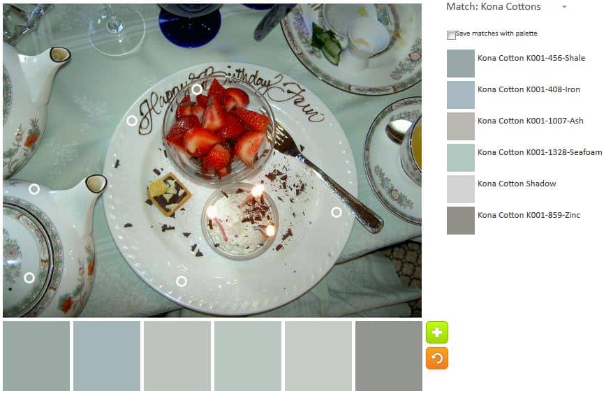
The grey palette is my monochromatic attempt.
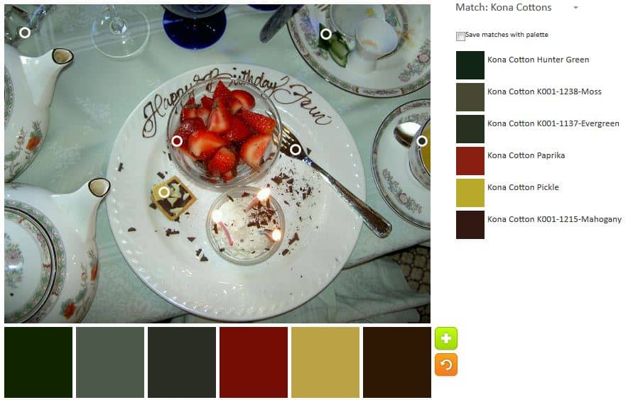
I thought I would finish up with palette n.4, but then I saw a bit of yellow and wanted to use that in a palette. The first attempt at adding the yellow resulted in Kona Moss. For whatever weird technological issue, I couldn’t get close enough to the edge to capture the yellow. I tried again and Pickle based on the little pastry on the plate. I was going for scarlett from the strawberries, but ended up with Paprika again.
Let me know what you think of these palettes and if you make anything.