Friend Julie has already started selecting fabrics and making blocks. I have just started with the most recent postcard she sent (Pantone #350, a VERY dark, almost black, green). I am behind and I have no excuse except I am quilting the Tarts, I finished Pies & Points and the Diagonal 9 Patch and I am working on clearing my to do list.
I needed a break while I was quilting the Tarts, so I started looking at fabrics.
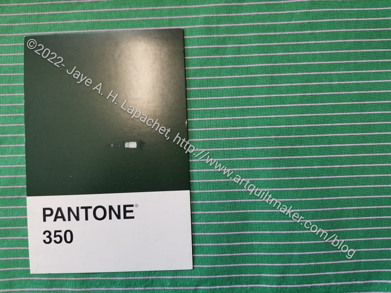
When I receive the postcard, I sometimes get an idea of the fabric I want to use. For this VERY dark, almost black, green I thought immediately of the Tula Tiny Dots and Stripes. On a break I got the striped fabric out, confident I would have one selected and compared the postcard with the fabric.
Bleah! Not dark enough.
No problem, what about the dots?
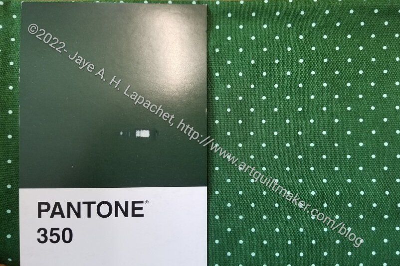
Better. Maybe a good enough option, but still not dark enough.
This was depressing and I started thinking about the greens I have. If I have a green this dark, it will be buried in a project box or at the bottom of some “old fabric” box, because the last time I may have used such a fabric was when I took the Mary Mashuta class on pushed neutrals. I also have a Tula solid that might work.
I put Pantone #350 aside for awhile. I had to file papers before I could climb up into the depths of my fabric closet to get at the old neutrals, so I took out the Pantone #14-1911, Candy Pink postcard. I knew there was a pink solid around that would be perfect.
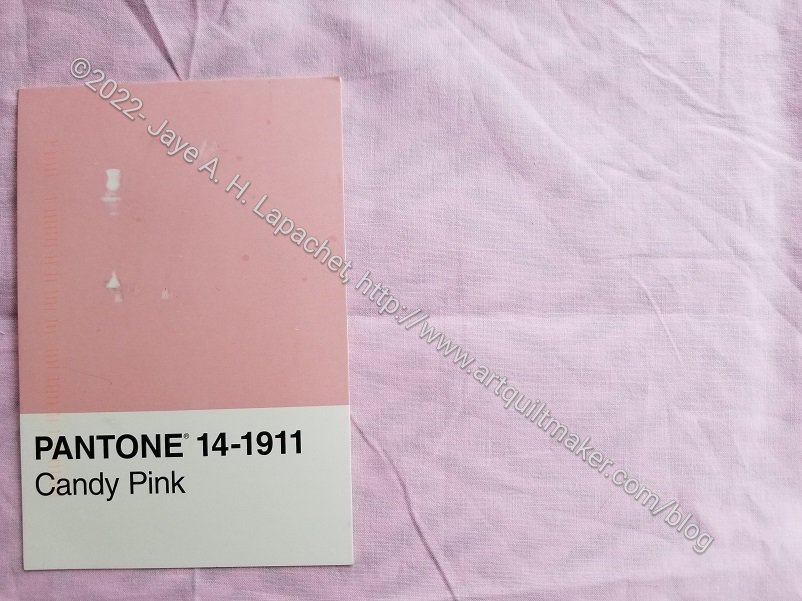
Wrong again. This is a great example of making visual decisions visually. Again, the pink might be good enough, but if you look at Julie’s selections, they are perfect matches. Sigh. More climbing up into the closet. I really don’t want to buy fabric for this project if I can avoid it.
I need to go file papers.