MQG Pincushion Swap Update

125 pincushions
125 pincushions

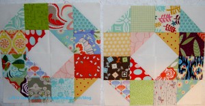
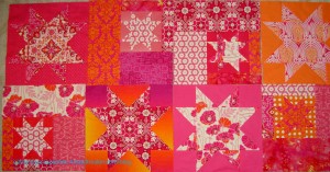
You might remember that I made a pincushion for a Modern Quilt Guild swap (and sent me into an orgy of pincushion making), which was organized by the Kansas Modern Quilt Guild. You can see the pincushions that were sent in to swap on Flickr. Not all of them are up there yet, so go back and look later.

The photo, left, was posted to the BAMQG Ning site (members only) by Adrianne. I tried to find the original source, but couldn’t, so I may swap it out, if I find it later. My pincushion is in the upper left hand corner a tiny bit in from the exact left.

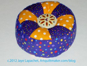
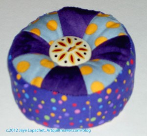
I love the creativity, but I have to say that I am pretty pleased with the way my pincushion turned out. It looks like a pincushion and is cute, but not cutesy, if you know what I mean.

I haven’t received a pincushion yet, but others in the guild have so I am waiting with bated breath.

Creative Prompt #187: Princess

Take 5 minutes to do any kind of artistic response: poem, doodle, quilt, pastel, pencil. ANYTHING counts. No rules; just do it!

Post the direct URL (link) where your drawing, doodle, artwork is posted (e.g. your blog, Flickr) in the comments area of this post. I would really like to keep all the artwork together and provide a way for others to see your work and/or your blog.

The Creative Prompt Project, also, has a Flickr group, which you can join to  post your responses. I created this spot so those of you without blogs and websites would have a place to post your responses.
Princess Diana

Pretty, pretty princess

Disney princess

Definition: Princess is the feminine form of prince (from Latin princeps, meaning principal citizen). Most often, the term has been used for the consort of a prince or for the daughters of a king or sovereign prince.

For many centuries, the title “princess” was not regularly used for a monarch’s daughter, who might simply be called “Lady” or a non-English equivalent. Old English had no female equivalent of “prince”, “earl”, or any royal or noble title aside from queen. Royal women, or women of the nobility, were simply addressed or referred to as “Lady” or “The Lady Firstname” for a particularly highborn woman.

As women slowly gained more autonomy and respect in European history, the title of princess became simply the female counterpart of prince; it does not necessarily imply being merely married to a prince.[citation needed] A princess may be a hereditary, sovereign, head of state in her own right.

The traditional meaning still applies in Europe in the sense that an untitled or at least non-royal woman who marries a prince will almost always become a princess with the possibility of eventually becoming Queen Consort, in nations where that title exists; but a man who marries a princess will almost never become a prince, unless his wife is expected to inherit the higher title of Queen regnant. If that is the case, then on her inheritance of that sovereign title, he will often become a prince (or remain one if he was already a prince).

In many of Europe’s royal families, a king would grant his heirs actual or theoretical principalities to train them for future kingship or to give them social class. This practice has led over time to many people thinking that “prince” and “princess” are titles reserved for the immediate family of a king or queen. In fact, most princesses in history were not immediate members of a royal family but rather women who married into it.

Princess Cruises

Princes (2006 movie)

Princess Kate

Princess Project

The Princess and the Pea

Princess Animal – SF Rock & Roll Craft Bar


26 Projects List – December Update

Yes, I rearranged the way this post was structured. You will get to see the year’s roundup soon, but I wanted to highlight the finishes on this list, too.

Finished projects that were on the list:

  1. Stars for San Bruno #2: Finished! YAY!
  2. Pavers. Finished! YAY!
  3. Kissy Fish: Finished! Yay!
  4. Stars for San Bruno #3: Finished! YAY!
  5. Food Quilt: Finished 5/24/2012. YAY!!!!
  6. Renewed Jelly Roll Race Quilt: Finished 9/9/2012 YAY!!!
  7. Whole Cloth Quilt: Finished 10/5/2012 YAY!!!
  8. Flowering Snowball: Finished 10/31/2012 YAY!!!

I came across last year’s end of year post and realized that I surpassed my previous goal of 9 quilts finished in one year last year when I finished 10 quilts. If I want to surpass another significant goal, I will have to finish at least 11 quilts this year. There is no hope for me now. Oh well, I did make a lot of progress on projects and that pleases me. I also had fun, which is the goal, right?

Still WIPs

  1. Aqua-Red SamplerFrances and I finished our fusible machine applique’ blocks and I am supposed to be preparing the next class on curves.
  2. The Tarts Come to Tea: I haven’t quilted on this since April 2011. I really do need to work on the quilting. I was making good progress and then got sidetracked. Quilting the Whole Cloth quilt sort of got me back in the swing of quilting, so perhaps there is hope for this piece.
  3. Garden: I started this piece in a class with Pamela Allen in 2006. I also used this piece for my beading demo for the 2012 EBHQ Voices in Cloth show (March 17). I made the facing and started to stitch it down. After stitching down the facing, I need to make a sleeve and finish about 2″ of blanket stitching that I noticed wasn’t complete.
  4. Pointillist Palette #4: Fourth is a series of 6 quilts; needs tiny square patches sewn together. Mrs. K. gave me more PP fabric and I won some from a giveaway. I think it is a sign that I need to work on this.
  5. See: needs satin stitching. Small, also a possibility for finishing.
  6. Self Portrait: started in 2006 at a class at Quilting Adventures in Richmond, Virginia. I like the piece, but don’t know where to go from where I am. Mouth? Hair?
  7. Spiderweb: Top is together, binding is made. I am working at ripping out the foundation paper (what a pain and what a mess!). I need to make a back and then take it to the quilter.
  8. Under the Sea: class project; like the design, but not the colors much.
  9. Flower Sugar Hexagon: sewed more hexagons together. Sewing Y seams is a bit of a chore, so I get tired of doing it after awhile.
  10. Young Man’s t-shirt quilt: have cut up the t-shirts and am still in the process of applying fusible. He cleaned out his drawers and found some more t-shirts to add to the quilt. Oh Yay! <– just a bit of sarcasm. He asked me again for another quilt, so I think this one is next in line. I plugged in his heating mattress pad, though, which should keep him quiet for a bit longer.

I still have a few more WIPs than I do finished projects. Again, I have made progress on clearing out old projects and I am pleased.

Ready for Quilting by Checkbook

  1. Original Bullseye: Top and back are finished. Needs binding and quilting. I think loopy feathers quilted in the border will set off the blocks fine.
  2. FOTY 2011: at the quilter, needs binding.
  3. Stepping Stones: at the quilter, made binding, which she will sew on for me and then I need to stitch down the binding.
  4. New: Wonky 9 Patch: needs quilting and binding. Not on original list
  5. Corner Store:  Finished quilting the middle and am preparing to work on the borders.
  6. New Super Secret Project #2: Top and back are made. It is ready to go to the quilter. Not on original list
  7. New: Super Secret Project: top, back and binding made. Ready to go to the quilter.  Stay tuned. 😉 Not on original list
  8. Infinity blocks: blocks sewn together into a quilt top, borders on. Back and binding made; ready to go to quilter.
  9. A-B-C (A-Z) BAMQG Challenge – top finished, back and binding finished. Ready for the quilter.

Abandoned

  1. Flower Garden: The flowers were too spiky. This is going to Pam for a cat bed.
  2. Pineapple: will remake blocks at a later time with more care.
  3. Moon and Stars: This quilt was barely a quilt and was not interesting. I realized I didn’t want to devote time to it. So, I finally just decided to give up and get it off the list. I will send it to Pam for a cat mat.

Hunting and Gathering

  1. Spin Wheel: really not started, but supplies gathered. Cutting fabrics as I go. TFQ does not consider this a UFO and made some good points to that end, which is why I have moved it to the Hunting and Gathering section. She says, and I have to agree, that quilts are not ‘projects’ until the sewing starts. OK. I’ll go with that.
  2. Windmill quilt: Still hunting and gathering.
  3. Stepping Stones #2 using Bonnie & Camille fabrics Bliss, Ruby, Vintage Modern: made two blocks, but still on back burner while I decide on the background colors.

I am pretty pleased. I have 8 projects off the list and 9 others with a definite plan.

I am still mulling over whether I want to continue this update into 2013. I, of course, want to create some kind of disposition for all of the quilts and projects on the list. However, I do want to think of a new focus for 2013 and I don’t want it to be the same focus year after year. Stay tuned while I decide.

Patchwork Wheels Possible Layout

Patchwork Wheel Comparison

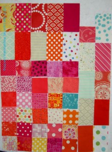
I am  redoubling my efforts to do good with fabric. To that end, I am thinking that I would like to finish the Patchwork Wheel blocks before Christmas and, thus, I need to think about layouts.

I mulled publicly sashing this piece in the last post and was pleased to receive an email from SherriD with her Photoshop handiwork allowing me to see the effects visually.

I like the space between the blocks that the sashing provides and I have plenty of Kona Snow to make sashing. I am not quite sure if Kona Snow will match the background used in the blocks, though, and that might be an issue.

The sashing-less version is much more chaotic, but it does look like roads winding through a town.

Thanks, again, to SherriD for taking the time to create this image for me.

Jelly Roll Race #2

Calm Top
Calm Top

I lost my mind again. I made another Jelly Roll Race despite the drama of the Renewed Jelly Roll Race.

“What were you thinking?????” is what I hear being screamed at me and you have every right to scream. No rending of garments or tearing of hair, please.

In certain respects, quiltmaking is an intellectual challenge for me. I want to know what makes the techniques tick, why fabric behaves the way it does and, often, what happens if….. The intellectual challenge in this case is to figure out how to make a Jelly Roll Race quilt not look terrible, to have some sort of control over what seems, essentially, to be an uncontrollable technique in terms of design.

In the back of my mind the little quilt voice was telling me to try the Jelly Roll Race technique again. It is hard to face that reality, but I have to. I don’t like failing at something unless I understand why and this is a mystifying technique.

Bali Pop Strip Set
Bali Pop Strip Set

I bought one of the Hoffman Bali Pops at PIQF (or shortly after, perhaps). I think that the first thing that makes a Jelly Roll Race more successful is to buy one with batiks. Batiks blend together really nicely and they have a depth that is subtle. I really liked the calming colors of this particular combination. I am not much of a beige person, but I was ok with the beiges in this collection, because they tended towards yellow or gold and went with the other the fabrics very well. I would buy this collection again. In fact, working with these colors and fabrics made me ask myself why I don’t buy more batiks. I don’t know if I could find the stock numbers of this particular collection and buy them all, though I suppose it is possible. I need to just buy more batiks.

TFQ was here and she arranged all the strips for me. It was very helpful, because I didn’t think to do it before hand, but really needed to do so.

Sewing LOOOOONG Seams

Why I say I lost my mind is that this type of quilt is a pain in the neck. I forgot how much thread this technique uses and how long the seams are. I went through at least 2 bobbins of Aurifil! Ironing the piece was stultifying! This technique is just plain tedious.

We did cut half of the strips in half, which made the process more tedious. I can’t say whether it made the top more interesting or not. I need more data to decide on that point.

I do think I had some success with this quilt top, though, so some tips:

  1. Use batiks or blendy fabrics.
  2. Arrange all the strips in the order you want to sew them. I suggest placing the same fabrics next to each other, so they don’t end up on top of each other.
  3. Add 2.5″x2.5″ square to the end of each strip. It adds interest to the quilt and helps move the eye around the design field.
  4. When you fold the first long strip in half to sew the halves together to start stacking the strips, don’t be afraid to adjust the strips so that the 2.5″ squares don’t butt up against each other right off the bat.
  5. Keep all the strips on the machine in one long chain until all the strips are sewn together. The way I did it was to sew the 2.5″ square to the strip, do the same for the next one. Continue. As soon as convenient, sew strip 1 to strip 2.
  6. Iron seams open, but fingerpress first. This method creates less bulk

Optional: cut the long strip into lengths of about 63″ and arrange them the way you want and then sew them together. TFQ’s idea was to sew a few strips together see how it was going and then rearrange them before sewing them all together. Good advice I didn’t take.

I may try this again despite the tedium of the long seams, because I made my husband do some math (will see about making it pretty and posting it sometime) to try and figure out how to keep like fabrics from butting up against each other as the rows are sewn together.

Last post on Jelly Roll Race quilts.

Pillowcases Help Kids at Sandy Hook

I saw this on Mark Lipinski‘s Facebook page. Thanks, Mark, for being in the loop and sharing this great opportunity.

Here is YOUR chance to help the families in Newtown…

Becky at Quliter’s Corner quilt shop in New Milford, CT is collecting pillowcases for the children at Sandy Hook School. She is trying to collect around 600. Please pass this message to any sewing friends. Pillowcases can be mailed to her at Quilters Corner, 312 Danbury Rd, New Milford, CT. 06776.

HOW TO MAKE EASY, FAST PILLOWCASES: http://yhoo.it/Uq5AHj

Here  is one way to help the students at Sandy Hook Elementary. I have written about pillowcases in the past. The pattern I like to use is the Twiddletails pattern. I like it because of the French seams, but the pattern can be a little tricky to understand.

What fun fabrics do you have that could help to brighten  a child’s day? I have some Mexican food fabric that is great for boys!

Patchwork Wheel Donation Blocks Continues

Patchwork Wheel #10
Patchwork Wheel #10
Patchwork Wheel #9
Patchwork Wheel #9

I am continuing to work on the Patchwork Wheel blocks. As I have said, I need 20 and I have about 12, so not much more work. There are a few seams in these so each one takes a bit of time.

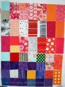
These are very bold blocks. I am just using the kits I was given. I may add some solids or some tone-on-tones to the last few blocks. I could scatter those as yet unmade blocks throughout the quilt top and perhaps they wouldn’t look too out of place.

In a way, this is my first truly modern quilt. I assume all of the fabrics are considered modern fabrics. I don’t know really as I am not an expert on modern fabrics.

The combination is really bold. The choices the person who prepared the kits made a lot of bold choices with these fabrics.

I’ll have to think about whether to put sashing between the blocks or preserve the interesting secondary source that is produced when the blocks are set right next to each other.

Patchwork Wheel Blocks

Twitter Power

I had the pleasure of being involved in a very sweet gesture recently.

You may know that the History Quilter lost her dad earlier this year. I am fortunate enough to still have my parents, so I can’t imagine her pain. Being a public figure like History Quilter generates a lot of empathy. That empathy generated a quilt for her from Melissa of Sew Bittersweet Designs, Shanna of Fiber of All Sorts and Jenna of Sew Happy Geek. Susan met all of these wonderful women via Twitter and her podcast.

Lower Left Corner
Lower Left Corner
Upper Right
Upper Right
Navy Star Variation
Navy Star Variation
Lower Right
Lower Right

In the strange quirks of the Internet world meeting the Real World, I met Melissa at a BAMQG meeting. She had the quilt and I offered to send it to Susan for her. Susan received it and loved it. How could she not?

It is such a sweet gesture and I am pleased to be a part of it.

Creative Prompt #186: Frosting

Take 5 minutes to do any kind of artistic response: poem, doodle, quilt, pastel, pencil. ANYTHING counts. No rules; just do it!

Post the direct URL (link) where your drawing, doodle, artwork is posted (e.g. your blog, Flickr) in the comments area of this post. I would really like to keep all the artwork together and provide a way for others to see your work and/or your blog.

The Creative Prompt Project, also, has a Flickr group, which you can join to  post your responses. I created this spot so those of you without blogs and websites would have a place to post your responses.

basic frosting recipe

butter cream

fondant

  • To be covered with a coating of Frost; also Frosted. This was the original and primary meaning of the term; most other usages are derived from it, directly or indirectly. Derived forms would include references to anything frost-like in appearance (see below).
  • Icing (food), the sweet glaze used in confectionery
  • Frosting (crime), a form of vehicle theft
  • Frosting (decorative arts), a motif in decoration of objects
  • froSTed, a pop punk band
  • Frosting (roofing), the effect of frost on mortar as result of freezing conditions, causing it to crack as the moisture in the mortar expands limiting the life of the roof
  • Frosting (Aerosol burn), Slang for the freezing of skin using an Aerosol spray.

Frosting appears a white, salt-like substance on the paint surface. Frosting can occur on any paint color, but it is less noticeable on white paint or light tints.


Star Sampler Tests

Star Sampler Background Tests

I was still not quite ready to start this project, but I did need to decide on the background.

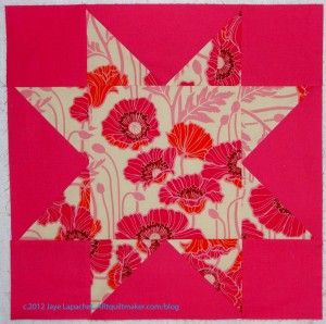
These two Sawtooth Stars are 4.5″ each. I used the Philip Jacobs print for the center and a couple of different background possibilities.

I really wanted the leaf print (right) from Simply Color by V&Co to work. I really like that print and wouldn’t mind having yards of it around. It would work with some of the solids I have chosen for the project, but, as you can see, with prints it would be a problem. I want the stars to be crisp and this print, sadly, makes the stars mushy.

I’ll put it on the back.

This conclusion meant that I needed to use the square dot print. I like it very much. It wasn’t what I expected to use, but I think I will like it. I wanted to do some more tests with some of the different fabrics, but the way manufacturers go through fabric lines, I had to get it quick before it was gone. The place I wanted to buy it was out, sadly ($4.20/yd!), but I found the amount I needed and am waiting for it to arrive.

The Garden Progresses

Garden front
Garden front

I said previously that I thought this piece was finished. I took it out on Friday in order to decide for sure and decided to put a facing on it and prepare the piece for finishing. The photo, left, shows the front with the facing applied by machine. I am sad that some of the edge detail was lost in the seam allowance. I’ll have to remember to plan better next time.

This piece didn’t need as much beading as the others I have done. I am not sure why. Laziness might be a factor, but the riot of color and fabric definitely draws attention to the elements of this piece. I don’t think it needs much detail to draw the viewer in.

I am a little sad about these small pieces. I really don’t have anywhere to display them, but would really like to have wally large enough to hang all of them.

Garden back
Garden back

I am particularly fond of the back. I used different colors to quilt and intended to cover up the back with a fake, but it looks so nice that I could barely stand to cover the edges with the facing.

Now I need to stitch down the facing and make the sleeve. I have a lot of cards to write for Christmas, so I don’t know if I will be able to finish this before the end of the year, but that is definitely my goal.

Now I feel like I can work on some of the other smaller pieces on the 26 Projects List. Perhaps I will do a blog post about each one as well?

Original Bullseye Top

Original Bullseye Top

I finished the borders for this Original Bullseye over last weekend (12/1). I thought for sure I would be able to finish the back as well, but the headache hangover kept me sewing at a snail’s pace. Also, I had to clear off the cutting table before I could sew.

For some reason, finishing this particular top makes me really feel like I have made true progress on the 26 Projects list.

This top has been hanging around so long (12 years!) that I know I am acting like I finished the whole quilt. I wonder how I will feel then!

Original Bullseye back

I got a bug in my ear to clear out some projects on Friday and made the back for this piece. I am pleased with it and think it matches. It isn’t really very special, but is interesting. As an added bonus my white on black bin has some space in it!

I have to say that I am resolved not to let projects languish for years. In the recent past, I think I have been plowing through projects once they get past the hunting and gathering stage and I hope to continue that practice.

Fortunately, I have friends with better memories than me. Julie wrote a nice overview of our Bullseye project and reminded me that I started this quilt in 2001. Last post on this subject.

Pincushions

Pincushions
Pincushions

I made a couple of pincushions for the raffle baskets that will be up for raffle at BAMQG.

I have decided that I enjoy making these pincushions, so there will be more in my future. I have more of the Sandy Gervaise fabric from the charm pack, so I will make at least one more of these. I have more roving and more pellets, so I think I will make even more from other fabric.

I don’t know if tickets will be available of meetings, but if so, I will let you know.

You might also be interested in my last post on pincushions.


Design Series: Size/Scale

This is a companion post to Sandy’s podcast. Be sure and listen to our discussion.

Size and Scale are an element of design

Size and Scale are related terms

Definition:

  •  “Size and scale are words used to describe the physical size that a shape or form has in comparison other shapes or lines within the design field.” (A Fiber Artist’s Guide, pg.98)
  • “The size of a work in relation to humans; the size of the elements within the work in relation to each other.” (Art+Quilt, pg.64)
  • “Proportion relates to how shapes interact with each other within a design.” (Adventures in Design, pg. 74)
  • “‘Scale and ‘proportion’ are related terms that both basically refer to size. Scale is essentially another word for size.” (Pentak & Lauer, pg.60)
      • “‘Large scale’ is a way of saying big and ‘small scale’ means small.” (Pentak & Lauer, pg.60)
          • “Big is meaningless unless we have some standard of reference. A big dog means nothing if we do not know the size of most dogs. This is what separates the two terms,” size and scale. (Pentak & Lauer, pg.60)
        • “Proportion refers to relative size, size measure against other elements or against some mental norm or standard.” (Pentak & Lauer, pg.60)
        • “…the scale of the pattern, that is, its size in relationship to the size of the pieces that are cut, will determine the impact of the pattern on the overall design of the quilt.” (Quilter’s Book of Design, 2d, pg. 80)

        Here are some general dictionary definitions of the terms we used in the podcast that you can mull over in your mind:

    Size (Merriam-Webster online dictionary):

    • Noun
      1. The relative extent of something; how big something is.
      2. A gelatinous solution used in gilding paper, stiffening textiles, and preparing plastered walls for decoration.
      Verb
      1. Alter or sort in terms of size or according to size: “some drills are sized in millimeters”.
      2. Treat with size to glaze or stiffen.
      Adjective
      Having a specified size; sized: “marble-size chunks of hail”.
      Synonyms
      magnitude – extent – dimension – measure – bulk

      Scale (Random House College Dictionary): a succession or progression of steps or degrees; a graduated series; an arrangement of things in order of importance.

      Proportion (Random House College Dictionary): the comparative relation between things or magnitudes; a proper or significant relation between things or parts; relative size or extent.

      Ratio (Random House College Dictionary): the relation between two similar magnitudes in respect to the number of times the first contains the second.

      Using Size:

      • “The principle of scale in a work of art is all about the volume of the message you wish to send to your viewer.” (Art+Quilt, pg.64)
      • “The scale of a work of art in relation to the viewer, its human scale, is often” one of the first considerations an artist makes.” (Art+Quilt, pg.64)
        • where will it be displayed? the atrium of a large office building or the foyer of a private home? (Art+Quilt, pg.64)
      • Elements in a design that are larger seem close. (Pentak & Lauer, pg.176)
      • Elements of a design that are smaller seem farther away. (Pentak & Lauer, pg.176)
      • Elements of a design that are larger seem more important, conversely elements of a design that are smaller seem less important. (Pentak & Lauer, pg.176)
        • I don’t want you to get the idea that small is unimportant. A small amount of yellow in a purple quilt can make all the difference to the overall design.
      • “Scale and proportion are closely tied to  emphasis and focal point. Large scale, especially large scale in proportion to other elements makes for an obvious visual emphasis.” (Pentak & Lauer, pg.60)
      • “Unusual or unexpected scale is arresting and attention getting. Sheer size does impress us.” (Pentak & Lauer, pg.61) Magnifying something that is usually quite small can capture your attention through sheer surprise. A butterfly wing that fills the entire frame gains significance as you see extraordinary details seldom noticed in everyday life.” (Art+Quilt, pg.65)
        • Georgia O’Keefe is an example of an artist that uses this technique. (Art+Quilt, pg.65)
      • “An unnatural contrast of scale in your quilts can also be used to achieve interesting effects. Surrealists such as Salvador Dali used wildly confused internal proportions to intentionally create uneasiness in the viewer. One element that is purposefully out of scale with other elements within the quilt will attract the viewer’s attention and become a focal point.” (Art+Quilt, pg.65)
        • if you want to exaggerate a shape, “have some visual continuity between the shapes.”(Adventures in Design, pg. 75)
      • Think about the relative sizes of pieces in a quilt. It is important to vary sizes to add interest. (Fearless Design, pg. 32)
        • think about piecing the same blocks in different sizes in order to add interest to your quilt.

Using Ratio

Using ratios really has to do with proportion. The Fibonacci sequence has to do with ratios of objects to one another on the design field. “One powerful way to help your design evolve to its highest potential is to select the width and height dimensions that promote the natural movement of your design….select your dimensions based on a ratio that best suits your design. Observing your design’s directional flow and focus gives you a starting point to sort through your options.” (Adventures in Design, pg. 77)

      • “1:1 ratio is a perfect ratio for designs that radiate symmetrically from a center point….if your design is 24″ high in this ratio, it will also be 24″ wide.” (Adventures in Design, pg. 77)
      • “A 1:2 ratio provides added width to a horizontal design or it extends height to a vertical design. In this ratio, the longer dimension is twice as long as the shorter dimension. If you want one dimension to be 24″ wide, the other dimension would be double that – 48″ high.” An example of this ratio is Poulnabrone Dolmen (Adventures in Design, pg. 77)
      • The 1:3 ratio provides more lengthwise extension than 1:2 ratio. “In this ratio, one dimension is three times greater than the other dimension. This gives more room for the design to expand in one direction. Thus if you want one dimension of your design to be 24″, the other dimension would be 72″.” An example is a quilt called Acid Rain by Gloria Loughman. This ratio has allowed a “dynamic sky to evolve in her quilt.” (Adventures in Design, pg. 77)
      • “A 1:4 ratio greatly exaggerates the length of a design. One dimension is four times greater than the other dimension. If you want your 24″ high design to have an extreme horizontal extension, the 1:4 ratio would give you a width of 96″.” An example is Rhododendrons over Water by Amanda Richardson of Cornwall England  (Adventures in Design, pg. 77)
      • ” The 3:4 ratio is best used when a design has only slightly more movement in one direction than the other. In a 3:4 ratio, a design that is 24″ in one direction would be 32″ high in the other direction”…. Joen Wolfrom says that “the 3:4 ratio should be saved for such occasions when your design does not need much expansion in one direction or the other.” Example is Ticondrroga Star by Larisa Key, Willimatic, CT. (Adventures in Design, pg. 77) I use this ratio quite a bit, especially for block quilts, because I think it adds interest to the layout.
      • “A 2:3 ratio allows for more extended directional movement than a 3:4 ratio does. It doesn’t exaggerate the length as much as the 1:2, 1:3, and 1:4 ratios do. ” (Adventures in Design, pg. 77) If you have 24″ high quilt, your quilt’s width would be 36″. (Adventures in Design, pg. 78) Example is Fishermen’s Widows by Anna Faustino
      • The Golden Mean or 8:13 ratio is considered to be “the most beautiful, pleasing dimension for art and architecture…It provides beautifully balanced dimensions”, because of the subtle dimensional change. “The Golden Mean is a component of the Fibonacci sequence.” (Adventures in Design, pg. 81)   If you have 24″ high quilt, your quilt’s width using the 8:13 ratio would be 39″. (Adventures in Design, pg. 78) You can find a calculator for Golden Mean ratios at: http://goldenratiocalculator.com/ and there is a chart in Adventures in Design pg.81. An example of a quilt using the Golden Mean Ratio is Pamela Mostek’s Five Apples.

Notes:

        • A designer can use relative sizes to give a feeling of space or depth. Artists have taken this basic idea and exaggerated it by increasing the size differences. It is very common to many periods and styles of art to use different scales. (Pentak & Lauer, pg.176)
        • “In past centuries visual scale was often related to thematic importance. The size of the figures was based on their symbolic importance in the subject being presented… This is called hieratic scaling.” (Pentak & Lauer, pg.60)
        • “Private spaces are perfect for small, intricately stitched works and allow for a more intimate experience with the art.” (Art+Quilt, pg.64)
        • “When your entire field of vision is occupied by a work of art you can’t help but pay attention to it. ” (Art+Quilt, pg.64) [ Georges-Pierre Seurat’s Sunday Afternoon on the Island of La Grande Jatte]
        • “The most renowned proportional number sequence is the Fibonacci sequence“…”The Fibonacci sequence begins as 0, 1, 1, 2, 3, 5, 8, 13, 21, 34, 55, 89, 144, and so on. Each successive number in this sequence is the sum of the previous two numbers. You can use small or large sections of this sequence to determine the dimensions of elements within a design.”… “The Fibonacci sequence highlights the strong relationship between mathematics, nature and art. (Adventures in Design, pg. 76)

          Fibonacci sequence from WolfieWolfgang.com
          Fibonacci sequence from WolfieWolfgang.com

The images denoting the Fibonacci sequence are fairly common. I imagine you will say “oh, of course! I have seen this!” when you see the spiral. Nautilus shells are also used as examples of the Fibonacci sequence. As we mentioned in the podcast, nature uses the Fibonacci sequence in its design field frequently. By doing a search on the term and looking at images, you will be amazed at the trees, flowers and other natural phenomena that include the Fibonacci sequence.


Resources:

Art+Quilt

Design Basics, 5th, c.1999, David A. Lauer, Stephen Pentak

Golden Ratio Calculator: http://goldenratiocalculator.com/

Painting by Numbers: the Fibonacci sequence in art by Curtis Belmonte and Conor Pappas