During my recent trip to the East Coast, I stayed in a hotel while attending a work meeting. I saw the carpet and thought it would make a great quilt, recolored, of course.
I like the simple design.
There is interest even though the design includes just squares, using different sized squares and subtle changes in “color.”**
I can see this design with a solid background and a variety of bright colored something fabrics for the squares. Prints or solids would both work. I was thinking about it, designing this in my head and then I saw….
Modern Quilts, Winter 2015
almost the exact same design in Modern Quilts, the Winter 2015 issue. I couldn’t believe it.
Back to the drawing board.
**Nota bene: color in this instance is generous as I consider color to be something I can actually see. 😉
Recently Frances posted on Twitter about the name of a block. She posted the picture of a quilt. I didn’t see the thread until several people had chimed in and Nonnie had tried to draft the block. There are three tools I use to find the names of blocks:
Barbara Brackman’s book, Encyclopedia of Pieced Quilt Patterns, published by the American Quilter’s Society, 1993. I have the reprinted edition. This book is out of print, so you should buy it where ever you see a good used copy.
Blockbase, an electronic version of the Encyclopedia of Pieced Quilt Patterns.
Brackman’s book is the original scholarly block dictionary. It was not the first block dictionary, but it was the first book, that I know of, that attempted to organize blocks into families/type and note their origin.
Beyer’s book went much farther, but, clearly, built off Brackman’s book. There are more references to sources, more drafting information and more of an attempt to group blocks in the Quilter’s Album of Patchwork Patterns.
Grecian Cross Notecard
BlockBase is a wonderful tool for actually drafting blocks and printing templates or rotary cutting directions. However, not all of the information from the Brackman book is included in BlockBase. Many of the blocks have only the Brackman number rather than all of the names. I make an effort to amend the notecards in BlockBase as I come across new or additional information that would improve retrieval. For example, a very common name of the block above is Grecian Cross. This name was listed in the Brackman book, but was not in BlockBase, so I added it.
It is helpful to know something about drafting to use any of these tools. By ‘drafting,’ I mean knowing the basic structure of blocks, e.g. is the basic structure a 4 patch or a 9 patch? The reason this is important is that if you only have a picture of the block, it cuts down on the number of blocks you need to look through if you know the basic structure.
Sadly, using patterns all the time does not foster the understanding of the basic structure of blocks, because the quiltmaker only needs to follow the directions of the designer/patternmaker.
Knowing a block’s structure is also helpful in designing quilts of your own. You may not want to mix 9 patch structured blocks with 4 patch structured blocks as the seam lines won’t always line up nicely. Or you may want to look a a variety of different 16 patch blocks so that you can design a quilt with an interesting secondary pattern.
These tools are not only good for looking up block names, but are also good to learn to understand the structure of blocks, get inspiration for new quilts and see how the authors have colored the quilts. You really need these books, if you have any serious interest in quiltmaking beyond buying fabric and making quilts.
You might notice that blocks have different names. People took blocks and republished them under different names or added a line here or divided a square there and deemed it a new block. This phenomenon is still happening today and it is something of which we just need to keep track.
Gradation is a principle of design, but it is not included in all books about design.
If gradation had an opposite, it would be contrast.
Definitions:
Gradation refers to a method if creating the elements by using a series of gradual changes in those elements. Unlike contrast, which stresses sudden changes in elements, gradation refers to a step-by-step change.” For example, gradual changes from a dark to light value, or from large to small shapes would be called gradation. (Deer Creek High School Principles of Design)
An idea that is expressed by a smooth flow of colors, size, shape, etc from one part of the continuum to the other. (The Nature of Design)
“Gradation of size and direction produce linear perspective. Gradation of of color from warm to cool and tone from dark to light produce aerial perspective. Gradation can add interest and movement to a shape. A gradation from dark to light will cause the eye to move along a shape.” (John Lovett)
Gradation definition, any process or change taking place through a series of stages, by degrees (definition from Dictionary.com)
“Refers to a way of combining elements by using a series of gradual changes. Examples of gradation:
1. gradually from small shapes to large shapes (an example is Ann Johnston’s quilt, Seven, which you can see on pg. 94 of The Quilter’s Book of Design.
2. gradually from a dark color to a light color
gradually from shadow to highlight ” (Newton K-12)
Examples:
You gradation to express depth. If you want to show a long road, put a line of trees next to it with the largest closest to you and the rest in ever diminishing size to the horizon.
Gradation of shading on a circle produces a ball that looks 3D for the eye.
Notes:
“Understanding that gray lies between black and white gives us an idea of what lies between light and dark. When we think about the value gradation of any given color, we can imagine it in its darkest form as having black added and in its lightest form as having white added.” (A Fiber Artist’s Guide to Color and Design, pg.104)
gradation is very common in solid fabrics. If you look at the Kona color card, you will see excellent examples of gradation from one color to another.
“Gradation is most often used with the Design Element Color. But with a little bit of thought Gradation can applied to the six other Design Elements as well.
Line – A gradual change from perpendicular to curved.
Direction – A gradual change from vertical to horizontal.
Shape – A gradual change from angular to round.
Size – A gradual change from small to large.
Texture – A gradual change from smooth to rough.
Value – A gradual change from light to dark.
Gradation is the Principle that banishes boredom from your work. It adds movement to otherwise boring areas. I consider ti one of the most useful Design Principles and one of the most easily applied. ” (Fine Art America Blog, Dec 21, 2009)
“Unless you are looking to create a sense of chaos or absence, you must learn to manage the contrasts present in your artwork so as not to overwhelm or bore the viewer.” (A Fiber Artist’s Guide to Color and Design, pg.102)
It is the “placement of varying elements, including color, within a design.” (A Fiber Artist’s Guide to Color and Design, pg.198)
Types of Contrast:
In this section, you might want to have a color wheel handy.
Emphasis by contrast: we talked about this when we talked about emphasis and focal point, so you can go back and review that episode, but I want to bring it up again from a different angle: the contrast angle rather than the emphasis angle. When you have a prevailing design scheme and one element contrasts with that design scheme, that element becomes the focal point, because it is in contrast to the rest the of the piece. (Pentak & Lauer, pg.48-49)
Contrast of scale: “Unusual or unexpected scale is arresting and attention getting. Sheer size does impress us.” (Pentak & Lauer, pg.61) Seeing something far larger than other elements of a composition provides scale contrast and visual interest.
Contrast of Hue: ” …easiest contrast to attain by simply using pure, intense, undiluted colors. This contrast is greatest when using the primary color combination of red, yellow and blue.” (A Fiber Artist’s Guide to Color and Design, pg.103)
Light/Dark Contrast: using black and white is the boldest contrast obtainable. (A Fiber Artist’s Guide to Color and Design, pg.104)
Cold/Warm Contrast: the color combination of red orange versus blue green is the strongest cold/warm contrast. … The contrast of temperature is very effective when trying to depict depth, the concept of near and far or three dimensionality.” (A Fiber Artist’s Guide to Color and Design, pg.105)
Complementary Contrast: “…gives a sense of equilibrium to the eye of the viewer. The pairs of colors that lie opposite each other (look on your color wheel) on the color wheel have a diametric* contrast to each other. They complete one another, but can also cancel each other out. … Complementary contrasts are”, generally considered “pleasing to work with and offer the artist the opportunity to hone his or her skills in creating balance.”(A Fiber Artist’s Guide to Color and Design, pg.106)
Simultaneous Contrast: “… is perceived by the viewer rather than being objectively present. … When a pair of direct complements are used together in their pure hues, exclusive of any other part of the color scale, the line where the colors meet will look as though it is moving. This happens because the colors are contrasting off each other at the same time. Our eye has a hard time discerning where one intensity begins and the other ends, thus causing the sense of movement or ‘sizzle’.” (A Fiber Artist’s Guide to Color and Design, pg.107)
Contrast of Saturation: “…refers to the contrast between pure, intense colors and dull, diluted colors. Saturation can be diluted in four basic ways – the addition of white, black, gray or a color’s complement.” The purity of the color is changed, but also the inherent temperature, brilliance, behavior, and emotional response. (A Fiber Artist’s Guide to Color and Design, pg.108)
Contrast of Extension: “… is the contrast between space and size using two colors, one light and pure and the other dark or dull.” Shapes will look larger or smaller depending on the brilliance of the colors and how much two colors contrast with each other. (A Fiber Artist’s Guide to Color and Design, pg.109) A sharp contrast in color can give a small object more significance in a large space. (The Quilter’s Book of Design, pg.9)
Contrast of Value: Often the key to the success of a strong design. “When there are many colors present, it is harder to judge value, but it is critical to be able to see value changes in a color composition and employ them to the advantage of the design. Two different colors with the same value in a composition can have less contrast or impact than two different values of the same colors.” (The Quilter’s Book of Design, pg.47)
Notes:
Art is at its best when the contrasts included provide managed, well-balanced interest in such a way so as not to fatigue the participants. There are at least 7 types of contrast, many of which have to do with color, but not all. You can have contrast of big and small, for example in your quilt as well (A Fiber Artist’s Guide to Color and Design, pg.102)
” Each art form has its own type contrast.” (A Fiber Artist’s Guide to Color and Design, pg.102)
Book or movie: good vs evil
recipe: contrasts of sweet and salty
Woven shawl: smooth and nubby fibers
Unity is enhanced when variation and contrast are included in the design. “…the design’s interest is strongest where contrast exists and the unity is broken.” (Adventures in Design, pg.99)
Example: Galaxy (quilt) by John Flynn of Billlings, MT, 2003: http://bit.ly/Kp3kRt
“The strength of the design lies in the contrast, not in the repetition. That being said, the design needs its repetitive features to create unity,” (Adventures in Design, pg.99) but the repetition allows the contrast to exist.
We are really getting into principles and elements working together. Have any of you had a hard time trying to work with just one principle or element?
If contrast in size is combined with a contrast in color, a focal point becomes even more obvious.” (The Quilter’s Book of Design, pg.29)
Last weekend was the CQFA meeting. I mentioned this project briefly when I talked about Attack of the Hexies.
Caroline taught a workshop using Susan Carlson’s techniques from her Serendipity Quilts book.
To start we got an email with prep instructions and when I finally got a minute (work really gets in the way of my quiltmaking!) I started getting the materials I would need together. One of the items was Drawing of simple object, ( Think little kid’s coloring book.)
I have one coloring book left from when I was a kid and couldn’t find it. I did find my old stained and leaded glass pattern books. Those drawings are simple enough and I perused them. Two stuck out for me. One was in the book and one was a drawing, probably a tracing of an image from another book, I had done that was stuck in the book. No attribution on the second one, nothing. If you have an Ed Sibbett, Jr book with the image below, please send me the citation. I do want to attribute it properly.
I decided to do them both, one at a time, but both. I have been lamenting, in my head, the fact that I haven’t been doing much art quiltmaking lately, which seems kind of lame, considering the name of this blog. I tell myself that all of my other quilts are ‘color work’, but I might be fooling myself. I do work a lot on color, but….
Stained Glass image
This image shows the first piece I will work on. the idea is to use scraps to make up the image. Everyone was working on it at the meeting and I was ‘in process.’
I will use pink for the hair and blue for the roses. I will probably use one piece of fabric for the face. It will not be green, but other than that I don’t know what color it will be. I might do the eyelash in embroidery.
According to Caroline, our workshop leader, the first step was to transfer the image to fabric. My actual first step was to enlarge the image. The original was smaller than 6×6 and I wanted to do something a bit larger. It is now in the 20×16″ range. It was a painful process, but I finally figured out how to do it and went ahead to the transfer-to-fabric stage.
Design on fabric
I used a piece of the linen colorway of an Art Gallery solid. I still had some left even after using bunches on the Flower Sugar Hexagon (Attack of the Hexies) quilt top. I simply traced over the printout with a Sewline pencil. It worked like a charm when I was able to keep the fabric in the right place over the printout.
My next task is to remind myself of the rules of light and dark: “if I put a light in a front piece of hair, will it look closer or farther?” and then I will get to it. I have the scraps already chosen and am eager to get to work.
I suppose I could check more thoroughly to see if I have Susan Carlson’s book, too.
Well, it has been awhile since Sandy and I were able to get together, but we are back in the saddle. We worked on a new Design Series episode last week. You should be able to hear all about Emphasis/Focal Point today!
You can find the other episodes and companion blog posts by searching the Design Series tag.
_______________________________________________________
I have dominance listed separately in my outline for this series of podcasts, but we cannot really talk about Emphasis and Focal Point without talking about dominance, so consider this episode related to the upcoming episode on Dominance.
Definitions:
An emphasized element of your design is a focal point (Pentak & Lauer, pg.46)
“Emphasis creates a focal point in a design; it is how we bring attention to what is most important. Emphasis is what catches the eye and makes the viewer stop and look at the image. Without emphasis, without getting the viewer to look at the image, communication cannot occur.” (The Elements and Principles of Design, pg. emphasis)
This can happen pretty easily with standard block quilts. If you have nothing to draw the attention, e.g. you use the same fabrics for each block and the size of the blocks is all the same, you may have nothing in the quilt to create a focal point.
Emphasis can be achieved through the use of color, value, intensity, size & scale as well as other design elements.” (Color & Design, pg. 125)
Emphasis gives “interest to one entity or area over others present in a design field, however a focal point is not always formed.” (Color & Design, pg. 125)
Focal point: “attracts viewer as a point of emphasis, encourages viewer to look farther.” (Quilter’s Book of Design, pg. 154)
“A focal point results when one element differs from the others. Whatever interrupts an overall feeling or pattern automatically attracts the eye by this difference:
when most of the elements are dark, a light form breaks the pattern and becomes a focal point
when almost all the elements (whether light or dark) are vertical, a diagonal element is emphasized
In an overall design of distorted expressionistic forms, the sudden introduction of a naturalistic image will draw the eye for its very different style
when many elements are about the same size, similar but unexpectedly smaller ones become visually important
when the majority of shapes are rectilinear and angular parallelograms, round shapes stand out
the list could go on and on…
a change in color or a change in brightness can immediately attract our attention.” (Pentak & Lauer, pg.48)
Emphasis on Isolation (Source: strose.lunaimaging.com via Jaye on Pinterest)
Using Emphasis/Focal Points:
“An unnatural contrast of scale in your quilts can also be used to achieve interesting effects. Surrealists such as Salvador Dali used wildly confused internal proportions to intentionally create uneasiness in the viewer. One element that is purposefully out of scale with other elements within the quilt will attract the viewer’s attention and become a focal point.” (Art+Quilt, pg.65)
If you have a large Mariner’s Compass in the middle of a quilt, the Mariner’s Compass will be the focal point.
“A problem for the quiltmaker is how to achieve both variety and unity. Just adding different elements to the composition may destroy its unity. Adding elements that are similar, but different from each other, can add interest without upsetting the unity of the whole. If one of the variations of the chosen elements is in high contrast to the rest of the piece, it can create a focal point. ”
(as an aside, I don’t mean that you are only allowed to use contrast as a focal point; the author means using something to differentiate that area or section from the rest of the piece) (The Quilter’s Book of Design , pg,27)
Emphasis by Contrast: “Very often in art the pictorial emphasis is clear, and in simple compositions (such as a portrait), the focal point is obvious. But the more complicated the pattern, the more necessary or helpful a focal point may become in organizing the design.” (Pentak & Lauer, pg.48)
Emphasis by Isolation: an element alone in part of a design immediately gets our attention even if there are many of the same shape in another part of the design. (Pentak & Lauer, pg.50)
“…a focal point that is too close to an edge will have a tendency to pull the viewer’s eye right out of the picture.” (Pentak & Lauer, pg.50)
Emphasis by Placement: “If many elements point to one item our attention is directed there, and a focal point results. A radial design is a perfect example of this device” (Pentak & Lauer, pg.52)
Imagine a Mariner’s compass with a Fleur de Lis in the center circle.
Emphasis by Value: “Value contrast can be used to create a focal point in the composition. High contrast will attract the viewer’s attention.” (The Quilter’s Book of Design, pg.66)
Structure: There are four different major types of structure. (you might remember this from a brief overview we did in the Balance segment)
Focus Structure: Focus structure has to do with placing elements of a design in such a way that the eye of the viewer focuses on it. You create focus by establishing the difference between the featured shape and its setting. (Adventures in Design, pg.117)
Circular Structure: “… a central design is the main focus and everything else plays a lesser role, accentuating the beauty of this central design.” In this structure, the artist must ensure that there is “enough continuity between the inner focus and the outer support so that the eye can move throughout the design.” Circular structure uses a circular design “skeleton to move the eyes around the design in a clockwise manner.” (Adventures in Design, pg.118)
Triangular Structure: The basis of your design, in a triangular structure, is a triangle (Adventures in Design, pg.119)
L Structure: In an L structure “the major design focus should be along one of the arms of the L.” The best placement in this kind of structure is to place the major focus close to the intersecting point of the L.” (Adventures in Design, pg.119)
Horizontal and vertical structure: use a “horizontal or vertical line as your structure. This directional structure can be used over the entire design surface” (Example is Layers of Time by Sylvia Naylor- see it on pg. 38 in Adventures in Design or a Chinese Coins quilt design) (Adventures in Design, pg.119). One of the ‘coins’ in a Chinese Coins quilt would have to stand out in some way (be fatter than the others, be a wildly different color, etc in order for this structure to be used to focus attention on one part of the quilt.
Rule of Thirds (Source: http://photoinf.com/Golden_Mean/Michael_Fodor/Photo_School_-_Rule_of_Thirds/ruleofthirds.jpg)
Rule of Thirds: Joen Wolfrom says “The rule of thirds is an easy way to find a focus range. Simply divide your design into thirds, horizontally & vertically. Four intersecting points will appear. Place your” focal point “in the vicinity of the most appropriate intersecting point.” (Adventures in Design, pg.117) I think you need to place your focal point where it helps you to communicate the message you want to get across to your viewers.
Notes:
“A focal point, however strong, should remain related to and a part of the overall design… In general, the principle of unity and the creation of a harmonious pattern with related elements is more important than the injection of a focal point if this point would jeopardize the design’s unity.” (Pentak & Lauer, pg.54)
“Giving dominance to, or emphasizing one design element or area will counteract confusion or the risk of monotony.” (Color & Design, pg. 125)
A definite focal point is not a necessity in creating a successful design. It is a tool that artists may or may not use, depending on their aims.” (Pentak & Lauer, pg.56)
“How does the designer catch a viewer’s attention? …Nothing will guarantee success, but one device that can help is a point of emphasis or focal point. This emphasized element initially can attract attention and encourage the viewer to look further.” (Pentak & Lauer, pg.46)
“You create focus by establishing the difference between the featured shape and its setting.” (Adventures in Design, pg.117)
“In past centuries when pictures were rare, almost any image was guaranteed attention. Today,…all of us are confronted daily with hundreds of pictures. We take this abundance for granted,” and have even trained ourselves (sometimes unknowingly) to filter out imagery that is unpleasant or distracting, “but it makes the artist’s job more difficult. Without an audience’s attention , any message, any artistic or aesthetic values, are lost.” (Pentak & Lauer, pg.46) This is why I rail a bit on drawing the viewer of your quilt into the design field and then rewarding them with small stitches or beadwork as a result of looking closer. At a quilt show, you need to get people to look at your quilt in the midst of hundreds of them.
There can be more than one focal point. Sometimes secondary points of emphasis are present that have less attention value than the focal point. These are called accents.” “…the designer must be careful. Several focal points of equal emphasis can turn the design into a three-ring circus in which the viewer does not know where to look first.” (Pentak & Lauer, pg.46)
“…provide a variation in order for our eyes to be attracted to the focus area.” (Adventures in Design, pg.117)
“Scale and proportion are closely tied to emphasis and focal point. Large scale, especially large scale in proportion to other elements makes for an obvious visual emphasis.” (Pentak & Lauer, pg.60)
“Emphasizing one element or letting one area dominate others sends an invitation tot he viewer to come in and take a closer, longer look at the work.” (color & Design, pg. 125)
Exercise:
Type “focal point” examples into Google or your favorite search engine and look at the images. As you look at the images, try and figure out what the focal point is.
I got sucked into Anna Maria Horner’s blog the other day as I do when the VIMH#1 wants to come out to play. I was reading about the death of her mother, then her latest pregnancy and found a post about composing a quilt for one of her daughters. She writes
“That particular Kokka piece on the right above not only captured almost the entire palette of the quilt, but the print itself feels like a patchwork so I left it in large whole blocks. I considered the direction I would orient the piece for a while though, in other words, what colored edge of the piece would be adjacent to what other piece of the quilt. When you have a single piece that varies so much within the print, this becomes pretty important, and that decision can really take the whole composition in various directions.“
I am especially interested in the line where she writes “I considered the direction I would orient the piece for a while though, in other words, what colored edge of the piece would be adjacent to what other piece of the quilt. ” I agree that this is important and she says it so well. This concept or idea has been on my mind since I began working on those tiny 4″ Sawtooth Star blocks. I wrote about it in an early Star Sampler blog post. I wrote “I want the stars to be crisp and I don’t want the colors of the fabric in the stars to bleed into the background.” It is the same idea, though AMH takes it a bit farther in that she is using larger pieces and going with the way the fabric is colored in informing her composition.
While this may be a small thing, I find it often important to think about whether fabrics are bleeding into the background and whether I want that look. If your composition wants the fabrics to merge, you can get a soft, smudgy look. It is easier to blend fabrics into each other when they are already merging into one another.
If you want a crisp look, it is important to make the background very different from the foreground pieces. The forethought will make the piece look crisp and defined.
Negative space is part of Design, but neither an element or principle. It could be included in the lesson on Form or Space, but Sandy and I have chosen to talk about it separately. Be sure to listen to the Episode 114 of Sandy’s podcast, Quilting… for the Rest of Us. where we discuss this topic.
Definitions:
In many basic drawing classes, students learn that there are three basic elements of a composition: the frame, the positive and the negative space. The positive space is easiest to understand. Generally, it is the space occupied by your subject. Conversely, negative space is the space that is not your subject. (Artinspired wiki, Positive & Negative Space page)
Positive Space is created by objects that are seen as a main element appearing to be in front of the background.
Negative Space “is the space between an object, around an object, but is not part of the actual object itself. It is the opposite of an identifiable object which can at the same time be used to help define the boundaries of positive space.” (http://www.tutorial9.net/articles/design/enhancing-your-art-with-negative-space/)
The concept of positive and negative space are also called “figure” and “ground”. (Pentak & Lauer, pg.150)
“Negative space, in art, is the space around and between the subject(s) of an image. Negative space may be most evident when the space around a subject, and not the subject itself, forms an interesting or artistically relevant shape, and such space is occasionally used to artistic effect as the “real” subject of an image. ” (http://favbulous.com/post/627/the-art-of-negative-space-illustration)
think about the design that appears when you put blocks together and get a secondary design.
If you have 4 identical white rectangles and 4 identical black squares and place the white rectangles horizontally in front of you and put the black squares on the white rectangles in different places on top, you will: (Pentak & Lauer, pg.150)
notice very different visual effects “caused solely by its placement within the format” (Pentak & Lauer, pg.150)
notice that the location of the black shape immediately organizes the empty (white) space into various shapes (Pentak & Lauer, pg.150)
Notan
“Notan is a Japanese word meaning dark-light. The word, however, means more than that. The principle of Notan as used here must further defined as the interaction between positive (light) and negative (dark) space. The idea of this interaction in Notan is embodied in the ancient Eastern symbol of the Yang and the Yin, which consists of mirror images, one white and one black, revolving around a point of equilibrium. Here the positive and negative areas together make a whole reality. In the Yang and the Yin symbol…opposites complement, they do not conflict. Neither seeks to negate or dominate the other, only to relate in harmony. It is the interaction of the light and the dark, therefore, that is most essential.” (Notan, pg.6)
YinYang from cut-the-knot.org (http://www.cut-the-knot.org/pythagoras/YinYangBisection.shtml)
We, as Westerners, have issues understanding the harmonious relationship of the light and the dark, because of our cultural heritage. “The Western culture thinks in terms of opposed dualities and attaches the moral values of good to the positive, of bad to the negative. Or we seize upon the positive as the only reality and dismiss the negative as invisible and non-existent.” (Notan, pg.6)
Remember, again, the secondary design that can pop up unexpectedly when 4 blocks are put together. You don’t want something ugly where your blocks meet. This is kind of the premise of Notan. Thinking of the whole design is the key rather than just the positive space.
Confusion and Trickery
Franz Kline’s White Forms (http://www.moma.org/collection_images/resized/436/w155h170crop/CRI_203436.jpg)
“Sometimes positive and negative shapes are integrated to such an extent that there is truly no visual distinction.”In Franz Kline’s White Forms, “we automatically see some black shapes on a background. But when we read the artist’s titles, White Forms, suddenly the view changes, and we begin to focus on the white shapes, with the black areas now perceived as negative space. The artist has purposely made the positive/negative relationship ambiguous. (Pentak & Lauer, pg.154).
“In most paintings of the past, the separation of object and background was easily seen, even if the selected areas merged visually. But several twentieth-century styles literally do away with the distinction. We can see that the subject matter of the painting,” Pablo Picasso’s Daniel-Henry Kahnweiler, “is a figure. Despite the cubist abstractions of natural forms into geometric planes, we can discern the theme. But it is difficult to determine just which areas are part of the figure and which are background. The artist, Picasso, also broke up the space in the same cubist manner. There is no clear delineation of the positive from the negative.” (Pentak & Lauer, pg.154-155). In Georges Seurat’s Silhouette of a Woman, the Black Bow and The Artist’s Mother (Woman Sewing), (late 1800s, not 20th century, not a Cubist) the positive and negative spaces meld so much as to confuse the mind as to which is which.
Some artists play with the reversal of positive and negative space to create complex illusions. The prints of M. C. Escher … often feature interlocking images that play with our perception of what is foreground and what is background. Other artists take these illusions of positive and negative images to even greater lengths, hiding images within images. Perception of form and shape are conditioned by our ingrained “instinct” to impute meaning and order to visual data. When we look at an image and initially form an impression, there is a tendency to latch on to that conclusion about its meaning, and then ignore other possible solutions. This may make it hard to see the other images. Training the eye to keep on looking beyond first impressions is a crucial step in developing true visual literacy.” (Art Design & Visual Thinking http://char.txa.cornell.edu/language/element/form/form.htm)
Above star is a great use of negative space. Flipping the negative space to positive. See below for homework on this block.
Notes:
In a picture, the shapes that the artist has deliberately placed are considered the positive shapes. The spaces around the shapes are the negative spaces. It is just as important to consider the negative space in a picture as the positive shapes. Sometimes artists create pieces that have no distinction between positive and negative spaces. M. C. Escher was a master at creating drawings where there was no distinction between positive and negative space. (Skaalid, http://www.usask.ca/education/coursework/skaalid/theory/cgdt/shape.htm)
A good artist realizes that the space surrounding an object (positive space / shape / mass / etc) is just as important as that object itself. Negative space helps define a subject, and brings balance to a composition.
The placement of one shape – a positive figure or foreground – creates another, a negative figure or background. The placement of a shape organizes the empty space around it into more shapes. (The Quilter’s Book of Design, 2d, pg.62)
“Negative space, or whitespace, is a powerful design element which impacts both the aesthetics and usability …; too little and the design feels cramped, too much and related page elements can become disconnected.” (Wayne Moir website: http://www.waynemoir.com/notebook/asides/negative-space-in-design/)
“It is important to remember that both elements have been thoughtfully designed and planned by the artist. The subject is the focal point, but the negative areas created are equally important in the final pictorial effect.” (Pentak & Lauer, pg.150)
With three dimensional art [forms], such as a sculpture, one can see how the object occupies space by walking around it, looking from above, below or from the side. Three dimensional objects have height, width and depth. With two dimensional art [like a quilt], the arrangement of objects on the design field can be crowded with lots of objects or nearly empty with very few objects. These design elements have height and width, but no depth. (A Fiber Artist’s Guide to Color and Design, pg.130)
“Negative shapes are also an aspect of letter design and typography.” (Pentak & Lauer, pg.150) People design fonts so they look good on the page – the right amount of space between letters and lines, etc.
The artist usually wants some back-and-forth visual movement between the positive shapes and the negative” space. “An unrelieved silhouette of every shape is usually not the most interesting spatial solution.” Generally, depending on the message you, as the artist, wants to convey, breaking the “background” into “areas of value that lend interest as well as better positive/negative integration” will make for a better design. (Pentak & Lauer, pg.152)
Swoon Secondary Design
I have highlighted the part of my design that is the unintended secondary design. It is less prominent, because of the variety of backgrounds, but still marked enough to pay attention and make some definite decisions about.
Photocopy or print famous paintings in black and white. Look at the negative and positive spaces and notice their shapes. The following are specifically mentioned in Pentak & Lauer: Georges Seurat’s Silhouette of a Woman, the Black Bow and The Artist’s Mother (Woman Sewing), but you can use any. Try to find one or two with simple lines.
Cut 4 2.5×2.5″ black squares, cut out 4 2.5″x4.5″ white rectangles. Arrange the black squares on the white rectangles in different ways and notice the way the negative space is organized. (See above)
See how the negative space is affected with different iterations of this block. Make the block above with:
one solid fabric where the scrappy fabrics are located
different solid fabrics in the same color range, e.g. all blues. Tone-on-tones would work, too.
change where the colors are with where the background is
the same type of fabric layout, then quilt the center with a complex pattern that has its own design, such as a feathered wreath, in white thread to see whether the center Sawtooth Star is still negative space
the same type of fabric layout, then quilt the center with a complex pattern that has its own design, such as a feathered wreath, in colored thread to see whether the center Sawtooth Star is still negative space
This is a companion post to Sandy’s podcast. Be sure and listen to our discussion.
Size and Scale are an element of design
Size and Scale are related terms
Definition:
“Size and scale are words used to describe the physical size that a shape or form has in comparison other shapes or lines within the design field.” (A Fiber Artist’s Guide, pg.98)
“The size of a work in relation to humans; the size of the elements within the work in relation to each other.” (Art+Quilt, pg.64)
“Proportion relates to how shapes interact with each other within a design.” (Adventures in Design, pg. 74)
“‘Scale and ‘proportion’ are related terms that both basically refer to size. Scale is essentially another word for size.” (Pentak & Lauer, pg.60)
“‘Large scale’ is a way of saying big and ‘small scale’ means small.” (Pentak & Lauer, pg.60)
“Big is meaningless unless we have some standard of reference. A big dog means nothing if we do not know the size of most dogs. This is what separates the two terms,” size and scale. (Pentak & Lauer, pg.60)
“Proportion refers to relative size, size measure against other elements or against some mental norm or standard.” (Pentak & Lauer, pg.60)
“…the scale of the pattern, that is, its size in relationship to the size of the pieces that are cut, will determine the impact of the pattern on the overall design of the quilt.” (Quilter’s Book of Design, 2d, pg. 80)
Here are some general dictionary definitions of the terms we used in the podcast that you can mull over in your mind:
Size (Merriam-Webster online dictionary):
Noun
The relative extent of something; how big something is.
A gelatinous solution used in gilding paper, stiffening textiles, and preparing plastered walls for decoration.
Verb
Alter or sort in terms of size or according to size: “some drills are sized in millimeters”.
Treat with size to glaze or stiffen.
Adjective
Having a specified size; sized: “marble-size chunks of hail”.
Synonyms
magnitude – extent – dimension – measure – bulk
Scale (Random House College Dictionary): a succession or progression of steps or degrees; a graduated series; an arrangement of things in order of importance.
Proportion (Random House College Dictionary): the comparative relation between things or magnitudes; a proper or significant relation between things or parts; relative size or extent.
Ratio (Random House College Dictionary): the relation between two similar magnitudes in respect to the number of times the first contains the second.
Using Size:
“The principle of scale in a work of art is all about the volume of the message you wish to send to your viewer.” (Art+Quilt, pg.64)
“The scale of a work of art in relation to the viewer, its human scale, is often” one of the first considerations an artist makes.” (Art+Quilt, pg.64)
where will it be displayed? the atrium of a large office building or the foyer of a private home? (Art+Quilt, pg.64)
Elements in a design that are larger seem close. (Pentak & Lauer, pg.176)
Elements of a design that are smaller seem farther away. (Pentak & Lauer, pg.176)
Elements of a design that are larger seem more important, conversely elements of a design that are smaller seem less important. (Pentak & Lauer, pg.176)
I don’t want you to get the idea that small is unimportant. A small amount of yellow in a purple quilt can make all the difference to the overall design.
“Scale and proportion are closely tied to emphasis and focal point. Large scale, especially large scale in proportion to other elements makes for an obvious visual emphasis.” (Pentak & Lauer, pg.60)
“Unusual or unexpected scale is arresting and attention getting. Sheer size does impress us.” (Pentak & Lauer, pg.61) Magnifying something that is usually quite small can capture your attention through sheer surprise. A butterfly wing that fills the entire frame gains significance as you see extraordinary details seldom noticed in everyday life.” (Art+Quilt, pg.65)
Georgia O’Keefe is an example of an artist that uses this technique. (Art+Quilt, pg.65)
“An unnatural contrast of scale in your quilts can also be used to achieve interesting effects. Surrealists such as Salvador Dali used wildly confused internal proportions to intentionally create uneasiness in the viewer. One element that is purposefully out of scale with other elements within the quilt will attract the viewer’s attention and become a focal point.” (Art+Quilt, pg.65)
if you want to exaggerate a shape, “have some visual continuity between the shapes.”(Adventures in Design, pg. 75)
Think about the relative sizes of pieces in a quilt. It is important to vary sizes to add interest. (Fearless Design, pg. 32)
think about piecing the same blocks in different sizes in order to add interest to your quilt.
Using Ratio
Using ratios really has to do with proportion. The Fibonacci sequence has to do with ratios of objects to one another on the design field. “One powerful way to help your design evolve to its highest potential is to select the width and height dimensions that promote the natural movement of your design….select your dimensions based on a ratio that best suits your design. Observing your design’s directional flow and focus gives you a starting point to sort through your options.” (Adventures in Design, pg. 77)
“1:1 ratio is a perfect ratio for designs that radiate symmetrically from a center point….if your design is 24″ high in this ratio, it will also be 24″ wide.” (Adventures in Design, pg. 77)
“A 1:2 ratio provides added width to a horizontal design or it extends height to a vertical design. In this ratio, the longer dimension is twice as long as the shorter dimension. If you want one dimension to be 24″ wide, the other dimension would be double that – 48″ high.” An example of this ratio is Poulnabrone Dolmen (Adventures in Design, pg. 77)
The 1:3 ratio provides more lengthwise extension than 1:2 ratio. “In this ratio, one dimension is three times greater than the other dimension. This gives more room for the design to expand in one direction. Thus if you want one dimension of your design to be 24″, the other dimension would be 72″.” An example is a quilt called Acid Rain by Gloria Loughman. This ratio has allowed a “dynamic sky to evolve in her quilt.” (Adventures in Design, pg. 77)
“A 1:4 ratio greatly exaggerates the length of a design. One dimension is four times greater than the other dimension. If you want your 24″ high design to have an extreme horizontal extension, the 1:4 ratio would give you a width of 96″.” An example is Rhododendrons over Water by Amanda Richardson of Cornwall England (Adventures in Design, pg. 77)
” The 3:4 ratio is best used when a design has only slightly more movement in one direction than the other. In a 3:4 ratio, a design that is 24″ in one direction would be 32″ high in the other direction”…. Joen Wolfrom says that “the 3:4 ratio should be saved for such occasions when your design does not need much expansion in one direction or the other.” Example is Ticondrroga Star by Larisa Key, Willimatic, CT. (Adventures in Design, pg. 77) I use this ratio quite a bit, especially for block quilts, because I think it adds interest to the layout.
“A 2:3 ratio allows for more extended directional movement than a 3:4 ratio does. It doesn’t exaggerate the length as much as the 1:2, 1:3, and 1:4 ratios do. ” (Adventures in Design, pg. 77) If you have 24″ high quilt, your quilt’s width would be 36″. (Adventures in Design, pg. 78) Example is Fishermen’s Widows by Anna Faustino
The Golden Mean or 8:13 ratio is considered to be “the most beautiful, pleasing dimension for art and architecture…It provides beautifully balanced dimensions”, because of the subtle dimensional change. “The Golden Mean is a component of the Fibonacci sequence.” (Adventures in Design, pg. 81) If you have 24″ high quilt, your quilt’s width using the 8:13 ratio would be 39″. (Adventures in Design, pg. 78) You can find a calculator for Golden Mean ratios at: http://goldenratiocalculator.com/ and there is a chart in Adventures in Design pg.81. An example of a quilt using the Golden Mean Ratio is Pamela Mostek’s Five Apples.
Notes:
A designer can use relative sizes to give a feeling of space or depth. Artists have taken this basic idea and exaggerated it by increasing the size differences. It is very common to many periods and styles of art to use different scales. (Pentak & Lauer, pg.176)
“In past centuries visual scale was often related to thematic importance. The size of the figures was based on their symbolic importance in the subject being presented… This is called hieratic scaling.” (Pentak & Lauer, pg.60)
“Private spaces are perfect for small, intricately stitched works and allow for a more intimate experience with the art.” (Art+Quilt, pg.64)
“The most renowned proportional number sequence is the Fibonacci sequence“…”The Fibonacci sequence begins as 0, 1, 1, 2, 3, 5, 8, 13, 21, 34, 55, 89, 144, and so on. Each successive number in this sequence is the sum of the previous two numbers. You can use small or large sections of this sequence to determine the dimensions of elements within a design.”… “The Fibonacci sequence highlights the strong relationship between mathematics, nature and art. (Adventures in Design, pg. 76)
The images denoting the Fibonacci sequence are fairly common. I imagine you will say “oh, of course! I have seen this!” when you see the spiral. Nautilus shells are also used as examples of the Fibonacci sequence. As we mentioned in the podcast, nature uses the Fibonacci sequence in its design field frequently. By doing a search on the term and looking at images, you will be amazed at the trees, flowers and other natural phenomena that include the Fibonacci sequence.
Resources:
Art+Quilt
Design Basics, 5th, c.1999, David A. Lauer, Stephen Pentak
In two dimensional art forms, such as quilts, an illusion of space is created using different techniques such as size, overlapping, vertical location, aerial perspective, linear perspective, one-point perspective, two-point perspective, multipoint perspective, etc. (Pentak & Lauer, pg.171)
“…the space around the object can distract, focus, or alter our impression. A cluttered background tends to diminish the importance of the object, while a plain background draws attention to it.” (Art Design & Visual Thinking http://char.txa.cornell.edu/language/element/form/form.htm)
“Two-dimensional design is concerned with the flat space” on which the design takes place “and the illusion of three-dimensional space. The major methods of controlling the illusion of space are:”
Overlap
objects in front of one another
Shading
modeling with light and dark
Linear perspective
the relationship between apparent size and space
Atmospheric perspective
how the atmosphere affects the appearance of objects in space
“Each composition is filled with positive and negative space. Design elements usually occupy positive space and are surrounded by negative space. The amount of negative space within a design field can greatly impact a composition.” (A Fiber Artist’s Guide to Color and Design, pg.130)
White Space (https://tomrobb.files.wordpress.com/2011/04/whitespace.png)
With three dimensional art, such as a sculpture, one can see how the object occupies space by walking around it, looking from above, below or from the side. Three dimensional objects have height, width and depth. With two dimensional art [like a quilt], the arrangement of objects on the design field can be crowded with lots of objects or nearly empty with very few objects. These design elements have height and width, but no depth. (A Fiber Artist’s Guide to Color and Design, pg.130)
“Forms and shapes can be thought of as positive or negative. In a two dimensional composition, the objects constitute the positive forms, while the background is the negative space. For beginning art and design students, effective use of negative space is often an especially important concept to be mastered. [An] exercise in cut paper require[s students] to work with the same composition in black on white and white on black simultaneously. This makes it difficult to ignore the background and treat it as merely empty space. The effective placement of objects in relation to the surrounding negative space is essential for success in composition.
Some artists play with the reversal of positive and negative space to create complex illusions. The prints of M. C. Escher … often feature interlocking images that play with our perception of what is foreground and what is background. Other artists take these illusions of positive and negative images to even greater lengths, hiding images within images. Perception of form and shape are conditioned by our ingrained “instinct” to impute meaning and order to visual data. When we look at an image and initially form an impression, there is a tendency to latch on to that conclusion about its meaning, and then ignore other possible solutions. This may make it hard to see the other images. Training the eye to keep on looking beyond first impressions is a crucial step in developing true visual literacy.”(Art Design & Visual Thinking http://char.txa.cornell.edu/language/element/form/form.htm)
Other:
“PICTURE PLANE Two-dimensional design takes place on a surface called the picture plane. The picture planes” you use your quilt. We have also been calling this the design field”For a painter it is the canvas, for a muralist the wall.The significance of the picture plane becomes apparent when you think of the image on picture plane as being like what you would see if you were looking through a window. A flat image, like one of your figure/ground projects, appears to be pasted to the window (picture plane) with no space extending beyond it. A photograph or any image that shows the illusion of space appears to extend beyond the picture plane. In rare instances it is possible to make the image project in front of the picture plane.”
Yes, Sandy and I are on a roll! If you have not listened to the previous podcast on shape, you might want to do so. Shape and form are related and listening to shape will help you when you listen to form.
Forms “can be defined by both depth and perspective. Forms have a top, bottom and sides. They occupy space and are capable of casting a shadow.” (A Fiber Artist’s Guide to Color & Design, pg.89)
Example: fabric bowls and vases (see books from C&T Publishing)
Just to confuse things further, the word Form is also used to describe a higher level of the design of art pieces, e.g. “Content implies subject matter, story, or information that the artwork seeks to communicate to the viewer. Form is purely visual aspect, the manipulation of various elements and principles of design. Content is what artists want to say; form is how they say it.” (Pentak & Lauer, pg.5) This is not the kind of form we are discussing in this podcast.
Architecture is the art form most concerned with three-dimensional volumes. Architecture creates three-dimensional shapes and volumes by enclosing areas within walls. (Pentak & Lauer, pg.138)
Susan Else creates quilt related architecture/forms.
“Volume and mass refer to the three-dimensional shapes of sculpture and architecture. Even though quilts have dimension in the relief created by quilting and embellishment, they are usually considered two-dimensional because the angle of viewing doesn’t critically change the image.” (The Quilter’s Book of Design, 2d, pg.58)
A Piece of a Flat globe n.6 Sculpture by Noriko Ambe (http://www.norikoambe.com/works/2008w0009p02.html)
With three dimensional art, such as a sculpture, one can see how the object occupies space by walking around it, looking from above, below or from the side. Three dimensional objects have height, width and depth. With two dimensional art [like a quilt], the arrangement of objects on the design field can be crowded with lots of objects or nearly empty with very few objects. These design elements have height and width, but no depth. (A Fiber Artist’s Guide to Color and Design, pg.130)
The Form vs. Shape Conundrum
A shape is also sometimes “called a form. The two terms are generally [thought to be] synonymous and are often used interchangeably. ‘Shape’ is a more precise term because form has other meanings in art. For example, ‘form’ may be used in a broad sense to described the total visual organization of a work, including color, texture and composition. Thus, to avoid confusion,” and because we are going to use form in a different way for our purposes, the term ‘shape’ is more specific. (Pentak & Lauer, pg.136). Refer to the previous podcast on shape.
Sou Fujimoto – Inside/Outside Tree ”
Source:Sou Fujimoto – Inside/Outside Tree ” Inside Outside, Inside Art
Notes:
“A flat work, such as a painting” or a quilt, “can be viewed satisfactorily from only a limited number of angles, and offers approximately the same image from each angle, but three dimensional works can be viewed from countless angles as [the viewer] moves around them.” (Pentak & Lauer, pg.138)
There are various ways to categorize form and shape. Form and shape can be thought of as either two dimensional or three dimensional. Two dimensional form has width and height. It can also create the illusion of three dimension objects. Three dimensional shape has depth as well as width and height. (Art Design & Visual Thinking http://char.txa.cornell.edu/language/element/form/form.htm)
“Forms and shapes can be thought of as positive or negative. In a two dimensional composition, the objects constitute the positive forms, while the background is the negative space. For beginning art and design students, effective use of negative space is often an especially important concept to be mastered. An exercise in cut paper required the student to work with the same composition in black on white and white on black simultaneously. This exercise makes it difficult to ignore the background and treat it as merely empty space. The effective placement of objects in relation to the surrounding negative space is essential for success in composition.
Some artists play with the reversal of positive and negative space to create complex illusions. The prints of M. C. Escher … often feature interlocking images that play with our perception of what is foreground and what is background. Other artists take these illusions of positive and negative images to even greater lengths, hiding images within images. Perception of form and shape are conditioned by our ingrained “instinct” to impute meaning and order to visual data. When we look at an image and initially form an impression, there is a tendency to latch on to that conclusion about its meaning, and then ignore other possible solutions. This may make it hard to see the other images. Training the eye to keep on looking beyond first impressions is a crucial step in developing true visual literacy.”
Sandy and I were doing so well while she was on sabbatical getting the Design series podcasts to you regularly. The last one we recorded together was Texture. Then this summer, she and I have been like two virtual ships passing in the virtual night –all summer long. I was seriously thinking of recording something myself and sending her an audio file, but the technology aspects were significant enough for me to easily put it off. Finally, Sandy and I both had a spare minute at the same time, earlier this week, and were able to spend some time podcasting.
With Shape we are starting, what I think of as, some of the more advanced concepts. Will I ever learn not to leave the hard ones until last?
Probably not.
I have no doubt that you can all understand, especially with the fabulous foundation of design you have from the previous episodes and all the details we have discussed. 😉 Be sure to listen to the podcast, Episode 103. Below are the notes I used on the podcast.
Design tip: I just read somewhere that the Elements of Design are sometimes called the Sensory Properties, because the viewer can see and touch them with their senses. This is great for remembering which are the elements and which are the principles.
Shape is an Element of Design
Definitions:
The word shape is “used to refer to a two-dimensional shape…a flat area.” (The Quilter’s Book of Design, 2d, pg.58)
Shape is “defined by the lines forming its perimeter. Shapes are not three dimensional. They have no depth and cast no shadow. Shapes are two dimensional entities created by contrasts with their surroundings. They can contain color, value and texture as well as other elements of design.” (A Fiber Artist’s Guide to Color & Design, pg.85)
Shapes can also be defined by a color or value changes defining the outer edge.” (Pentak & Lauer, pg.136)
There are various ways to categorize form and shape. Form and shape can be thought of as either two dimensional or three dimensional. Two dimensional shapes have width and height. Shapes can also create the illusion of three dimension objects. Three dimensional forms have depth as well as width and height. (Art Design & Visual Thinking http://char.txa.cornell.edu/language/element/form/form.htm)
Volume and Mass: Shape is considered to be a two-dimensional element, which has no volume or mass. Three-dimensional elements (form) have volume and/or mass. A painting has shapes, while a sculpture has volume and mass. (Skaalid, http://www.usask.ca/education/coursework/skaalid/theory/cgdt/shape.htm), (Pentak & Lauer, pg.138) “Volume and mass refer to the three-dimensional shapes of sculpture and architecture. Even though quilts have dimension in the relief created by quilting and embellishment, they are usually considered two-dimensional because the angle of viewing doesn’t critically change the image.” (The Quilter’s Book of Design, 2d, pg.58)
Example: “paintings have shapes while sculptures have masses.” (Pentak & Lauer, pg.138)
Types of Shapes
Some books say there are only three types of shapes. I found up to five in various sources. Therefore we will use the following types of shapes:
Geometric shapes
“…include, but are not limited to, circles, squares, rectangles, triangles, stars & diamonds. These types of shapes make up the bulk of the designs in traditional quilt making. They are used alone or together to create blocks and a repetition of design or patterned repeats on the surface of a quilt.” (A Fiber Artist’s Guide to Color & Design, pg.85)
“…replicate shapes found in [our lives] nature. These shapes actually exist and can be copied or recreated. Flowers, leaves, mountains, people, a pair of shoes and rocks in a riverbed are all realistic shapes.” These types of shapes are used quite often in applique’. (A Fiber Artist’s Guide to Color & Design, pg.85)
Check out Laura Kemshall’s DesignTV video where the main focus is the pair of red shoes. The shoes are a realistic shape. You can find the video in the Free Shows link on DesignTV. It is called Sketchbook Secrets – Using Photocopies Part 1. You will enjoy it.
Organic shapes (AKA Natural shapes)
“…are usually taken from nature but are less consistent than realistic shapes and offer more variation.” The following all have shapes that can be used as design elements.
clouds
flowing water
puddles
spills
Organic shapes call be linked to both the realistic and the abstract. (A Fiber Artist’s Guide to Color & Design, pg.85)
“Abstraction of shapes implies a simplification of natural shapes to their essential, basic character. Details are ignored as the shapes are reduced to their simplest terms.” (Pentak & Lauer, pg.144)
“Abstract shapes are those that have a recognizable form but are not “real” in the same way that natural shapes are. For example, a stick-figure drawing of a dog is an abstract dog shape, but another dog in a photo is a natural shape. Abstract shapes in Web designs are usually added through images. Some examples of abstract shapes are:
alphabet glyphs (an alphabet glyph is a an element of writing: an individual mark on a written medium that contributes to the meaning of what is written.)
icons (a pictogram used in a graphical user interface, from Wikipedia)
“Abstract shapes do not fall into the geometric category and are usually an exaggeration or simplification of natural shapes. With these shapes realism goes out the window and improvisation takes over.” (A Fiber Artist’s Guide to Color & Design, pg.85)
Example: a landscape stitched together using blocks and strips of color to imply a landscape. “We know that landscapes are not filled with squares, rectangles and strips, but when placed together in the right position with the right colors a landscape can be implied. Art” quiltmakers often rely heavily on abstract design and shape. (A Fiber Artist’s Guide to Color & Design, pg.85)
Abstract shapes are “simplified or transformed from the real object. The amount of abstraction can range from slight to extreme.” “A transformed shape can be used to provoke a response in the viewer and to emphasize elements in the subject.” (The Quilter’s Book of Design, 2d, pg.59)
Example: stick figure
An example of an abstract and a realistic shape side by side is the New Yorker magazine cover from November 23, 1992. (Note: click on the link, you will be asked for a username and password, but close the box and you can still see the cover without logging in or paying. If you want to read the article, you have to pay. You can also go to the Library and request to see the issue)
Non-objective shapes
“…shapes not found in geometry or nature. These are non-realistic. They are similar to abstract shapes, but they lack any relation to a real idea or object. Free style piecing often features non-objective shapes.” (A Fiber Artist’s Guide to Color & Design, pg.85)
“Non-objective shapes are frequently used when the subject of a work is a concept, such as the relationship of colors or an emotion.” (The Quilter’s Book of Design, 2d, pg.59)
Example is a quilt called Two Trunks, by Ann Johnston, 2004.
Properties of Shape
Size – “scale the shape you choose to enhance the meaning of your quilt design. Size alone can give emphasis to a shape in a design.” (The Quilter’s Book of Design, 2d, pg.60)
Proportion – “…the size of a shape in relationship to other shapes in the same design.” Making shapes “much larger and out of proportion to other figures is unexpected and adds significance to their position in the design.” “If the scale of a shape is exaggerated by the artist, it may command attention.” (The Quilter’s Book of Design, 2d, pg.61)
Example: If you have a giant figure on your quilt and the houses, cars and animals are all much smaller, this use of proportion tells the viewer that the figure is the most important part.
Example: if you make a medallion quilt with a Mariner’s Compass or star (like Sandy’s Stonehenge piece) in the middle, the star becomes the most important part, because it is the largest. It doesn’t mean we shouldn’t look at the other parts of the quilt, but larger, generally,=more important.
Placement – “use placement of shapes for three-dimensional effects in a design.” (The Quilter’s Book of Design, 2d, pg.62) This does not mean you are making a 3D object, just that you are creating that effect using shapes. For example, “[i]f shapes are overlapped, one appears to be in front of the other, giving a sense of depth.” (The Quilter’s Book of Design, 2d, pg.62).
“…we automatically view the bottom of a composition as the foreground and the top of a composition as the background.” (The Quilter’s Book of Design, 2d, pg.62)
“The placement of shapes can direct and control where the viewer’s eye is first attracted, where it travels next , and where it ends. (Art + Quilt: Design Principles and Creativity Exercise, pg.28)
Psychology of shapes
circle = protective or infinite, also eternity, connection, community, wholeness, endurance, movement, safety, perfection, power, energy, integrity, completeness, home, restriction; refers to the feminine: warmth, comfort, sensuality, and love, wholeness and unity (Design Element Shape: http://msfrankel.com/design_principles/elements/presentations/shape.pdf)
Using Shape to achieve balance: (Pentak & Lauer, 5th, pg.88)
Shapes can be equal in size and density to achieve balance, but a larger more simple shape can also be balanced by smaller, more complex shape. Imagine a rectangle inside a rectangle on the left and splat or blob inside a rectangle on the right. The splat is more complex, thus, even though smaller, it can balance the simpler shape.
The photo above shows four jars. The brown jars are smaller. They are also denser than than the larger jars which seems to achieve the balance. The candle helps with the balance by mimicking the shape of the jars and making an odd number of shapes .
The Shape vs. Form Conundrum
A shape is also sometimes “called a form. The two terms are generally synonymous and are often used interchangeably. ‘Shape’ is a more precise term because form has other meanings in art. For example, ‘form’ may be used in a broad sense to described the total visual organization of a work, including color, texture and composition. Thus, to avoid confusion,” and because we are going to use form in a different way for our purposes, “the term ‘shape’ is more specific.” (Pentak & Lauer, pg.136)
Notes:
“Pictures certainly exist without color, without any significant textural interest, and even without line, but rarely do they exist without shape.”
Example: modern paintings that are just splatters of paint. The splatters/droplets have a shape
“A flat work, such as a painting” or a quilt, “can be viewed satisfactorily from only a limited number of angles, and offers approximately the same image from each angle, but three dimensional works can be viewed from countless angles as [the viewer] moves around them.” (Pentak & Lauer, pg.138)
The placement of one shape – a positive figure or foreground – creates another, a negative figure or background. The placement of a shape organizes the empty space around it into more shapes. (The Quilter’s Book of Design, 2d, pg.62)
“Unless we are working whole-cloth, we textile artists must cut out shapes to create our work. The placement of shapes can direct and control where the viewer’s eye is first attracted, where it travels next , and where it ends. (Art + Quilt: Design Principles and Creativity Exercise, pg.28)
Here is your mystery to ponder: “which came first line or shape?” Kind of like the chicken and the egg. (The Quilter’s Book of Design, 2d, pg.58)
Resources:
A Fiber Artist’s Guide to Color & Design, Heather Thomas
It was sort of a clock week last week. I went to Chicago for work. I don’t like sleeping in hotels as I never sleep very well. I do love looking at the sights and sounds and details of new cities. I tend to take lots of photos of details. I saw several displays of clocks on this trip, which was very interesting to me. I really liked the angles and colors of the display at SFO.
One appealing aspect was the repetition. There are so many of the robot clocks that the arrangement is interesting because of the repetition.
Robot Clocks in SFO detail
I became more interested in the design of clocks when my son was small. He was fascinated with clocks and always pointed them out to me. He also dragged one around for a year that just fell apart in his 2 year old hands.
Clocks are, to me, the epitome of something that can be useful and beautiful. Because of the way we live, we all need clocks. They also can be small, so they are easy to buy or make and the design possibilities are endless, as shown in the detail photo, right.
While in Chicago, I visited the Art Institute of Chicago. Regardless, I was determined to do that. I didn’t have a lot of time, so I kind of wandered through and I found my creative juices start to flow. At the Art Institute, they had a lot of clocks, which was interesting to me. I love looking at items from Decorative Arts collections and don’t remember seeing so many clocks in other displays.
Tall Case Clock, c.1906, Vienna
The gold is quite a lot in this piece, but I really liked it. It reminds me of the Klimt painting the Kiss. Klimt was Austrian, or worked in Austria, too. The AIC has more information about the clock online. I wish all museums did this.
I always wanted a tall clock like this in my house, but we don’t have the appropriate scale of house. Perhaps in my mansion when I win the lottery? 😉
Art Deco Clock (?)
I cannot guarantee that this last photo is actually an Art Deco clock. I forgot to take a photo of the description. It has a kind of 50s look to it, too.
Sandy and I had fun talking about Texture, another element of design, a few days ago. It is so interesting to do the research for these segments as I learn so much. Check out Sandy’s podcast episode 89 on Texture.
Texture is an Element of Design
Definition:
“The way something feels to the touch or the visual patterns on a surface.” (Art+Quilt, pg.88)
“Texture is the surface and tactile quality of an object.” (Quilter’s Book of Design, 2d, pg.49)
Texture and Pattern are closely related.
Types of texture:
amorphous – organic and curvilinear (looks like nature)
structural – rigid and geometric (looks architectural, man made)
Some thoughts:
Texture is usually appreciated through our sense of touch. (Quilter’s Book of Design, 2d, pg.85)
Architecture and sculpture employ “actual material that have…tactile texture.” You can also see (museums probably won’t let you feel) texture in some paintings with very thick paint usage, such as Wayne Thiebaud’s work. (Pentak & Lauer, pg.160) Examples: Sculpture in Toronto
silky smooth satin, roughness of coarsely woven linen (Art+Quilt, pg.22)
bold, subtle (Art+Quilt, pg.88)
feathery, sharp (Art+Quilt, pg.88)
tactile, actual, imitation (Art+Quilt, pg.88)
cotton vs wool (Art+Quilt, pg.23)
satin vs velvet
“It is important to remember when planning a large quilt that its textural qualities will add visual interest to the design at close range and will have much less impact at a distance.” (Quilter’s Book of Design, 2d, pg.86)
Use of Texture in General
“…help define the design and contribute to its success.” (Quilter’s Book of Design, 2d, pg. 87)
“Use of texture to suggest movement.” (Quilter’s Book of Design, 2d, pg. 88)
“…create lines and a sense of movement.” …spiral quilting lines add swirls and shapes in sky. Long, wavy, diagonal quilting lines can suggest motion and contribute to the idea of flight. (Quilter’s Book of Design, 2d, pg. 88)
Size of thread can make part of a quilt stand out as can echo quilting. (Quilter’s Book of Design, 2d, pg. 88)
Use of texture to add dimension (Quilter’s Book of Design, 2d, pg. 88)
rocks can look rounder (Quilter’s Book of Design, 2d, pg. 88)
emphasize cracks (Quilter’s Book of Design, 2d, pg. 88)
suggest water in motion by using metallic thread (Quilter’s Book of Design, 2d, pg. 88)
give the impression of depth by overlapping a pattern underneath (Quilter’s Book of Design, 2d, pg. 88)
Use of Texture in Quiltmaking
“Piecing in and of itself creates visible edges with shadows on a quilt top. A whole cloth quilt will have a much flatter look than one with seams or applique.” (Quilter’s Book of Design, 2d, pg. 89)
“In order to sculpt the surface of the quilt, I like to in complete control of the seam allowances. When the quilting is done on the background, close to the seam, the patch under which the seam allowances are pressed can be lifted from the surface of the quilt by the extra padding provided by the seam allowance.” (Piecing: Expanding the Basics, pg.6)
applique’ (think of the layers sometimes used to build up a design)
raw edge applique’ to have the fibers of the fabric add to the design
all the different types of applique’ provide different types of dimension and texture to a quilt.
ruching (flowers in Baltimore Album quilts)
thread painting (have you every felt the texture of the stitching?)
the feel of the quilt if you put your thumb on the back and your fingers on the top of the quilt and squeeze
couching (listen to Sandy’s podcast interview with Karen Lee Carter)
yo-yos
trapunto
beading (Kissy Fish as example)
Cathedral Window quilts
prairie points (Example: Autumn by Ludmilla Aristova from (Adventures in Design, pg.68) )
buttons (Adventures in Design, pg.65)
paint (Adventures in Design, pg.65)
embellishment (Adventures in Design, pg.65)
Crazy quilts
quilting
“The type of quilting used changes the texture of a quilt: a hand-quilted line looks a lot different than a machine-quilted line.” (Quilter’s Book of Design, 2d, pg. 90)
Notes:
“The essential distinction between texture and pattern seems to be whether the surface arouses our sense of touch or merely provides designs appealing to the eye. In other words, while every texture makes a sort of pattern, not every pattern could be considered a texture.” (Pentak & Lauer, pg. 168)
“Tactile texture is the way the cloth feels when you touch it, the difference between satin & burlap.” (Art+Quilt, pg.22)
“Visual texture is the way the cloth looks, from the printed or woven pattern such as subtle brocade to a bright and bold Hawaiian print.” (Art+Quilt, pg.22) ” “A bold visual texture will automatically become a dominant feature when placed with a more subdued prints and solids.” (Art+Quilt, pg.23)
Visual texture is “that which can be seen and gives the appearance of a texture where no actual difference in the surface of can be felt. Examples of visual texture are printed fabrics that look like rock or sand, but actually feel smooth and even.” (Quilter’s Book of Design, 2d, pg.85)
“Visual texture is implied.” “There is no actual ” tactile feel to it, instead it has a print on it which makes the surface look as though it has a print on it whcih makes the surface look as though it is textured.” (A Fiber Artist’s Guide to Color & Design, pg. 90)
Pattern is sometimes thought of as visual texture.
Texture “allows subtle changes in the surface design.” (Adventures in Design, pg.65)
“Pattern and texture are often used interchangeably because a pattern may give a surface the appearance of texture and because textures have a distinct repeating arrangement that creates a pattern.” (Quilter’s Book of Design, 2d, pg. 79)
“You draw a line, close it to make a shape, and then fill it with texture. As quilt artists we work mainly in the opposite direction. We choose the texture of our fabric, cut out shapes, then add line with stitching and thread” (Art+Quilt, pg.22)
“Though many fabrics have tactile texture, most quilt artists use cotton fabrics made specifically for quilting. These fabrics have a polished surface with no tactile texture. …we rely heavily on the visual texture that is derived by the motifs printed on the surface of the fabric. ” (A Fiber Artist’s Guide to Color & Design, pg. 90)
You can change the texture of your fabric by manipulating it. Fabric can be “scrunched, wrinkled, pleated, folded, felted, or twisted to add” to what you want your work to say. (Art+Quilt, pg.23) Example: Change of Seasons
“Texture provides interest and variety. It can add realism to landscape, portrait and animal quilts. It also helps delineate space…Simply put, we need to see when the perimeter of one section ends and another begins. We achieve this through contrasts in color and value, as well as contrast of textures.” (A Fiber Artist’s Guide to Color & Design, pg. 91)
“Van Gogh was an early exponent of the actual application of paint as a further expressive element.” In his painting Portrait of the Artist, you can see “how short brushstrokes of thick, undiluted paint are used to build up the agitated, swirling patterns of Van Gogh’s images. The ridges and raised edges of the paint strokes are obvious to the viewer’s eye.” (Pentak & Lauer, pg.160)
“Texture adds character, can create a sense of age, and provides uniqueness.” (Adventures in Design, pg.65)
Homework:
Look at your most recent quilt and see what kinds of texture you can find.
Think about how “texture will affect your work. Will the viewer immediately see the weave of the cloth, or is it so smooth and tightly woven that it reflects the light? Can you use those qualities to evoke certain emotions or feelings? (Art+Quilt, pg.22-23)
The example above has great texture. Resources
A Fiber Artist’s Guide to Color & Design by Heather Thomas
Adventures in Design by Joen Wolfrom
Art+Quilt by Lyric Kinard
Design Basics by Pentak & Lauer
Leaf embroidery: http://www.duitang.com/people/mblog/19374527/detail/ (note this is an Asian site written in characters. I don’t read this language, so don’t know what it says)
Ludmila Aristova Website – http://web.mac.com/ludmila.aristova/Ludmila_Aristova/Home.html
Piecing: Expanding the Basics by Ruth McDowell
Quilter’s Book of Design, 2d, by Ann Johnston
Sandy and I spent some time talking about pattern the other day and here is the next installment of our Design series. You can listen to the accompanying podcast on Sandy’s site or via iTunes.
Pattern is an Element of Design
What we are talking about is NOT a “plastic baggy with the instructions for a quilt inside.” (A Fiber Artist’s Guide to Color & Design, pg.99)
Definition:
“Pattern is a repetitive design with a motif appearing again and again.” (Quilter’s Book of Design, 2d, pg. 49)
Pattern is “formed by the repeat of shape, line or form within a design field.” (A Fiber Artist’s Guide to Color & Design, pg.200)
“…design or designs formed by the repeat of shape, line or form within the design field. When a shape is repeated three or more times a pattern is formed.” (A Fiber Artist’s Guide to Color & Design, pg.99)
The repetition of the motif, color, value, line, shape, or texture does not necessarily have to be identical in order to create a pattern. (Quilter’s Book of Design, 2d, pg. 49)
A pattern is often regular, high in contrast and represents something we can identify, like a plant. (Pentak & Lauer, pg. 168) See figure A
A quiltmaker can “use design elements such as solid colors and plain thread without any pattern in them, and use them in a way that creates a pattern in the whole composition.” (Quilter’s Book of Design, 2d, pg. 80)
“If fabric has a large scale pattern, its repetitions will not even be visible when small pieces are cut from it. If the fabric has a medium scale pattern, the repeats may be visible and be a strong part of the design.” “It is important to remember that the size of the fabric pattern will influence its readability at a distance.” (Quilter’s Book of Design, 2d, pg. 80)
Types of pattern: “patterns can be broadly grouped into categories according to their style or shape.” (Quilter’s Book of Design, 2d, pg. 81)
geometric or amorphous: mostly straight lines with angles. Designs with curvilinear lines are sometimes geometric.
Realistic: something can be identified such as objects or people (Quilter’s Book of Design, 2d, pg. 81) (The Tarts Come to Tea)
abstract: simplified shapes that suggest a subject (Quilter’s Book of Design, 2d, pg. 81)
non-objective: abstract without suggesting any realism(Quilter’s Book of Design, 2d, pg. 81)
Pattern used in Quiltmaking
repeat motifs on a length of fabric, like dots. “Fabric will pattern may be used to contribute to the unity, balance, or variety in the design, but the scale of the pattern, that is its size in relationship to the size of the pieces that are cut will determine the impact of the pattern on the overall design of the quilt.” (Quilter’s Book of Design, 2d, pg. 80)
repeat of a group of designs on a length of fabric (fabric repeat)
Notes:
“A pattern is created when the viewer is led to anticipate the same elements in a design.” (Quilter’s Book of Design, 2d, pg. 49)
“The repetition does not have to be symmetrical, nor does it have to be precisely place for the viewer to be able to anticipate or find a pattern. Sometimes a pattern is noticed by one viewer and not another.” (Quilter’s Book of Design, 2d, pg. 49)
Consistent Feel
“The shape does does not have to the same size or scale [to create a pattern], but it does need to have a consistent feel.”(A Fiber Artist’s Guide to Color & Design, pg.99) The example of the fabric to the left has a variety of motifs, but the line quality and relation of motifs to each other gives the design a consistent feel. thus creating a pattern. Of course, there is a repeat in the design as well.
“Pattern and texture are often used interchangeably because a pattern may give a surface the appearance of texture and because textures have a distinct repeating arrangement that creates a pattern.” (Quilter’s Book of Design, 2d, pg. 79)
Pattern is sometimes called visual texture.
“The essential distinction between texture and pattern seems to be whether the surface arouses our sense of touch or merely provides designs appealing to the eye. In other words, while every texture makes a sort of pattern, not every pattern could be considered a texture.” (Pentak & Lauer, pg. 168)
Examples:
Claudine Helmuth points out Edouard Vuillard’s work. “He would fill his paintings to the brim with pattern. Every surface is covered in pattern, none of which normally go together but somehow it all works.” Claudine Helmuth’s Series on Finding your Artistic Style, pt.2)
Swoon Block #1 - finished
The Swoon block shown was discussed in the episode as one of the examples.
Resources
A Fiber Artist’s Guide to Color & Design by Heather Thomas
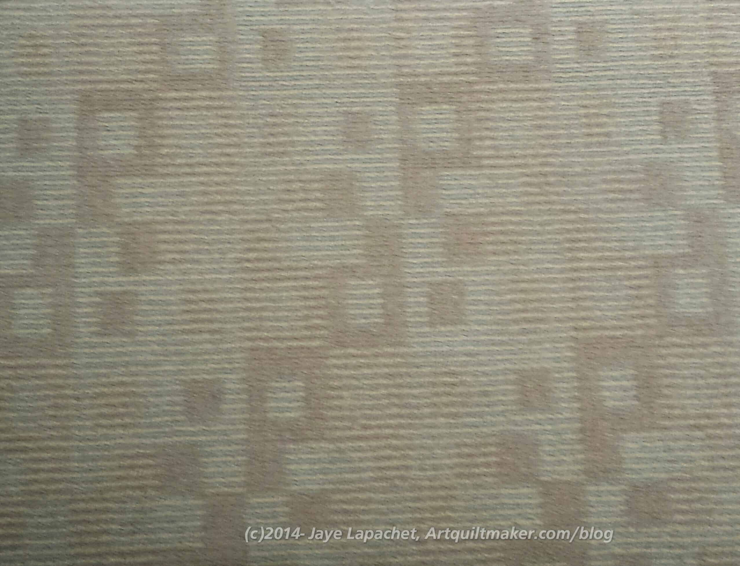
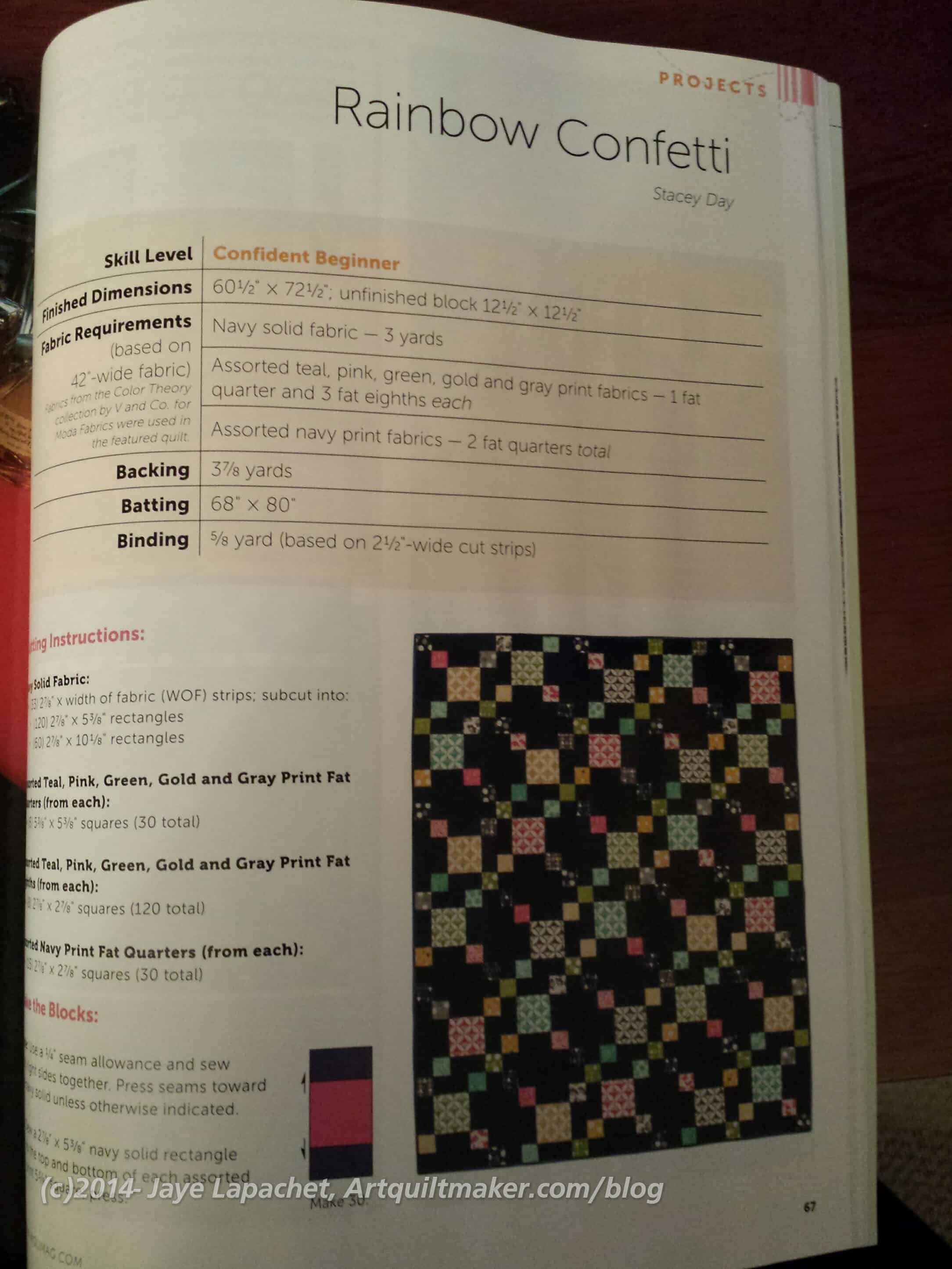
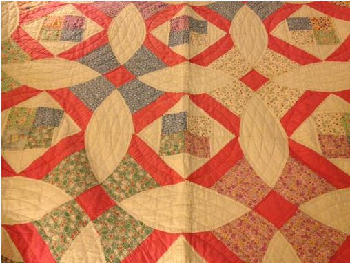
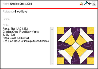
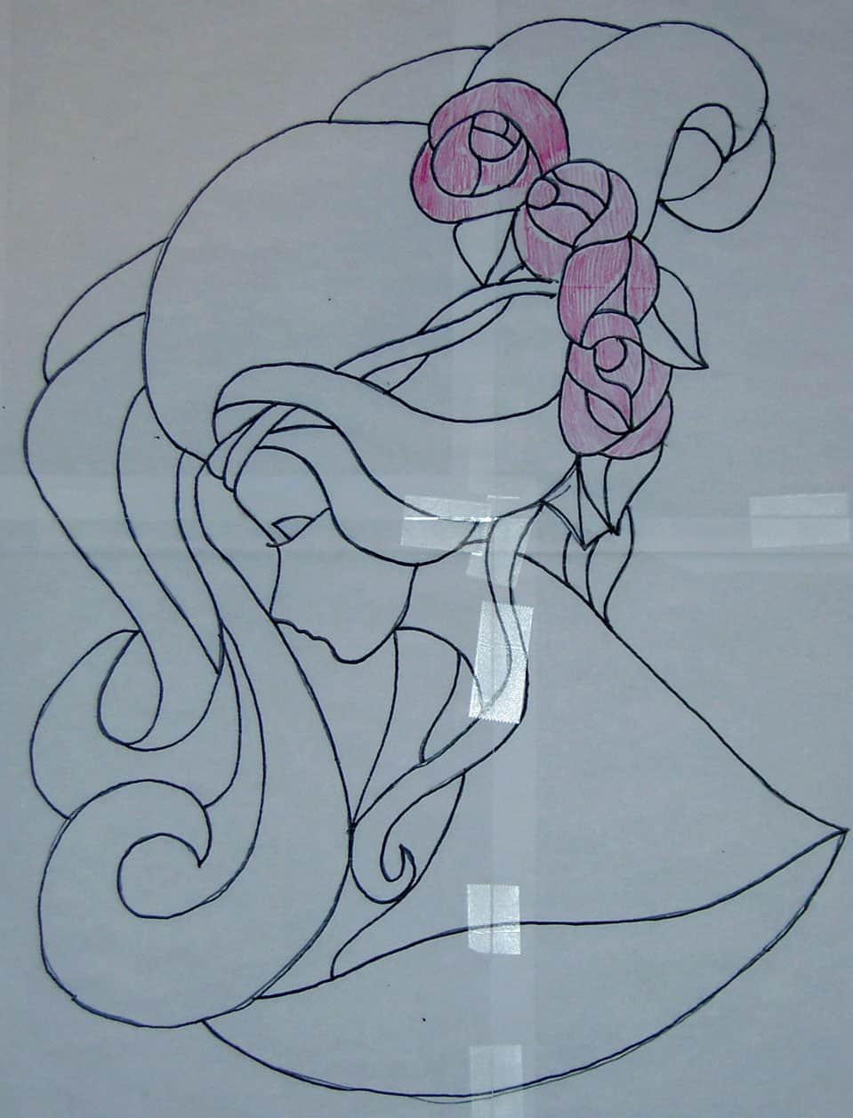
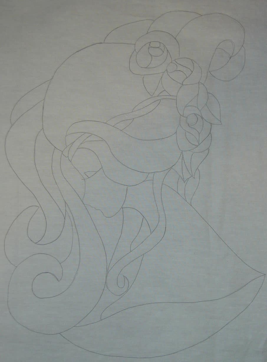
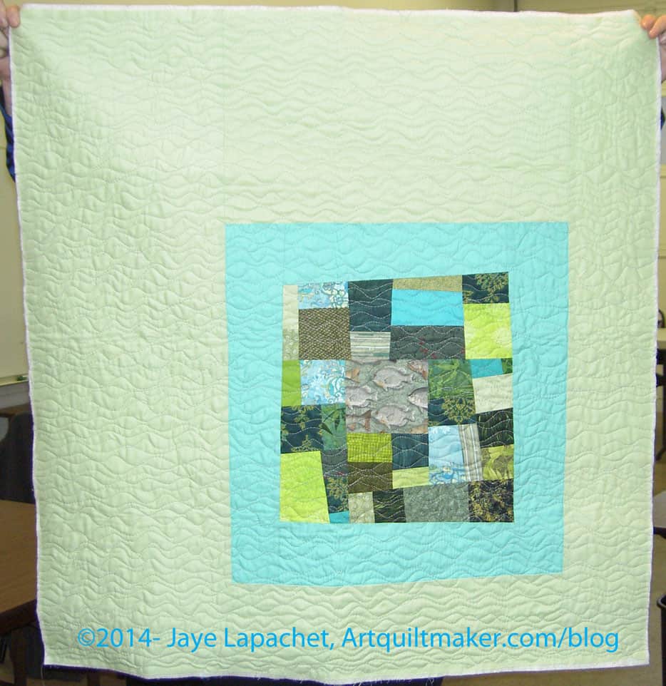

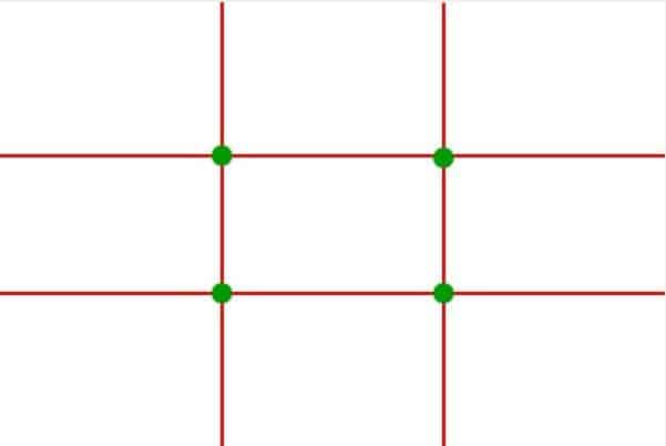
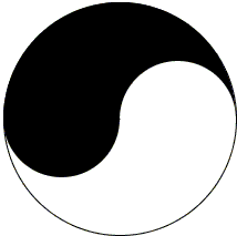
")
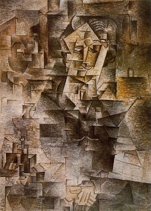
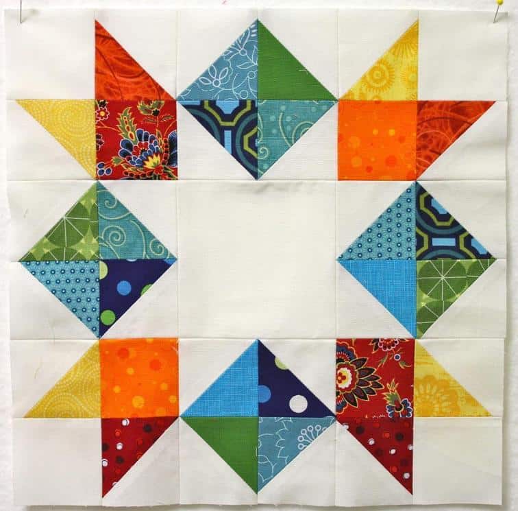
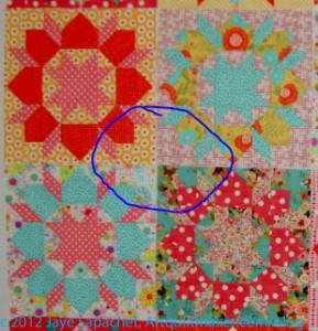

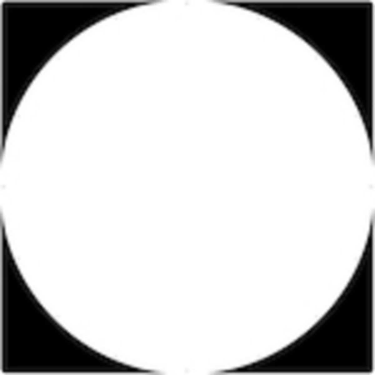
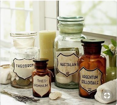


")


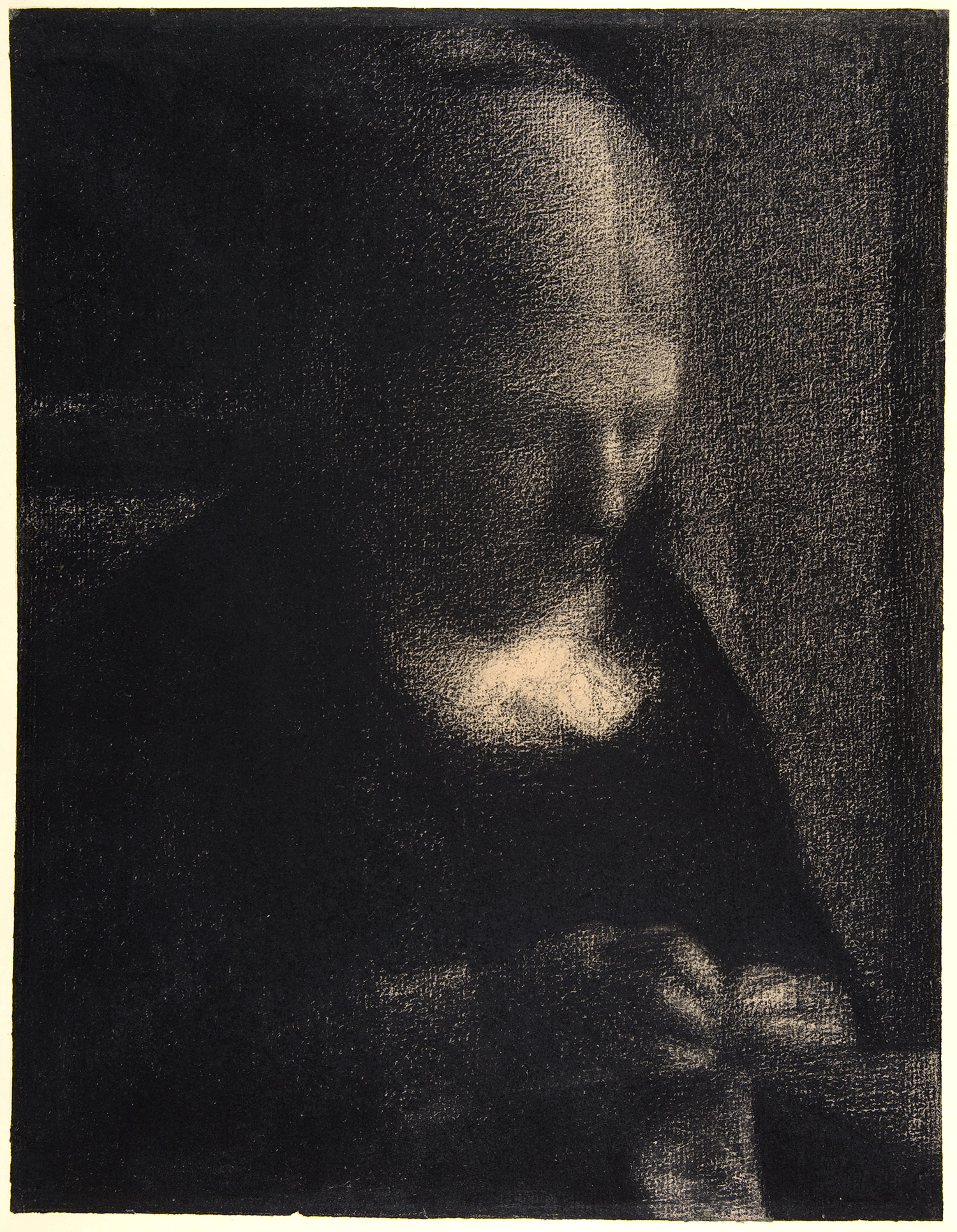
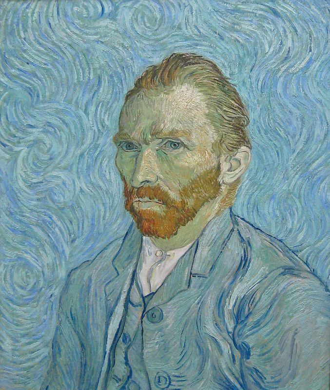