Book Review: Fearless Design for Every Quilter

Fearless Design for Every Quilter: Traditional & Contemporary 10 Lessons Creativity & CritiqueFearless Design for Every Quilter: Traditional & Contemporary 10 Lessons Creativity & Critique by Lorraine Torrence

This is the year of cleaning up little details. This book has been on my list for a long time as I worked through the Design Series with Sandy. We haven’t finished the podcasting portion, but I want this book off my list. This book did not take me 4 years to read! I refused to take it off my list until, first, I finished the design series with Sandy and, second, I wrote this review.

I have taken at least one class with Lorraine Torrence. She is an excellent teacher who teaches concepts and techniques more than projects. In the classes I have taken with her, and articles & books by her I have read, the principles and elements of design infuse her work. Thus I was excited about this book when it came out. As I started my own studies into the principles and elements of design, I found this book to be a good resource and starting place. It is, however, not comprehensive.

The book comprises the creative process as well as five of the principles and elements of design. It starts with a comprehensive table of contents (pg.4) and continues with an introduction that includes a brief history of the contemporary quiltmaking movement. The introduction continues with a section from each of the two authors. Lorraine’s section talks about her long term Design Essentials class, including sketching out the content of the class allowing any shop to offer such a class. I am not sure that was the intent. Jean was a student in the class and talks about her experiences while Lorraine talks about the evolution and teaching of the class.

The introduction is followed by a short section on the goals of the books and some introduction on how to use the book. Critique and inspiration are part of using the book and are described in this part as well.

The overall message in this section is figuring out the exercises and that people learn more when the instructions are vague or do not give all the information. This is not meant to deprive the reader, but to encourage experimentation.

The above sections are followed by “Commit to Create: The Creative Process” There is an interesting discussion about how “being creative is not a mysterious process.” (pg.8), telling the reader that creativity is a process in which anyone can engage. There are comments in this section that I have said to others. This section is not all about telling the reader s/he is creative, there is also a process outlined and how to engage in each step. The process includes: Prepare, Incubate, Create, Evaluate.

I like this process because it is simple yet effective. The authors provide a lot of information, but it is concise, to the point and easily digestible.
The Creative Process is covered in the Critique Process (pg.11). The word critique is scary but this section starts by talking about vocabulary and phrasing, which helps to take some of the sting out of the process.

Throughout the book are references to other books and articles that add to or expand on the content.

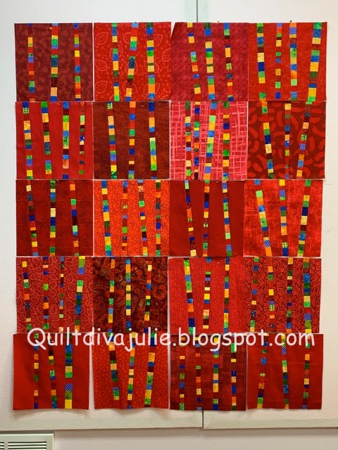
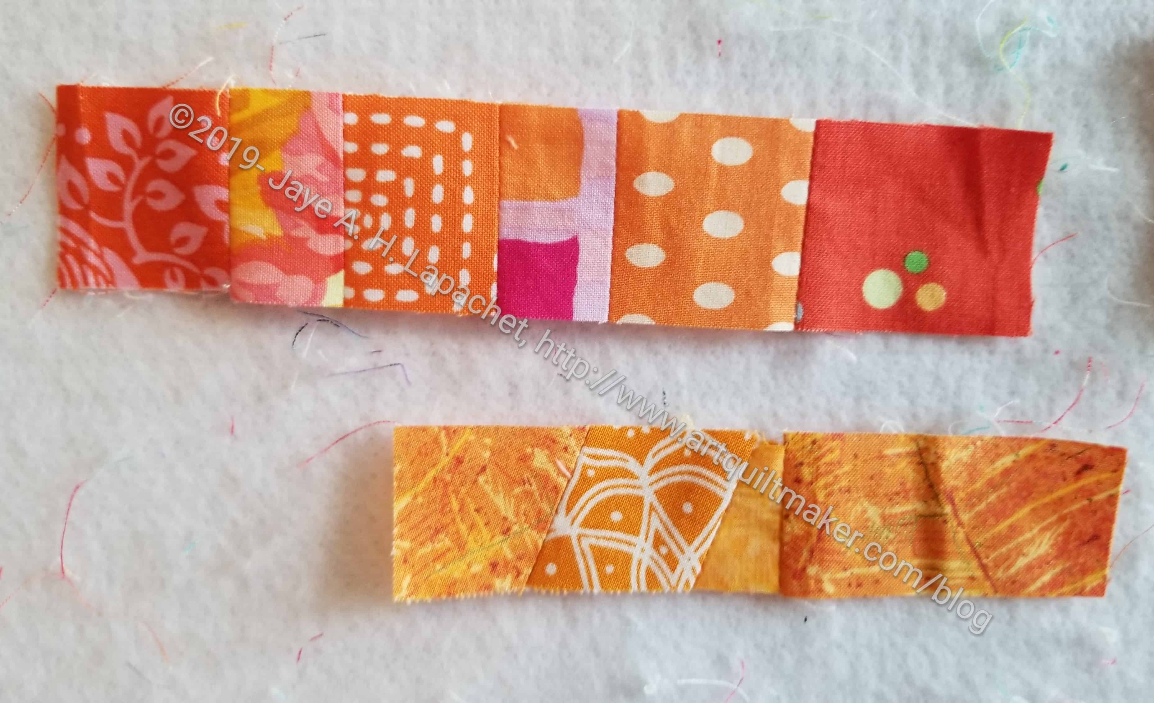
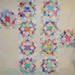
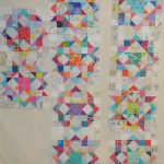
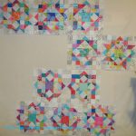
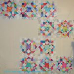
Students participated in this book and they are introduced starting on pg.13. “Their work and thoughts appear as examples of design and critique.” (pg.13) “The first part of the design course focuses on the principles and elements, exploring the relationship of these components to the overall success of a quilt design” (pg.11). The principles and elements covered are Balance, Asymmetrical Composition and Value, Scale, Value and Balance, Identifying Value in Color, and Color. As I said these are a good place to start, though not comprehensive. Each of these chapters gives an exercise then goes through a critique section, using the student work as examples. There is also a section within each chapter called ‘the continuing education process’, which suggests different approaches and tools.

These chapters are all full color with many images throughout. The words making up the chapter are filled with helpful information, definitions and examples. One quote, which is a great reminder is “Doing the exercises in this chapter is simply a way to try out color ideas visually to find new combinations….” (pg.50). Replace ‘color ideas’ with other concepts and the line becomes a universal excuse for going to your studio and working.

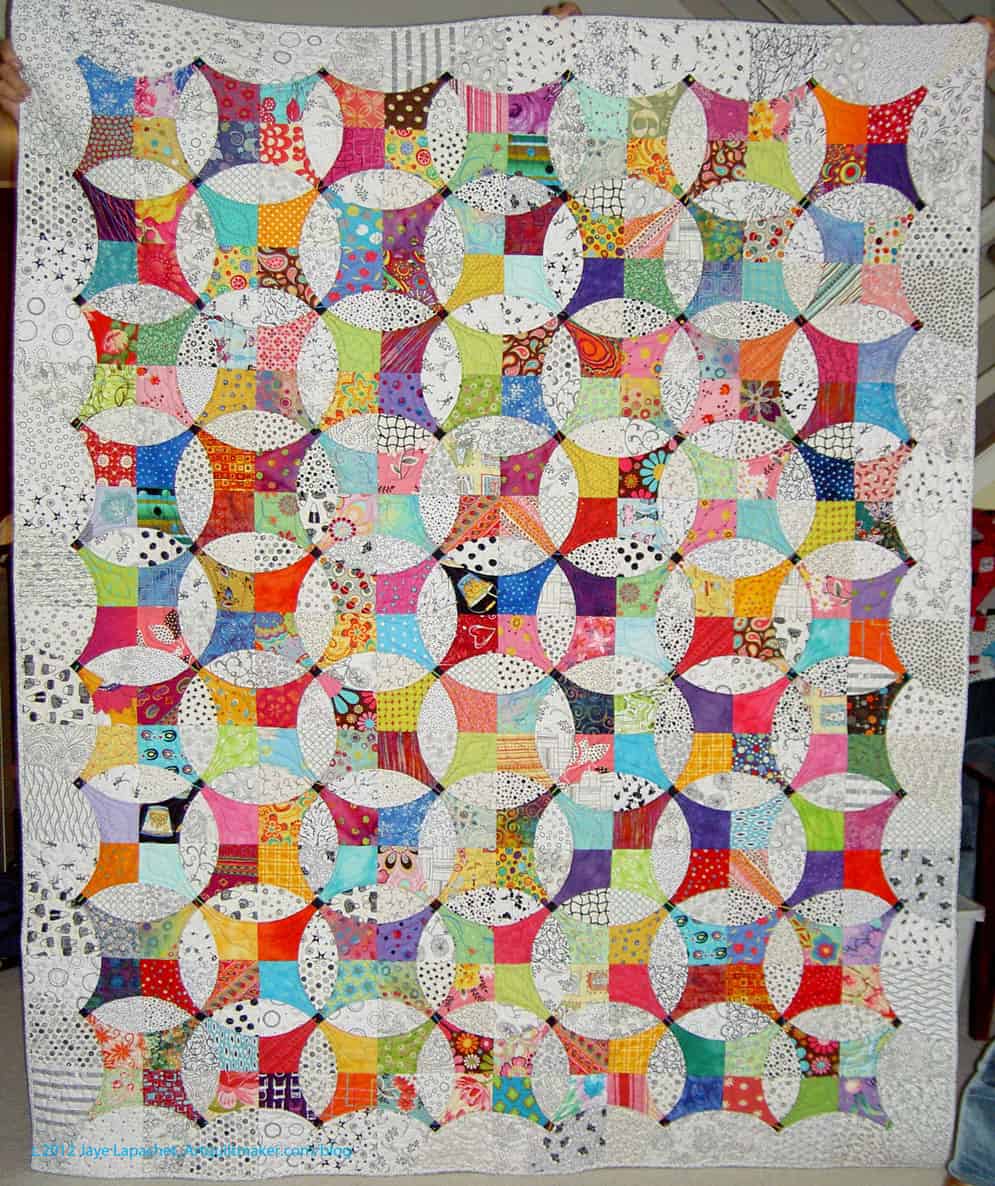
The next major section is called “Design Sources and Inspiration” (pg.52) and focuses, not surprisingly, “on sources and inspiration” (pg.52). Some of the inspirations are Words (pg.53), Using Images from your Surroundings (pg.58), and Maintaining Unity Using Panels (pg.64). These chapters also show student work in the critique section, include a creativity exercise and suggested reading.

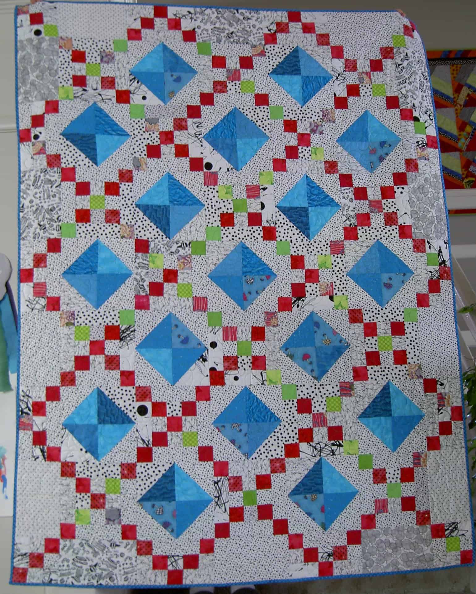
The section called Designing Borders and Quilting (pg.69) is put together like the others, but seems to be a section that the publisher said the authors had to include. It isn’t a comprehensive how-to quilt section; it is more about fitting the quilting to the overall design of the piece. The quilting doesn’t show up very well on some of the pieces in the critique session (pg.70-72).

There is a section on borders, which is interesting. It starts with “A good way to audition borders for a quilt is to photograph the quilt and make several paper picture frames for the photo” (pg.74). Of course, you could copy the fabric you were planning on using or you could take the idea and reproduce it in EQ or another quilt software.

Throughout the book you are encouraged to produce a ‘library’ of designs. In this section, the idea is to add to this concept with a quilting design library. This reminds me of Inspiration Odyssey by Diana Swim Wessel. You could just use her materials instead of creating your own, but creating your own makes your project personal and provides a starting place. Christa Watson has a new machine quilting book that has fill designs, etc, that would be useful. This idea isn’t bad if you have ideas of your own that differ from those published. As the authors say, it “will be a good resource for ideas.” (pg.74)

There is a tidbit in the Creativity Exercise in this section that I really like. The authors say “…do a mental check to see if you have built ‘fences’ around your ability to be creative. Sometimes we can get stuck in what we know have always done, rather than focusing on what we creatively dream” (pg.74). I really love this thought. It isn’t easy, especially when we are in ‘get ‘er done’ mode, but its important to try to remember and practice.

The chapter in this section is called “Designing and Working with Pattern,” which is all about understanding the fabric design process and using those fabrics you create (pg.75). The exercise is to design fabric and the assignment gives you ideas on how to do it such as printing on fabric and others. I immediately thought of Tsukineko inks. This creation process is followed up by using the fabrics.

The next major section is called “Working in a Series” and covers topics such as What is Series Work, Where to Start, and How Long to Work on a Series. This section ends with the reminder that quantity equals quality and is followed by student work.

The book sums up with a Section called “Summing Up” (pg.90) that tells readers where to go from this point. The suggestion is to start your own critique group and the book gives a list of things to consider when doing so (pg.91). In the “Some Final words” section there are thoughts on your inner critic, on inspiration and other things.

I am disappointed that this book does not have an index.

Goodreads is showing the ebook for this review, but I have the print version, which has a nice selection of art quilt books on the last page by such quilt luminaries as Jane Davila, Katie Pasquini-Masopust and Ruth McDowell.

View all my reviews

More Fabric of the Year 2015 Layout

I know I just posted a few days ago and for you looking at a computer screen the changes to the piece are hard to see. I promise not to give you a patch by patch update.

FOTY 2015 - 4-17-2016
FOTY 2015 – 4-17-2016

Now is the time where the changes are very subtle and looking for changes in the shape of the areas of color are the best way to See the evolution. I worked quite a bit more on the red and pink areas. “Working on an area” means getting the darkest or lightest fabrics together and blending the mediums into a smooth transition between the two. Mostly it means deciding where a piece goes. As I have said that is not always easy and in this case, I am struggling with some of the off colors in each area with no way to smooth the transitions. Green is a particular problem for me this time around. Green, never a favorite, has a bunch of grey greens included this time and they don’t seem to fit in either grey or green.

That is the way of it, though, and at some point, I have to stop and say enough is a enough.

Fabric of the Year 2015 Layout Continues

FOTY 2015 - Layout 4/17/2016
FOTY 2015 – Layout 4/17/2016

I achieved my goal of getting all of the patches onto the wall last Sunday. I was also able to start rearranging the patches into their final positions. To be honest I have about 5 patches that will not make it on to the front of the quilt. They will have to go on the back. Normally, I wouldn’t do that, and I don’t really like it, but I would have to cut about 22 additional patches in order to fit them into the quilt. I think putting 5 on the back is the lesser of two challenges. Also, the process is evolving and I am thinking of this as evolution.

As per usual, there are patches that are not in the right place. Moving the left side around gave me the advantage of putting that section into better, not perfect, but better, shape than it would be normally.

If you have ever tried to blend (gradate? Colorwash?) commercial fabrics into each, you will know it is not an easy task. It is a struggle and I am at the point where I wonder why I do it. Still, I see the value and will continue on.

Carpenter’s Wheel Layouts #2

In between other things going on here in the Artquiltmaker Workroom, I wrote the book review of Scraps Inc. As you may have read, I was lukewarm about the book in general, but everything can provide some inspiration.

Carpenter's Wheel Layout #8
Carpenter’s Wheel Layout #8

One quilt (from the related blog post) that I didn’t think should be included in the book** provided inspiration for the Carpenter’s Wheel layout, however. I don’t think I have quite enough blocks to make this layout work. I can’t really tell since the design wall isn’t large enough to give me a good sense and the proportions of this layout are off. I might try it on the living room floor since I can see it from the upstairs hallway.

Carpenter's Wheel Layout #9
Carpenter’s Wheel Layout #9

My SIL suggested a regular on-point 3-2-3 layout. I tried it. This might work without the bottom two blocks, but with those two blocks, it looks crowded and odd. If I do this layout, what will I do with the bottom two blocks?

I have more work to do on this piece, so stay tuned.


**Nota bene: There is nothing wrong with the quilt and it is very modern, but it uses very few scraps, thus I didn’t think it fit the definition implied by the book. YMMV.

Fabric of the Year 2015 Continues

I worked a lot on the piece over the weekend as well as on and off during the week. these blog posts are a little behind my actual process, so you can follow me on Instagram (check the sidebar) for more up to the minute news.

Even though I was on the fence about this year’s edition, I am enjoying the process. This is the ultimate in scrap quilts, even if the scraps were cut from yardage specifically for the process. Perhaps, more accurately, it is the ultimate in charm quilts.

FOTY 2015 - First Pass
FOTY 2015 – First Pass

I thought my first pass was really good, but as I walked around and past the design wall, I realized that the transition from dark to orange wasn’t working. I looked at FOTY 2013 and saw that I had transitioned from dark to red. That meant moving all of the pieces on the left side and reversing their positions.

Sigh.

I am trying to enjoy the process, a constant battle because the next project is always newer, fresher, more fun. Moving a few hundred pieces was not my idea of a fun day. That dreaded “it will be fine” phrase popped into my head and I knew I had to just start taking pieces off and repositioning them.

FOTY 2015 - Off and Back On
FOTY 2015 – Off and Back On

This exercise actually turned out to be a good one. I was able to restack the color groups and think about them again. I looked at the pieces in each color group in relation to each patch. I used it as a way to further refine the layout while the patches were off the wall.

FOTY 2015 - After the Swap
FOTY 2015 – After the Swap

I think this was valuable, as the left side looks a lot better, not only because the red is at the bottom and lighter colors more towards the top, but because the placement of patches within each color family is better.

My next goal is to get all the patches on the wall.

Carpenter’s Wheel Layouts #1

Lots of design work going on in my workroom.

Before I allowed FOTY 2015 to take over my design wall, I did a little bit of layout design with the Carpenter’s Wheel blocks. I don’t want the layout to be a straight block layout. I am willing to piece a bunch of low volume alternate blocks if I need to (rote sewing- YAY!). I only have 10 blocks, which adds to the design challenge.

Color Group Donation Quilt

I was first thinking of designs that were similar to a donation quilt that Kathleen and I made. It was all Kathleen’s idea, but I happily went along. Donation quilts, as I have said about 12 million times, are good for trying out new ideas.

I wanted to stretch myself with these blocks. I like the linear effect of the donation quilt and wondered what I could do with the Carpenter’s Wheel blocks that would give the same effect?

I tried out different linear type layouts. Of the above, #1, #6 and #7 are my favorites. I like the idea of giving these blocks some space and all of these layouts give the blocks space. That might not be the case with alternate blocks made up of low volume prints, however. I might be able to mitigate it by not including any patches that have a large concentration of black. We’ll see. I may need to do a test block.

#1 is a bit too symmetrical and I wonder if that layout is not stepping out of my comfort zone enough?

Back to the design wall, I think.

Flying Geese Design Thoughts

I was thinking about the design for the Flying Geese I have been getting and making for the Flying Geese swap with TFQ. We have been sending each other photos of interesting Flying Geese quilt designs.

Possible Flying Geese Design

The other day I was at In Between Stitches and I saw a version of Camille Roskelley’s Round and Round pattern. I really like the way she combined a bunch of small Friendship Stars into something fantastic. Seeing this quilt and thinking about the Flying Geese gave me an idea. Driving home from the North Coast, I sketched out an idea.

The image left is about the third draft of my design. It isn’t quite the way I want it and there are no sizes involved. Still, the Flying Geese portion is pretty much the way I want it.

Possible Flying Geese Design #2

I don’t want the Friendship Star blocks to be lined up the way they are in the picture above. Draft n.2 is much more asymmetrical than the picture above and more the way I would want the whole quilt.

What I don’t know yet is:

  • what sizes I will make the Friendship Star blocks
  • whether I will have half or quarter Friendship Star blocks along the border or only finished ones
  • if I will fill in more Flying Geese around the edges

Even though I have not decided to make the Flying Geese quilt, I like this idea. I get to use the Round and Round block and the Flying Geese are not lined up. For some reason that appeals to me.

Weird Coincidence?

Carpet Inspiration
Carpet Inspiration

During my recent trip to the East Coast, I stayed in a hotel while attending a work meeting. I saw the carpet and thought it would make a great quilt, recolored, of course.

I like the simple design.

There is interest even though the design includes just squares, using different sized squares and subtle changes in “color.”**

I can see this design with a solid background and a variety of bright colored something fabrics for the squares. Prints or solids would both work. I was thinking about it, designing this in my head and then I saw….

Modern Quilts, Winter 2015

almost the exact same design in Modern Quilts, the Winter 2015 issue. I couldn’t believe it.

Back to the drawing board.


**Nota bene: color in this instance is generous as I consider color to be something I can actually see. 😉

Researching Block Names

Frances' Grecian Cross
Frances’ Grecian Cross

Recently Frances posted on Twitter about the name of a block. She posted the picture of a quilt. I didn’t see the thread until several people had chimed in and Nonnie had tried to draft the block. There are three tools I use to find the names of blocks:

  1. Barbara Brackman’s book, Encyclopedia of Pieced Quilt Patterns, published by the American Quilter’s Society, 1993. I have the reprinted edition. This book is out of print, so you should buy it where ever you see a good used copy.
  2. The Quilter’s Album of Patchwork Patterns by Jinny Beyer, published by Breckling Press 2009. I wrote a review of it, which you can find in a post from 2013.
  3. Blockbase, an electronic version of the Encyclopedia of Pieced Quilt Patterns.

Brackman’s book is the original scholarly block dictionary. It was not the first block dictionary, but it was the first book, that I know of, that attempted to organize blocks into families/type and note their origin.

Beyer’s book went much farther, but, clearly, built off Brackman’s book. There are more references to sources, more drafting information and more of an attempt to group blocks in the Quilter’s Album of Patchwork Patterns.

Grecian Cross Notecard

BlockBase is a wonderful tool for actually drafting blocks and printing templates or rotary cutting directions. However, not all of the information from the Brackman book is included in BlockBase. Many of the blocks have only the Brackman number rather than all of the names. I make an effort to amend the notecards in BlockBase as I come across new or additional information that would improve retrieval. For example, a very common name of the block above is Grecian Cross. This name was listed in the Brackman book, but was not in BlockBase, so I added it.

It is helpful to know something about drafting to use any of these tools. By ‘drafting,’ I mean knowing the basic structure of blocks, e.g. is the basic structure a 4 patch or a 9 patch? The reason this is important is that if you only have a picture of the block, it cuts down on the number of blocks you need to look through if you know the basic structure.

Sadly, using patterns all the time does not foster the understanding of the basic structure of blocks, because the quiltmaker only needs to follow the directions of the designer/patternmaker.

Knowing a block’s structure is also helpful in designing quilts of your own. You may not want to mix 9 patch structured blocks with 4 patch structured blocks as the seam lines won’t always line up nicely. Or you may want to look a a variety of different 16 patch blocks so that you can design a quilt with an interesting secondary pattern.

These tools are not only good for looking up block names, but are also good to learn to understand the structure of blocks, get inspiration for new quilts and see how the authors have colored the quilts. You really need these books, if you have any serious interest in quiltmaking beyond buying fabric and making quilts.

You might notice that blocks have different names. People took blocks and republished them under different names or added a line here or divided a square there and deemed it a new block. This phenomenon is still happening today and it is something of which we just need to keep track.


Design Series: Gradation

Gradation is a principle of design, but it is not included in all books about design.

If gradation had an opposite, it would be contrast.

Definitions:

  • Gradation refers to a method if creating the elements by using a series of gradual changes in those elements. Unlike contrast, which stresses sudden changes in elements, gradation refers to a step-by-step change.” For example, gradual changes from a dark to light value, or from large to small shapes would be called gradation. (Deer Creek High School Principles of Design)
  • An idea that is expressed by a smooth flow of colors, size, shape, etc from one part of the continuum to the other. (The Nature of Design)
  • “Gradation of size and direction produce linear perspective. Gradation of of color from warm to cool and tone from dark to light produce aerial perspective. Gradation can add interest and movement to a shape. A gradation from dark to light will cause the eye to move along a shape.” (John Lovett)
  • Gradation definition, any process or change taking place through a series of stages, by degrees (definition from Dictionary.com)
  • “Refers to a way of combining elements by using a series of gradual changes. Examples of gradation:
    • 1. gradually from small shapes to large shapes (an example is Ann Johnston’s quilt, Seven, which you can see on pg. 94 of The Quilter’s Book of Design.
    • 2. gradually from a dark color to a light color
    • gradually from shadow to highlight ” (Newton K-12)

Examples:

  • You gradation to express depth. If you want to show a long road, put a line of trees next to it with the largest closest to you and the rest in ever diminishing size to the horizon.
  • Gradation of shading on a circle produces a ball that looks 3D for the eye.

Notes:

  • “Understanding that gray lies between black and white gives us an idea of what lies between light and dark. When we think about the value gradation of any given color, we can imagine it in its darkest form as having black added and in its lightest form as having white added.” (A Fiber Artist’s Guide to Color and Design, pg.104)
  • gradation is very common in solid fabrics. If you look at the Kona color card, you will see excellent examples of gradation from one color to another.
  • “Gradation is most often used with the Design Element Color. But with a little bit of thought Gradation can applied to the six other Design Elements as well.
    • Line – A gradual change from perpendicular to curved.
    • Direction – A gradual change from vertical to horizontal.
    • Shape – A gradual change from angular to round.
    • Size – A gradual change from small to large.
    • Texture – A gradual change from smooth to rough.
    • Value – A gradual change from light to dark.

Gradation is the Principle that banishes boredom from your work. It adds movement to otherwise boring areas. I consider ti one of the most useful Design Principles and one of the most easily applied. ” (Fine Art America Blog, Dec 21, 2009)

Resources

Design Series: Contrast

Sandy and I are on a roll with the next installment of the series. Check out the podcast.

Contrast is a Principle of Design

Definition:

  • Difference in light and dark.  Or light vs dark. (See The Sharpened Artist).
  • “..the juxtaposition of differing elements and principles which can provide tension visual interest.” (A Fiber Artist’s Guide to Color and Design, pg.102)
    • “Unless you are looking to create a sense of chaos or absence, you must learn to manage the contrasts present in your artwork so as not to overwhelm or bore the viewer.” (A Fiber Artist’s Guide to Color and Design, pg.102)
  • It is the “placement of varying elements, including color, within a design.” (A Fiber Artist’s Guide to Color and Design, pg.198)

Types of Contrast:

In this section, you might want to have a color wheel handy.

  • Emphasis by contrast: we talked about this when we talked about emphasis and focal point, so you can go back and review that episode, but I want to bring it up again from a different angle: the contrast angle rather than the emphasis angle. When you have a prevailing design scheme and one element contrasts with that design scheme, that element becomes the focal point, because it is in contrast to the rest the of the piece. (Pentak & Lauer, pg.48-49)
  • Contrast of scale:  “Unusual or unexpected scale is arresting and attention getting. Sheer size does impress us.” (Pentak & Lauer, pg.61) Seeing something far larger than other elements of a composition provides scale contrast and visual interest.
  • Contrast of Hue: ” …easiest contrast to attain by simply using pure, intense, undiluted colors. This contrast is greatest when using the primary color combination of red, yellow and blue.” (A Fiber Artist’s Guide to Color and Design, pg.103)
  • Light/Dark Contrast: using black and white is the boldest contrast obtainable. (A Fiber Artist’s Guide to Color and Design, pg.104)
  • Cold/Warm Contrast:  the color combination of red orange versus blue green is the strongest  cold/warm contrast. … The contrast of temperature is very effective when trying to depict depth, the concept of near and far or three dimensionality.” (A Fiber Artist’s Guide to Color and Design, pg.105)
  • Complementary Contrast:  “…gives a sense of equilibrium to the eye of the viewer. The pairs of colors that lie opposite each other (look on your color wheel) on the color wheel have a diametric* contrast to each other. They complete one another, but can also cancel each other out. … Complementary contrasts are”, generally considered “pleasing to work with and offer the artist the opportunity to hone his or her skills in creating balance.”(A Fiber Artist’s Guide to Color and Design, pg.106)
  • Simultaneous Contrast: “… is perceived by the viewer rather than being objectively present. … When a pair of direct complements are used together in their pure hues, exclusive of any other part of the color scale, the line where the colors meet will look as though it is moving. This happens because the colors are contrasting off each other at the same time. Our eye has a hard time discerning where one intensity begins and the other ends, thus causing the sense of movement or ‘sizzle’.” (A Fiber Artist’s Guide to Color and Design, pg.107)
  • Contrast of Saturation:  “…refers to the contrast between pure, intense colors and dull, diluted colors. Saturation can be diluted in four basic ways – the addition of white, black, gray or a color’s complement.” The purity of the color is changed, but also the inherent temperature, brilliance, behavior, and emotional response. (A Fiber Artist’s Guide to Color and Design, pg.108)
  • Contrast of Extension: “… is the contrast between space and size using two colors, one light and pure and the other dark or dull.” Shapes will look larger or smaller depending on the brilliance of the colors and how much two colors contrast with each other. (A Fiber Artist’s Guide to Color and Design, pg.109) A sharp contrast in color can give a small object more significance in a large space. (The Quilter’s Book of Design, pg.9)
  • Contrast of Value: Often the key to the success of a strong design. “When there are many colors present, it is harder to judge value, but it is critical to be able to see value changes in a color composition and employ them to the advantage of the design. Two different colors with the same value in a composition can have less contrast or impact than two different values of the same colors.” (The Quilter’s Book of Design, pg.47)

Notes:

  • Art is at its best when the contrasts included provide managed, well-balanced interest in such a way so as not to fatigue the participants. There are at least 7 types of contrast, many of which have to do with color, but not all. You can have contrast of big and small, for example in your quilt as well (A Fiber Artist’s Guide to Color and Design, pg.102)
  • ” Each art form has its own type contrast.” (A Fiber Artist’s Guide to Color and Design, pg.102)
    • Book or movie: good vs evil
    • recipe: contrasts of sweet and salty
    • Woven shawl: smooth and nubby fibers
  • Unity is enhanced when variation and contrast are included in the design. “…the design’s interest is strongest where contrast exists and the unity is broken.” (Adventures in Design, pg.99)
  • “The strength of the design lies in the contrast, not in the repetition. That being said, the design needs its repetitive features to create unity,”  (Adventures in Design, pg.99) but the repetition allows the contrast to exist.
    • We are really getting into principles and elements working together. Have any of you had a hard time trying to work with just one principle or element?
  • If contrast in size is combined with a contrast in color, a focal point becomes even more obvious.” (The Quilter’s Book of Design, pg.29)
  • Two color quilts have good contrast.

Resources:


*completely opposed :  being at opposite extremes

Serendipity Quilt

Last weekend was the CQFA meeting. I mentioned this project briefly when I talked about Attack of the Hexies.

Caroline taught a workshop using Susan Carlson’s techniques from her Serendipity Quilts book.

To start we got an email with prep instructions and when I finally got a minute (work really gets in the way of my quiltmaking!) I started getting the materials I would need together. One of the items was Drawing of simple object, ( Think little kid’s coloring book.)


I have one coloring book left from when I was a kid and couldn’t find it. I did find my old stained and leaded glass pattern books. Those drawings are simple enough and I perused them. Two stuck out for me. One was in the book and one was a drawing, probably a tracing of an image from another book, I had done that was stuck in the book. No attribution on the second one, nothing. If you have an Ed Sibbett, Jr book with the image below, please send me the citation. I do want to attribute it properly.

I decided to do them both, one at a time, but both. I have been lamenting, in my head, the fact that I haven’t been doing much art quiltmaking lately, which seems kind of lame, considering the name of this blog. I tell myself that all of my other quilts are ‘color work’, but I might be fooling myself. I do work a lot on color, but….

Stained Glass image
Stained Glass image

This image shows the first piece I will work on. the idea is to use scraps to make up the image. Everyone was working on it at the meeting and I was ‘in process.’

I will use pink for the hair and blue for the roses. I will probably use one piece of fabric for the face. It will not be green, but other than that I don’t know what color it will be. I might do the eyelash in embroidery.

According to Caroline, our workshop leader, the first step was to transfer the image to fabric. My actual first step was to enlarge the image. The original was smaller than 6×6 and I wanted to do something a bit larger. It is now in the 20×16″ range. It was a painful process, but I finally figured out how to do it and went ahead to the transfer-to-fabric stage.

Design on fabric
Design on fabric

I used a piece of the linen colorway of an Art Gallery solid. I still had some left even after using bunches on the Flower Sugar Hexagon (Attack of the Hexies) quilt top. I simply traced over the printout with a Sewline pencil. It worked like a charm when I was able to keep the fabric in the right place over the printout.

My next task is to remind myself of the rules of light and dark: “if I put a light in a front piece of hair, will it look closer or farther?” and then I will get to it. I have the scraps already chosen and am eager to get to work.

I suppose I could check more thoroughly to see if I have Susan Carlson’s book, too.


Design Series: Focal Point/Emphasis

We’re back!!!!

Well, it has been awhile since Sandy and I were able to get together, but we are back in the  saddle. We worked on a new Design Series episode last week. You should be able to hear all about Emphasis/Focal Point today!

You can find the other episodes and companion blog posts by searching the Design Series tag.
_______________________________________________________

Rhonda Ludwico
Rhonda Ludwico

Emphasis/Focal Point is a principle of design.

Emphasis/Focal Point is related to Size/Scale

I have dominance listed separately in my outline for this series of podcasts, but we cannot really talk about Emphasis and Focal Point without talking about dominance, so consider this episode related to the upcoming episode on Dominance.

Definitions:

  • An emphasized element of your design is a focal point (Pentak & Lauer, pg.46)
  • “Emphasis creates a focal point in a design; it is how we bring attention to what is most important. Emphasis is what catches the eye and makes the viewer stop and look at the image. Without emphasis, without getting the viewer to look at the image, communication cannot occur.” (The Elements and Principles of Design, pg. emphasis)
    • This can happen pretty easily with standard block quilts. If you have nothing to draw the attention, e.g. you use the same fabrics for each block and the size of the blocks is all the same, you may have nothing in the quilt to create a focal point.
  • Emphasis can be achieved through the use of color, value, intensity, size & scale as well as other design elements.” (Color & Design, pg. 125)
  • Emphasis gives “interest to one entity or area over others present in a design field, however a focal point is not always formed.” (Color & Design, pg. 125)
  • Focal point: “attracts viewer as a point of emphasis, encourages viewer to look farther.” (Quilter’s Book of Design, pg. 154)
  • “A focal point results when one element differs from the others. Whatever interrupts an overall feeling or pattern automatically attracts the eye by this difference:
    • when most of the elements are dark, a light form breaks the pattern and becomes a focal point
    • when almost all the elements (whether light or dark) are vertical, a diagonal element is emphasized
    • In an overall design of distorted expressionistic forms, the sudden introduction of a naturalistic image will draw the eye for its very different style
    • when many elements are about the same size, similar but unexpectedly smaller ones become visually important
    • when the majority of shapes are rectilinear and angular parallelograms, round shapes stand out
    • the list could go on and on…
    • a change in color or a change in brightness can immediately attract our attention.” (Pentak & Lauer, pg.48)

    Emphasis on Isolation (Source: strose.lunaimaging.com via Jaye on Pinterest)
    Emphasis on Isolation (Source: strose.lunaimaging.com via Jaye on Pinterest)

Using Emphasis/Focal Points:

    • “An unnatural contrast of scale in your quilts can also be used to achieve interesting effects. Surrealists such as Salvador Dali used wildly confused internal proportions to intentionally create uneasiness in the viewer. One element that is purposefully out of scale with other elements within the quilt will attract the viewer’s attention and become a focal point.” (Art+Quilt, pg.65)
      • If you have a large Mariner’s Compass in the middle of a quilt, the Mariner’s Compass will be the focal point.
    • “A problem for the quiltmaker is how to achieve both variety and unity. Just adding different elements to the composition may destroy its unity. Adding elements that are similar, but different from each other, can add interest without upsetting the unity of the whole. If one of the variations of the chosen elements is in high contrast to the rest of the piece, it can create a focal point. ”
      • (as an aside, I don’t mean that you are only allowed to use contrast as a focal point; the author means using something to differentiate that area or section from the rest of the piece) (The Quilter’s Book of Design , pg,27)
    • Emphasis by Contrast: “Very often in art the pictorial emphasis is clear, and in simple compositions (such as a portrait), the focal point is obvious. But the more complicated the pattern, the more necessary or helpful a focal point may become in organizing the design.” (Pentak & Lauer, pg.48)
    • Emphasis by Isolation: an element alone in part of a design immediately gets our attention even if there are many of the same shape in another part of the design. (Pentak & Lauer, pg.50)
      • “…a focal point that is too close to an edge will have a tendency to pull the viewer’s eye right out of the picture.”  (Pentak & Lauer, pg.50)
    • Emphasis by Placement: “If many elements point to one item our attention is directed there, and a focal point results. A radial design is a perfect example of this device” (Pentak & Lauer, pg.52)
      • Imagine a Mariner’s compass with a Fleur de Lis in the center circle.
    • Emphasis by Value: “Value contrast can be used to create a focal point in the composition. High contrast will attract the viewer’s attention.” (The Quilter’s Book of Design, pg.66)
    • Structure: There are four different major types of structure. (you might remember this from a brief overview we did in the Balance segment)
      • Focus Structure: Focus structure has to do with placing elements of a design in such a way that the eye of the viewer focuses on it. You create focus by establishing the difference between the featured shape and its setting. (Adventures in Design, pg.117)
      • Circular Structure: “… a central design is the main focus and everything else plays a lesser role, accentuating the beauty of this central design.” In this structure, the artist must ensure that there is “enough continuity between the inner focus and the outer support so that the eye can move throughout the design.” Circular structure uses a circular design “skeleton to move the eyes around the design in a clockwise manner.” (Adventures in Design, pg.118)
      • Triangular Structure: The basis of your design, in a triangular structure, is a triangle (Adventures in Design, pg.119)
      • L Structure: In an L structure “the major design focus should be along one of the arms of the L.” The best placement in this kind of structure is to place the major focus close to the intersecting point of the L.” (Adventures in Design, pg.119)
      • Horizontal and vertical structure: use a “horizontal or vertical line as your structure. This directional structure can be used over the entire design surface” (Example is Layers of Time by Sylvia Naylor- see it on pg. 38 in Adventures in Design or a Chinese Coins quilt design) (Adventures in Design, pg.119). One of the ‘coins’ in a Chinese Coins quilt would have to stand out in some way (be fatter than the others, be a wildly different color, etc in order for this structure to be used to focus attention on one part of the quilt.


Rule of Thirds (Source: http://photoinf.com/Golden_Mean/Michael_Fodor/Photo_School_-_Rule_of_Thirds/ruleofthirds.jpg)
      • Rule of Thirds:  Joen Wolfrom says “The rule of thirds is an easy way to find a focus range. Simply divide your design into thirds, horizontally & vertically. Four intersecting points will appear. Place your” focal point “in the vicinity of the most appropriate intersecting point.” (Adventures in Design, pg.117) I think you need to place your focal point where it helps you to communicate the message you want to get across to your viewers.

Notes:

      • “A focal point, however strong, should remain related to and a part of the overall design… In general, the principle of unity and the creation of a harmonious pattern with related elements is more important than the injection of a focal point if this point would jeopardize the design’s unity.” (Pentak & Lauer, pg.54)
      • “Giving dominance to, or emphasizing one design element or area will counteract confusion or the risk of monotony.” (Color & Design, pg. 125)
      • A definite focal point is not a necessity in creating a successful design. It is a tool that artists may or may not use, depending on their aims.” (Pentak & Lauer, pg.56)
      • “How does the designer catch a viewer’s attention? …Nothing will guarantee success, but one device that can help is a point of emphasis or focal point. This emphasized element initially can attract attention and encourage the viewer to look further.” (Pentak & Lauer, pg.46)
      • “You create focus by establishing the difference between the featured shape and its setting.” (Adventures in Design, pg.117)
      • “In past centuries when pictures were rare, almost any image was guaranteed attention. Today,…all of us are confronted daily with hundreds of pictures. We take this abundance for granted,” and have even trained ourselves (sometimes unknowingly) to filter out imagery that is unpleasant or distracting,  “but it makes the artist’s job more difficult. Without an audience’s attention , any message, any artistic or aesthetic values, are lost.” (Pentak & Lauer, pg.46) This is why I rail a bit on drawing the viewer of your quilt into the design field and then rewarding them with small stitches or beadwork as a result of looking closer. At a quilt show, you need to get people to look at your quilt in the midst of hundreds of them.
      • 57625240465184)
        Marie-Hélène Cingal, Bruxelles (Source: http://www.flickr.com/photos/24271543@N03/5120409660/in/set-72157625240465184)

        There can be more than one focal point. Sometimes secondary points of emphasis are present that have less attention value than the focal point. These are called accents.” “…the designer must be careful. Several focal points of equal emphasis can turn the design into a three-ring circus in which the viewer does not know where to look first.” (Pentak & Lauer, pg.46)

        • “…provide a variation in order for our eyes to be attracted to the focus area.” (Adventures in Design, pg.117)
      • “Scale and proportion are closely tied to  emphasis and focal point. Large scale, especially large scale in proportion to other elements makes for an obvious visual emphasis.” (Pentak & Lauer, pg.60)
      • “Emphasizing one element or letting one area dominate others sends an invitation tot he viewer to come in and take a closer, longer look at the work.” (color & Design, pg. 125)

Exercise:

Type “focal point” examples into Google or your favorite search engine and look at the images. As you look at the images, try and figure out what the focal point is.

Resources:
Art + Quilt
Design Basics by Pentak & Lauer
The Elements and Principles of Design, http://nwrain.net/~tersiisky/design/emphasis.html

Thoughts on Color & Composition

I got sucked into Anna Maria Horner’s blog the other day as I do when the VIMH#1 wants to come out to play. I was reading about the death of her mother, then her latest pregnancy and found a post about composing a quilt for one of her daughters. She writes

That particular Kokka piece on the right above not only captured almost the entire palette of the quilt, but the print itself feels like a patchwork so I left it in large whole blocks.  I considered the direction I would orient the piece for a while though, in other words, what colored edge of the piece would be adjacent to what other piece of the quilt.  When you have a single piece that varies so much within the print, this becomes pretty important, and that decision can really take the whole composition in various directions.

I am especially interested in the line where she writes “I considered the direction I would orient the piece for a while though, in other words, what colored edge of the piece would be adjacent to what other piece of the quilt. ” I agree that this is important and she says it so well. This concept or idea has been on my mind since I began working on those tiny 4″ Sawtooth Star blocks. I wrote about it in an early Star Sampler blog post. I wrote “I want the stars to be crisp and I don’t want the colors of the fabric in the stars to bleed into the background.” It is the same idea, though AMH takes it a bit farther in that she is using larger pieces and going with the way the fabric is colored in informing her composition.

While this may be a small thing, I find it often important to think about whether fabrics are bleeding into the background and whether I want that look. If your composition wants the fabrics to merge, you can get a soft, smudgy look. It is easier to blend fabrics into each other when they are already merging into one another.

If you want a crisp look, it is important to make the background very different from the foreground pieces. The forethought will make the piece look crisp and defined.


Design Series: Negative Space

Negative space is part of Design, but neither an element or principle. It could be included in the lesson on Form or Space, but Sandy and I have chosen to talk about it separately. Be sure to listen to the Episode 114 of Sandy’s podcast, Quilting… for the Rest of Us. where we discuss this topic.

Definitions:

In many basic drawing classes, students learn that there are three basic elements of a composition: the frame, the positive and the negative space. The positive space is easiest to understand. Generally, it is the space occupied by your subject. Conversely, negative space is the space that is not your subject. (Artinspired wiki, Positive & Negative Space page)

  • Positive Space is created by objects that are seen as a main element appearing to be in front of the background.
  • Negative Space “is the space between an object, around an object, but is not part of the actual object itself. It is the opposite of an identifiable object which can at the same time be used to help define the boundaries of positive space.” (http://www.tutorial9.net/articles/design/enhancing-your-art-with-negative-space/)
  • The concept of positive and negative space are also called “figure” and “ground”. (Pentak & Lauer, pg.150)
  • “Negative space, in art, is the space around and between the subject(s) of an image. Negative space may be most evident when the space around a subject, and not the subject itself, forms an interesting or artistically relevant shape, and such space is occasionally used to artistic effect as the “real” subject of an image. ” (http://favbulous.com/post/627/the-art-of-negative-space-illustration)
    • think about the design that appears when you put blocks together and get a secondary design.
  • empty space, space around an object or form; also called white space” (http://dictionary.reference.com/browse/negative+space)

If you have 4 identical white rectangles and 4 identical black squares and place the white rectangles horizontally in front of you and put the black squares on the white rectangles in different places on top, you will: (Pentak & Lauer, pg.150)

  • notice very different visual effects “caused solely by its placement within the format” (Pentak & Lauer, pg.150)
  • notice that the location of the black shape immediately organizes the empty (white) space into various shapes (Pentak & Lauer, pg.150)

Notan

“Notan is a Japanese word meaning dark-light. The word, however, means more than that. The principle of Notan as used here must further defined as the interaction between positive (light) and negative (dark) space. The idea of this interaction in Notan is embodied in the ancient Eastern symbol of the Yang and the Yin, which consists of mirror images, one white and one black, revolving around a point of equilibrium. Here the positive and negative areas together make a whole reality. In the Yang and the Yin symbol…opposites complement, they do not conflict. Neither seeks to negate or dominate the other, only to relate in harmony. It is the interaction of the light and the dark, therefore, that is most essential.” (Notan, pg.6)

YinYang from cut-the-knot.org (http://www.cut-the-knot.org/pythagoras/YinYangBisection.shtml)

We, as Westerners, have issues understanding the harmonious relationship of the light and the dark, because of our cultural heritage. “The Western culture thinks in terms of opposed dualities and attaches the moral values of good to the positive, of bad to the negative. Or we seize upon the positive as the only reality and dismiss the negative as invisible and non-existent.” (Notan, pg.6)

  • Remember, again, the secondary design that can pop up unexpectedly when 4 blocks are put together. You don’t want something ugly where your blocks meet. This is kind of the premise of Notan. Thinking of the whole design is the key rather than just the positive space.

Confusion and Trickery

Franz Kline's White Forms (http://www.moma.org/collection_images/resized/436/w155h170crop/CRI_203436.jpg)
Franz Kline’s White Forms (http://www.moma.org/collection_images/resized/436/w155h170crop/CRI_203436.jpg)

Source: google.com via Jaye on Pinterest, piece is Franz Kline’s White Forms

“Sometimes positive and negative shapes are integrated to such an extent that there is truly no visual distinction.”In Franz Kline’s White Forms, “we automatically see some black shapes on a background. But when we read the artist’s titles, White Forms, suddenly the view changes, and we begin to focus on the white shapes, with the black areas now perceived as negative space. The artist has purposely made the positive/negative relationship ambiguous. (Pentak & Lauer, pg.154).

https://www.pablopicasso.org/portrait-of-daniel-henry-kahnweiler.jsp

Source: https://www.pablopicasso.org/portrait-of-daniel-henry-kahnweiler.jsp, piece is Pablo Picasso’s Daniel-Henry Kahnweiler

“In most paintings of the past, the separation of object and background was easily seen, even if the selected areas merged visually. But several twentieth-century styles literally do away with the distinction. We can see that the subject matter of the painting,” Pablo Picasso’s Daniel-Henry Kahnweiler, “is a figure. Despite the cubist abstractions of natural forms into geometric planes, we can discern the theme. But it is difficult to determine just which areas are part of the figure and which are background. The artist, Picasso, also broke up the space in the same cubist manner. There is no clear delineation of the positive from the negative.” (Pentak & Lauer, pg.154-155).  In Georges Seurat’s Silhouette of a Woman, the Black Bow and The Artist’s Mother (Woman Sewing), (late 1800s, not 20th century, not a Cubist) the positive and negative spaces meld so much as to confuse the mind as to which is which.

Some artists play with the reversal of positive and negative space to create complex illusions. The prints of M. C. Escher … often feature interlocking images that play with our perception of what is foreground and what is background. Other artists take these illusions of positive and negative images to even greater lengths, hiding images within images. Perception of form and shape are conditioned by our ingrained “instinct” to impute meaning and order to visual data. When we look at an image and initially form an impression, there is a tendency to latch on to that conclusion about its meaning, and then ignore other possible solutions. This may make it hard to see the other images. Training the eye to keep on looking beyond first impressions is a crucial step in developing true visual literacy.” (Art Design & Visual Thinking http://char.txa.cornell.edu/language/element/form/form.htm)

Inverted Star Tutorial - purchase on Craftsy
Inverted Star Tutorial – purchase on Craftsy

Above star is a great use of negative space. Flipping the negative space to positive. See below for homework on this block.

Notes:

  • In a picture, the shapes that the artist has deliberately placed are considered the positive shapes. The spaces around the shapes are the negative spaces. It is just as important to consider the negative space in a picture as the positive shapes. Sometimes artists create pieces that have no distinction between positive and negative spaces. M. C. Escher was a master at creating drawings where there was no distinction between positive and negative space. (Skaalid, http://www.usask.ca/education/coursework/skaalid/theory/cgdt/shape.htm)
  • For every positive shape, there is a negative shape surrounding it. (Artinspired wiki, Positive & Negative Space page http://artinspired.pbworks.com/w/page/13819678/Positive%20and%20Negative%20Space)
  • A good artist realizes that the space surrounding an object (positive space / shape / mass / etc) is just as important as that object itself. Negative space helps define a subject, and brings balance to a composition.
  • The placement of one shape – a positive figure or foreground – creates another, a negative figure or background. The placement of a shape organizes the empty space around it into more shapes. (The Quilter’s Book of Design, 2d, pg.62) 
  • “Negative space, or whitespace, is a powerful design element which impacts both the aesthetics and usability …; too little and the design feels cramped, too much and related page elements can become disconnected.” (Wayne Moir website: http://www.waynemoir.com/notebook/asides/negative-space-in-design/)
  • “It is important to remember that both elements have been thoughtfully designed and planned by the artist. The subject is the focal point, but the negative areas created are equally important in the final pictorial effect.” (Pentak & Lauer, pg.150)
  • With three dimensional art [forms], such as a sculpture, one can see how the object occupies space by walking around it, looking from above, below or from the side. Three dimensional objects have height, width and depth. With two dimensional art [like a quilt], the arrangement of objects on the design field can be crowded with lots of objects or nearly empty with very few objects. These design elements have height and width, but no depth. (A Fiber Artist’s Guide to Color and Design, pg.130)
  • “Negative shapes are also an aspect of letter design and typography.” (Pentak & Lauer, pg.150) People design fonts so they look good on the page – the right amount of space between letters and lines, etc.
  • The artist usually wants some back-and-forth visual movement between the positive shapes and the negative” space. “An unrelieved silhouette of every shape is usually not the most interesting spatial solution.” Generally, depending on the message you, as the artist, wants to convey, breaking the “background” into “areas of value that lend interest as well as better positive/negative integration” will make for a better design. (Pentak & Lauer, pg.152)
Swoon Secondary Design

I have highlighted the part of my design that is the unintended secondary design. It is less prominent, because of the variety of backgrounds, but still marked enough to pay attention and make some definite decisions about.

Examples:

Homework:

  • Photocopy or print famous paintings in black and white. Look at the negative and positive spaces and notice their shapes.  The following are specifically mentioned in Pentak & Lauer: Georges Seurat’s Silhouette of a Woman, the Black Bow and The Artist’s Mother (Woman Sewing), but you can use any. Try to find one or two with simple lines.
  • Cut 4 2.5×2.5″ black squares, cut out 4 2.5″x4.5″ white rectangles. Arrange the black squares on the white rectangles in different ways and notice the way the negative space is organized. (See above)
  • See how the negative space is affected with different iterations of this block. Make the block above with:
    • one solid fabric where the scrappy fabrics are located
    • different solid fabrics in the same color range, e.g. all blues. Tone-on-tones would work, too.
    • change where the colors are with where the background is
    • the same type of fabric layout, then quilt the center with a complex pattern that has its own design, such as a feathered wreath, in white thread to see whether the center Sawtooth Star is still negative space
    • the same type of fabric layout, then quilt the center with a complex pattern that has its own design, such as a feathered wreath, in colored thread to see whether the center Sawtooth Star is still negative space

Resources:

Art Design & Visual Thinking http://char.txa.cornell.edu/language/element/form/form.htm

Artinspired wiki, Positive & Negative Space page http://artinspired.pbworks.com/w/page/13819678/Positive%20and%20Negative%20Space

Artline Elements of Design: http://coolschool.k12.or.us/courses/115100/welcome/elements1.html

Favbulous: http://favbulous.com

A Fiber Artist’s Guide to Color and Design by Heather Thomas

Design Basics, 5th, c.1999, David A. Lauer, Stephen Pentak (has an excellent section on positive and negative space)

The Quilter’s Book of Design, 2d

Notan: the dark-light principle of design by Dorr Bothwell and Marlys Mayfield, 1968

Wayne Moir website: http://www.waynemoir.com/notebook/asides/negative-space-in-design/

Tutorial9: Enhancing your art with negative space: http://www.tutorial9.net/articles/design/enhancing-your-art-with-negative-space/

Bonnie Skaalid, Web Design for Instruction: Classic Graphic Design Theory: Elements of Design: Shape http://www.usask.ca/education/coursework/skaalid/theory/cgdt/shape.htm