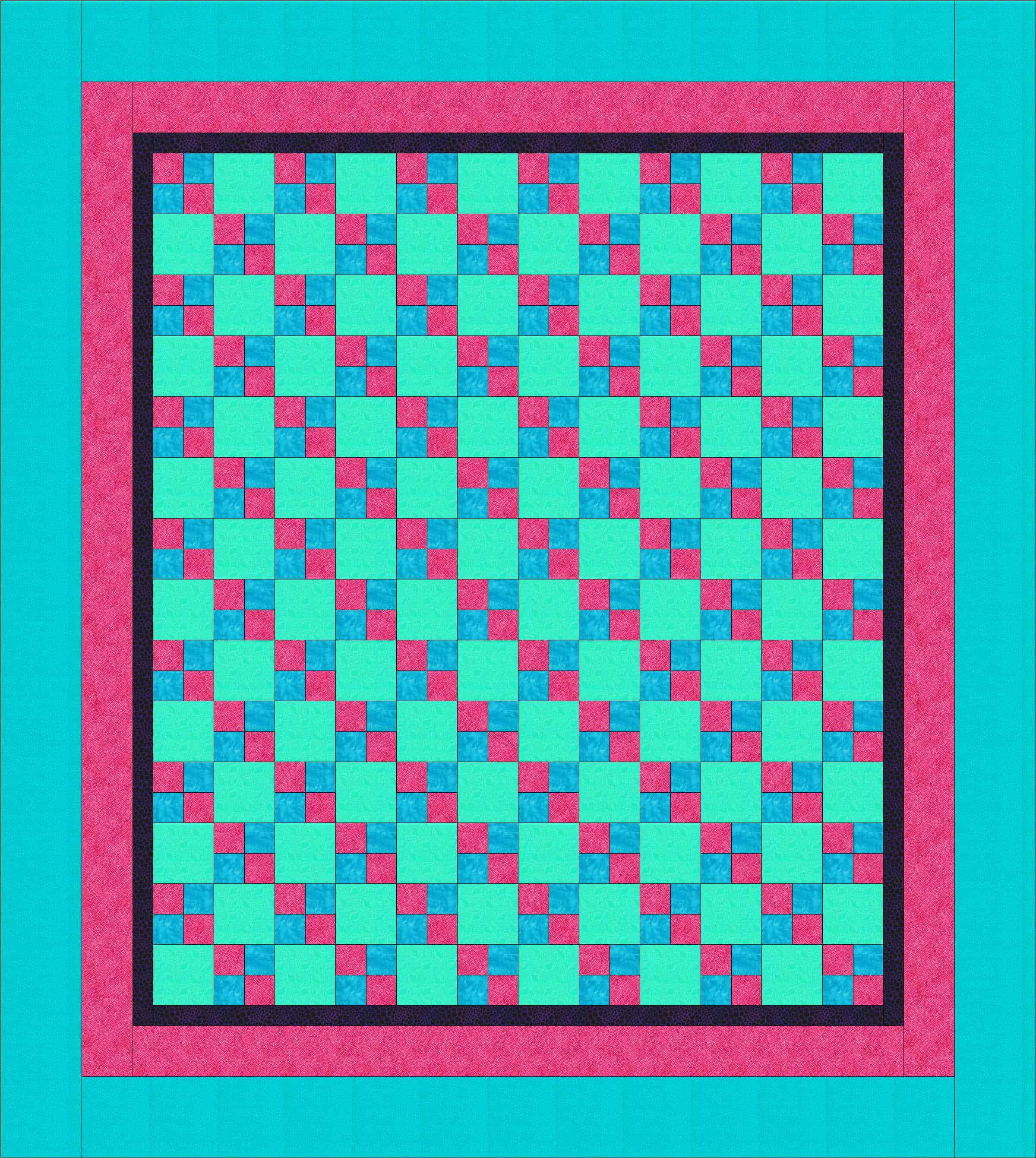
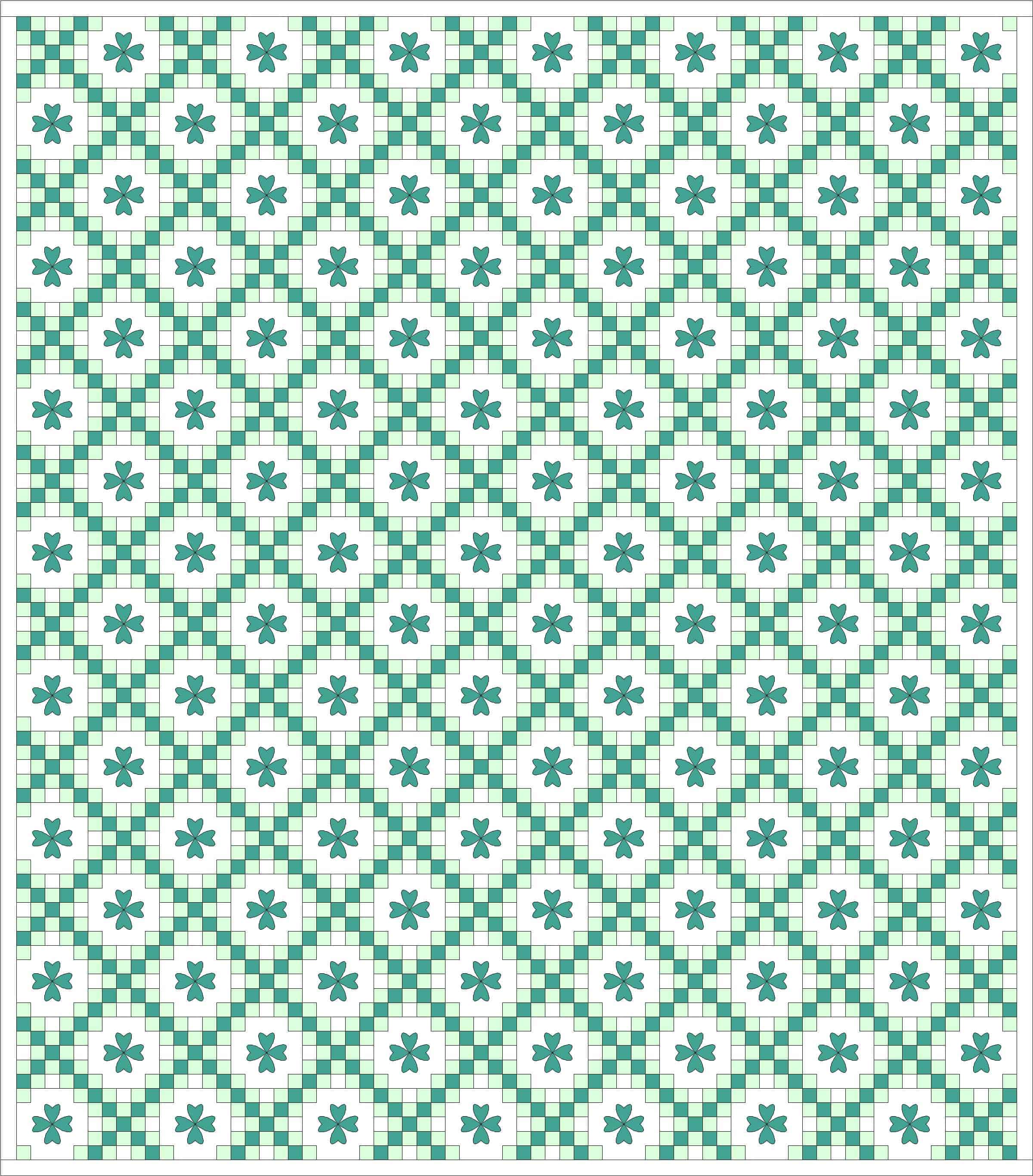
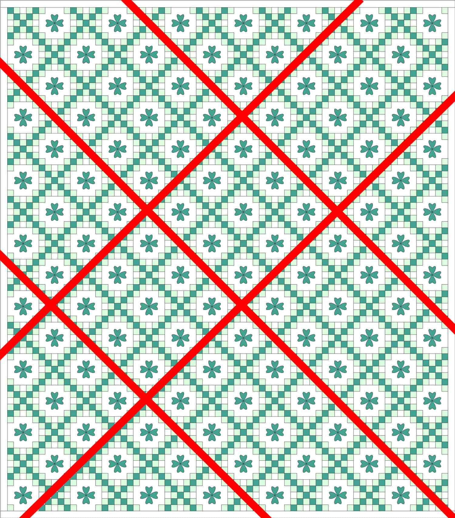
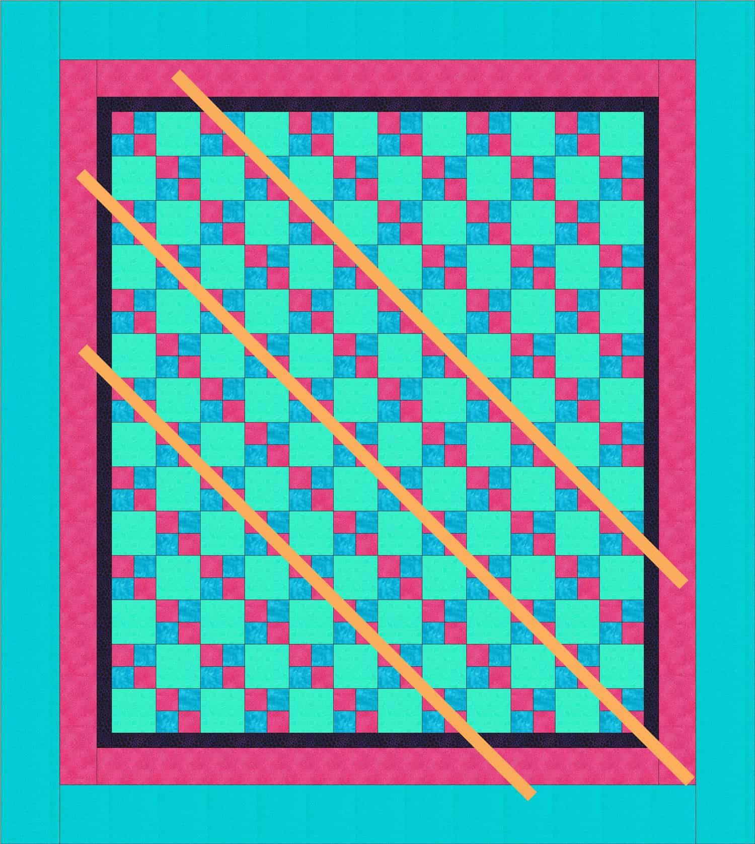
Design Series: Rhythm

For the audio portion, check out Sandy’s page or iTunes

Rhythm is a Principle of Design

Rhythm is a design principle based on repetition (Pentak & Lauer, pg. 100)

Definitions:

  1. “Intervals at which related element occur throughout a piece of art” (Liz Berg handout entitled Principles of Design from “Design the Abstract Quilt” class)
  2. Visual rhythm is created when elements repeat in a sequence in a design. The repeated elements are often shape or color motifs…rather than simply repeating the elements to create a pattern. They act as a series of beats that ‘speak’ to one another.” (Aimone, Design! A lively guide to design basics for artists & craftspeople, pg. 112-113)
  3. “..rhythm involves a clear repetition of elements that are the same or only slightly modified.”  (Pentak & Lauer, pg. 100)
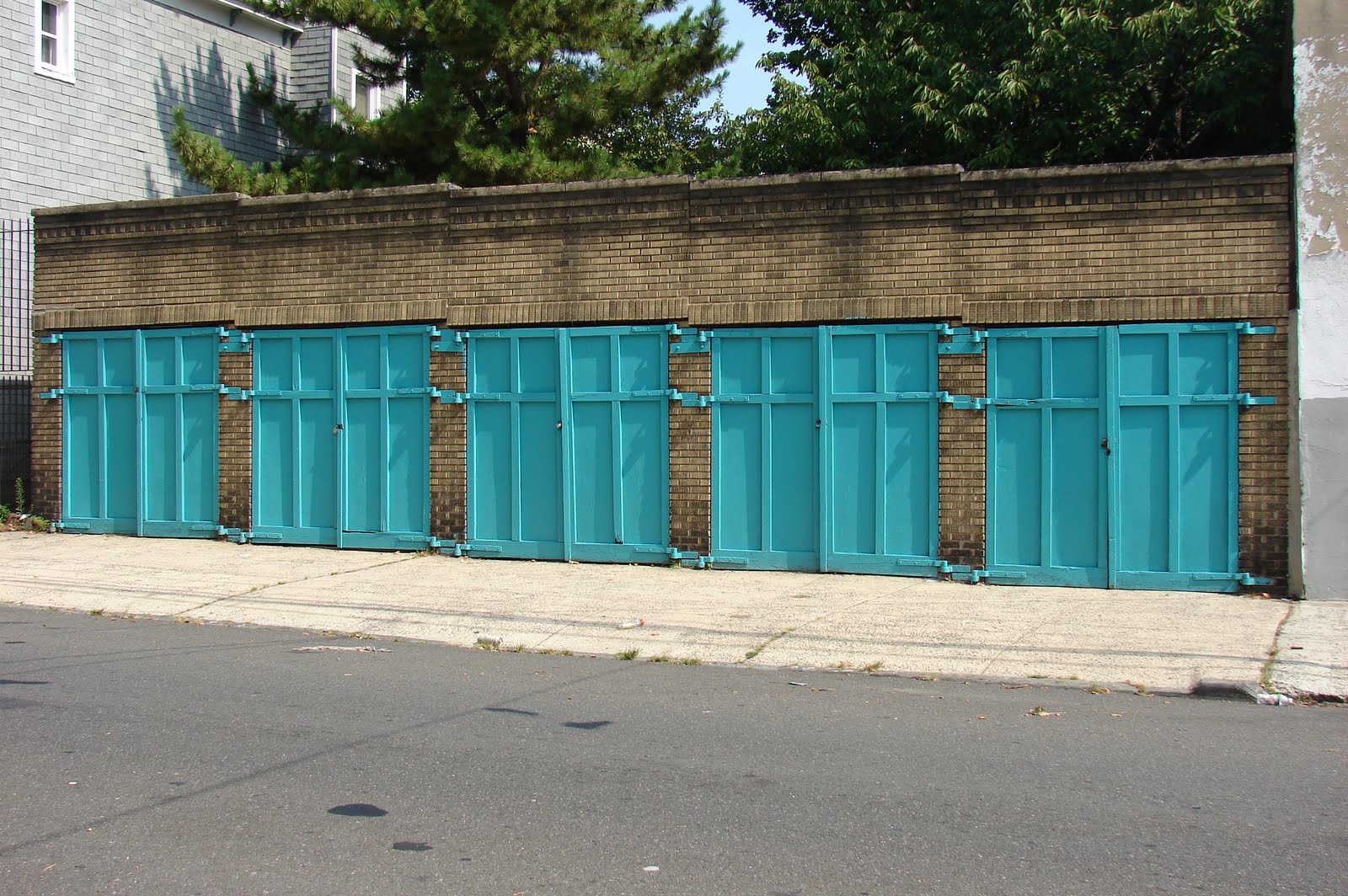
    • Vertical slats on the back of a chair


  1. Rhythm is “the repetition of a regular pattern, or a harmonious sequence or correlation of colors or elements.” (Art+Quilt by Lyric Kinard, pg. 80)
  2. “Visual rhythm involves the movement of our eye from one element to the next in a regular pattern.” (Art+Quilt, pg. 80)
  3. “In visual art, refers to the movement of the viewer’s eye across recurrent motifs.” (The Quilter’s Book of Design, 2d ed, pg. 155)

“…repetition of an element creates visual rhythm.” (The Quilter’s Book of Design, 2d ed, pg.15)

The following relate back to unity, so be sure to review those notes and the podcast before you move to Rhythm

Types of Rhythm

Alternating Rhythm (The Quilter’s Book of Design, 2d ed, pg. 16)

  • “…the variation of a repeated pattern between two or more elements.” (Art+Quilt, pg. 80)
    • Example: the pattern of night and day (Art+Quilt, pg. 80)
    • Example: “…a chorus repeated between different verses of a song.” (Art+Quilt, pg. 80)
  • “…uses patterns that move back and forth.”  (The Quilter’s Book of Design, 2d ed, pg. 16)
    • Light and dark
    • thick and thin
    • hot and cold
    • tall and short
  • “A familiar example of this idea can be seen in a building with columns, such as a Greek Temple. The repeating pattern of light columns against darker negative spaces is clearly an alternating rhythm.” (Pentak & Lauer, pg. 104)

Progressive Rhythm (The Quilter’s Book of Design, 2d ed, pg.16)

  • “…uses the repetition of an element to deliberately move the viewer’s eye in a specific direction. It is a pattern in which the viewer can see a sequence that is predictable. (The Quilter’s Book of Design, 2d ed, pg. 16)
  • “In visual art, a progressive rhythm might consist of any repeated element growing or shrinking in size, shape, or number.” (Art+Quilt, pg. 80)
    • Example: “The expanding rays of a Mariner’s compass block as it reaches outward.” (Art+Quilt, pg. 80)
  • “A progressive rhythm is often found in nature when the size or shape of something gradually increases or descreases.” (Art+Quilt, pg. 80)
    • concentric layers of tree rings (Art+Quilt, pg. 80)
    • a musical theme that “grows in complexity, volume, and instrumentation with repetition.” (Art+Quilt, pg. 80)
    • “gradually diminishing pattern of ocean waves as your eye moves toward the horizon” (Art+Quilt, pg. 80)
  • Commonplace in nature, but not always readily apparent (Pentak & Lauer, pg. 107)
    • Cut in half, the inside of an artichoke shows a growth pattern. (Pentak & Lauer, pg. 107)
    • chambered nautilus cut in cross section. (Pentak & Lauer, pg. 107)

Staccato Rhythm

  • “abrupt changes with dynamic contrast. The reccurrence of these dark squares establishes a visual rhythm. The irregular spacing of the small squares causes the pattern (and rhythm) to be lively rather than monotonous.” (Pentak & Lauer, pg. 100)
    • Piet Mondrian painting called Broadway Boogie-Woogie  expresses the “on/off patterns of Broadway’s neon landscape but also the rhythmic sounds of 1940s instrumental blues music.” (Pentak & Lauer, pg. 102)
  • Staccato rhythm can, sometimes, be exciting if unsettling. (Pentak & Lauer, pg. 100)

Static Rhythm

  • “…has no variety and can be monotonous if carried throughout a composition… If there is no variety in the fabrics chosen, the quilt will have static rhythm, …no movement.” (The Quilter’s Book of Design, 2d ed, pg. 15)
  • “Static rhythm is only apparent; for in every seeming case, the rhythm really pervades the succession of acts of attention to the elements rather than the elements themselves; a colonnade, for example, is rhythmical only when the attention moves from one column to another.” (http://www.authorama.com/principles-of-aesthetics-6.html) – I think this is why we like those red and white Sawtooth Star quilts.

Syncopated Rhythm

  • “…gives surprising emphasis to a beat that is normally weak and adds unexpected interest.” (Art+Quilt, pg. 80)
  • “A syncopation or syncopated rhythm is any rhythm that puts an emphasis on a beat, or a subdivision of a beat, that is not usually emphasized…Syncopation is one way to liven things up. The music can suddenly emphasize the weaker beats of the measure, or it can even emphasize notes that are not on the beat at all.” (Connexions http://cnx.org/content/m11644/latest/)

Visual Rhythm

  • “Repetition is another way to create unity in a quilt design. The repetition of an element in a composition can tie the whole together, creating a relationship among the elements.” (The Quilter’s Book of Design, 2d ed, pg.15)
    • “…repetition of an element creates visual rhythm.” (The Quilter’s Book of Design, 2d ed, pg.15) Static rhythm, alternating rhythm and progressive rhythm have an effect on unity through repetition.
  • “Visual rhythm can be smooth and even, or it can be abrupt and uneven, depending on the goal the quilt designer wants to achieve.” (The Quilter’s Book of Design, 2d ed, pg. 16)

 Examples of Rhythm

  • heartbeat – “repeats in a regular, orderly manner and establishes a rhythm that underlies your very existence” (Aimone, Design! A lively guide to design basics for artists & craftspeople, pg.112)
  • “breathing consists of a regular sequence of inhaling and exhaling” (Aimone, Design! A lively guide to design basics for artists & craftspeople, pg.112)
  • “When you walk, you establish parallel rhythms with the two sides of your body.” (Aimone, Design! A lively guide to design basics for artists & craftspeople, pg.112)

 Notes:

  • “Careful placement of accents pulls the viewer’s eye across the picture. The eye travels quickly when elements are closely spaced, more slowly across wider intervals. Use accents to control the rhythm and keep the viewer’s eye moving within the picture.” (Liz Berg handout entitled Principles of Design from “Design the Abstract Quilt” class). This is one area where a border is useful. Instead of just slapping on a border (and you all know by now that this is one of my biggest pet peeves), look at whether your design is falling off the quilt and needs to be contained or whether you need to continue the design into the border to finish it.
  • “…rhythm relies on repetition. Repeating design elements over and over again will create a sense of rhythm with the design field.” (A Fiber Artist’s Guide to Color & Design, pg. 127)
  • “Rhythm helps to entice the viewer to stay longer and can make an artwork easier to live with.  (A Fiber Artist’s Guide to Color & Design, pg. 127)
  • “..if the rhythm of a work becomes too static or monotonous then the work becomes easy to ignore.” (A Fiber Artist’s Guide to Color & Design, pg. 127)
  • Visual rhythm is closely connected to rhythms in music and the rhythms of art pieces are sometimes inspired by music. (Pentak & Lauer, pg. 108)

Rhythm Resources:

  • A Fiber Artist’s Guide to Color & Design book* by Heather Thomas
  • Art+Quilt* by Lyric Kinard
  • Design! A lively guide to design basics for artists & craftspeople by Steven Aimone book*
  • International School | Breda Principles of Design page
  • Liz Berg handout entitled Principles of Design from “Design the Abstract Quilt” class
  • Rhythm – Basic Principles of Design post/article
  • The Quilter’s Book of Design, 2d book*


**Obviously, you should shop at local quilt shops. However, I use affiliate links and may be paid for your purchase of an item when you click on an item’s link in my post. There is no additional cost to you for clicking or purchasing items I recommend. I appreciate your clicks and purchases as it helps support this blog.

Design Series: Repetition

Sandy and I got together, virtually, of course, and recorded another episode. This time the topic was Repetition, which is a Principle of Design. Repetition is closely related to Unity, another principle of design and a topic we discussed in this series previously. If you didn’t listen to the Unity podcast, you would be well served to listen to it before you listen to this one.

As a reminder, the design definition with which we are working is:  Design is a problem solving activity within all the arts, placing or creating subject matter so it is of visual significance and interesting to the artist. (from The

“The principle of repetition is very versatile. It not only promotes the existence of unity, but it plays a significant role in the appearances of the principles of rhythm and harmony (Adventures in Design, pg. 97)

Definitions of Repetition:

  1. “[Repetition] provides visual clues to help move the eye about the picture. Similarities in elements reinforce the viewer’s recognition of symbols, strengthen the rhythm, encourage movement, and produce patterns. Introduce variations of repeated elements to prevent boredom.” (Liz Berg handout entitled Principles of Design from “Design the Abstract Quilt” workshop). Nota bene: When she uses ‘elements’ in this definition, she doesn’t mean design elements, but elements in the design; parts of the design, e.g. repeating a checkerboard at various intervals.
  2. “We use the word repetition to describe the practice of using design elements over and over again” (A Fiber Artist’s Guide to Color & Design, pg. 124)
  3. An element that repeats in various parts of a design to relate the parts (The Quilter’s Book of Design, 2d ed, pg.155)
  4. “Repetition in design is simply repeating one or more elements. (Wolfrom, Adventures in Design, pg. 97)
  5. “…something simply repeats in various parts of the design to relate the parts to each other. The element that repeats may be almost anything: a color, a shape, a texture, a direction or an angle.” (Pentak & Lauer, pg.28)
  6. Provides visual clues to help move the eye around the image. (Liz Berg handout entitled Principles of Design from “Design the Abstract Quilt” class)

“…repeated elements will help bring unity to our artistic creations.” (Art+Quilt, pg. 80)

“A definite focal point is not a necessity in creating a successful design. It is a tool that arts may or many not use, depending on their aims. An artist may wish to emphasize the entire surface of a composition over any individual elements.” (Pentak & Lauer, pg.57) One way to do this is to repeat a motif or element.

  •  In Andy Warhol’s 100 Cans painting, there are “a hundred repetitions of precisely the same image with no change, no contrast, and no point of emphasis. But the repetitive, unrelieved quality is the basic point and dictated the design.” (Pentak & Lauer, pg.57)

Repetition is used frequently in quiltmaking.

  • blocks
  • similar fabrics or colors
  • fabric repeats
  • Repeated vertical stripes in an Amish Bars quilt (Art+Quilt, pg. 80)

Repetition can be used in representational work as well. In Degas’ painting, The Millinery Shop, the artist often repeats a circle motif. The circles are a repeating element of visual unity, but the circles fit into the painting, because they represent objects such as hats, flowers, bows, the woman’s head, bosom, and skirt. (Pentak & Lauer, pg.28)

Examples of repetition in quilts and other art:

Integrating with other Principles and Elements

  • Repetition is the element of choice to create unity. (Wolfrom, Adventures in Design, pg.97)
  • “Repetition promotes the existence of unity, but it plays a significant role” in the appearances of rhythm as well. “Repetition that flows fluidly throughout a design allows rhythm to come forth. When Repetition and Rhythm work together in a visually pleasing manner, harmony is created.” (Wolfrom, Adventures in Design, pg.97)
  • “…at least one repeating element” can serve to create unity.” (Wolfrom, Adventures in Design, pg.97)
  • “If no repetition exists there is nothing to hold the design together.” (Wolfrom, Adventures in Design, pg.98)
  • “Pattern is a repetitive design with a motif appearing again and again. A pattern is created when the viewer is led to anticipate the same elements in a design. The repetition does not have to symmetrical, nor does it have to be precisely placed for the view to be able to anticipate or a find a pattern.” (The Quilter’s Book of Design, 2d ed, pg.49)
  • Repetition is “a valuable and widely used device for achieving visual unity.” (Pentak & Lauer, pg.28)
  • Rhythm is “the repetition of a regular pattern, or a harmonious sequence or correlation of colors or elements.” (Art+Quilt by Lyric Kinard, pg.80)

Tips and Tricks

      • “Every element does not need to be repeated. If too many elements are repeated, predictability, visual monotony, and disinterest can result.” (Wolfrom, Adventures in Design, pg.97)
      • Elements can be repeated in different sizes, shapes or textures, etc and still be considered repetition. (Pentak & Lauer, pg.28)
  • “Similarities in elements reinforce the viewer’s recognition of symbols, strengthen the rhythm, encourage movement, and produce patterns. Introduce variations of repeated elements to prevent boredom.” (Liz Berg handout entitled Principles of Design from “Design the Abstract Quilt” class)

Notes:

If you have not seen Wayne Thiebaud‘s work, not only are his cakes and candies paintings whimsical, they are GREAT examples of repetition.

  •  “Repetition is another way to create unity in a quilt design. The repetition of an element in a composition can tie the whole together, creating a relationship among the elements.” (The Quilter’s Book of Design, 2d ed, pg.15) Nota bene: again, ‘element’ in this context means part.
  •  “…repetition of an element creates visual rhythm.” (The Quilter’s Book of Design, 2d ed, pg.15). Static rhythm, alternating rhythm and progressive rhythm have an effect on unity through repetition, but we will cover that when we cover the Principle of Rhythm.
  • “Repetition that flows fluidly throughout a design allows rhythm to come forth.” (Adventures in Design, pg. 97)
  • “When repetition and rhythm work together in a visually pleasing manner, harmony is created.” (Adventures in Design, pg. 97)

Repetition Resources

 Examples of Repetition:

Paper Christmas Tree by Little Lovables (http://littlelovables.blogspot.com/2009/12/paper-christmas-trees.html)

The triangles of the branches are what caught my attention.

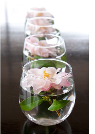
Camellias in glass and water (https://www.cathyhecknurseryart.com/blog/2011/03/the-bewildered-gardner-and-her-husband-on-camelias)

Source: cathyhecknurseryart.com via Jaye on Pinterest

Camellias in vases lined up are gorgeous.

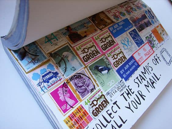
Stamps by iHanna (https://www.flickr.com/photos/kitty80/4935066650/in/photostream/)
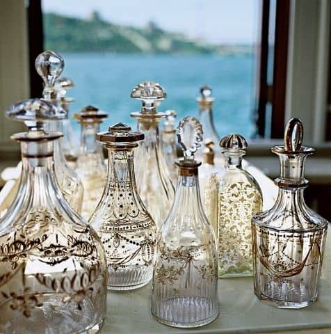
Decanters by https://umla.tumblr.com/

Source: umla.tumblr.com via Jaye on Pinterest

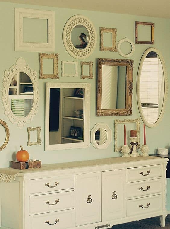
Repetition of Mirrors


Daily Dose of Design?

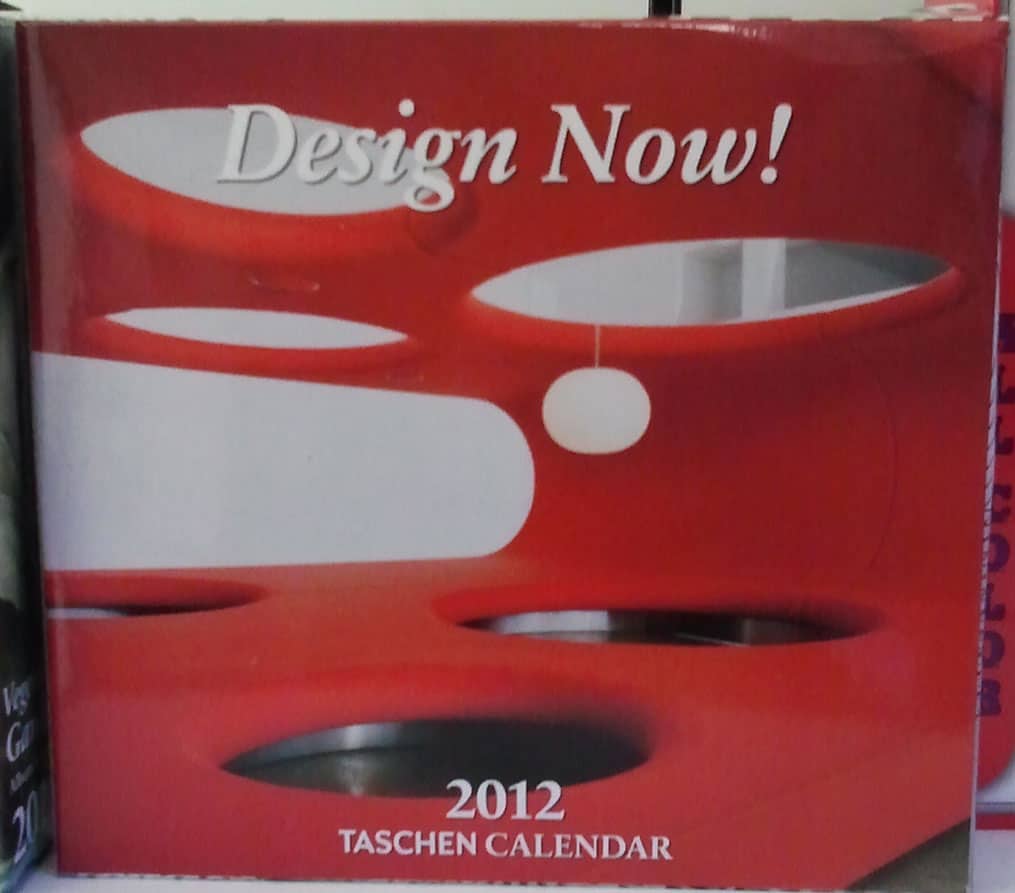
Design a Day Calendar

I always feel a bit abashed that I have a smartphone, but every day I seem to find a cool use for it, especially the camera.

On my lunch hour the other day, I went to buy some sympathy cards and saw this calendar. For those of you following along on the Artquiltmaker/Quilting for the Rest of Us Design Series, I thought this might be a good way to keep design on your mind every day. It isn’t too late to get a calendar!

Design Series: Unity/Harmony

Look for Sandy‘s podcast, which was posted on 1/12/2012. This post is a companion to the podcast and we discuss many examples and I provide a lot of explanations about the information below.

The Design Definition we are using in this series is:  Design is a problem solving activity within all the arts, placing or creating subject matter so it is of visual significance and interesting to the artist. (from The Quilter’s Book of Design, 2d ed)

Unity/Harmony are Principles of Design. Unity and Harmony are often combined as one principle. Harmony is used here as another word for Unity.

Definition:

  1. the presentation of an integrated image (Pentak & Lauer, 5th ed. pg.20)
  2. a design in which “congruity or agreement exists among the elements in a design; they look as though they belong together” (Pentak & Lauer, 5th ed. pg.20)
  3. some visual connection beyond mere chance has caused elements to come together. (Pentak & Lauer, 5th ed. pg.20)

According to Adventures in Design by Joen Wolfrom, “the backbone of any design is unity,” because it provides stability and control in a design as well as visual comfort. It also clarifies the design (Wolfrom, Adventures in Design, pg.97)

“The strength of the composition is that the parts are not there by chance, but that they appear to belong together… The parts don’t have to be the same or have to touch each other; rather, they must make sense together.” (The Quilter’s Book of Design, 2d ed, pg.13)

Creating Unity (aka Unity with Variety  (Pentak & Lauer, 5th ed. pg.19) )

Unity cannot exist without other closely related elements and principles (Wolfrom, Adventures in Design, pg.97), which means that this is probably the principle where we will discuss the most other elements and principles.

“Unity of design is achieved by the arrangement of the lines, shapes, colors, values textures and patterns that are used.” (The Quilter’s Book of Design, 2d ed, pg.13)

Methods of creating Unity are below:

  • The Grid
    • a checkerboard pattern using only black and white fabrics has complete unity. There is a “constant repetition of shape and obvious continuation of lined-up edges.” This design, however, can be a bit boring. (Pentak & Lauer, 5th ed. pg.34)
    • Many, many quilts have an underlying checkerboard pattern (blocks)
    • a checkerboard pattern using black, white and two kinds of grey adds in some variety to the basic checkerboard theme
    • a checkerboard pattern using black, white and two kinds of grey where rectangles are added to,” OR replace some of, “the squares creates even more variety while still using a basic grid. There is an “obvious, underlying feeling of unity, yet variations enliven the pattern.” (Pentak & Lauer, 5th ed. pg.34)
    • “shapes may repeat, but perhaps in different sizes; colors may repeat, but perhaps in different values.” (Pentak & Lauer, 5th ed. pg.34)
  • Unity through Repetition
    • “Repetition is another way to create unity in a quilt design. The repetition of an element in a composition can tie the whole together, creating a relationship among the elements.” (The Quilter’s Book of Design, 2d ed, pg.15)
      • “…repetition of an element creates visual rhythm.” (The Quilter’s Book of Design, 2d ed, pg.15) Static rhythm, alternating rhythm and progressive rhythm have an effect on unity through repetition, but we will cover that when we cover the Principle of Rhythm.
      • Examples:
        • http://www.flickr.com/photos/68806166@N05/6632122205/
        • http://www.flickr.com/photos/baileygirl5/5179971933/
        • http://www.flickr.com/photos/ericacrafts/4542434534/
        • http://www.flickr.com/photos/14922562@N05/6153186561/
        • http://www.flickr.com/photos/redpepperquilts/3361801067/
        • http://www.flickr.com/photos/goingsewcrazy/5102965576/ (also shows pattern interruption)
        • http://www.flickr.com/photos/daarrr/6609341817/
  • Varied Repetition
    • Variety is achieved by  position (straight set or on point), size and difference in proportion (e.g. all star blocks, but not the same size star blocks) of the features. (Pentak & Lauer, 5th ed. pg.36)
    • “Variation or contrast with unity creates a stronger design than unity alone.” (Wolfrom, Adventures in Design, pg.99)
    • “Variety creates increased interest in a design.” (Wolfrom, Adventures in Design, pg.99)
    • porch posts or stair rails are another example. Certain standard measurements repeat while a variety of carving vary the sections of each column. (Pentak & Lauer, 5th ed. pg.36)
    • “Repetition in design is simply repeating one or more elements. Every element does not need to be repeated. If too many elements are repeated, predictability, visual monotony, and disinterest can result.” (Wolfrom, Adventures in Design, pg.97)
    • “When elements of a design have a similar shape, we automatically create a visual relationship among them.” (The Quilter’s Book of Design, 2d ed, pg.14)
    • “Variation is added through the shifting of motif shapes;” “our eyes are most interested in the place where the pattern is interrupted.” (Wolfrom, Adventures in Design, pg.99)
      • Example: http://www.flickr.com/photos/goingsewcrazy/5102965576/
  • Emphasis on Unity
    • “To say a design must contain both the ordered quality of unity and the lively quality of variety does not limit or inhibit the artist. The principle can encompass a wide variety of extremely different visual images and can even be contradicted for expressive purposes.” (Pentak & Lauer, 5th ed. pg.38)
    • Subtle repetition can enhance the unity of composition. By using subtle repetition, the artist draws the viewer in to look more carefully for differences. (Pentak & Lauer, 5th ed. pg.38)
      • consider identical twins. When looking at a photo of identical twins, the eye seeks out the differences. The same can be said for a one block quilt. If the quiltmaker chooses subtle variations in color, the viewer will seek out the differences even if the block is the same.
    • “Unity without variety can evoke our worst feelings about assembly lines and institutions.” (Pentak & Lauer, 5th ed. pg.38)
  • Emphasis on Variety (difficult to explain in words, because it is easier to see a visual example!)
    • Star quilt where none of the star patterns are the same.
    • Quilt where none of the blocks are the same, but the colors unify the piece
  • Chaos & Control
    • “without some aspect of unity, an image or design becomes chaotic and quickly ‘unreadable’. (Pentak & Lauer, 5th ed. pg.42)
    • design can also become lifeless or dull (Pentak & Lauer, 5th ed. pg.42)
    • “neither utter confusion nor utter regularity are satisfying” (Pentak & Lauer, 5th ed. pg.42)
    • housing subdivisions often start out boringly the same, but as years pass elements of personal variations crop up (landscaping, paint color, fence style, etc) (Pentak & Lauer, 5th ed. pg.42)
  • Bridging
    • Bridging is used to gently move the eye from one extreme to another. (Wolfrom, Adventures in Design, pg.103)
    • considered a ‘principle’ by Joen Wolfrom, but is more of an element under unity for our purposes.
      • Color is often used for bridging. (Wolfrom, Adventures in Design, pg.103) Color gradation often shows up in quilts (consider my Fabric of the Year series).  Moving from light to dark can add great drama to a design. (Wolfrom, Adventures in Design, pg.103)
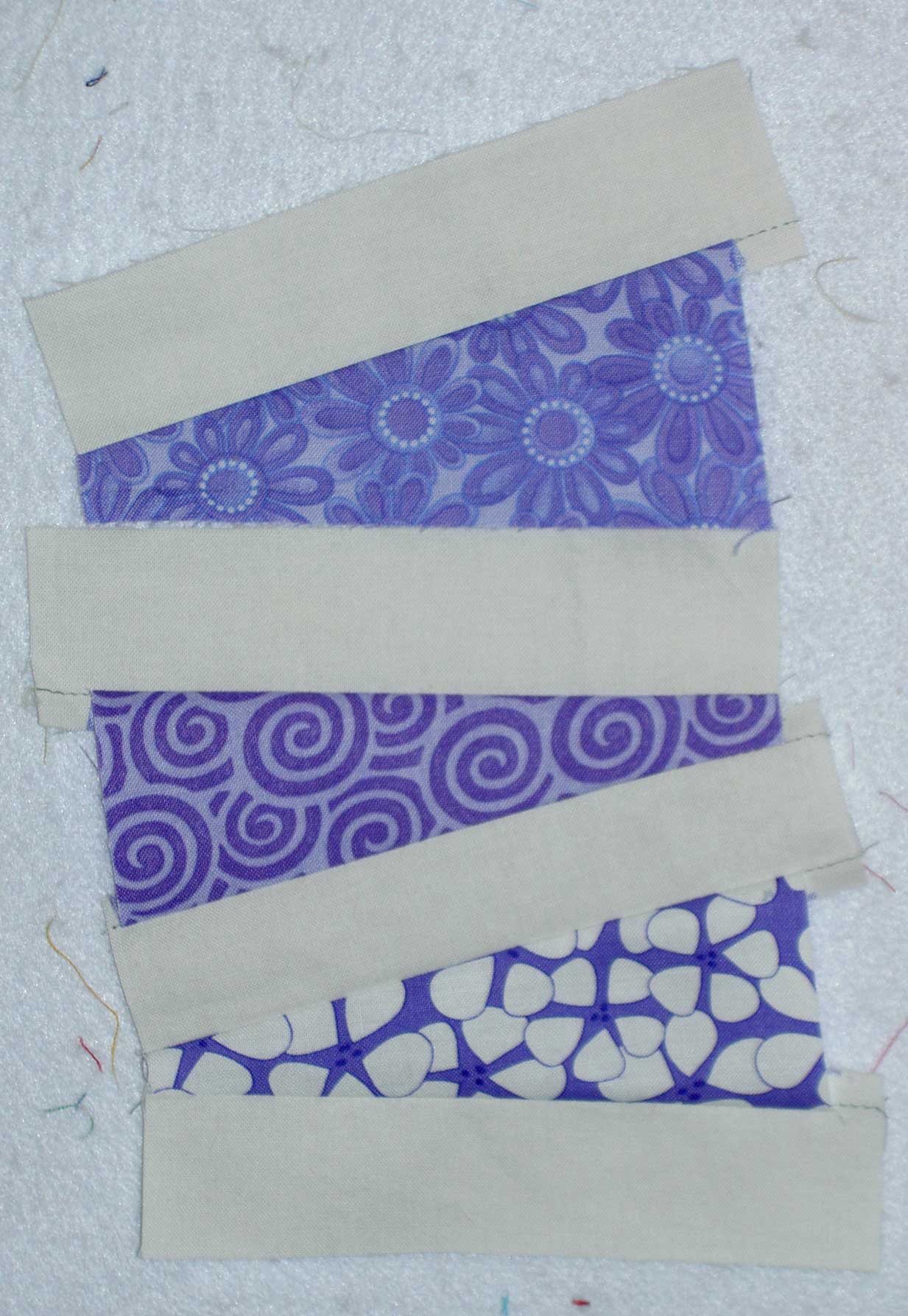
      • Size gradation is also compelling. Moving across your quilt from a large shape to a small shape can create variety and interest. (Wolfrom, Adventures in Design, pg.104). It kinds of looks like this series of rectangles
      • A quiltmaker can also change the configuration of shapes such as going from a vertical thin rectangle through a square to a thin, horizontal rectangle. (Wolfrom, Adventures in Design, pg.105)
  • Unity through Proximity
    • “One of the easiest ways to tie elements of a design together is to place them close to each other.” (The Quilter’s Book of Design, 2d ed, pg.13)
    • “Make sure the objects in your design are close enough that they have a visual bond – a visual relationship. Objects need to be in close proximity for unity” (Wolfrom, Adventures in Design, pg.105)
    • Different shapes can be placed in such a way that they have no unity, but shapes can also be placed in such a way that suggests a meaning. (The Quilter’s Book of Design, 2d ed, pg.14)
    • Tidal Flat by Inge Mardal and Steen Hougs uses proximity well.
    • Bagpipes by Judy Simmons
    • “Our eyes also organize the empty spaces in a design. The foreground or positive shapes are surrounded by the background, also called negative space.” (The Quilter’s Book of Design, 2d ed, pg.15)
      • “…the artist has to be aware that the shapes in the foreground create shapes in the background that can confuse the viewer, or dominate the positive shapes. Traditional pieced quilts often use this principle to add complexity to a design.” (The Quilter’s Book of Design, 2d ed, pg.15)
  • Movement
    • Repeating an object’s shape across the design creates movement when the repetition gives the eye the opportunity to move across the design. (Wolfrom, Adventures in Design, pg.106)
  • Unity  through Continuation
    • “…the arrangement of various elements in the composition so that their edges create a visual line. (The Quilter’s Book of Design, 2d ed, pg.18)
    • “Quilts often employ a grid as an underlying structure that gives the blocks unity through the principle of continuation.” (The Quilter’s Book of Design, 2d ed, pg.18)

Achieving Unity

  • “One way to tie the foreground and background together is to repeat a color in both the positive and negative spaces.”  (The Quilter’s Book of Design, 2d ed, pg.20)
    • This means that perhaps you have a batik with gold running through the predominantly black fabric. By appliqueing gold leaves to the background fabric, you have moved in the direction of creating unity. (The Quilter’s Book of Design, 2d ed, pg.20)
    • If your quilt has large yellow areas, you can quilt with yellow Perl cotton to help achieve unity. In this example, there must be contrast as well.  (The Quilter’s Book of Design, 2d ed, pg.20)
  • The balance of positive and negative space can also work to your advantage in creating unity. (The Quilter’s Book of Design, 2d ed, pg.21-22)

 Un-unified or Un-harmonious Designs

  • the whole design or the group elements appear separate or unrelated.
  • A viewer will ignore a chaotic design (Pentak & Lauer, 5th ed. pg.24)
  • “lack of unity is one of the major reasons a design is unsuccessful. Too much variety creates visual chaos. If not repetition exists, there is nothing to hold the design together.” (Wolfrom, Adventures in Design, pg.98)
    • this quote brings orphan block quilts to mind. These are difficult quilts to design, because of the variety included. The artist must create something to hold the group together such as unified sashing, a color that flows throughout the piece, etc.

 Notes:

  • “in the application of any art principle, wide flexibility is possible within the general framework of the guideline” (Pentak & Lauer, 5th ed. pg.38)
  • “To say a design must contain both the ordered quality of unity and the lively quality of variety does not limit or inhibit the artist. The principle can encompass a wide variety of extremely different visual images and can even be contradicted for expressive purposes.” (Pentak & Lauer, 5th ed. pg.38)
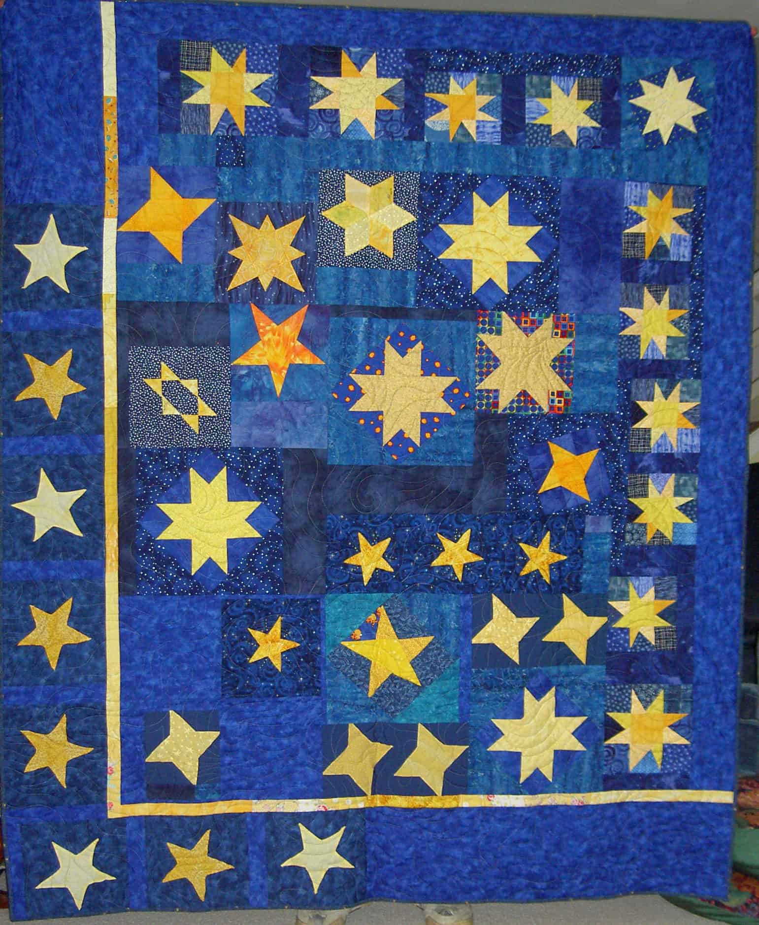
Stars for San Bruno #1

A kind of Star Sampler is my Stars for San Bruno #1 quilt.

Unity/Harmony Resources:

Art Institute of Chicago’s Art Explorer (the Millinery Shop): http://www.artic.edu/artexplorer/search.php?tab=1&resource=14572
Design Basics, 5th ed. by David A. Lauer and Stephen Pentak, pg. 19-43
NPR blog post on Unity: http://www.npr.org/blogs/13.7/2011/09/07/140211660/what-is-unity?sc=fb&cc=fp
Setting Solutions by Sharyn Craig

You can see the last Design class, which was on Balance on the November 29 post.

Design Series: Balance

This post is a companion to the Quilting…for the Rest of Us podcast episode on Balance.

As a reminder, the general design definition that we are using is:  Design is a problem solving activity within all the arts, placing or creating subject matter so it is of visual significance and interesting to the artist. (from The Quilter’s Book of Design, 2d ed)

Balance is a Principle of Design.

Definition of balance:

  1. Balance is used to describe the distribution of visual weight in a design. Visual weight refers to the parts of the design that appear larger, that appear to come forward, or that appear to have more importance. (The Quilter’s Book of Design, 2d, pg. 4)
  2. Balance is concerned with the distribution of visual interest — what is placed where in a composition. (http://daphne.palomar.edu/design/bsymm.html)
  3. Balance refers to the ways in which the elements (lines, shapes, colors, textures, etc.) of a piece are arranged. (http://arthistory.about.com/cs/glossaries/g/b_balance.htm)
  4. Balance is an art and design principle concerned with the arrangement of one or more elements in a work of art so that they appear symmetrical (even) or asymmetrical (uneven) in design and proportion. (http://www.artincanada.com/arttalk/arttermsanddefinitions.html)

You can affect balance by using some elements of design including size, placement, color and texture. (The Quilter’s Book of Design, 2d, pg. 4)

There are four main types of balance:

  • symmetrical: This is also called formal balance (The Quilter’s Book of Design, 2d, pg. 4). Ruth McDowell explains, in her Symmetry book, that there are 17 types of symmetry. The most common types of symmetry used in quiltmaking are noted with an asterisk. They are:
    • mirror *
    • two mirrors
    • four mirrors
    • six mirrors
    • mirrored kites
    • mirrored triangles
    • rotational *
      • 60 degrees
      • 90 degrees
      • 120 degrees
      • 180 degrees
    • translational *
    • glide *
    • two glides
    • staggered pairs
    • staggered fours
    • glides and mirrors
    • pinwheels and mirrors
  • radial 
  • crystallographic
  • asymmetrical 
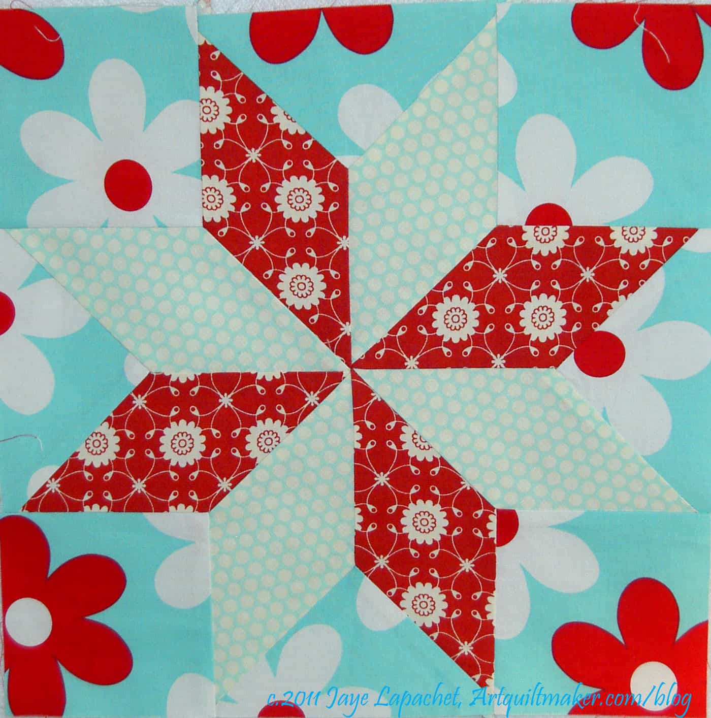
Finished LeMoyne Star

Symmetrical Balance:

  • “Symmetrical balance, or symmetry, is the regular arrangement of similar parts in a predictable pattern. Ruth McDowell, in her book Symmetry, explains that there are seventeen different kinds of symmetry based on the scientific study of crystallography.” (Fearless Design, pg.17).
  • “Symmetrical balance repeats similar shapes, colors, values, lines , or other elements on both halves of the composition.” (The Quilter’s Book of Design, 2d, pg. 5); “One side, in effect, becomes a mirror image of the other” (Pentak & Lauer, 5th ed. pg.80)
    • LeMoyne Star
    • Eva’s Delight
    • Double 4 Patch
    • Nine Patch  (The Quilter’s Book of Design, 2d, pg. 5)
    • Irish chain (The Quilter’s Book of Design, 2d, pg. 5)
    • Log Cabin (The Quilter’s Book of Design, 2d, pg. 5)
    • Jacob’s Ladder (The Quilter’s Book of Design, 2d, pg. 5)
    • Drunkard’s Path (The Quilter’s Book of Design, 2d, pg. 5)

“The formality of a grid can be used to lend some organization to a complex or busy image.” (The Quilter’s Book of Design, 2d, pg. 5)

“The formal quality in symmetry imparts an immediate feeling of permanence, strength, and stability. Such qualities are are important in public buildings to suggest the dignity and power of a government.” (Pentak & Lauer, 5th ed. pg.80)

“Symmetrical balance does not, by itself, preordain any specific visual result” (Pentak & Lauer, 5th ed. pg.81). You have to choose the elements that you put into a symmetrically balanced design.

Radial Balance

  • “Radial balance is based on elements radiating from a central point.” ” Radial balance is based on divisions of a circle. To achieve radial balance, it is best to use five or more divisions. Using 4 divisions would be the same as rotational symmetry.” (Fearless Design, pg.18)
    • Dresden Plate
    • Winding ways
    • Mariner’s Compass
    • Medallion quilts radiate out from a large center motif to create overall radial balance. (The Quilter’s Book of Design, 2d, pg. 6)
      • the sun with its emanating rays (Pentak & Lauer, 5th ed., pg.94)
      • flowers (Pentak & Lauer, 5th ed., pg.94)
      • round form of domed building (Pentak & Lauer, 5th ed., pg.94)
      • tibetan mandalas (Pentak & Lauer, 5th ed., pg.94)
  • Also called circular balance. (The Quilter’s Book of Design, 2d, pg. 6)

Radial balance is sometimes considered a refinement of symmetrical or asymmetrical balance “depending on whether the focus occurs in the middle or off center.” (Pentak & Lauer, 5th ed., pg.94)

The advantage of a radial design “is the clear emphasis on the center and the unity that this form of design suggests.” (Pentak & Lauer, 5th ed., pg.94)

Crystallographic Balance

  • Crystallographic balance is a field of pattern scattered all over the surface. Essentially it is balance without a focal point. It is balanced, because it is the same all over.” (Fearless Design, pg.18)
    • scattered designs on fabric (calicos?)
    • allover fabric designs, such as dots or small flowers, are often companion prints to a fabric with a large focal point motif, such as prints by Philip Jacobs. These types of fabrics are used for resting places when the whole line is used together. The allover print is usually a crystallographic balanced design.
      • Tumbling Blocks
    • Crystallographic balance, or “allover patterns without a focal point” are balanced because they have “equal emphasis over a whole composition” (The Quilter’s Book of Design, 2d, pg. 6) or equal emphasis over the whole composition. Pentak & Lauer describe this as “the same weight or eye attraction literally everywhere” (Pentak & Lauer, 5th ed., pg.96)

Crystallographic balance is also considered a “refinement of symmetrical balance,” but it is “truly a different impression from our usual concept of symmetrical balance.” (Pentak & Lauer, 5th ed., pg.96)

“Many quilts use crystallographic balance in a grid. The block setting traditionally used for quilts lends itself to overall design balance.” (The Quilter’s Book of Design, 2d, pg. 7)

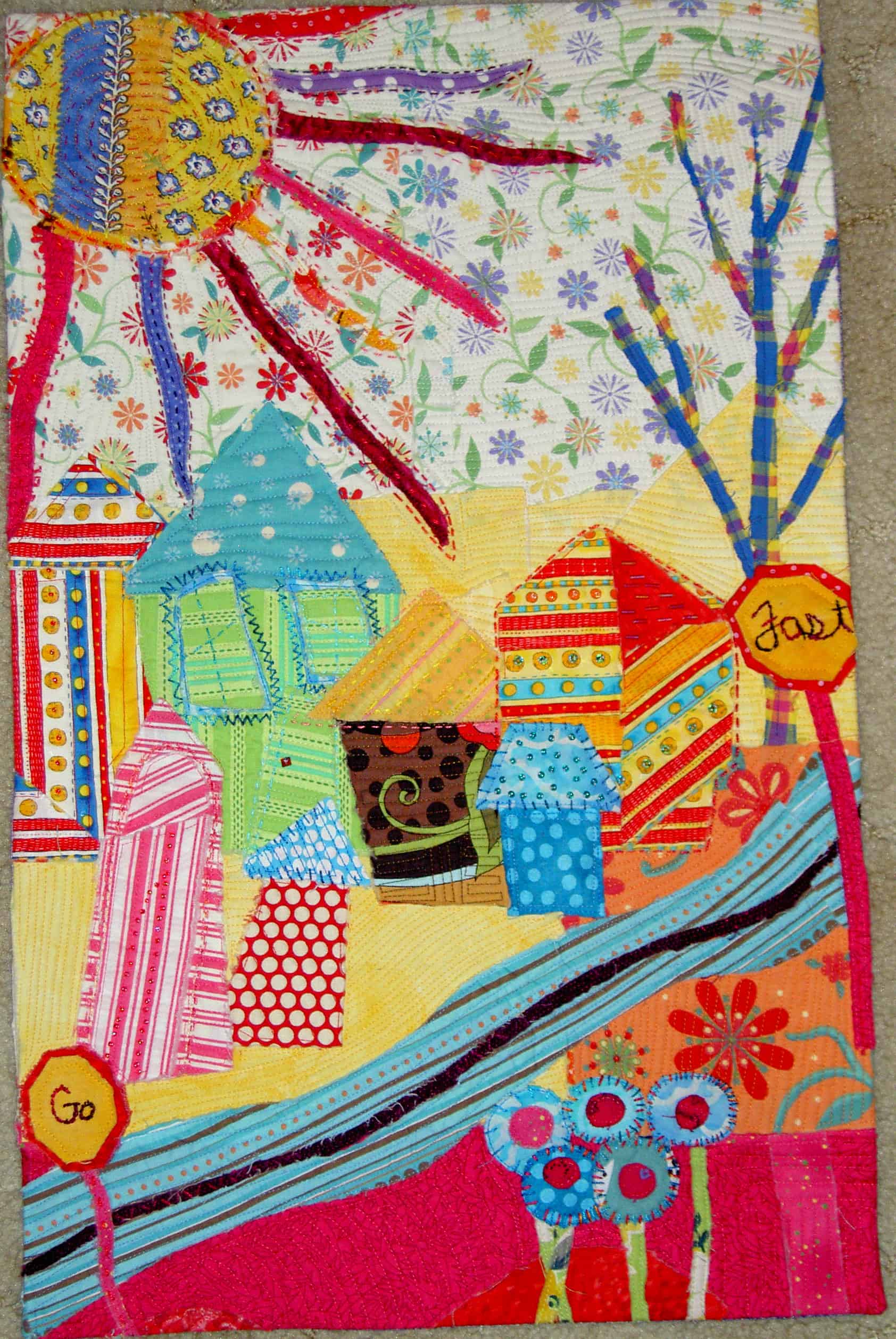
Beach Town Front
Beach Town Front

Asymmetrical Balance

  • “…parts of the composition are not the same, but are balanced in placement and visual weight. Think of a teeter-totter. Two people of equal weight in the same position on each end represent symmetrical balance. Two people of unequal weight” means that the heavier person is closer to the fulcrum or balance point, which “can also balance the teeter-totter. Asymmetrical balance is equal, but not the same. (Fearless Design, pg.18)
    • Example: if you have a dark green element towards the bottom right hand corner of your quilt, you will need to put smaller elements, that together achieve a similar weight to the larger item towards the upper left hand corner.
    • “…balance is achieved with dissimilar objects that have equal visual weight or equal eye attraction.” (Pentak & Lauer, 5th ed. pg.84)
      • “…dissimilar objects are equally pleasing too the eye.” (Pentak & Lauer, 5th ed. pg.86)
      • This is also called informal balance, because it uses dissimilar shapes with unequal visual weight to create balance and attract the eye. (The Quilter’s Book of Design, 2d, pg. 6)

Asymmetrical balance is the big unknown. This type of balance is where it is important to know about the elements of design so that you can use them to adjust the visual weight of your design. (The Quilter’s Book of Design, 2d, pg. 9)

  • “A complex shape, even though smaller, has a stronger attraction too the eye of the viewer….Complexity of shape…can balance a much larger simple shape of the same value and color.” (The Quilter’s Book of Design, 2d, pg. 9)
  • “A sharp contrast in color can give a small object more significance in a large space.” (The Quilter’s Book of Design, 2d, pg. 9)

“Asymmetry appears casual and less planned…,” but it is actually more intricate and complicated to use than symmetrical balance, because attempting to balance dissimilar items involves more complex considerations and more subtle factors. (Pentak & Lauer, 5th ed. pg.85). The quilt we talked about in this segment is called Fishermen’s Widows by Anna Faustino, 2008. It is pictured on pg.114 of Adventures in Design.

  • Consider a star sampler quilt. You have asked your friends to make you star blocks in solid fabrics with a black background. They can make the star any size and any pattern. When you get the blocks back, they are all perfectly pieced, but different sizes and colors of solid fabric. You will have to arrange them in a pleasing way. What you are doing what you are doing when you arrange these star blocks is asymmetrical balance.

Structure
Structure is a helper concept to balance. You choose a structure to use within balance. There are four different major types of structure:

  • Focus Structure
  • Circular Structure
  • Triangular Structure
  • L Structure

Focus structure has to do with placing elements of a design in such a way that the eye of the viewer focuses on it. You create focus by establishing the difference between the featured shape and its setting. (Adventures in Design, pg.117)

  • “The rule of thirds is an easy way to find a focus range. divide your design into thirds horizontally and vertically. Four intersecting points will appear. Place your featured focus in the vicinity of the most appropriate intersecting point.” (Adventures in Design, pg. 117)

Circular structure uses a circular design “skeleton to move the eyes around the design in a clockwise manner.” (Adventures in Design, pg.118)

  • An example of circular structure is Denise Tallon Havlan’s quilt Unbridled Passion, 2006

The basis of your design, in a triangular structure is a triangle (Adventures in Design, pg.119)

  • An example of triangular structure is Melinda Bula’s quilt, Yellow Daisies. (Adventures in Design, pg.119)

In an L structure “the major design focus should be along one of the arms of the L.” The best placement in this kind of structure is to place the major focus close to the intersecting point of the L.” (Adventures in Design, pg.119)

  • An example of a quilt made using the L structure is Tidal Flat by Inge Mardal and Steen Hougs (Adventures in Design, pg.104)

There is also horizontal and vertical structure, which is also called horizontal and vertical balance.

Horizontal and Vertical structure (or balance) (The Quilter’s Book of Design, 2d, pg. 4)

  • Horizontal balance is everything on either side of an imaginary line (center vertical axis) down the middle of your design from top to bottom. This might seem hard to understand, but think of a book. You read from left to write when you read English. The words on the pages on either side of the spine (acting as the center vertical axis) are horizontally balanced. This type of  balance is what we unconsciously assume when we look at a piece, because it is very common.
    • a person’s face
    • book
  • Vertical balance is the visual weight above and below an imaginary line drawn from right to left across the center of  the design. You are looking from top to bottom.
    • Because of gravity, we are used to seeing more weight at the bottom of a design (think of a mountain: the bottom is heavier than the top) (Pentak & Lauer, 5th ed. pg.78)
    • Example: horizon line

Unbalanced Designs

  • leave viewer with a vague sense of unease (Pentak & Lauer, 5th ed., pg. 77)

Notes

It is interesting how almost anything can inspire us to create a new design. Ruth McDowell was inspired to look into symmetry further when she was gallery sitting and ended up talking with a professor from a local Boston college who demanded to know why the designs only used 4 of the 17 types of Symmetry. (Symmetry, pg.8)

Crystallography is the science of the forms and structures of crystals (http://www.merriam-webster.com/dictionary/crystallography)

Homework

Exercise #1:

Supplies:

  • 20-30 disparate items
  • large piece of paper or table on which to arrange your items
  • camera (if you have one)

A note on your items: go to your junk drawer or your Extra Everything closet or just walk around the house and grab things of all different sizes, shapes, colors, thicknesses and weights. Make sure you have a piece of crumpled junk mail. You can include a marble, a ball, a spoon, a whisk, a statute, a postcard, a remote control. The items should be easy for you to handle (don’t try and move your TV!)

Take your items (a variety of sizes shapes and colors) and arrange them on the piece of paper or table or other clear space. Try to arrange them in pleasing way.

If you have a camera, take a photo and look at the photo.

Exercise #2:

Using the same items from above (see supply list and notes above) and pretend your items are quilt blocks.

Rearrange your items and answer the questions below:

  • are you looking at the items differently?
  • did you remove any items?add any items?
  • tell us some of your thoughts while you were rearranging your items (you can leave out the part about how stupid I am and what a dumb exercise this is)

Take a photo and share it in Sandy’s Flickr group or on your blog. If you post a photo on your blog, put a link to your blog in the comments section below.

Balance Resources

Design Basics, 5th ed. by David A. Lauer and Stephen Pentak, pg. 75-97
Elementary Crystallography: An Introduction to the Fundamental Geometric Features of Crystals by Martin Julian Buerger (1978)
Fearless Design by Lorraine Torrence, pg.17-23
The Quilter’s Book of Design, 2d by Ann Johnston, pg.4-11
Pattern on Pattern by Ruth McDowell
Symmetry by Ruth McDowell

Thank you!

Design Homework: Line

During the last Quilting…for the Rest of Us Design podcast and my accompanying post on Line, I suggested some homework exercises. I did the exercises and thought I would share my work with you.

Exercise #1

I said that you would need the following supplies:

  • piece of blank paper (can be the back of junk mail)
  • catalog or magazine pictures you are willing to cut up
  • paper scissors
  • drawing or writing implement  (You can use anything, but one with a smooth line is great!)
  • glue stick

And I said that you should take the following steps:

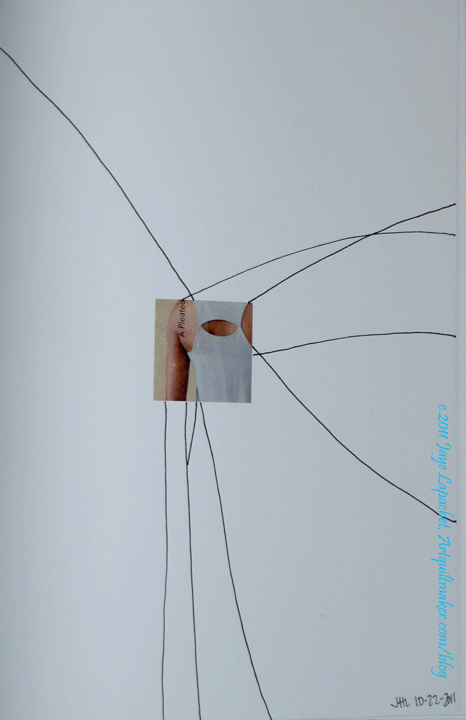
  1.  Find a picture in your magazine or catalog and cut a 3×3(?) square out of it.
  2. Take a piece of blank paper and lay it on the table in front of you
  3. Glue the 3×3(?) square somewhere towards the middle on the paper. There should be at least 2? of white space around each side of the magazine picture.
  4. Turn the paper upside down so the image is upside down.
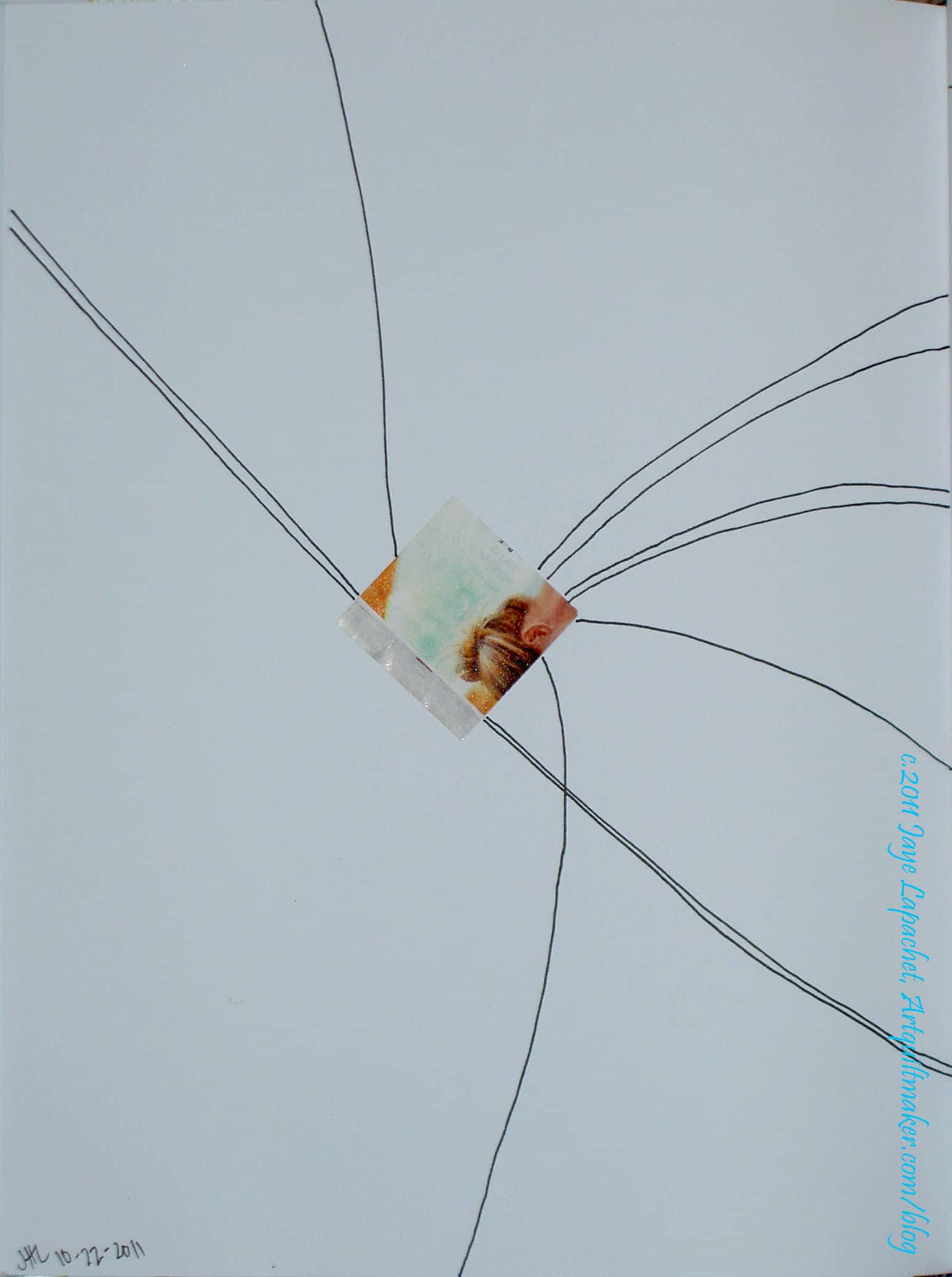
  5. Continue the image out from each side of the paper using your pen
  6. “Simplify the design in the square and its drawn continuation.” Use the cut off edges to make a new design.
  7. Perform this exercise over and over on different pieces of paper with different pictures until you are happy with the result.
  8. Use the simplified design as a starting point for a quilt.

(adapted from Fearless Design for Every Quilter by Lorraine Torrence, pg. 63)

Exercise #1 results
Exercise #1 results
Line: Exercise #1 (2)

What I did: I have a relatively large pad of white paper. For what purpose I originally bought it, I don’t remember, but I find it useful for photographing projects that need a white background and drawing out appropriately sized applique’ patterns. It also came in handy for this design homework.

I pasted the square onto these pages and drew the lines. I think the designs would have been more effective on an 8/5″x11″ piece of paper. The large size of the paper diluted the design, I think. Still, it was fun.

And then, on to:

Exercise #2
You can do exercise #2 with free motion quilting as well using a 3×3? square of fabric on top of a small (11×11? or so) quilt sandwich.

I told you that the supplies you would need were:

  • a charm pack OR
  • a group of approximately 50 3-5″ paper squares of all colors and designs (junkmail works well, you could use a scrapbooking paper punch if you have that) OR
  • cut a group of 3-5″ squares of fabric (approximately 50)
  • notebook or paper (reusing junk mail is just fine)
  • pen or other writing implement

Directions:

Line: Exercise 2
Line: Exercise 2
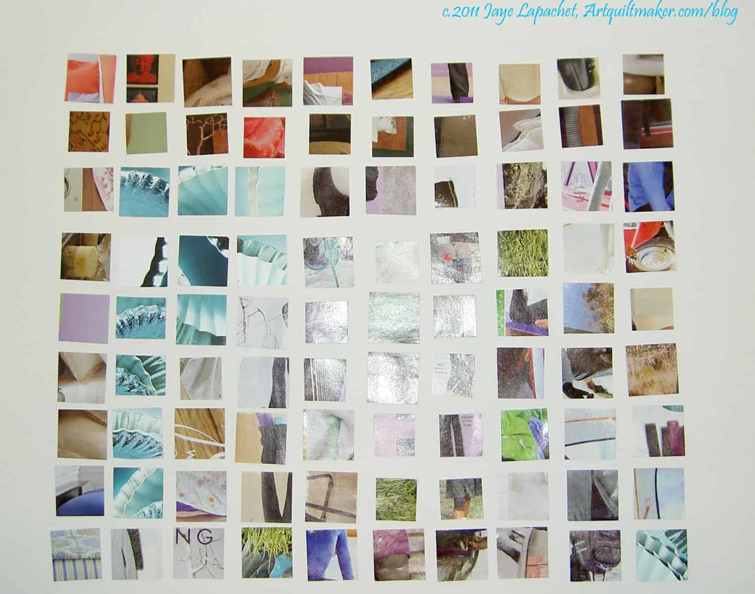
  1. Put all the squares on the floor or on a table right next to each other. Do not arrange them yet.
  2. Look at them and see if you see any dominate lines. Make a note of how the lines show up (because of the color? because of the design on the fabric or paper? Other?)
  3. Line: Exercise 2 (2)
    Line: Exercise 2 (2)

    If you have a camera, take a photo.

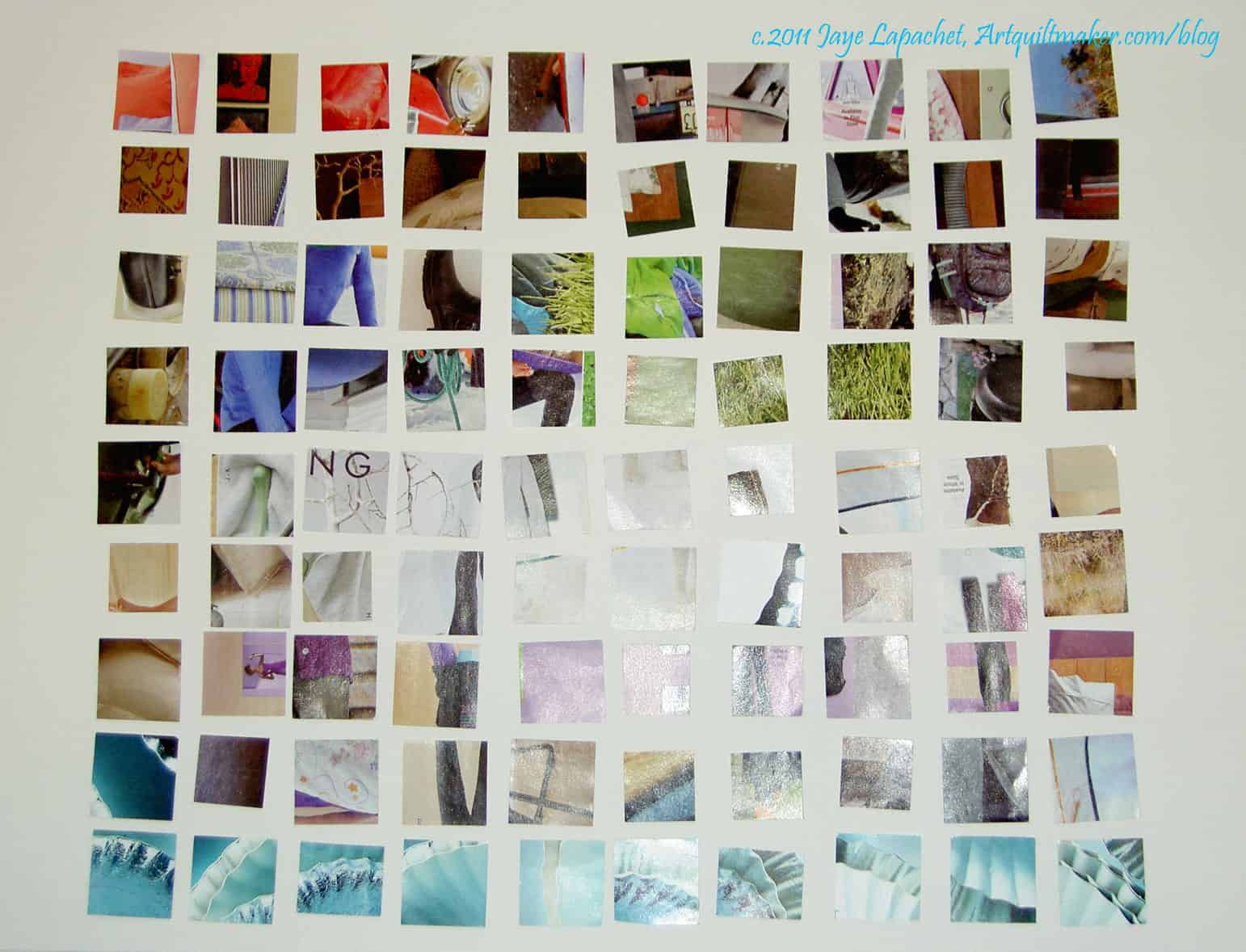
  4. Rearrange the squares in some kind of order.
  5. Look at them and see if you see any dominate lines. Make a note of how the lines show up (because of the color? because of the design on the fabric or paper? Other?)
  6. If you have a camera, take a photo.
  7. Based on what you saw in the squares of your fabric, draw simple lines in your notebook or on paper.
  8. Optional: think about and take note of design ideas that are suggested to you by the images you have created.

What I did: The Young Man took a scrapbook square maker and punched some squares out of some catalogs for me. Above in the first photo, I put all the squares on the white piece of paper in a rectangle. I removed some of the squares that were too obviously faces or letters, but otherwise didn’t rearrange the squares.

In the second photo, I arranged all the squares in color order in lines as much as possible. I didn’t see any designs that intrigued me right at the moment. I did really like the squares in the bottom lines, but I liked them individually not so much together. I liked the curved edges shown on some of the squares. I also liked the arrangement of colors.

Exercise #3

You will need:

  • notebook or paper (junkmail is fine)
  • pen or writing implement (colors are fun)

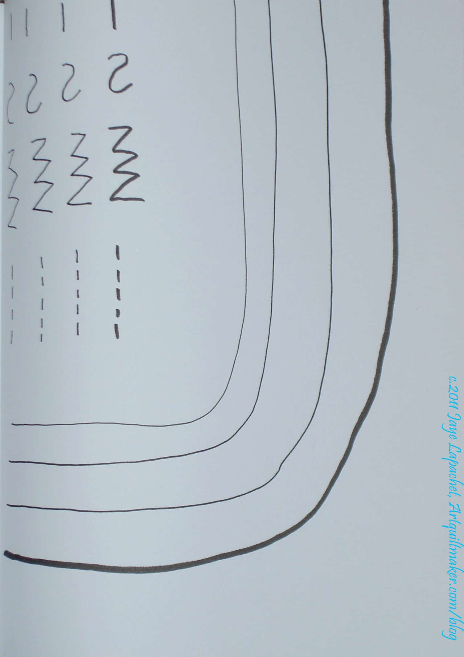
Directions: Draw different kinds of lines:

  • zig zag
  • curved
  • broken
  • straight (ish!)
  • continuous
  • fat
  • thin
Line: Exercise 3
Line: Exercise 3

What I did: I just drew different lines on a page of my journal. I thought this was a really boring exercise, though I can see its usefulness.

Design Class: Line

Sandy and I got busy on the second class in the design series. See her blog for more information. See her supplemental post for even further information.

During my research travels into Line this past week, I found a great definition for design in Ann Johnston’s The Quilter’s Book of Design, 2d. This is an adjunct to the definitions we gave you in the last podcast. It is: Design is a problem solving activity within all the arts, placing or creating subject matter so it is of visual significance and interesting to the artist.

Line is an Element of Design.

Double 4 Patch
Double 4 Patch
Irish Chain
Irish Chain

Definition: Line is a mark on the surface that describes a shape or outline. A line is a mark made by a moving point and having psychological impact according to its direction, weight, and the variations in its direction and weight. Lines in quilt blocks can draw the eye around the quilt. For example, a Double Four Patch set in diagonal lines will draw the eye from top to bottom diagonally. An Irish Chain quilt setting can frame plain blocks filled with quilting or applique’ blocks.

Irish Chain Frame
Irish Chain Frame
Double 4 Patch- with Lines

Line is a mark on the surface that describes a shape or outline. Types of lines can include actual, implied, vertical, horizontal, diagonal and contour lines. The line quality makes the work more expressive. Lines act as a connector or boundary between shapes. They divide, but also connect. Lines may be:

  • thick or thin (Perl cotton v. Aurifil)
  • fast
  • slow
  • serene
  • agitated
  • jagged
  • lyrical
  • aggressive.

Line brings energy to the design. (Liz Berg handout)

  • lines in quilts are generally seam lines or quilting lines.
    • hand quilting
    • machine quilting
  • Pressing also creates a line.
    • When you press to one side, you have 3 layers of fabric bulking up the seam. This can be used to highlight areas (see Ruth McDowell’s Piecing Beyond the Basics book)
  • lines on quilts can also be embroidery (hand or machine)
    • sashiko
    • redwork ( and similar)
    • couching
  • sashing creates lines
  • overall top design can include strong lines

Questions/Things to consider:

  • how a design uses line
  • secondary designs created by the way line is used in a block, leading the eye through a design, that kind of thing.
  • Line has dimension
    • Perl cotton has more dimension than Aurifil thread
  • Lines have width and length
  • Lines are directional: horizontal, curved, vertical, diagonal, zig zaggy, straight, parallel and so on.


Quilt Blocks and Quilt Designs with Strong Lines

Homework:

Exercise #1

You will need:

  • piece of blank paper (can be the back of junk mail)
  • catalog or magazine pictures you are willing to cut up
  • paper scissors
  • drawing or writing implement  (You can use anything, but one with a smooth line is great!)
  • glue stick
  1.  Find a picture in your magazine or catalog and cut a 3×3″ square out of it.
  2. Take a piece of blank paper and lay it on the table in front of you
  3. Glue the 3×3″ square somewhere towards the middle on the paper. There should be at least 2″ of white space around each side of the magazine picture.
  4. Turn the paper upside down so the image is upside down.
  5. Continue the image out from each side of the paper using your pen
  6. “Simplify the design in the square and its drawn continuation.” Use the cut off edges to make a new design.
  7. Perform this exercise over and over on different pieces of paper with different pictures until you are happy with the result.
  8. Use the simplified design as a starting point for a quilt.

(adapted from Fearless Design for Every Quilter by Lorraine Torrence, pg. 63)


Exercise #2
You can do exercise #2 with free motion quilting as well using a 3×3″ square of fabric on top of a small (11×11″ or so) quilt sandwich.

Supplies you will need:

  • a charm pack OR
  • a group of approximately 50 3-5″ paper squares of all colors and designs (junkmail works well, you could use a scrapbooking paper punch if you have that) OR
  • cut a group of 3-5″ squares of fabric (approximately 50)
  • notebook or paper (reusing junk mail is just fine)
  • pen or other writing implement

Directions:

  1. Put all the squares on the floor or on a table right next to each other. Do not arrange them yet.
  2. Look at them and see if you see any dominate lines. Make a note of how the lines show up (because of the color? because of the design on the fabric or paper? Other?)
  3. If you have a camera, take a photo.
  4. Rearrange the squares in some kind of order.
  5. Look at them and see if you see any dominate lines. Make a note of how the lines show up (because of the color? because of the design on the fabric or paper? Other?)
  6. If you have a camera, take a photo.
  7. Based on what you saw in the squares of your fabric, draw simple lines in your notebook or on paper.
  8. Optional: think about and take note of design ideas that are suggested to you by the images you have created.

Exercise #3

You will need:

  • notebook or paper (junkmail is fine)
  • pen or writing implement (colors are fun)

Directions: Draw different kinds of lines:

  • zig zag
  • curved
  • broken
  • straight (ish!)
  • continuous
  • fat
  • thin

Resources:

Two of my art quilts that were discussed in the episode: What Comes Next and Kissy Fish

What Comes Next
What Comes Next

You can read more about What Comes Next in a previous post.

Kissy Fish (in progress)

Kissy Fish is difficult to photograph, because there are a lot of parts that reflect light very well.

Design Overview

Recently, Sandy, of Quilting for the Rest of Us, and I recorded a podcast where we started to talk about design. Several months ago, she asked me if I would considering talking with her and her listeners about design. I was reluctant. I am not an expert, but Sandy is pretty good at convincing people to do stuff and I am good at research. It has taken me some time to find the time, coalesce my thoughts and to start to do the research.

The first podcast we recorded was an overview of design. We discussed the principles and elements of design. We talked about what the principles and elements are in design and some examples of how to use them. We tried to talk about why a classic quiltmaker who uses patterns and books should care about design. I’d like to know if you have examples of how you have used design.

Some of my thoughts…

Knowing about design principles and elements helps refine your innate skill. Everyone has innate design skills.

Concept: I use patterns why do I need to know about design?

  • Color is an element of design. To make beautiful quilts, you need to know about color. If you buy a kit, there may be one color you do not like and by knowing about design, you will be able to replace it successfully.
  • Balance is a principle of design. If your eye sees an element of the quilt as being unbalanced, then knowing about design will help you adjust it.

Concept: I am not an art quiltmaker, why do I need to know about design principles and elements?

  • “Some designs lack that indefinable life – or spark – that lifts them out of the mundane, the predictable, the commonplace …. learning about design elements and principles helps you train your vision and refine your subconscious decision making.” (Fearless Design for Every Quilter by Lorraine Torrence, pg.57)
  • Negative space in fabric: “When choosing prints for a patchwork, think about how they’ll look when cut up. Does that small print have so much negative (empty) space that the actual print part won’t show up on half of the pieces? Is that large print so big that the pieces cut from it will look like they’re from entirely different pieces of fabric? (Elizabeth Hartman, The Practical Guide to Patchwork, pg.24).
  • Borders: does slapping on 4 lengths of fabric work with the design you have chosen or would a bit of piecing enhance your excellent quilt top?
  • Books: when looking at books and evaluating whether you want to spend money on it, you can evaluate the various elements and principles of  design included in the patterns of the book.

Many quiltmakers, though not formally trained in art (e.g. an MFA in fine art) have intuitive art sensibilities. (Fearless Design for Every Quilter by Lorraine Torrence, pg.5)

I have been thinking about design for awhile. I never took a dedicated design class in school and have never found one that fit into my schedule since. Also, I am too lazy to leave my house again once I get home. If I did sign up I would go, so the laziness is really me thinking that I would be lazy and not go to class even before I sign up. Sigh!

I have pages and pages of notes I have taken on design elements and principles as I have tried to make the design elements and principles part of my working toolbox.

Design is a way of organizing a piece of visual work. According to the Quilter’s Book of Design, 2d by Ann Johnston, “Design is a  problem-solving activity within all the arts, placing or creating subject matter so it is of visual significance and interesting to the artist.” (pg.xi). I like this definition, because it is understandable and doable. It also isn’t scary for people who have no MFA. When I think about solving a problem with my quilt, I relax about design and try to review the skills in my design toolbox. Remember, though, that “we all have personal experiences, subjective leanings, and differences in personality that make us prefer one thing to another…” (Fearless Design for Every Quilter by Lorraine Torrence, pg.57)

Good design requires practice and is the “result of of a successful combination of design elements … and principles…”(Fearless Design for Every Quilter by Lorraine Torrence, pg.6)

Elements of Design
The elements form the ‘vocabulary‘ of the design (Wikipedia, design elements and principles).

The Elements of Design are the language of the visual arts (http://www.wiu.edu/art/courses/design/elements.htm).

The elements are components or parts which can be isolated and defined in any visual design or work of art. They are the structure of the work, and can carry a wide variety of messages (http://char.txa.cornell.edu/language/element/element.htm).

  • Line
  • Shape
  • Value
  • Color
  • Movement
  • Size
  • Pattern

Principles of Design
The principles constitute the broader structural aspects of the design’s composition (Wikipedia, design elements and principles).

Principles (http://www.wiu.edu/art/courses/design/principles.htm).

The Principles are concepts used to organize or arrange the structural elements of design. Again, the way in which these principles are applied affects the expressive content, or the message of the work (http://char.txa.cornell.edu/language/principl/principl.htm).

  • Unity
  • Harmony
  • Contrast
  • Rhythm
  • Repetition
  • Gradation
  • Balance
  • Dominance

The principles of design, according to my research, are usually taught first. I think they are also a little harder to explain to an audio audience, so I told Sandy we should start with the elements. After getting into it a bit, I am thinking that we might bounce around. Hope you tune in to find out!

Hexagons Follow-up

Recently, I talked about my adventures with hexagons. The adventures continue and a few people are joining in, something I didn’t know, or think, would happen. There seems to be something about hexagons that intrigues people.

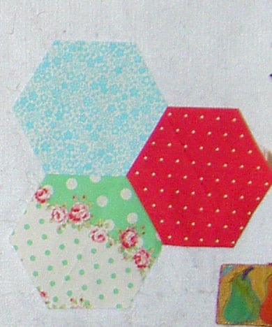
Small Hexagon Test
Small Hexagon Test

The above photo shows what I did to test out my hexagon theories.

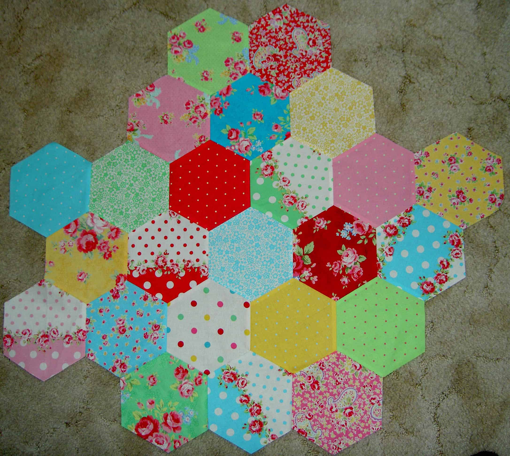
Much larger hexagon test piece

The test kind of grew.

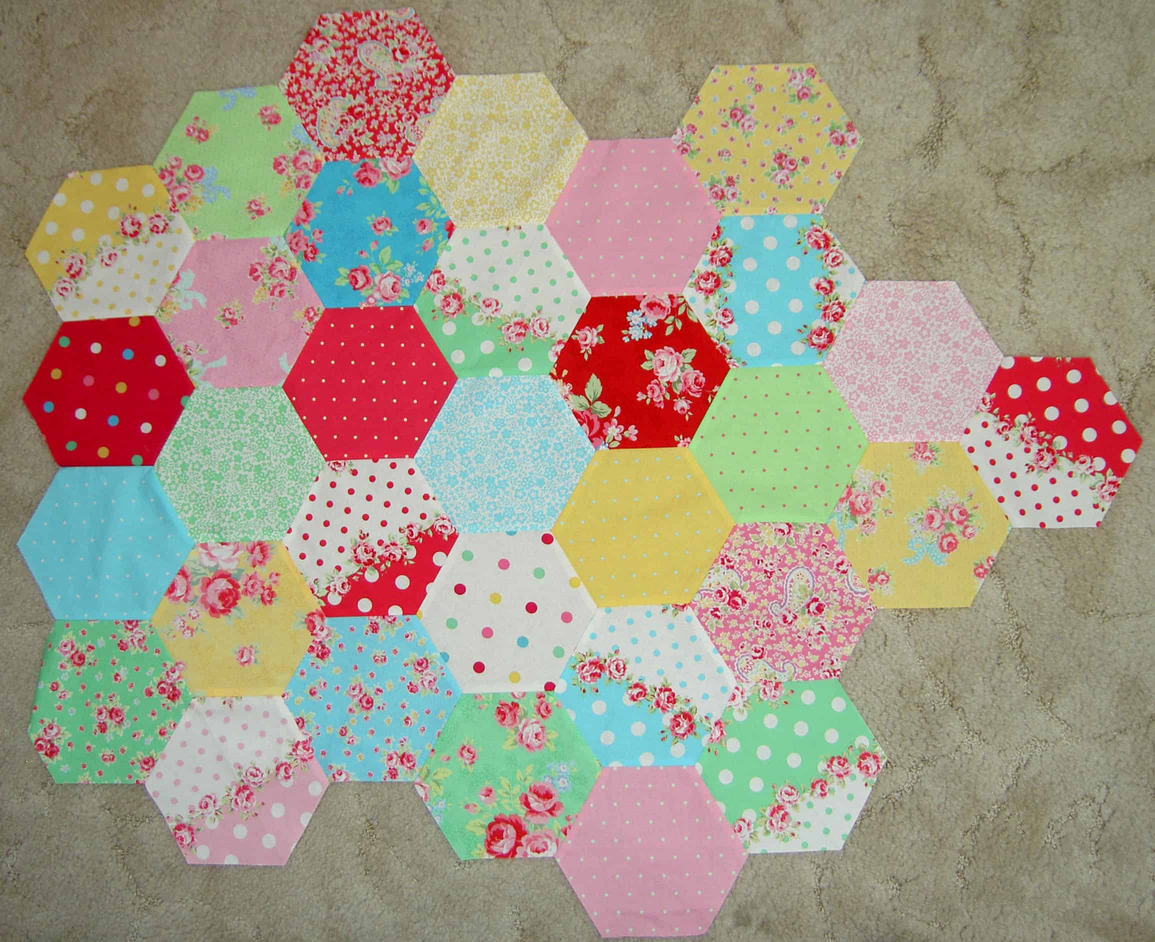
Hexagon-not a test
Hexagon-not a test

Now I have to admit that this hexagon piece is no longer a test. This will be a real quilt at some point. At this point, I am just sewing hexagons to each other as a kind of treat for myself in between other ‘must finish’ projects. The hexagon piece really helped me get through the pillows. The colors are cheerful and fun. I am trying to keep it even on all sides, but the edges keep creeping out into long lines of hexagons. I don’t know how big it will be – perhaps as big as the amount of fabric I have?

It is good to look at the piece in a photo format, because it helps me see where I need to put the next colors.

Clearview Ruler
Clearview Ruler

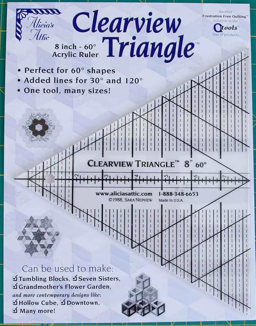
The ruler I used is a Clearview Ruler from Alicia’s Attic. They are a bit hard to find, but you can find them at the Granary. I am pretty sure that if you call them they will send you one. Why do you need this one? Because you need the tip. Any 60 degree ruler will work as long as the tip is not blunted.

Pyramid Ruler
Pyramid Ruler

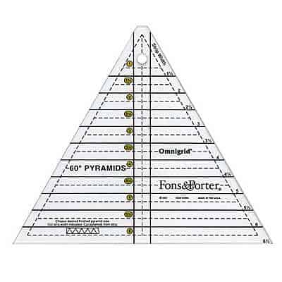
I started out using my beloved Pyramid ruler from Fons & Porter and my hexagons came out kind of squashed looking. I love this ruler, but it doesn’t work for this quick cutting hexagon method. You MUST have the tip to use the quick cutting method described in the video by Kaye Wood, which is on Little Bluebell’s blog.
You can, of course, use a hexagon ruler. You don’t need to make hexagons using the quick cutting method described by Kaye Wood.

Hexagon Ruler
Hexagon Ruler

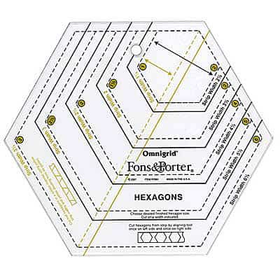
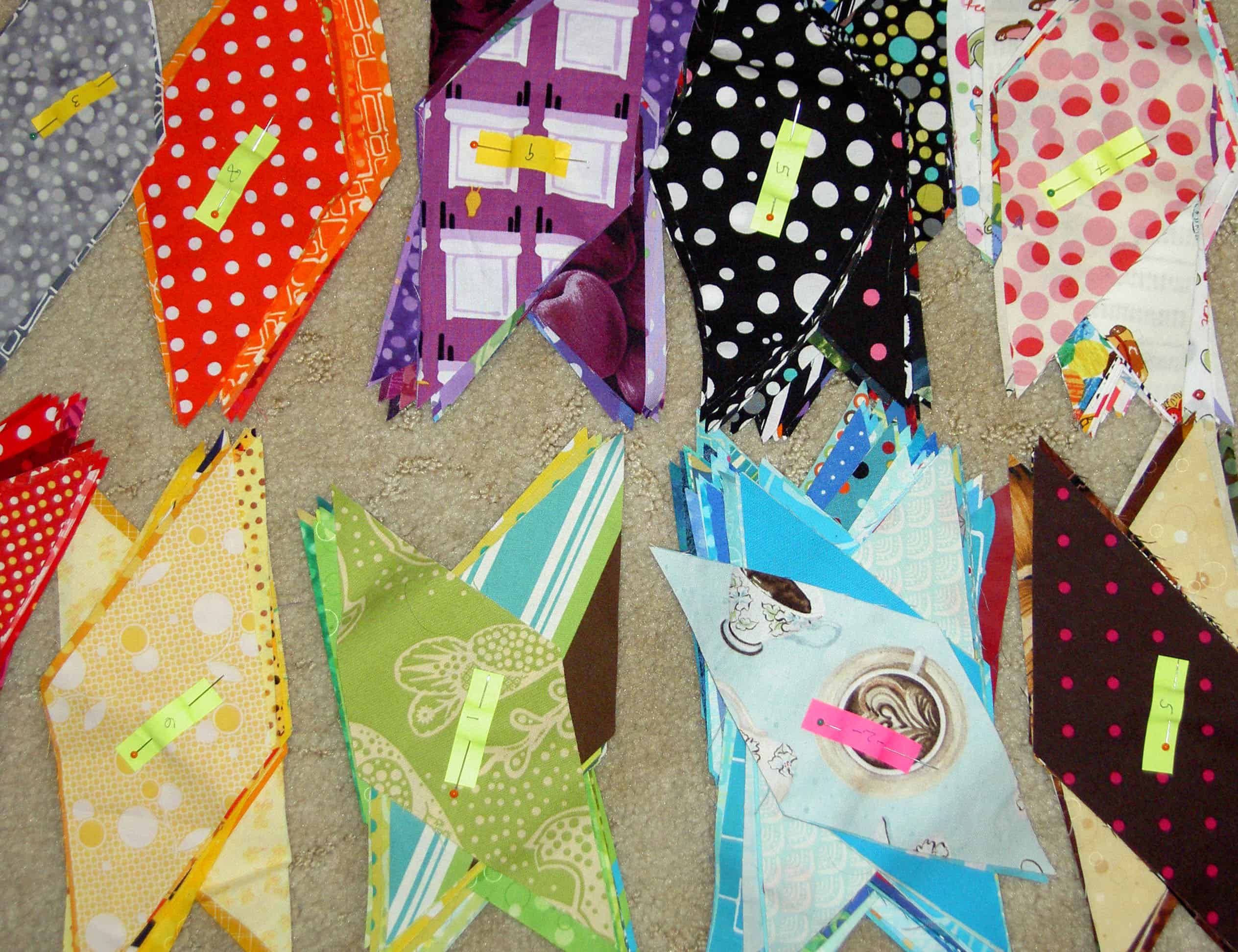
I bought the Fons & Porter hexagon ruler for the Spin Wheels project. I didn’t start out using it for the hexagon project, so I am not using it for that project. If you plan to do a scrappy hexagon, this ruler (or one like it) is the way to go. The Kaye Wood quick hexagon cutting method uses strips and if you aren’t using strips, there is no reason to use that method. I have an Easy Hexagon ruler by Sharon Hultgren, but it is too big for me and  I am getting rid of it. Check Quilt Trader’s Newsletter.

I have 150 or so hexagons cut. I am sure I could figure out how big that would be, but where would be the fun in that? I just want to make sure it doesn’t get too big. 😉
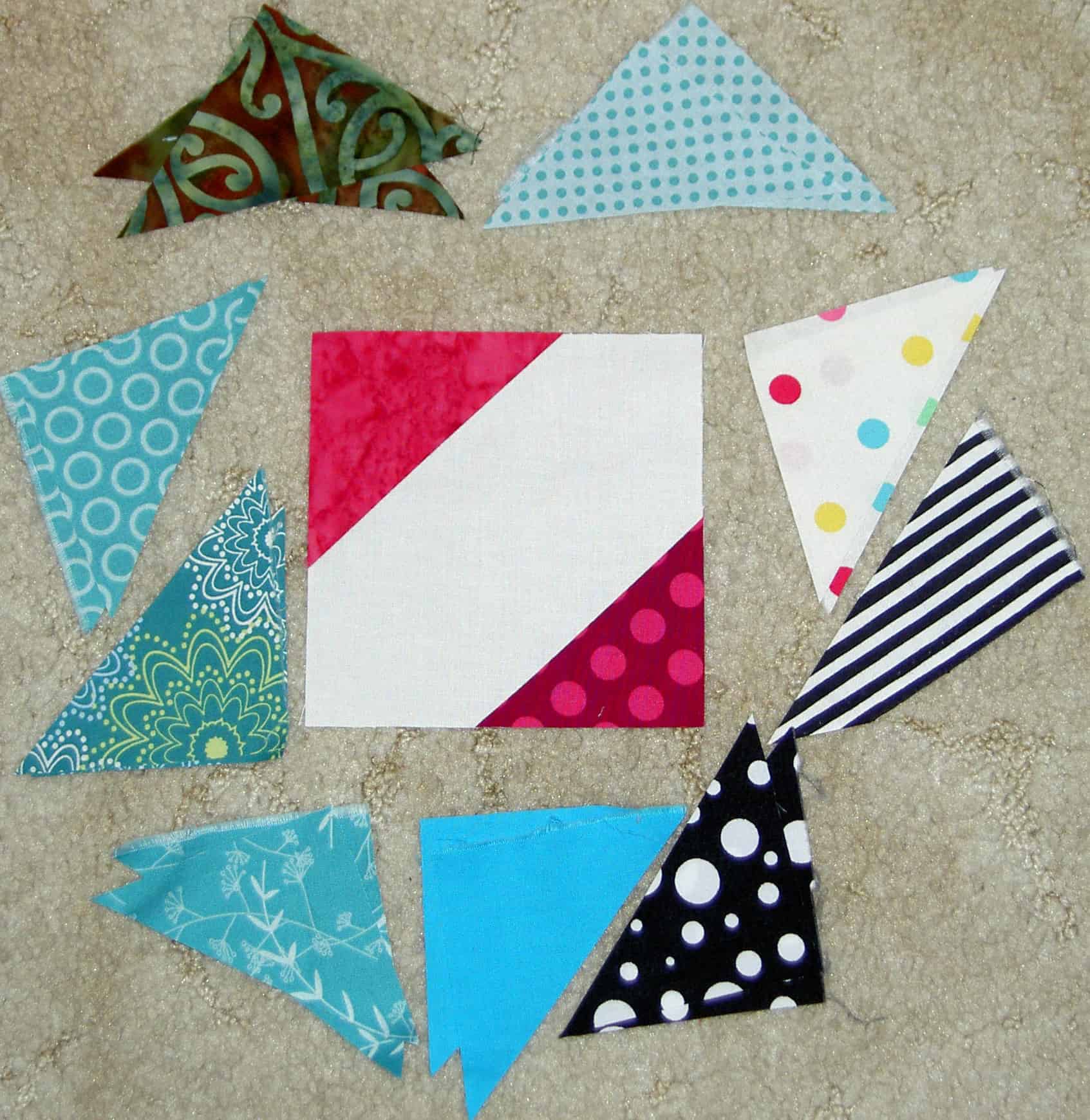
Hooked on Hexagons

Dear TFQ and Little Bluebell,
This is all your fault.
Jaye
_____________________________
Now that I have that out of the way, yes, I seem to be hooked on hexagons. The test piece is much larger. If you want to cut hexagons, like I am doing, check out Little Bluebell’s cutting directions.

Much larger hexagon test piece

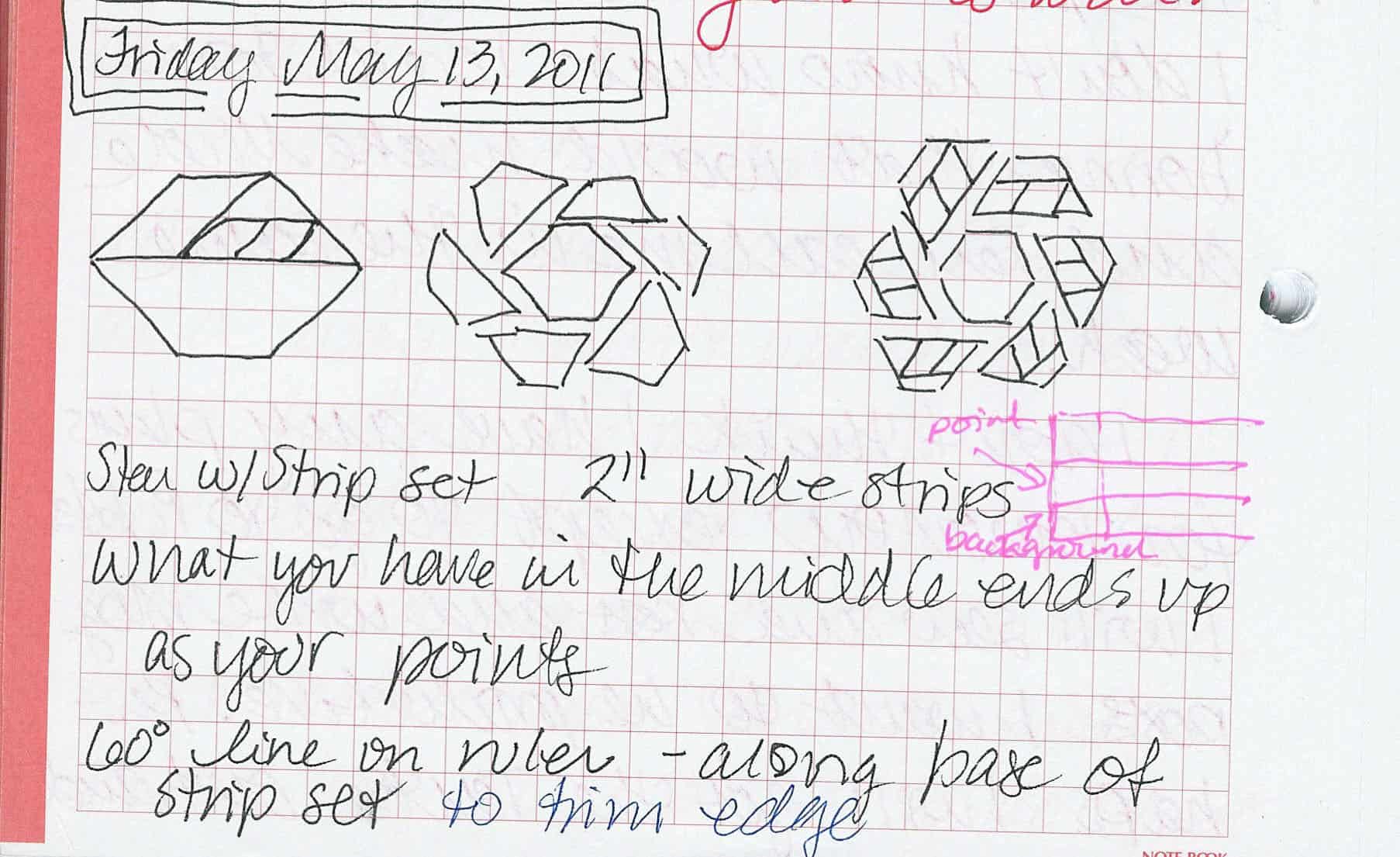
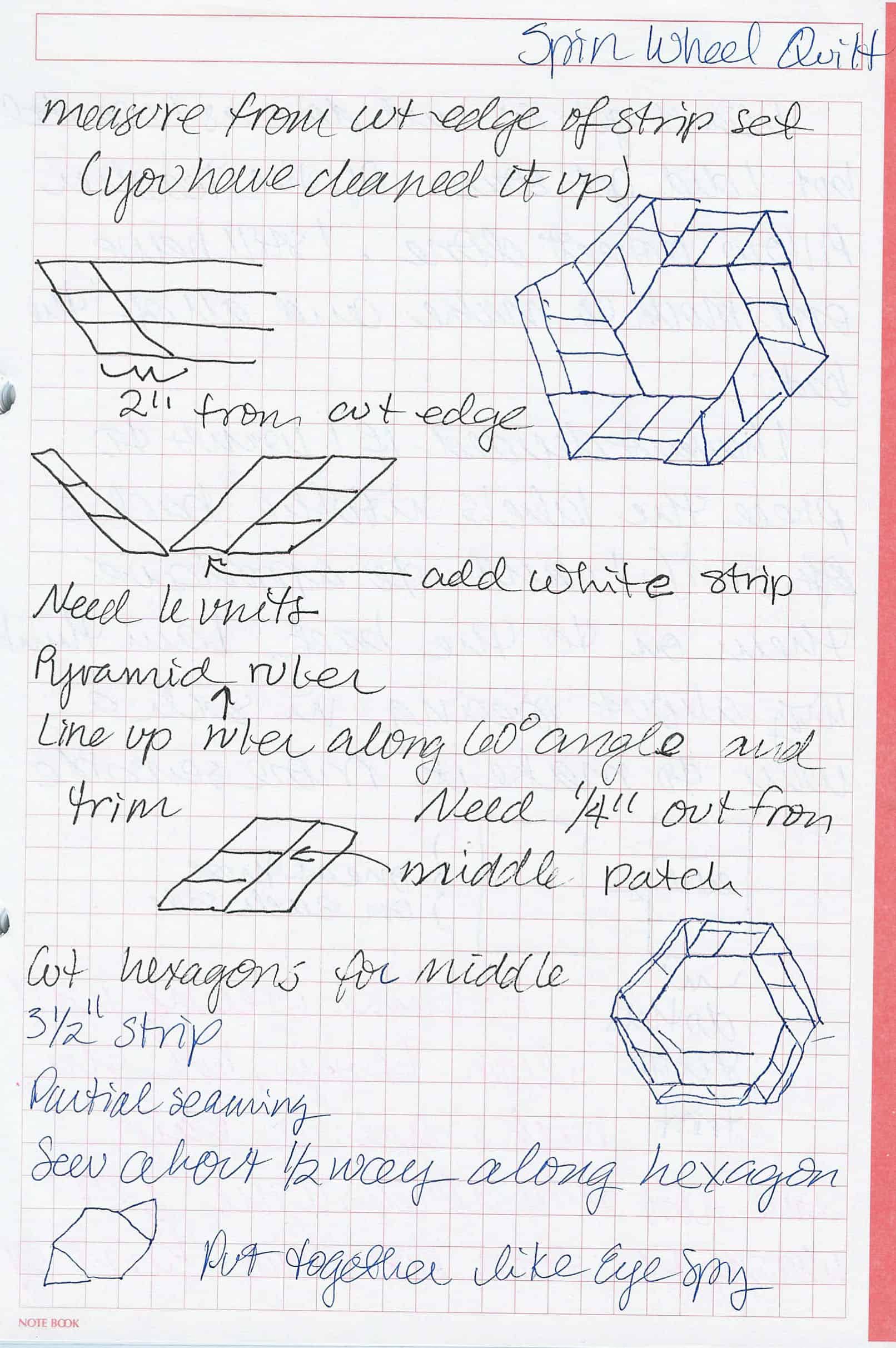
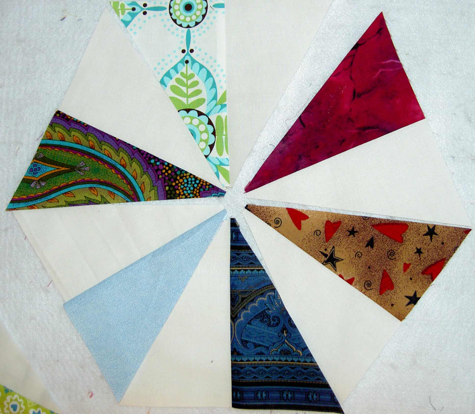
I am also interested in the Spin Wheel design by Fons & Porter. I was watching, what I thought was a Kaleidoscope episode and it turned out to be the Spin Wheel episode. I took notes again so I could do a test block.

Spin Wheel drawings
Spin Wheel drawings
Spin Wheel drawings 2

I went looking for examples people have made and only found a few. I found a tutorial, which is good since I don’t have the magazine. BeckyF also did the pattern in fun colors, which I found on Flickr. There is one on Webshots that is done more in the colors the Fons & Porter ladies like. I like this progression/gallery of photos making the Spin Wheel. Also, the blue and yellow are cheerful.

This has nothing to do with the Spin Wheel, but Daniel Rouse has put up a really cool hexagon quilt on his site. I like the small and large.

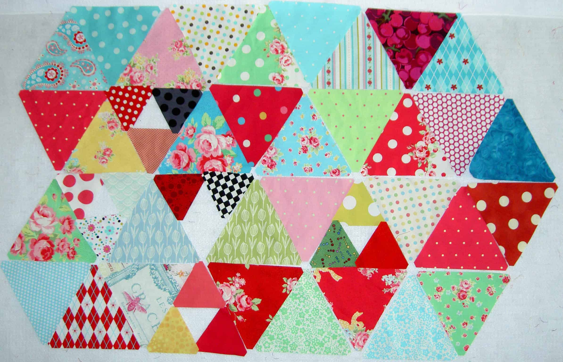
Test Pieces Arranged #2

I am also starting a scrap project using the Twirling Triangles pattern, which is, ultimately, a hexagon.

FOTY 2011 Triangles - 4/2011
FOTY 2011 Triangles – 4/2011

Oh, of course, FOTY 2011, too. Yes, I have a thing going. Obsessed is probably a better word.

Check out Sandy’s site. She is thinking about hexagons, too. And Pam over at Hip to Be a Square podcast. These two are totally my fault. How can I not want to spread the joy of something fun?

Hexagon Related Posts:
November 13, 2012- Blue Chair Blog Hexagon Sewing tutorial
October 20, 2011- Hexagons Return
June 28, 2013- Hexagon Clarification
June 9, 2011 – Hexagons tutorial
June 7, 2011 – Attack of the Hexies
Little Bluebell’s Cutting Instructions

Diamond Organization

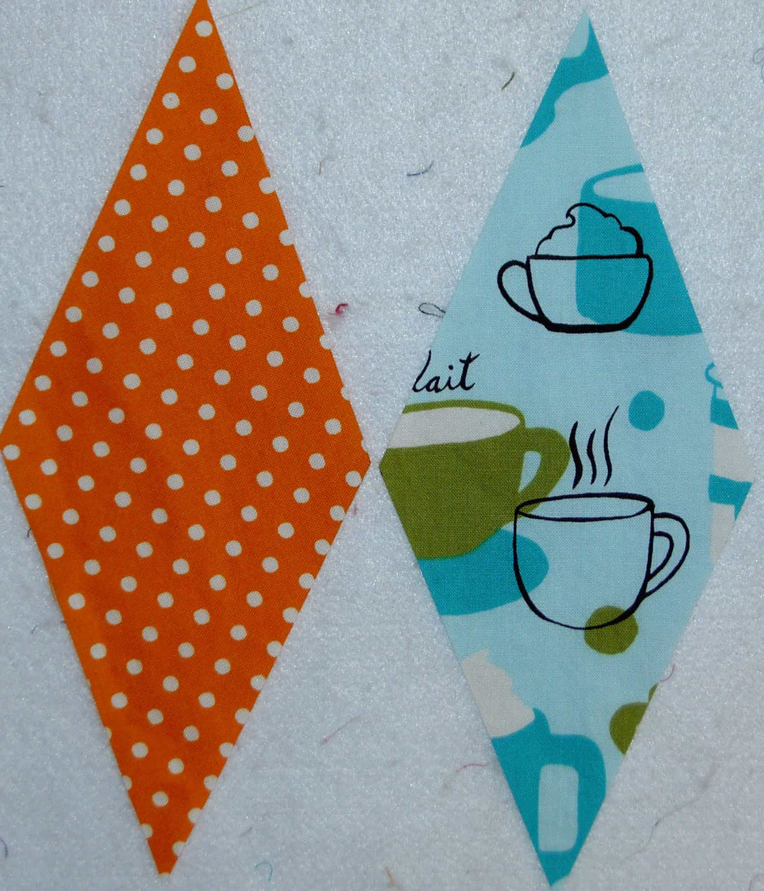
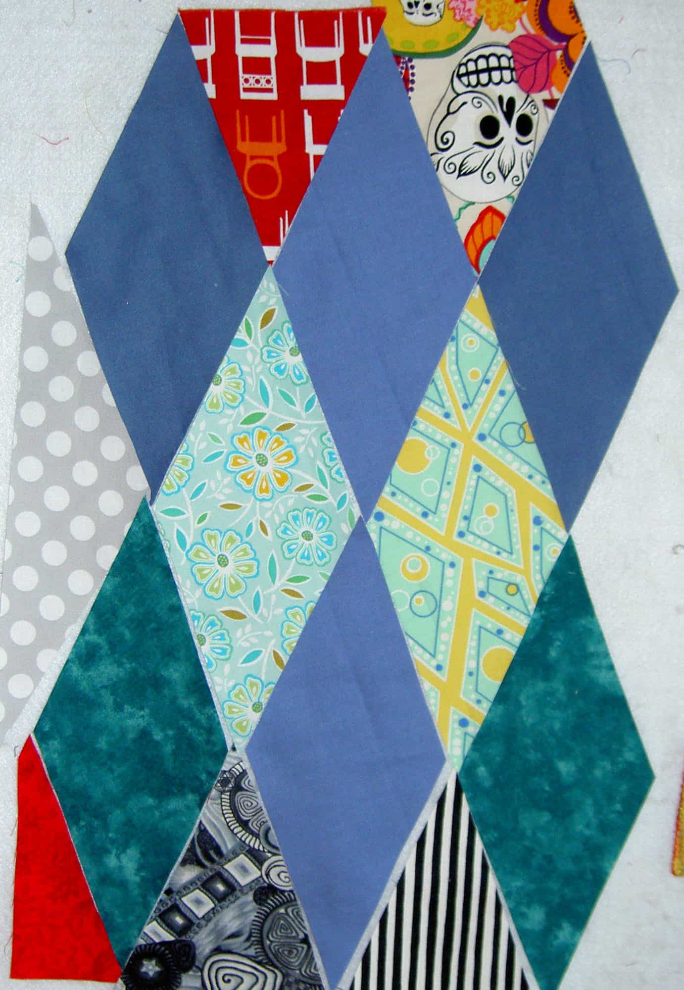
Except for one diamond, all of the diamonds for Fabric of the Year 2010 are cut, bar one. I am now in the stage where I have to make sure that I have enough border patches. I also needed to figure out what the arrangement of the diamonds would be.

Counting Diamonds
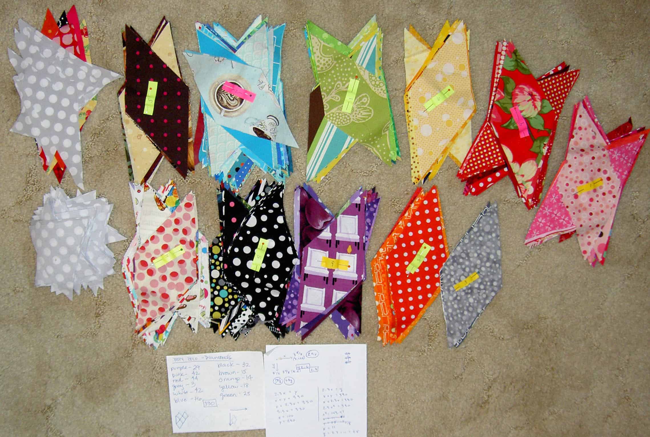
Counting Diamonds

My first task was to count my diamonds. It was fun to go through the patches and see all of the fabrics I cut. I weeded out a few duplicates and came up with 330 diamonds.

Next, I needed to figure out the layout of the diamonds. I thought I could figure that puzzle out by doing some division, but, as it turns out, diamonds are whole different animal. The rows are not right next to each other. There are, as I see it two rows for each segment. The inside row (eg if you think of the bottom most row of the quilt, one row up is the inside row) is one diamond smaller than the bottom row and so it goes up the entire quilt. One row is, for example, 10 diamonds across. The next row up is 9 diamonds across. One row up from that is, again, 10 diamonds across and so it goes up the entire quilt. This means that you can’t just assume that to make a quilt of 330 diamonds could be designed by taking the square root of 330 (18×18=324), which you could do if the patches were square or rectangular.

When I realized this, I had to get my resident math genius involved. DH began working on the problem and realized the difficulty of the math.

Two Last Diamonds
Two Last Diamonds

DH ended up making a rectangle or square out of  the diamonds (imagine a rectangle drawn around the two diamonds above) and worked out the problem that way. After a few hours, it occurred to me that EQ7 might have a solution. It has elaborate explanations on how they count diamonds.

Math & Diamonds
Math & Diamonds

As DH came up with different arrangements, I tried them out in EQ7. We still had to count the two rows of diamonds and then multiply to be sure that we would use the most number of diamonds cut. There was no way, in EQ7, to put in the number of diamonds and then have the program determine the arrangement. That would be a great feature.

20x9 Diamonds
20x9 Diamonds

Eventually, we figured out the arrangement: 20 diamonds across by 9 diamonds down. The above is from EQ7 and the coloration was just a quick way of making the layout stand out a bit. It seems like a bit of an odd shape, but I have to remind myself that the diamonds are taller than they are wide and, thus, it appears that the arrangement will work.

My next step is to cut one last diamond, because for this arrangement I need 332 diamonds. I am planning to use the Metro coffee fabric from Monaluna. I did buy that fabric last year, so it fits with the theme. I am not sure what I was planning to make with this fabric, but after spending another 1.25 days making a back for a quilt I just finished (just the top and the back; I haven’t done the quilting), I am sick of pieced backs. I am still going to make them, because I see no point in not using fabric I already have, but it is so much easier to use larger pieces of fabric. To give myself a break, I am planning to use a large piece of the Monaluna fabric on the back of FOTY 2010, thus I want to include a diamond from that print. Before I cut the diamond, I decided to make a Jane Market tote from that fabric.

I cut a bunch of border triangles and I need to count those to see if I need to cut more. I need 38 top and bottom triangles total. I need 16 side triangles total. I am good on the corner triangles, though I did find them a little hard to cut. The Fast2Cut corner ruler did make it easier.

Diamond Test Piece
Diamond Test Piece

I still haven’t finished the test piece. I started it, but haven’t been using my sewing time well lately, so I am behind.

Finally, I will arrange the patches at the retreat.

Scraps

Cheerful Baskets
Cheerful Baskets

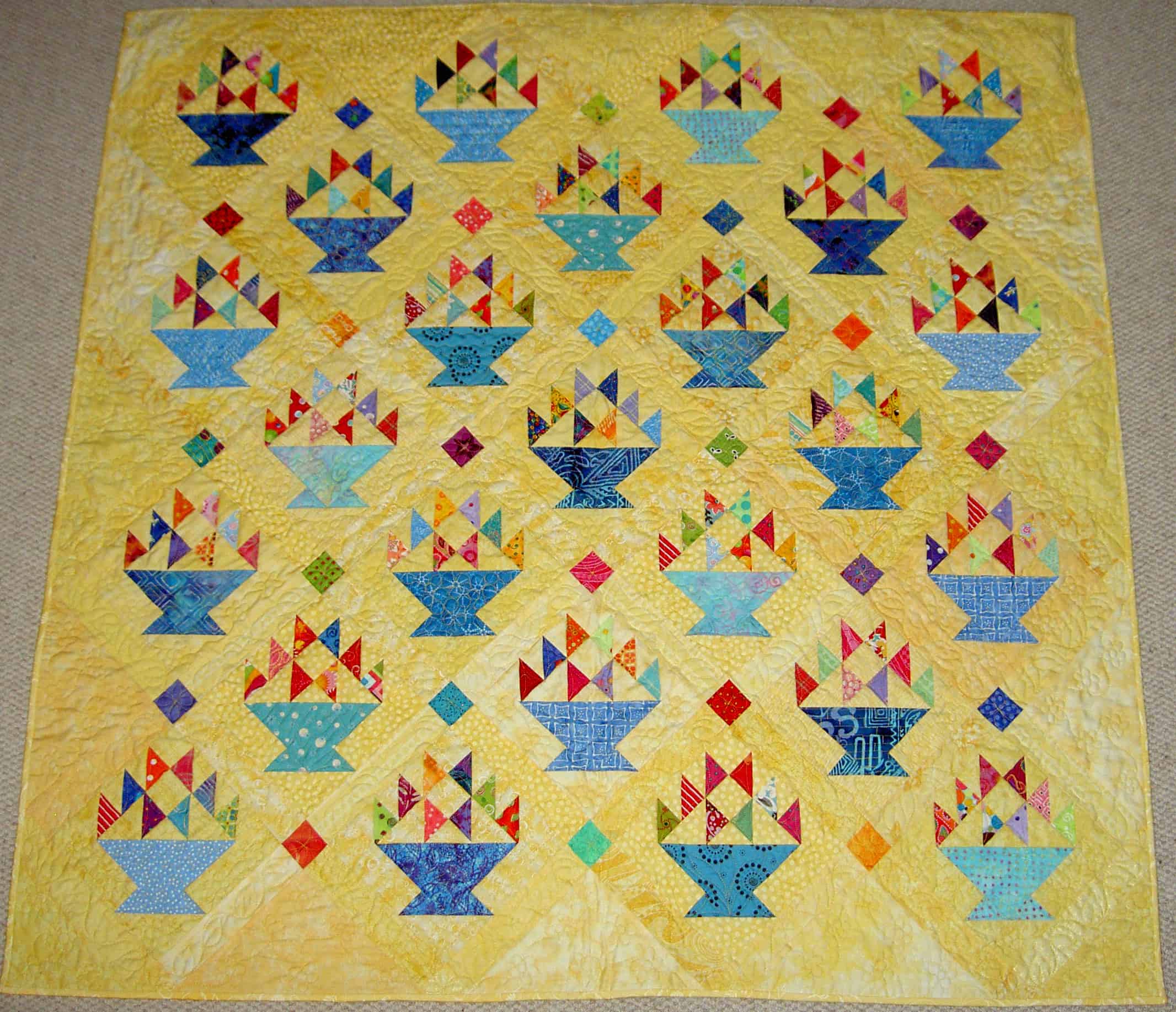
Recently, I was thinking about scraps. Part of my thought process stemmed from a discussion I had with a New Zealand quilt friend, another part had to do with the completion of the Cheerful Baskets quilt and, finally, looking and thinking about some of TFQ’s quilts and process.

For me, a scrap quilt is a quilt made from many, many different fabrics. The fabrics do not have to all come from my scrap basket. Cheerful Baskets is a scrap quilt, because many fabrics were used. Most of the triangles are different. The triangles, for the most part, did come out of my scrap basket. The baskets did not, but are mostly different. We purchased a small piece of many of the yellows based on the exact shade of the yellow. There are many different prints used as the background.

Cheerful Baskets is a thoughtfully made quilt, not just in the piecing, but also in the color selection and placement. I do not think that any old scrap should be placed next to any other scrap. Scrap quilts, for me, are not a jumbled mess.

I don’t have a large scrap pile, because I either toss the scraps or use them up. I don’t like to waste, though, so periodically my scrap basket overflows.

Four patches
Four patches

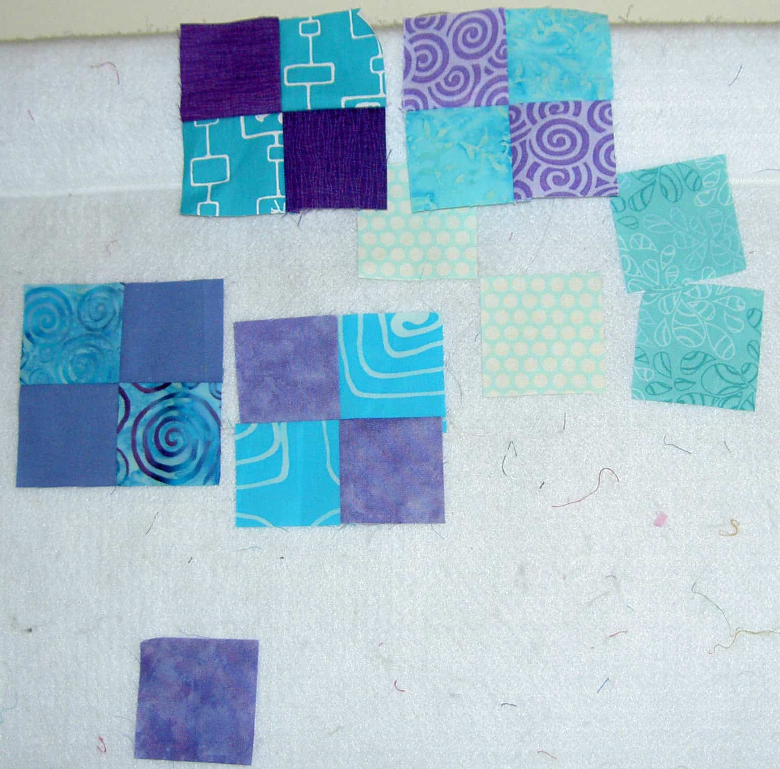
One thing that I do is plan a bit ahead for my projects. I have list of pieces I need to cut for scrap quilts. One shape I am cutting now is 2×2″ squares in turquoise and purple. I am making some four patches from these pieces. I put these through the machine in between other chain piecing, so they act as leaders and enders a la Bonnie Hunt (she mentions this technique in a recent post, but I think she goes into more detail in an older post). This type of in between piecing/leaders and enders also is great to warm up your sewing muscles when you start a sewing session.

Along these lines, I also cut squares of various sizes and keep them in a bag for when I need some squares. This is not a well thought out plan and I should probably cut squares all the same size and put them in bags according to their size. I haven’t gotten that far yet.

The idea is to cut regular sized pieces so that you have a selection to choose from when you need some shapes for a project. You can also cut different shapes such as triangles with an eye towards half square triangles, rectangles, etc. This is also a good task when you don’t know what else to do.

The Fabric of the Year (FOTY) quilts are, technically, scrap quilts. They are also charm quilts, but scrap quilts do not have to be charm quilts if you are working TJW. As you know, for the FOTY quilts, I cut a piece from each fabric I purchase or use throughout the year and then make a quilt top from those pieces in January. This concept can be used in general as I am with an upcoming pink quilt and an upcoming blue quilt. I am cutting 2.5×4.5″ rectangles of all of the pinks I come across, either newly purchased or from my stash. When I have enough I will arrange them on the wall and sew them together. I am doing the same for blues.

I don’t do this, but I think it would be useful to sort my scraps by color. I don’t think I have enough scraps to sort by color. I don’t want to devote fabric space to scraps, so I try and keep the scrap pile manageable.

Corner Store block and patches

I found a new source for scraps when I started the FOTY 2010 project. I use a ruler when I cut the diamonds and end up with two triangles. After seeing the Corner Store project in Pretty Little Mini Quilts, I decided I could do that with the triangles. The block is shown in the middle. The triangles are added to a square of Kona Snow and then trimmed to size. The triangles are all slightly different sizes and I am trying to take advantage of the wonkiness. The nice thing about this project is that the triangles never even go into my scrap basket. They go into a separate pile and are sewn on to the squares.

The Red Journal is also a scrap project. As longtime readers know, I have been sewing together little slivers of red fabric for awhile to make a new piece of fabric. The technique is called Mosaic quilting, a concept developed by Shannon Williams. It has all the qualities that work for me for scrap quilting. The maker sews random pieces of like colors together to make new fabric. I do this with red and want to do it with all of the colors, but haven’t gotten to it yet.

I think there are a lot of ways to think about scraps. Above are a few of the ways I think about and use scraps. Hope it is useful.

Color Inspiration

A discussion came up at the CQFA meeting on Saturday about Jelly Rolls. As you know, I used a Jelly Roll for the Zig Zaggy top, It’s a Merry & Bright Wrap and I am in the process of using one for the Frosted Stars. As I mentioned in a previous post, I had been hearing about Jelly Rolls and wanted to try one. Why not, right? It is always good to have an informed opinion.

One member had a few questions about them and so we started talking. Another member chimed in about how using someone else’s color choices took all the creativity out of making a quilt. She kind of went on and on for a bit about it. After she had finished I felt compelled to say that using someone else’s color choices might be a good way to learn to use colors that you wouldn’t normally choose. There is a gold in It’s a Merry & Bright Wrap that I wouldn’t ever pick myself, but works very well with the off shade of blue included in the Merry & Bright Jelly Roll by Sandy Gervais.

This conversation got me to thinking about color choices and how I work with color. I realized that I work in a couple of ways.

1. I choose colors in which I am interested in working. I see a color or a fabric and it gets me thinking about a quilt or a bag or a tote in those colors. At this moment, that means that I am collecting aqua and red fabrics and setting them aside in order to make a quilt in the future. I don’t know what quilt, though am leaning towards a basket quilt.

2. I also like working with whole lines of fabric. I like being part of a creative endeavor that someone else started. In a strange way, it is like a round robin. Like the It’s a Merry & Bright Wrap quilt, for which I made no decisions (pattern, whole line of fabric), I found solace in not making decisions. Also, if I am making a difficult quilt, like the Zig Zaggy quilt, which requires a lot of thought in construction, I find that putting the color choices aside allows me to  focus on the sewing techniques and process.

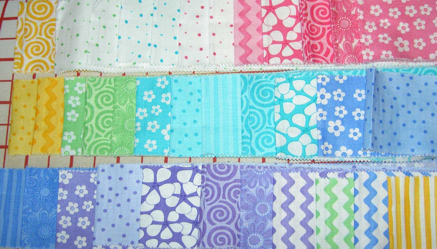
2A. I am also enjoying the groups that Cynthia and her staff at Birch Fabrics/Fabric Worm put together. They are usually not a whole line of fabric from one designer , but fabrics that go together and have a variety of scales and designs. I haven’t actually made a quilt with one of her groups yet, but I am putting them together after washing and cutting patches in order to be ready to go when I start the next quilt. I am finding that I am also adding other fabrics in that I will go well.

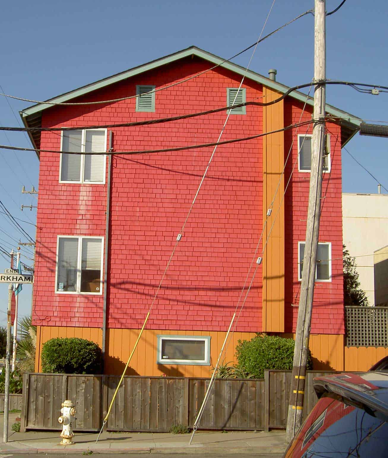
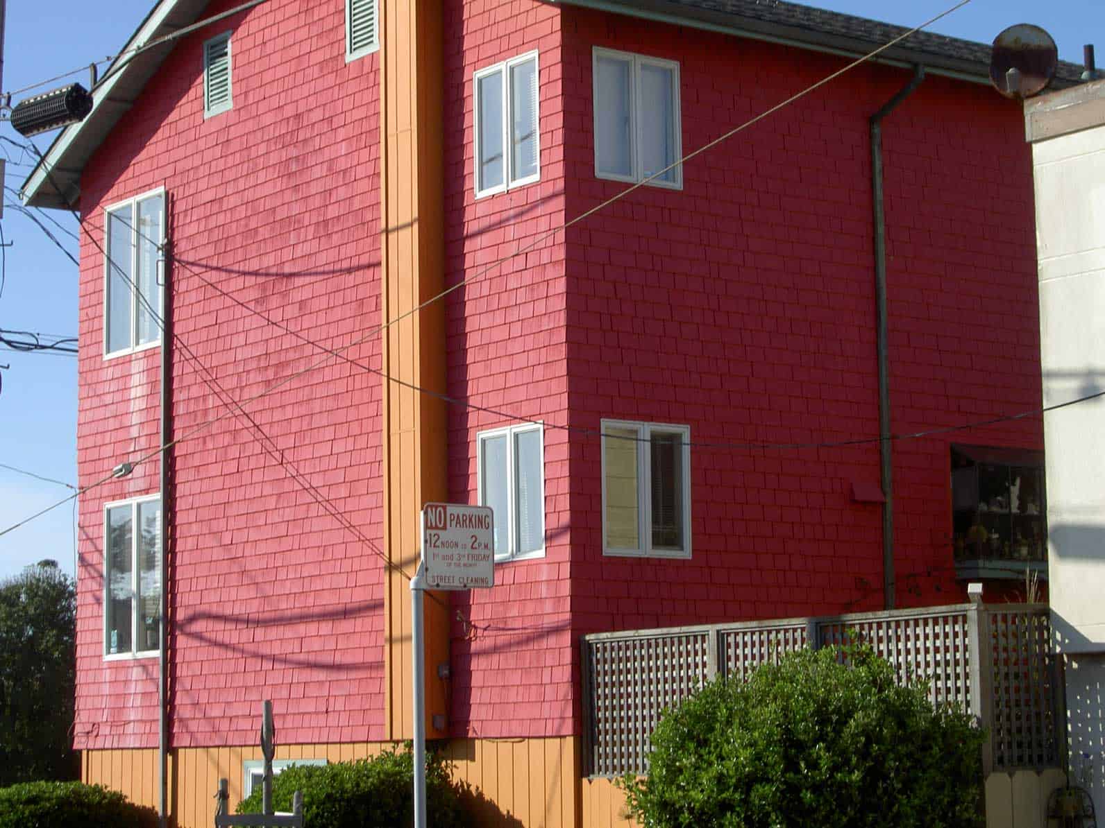
Kirkham & La Playa house

3. Sometimes, I see something that inspires me.I have been driving by the house pictured for YEARS. In the last year or so, they painted it this rose and pumpkin color. I never have my camera with me when I go by, but today I was nearby and did have my camera so I swung by to snap some shots. I think I will make a quilt in these colors, but will add some violet as well. I think violet would look fabulous with the pumpkin and rose. There is an orange tending towards pumpkin dot (like the Ta Dots) that I have seen around. I haven’t had a chance to dig through my collection of dots to see if I have it, but it is on my list. Of course, I have to make visual decisions visually and will have to see.

4. Sometimes color doesn’t matter and I work with light and dark and a certain pattern. The Pineapple quilt is an example of this type of fabric selection. I am not sure if one would call this ‘color’ selection per se. Once inside such parameters, I do make rules for myself such as no like colors next to each other or only complementary colors next to each other etc. It usually depends on my mood.

5. Monochromatic color schemes, like the Blue Janus quilt are also intriguing me lately. I like the monochromatic color scheme, because it helps my eye discern the different types of blues, or reds or whatever color I have chosen for the color scheme. When you have 300 blues together they all look a bit different.

6. Rainbow/color wash type quilts have really been good exercises lately. The FOTY quilts have really been good for this. I have to admit that I am not liking the way I blended the colors in FOTY 2008. I don’t know what I was thinking. I do like the quilt, but in this color wash type of colorwork, the colors should blend more. It could be that my idea of this type of colorwork has evolved since FOTY 2008. I did a much better job on FOTY 2009. Maureen helped and I learned a lot from working with her on the colors. FOTY 2010 with the diamonds is next. We’ll see how that goes. In general, I like trying to blend the colors. I think the quilts are very attractive and they are an intellectual challenge to make.

How do you pick your fabrics?

Zig Zaggy Start

Jelly Roll for Zig Zaggy Quilt

This past weekend I mostly worked on the Blue Janus Quilt, which I called the Blue Quilt in a previous post. Those squares required a lot of chain piecing and I needed something to piece in between so that I wouldn’t have to cut threads each time I wanted to press as I moved farther along in the process.

I decided to start the Zig Zaggy quilt and use the pieces to help with my chain piecing.

Measuring
Measuring

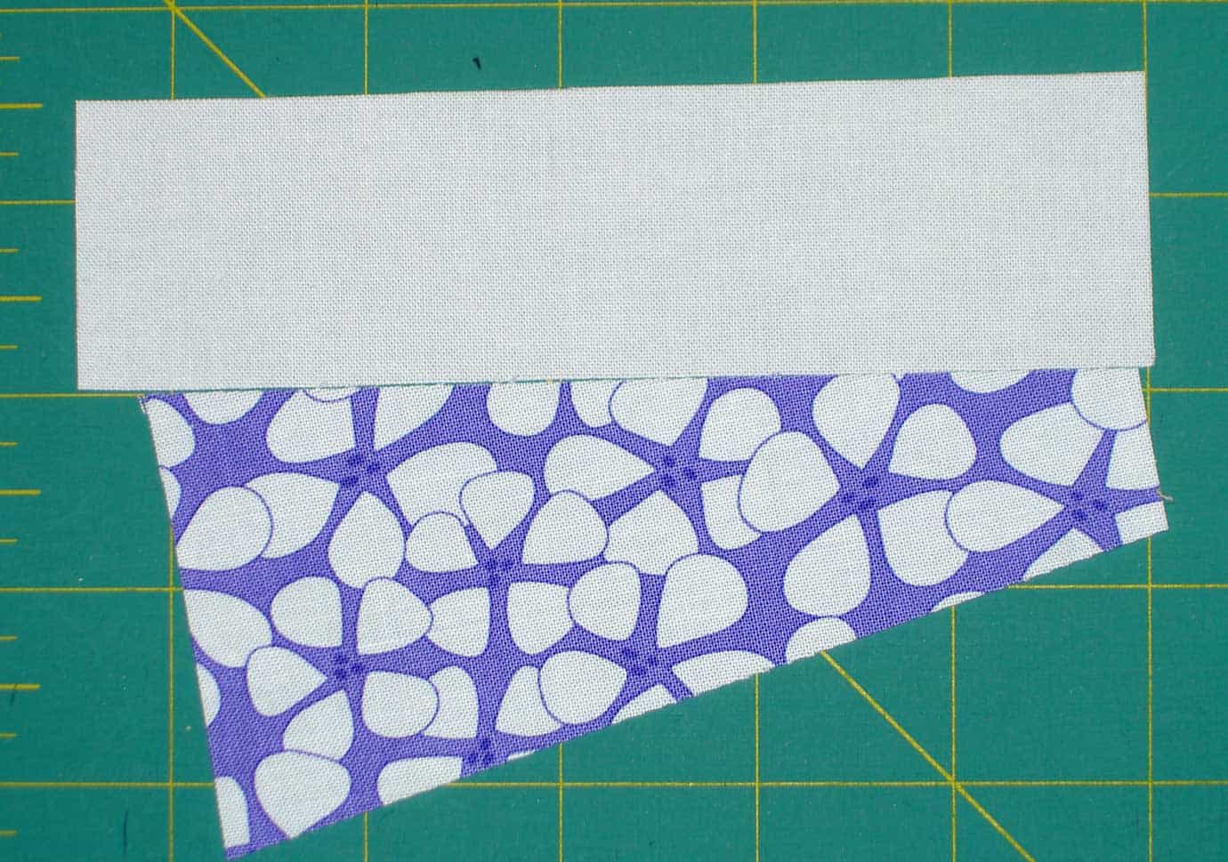
First, I looked at the Happy Zombie site again and confirmed the sizes. then I cut some samples. Happy Zombie used a special ruler and cut 5″ long wedges. Elizabeth Hartman from Oh Fransson! blog originally used templates and cut the wedges longer. I decided to use Happy Zombie’s method and trim later.

Zig Zaggy Sewn
Zig Zaggy Sewn

I cut and sewed a few together, think I would do another colorwash look.

Blech!

I am not doing the colorwash. With just the purples it is too boring. the purples are all the same value and just don’t look like the colors are gradating. I am going to mix up the colors. I just didn’t get very far.

Interview with Denyse Schmidt at Design Sponge

I love good interviews and this one gets to the heart of this designer. I love knowing how people work and a little about their process. Thanks to Denyse for being interviewed and design sponge for writing and posting the interview!
clipped from www.designspongeonline.com

Design Sponge

June 30th, 2010

what’s in your toolbox: denyse schmidt

Denyse: I just got a new iMac. I use the computer a lot. I use Adobe Illustrator to draw my fabric designs, and to create my quilt designs to scale. I always start with pen and paper, and usuallyscan in my sketches as a template. I have to draw on blank paper- never lined or graph paper (I’ve always had an aversion to- and feel totally distracted by- lined paper. I’ve been using Muji sketch books for the last few years. They are affordable and I love the kraft paper cover.
blog it