Julie has written an article about taking Pamela’s class with a lot more photos, so you can get a different perspective here.
Tag: Design
Reflections on Pamela’s Class
I know I overloaded myself with photos posted to Artquiltmaker blog on Saturday after the class with Pamela, so I must have overloaded you all as well. This post is about focus and reflection on the class.
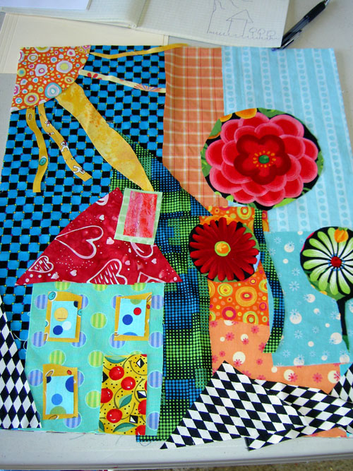
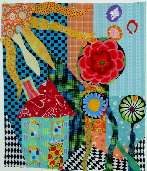
Here is my first draft, so to speak. I had looked at my previous effort, from the first class with Pamela, before this class and had an idea that doing a related quilt would be a good idea. I was also looking at Collaborative Quilting by Freddy Moran and Gwen Marston last week, which made me think about houses. The sun and the flowers are in common, I think.
One thing I realized is that I have not been working with scale much lately. The Pineapple, the various square pieces including Thoughts on Dots did not require me to work with scale in any meaningful way. I did pay attention to dots were in the various prints I used for Thoughts on Dots. I didn’t have to worry about scale overall in terms of the elements of the quilt. So, this piece made me stretch. When Pamela came around to help me the first time, scale was what we focused on. I needed larger flowers and larger rays of the sun.
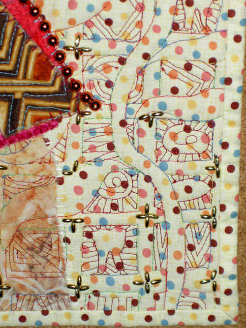
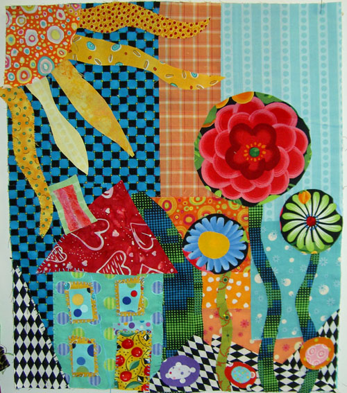 Final piece (sans quilting)
It wasn’t quite so easy as making some elements a little bigger, though, because I had the previous garden quilt (below) on my mind as well. Some of the intermediate “drafts” of this piece had many more flowers. You can see the various drafts in Saturday’s post.
I brought scraps per the directions, so I didn’t have a lot of choice of background. I had a lot of variety in fabrics, but not a lot of variety in size. My scraps are relatively small in general, so I put some darks in (per Pamela’s instructions) and really had trouble working with them, as I also mentioned. I have not been working with black and the checkerboard is interesting, but it doesn’t read as a cheerful fabric to me. I have gotten some feedback that it isn’t too dark, so I am considering it stretching and moving on.
Pamela’s technique of cutting directly into the fabric is a very freeing way to quilt, however, and I think it is good for me. Now that I have two of these garden type quilts, I might try to make two more and have a quartet. We’ll see.
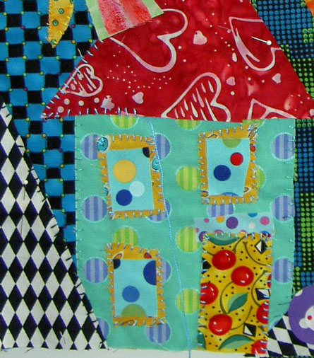
I enjoyed her handstitching techniques with Perl Cotton as well. One of the things about this is that it doesn’t have to be perfect. The stitching adds to the charm, but I don’t think it looks like the fake folk art kind of look. I could be wrong, of course!
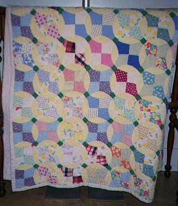
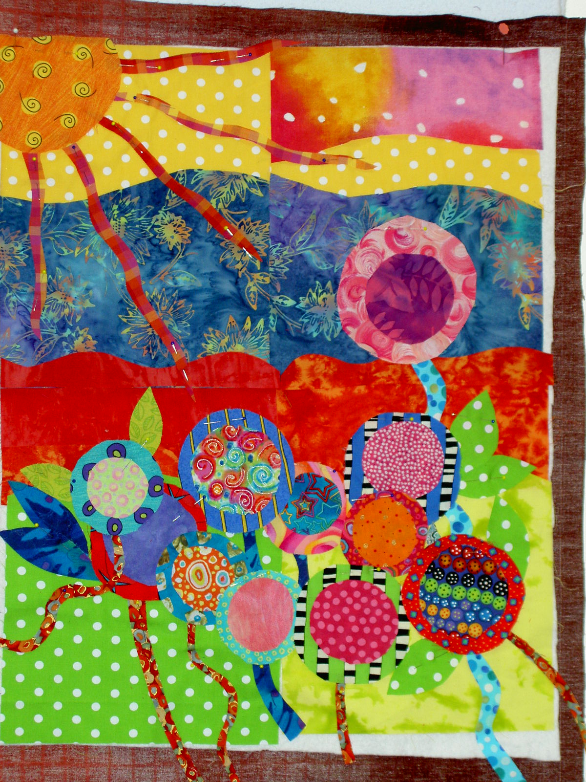 My 2006 Pamela piece. I am more excited about getting back to it now. I machine stitched some of it down, but plan to go back and work some more with the Perl Cotton on the flowers, especially.
I highly recommend Pamela’s classes. She is a quilt teacher, but she has been trained in art and knows about design principles. That is the focus of her class with fabric as the medium. She seems to truly want people to do good work. I am glad she directed me, in her gentle but firm way, to scale, because that is what I needed to work on.
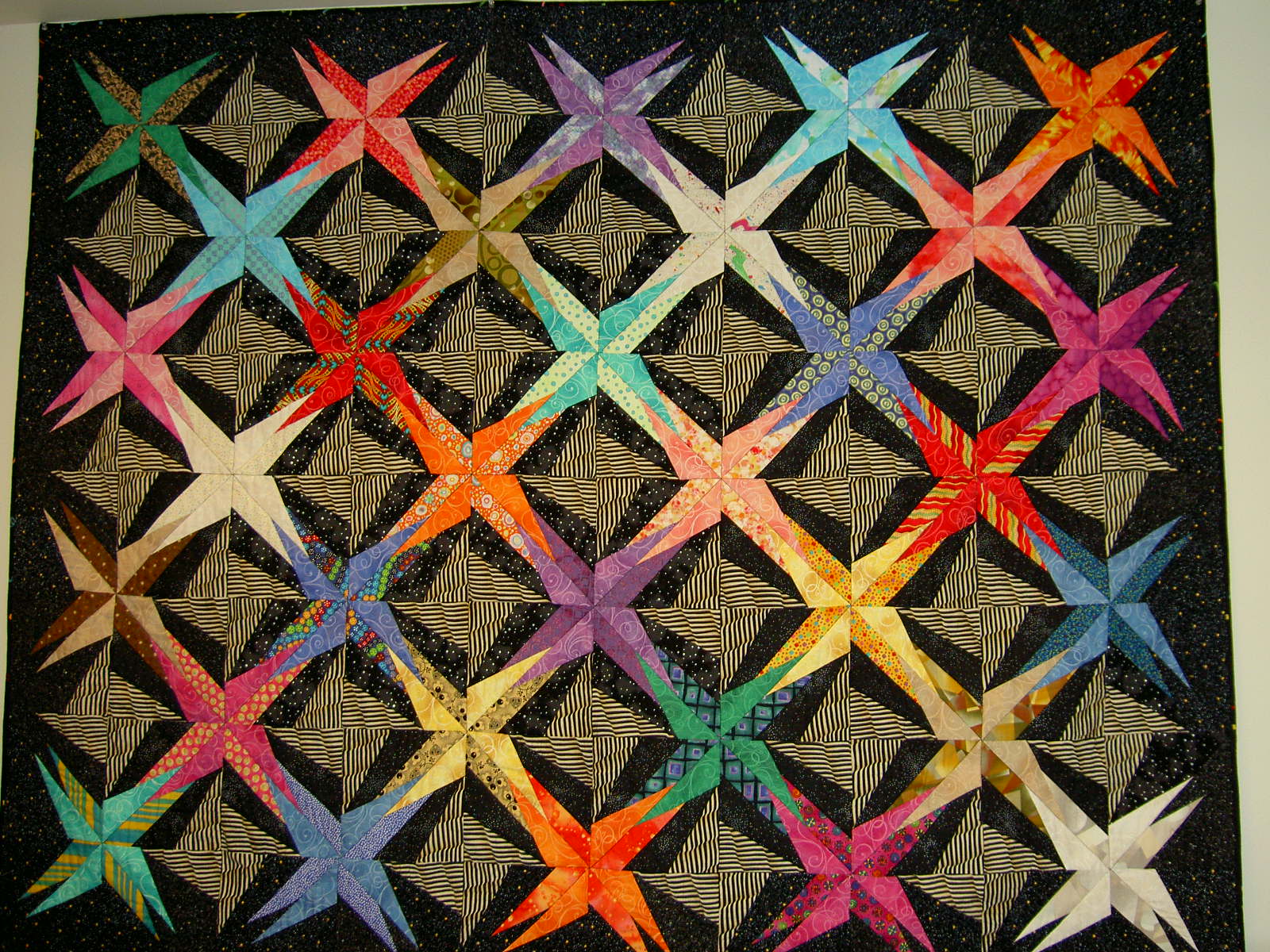
A Day with Pamela
I made it to the Pamela Allen class at EBHQ.
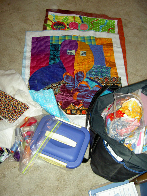
This is all the stuff I took to class, except my sewing machine is not in the picture. (above). The pieces you see are pieces that I made in a previous class with her at Quilting Adventures.
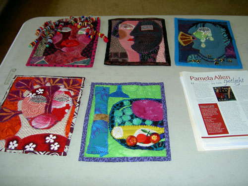
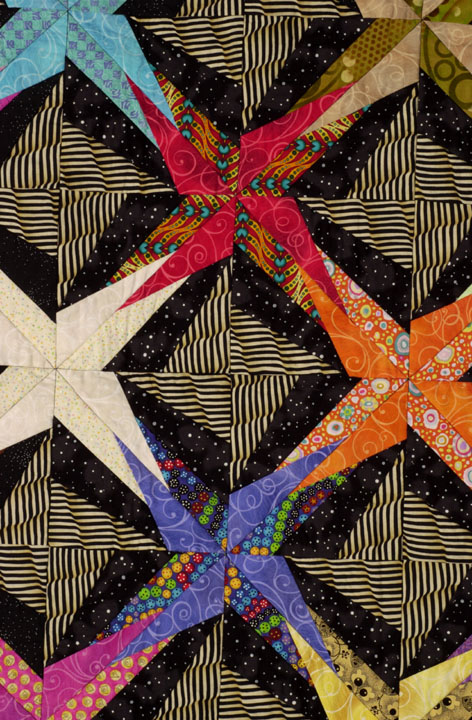
Pamela’s work (below)

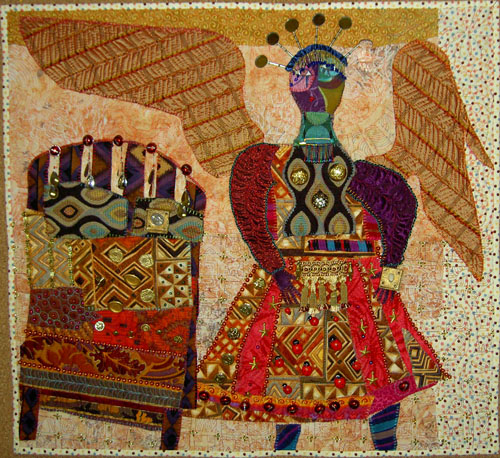
Tooth Fairy
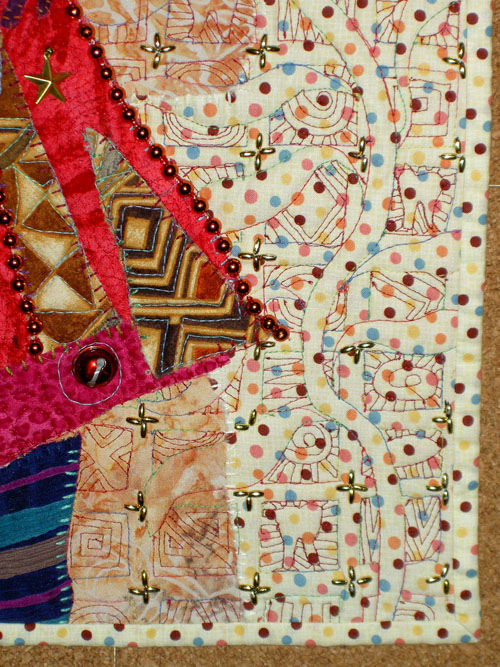
Tooth Fairy (detail)
more Tooth Fairy detail
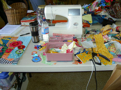
This is what it looks like when I work in a class. (above) What a mess!
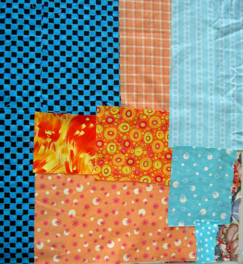
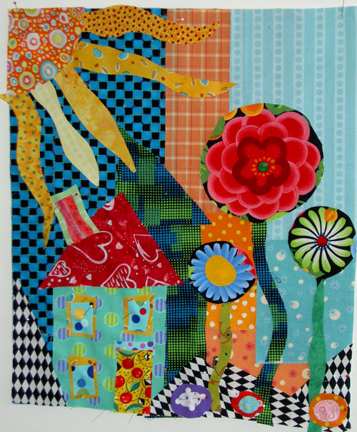
My background for the House & Garden quilt. I really can’t help starting new projects in her class.

First draft

Pamela working on my piece
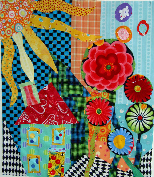
Lots of flowers and flying dots.
Not so many flowers and flying dots.
Not so many flowers and no flying dots.

Final composition. I like it, but I have to admit that I had a very hard time working with the darker colors (the black around the flowers and the blue/black checkerboard. All I could think of was that I wasn’t used to it. I haven’t been using much black lately and, as you know, have been trying to make cheerful quilts. This quilt-let seems a little dark to me.
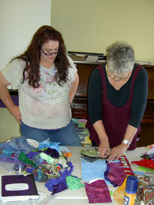
Pamela working with Julie

Julie’s piece. I love the line up the left hand side.

Group Sampler project. We had 15 minutes to make our part of this piece.
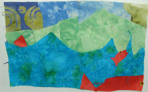
Julie’s two fish. Can you find the second one?
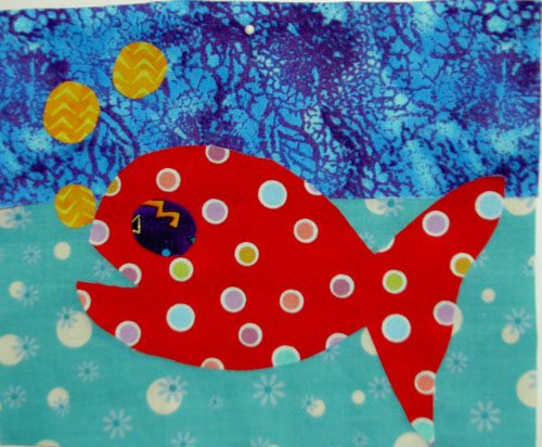
My fish – with dots, of course!
I am tired and about to sign off, but I thought I would put up some photos for all of you to drool over while I go recover from a FAB day. More tomorrow.
Design Book Review
We were discussing design books on a list in which I participate. I reviewed, sort of, Johannes Itten’s book, Elements of Color, some time ago. I wanted to mention Sarah Ann Smith’s posts about Steven Aimone’s book Design!: A Lively Guide to Design Basics for Artists & Craftspeople.
Design Ideas for Coffee Quilt
After writing the post about the Coffee quilt, it occurred to me that a row quilt might be the way to go.
When my computer is idle, it scrolls through various quilt show photos I have taken. While it was scrolling through the PIQF 2005 photos, I saw a row quilt that might work for the coffee quilt.
This one is done with 4Patches, which wouldn’t really work, but I could fussy cut the squares with motifs in them instead of making a four patch. I could also make the squares different sizes to accomodate the motifs. Sue Nickels has a row quilt that I liked. I am pretty sure I took a picture of it when I was in her class and will have to dig that out.
I am not starting this quilt, just mulling.
Coffee Quilt
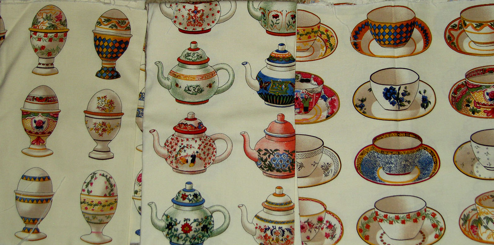
Luana has some new coffee fabrics, which got me to thinking about the coffee fabrics I have been collecting.
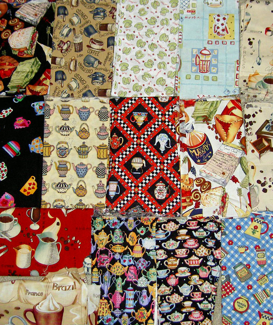
I have quite a lot of coffee fabrics, which I was collecting about 4 years ago for some unnamed/undesigned/unstarted project. At some point I realized that many of them were brown and I didn’t like brown. Now that turquoise and brown are popular and look good together, I think I can use turquoise with them to make the brown more cheerful.
Still, I do like the fabrics and would like to think of something nice to do with them. St. JCN and I did “She Had to Have Her Latte.” The Tarts Come to Tea is supposed to be a coffee quilt. However, the name is much better than the Crabs Come to Coffee or something, so I guess it will secretly be about coffee.
I don’t want to do something like attic windows just to showcase the fabrics. I want to do something creative and original. Perhaps a “She Had to Have Her Second Latte”?
I also have some great Dutch coffee fabrics that I bought at Black Cat Quilts. They are pretty special and I would like to do something special with them. Some kind of breakfast quilt? I am not sure. I suppose they have to go to the cogitation pile.
Something Just Wasn’t Right
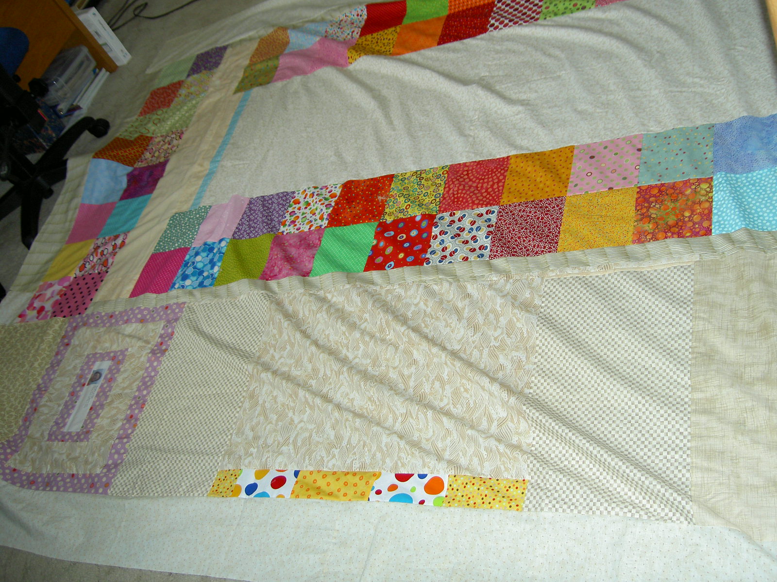
I know I said that I finished the back of Thoughts on Dots last weekend (weekend before???), but something kept bothering the back of my mind. I keept looking at the back and finally decided that the beige pieces on the inside needed to be on the outside, so I would not have to cut through the piecing that I did on the label when I trimmed the quilt after quilting.
Initially I thought I would unpick the beige piece next to the label (above) and sew it on the outside, but St. JCN suggested that I just cut it and then sew it back on as it would take less time. She, of course, was correct. It was easier, but I had to fill in the edge of one side as it was uneven. That took a bit of time, but eventually I got it done. After a brief worry about the back being way too big for the top and which meant facing cutting the piecing after quilting anyway, I finished the back both IRL and in my mind. This means that that mentally I can move on to the back for the Nosegay.
Bottom right (but photo is oriented sideways)
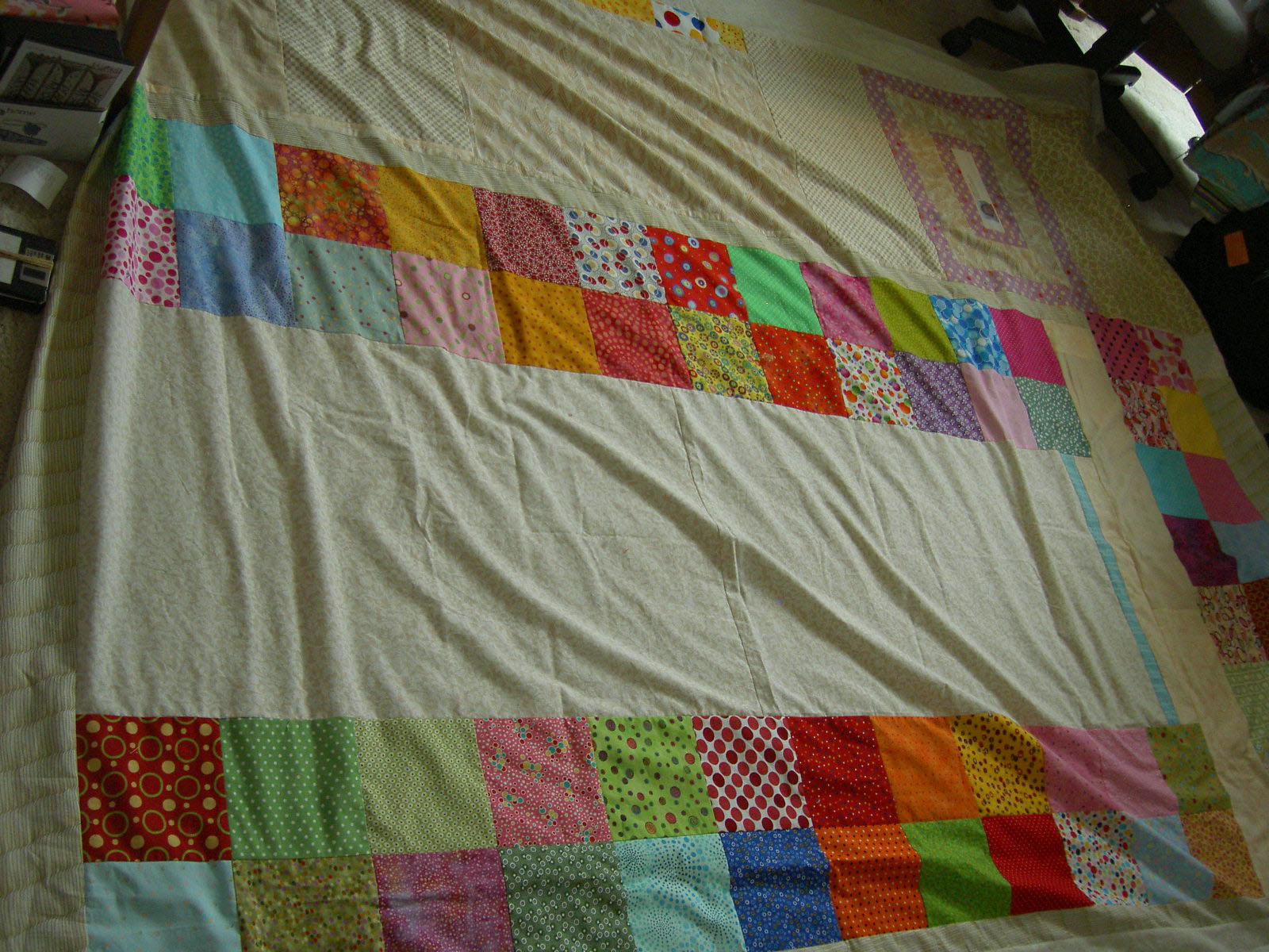
Bottom left (but, again, photo is oriented sideways)
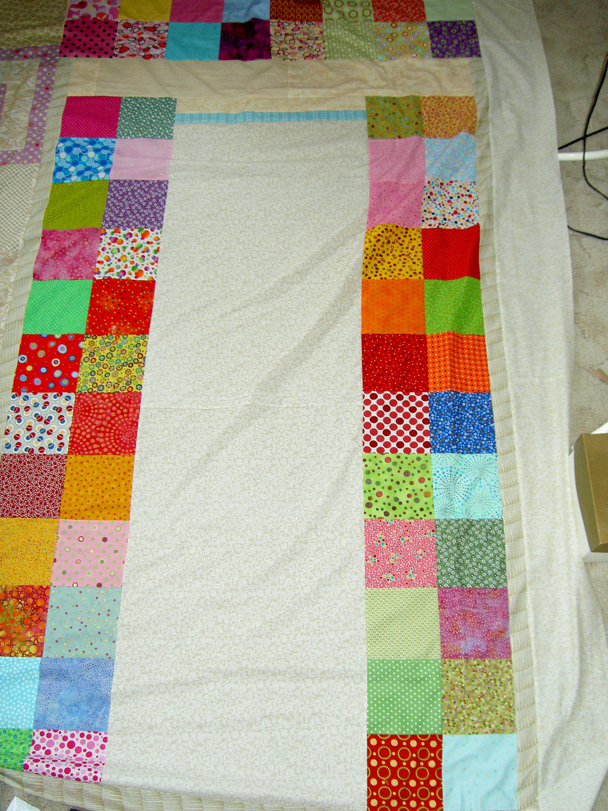
Top left
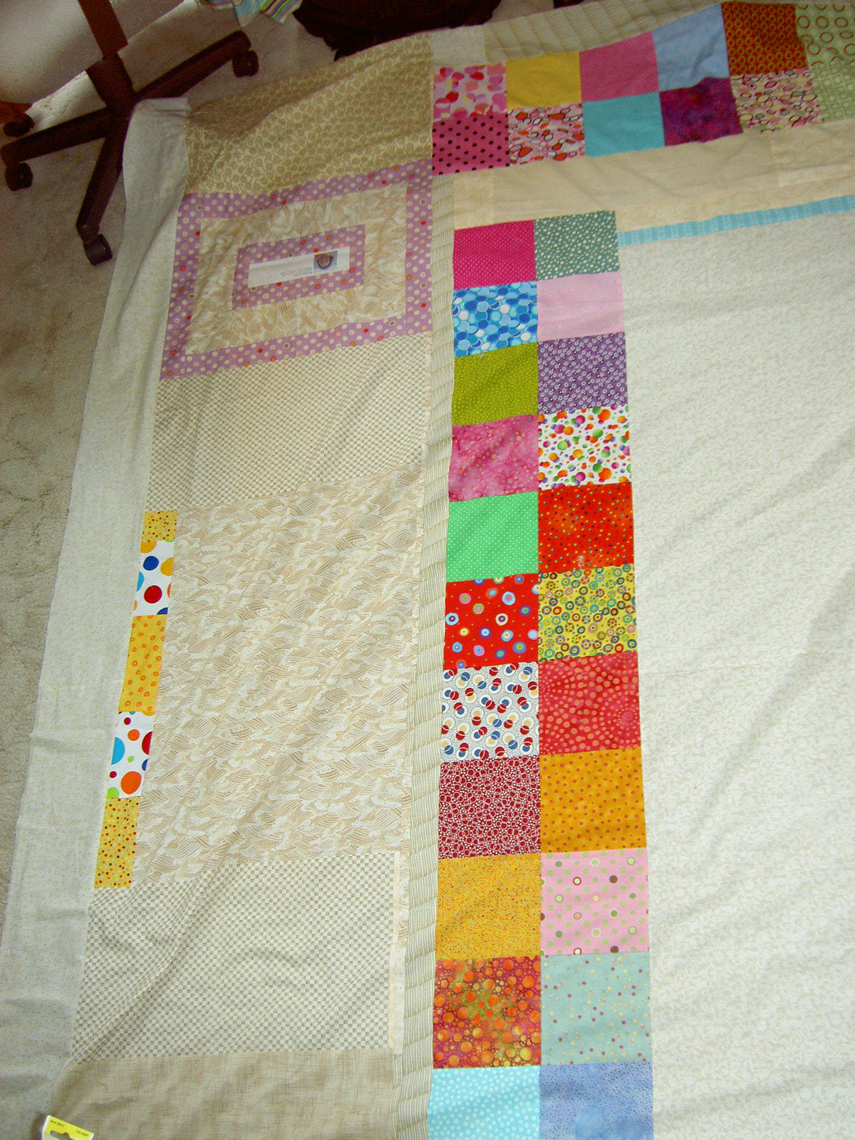
Top right
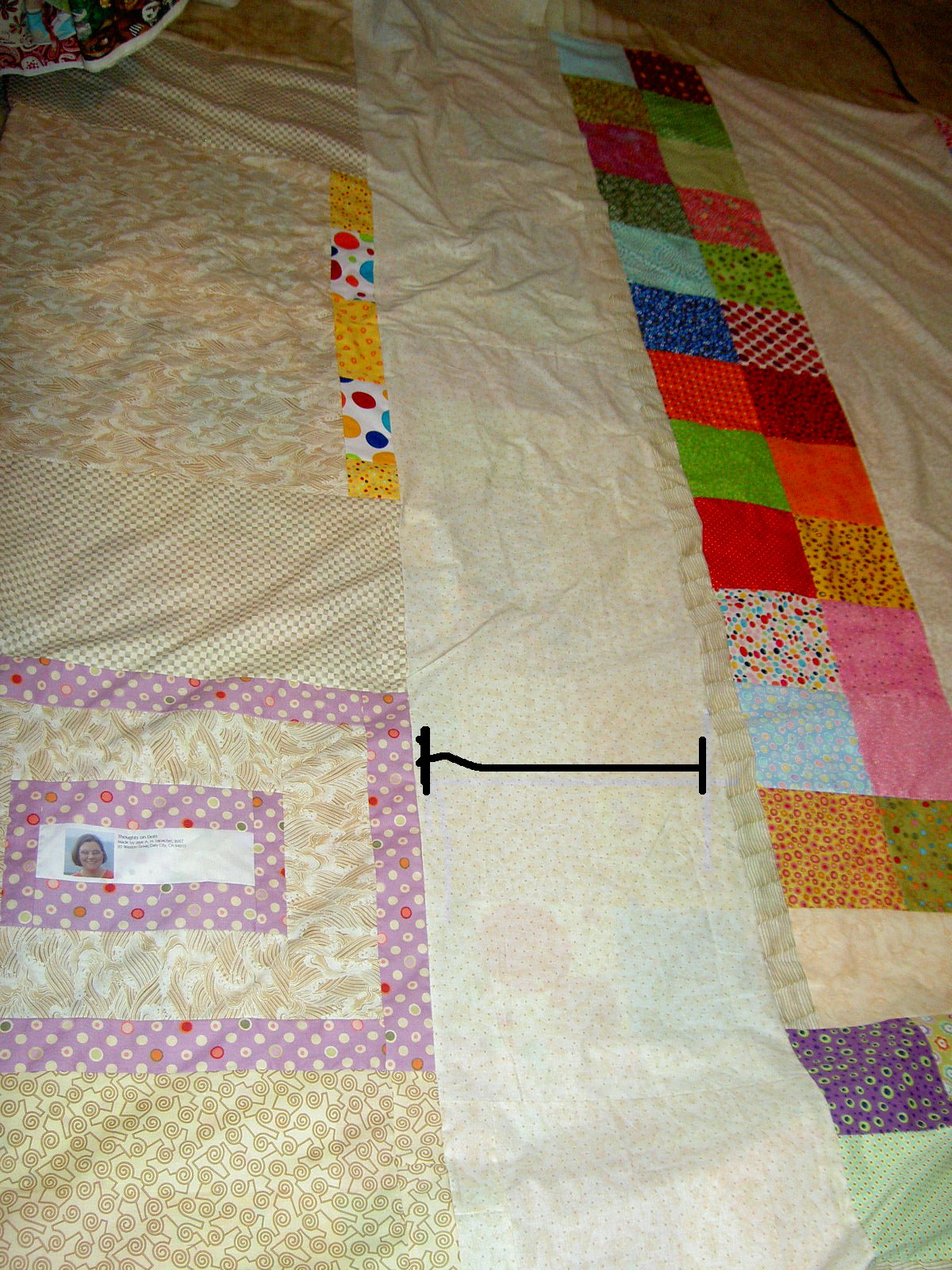
The quilt is too big for the room, so I couldn’t lay the whole thing out, but, hopefully, you get the idea.
Cross Block Redux
By the time this quilt is finished, I will probably have named 137 posts Cross Block Redux n.1…..n.137. We’ll see how interesting this quilt stays.
In response to the post Quiltmaking is a Journey Not a Destination, fellow quiltmaker and blogger, Laume wrote:
“There is a third option – make each block scrappy, but not planned so that the colors in each secondary “stretched out square” is matched. You would get rid of the matched “X’s” in the second option you think look unfinished. Whether the background circles would still come to the fore like the second option, or whether they secondary pattern of dark stretched out squares would come to the fore like the first option, I don’t know. You’d have to try it on paper and see.”
I had no idea what Laume was talking about. I knew it couldn’t be terribly complicated, but I am visual person and the words just didn’t translate. I sent Laume a line drawing of the quilt and she was kind enough to color it in.
Basically, she was saying to make the Xes totally scrappy and just match the curved background pieces. I was leaning in the direction as I had just realized that I used a piece of fabric for the back of Serendipity Puzzle that I really wanted to use in this quilt.
Laume’s idea is an excellent one, because the parts of the Xes really do take up quite a bit of fabric, which means I can’t use as many scraps as I would like. However, I will still have to cut into yardage, regardless, so perhaps it doesn’t matter?
Stay tuned!
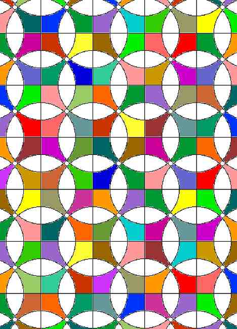
The Center is Not the Center
It occurred to me this morning that I seem to be working with patterns that create not obvious secondary patterns. Spiky Stars was the first (that I can identify), the Pineapple and now the Cross Block.
In Spiky Stars, the center of the blocks seems to be where the X of color is. Perhaps, in and artistic sense it is. However, in a technical sense (making the block), where the legs of two colors join is the center of the block. See below: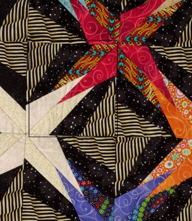
I have made an effort to outline the block in PSP, but Deirdre and DebR are more proficient, but you will get the idea.
The Pineapples are the same way.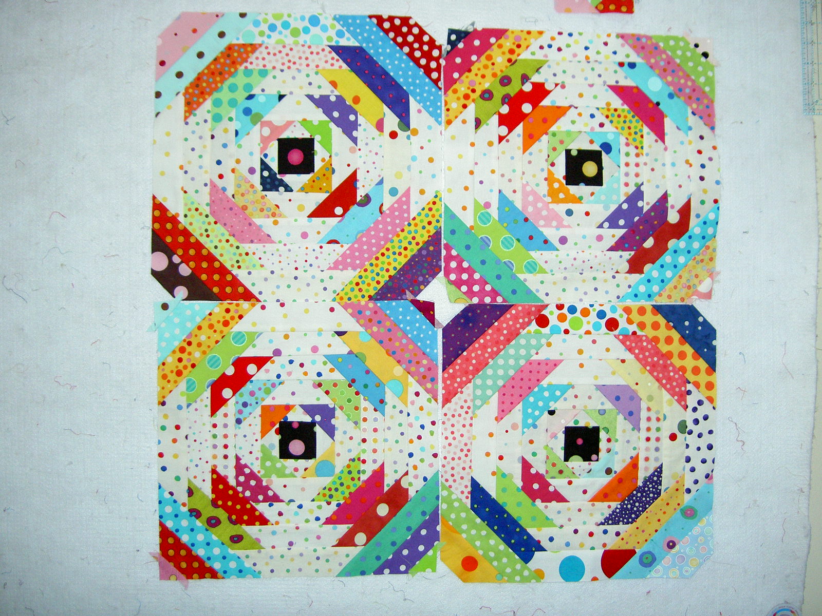
It is a little difficult to see the secondary pattern at this point in the process. It is not the black square, which is actually the center of the block. The secondary pattern will become dominant as I make more blocks and as I put the corners on each block.
And now the Cross Block:
I wonder if this phenomenon has some deep subconscious psychological meaning or if it is a message from the depths of my mind? I think I am just trying to create interest. Worth pondering, I suppose.
Quiltmaking is a Journey Not a Destination
I found this quilt somewhere, drafted the block and am now trying to decide if there is a color layout scheme that I prefer. I don’t remember where I saw the quilt, which is a shame because I would like to document it better than “I don’t remember.”
There are two color layouts for the Cross Block quilt that appeal to me:
I like this one because the circles really stand out and you can really see the fabric. I don’t like the way I would have to plan out a bunch of the fabrics in advance (like Spiky Stars, which worked out well in the end). The other thing that bothers me is the half blocks on the edge. On one hand, they look unfinished. On the other hand they could comprise a self bordering technique border, again like Spiky Stars, that is so effective.
In the option above, the blocks would be a lot easier to piece. The crosses really stand out, which is nice, in a way. It looks a lot less interesting than the one above…a lot more regular.
So, does this count as another project or a way to get some more sewing done when I am not at the machine? Quiltmaking is a journey and not a destination, so does it matter?
Thinking More About Solids
I read a bit more of the Amish-Inspired Quilts book. One thing I noticed, as I was reading, was the picture of the quilt, Lorna’s Vine. You can only see a bit of it, but the thing that struck me is osmething that St. JCN and I discuss all the time: more fabric is beter than less. St. JCN has recently accepted that she prefers making scrap quilts with lots of fabrics. In this picture, the vine and leaves use many different solids, which adds a lot of interest to the quilt. Why in the world should a quilt be boring even if the fabrics are all solids? It shouldn’t. More fabric is better than less.