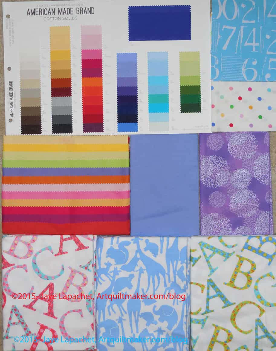
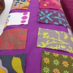
I received two, yes TWO, Fat Quarter Shop gift certificates for my birthday. I spent about two weeks looking at all the stuff I could buy and ended up with these options.
The color card is a color card of American Made Brands solids. You just never know when you will need to buy some. 😉
The striped fabric below it is actually not a striped fabric, but a carefully folded fat quarter pack of American Made Brands solids. This goes well with the ones my mom gave me for Christmas.
The flannels on the bottom are for some receiving blankets for a friend who is having a baby in May. Plenty of time, right? (HA! Famous last words!)
The rest are stash fabrics. I am starting to contemplate a quilt for my aunt. She loves purple and those violets would be nice for her. I’ll use the dots for the EPP Stars.
Thanks to my sis and TFQ for providing such great gifts!
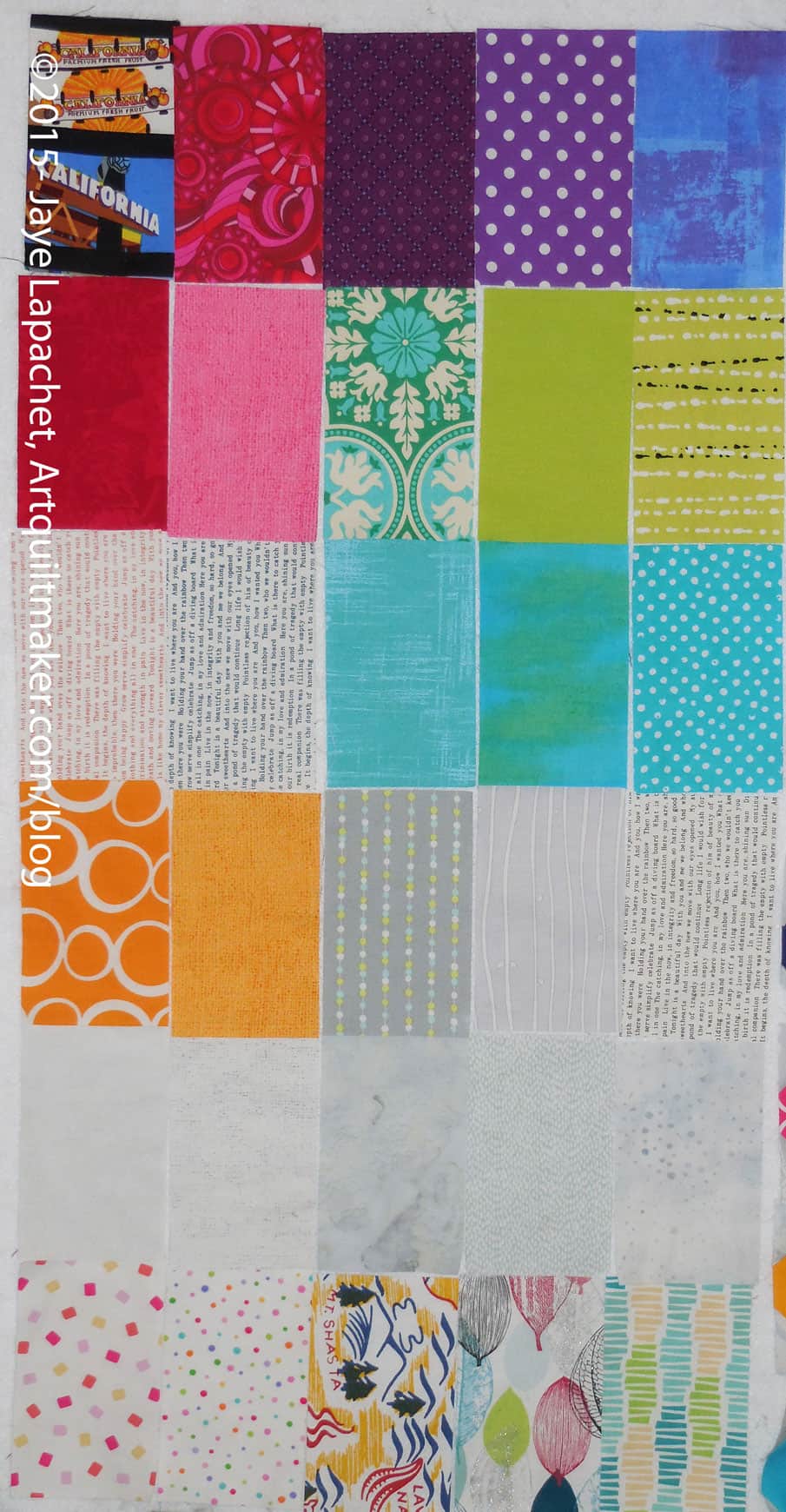
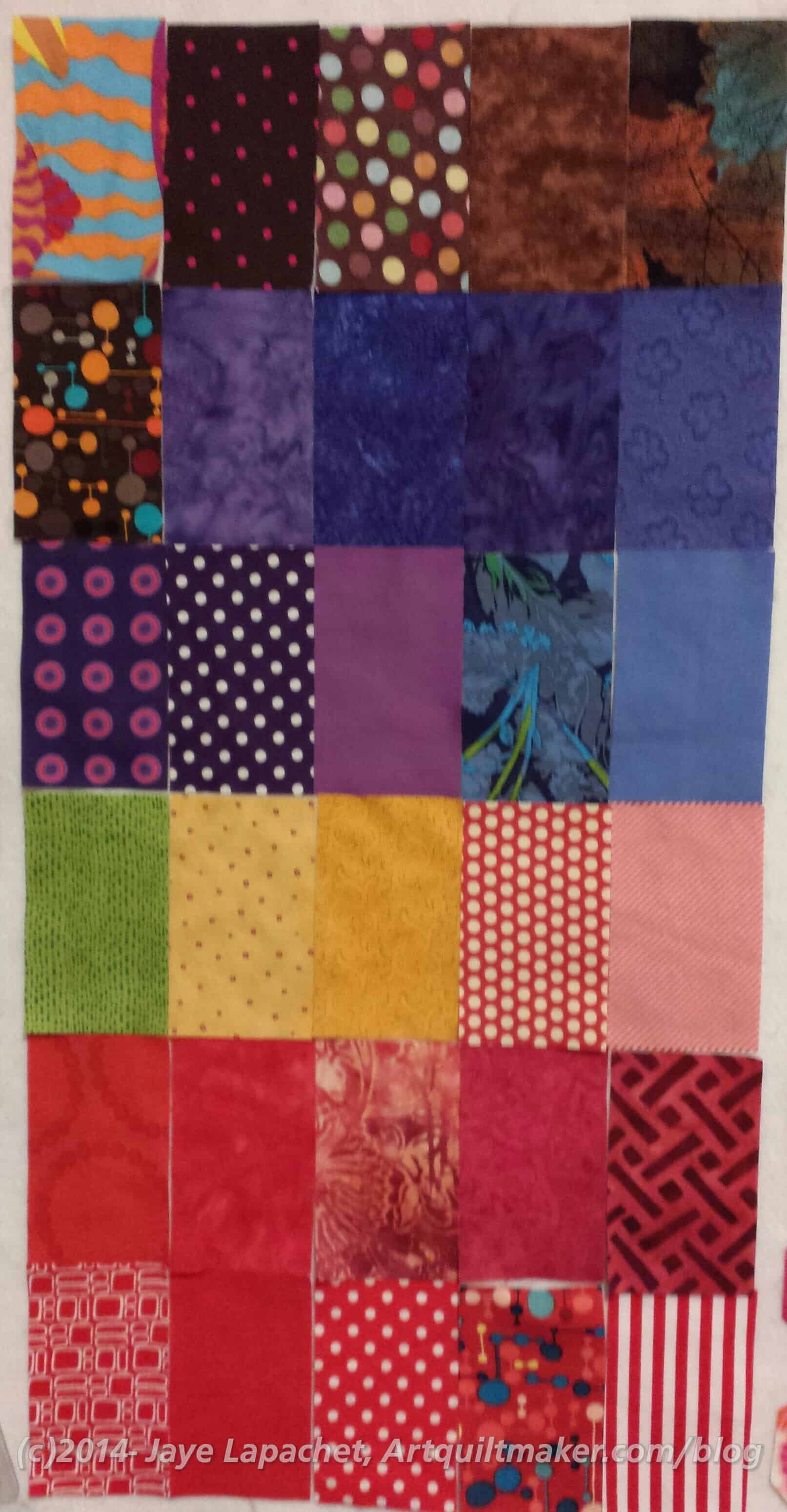
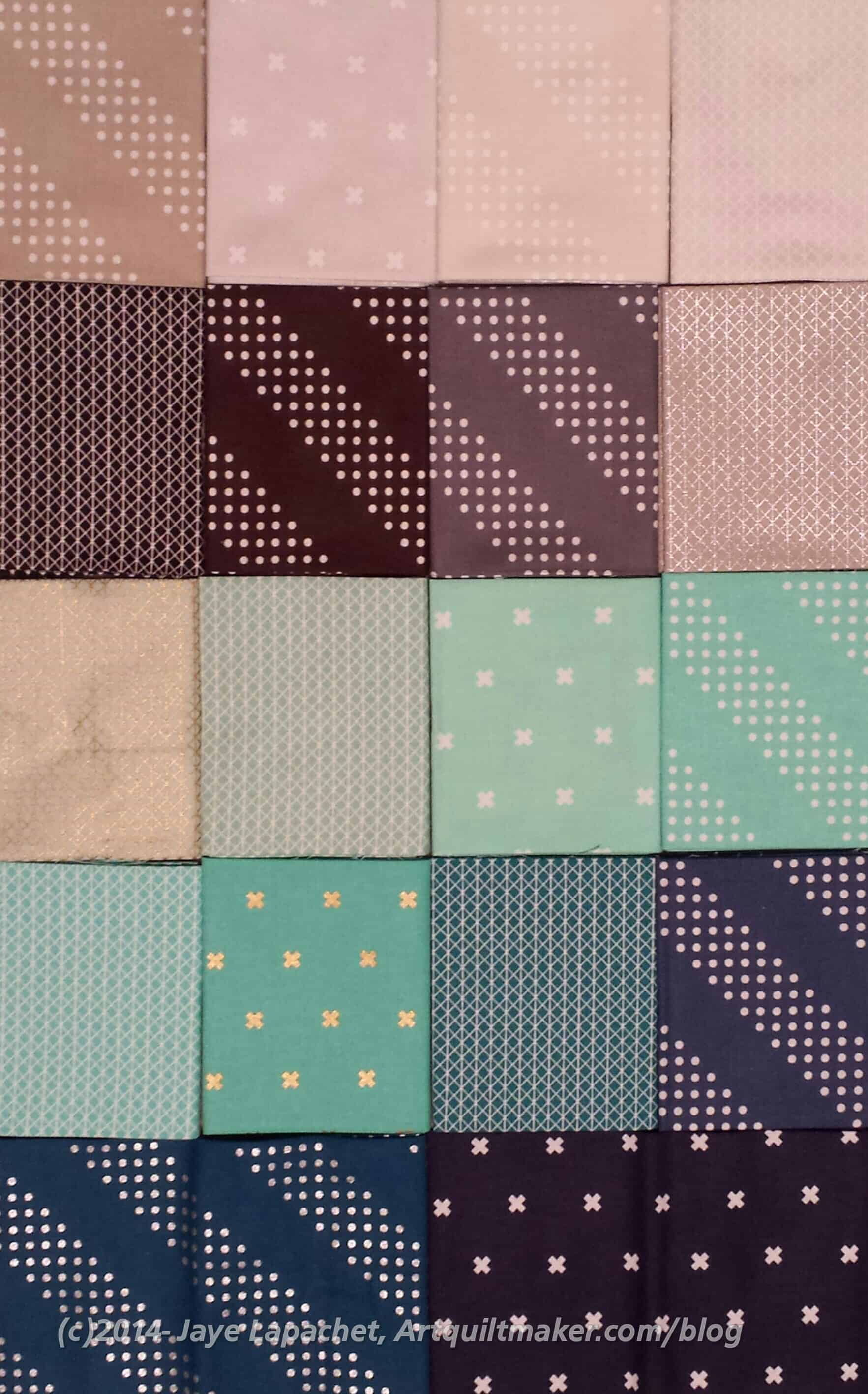
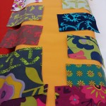
Here are the most recent patches. I can’t decide if I am going to keep cutting until I start laying out the piece on the design wall or if I should stop now.
The CQFA Retreat will be in May this year, but I certainly don’t want to wait that long. On the other hand, I haven’t chosen a shape for FOTY 2015. Lots to do.
Yes, it is 2015 and I am still gathering fabrics. In fairness, most of these were from the end of 2014. In any case, it is my project and I am still gathering fabrics. 😉
I can’t arrange this piece until the Black & Grey Teenaged Boy Quilt is off the design wall and that project is going nowhere at the moment.
There are a couple of things going on. First, there are certain fabrics I want to include in this entry in the series.
Next, I am doing quite a bit of scrap reduction and when I have a large enough piece that I can use a goodly chunk of it, I cut a piece for the FOTY 2014.
Finally, I am annoyed that I didn’t decide on shapes like I did for 2012, which were rectangles and squares. I’ll probably go with that arrangement for the 2015 version. That is still some time off, so we’ll have to see.
Well, 2015 has barely started and I can already say that I had a hand in making a donation top.
Ooops! I have forgotten what the politically correct term is for donation quilt. I guess I didn’t listen to Pam’s podcast episode well enough.
Anyway.
BAMQG Sew Day was yesterday. I planned to go and had all of my cutting projects planned out to take when I thought of emailing Gerre to see if she would be there. Gerre and I made the Green T quilt together in the Great Charity Race last fall. We make a good team and Gerre makes me happy to be around.
Shockingly, she said no! It turns out that she was injured before Christmas had had been stuck at home since then and she didn’t feel like it. I cajoled and encouraged and bribed her with the prospect of working on another charity project with me. My thought was that she wouldn’t have to think about a project. She could just show up with her sewing machine.
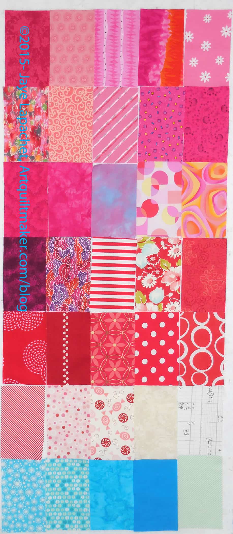
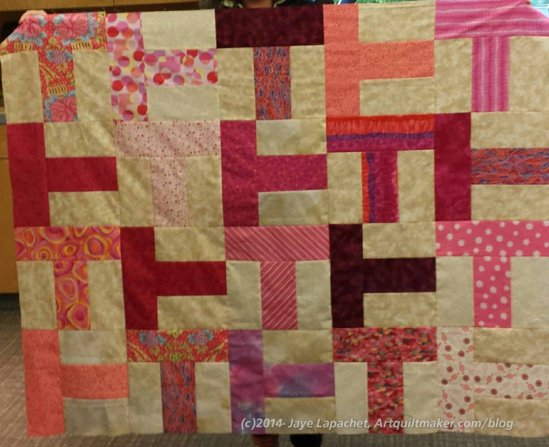
It worked! Gerre decided to come and my job was to get fabric for another ‘T’ quilt together. We agreed that something cheerful was in order. I pulled out some pinks. I also pulled some beiges for the background that I wanted to use up anyway.
I arrived a little later than I intended (those PJs were nice and comfy). I started pressing and Gerre started cutting. The T quilts we made during the Great Charity Race were cut out. We found out how daunting the cutting can be. Once we passed that hurdle, I sewed the first seam and then pressed and Gerre sewed the rest as I pressed and handed her pieces.
Pink T Donation Quilt
The result is a cheerful quilt that we hope some lovely girl will enjoy. I don’t even think the beiges are very terrible.
Gerre has the piece, which is about 55″x45″. I will make the back and send it to her, she will quilt it, then I will bind it.
Gerre left much more cheerful and I got in over 5K steps running around, so it was a good day on many different levels.
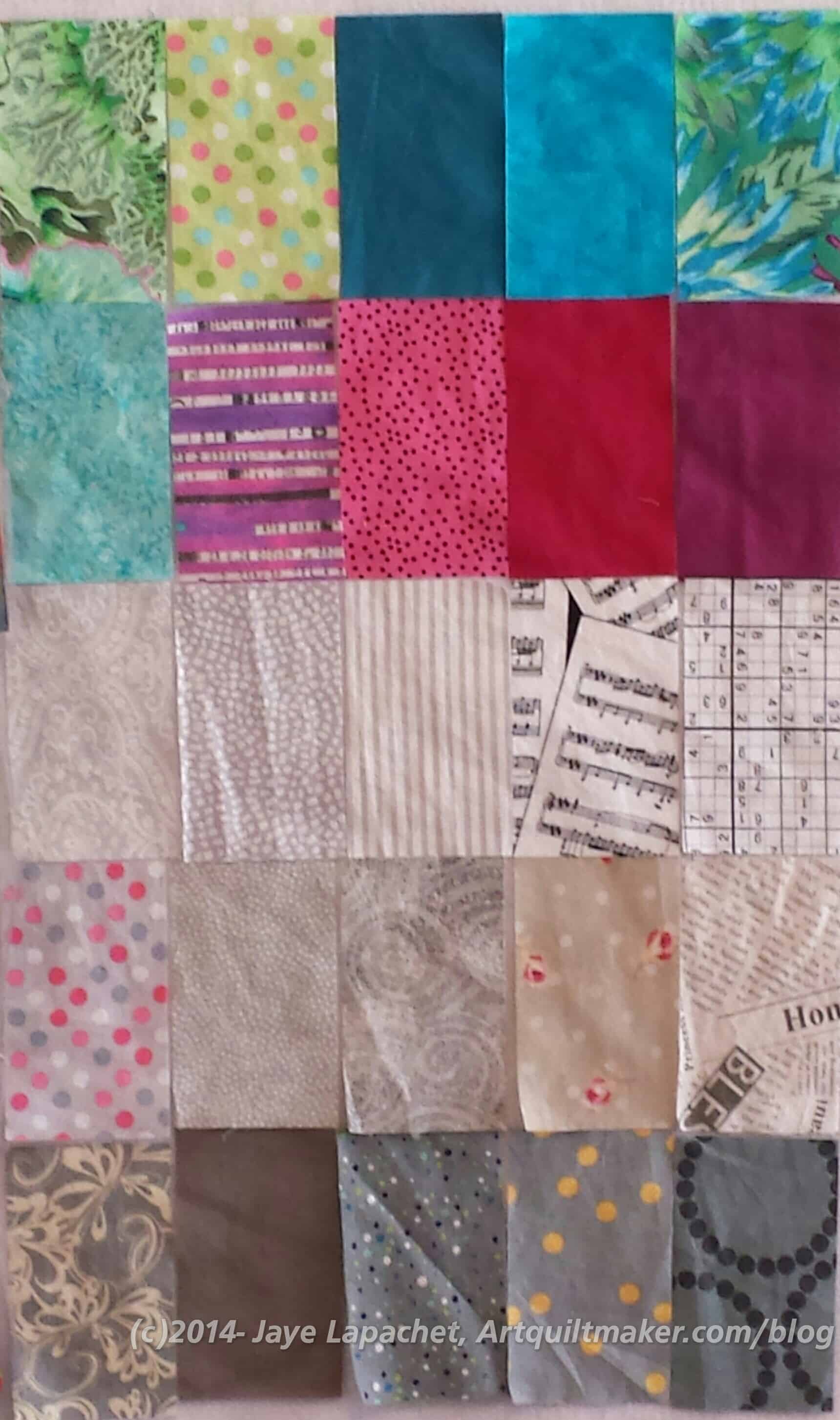
Like a bad penny the pieces for this quilt just keep turning up. I purposefully did a load of fabric laundry on Wednesday, even though I was enjoying my unpressed fabric free space, just so I could add some more pieces to FOTY 2014.
I did a load of turquoise/aqua so I could also cut some patches from that color for another project.
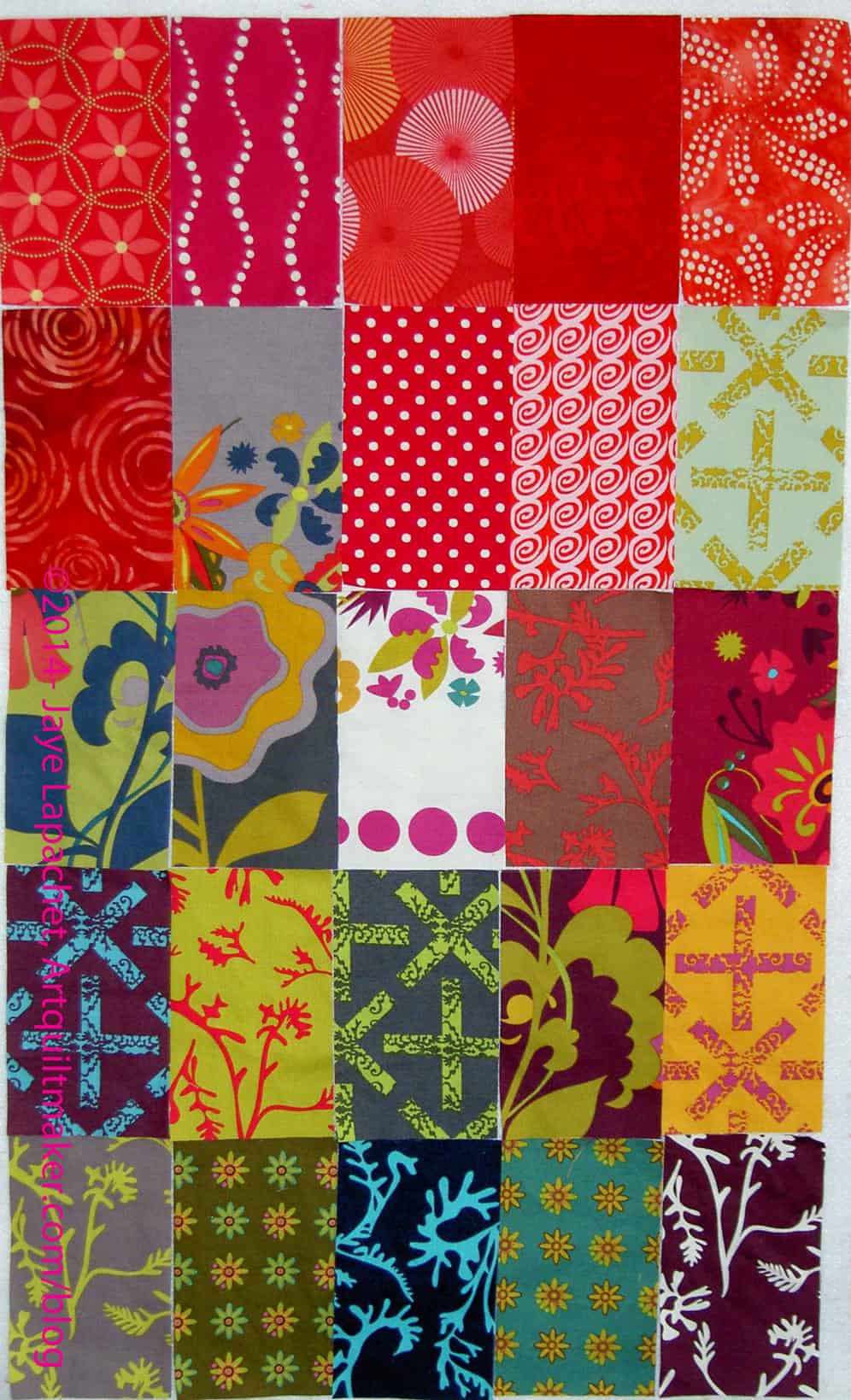
The last time I had enough rectangles to show you was in early November. I feel like I am not cutting enough pieces for this project (within the parameters, of course), which makes me feel like it will be 8″x10″. I know it won’t be that small, but I want it to be a nice sized wall hanging.
Also, I look at the fabrics and think they are not that interesting. Of course, I have to remember that they will be completely rearranged and their individual motifs will be lost in the overall layout.
I think I might be experiencing a bit of a creative block. I need to find some rote sewing to do.
Off to cut those rectangles from the fabric I just washed.
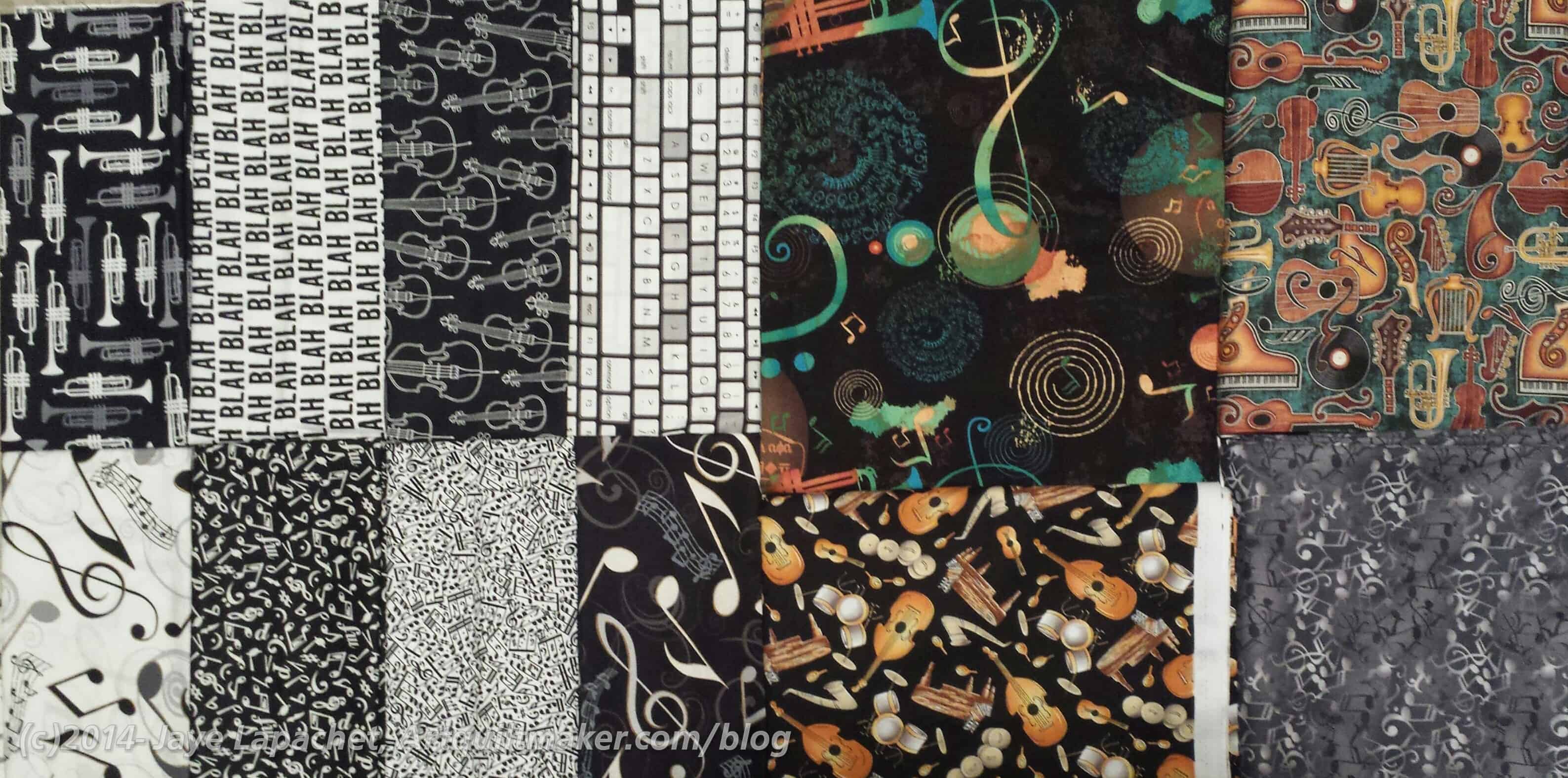
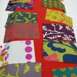
I have made progress on choosing fabrics for the music quilt. I bought some fabrics at Houston and then I received a huge box of music fabrics from Mrs. K. What a bonanza!
The fabrics on the left are the fabrics I bought at Houston for the quilt. The fabrics on the left are music fabrics that Mrs. K sent me.
I still don’t have a pattern. I did another Missouri Star disappearing pattern that might work. We’ll have to see.
This seems like progress, but it is extremely painful.
I have been a little off fabric buying for the past couple of months, but that seems to have abated. Despite not feeling the love for any new fabrics, I kept looking at Cotton & Steel. Who couldn’t with all the hype?
I am not that fond of the fussy-cuttable prints, but liked the tone-on-tones. I hadn’t yet gotten myself together to go and seek out the prints I wanted when I saw that MassDrop had an interesting offer. Interested parties were allowed to choose two FQ bundles of the tone-on-tone color groups of their choice. Note that this drop is closed now, but you can request that it be opened again.
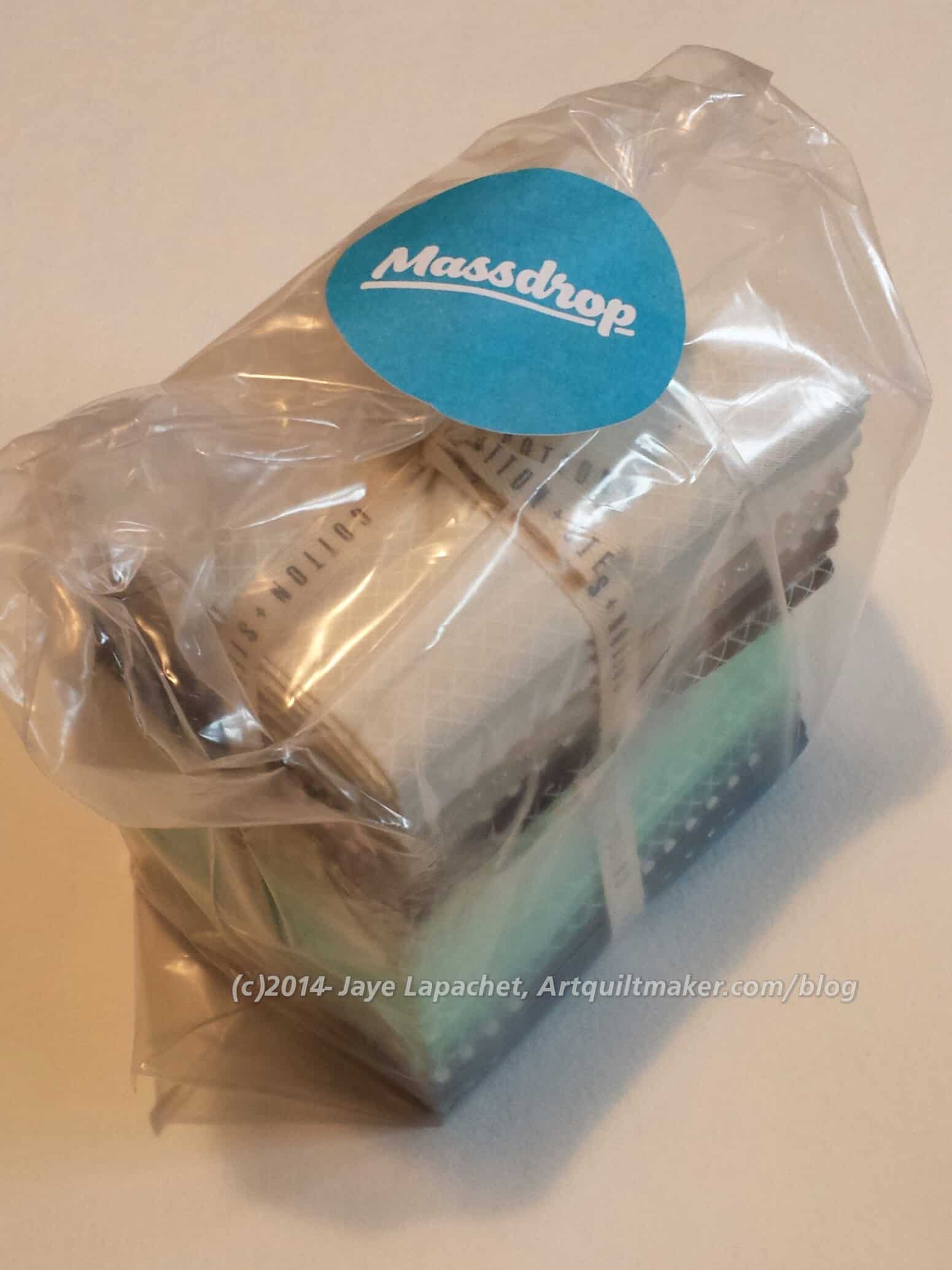
MassDrop order arrives
Right before I left for Houston, I received the bundles. I didn’t really have a chance to open it as a lot was going on the few days before I left. I was excited about the cute little packets of fabric, though.
Went to Houston, came home and had a lot of stuff to do around the house, related to work, etc. Finally, I dragged my cutting table out of the closet (I store in the Fabric Closet when not in use or when we have guests or when someone is vacuuming) and began unearthing the rotary cutting mat. What a mess! I have a lot of projects in process, as you know, and it just creates chaos. I am in creative chaos stage right now.
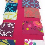
One of the things I unearthed was the package above. Of course, I opened it.
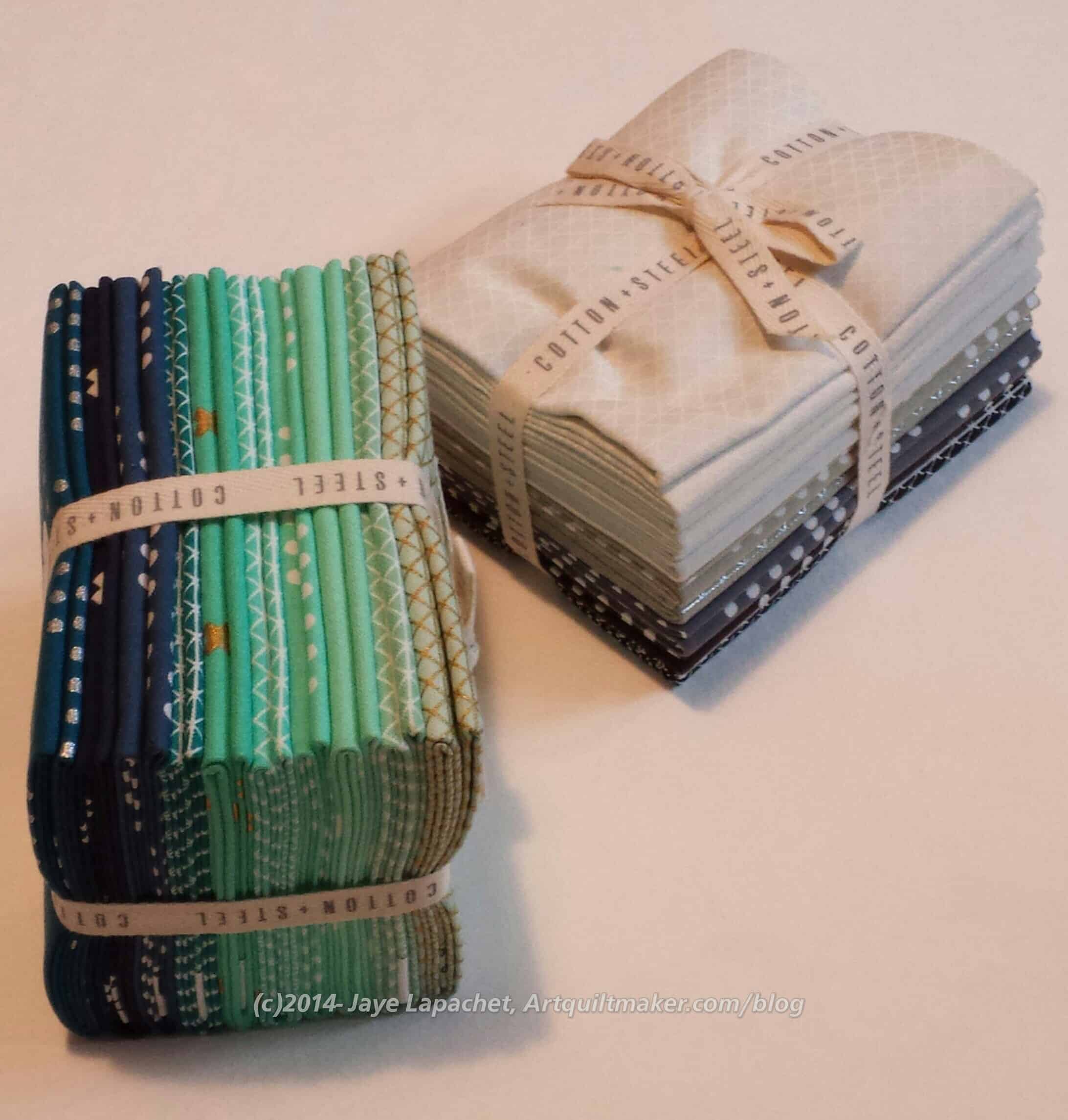
Cotton+Steel Open
Inside were two FQ bundles. Normally, I buy larger cuts of fabric, because you never know when you will need to make a border. Considering that I have plenty of fabric, especially in the blue range, I think fat quarters are plenty. I also have a project in mind for the neutrals.
There are a couple of kind of ugly greens (the ones on the end-right), but they look ok with the others.
Now I can I can say I am in the ‘in’ crowd and not just trying to be in the ‘in’ crowd. 😉
I do have to say that once I got them out of the MassDrop packaging, I didn’t want to take the FQ packs apart. They were just so compact and adorable. I gritted my teeth and did it, though.
All Cotton+Steel
The fabrics all go together pretty nicely and as soon as I was the blue and green pack, I will add them to my pile for Tale of Two Cities.
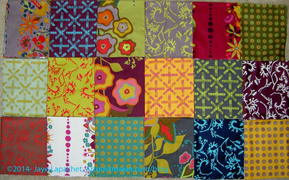
I went back in time to look at the tags for my last FOTY post and was shocked to see that it was August that I last posted. I really couldn’t believe it, but I looked at the various Design Wall Monday posts I have posted recently and those same FOTY patches were there with very few changes. I actually took a picture of this group (above) right before the picture of the design wall for yesterday’s post, so next time I do a DWM post, you will, hopefully, see a new batch of FOTY patches.
The reason it took me so long, aside from being really busy during the week is that the last load of fabric I washed was grey and light neutrals, which I found really depressing to press, so I kind of avoided doing it. TFQ saw the pile and got down to business, so now I have newly pressed fabrics from which to cut patches.
I also have a lot of great fabrics waiting to be washed and I should make time so the patches can go into FOTY 2014. The new year isn’t that far away and pretty soon, I’ll be sorting thesepatches into color groups and picking the shape for FOTY 2015. WOW! Time flies.
One of my goals for Labor Day was to finish the Fabric of the Year 2013 top. This was a daunting goal, because each piece has to be sewn to another one in a certain order.
That meant that I started in one corner (see below), sewed two pieces together, put a leader/ender in the machine right after the two FOTY pieces, sewed those, took the FOTY pieces out of the machine, pressed them and put them back on the wall before taking the next two pieces. Repeat. There are 306 pieces in this quilt, so I made progress on ~306 pieces from other projects as well.
FOTY 2013 Back
This project is extremely taxing in terms of piecing. I was pretty much done with the project when I finished top, so I did try to piece the back with large pieces of fabric. I used two pieces of different Philip Jacobs fabric. They go together well enough and I enjoy the large lettuces. They make me laugh. I hope I’ll still laugh when I am liking the project much better.
Normally, I would have put a quilting border on it, but I emailed Colleen and she said just to stitch 1/8″ away from the edge and that would keep the quilt from getting out of shape when it is quilted. I hope it works, because I want the shape of the quilt today to be the shape of the quilt forever. If it works, I’ll have to remember this trick for the future. I do like using ugly fabric as a quilting border, though.
Below are some photos of the project in process.
FOTY 2013 in processFOTY 2013 in processFOTY 2013 in process
I really don’t know why the Field Day prints appeal to me so much, but they do. They really aren’t my colors and more than one person has said that they aren’t my colors. I needed to be careful not to use a background that would make the top/piecing too depressing for me to work on.
I found that the backgrounds I posted before were too … too…. too something. Too wrong? Too boring? Too expected. They weren’t right.
I took some of the rectangles, as I said in the Thursday post, with me to Beverly’s to pick out a different background. Maureen met me there and helped.
Purple
Grape
Violet
Goldenrod
Sunset
Sangria
Kelly suggested some kind of bright turquoise. I went to the store fully intending to buy some kind of turquoise. They didn’t have the new Jamaica colorway, which I thought would be perfect. I wasn’t excited about some of the other turquoises that were available. So, I started looking at other colors. I picked up Sangria and really liked it.
Maureen pulled some other colors and we looked at them as well. I bought more than one background color, because I still haven’t decided. I may make more than one just to use the different backgrounds and see the difference in the look of the quilts.
I needed to take some of the Field Day prints to the store to pick out a good background. I am still working on pressing the reds and snuck Field Day into the wash, so I had even more fabric to press.
I am torn between sewing and pressing. Right now sewing is winning.
I has been nearly a month and a half since I posted new rectangles I have cut for the FOTY 2014 piece. Before the past weekend, I felt like I haven’t been in my sewing room much in the past month. I know I have been in there, at least a little bit, since there have been no shortage of posts to prove it.
I didn’t press and cut very much in that time, though, so the wall where I keep new rectangles has looked the same all this time. Then Friday I started pressing fabric and cutting some new rectangles with a vengeance.
I went to put them away and found my container full, so I have to figure out what to do about that. The work room overfloweth, that is for sure.
For some reason I became enamored with the Field Day print fabrics by Alison Glass. These are not my colors, they are somewhat muddy and have a flair, or feel, of the turn of the 20th Century. This ‘feel’ makes it so odd that I actually want to work with them. There is something about them that appeals to me.
My favorite print is the dark blue with the turquoise kelp-like print on top.
Shortly after receiving the fabrics, I came across a pattern I will use with these fabrics. It came from the Missouri Star Quilt Company and I found it in their Block! magazine (watch for a review soon). It isn’t a hard pattern, but there is something about it and the fabric that went together in my mind.
I washed the Field Day fabric last Friday, then started cutting 2.5″ strips on Saturday. I have about 10 strips cut. I need to cut them into 2.5″x5″ rectangles, but have only done that for one strip so far, because I still haven’t decided what to use as a background. Also, I still have about 10 FQs to cut strips from.
I thought about looking at the coordinating solids that various online shops suggest. I did that, but did not want to chose gold, chartreuse or deep garnety red-purple for the background. I want something lighter, brighter so the quilt doesn’t seem depressing.
I have the following background options:
IKEA large text print
I love this print, but think that the large letters will get lost.
Painter’s Canvas in Vanilla
This is my favorite, because it brightens up the muddiness of some of the fabrics.
I also have a lot of grey.
Grey print from search
I would probably have to use a few different greys as I only have a yard of this one and I think I will need more. I don’t mind using different greys as it will add interest.
The funny thing is that after I started cutting the Field Day, I came across a friend who I think needs a quilt and this one might be perfect.
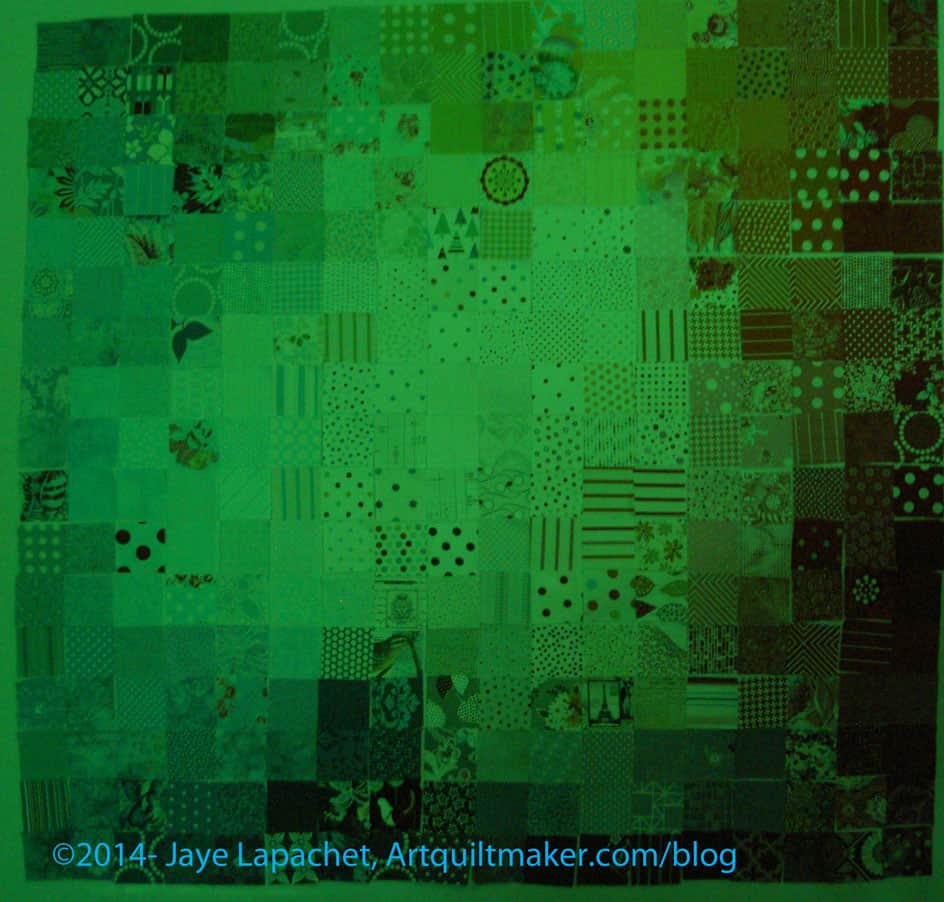
A week or so ago, I posted some black and white photos of the Fabric of the Year 2013 quilt. I also took photos through the red and green film of the Ultimate 3-in-1 tool. I am not sure they were very help, but they are interesting. I thought I would share those photos with you.
FOTY 2013 in Green
The green makes the entire quilt look a little sick and this might cure me from this color green for awhile.
It is helpful, though, as there are a couple of places that stick out that also stuck out in the black and white photos I posted previously. A few other things stick out that I need to look at in the real piece.
FOTY 2013 in Red
The red makes the colors extremely subtle.
One thing to remember is to look at the piece in real life. I mentioned it above, but it is an important point. These different views that I have shown are great tools to use to point out glaring problems. The key thing to remember is that they are tools. TOOLS. Your viewers won’t be looking at the quilt through a black and white, or green, or red filter when the quilt is on your wall. Be sure to use these tools to get an idea of what might not be working, then look at the real pieces in color before moving patches around.
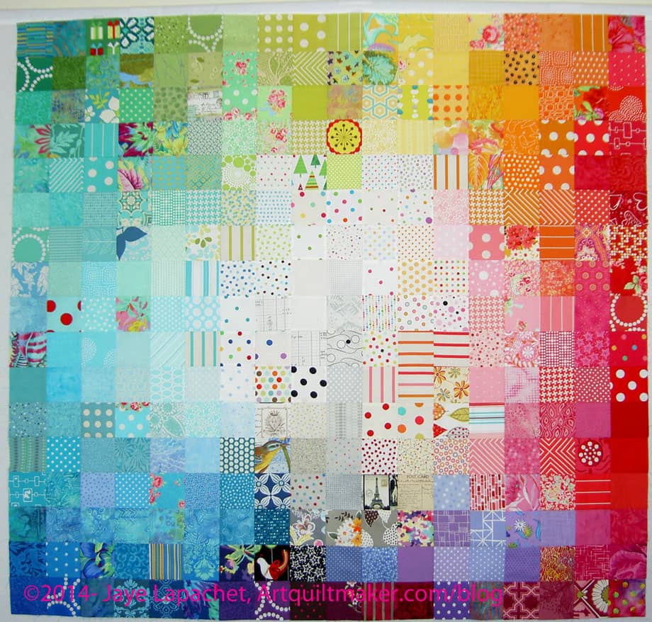
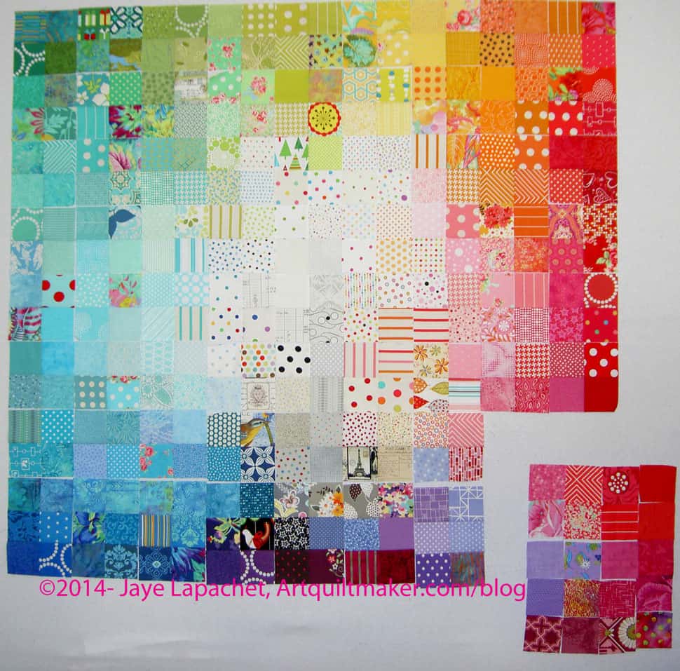
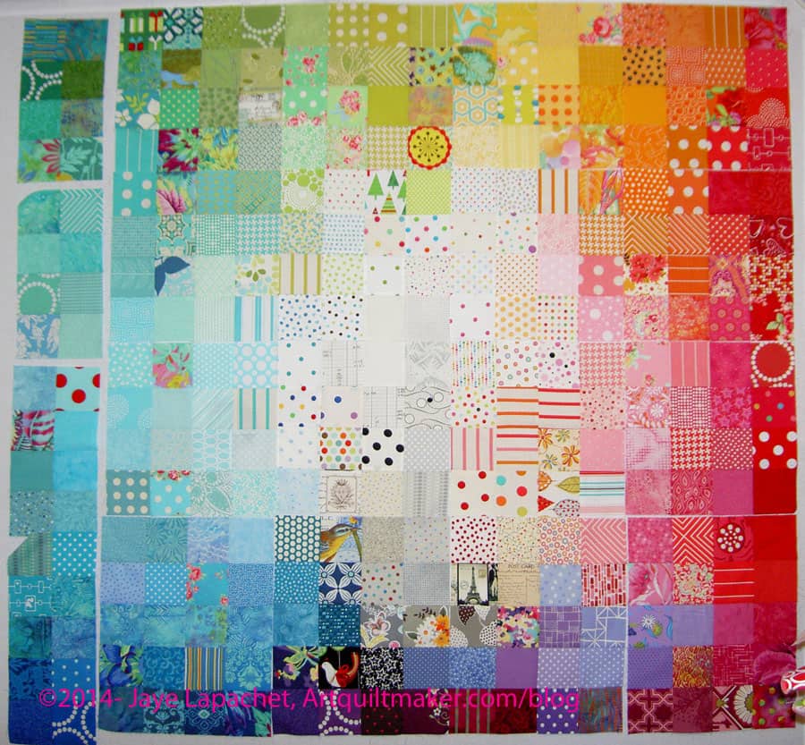
I am slowly, painfully, making my way through the FOTY 2013 piece. I am nearing the end of the arranging.
Nearing the end.
Not there yet.
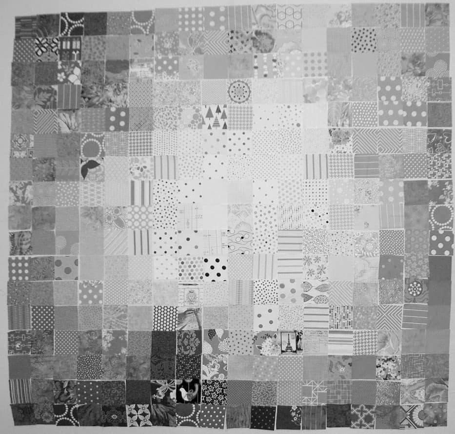
I have been looking at the quilt project through the green and red films that come with the Ultimate 3-in-1 Color tool (if you don’t have this, click on the link and buy it RIGHT NOW**). It hasn’t been working out that well for me, so I decided to switch a photo to black and white to see areas that could use improvement. This was a great idea, because 1) it shows me that I am doing pretty well and 2) it shows me areas that I might be able to improve.
I am trying to stick to the idea that the darkest fabrics will go on the bottom because they have a heavier feeling.
I also want the like colors to be mostly together and there to be a smooth-ish gradation between colors.
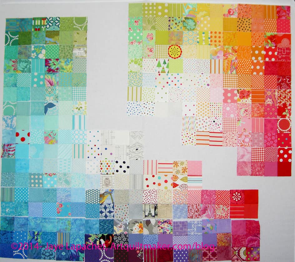
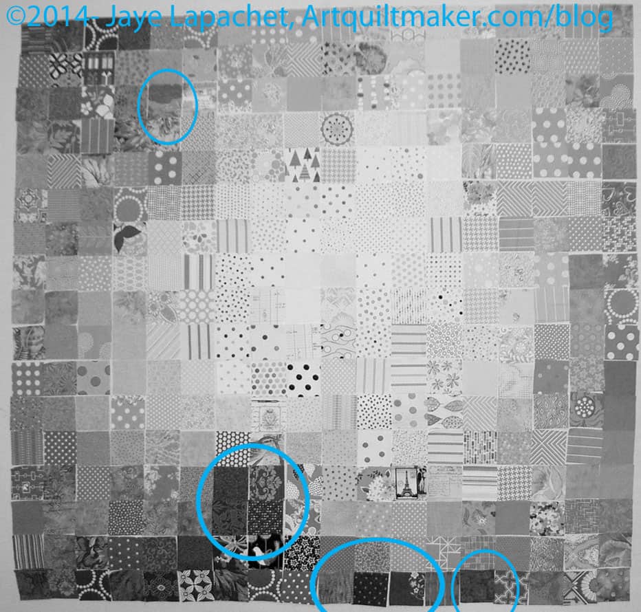
Annotated FOTY 2013
I thought I would share with you areas that jumped out at me and see what you think.
The areas I have indicated are too dark or too light for where they are currently placed OR do not make a smooth transition. I have not moved anything yet, because identifying a problem creates another problem: where to put the problem fabrics and what to put in their place.
This is where you have to look at the piece and at the colors to make sure that if you move it to the ‘obvious’ location, it doesn’t ruin the smooth transitions between colors.
Once I make the changes, I have to go start the process over.
**You should buy the Ultimate 3-in-1 color tool because it is a quick reference for color work. You can look at the relevant page see the complement, the analogous colors, triadic and split complementary. There is also a long list of colors that would work in a monochromatic quilt. It is a sampling of tints, shades and tones.