ColorPlay Fun and Inspiration

Alden Lane Window Frames

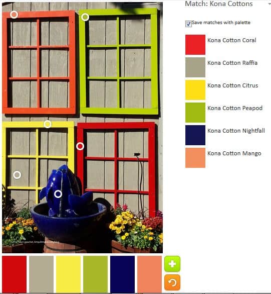
I found another good photo for this project in the Alden Lane photos. To my eye, there are limited colors. To the tool’s way of thinking there were many.

Colorplay-windows
Colorplay-windows

The Palette Builder chose the colors above. There are more warm colors than the tool usually chooses, but I think ‘choose’ is the wrong term. I like the two greens – Kona Peapod and Kona Cactus. If nothing else, I am getting a nice introduction to the Kona solids.

Colorplay-windows 2
Colorplay-windows 2

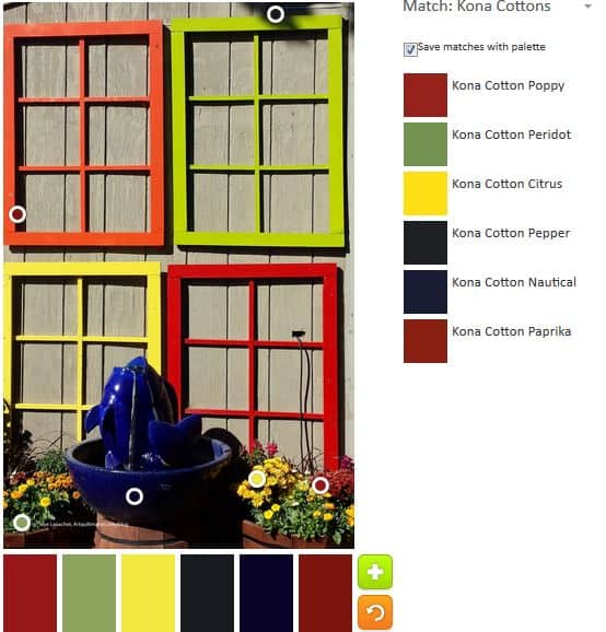
Of course, I decided to have my fun and play around with what other palettes I could find using this picture. I definitely had to get that dark blue from the fountain into the palette.

Colorplay-windows 3
Colorplay-windows 3

Finally, I moved the circles down to the flowers towards the bottom to see what changes I could make. I was surprised at how much darker the palette became.

Creative Spark: Chapter 4

The fourth chapter in The Creative Spark is called The Crazies. Many writers of creative inspiration write about the negative voices in our heads: the judges, the critics, naysayers, all the people who ever told you you couldn’t. Bloomston calls them The Crazies.

I am not surprised that Bloomston brings them up. They are as much a part of the creative process as paper and fabric. They are in our heads and we all hear them whether we acknowledge them or not. “The Crazies are programmed to trip you up” (pg.21).

I hear them. They often tell me I am not good enough, need to do better, need to do more, need to spend more time, etc. It isn’t always possible, but when they tell me I need to do better, I try to listen by work on improving my skills. I also try not to get depressed. Examples of things I do are:

  • Ripping out pillowcase cuffs when I sewed them on upside down
  • Matching seams better
  • Evening out topstitching
  • etc

Using what they say often involves a lot of ripping. From my vantage point, my work is better when I try harder to do better.

Still, I don’t always like hearing what the critics have to say. They are never nice about my work and it isn’t always possible to be Zen about their words.

I have never wanted to be a full-time artist; I have always wanted to make what I want to make when I want to make it. This attitude gets me off the hook for most of the comments about being irresponsible and dooming myself to a life of “poverty,  lack and struggle ” (pg.21). Still this work, especially since fabric and thread are so firmly  rooted in the female realm, is not valued and that is painful to me. Even not being a full-time artist, I feel I have to explain or justify the time I spend on my work and what I make.

Bloomston has great strategies for banishing the Crazies. Chief among them is writing them down and enclosing the voices somewhere.

Being organized is another one. “Life generally tampers with creativity because being a grownup requires a great deal of organization and management” (pg.22). Being a grownup doesn’t mean you have to give up your creativity or the art you make. It simply means you have choices with regard to your art. Don’t  let The Crazies become the buzzkill, the axman or the murderer of your dreams of art (pg.22), use their criticism to spur you on.

Bloomston also has great techniques for dealing with, if you can’t banish The Crazies: Play, Notice, box Them Up, Show Them the Door (pg.23).

And when you are being overwhelmed with the magnitude of the criticism, turn to your friends, your critique group, your sewing circle, for support.

If you work regularly you will succeed.

ColorPlay Inspiration

Last time I said that I needed to find some brighter colors. My screen saver is the photos from the Alden Lane Outdoor Quilt Show. I went a few years ago and took lots of inspirational pictures. Recently I saw some of the non-quilt photos and thought of you!

Alden Lane Nursery Stock

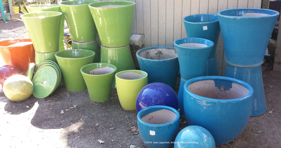
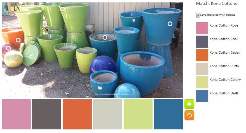
Alden Lane is a nursery, so I wasn’t surprised to see this group of pots. I was also thrilled because this is the kind of photo you see in magazines. Real people don’t find artfully arranged and pretty pots laying around waiting for me to photograph them. 😉

They also are bright and cheerful and make a good color palette.

Alden Inspiration-Auto

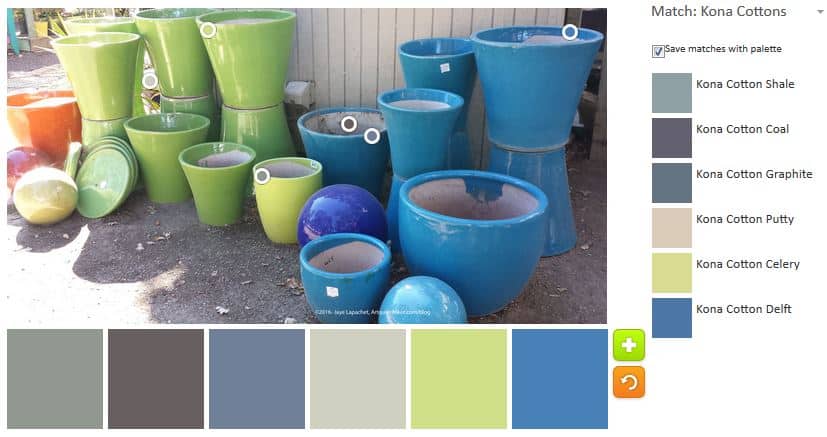
First is the palette the tool chose. I wonder if it tends to choose cool colors? I like the palette, though I think the quilt could end up being a preponderance of depressing neutrals. It is saved by the blue and green. I suppose you could control the depressing nature of the colors by adding in a lot more of the Kona Celery and the Kona Delft than the Kona Coal.

Alden Inspiration
Alden Inspiration

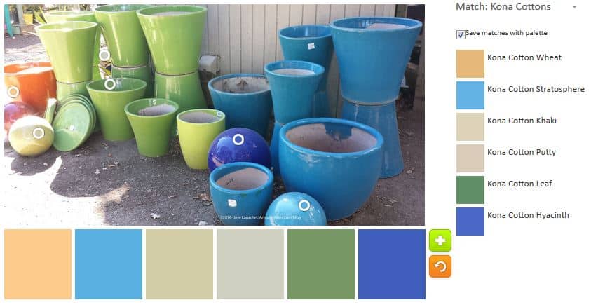
I rearranged the color selecting circles to get a few more warm colors. I was surprised to see Kona Cotton Rose show up. I wonder if it was like the other time where the tool couldn’t read the fuschias and this time the issues extended to orange?

Alden Inspiration 2
Alden Inspiration 2

I made one more just because this is so fun. On this palette I do like the Kona Wheat and the Kona Stratosphere. Those two colors together (nearly opposites on the color wheel) look fabulous together. I am not such a fan of the Kona Khaki and the Kona Leaf, but I think the leaf works. I might change out the Khaki. To what? I don’t know. I could, as mentioned above, just put in a little bit.

Keep reading these color posts, but try the Palette Builder tool with your own photos and see if you find a palette from which you want to make a quilt.

ColorPlay Inspiration

It never ceases to amaze me that I see new things as I walk around the neighborhood. Then I realized that everything is mostly the same but the details are different. Different flowers are bloom, plants are different colors, people put new decorations up for different seasons and holidays.

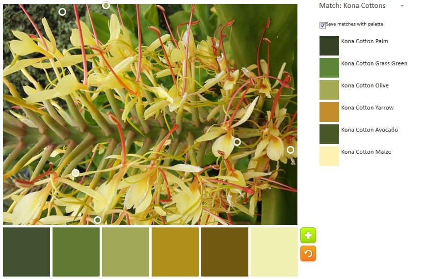
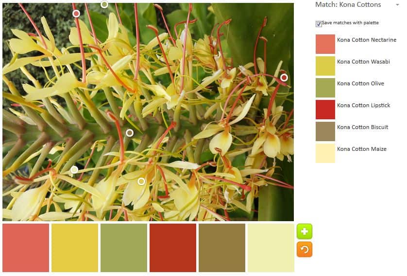
Because of the drought, people are using a lot more succulents. Succulents are not my favorite, but I am trying to see the beauty in them. I saw this yellow flower on a succulent and took a super close-up.

Yellow Spiky Flower Inspiration

Because I can’t resist fiddling, I moved the circles and did a, mostly, different palette.

Yellow Spiky Flower Inspiration 2

There are little bits of warm colors – pinky reds and reds – and I capitalized on them. Still, this palette is not bright enough for me. I think I’ll need to find some tropical flowers and make some palettes out of them. 😉

Try out the Palette Builder on the Play-Crafts.com website

Quilt and Cleft Palate

As I said, we were in Southern California all weekend. One of the things we did was to give a check to St. John’s Hospital for their Craniofacial Anomalies/Cleft Palate program. It is a comprehensive program that includes pediatricians, dentists, social workers, plastic surgeons, ENTs and a score of other medical professionals who help get kids out of the land of being branded a Frankenstein and into a “normal” life.

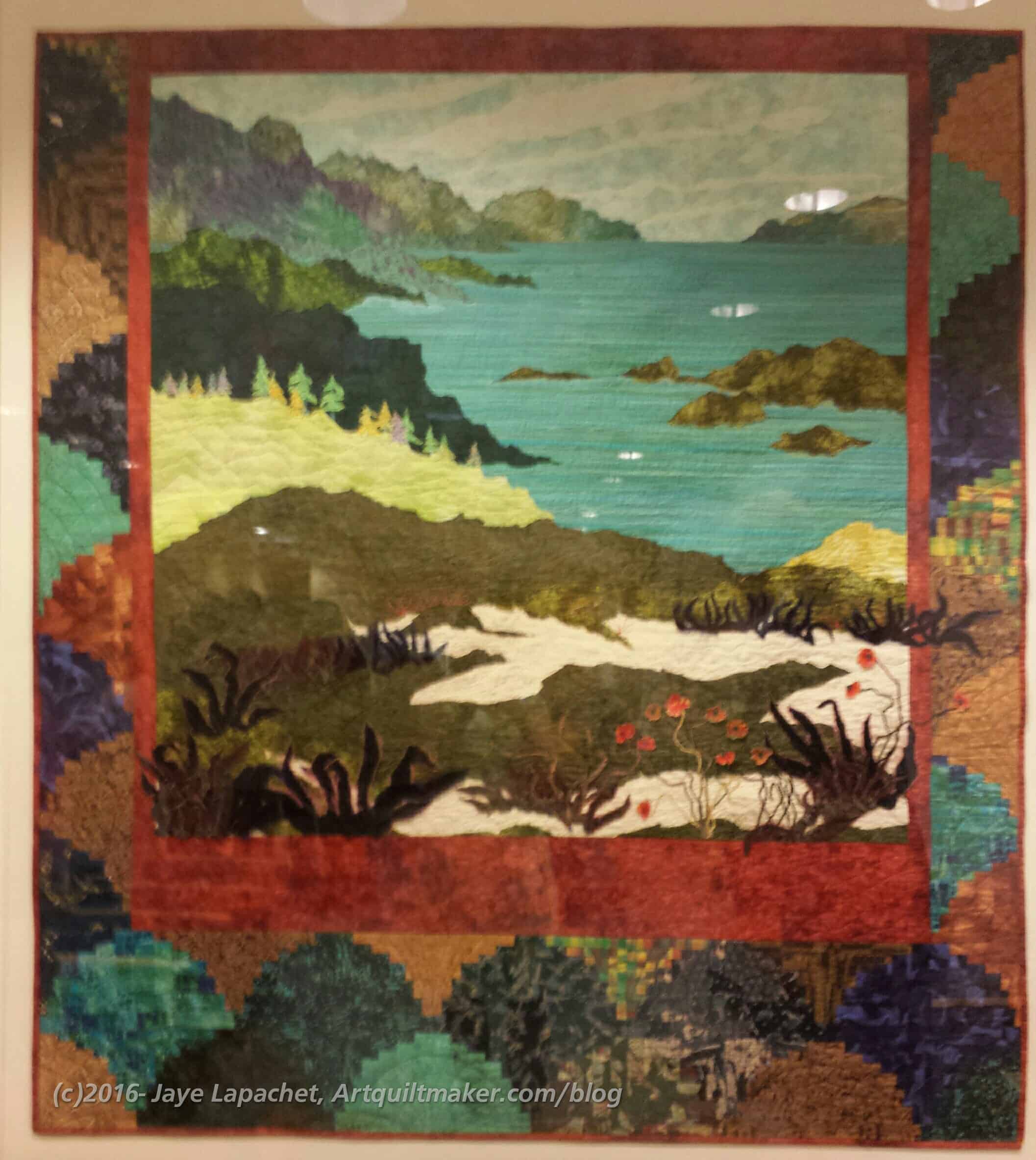
There is a quilt hanging in the reception/intake area. We spent time in that room before the program started. I had noticed it last year, but didn’t have a chance to take a picture. I had the opportunity to look at it more closely, because the Grand Historian asked me whether it was a quilt, because he saw the applique. His question gave me the opportunity to look at the quilt more carefully, share my knowledge and take a photo. Since I wasn’t able to visit any quilt shops, I was thrilled.
Down East by Terry Waldron

The quilt is called Down East by Terry Waldron. The color is very rich. It is mostly batiks with some velvets. There is quite a bit of embellishment using raw edge applique and yarn. There is piecing as well in the form of log cabin blocks. The quilt is behind plexiglass, thus the glare. You can see a picture of the artist with the quilt, though I don’t see the quilt listed on her website.

Down East by Terry Waldron, detail

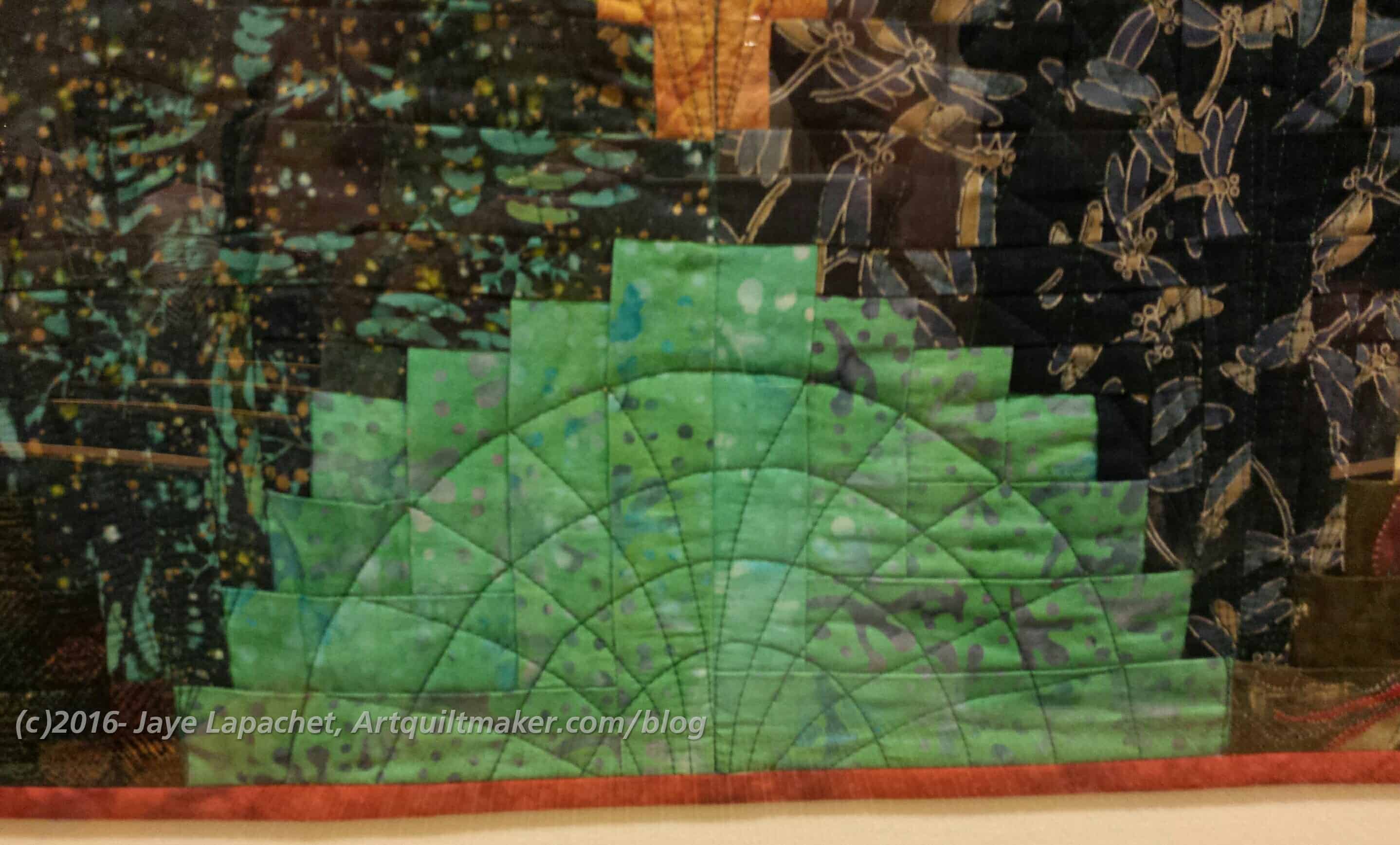
There was one bit of quilting that I liked very much. I thought it was a clever way to highlight a motif that was not a block.


At this event, the Grand President, my DH, gave St. John’s a check for $55,000. Less that 1/2 of 1% of your donation goes to administrative costs. This is one of the best events for me, because each dollar of that $55,000 came from $5 raffle tickets, $10 BBQ tickets and $2 fines for cell phone use during meetings. There were no millionaires who chipped in $20,000. All the money came from members and their families. $55,000 is a lot of $2, $5, and $10. All of the trustees donate their time, including travel costs. Feel free to donate to the NSGW Charitable Foundation to support kids with craniofacial anomalies and their families.

Creative Spark: Chapter 3

The third chapter in Carrie Bloomston’s book is called Take a Class, thus the third spark is about getting stimulation from an external source. Specifically, she talks about taking a class. I like taking classes, but I am choosy about the classes I take. Just because someone can sew doesn’t mean they can teach. Teaching is a skill that takes practice, though, yes, there are a few natural teachers.

Bloomston says “You get an amazing energy and buzz from taking a class. You learn about technique, craft, and process — the bones of a working practice.” I think this one line is so important.

Local adult schools and community colleges are good sources of classes. Your LQS definitely has a listing of classes that changes regularly. I like to take more arty classes, like color theory at community colleges, but LQSs can have those classes as well. Find out what other types of classes are available at local studios. Here in SF there used to be a sewing studio a few blocks from house. I took a fantastic pillowmaking class there and learned some fabulous techniques such as piping.

Of course, there are also online classes, which can be very good. If there are no local classes convenient to you, then definitely take an online class. I like the energy of an actual classroom and think it adds something to the experience. There are also DVDs with which you can learn some interesting techniques. I was inspired by a DVD I received for review by Sarah Ann Smith.

Bloomston provides a list of her favorite classes and then leaves a space for the reader to write down the classes in which s/he is most interested. She doesn’t include Craftsy, but Craftsy is available as well.

My advice:

  • Be choosy
  • Move outside of your medium
  • Do your best
  • Banish the “I can’ts” and the “I don’t knows” and all of those other negative self discussion from your class. There is no place for them when you are learning something new.
  • Buy the best supplies. If you create a masterpiece, it will last (this is something my mom tells her students)

I continue to want to encourage creativity and creative pursuits in YOU via a regular blog post, so this another effort using The Little Spark book. A few weeks ago, I posted about the first chapter of The Little Spark and how to start to use this book to spark your creativity. I also reminded you that I had reviewed the book in November 2015. If you haven’t bought the book, go buy it NOW.

I feel it is important to nurture creative endeavors in myself. If I can encourage creativity in others, I get a huge bonus. It is so easy to get sidetracked by work, housework, kids’ activities, the time suck that is the Internet and take no time for yourself. It is so easy to think that creativity is not important. Creative endeavors nurture your soul. If your soul is healthy all the other things you have to do in your life are easier and come out better.

Like in the Creative Prompt Project, any kind of art is appropriate for this creative exercise. If you are a potter or a cartoonist or a weaver, these reviews and exercises will work for you just as well as for someone who sews, makes quilts, draws or paints.


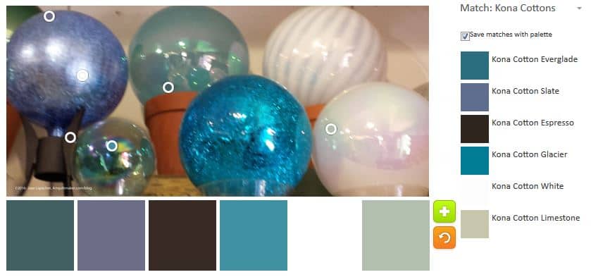
Color Globes Inspiration

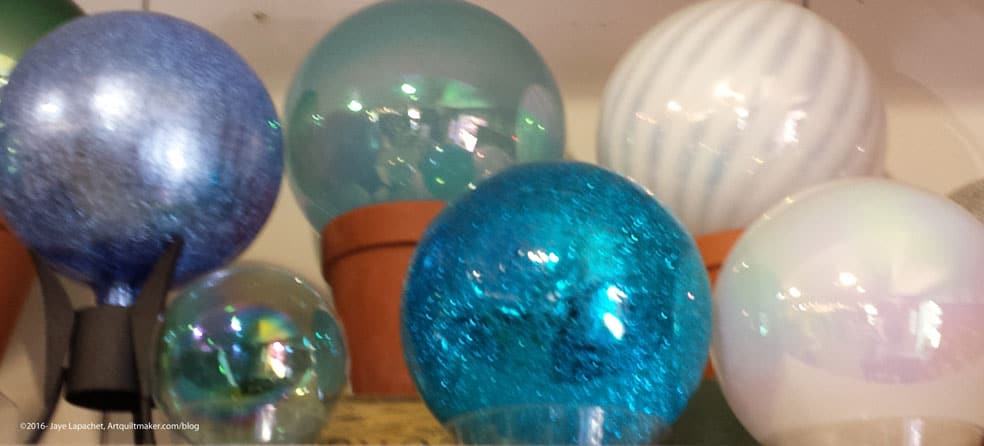
Globes at Quilt Show

I did something a little different today in that I was interested in how many different palettes I could create using the photo above. You can see that colors in the image are already limited.

Color Globes - Palette 1
Color Globes – Palette 1

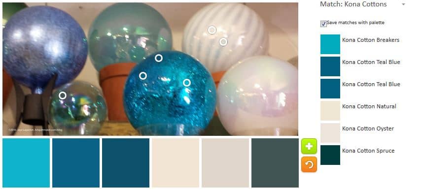
First, I focused on the turquoise globe. I was interested in some of the colors the Palette Builder showed when I first uploaded the photo. I am constantly fascinated with creating a palette that has the right mix of contrasting blues.

Color Globes- Palette 2

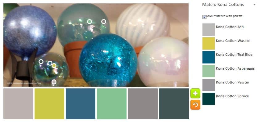
Next, I moved to the more green globes and focused the circles on them exclusively. You can see more green/yellows in the tones of the colors in the palette. It is interesting how many colors there are in this picture.

Color Globes - Palette 3
Color Globes – Palette 3

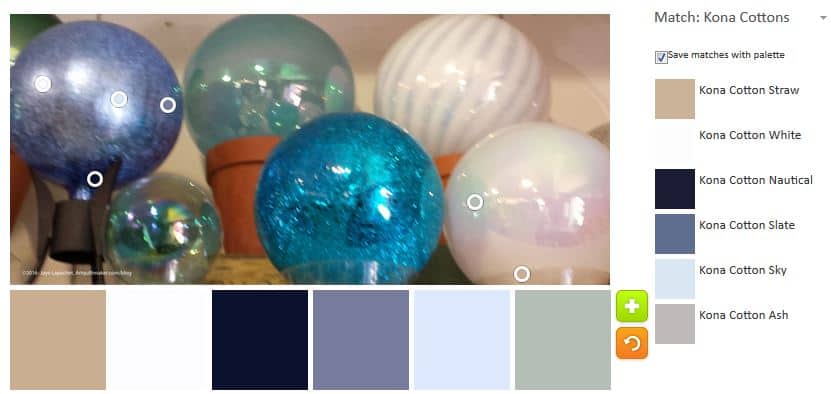
I could probably play with this one photo ad infinitem. I realized that after my third try and the tool doesn’t even have the color discernment that my eye does.

Color Globes- palette 4

I really couldn’t stop playing with this photo. The colors are relatively limited, but there is still enough of a difference, with the glare and light sources to make the colors slightly different.

I may work with this photo again.

I am wondering what a quilt would be like made from all the colors in the three palettes?

Color Globes - Palette 1
Color Globes – Palette 1
Color Globes - Palette 2
Color Globes – Palette 2
Color Globes - Palette 3
Color Globes – Palette 3
Color Globes- palette 4

What do you think?

Color Friday: Red?

Red Plant
Red Plant

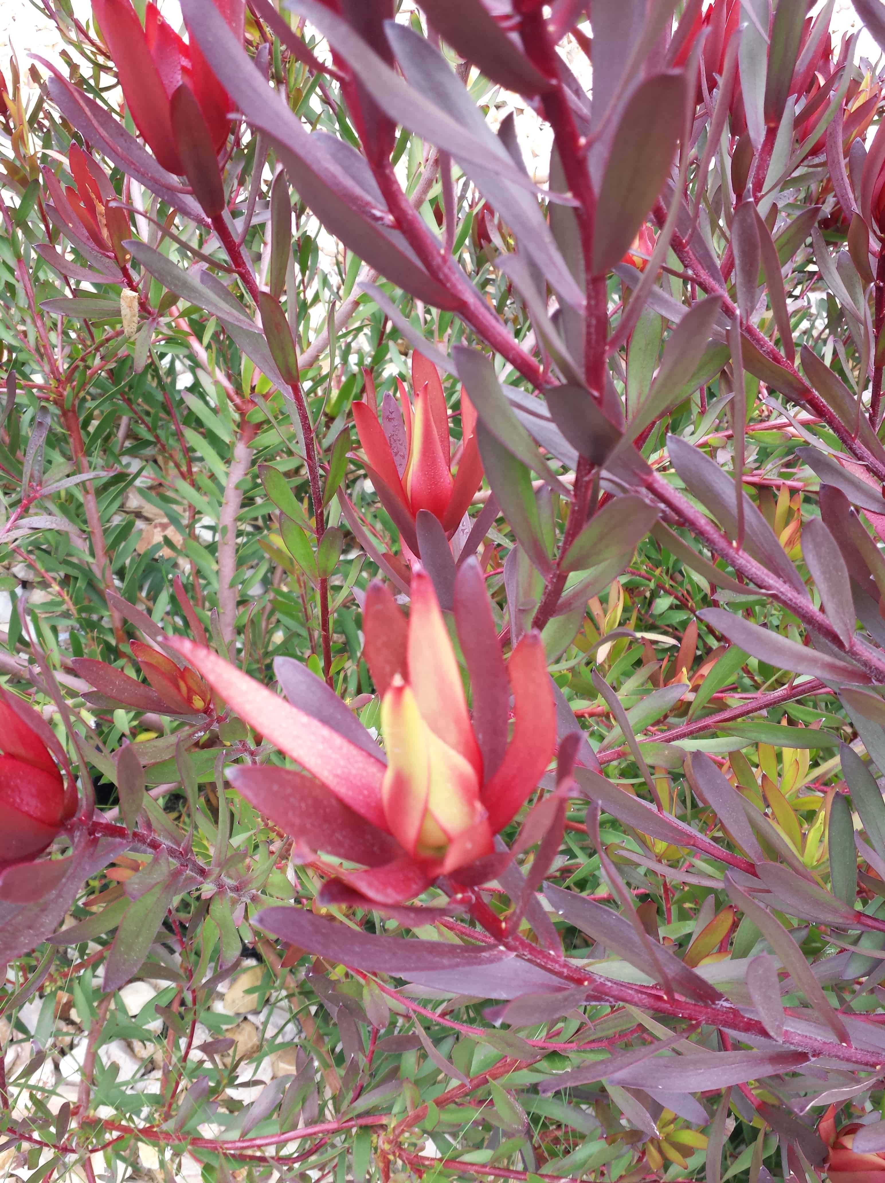
This is another picture I took while doing one of my daily walks. These are not plants that I normally have much interest in, but the red color caught my eye. When I look at the plant, I see red. When I look at this picture with my eyes, I see red.

The computer sees something different. The computer sees more green and grey than I do initially. Of course, when I really look, I do see the greens and greys, which make me wonder about what catches my eye vs what catches they eyes of other people.

Click on the photos to make them larger. I was surprised that the color selections weren’t that different. The color names are different, but the colors look very similar.

Of course, this tool is too much fun, so I couldn’t stop with the above. I moved the circles around to highlight different parts of the photo to see what I could get. I have to be honest that I skewed the results towards the red tones to see what the tool would come up with. It is interesting to consider the palette without the greens and greys.

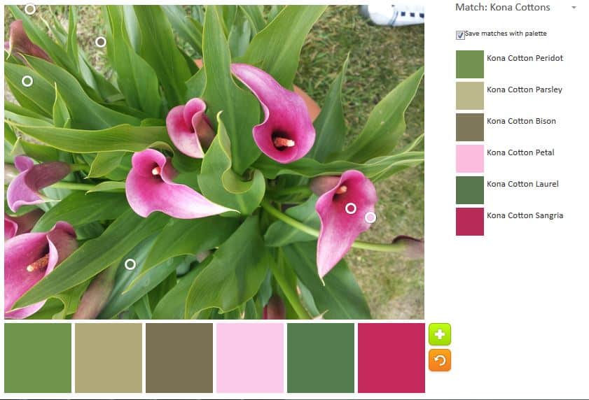
Despite the fuchsia issues I had before, I love this combination of pinks and reds.

Design Inspiration

Quilt Design Inspiration

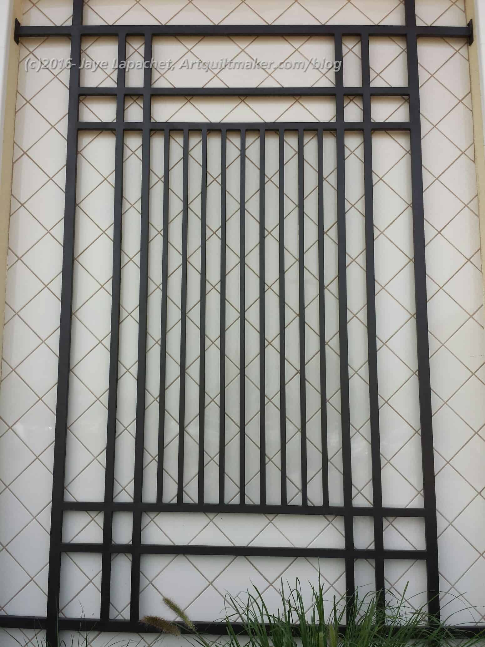
I was out walking the other day and saw the design in the picture. It caught my eye as a possible quilt design I imagine that this design would be done in layers. I was thinking of taking a charm pack and making the bottom layer. Perhaps a couple of charm packs or charm packs with additional layers.

Either I would cut the bottom and sew in the black part or make the two parts separately and applique’ the black part on top. I wouldn’t necessarily make the top layer in black. The final color would depend on the charm pack I chose. I think a solid would probably be good.

This was a good reminder for me that design inspiration can be anywhere.

Color Palette Friday

Greens
Greens

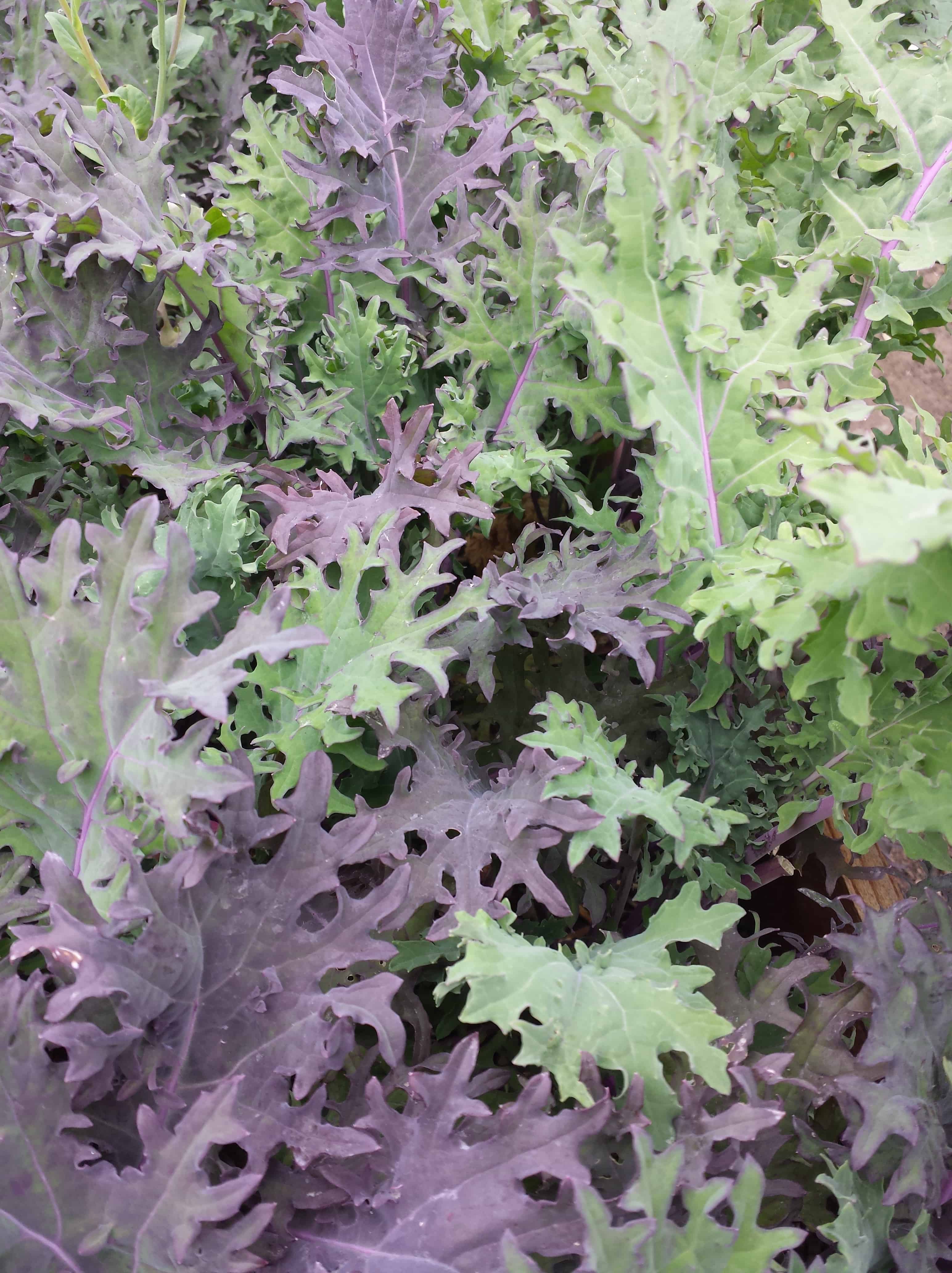
I can remember riding along with my parents in the car on some trip or other looking out the car window at the variety of colors on the hills, as we traveled through forests and in the reflections of lakes. I often think that some scene appears, for example, green, but when closely examined is really a variety of greens.

Greens Palette
Greens Palette

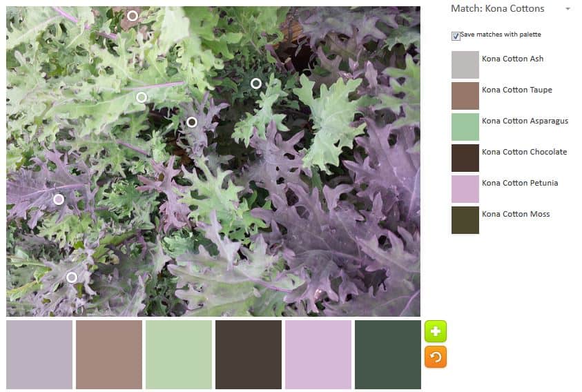
I saw this patch of greens (in the salad sense, since I don’t know exactly what kind of greens they are) and I was very interested in what came up in the Palette Builder.

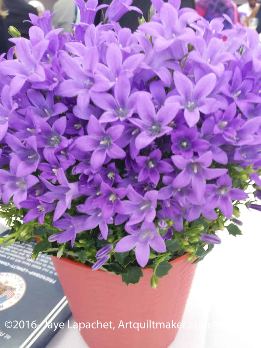
When I look with my eyes, I see a lot of light purple or lavender. I know others would see different colors. The technology is certainly not perfect and limited to the colors available in fabric. I love playing around with it.

Color Play Friday

House Beautiful Color

I saw this color study in my most recent issue of House Beautiful. One reason I like that magazine is the color. They report on a lot of great color combinations in interior design. I follow them on Instagram so I can get a quick dose of color when I need it.

They often have very energetic color combinations similar to Anna Maria Horner, Jennifer Paganelli and some Amy Butler, but in furniture, wallpaper and dishes. I really love the over the top combinations and would do soemthing similar in my vacation house, if I had a vacation house, 😉 and were starting from scratch with decorating.

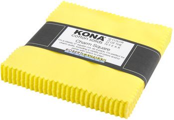
Kona Color of the Year 2016

This caught my eye because of QuiltCon. Remember Highlight? The Robert Kaufman Color of the Year? I don’t think the values are quite the same, but the sentiment is definitely the same!

I am really intrigued with the circumstance that brings these two companies to the same color. Actually, there are more companies and House Beautiful saw the similarities and brought them together. I am sure somehow there is some overlap. Furnishings companies need fabric, right? Still I am intrigued by why this particular color?

I have heard many people profess to dislike yellow, even easy to use sunshiney and golden yellows. This neon would be difficult to use if it weren’t the main color in a quilt. The quilts made for the challenge and displayed at the QuiltCon booth were great. (QuiltingMod displayed some in her blog post about Quilt Market). Still, I like yellow in a quilt as it helps the eye move around the surface.

What are your theories about highlight cropping up?

Revisiting Projects: Carpenter’s Wheels

Carpenter's Wheels
Carpenter’s Wheels

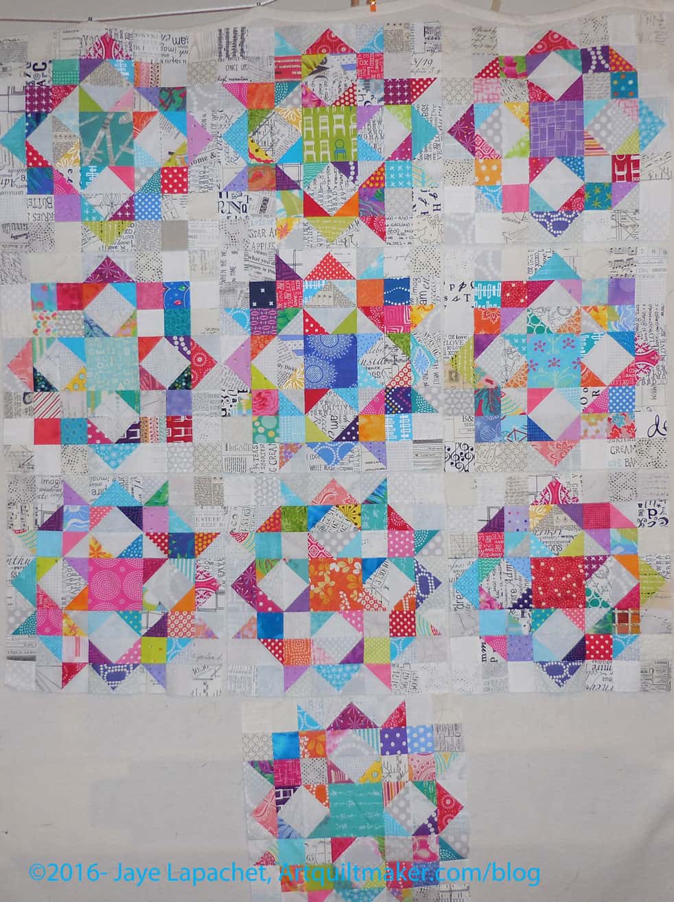
The last time we talked about the Carpenter’s Wheel blocks I was trying out layouts. One reason these blocks are not next on my list is that I still have not decided on a layout. My mind keeps floating back to the round-ish layout I talked about after being inspired by Scraps Inc.

I think I really want to set these blocks in kind of a round layout and sew a million 2.5″ squares together to make it work. I might have to make a few more blocks.

I haven’t taken a photo of the layout, because my design wall isn’t large enough (I know I keep saying that) so I will really need to figure out how to take a photo and figure out if I need more blocks.

Color Palette Inspiration

Succulent Vignette
Succulent Vignette

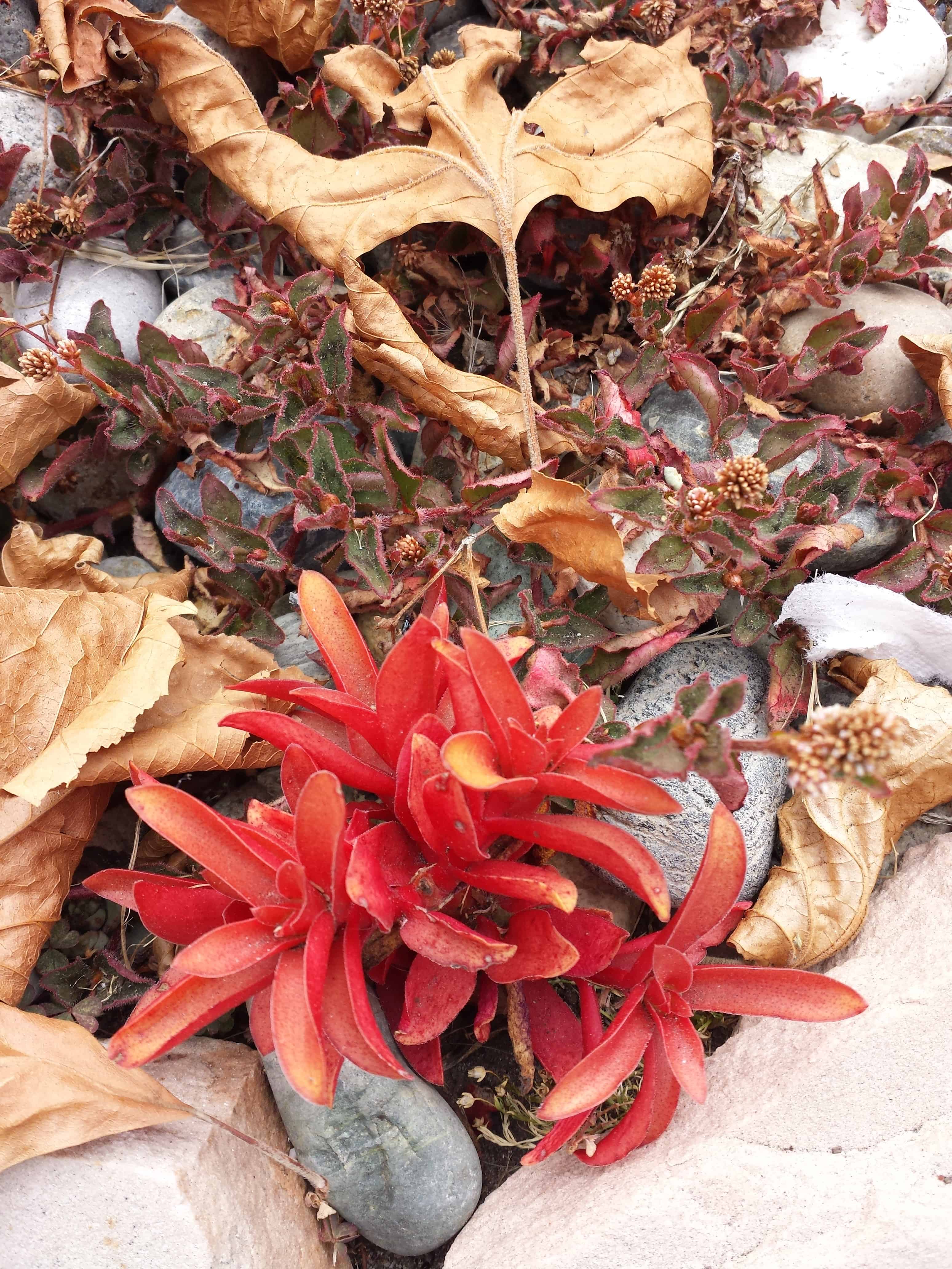
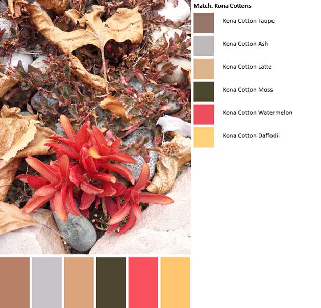
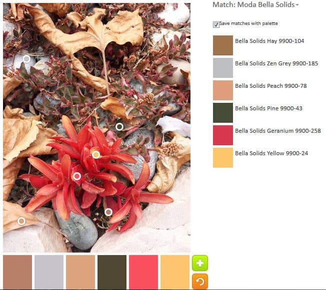
On another of my daily walks, a bit of red caught my eye. I saw this small bit of succulent and liked the arrangement.

I tried both palettes.

Kona Palette
Kona Palette

Left is the Kona palette. The red and sunshine yellow (gold??) are really nice colors.

Bella Palette
Bella Palette

Because I liked comparing the two palettes last week, I also tried the Bella solids palette. It seems similar, even though we know that the fabrics have different names.