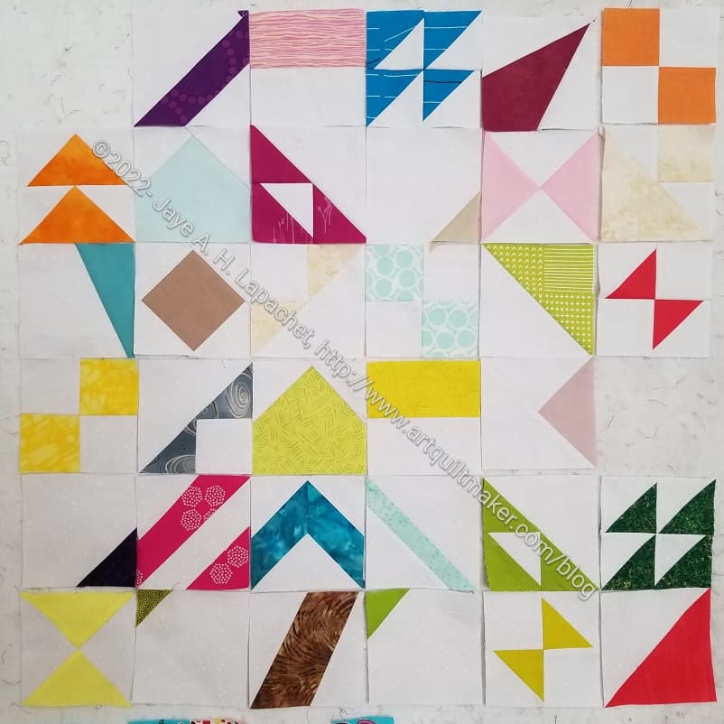
I received a nice package of blocks from Friend Julie the other day. It is so interesting to see these blocks. Julie mentioned that it looked like a real project now when she posted about the blocks I sent to her last week.
I can’t really see what they will end up looking like, but I can see that they will end up as something. I can see the possibilities now.
I have received more postcards and need to match them to fabric. I might be over the hump of fabric selection being a big barrier. We’ll see how it goes with the next group.
I made more Pantone Project blocks. I am not caught up, but am getting there. Julie had a great post about her blocks and playing with our combined blocks on the design wall.
Making these blocks is providing me with little snippets of sewing now that I am finished with Pies & Points. I still want to get in a groove like I did with the Flying Geese project a million years ago (2015), but I am not there yet.
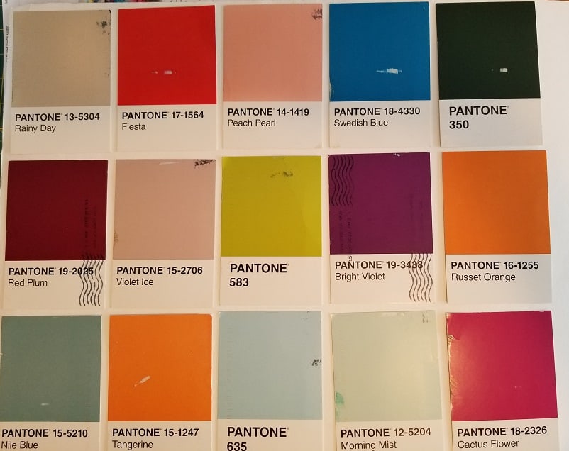
This is really the first time I have looked carefully at Pantone colors. I am not sure what they are trying to do. They have a LOT of beiges and other neutrals. They don’t have many bright, clear colors – or as many as I would like. I guess I should go read their website.
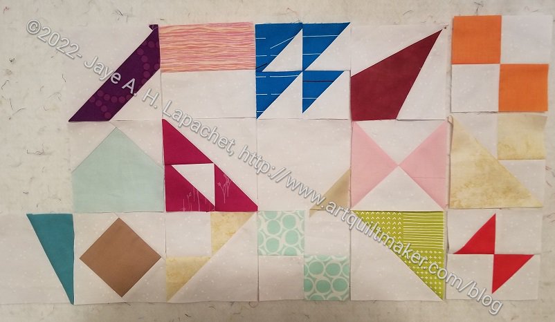
I finally (FINALLY!) made some Pantone Project blocks and handed them off to Julie when we were at PIQF.
I know there are a small number shown here, but along with the fabrics I have selected, I feel like I have made a good start. I am in the process of making the other blocks. Once I do that I will be caught up and should be able to make a couple of blocks per week. Fingers crossed.
I talked about the parameters of the Pantone Project in July, then again in early August and mid-August as my attempts to select fabric started. I didn’t feel confident after these attempts and the postcards started to stack up. As the postcards stacked up, the project started to weigh on my mind. As Friend Julie made progress, the project started to weigh on my mind.
Pantone: first big fabric pull
I finished a big project on Saturday night and needed something different to work on. I was spurred on by wanting some basic piecing. The blocks for the Pantone Project will be basic piecing, but I had to choose fabric first. I was not excited, because I am getting a little annoyed with Pantone. Piecing starts with fabric, however. I decided that I had the time to pull fabrics for this project. First, I laid out all the cards I had received, so I knew what I had to work with.
Yes, Pantone 350, in the upper right hand corner is that green with which I started. It was still in the mix. I had the greens I had chosen separated out, but kept it in the mix since I thought I might find something better. I have to say that I made major progress on the Pantone Project on Sunday.
Pantone: Rainy Day Fabric Match
I started with the easy colors such as the reds and pinks. Fiesta and Cactus Flower were pretty easy, but I quickly realized that I had to pull out much more fabric to get more choices.
I even dragged out a bin that includes solid neutrals and found a beige that matches Rainy Day pretty well.
Pantone: tough color nuts
Surprisingly, or maybe not, a lot of my older fabrics are much more aligned to these colors than the newer fabrics. This could be my buying habits as well. I stick to pretty clear colors when I buy fabrics now. After awhile, I had only a few left. I had to not only pull out old fabrics, but I used several hand-dyed fabrics. I haven’t dyed and printed fabric in years so lots of old fabrics are getting an airing.
Pantone: 1st big color pull
Eventually, I found fabrics that were good matches to the postcards I have received. Some cards span 2 or more fabrics as I am still deciding. Some fabrics were a great match. I was really pleased with the fabric I found for the Swedish blue (2d row, 2d from right). It is a perfect match. The Nile Blue (bottom left corner) is a problem. The three fabrics I chose look better in person than they do in the photos, but are still not perfect. There is also a peachy pink, Peach Pearl, (2d row, 3rd from left) where I found a good match, but only have a little of the fabric. I’ll have to be very careful when I cut it.
I have to say that I have a lot of questions for Pantone, most importantly: why so many beiges? I need to read up a bit on Pantone and get a better sense of their business.
Now, I can get to piecing. I do feel a bit of a sigh of relief that I have made a start and nothing awful has happened when the fabrics weren’t perfect matches.
Fabric, Sewing machine and regular Sewing supplies (BSK)
Decisions to Make:
Size of units (blocks)
Type of units to make
Timeframe for making the project
Timeframe for sending postcards
**Obviously, you should shop at local fabric, knitting shops or quilt shops. However, if you can’t, please know that I use affiliate links. I may be paid for your purchase of an item when you click on an item’s link in my post. There is no additional cost to you for clicking or purchasing items I recommend. I do not recommend items I don’t like. I appreciate your clicks and purchases as it helps support this blog.
Julie and I went out the other day to Golden State Sewing. We usually meet for lunch and visit the Granary, but I suggested we change it up. They have really good fabric at Golden State. More on the visit later.
One of the things I wanted to do was look for fabrics for The Pantone Project for the cards with which I was struggling. We also chatted about ‘good enough’, which is de rigeur for this project. We agreed that neither of us want to buy a lot of fabric.
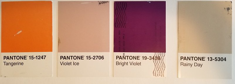
Pantone 350 choices (green)
I finally crawled up into the fabric closet and got down the cool solids bin and pulled out the greens I remembered. Neither were exactly right, but Julie and I decided that two of the three fabrics would work.
We think the Tula Pink Tiny Dots is the right color, but lighter. We think the top right solid is dark enough, but doesn’t have that black (or brown?) tinge to it. We agreed that either would work.
One strategy I haven’t tried is comparing the postcards to the color cards I have. As I said, though, I don’t want to buy a lot of fabric; I’d like to use what I have.
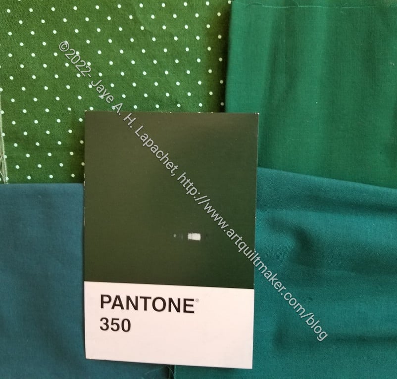
Friend Julie has already started selecting fabrics and making blocks. I have just started with the most recent postcard she sent (Pantone #350, a VERY dark, almost black, green). I am behind and I have no excuse except I am quilting the Tarts, I finished Pies & Points and the Diagonal 9 Patch and I am working on clearing my to do list.
I needed a break while I was quilting the Tarts, so I started looking at fabrics.
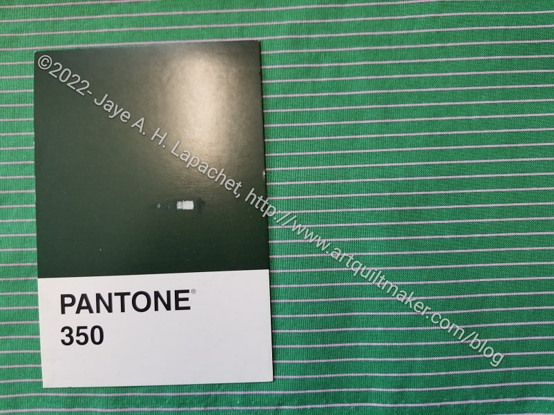
PP Comparison: Tula Tiny Stripes
When I receive the postcard, I sometimes get an idea of the fabric I want to use. For this VERY dark, almost black, green I thought immediately of the Tula Tiny Dots and Stripes. On a break I got the striped fabric out, confident I would have one selected and compared the postcard with the fabric.
Bleah! Not dark enough.
No problem, what about the dots?
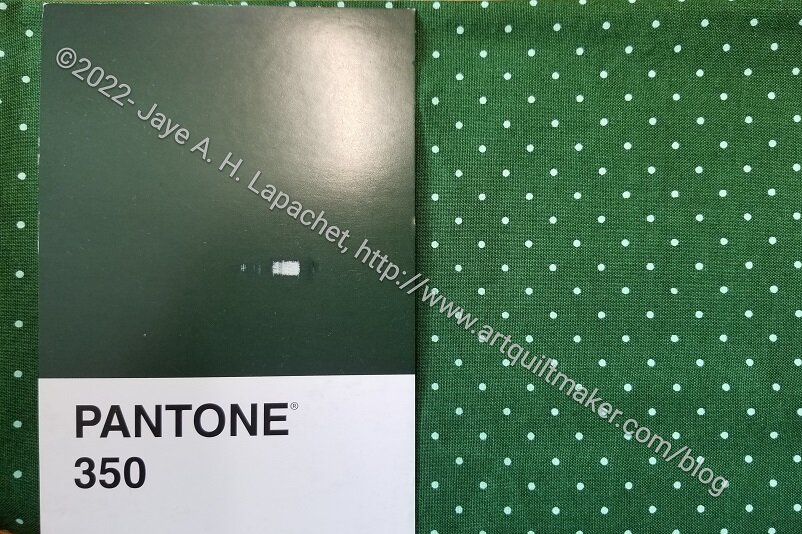
PP Comparison: Tula Tiny Dots
Better. Maybe a good enough option, but still not dark enough.
This was depressing and I started thinking about the greens I have. If I have a green this dark, it will be buried in a project box or at the bottom of some “old fabric” box, because the last time I may have used such a fabric was when I took the Mary Mashuta class on pushed neutrals. I also have a Tula solid that might work.
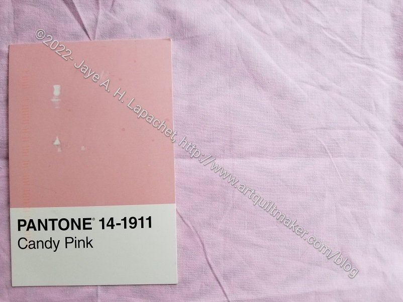
I put Pantone #350 aside for awhile. I had to file papers before I could climb up into the depths of my fabric closet to get at the old neutrals, so I took out the Pantone #14-1911, Candy Pink postcard. I knew there was a pink solid around that would be perfect.
PP: Candy Pink
Wrong again. This is a great example of making visual decisions visually. Again, the pink might be good enough, but if you look at Julie’s selections, they are perfect matches. Sigh. More climbing up into the closet. I really don’t want to buy fabric for this project if I can avoid it.
Friend Julie and I started a project together. This isn’t the first project we have worked on together. We have worked on Bullseye quilt projects together, the Windmill quilts and Julie’s Tumbler quilts. I enjoy working on projects with her.
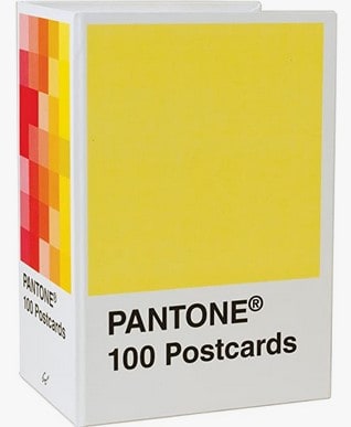
Pantone Postcards
This project started with me asking for the Pantone Postcard Box for a gift. Friend Julie got it for me, then we started talking about doing something quilty with it.
We threw ideas back and forth, but recently we got together for lunch and laid out our guidelines. It was a lot easier to make the list when we were together, though I suppose we could have done it on the phone as well.
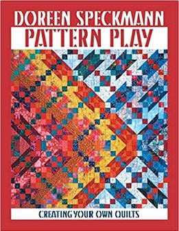
Pattern Play by Doreen Speckmann
We decided we would use the units Doreen Speckmann recommends in her Pattern Play book. I LOVED Doreen Speckmann’s classes. I have had the book for a long time, but Friend Julie bought it recently. It is a technique book, though there are a few patterns. Doreen shows readers how to make and use different units to make quilts look more personalized. These were the types of books that were written in the past whereas now people just write books that tell you how to make a certain quilt with certain fabric. I don’t see that I have written a book review on this book, but it might be time.
That being said, this is a block based book and, thus The Pantone Project will be a block based quilt.
Fabric, Sewing machine and regular Sewing supplies (BSK)
Decisions to Make:
Size of units (blocks)
Type of units to make
Timeframe for making the project
Timeframe for sending postcards
Every week or so we send each other a postcard. The interval is pretty random, but we aren’t letting months go by. I was on a trip recently and didn’t send any that week, but sent one as soon as I got back.
The postcards have a certain Pantone color. From the color we will choose a solid, tone-on-tone or ‘reads as solid’ fabric to use for the block.
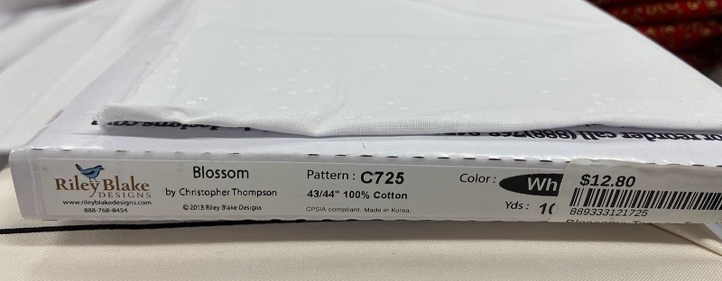
Blossom by Christopher Thompson for Riley Blake
We decided to use the same background and bought some together the other day. We bought a cool grey called Blossom by Riley Blake. Christopher Thompson is the designer. I don’t know why it is called Blossom since there is not one blossom-y color on it. Some of the other fabrics in the line are more blossom-like. Anyway, this is a really good grey, which is now washed and waiting to be incorporated into blocks. You can see more of the design of the fabric on Julie’s blog.
Our units will be 4 inches finished (4.5 inches unfinished).
We will make two blocks, plus cut two squares and send one block and one square to the other person. At the moment, I am behind and won’t be able to get started until later this week or next week. Julie has a nice picture of the postcards I have sent on her blog. She also made one block already. I need to get busy, and will soon.
**Obviously, you should shop at a local quilt shop. However, I use affiliate links and may be paid for your purchase of an item when you click on an item’s link in my post. There is no additional cost to you for clicking or purchasing items I recommend. I appreciate your clicks and purchases as it helps support this blog.