Julie and I went out the other day to Golden State Sewing. We usually meet for lunch and visit the Granary, but I suggested we change it up. They have really good fabric at Golden State. More on the visit later.
One of the things I wanted to do was look for fabrics for The Pantone Project for the cards with which I was struggling. We also chatted about ‘good enough’, which is de rigeur for this project. We agreed that neither of us want to buy a lot of fabric.
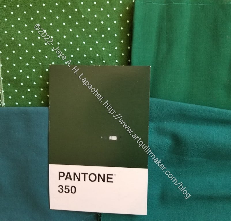
I finally crawled up into the fabric closet and got down the cool solids bin and pulled out the greens I remembered. Neither were exactly right, but Julie and I decided that two of the three fabrics would work.
We think the Tula Pink Tiny Dots is the right color, but lighter. We think the top right solid is dark enough, but doesn’t have that black (or brown?) tinge to it. We agreed that either would work.
One strategy I haven’t tried is comparing the postcards to the color cards I have. As I said, though, I don’t want to buy a lot of fabric; I’d like to use what I have.
I’m so glad we looked at the fabrics in person, it really helped. We probably should have gone into a sunny spot for more accuracy. That’s what I’m finding, I think I’ve made a match, and then I hold it up by the window and, nope! I guess we’ve given ourselves more of a challenge than we possibly meant to.
I agree. We do have to realize that people won’t be looking at the finished quilts in bright sunlight, so room light is probably good. Perhaps this is a lesson about perfect vs. good enough?