The following is a lesson on different methods of selecting fabric. This is a lesson I give as one of the first classes when I teach beginning quiltmaking.
Color Choice Basics
-
-
- Use what you love
- Use the good fabric
- Don’t be boring
- Splash Out – be bold
- There’s always more fabric
-
Using fabric you love or your really good fabric means that you will enjoy working on the quilt as well as using it or looking at it once it is finished. Since there is always more fabric, be bold in your choices. Take chances and try new color combinations. Yes, quilts take a long time, but you can always make another.
Fabric Selection
-
-
- Fabric selection is personal. Think about what you like not what is trendy. Don’t copy the fabric choices of your friends. Quilts take a long time to make so don’t make a quilt that has already been made.
- Colors should bring you joy. Don’t use colors because you think you should, such a ‘on trend’ colors or fabrics.
- Your opinion matters. Like your fabrics
- What you choose at the start is not the final selection.
-
- Add and delete throughout the process
- You will gain insight as you work with the fabrics
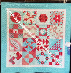
Aqua-Red Sampler with prize -
-

-
-
- Start with ¼-1/2 yard of 8-10 foreground fabrics
- Select background fabric as well
- Often background fabrics are neutrals (grey, white or beige)
- Splash out! Use yellow, blue, green, pink, or black as backgrounds. They can be effective, exciting and wonderful choices. Also, they can be unusual when the fashion is to use neutrals
- Revise (add or delete) fabric choices after you have made a few blocks
-
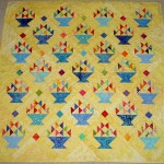
Cheerful Baskets still has a light background, but looks nice and warm with yellow instead of white. Also, yellow is across from blue on the color wheel so the baskets play nicely with the background.
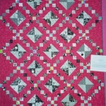
I turned background and foregrounds on their head in the Punk Rock Quilt, using pink for the background and black and white prints for the foreground.

-
-
- Stand back and squint
- If some of the fabrics blend together, you will not be able to distinguish between them in the quilt.
-
-
- If you like or want a blendy effect GREAT!
-
-
- If you want to see each of your fabrics very clearly, then remove some of the fabrics that blend together.
- If you love each of the fabrics you have chosen, move the fabrics around so the ones that blend are not next to each other.
-
8 Methods for Fabric Selection
Method #1: Selecting by Value
- Select one color to be your main color
- Tone-on-tone or solid colored fabrics work well for your main color, but don’t limit yourself if you love a, for example, red and white print. After you have selected your color, then you will choose a light, medium and dark of that color, e.g. light blue, medium blue, dark blue.
Value is important. There are lots of quilt fabrics that have a medium value. Choose enough lights and some darks, so that the piecing of your blocks shows up and the eye of the viewer moves around the quilt.
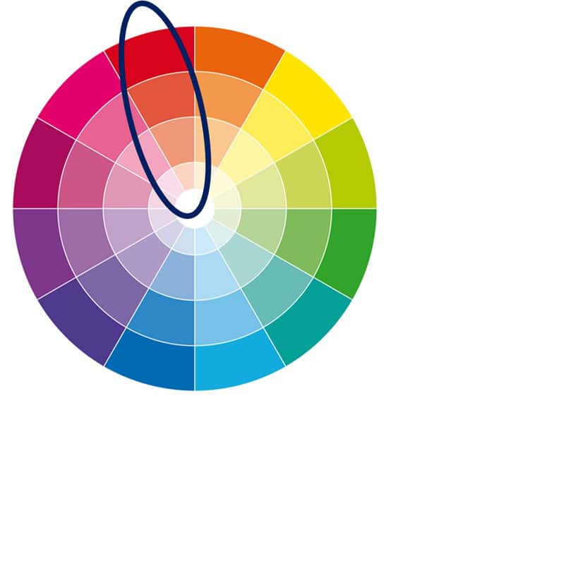
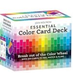
Use a color wheel to help you.
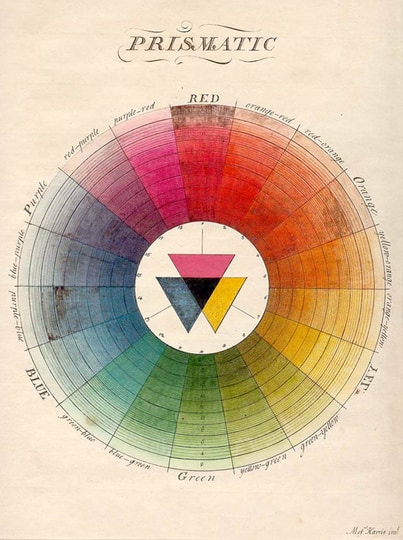
All of the hues in one of these groups will be your palette
Method #2: Heroine or Focus Fabric
-
-
-
- Select a lovely, busy print with more than 2 colors.
- Large scale prints work well
- Lots of colors gives you a lot of colors from which to choose. All of the colors, or a selection can be used to make a successful quilt.
-
-
Note: Many large scale prints are the main fabric in a line of fabric.
Once you have your focus fabric:
-
-

Handbag Sampler – ready for binding - Choose fabrics that have the colors you find in the focus fabric
- Select some solids or tone-on-tone fabrics to give the eye of the viewer a resting place
- Vary the size and scale of prints.
- Try not to match up the colors exactly. It will add interest if the colors are slightly off the color in your main fabric.
- Include the complementary color to the focus fabric’s main color to pop that main color
- If you want each of your fabrics to shine, make sure you have lots of contrast
-

Method #3: Monochromatic / Two Color
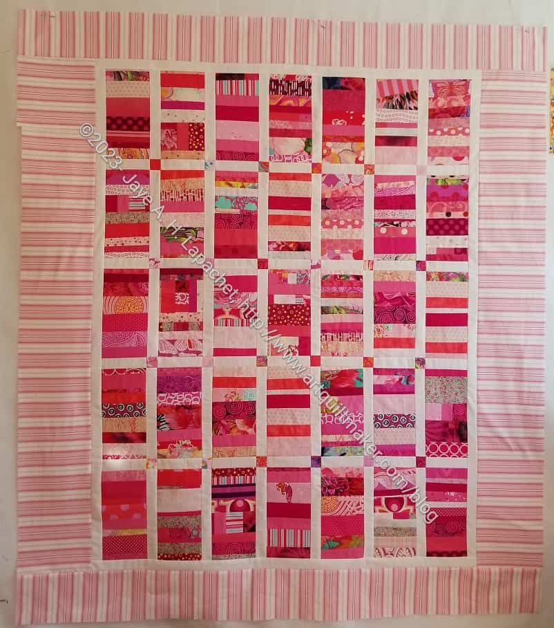
Monochromatic is a method where you choose one color and include many different fabrics in that color.
-
-
- You can also choose a variety of different fabrics in the same color family and one background.
- Monochromatic and two color quilts have a long history in quiltmaking. Think of red and white quilts.
-
If you pull from your stash, usually these quilts come out well since most quiltmakers buy tones and shades of colors. For example, clear orange versus dusky orange. I am a clear orange girl.
The two color method is a slight variation of the monochromatic method
- Choose one color and a background fabric (red+white or blue+white are popular examples).
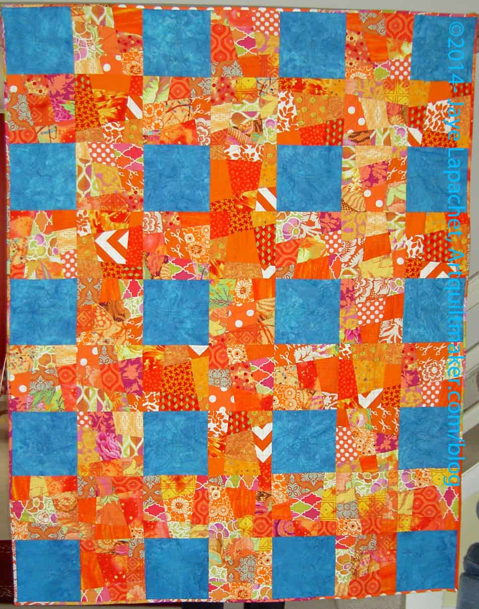
- Using the complement of your main fabric can be super striking. This orange and blue quilt is one of my most successful quilts.
Method #4: Dealer’s Choice

Dealer’s Choice is the method by which you choose whatever fabrics you like.
-
-
- These could be the newest or the most recent you have bought.
- Put all the colors you like together
- You can control the look by choosing a type of fabric like solids or all dotted fabrics.
-
Method #5: Scrappy

This is similar to Dealer’s Choice. The difference is using scraps. There are often more fabrics and fewer duplicates using the scrappy method.
-
-
- This can be a very serendipitous method
- Use a lot of fabrics.
- Use a variety of colors
- Make sure there is a variety of contrast
- Use a variety of motif scales – big prints, small ditsy prints, etc
- Use fabrics, colors and prints you like
- Curate your fabrics so the overall quilt appeals to you
- Have a good mix without too many of one color or value
- Scale means that you think about having different size motifs
- Solids and tone-on-tone fabrics to provide resting spots
- Distribute similar colors across the quilt; try not to concentrate one color in one area unless you are trying to gradate the colors
-

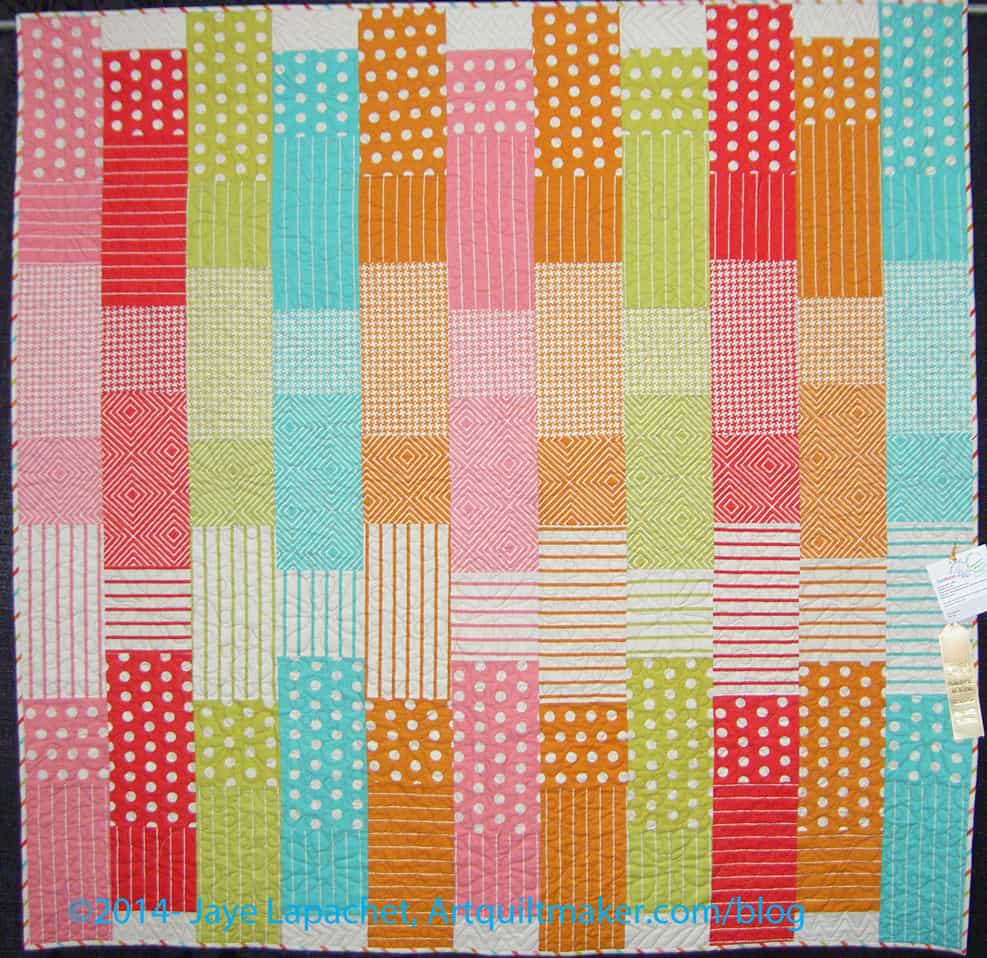
Using a similar background (dots on white in the example above and black on white in the example, left) creates success through lack of confusion. Not having a defined background can make the quilt look confusing to the viewer.
I also curate my scraps. If I think a patch will look ugly in the quilt, I don’t use it. I don’t use the ‘paper bag’ method, because I am a grownup and can choose fabrics without a gimmick.
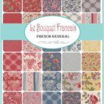
Method #6: Whole Line of Fabric
Using a whole line of fabric can be a stress free way of starting your fabric selection process. A whole line provides a starting place.
-
-
- Choose a line that has a lot of fabrics in it. Some current lines don’t have enough different fabrics for an interesting quilt. For example, the Parisville Deja Vu line by Tula Pink has only 8 fabrics. One thing that can help you overcome such a problem is that many fabric designers use similar colors in their lines. In Tula’s case, you can use several lines to make up the fabric selection for your quilt, because all of her fabrics coordinate.
- Remove between 10-25% of the included fabrics. Collections tend to have a lot of medium colored fabrics as well as a lot of fabrics with a similar scale in the motifs. You need variety
- Replace the removed fabrics with lights and darks
-
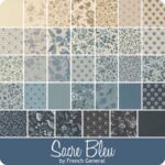
These lines are an example of mostly medium fabrics, which would make a beautiful blendy quilt. However, if you want contrast, you need to add fabrics.
I think that one dark dark on the bottom right of the Sacre Bleu photo would stick out like a sore thumb, though, which is why I like 10-25% lights and darks.
-
-
- Shops also create curated packs of fabrics.
- Using someone else’s color choices can be a good way of learning about color.
- It is also a good way of learning what you like and what you don’t like.
- Adding a background that isn’t included in the line can make the quilt more interesting.
-
It is a good learning experience to use someone else’s fabric selection so that you can learn. This is where a tool can come in handy. You can compare the designer’s color choices to palettes in the tool to get an idea of what they were thinking.
Method #7: Inspirational Image

Magazines, blogs, websites, Instagram all pay a lot of money for great photos. If you find one you like, you can use it to select colors for a quilt.
Use a photo you snap as you move through the world to create a color palette. It can be an exercise even if you never make the quilt. Choose a photo, choose fabrics similar to the colors you find in the photo. Decide if the exercise is successful. Learn from the exercise.
Nature can help out, especially with monochromatic quilts. Next time you drive through the mountains, check out all the different greens you find on the hills where there are forests.
Method #8: Use a Tool

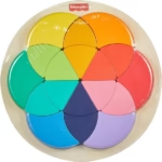
Tools are a great way to learn, though try not to rely on them long term. Tools are great for solving a problem. When you have a quilt on the design, but feel something is missing, pull out your color wheel, or other tool and see what you can add or delete.
Important things to think about when picking fabric:
-
-
- Do I like these fabrics?
- Do these fabrics appeal to me?
- Will I enjoy looking at and working with these fabrics?
- Do they feel good in my hand?
- Do I like these colors?
- Is the value correct?
- Is there enough contrast?
- Do I have a variety of large and small prints? (Scale of prints)
-
Amounts of the fabrics is not as high priority, because there is always more fabric.
If you are trying to add or remove fabrics, check out the post I did when I was working with Frances.
The Bottom Line
The bottom line? Make visual decisions visually.
This means hang your fabrics on the design wall (or lay them on your design floor or pin them up on your clothesline) and then stand back and look at your choices. Leave them up for a few days so you can see them as you walk around.
If anything bugs you, make the piece smaller. If it still bugs you remove it. Add new fabrics in and remove fabrics until you have a palette you like.
____________________________________________
____________________________________________
Resources
Here are a selection of resources. I have only included resources I have read and don’t dislike. Everyone has a perspective and they are all valid.
-
-
- AQ: Overview of Fabric Selection (2011)
- SuzyQuilts: Picking Fabric for a quilt pt.1
- SuzyQuilts: Picking Fabric for a quilt pt.2
-
Good morning, Jaye
You always have something uplifting and fun.
Thanks for this color wheel information.
Have a terrific Tuesday.
Eleanor and Bessie (4paws)