The week is nearly upon us. My house looks like a bomb of tissue paper, decorative paper and ribbon went off in it. There are gifts and baskets everywhere. I haven’t even begun to inventory my clothes for the week yet. That will only add to the chaos.
In addition to the physical chaos, we also had some other chaos: our washer broke and is unfixable and one of the Grand Officers died so some of our precious prep time was, understandably, devoted to a rosary and a funeral.
Favor Soaps
Soaps and Ribbon: prep for boxing
Boxing Soaps in Process
My SILs, a friend and I spent Craft Night on Monday boxing and wrapping favors for the Ladies Luncheon. These soaps were made my my sister, owner of Wooden Heart Soaps (go buy some-they are awesome), the wallpaper from which we made the boxes was from FabMo and one of my SILs dug into her stash of gift bag ribbon for our use.
The soaps are Grapefruit Bellini scent. I wanted something that most people would like and was not too strong. Cross your fingers.
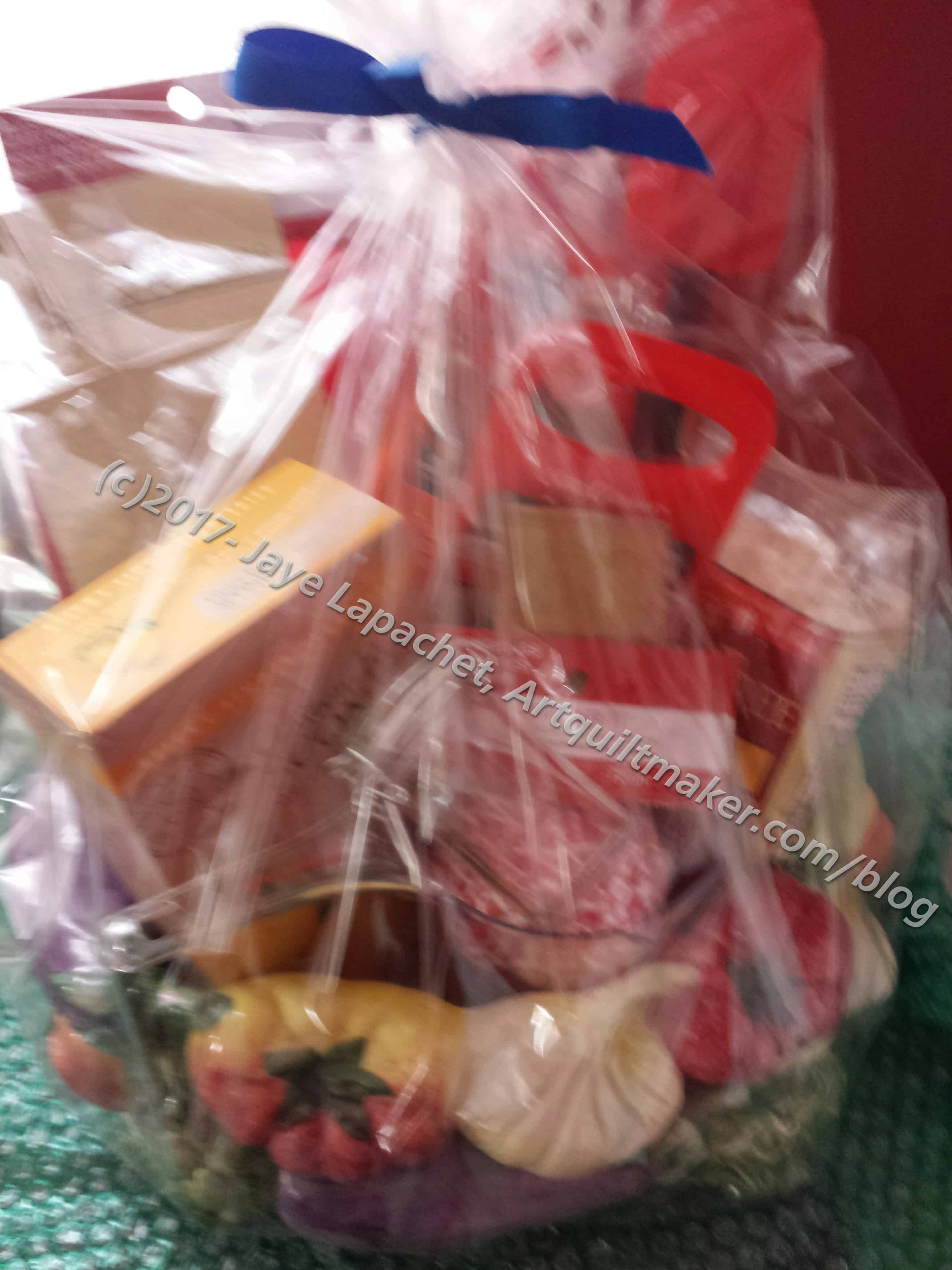
Gifts for Ladies Committee
I also had to procure a number of thank you gifts for the people who helped with all of the events.
I decided to use handbags as the holders since they were nice and could be used later. I hope the committee likes them. If they don’t, I know they won’t say anything. 😉
One Centerpiece
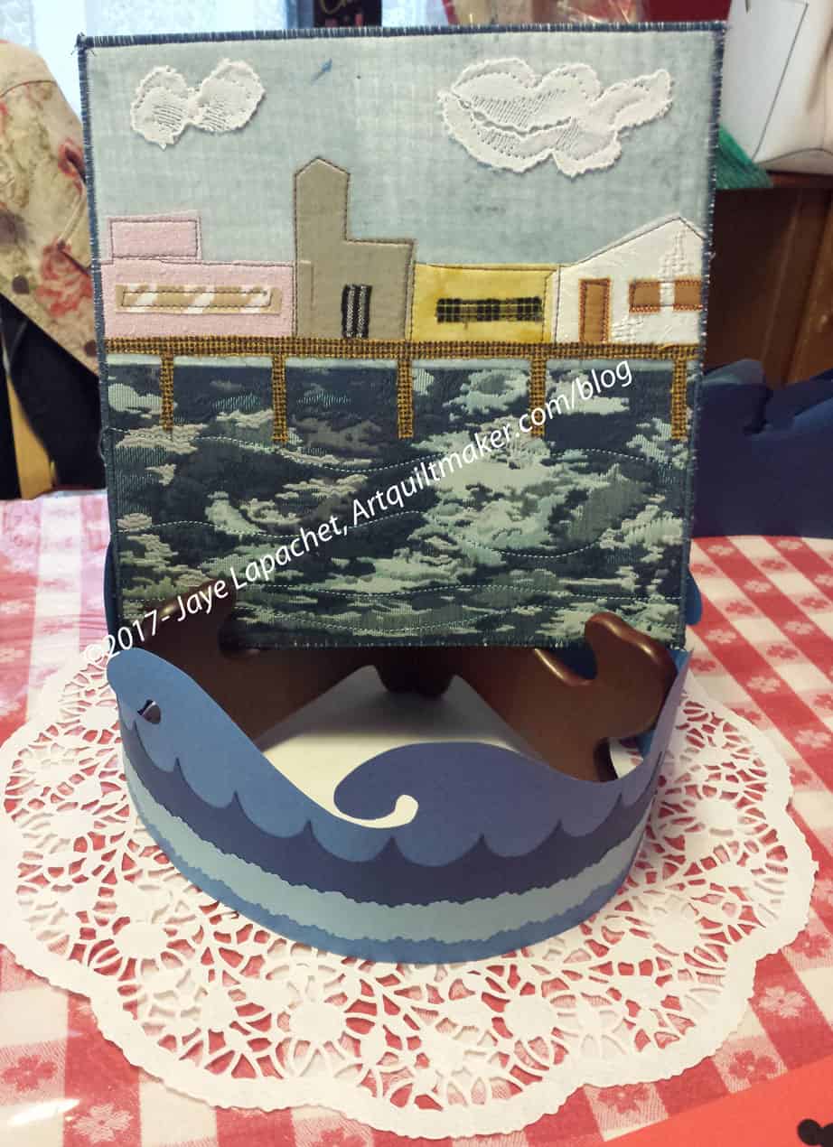
Maureen designed the centerpieces and Carol took them and designed a tableau around Maureen’s work. The plate holder will be clear or white (I can’t remember); the one in the picture is just a sample. Carol designed the waves and put together enough for all the tables. She did a wonderful job, especially using the lace doily to add a bit of finish to work.
After organizing my clothes, I think I will be done. We’ll see whatever other crises fate throws in our way.
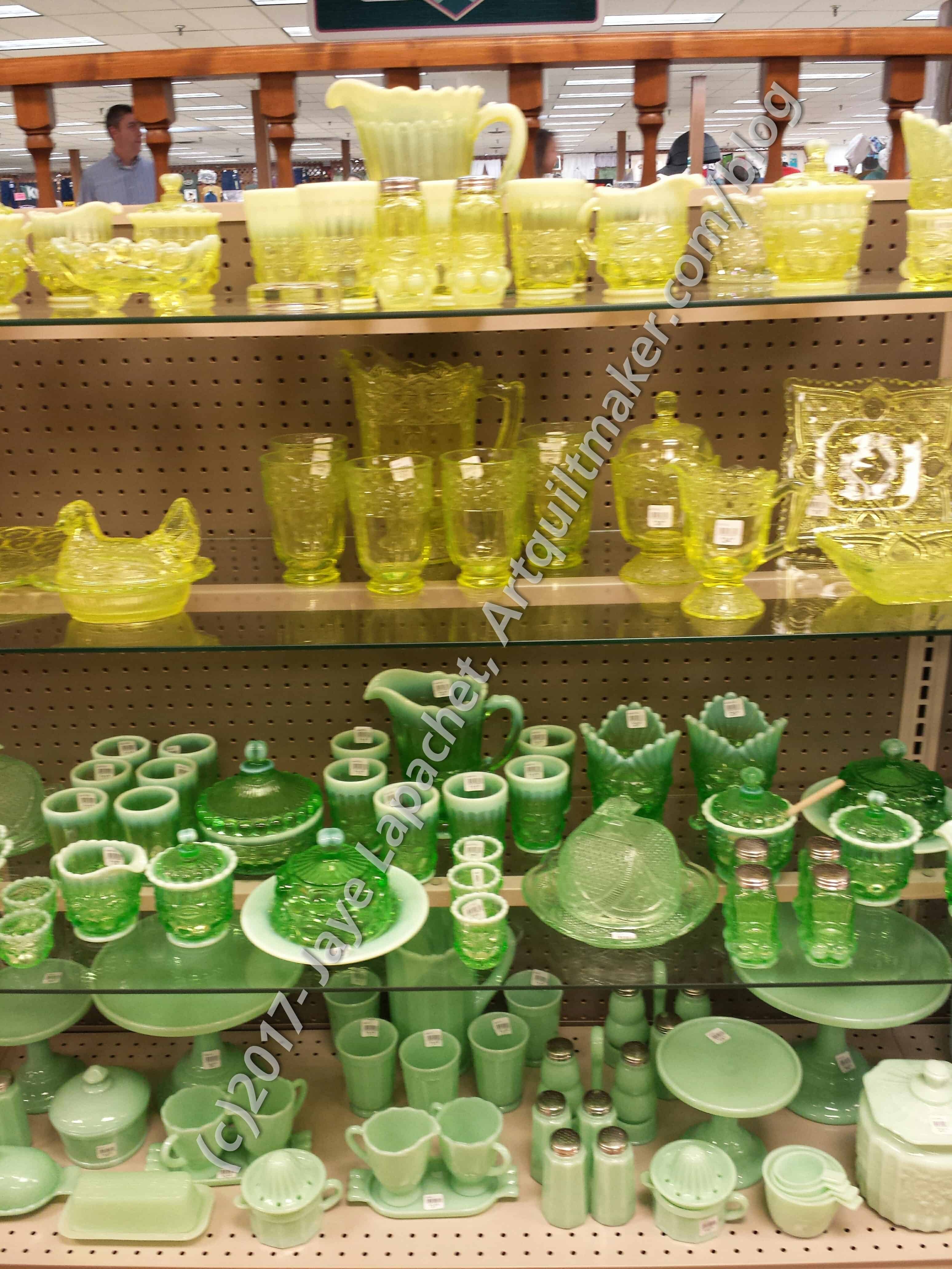
Last week I talked about the pressed glass glassware I saw at Yoder’s. There was a lot of it and I decided to do a series of posts about the different colors.
Green & Yellow Pressed Glass
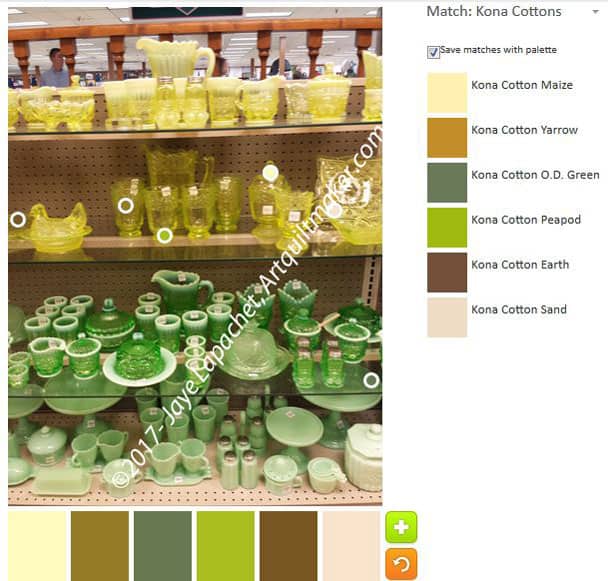
The green and yellow weren’t my favorite, but I could appreciate the colors. The green also reminded me of my Jadite batter bowl.
The yellow is really interesting. There is a combination of milky and clear that I can see in the photo. (I don’t remember from the store)
The Palette Builder is a great and fun tool. Try it out! Let me know if you make anything with any of these palettes.
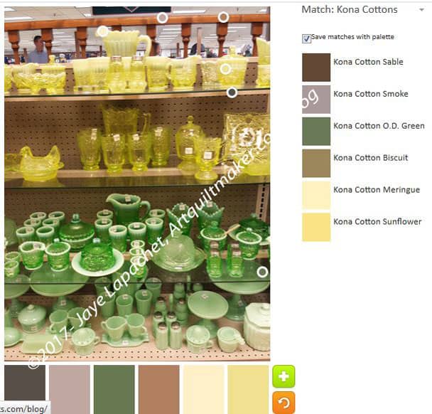
ColorPlay May12 – defaultColorPlay May 12 n.2
The default palette is predictably neutral based. There is one yellow and I guess Meringue can be either a neutral or not, depending on whether it is next t a neutral or next to a bright. It is kind of shocking how many neutrals can be found in an image where my eye sees mostly green and yellow.
A very smart reader pointed out that the camera has limitations on what it can see. I know that is true, but it still amazes me.
It was interesting do move the dots around for the first time on this image. I always get a little tingle when I do that. All of the circles were towards the top in the default image, so the green was not even touched in the default palette. I kept my range in the yellows and tried to get as many yellows as I could. I will work my way down.
ColorPlay May 12 n.3
The third option is a combination of neutrals and greens. It is fine.
ColorPlay May 12 n.4
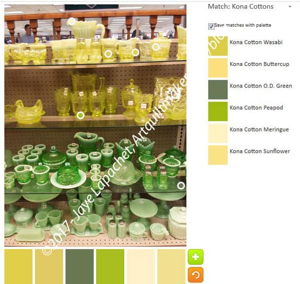
ColorPlay May 12 n.5
I got two marginally different green palettes out of this image. While there are some similarities in the exact shades, which makes sense, there are no duplicates in the palette. This is a good thing about camera images. The camera can pick up the differences in shades and tones found in shadows and in bright light.
ColorPlay May 12 n.6
Finally, I wanted to play around the Jadeite looking pieces on the bottom. I was concerned there would be too many lights for Kona, but I don’t know how many lights they have so I decided to see what I got. I was surprised to see the tool register so many darks. I did stay towards the back of the case, I’ll admit that, but still. The pieces seem lighter than the pieces one shelf higher.
I could have gone on and done more palettes, but I had to get on. Enjoy!
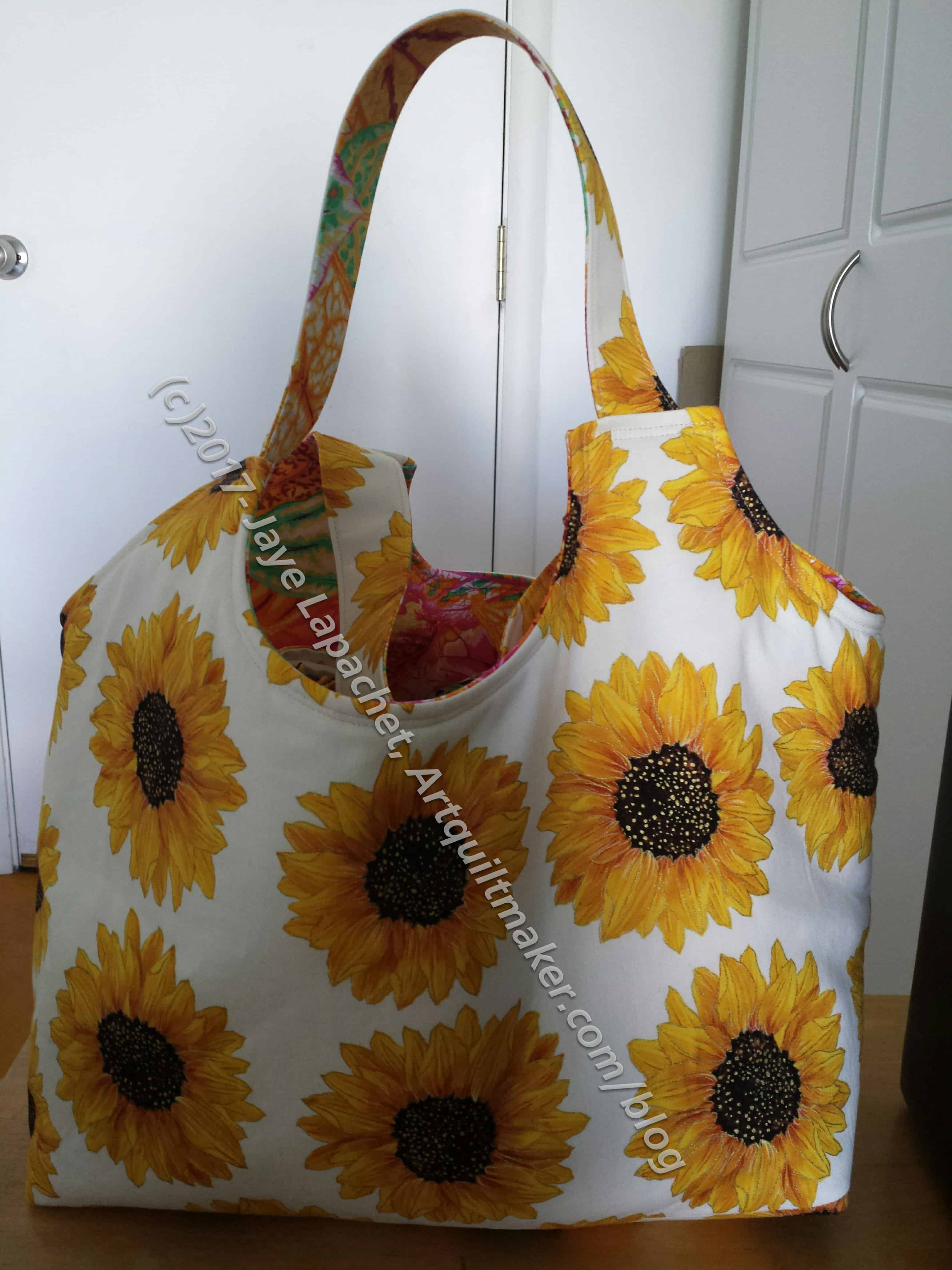
I have decided that I like that Big Tote pattern from the Make It Take It book.
This will be the carrier for the other gifts, such as the cloth napkins I talked about earlier this week, DH will present to the NDGW Grand President. This is the first one I made with just two fabrics. No mosaic piecing. The bold print works very well, but I think smaller prints would look better using the mosaic piecing method I used for the second one I made.
There are some things I would like to try, e.g. pockets. In my mind pockets are essential. This isn’t a huge tote, so I envision it being used as a handy bag to put a few things in when you weren’t planning on buying anything.
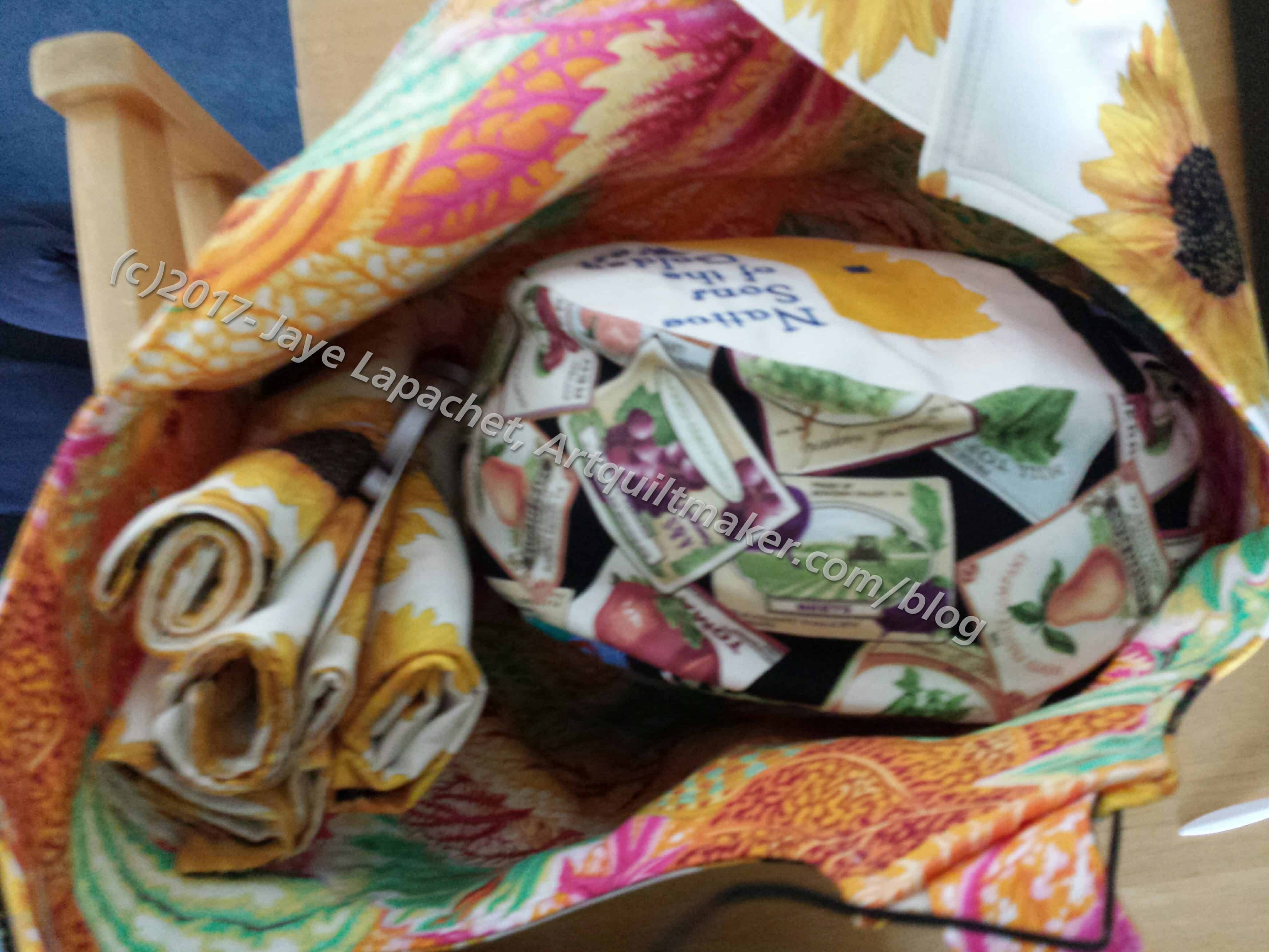
Kaffe print inside
I couldn’t resist adding a little of my own personality to the inside.
You can see some of the other gifts inside the bag.
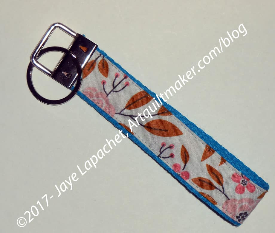
This is so small and I used a scrap that I didn’t even put the used fabric on my spreadsheet. I am sure I will get 10 inches by 2 inches at some point.
I never thought I would make a key chain. Buying the hardware is the stumbling block for me, but since I was at Fabric Depot and saw them I bought two sets of the hardware.
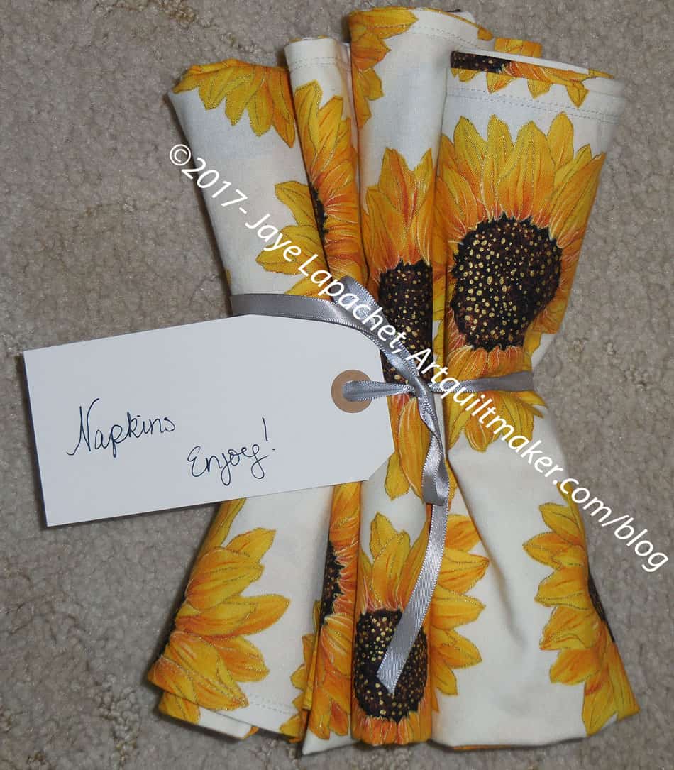
These are also for the Grand President of the Native Daughters. The napkins will be placed in the bag I will show you later this week. Same fabric.
They go with her theme, which is sunflowers and with the dessert plates we got for her as a gift last year.
I put the label on as many people do not use cloth napkins at home and I wasn’t sure she would know what they are. I would hate to see someone wearing one on his/her head. 😉
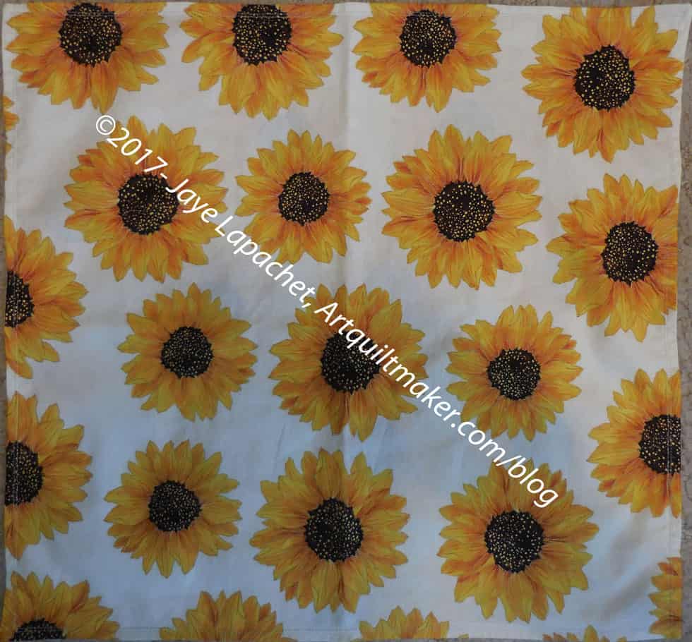
Sunflower Napkins – full
I generally use 2 quarter yards – fat quarters – to make my napkins. I like generous napkins that cover my whole lap. I think I made these square.
Normally, I do a decorative stitch on the edge, but I wasn’t up for that with this project. I just sewed two lines of straight stitching and I think it looks fine.
They are done and I am pleased. Napkins are a great way to use up fabric, by the way.
Except for one long seam across the center, I actually finished this piece before I went to Portland.
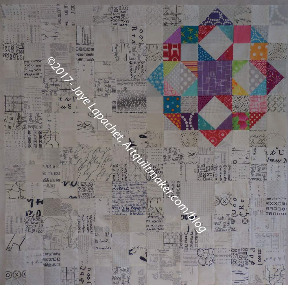
It is the first section of the last row and it is a bit of a trial. I have more cutting to do for the text squares and it is a bit of a trial. There seems to be a lot of cutting in my life right now.
I have now started on the next section. I have to cut, as mentioned, and make a bunch of four patches before I can make any significant progress, but I am making some progress.
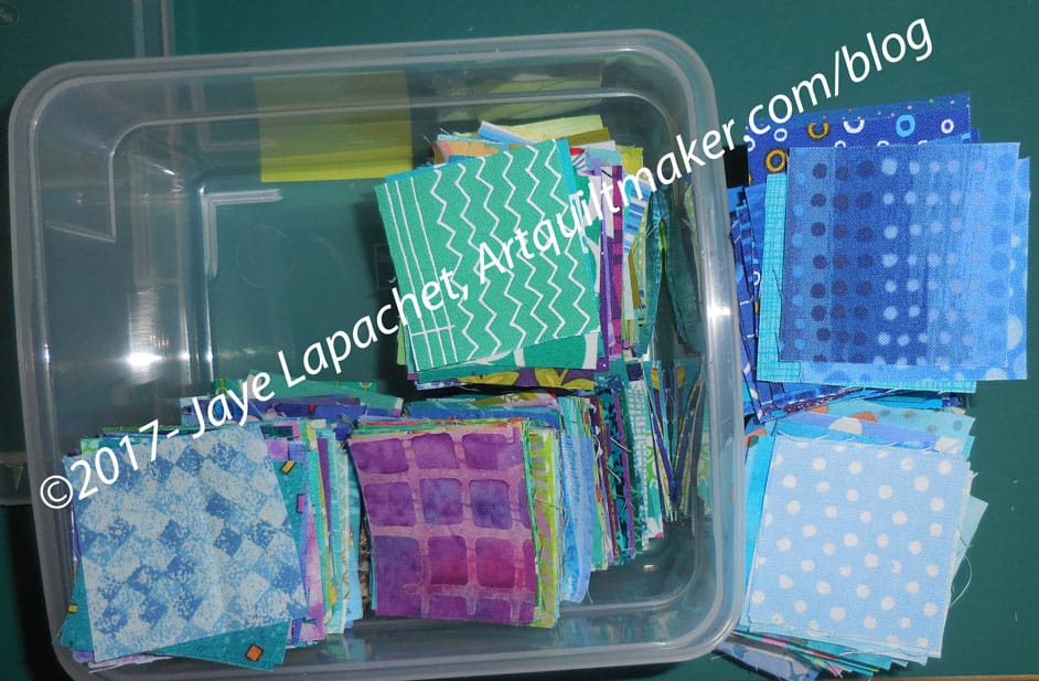
I decided to use blue instead of purple on step 3 of En Provence. I have been hanging around not doing anything about step three for several weeks. Finally, needing something mindless to do for a few minutes, I cannibalized the blue squares from my stash of Blue Lemonade 2 inch squares. I planned to use them for En Provence and replace the Blue Lemonade blue squares before I started to sew that piece together.
Everything didn’t go as planned.
Blue Lemonade also has green and purple squares, so the entire box wasn’t blue. Also, there were duplicates, so I didn’t take all of the blue squares as I want both to be relatively scrappy. Not even the majority of the box was blue. I think the squares were evenly distributed between the three colors.
Cutting from Scraps
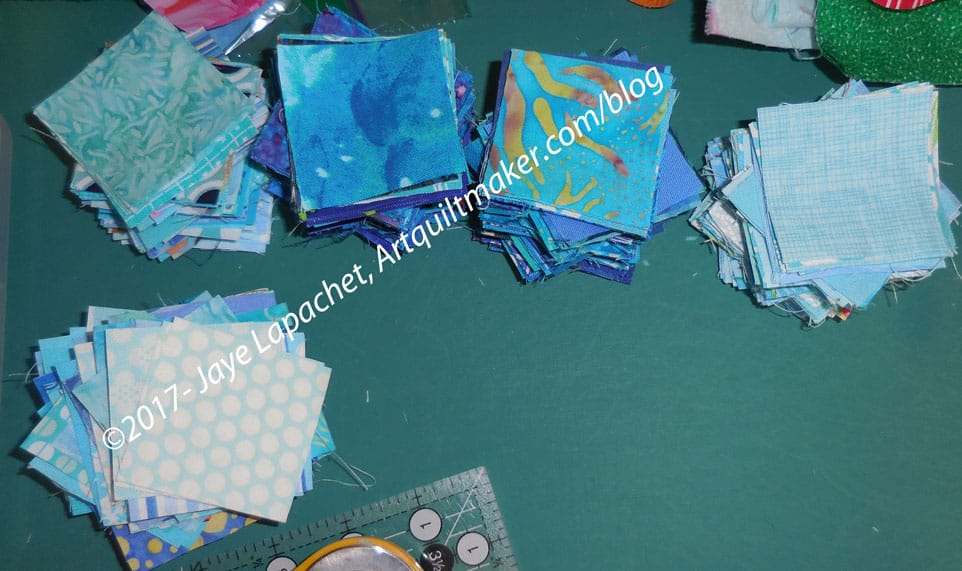
I ended up with about 380 squares. If my math is right (never a guarantee), I need 672 squares to make 168 four patches. Bonnie doesn’t exactly say, but I think I need 672 squares to make 168 four patches. My math isn’t so terrible that I can’t multiply. Still, it seems like a lot. I can use strips and make them less scrappy. We’ll see.
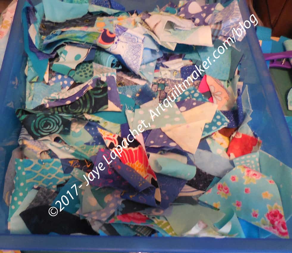
Blue Scrap Bin
Then I started to cut from my scrap bin. I have a lot of blue scraps, so I was able to cut several out of the scraps. My scraps are either too small or too big. Still, I found some I could use. This put me up to 464 squares. Not shabby, but still 200+ short. I don’t relish the thought of cutting 200+ squares, but it has to be done or I have to use strips.
Then I have to replenish the Blue Lemonade squares as well. Sigh.
Yes, I am starting another project. Mostly I am starting it because Daisy said I should and then the omens were good. I found a layer cake I liked at $15 off and found some American Made Brands background at a $1 off per yard. Perhaps this will be boyish enough for one of the nephews?
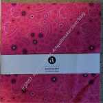
Alison Glass Sunprints from Fabric Depot
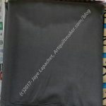
American Made Brands Charcoal from Yoder’s
I couldn’t have done it without my recent travel. I got the layer cake (left) at Fabric Depot in Portland. That place is huge-HUGE and they were having a pretty good sale. Yes, both new items add to my fabric usage totals, but I am hopeful that I’ll be able to finish something larger than a handbag soon.
The charcoal is from Yoder’s in Shipshewana, Indiana. They had the whole line, which was awesome! I got a bit more than I needed, but you know, mistakes. The fabric is now washed so I can start cutting.
The quilt is called the Layer Cake Explosion. You can find the free pattern on Craftsy. Also, check out Daisy’s blog for more information. I did look at the templates for the alternate block and I am thinking I might do something else. I am not a fan of the way that little triangle looks. We will see.
The pattern calls for the Creative Grids Stripology Ruler. There is a YouTube video which shows you how to use this ruler. As much as I love rulers, I don’t think I will be using it. I think I will use my Accuquilt, though it is possible I don’t have the right die for the strip size. Stay tuned.
I haven’t done any sewing for the past 14 days or so, thus Indiana is being featured again. At Yoder’s they had a section of housewares that had the most interesting stuff: 5 kinds of molds for popsicles, the old versions of Risk, Clue and Sorry as well as bowls, plates, locally made wooden spoons and cutting boards and a zillion other things you didn’t know you needed.
Yoder’s Pressed Glass
One thing I saw was a whole display of pressed glass serveware. OMG! I never saw such pretty stuff. It wasn’t expensive, but I could have fun with some of the serving pieces. How do you like that square cake plate?
ColorPlay: Pressed Glass-default
Will I ever learn? The default palette has nothing to do with what I see in the photo. I always expect so much more.
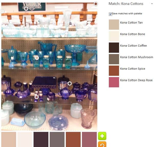
ColorPlay: Pressed Glass n.2
Of course, I liked my first attempt much better. It isn’t great. I could do without the Kona Taupe, but the Morning Glory is wonderful.
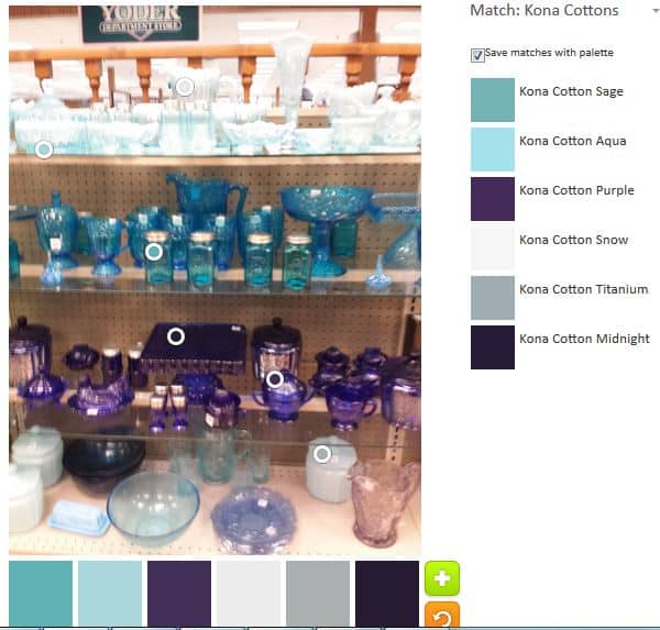
ColorPlay: Pressed Glass n.3
I am not a fan of the Midnight but otherwise the third palette is much better. The Sage and Aqua really add to this palette.
The Palette Builder is a great and fun tool. Try it out! Let me know if you make anything with any of these palettes.
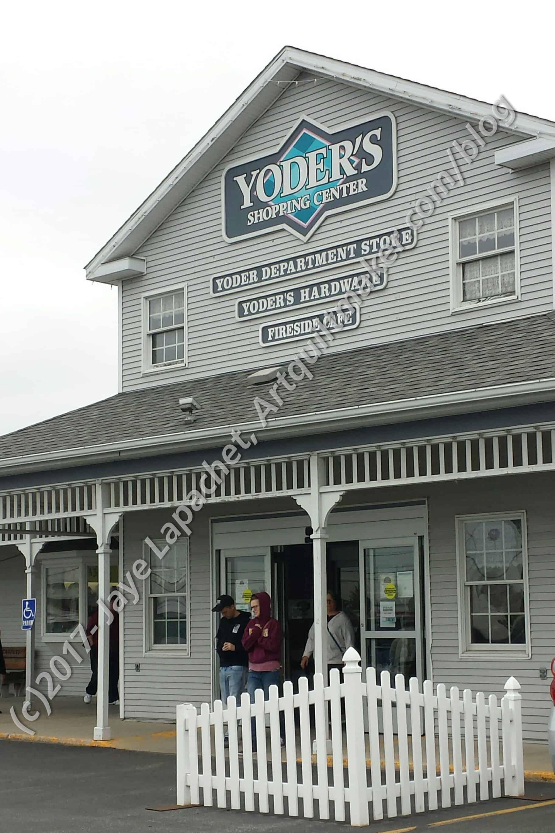
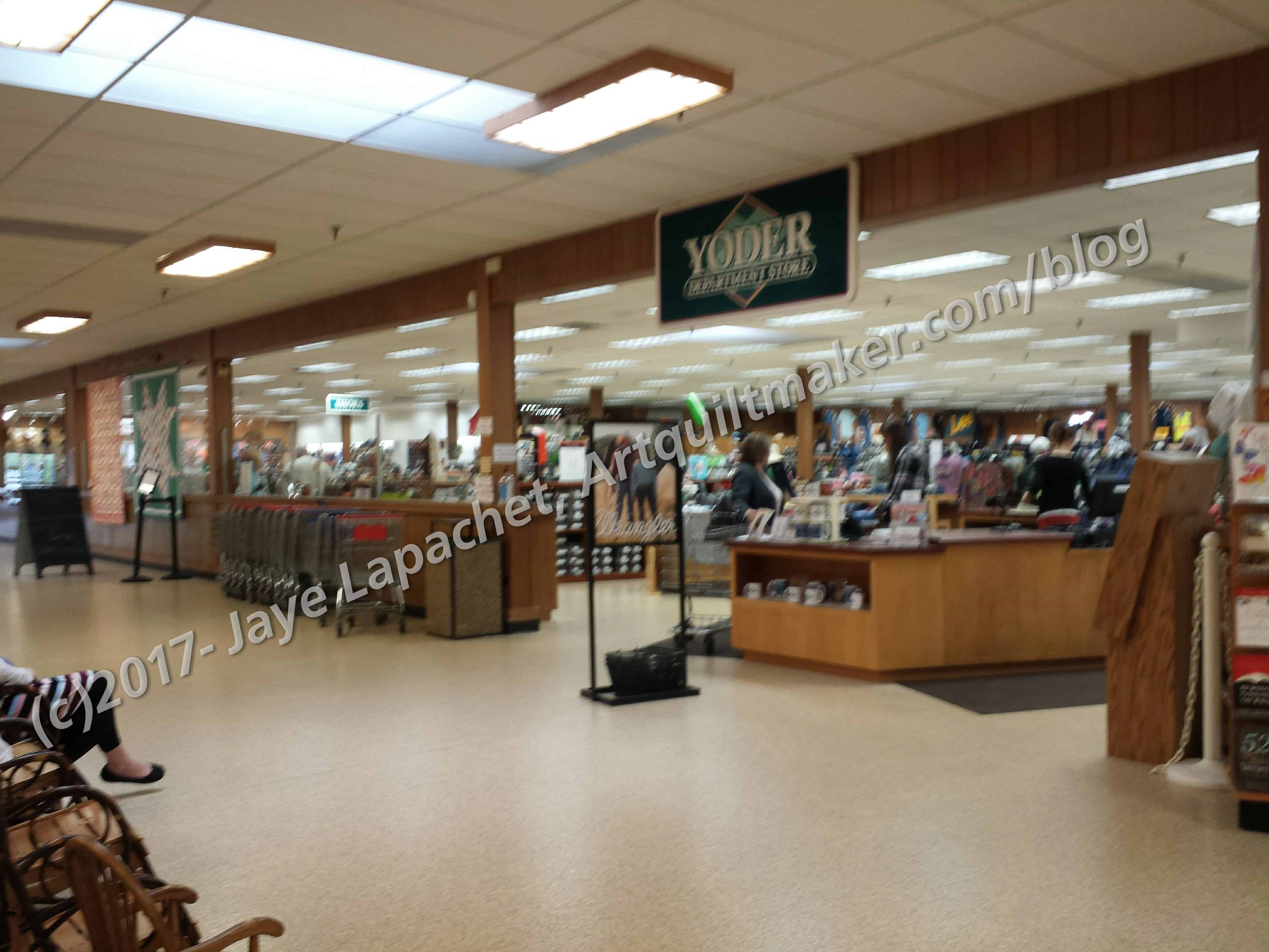
Yoder’s Department Store is the place that is the main fabric store for the Shipshewana Quilt Festival. I never thought I would go to this place. It’s in Indiana. Do you know how far it is from my house? 5 hours on a plane, 3 hours on a bus, assuming your plane isn’t late and you don’t miss the bus, and about an hour in a car. We went to this store right after Zinck‘s and only had about an hour to look around. I was slightly jetlagged, so I had enough time, but I could have spent weeks in that store and not seen everything.
The other thing I noticed was that the store was scrupulously clean. Where Zinck’s was a little dark and slightly grubby – not dirty, just very basic – Yoder’s was spotless and bright.
Yoder’s Soft Goods SectionYoder’s large fabric area
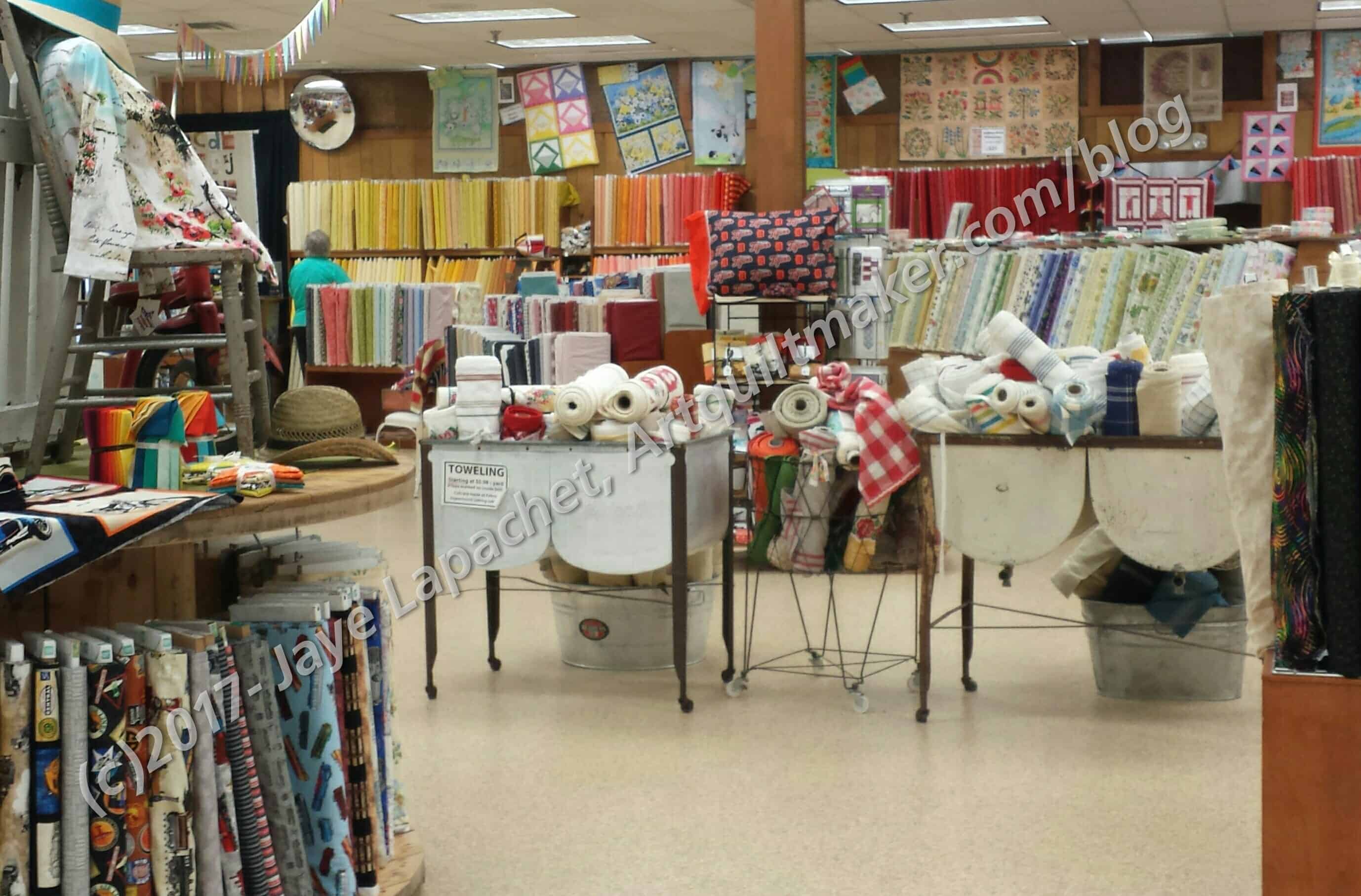
For those of you who have not been to Yoder’s, it is a giant building with a few different and separate areas: fabric and clothing, housewares, hardware and a few others. We went into the fabric and clothing section, which also had shoes, table linens, baby clothes, and a few other things. The fabric section took up about half of that space. There was so much fabric that it was difficult to take it all in.
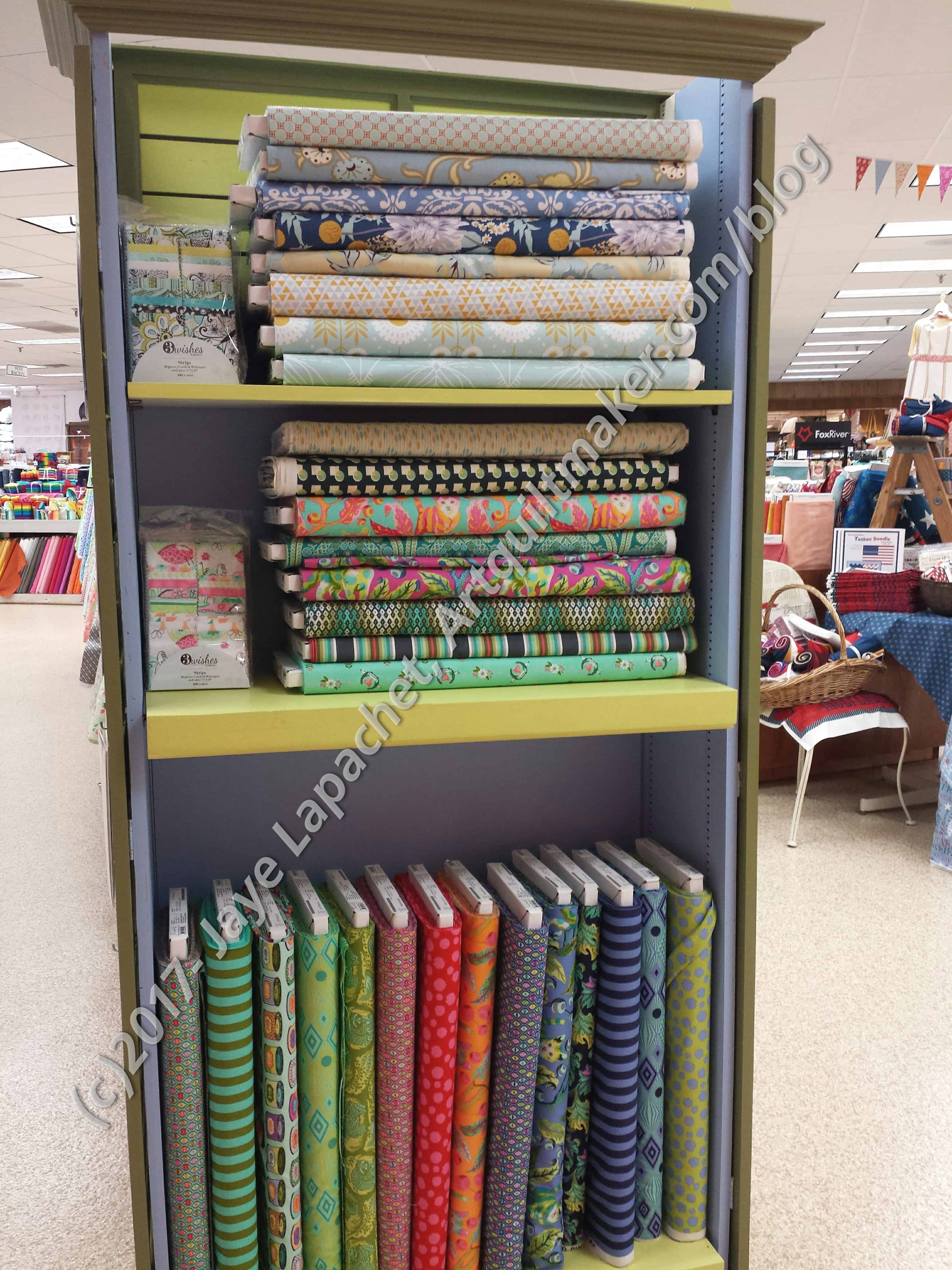
Yoder’s Tula Pink & Friends
Finally, I decided to do a circuit around the outside of the department to see what I saw. One of the first things I saw was some Tula Pink fabric.
This made me realize that I was in a different sort of store. The fabrics weren’t closeouts or remnants; they were the latest fabrics and a lot of them. I saw several lines of Thimbleblossoms fabrics, tons of Moda, all the American Made Brands solids, Kona solids, Bella solids.
Yoder’s pre-cuts area
Yoder’s pre-cuts area
I think I saw more of everything than I have ever seen anywhere. I think there was more fabric here than in Portland at the Fabric Depot. It would be close. If a person couldn’t take in all of the yardage and wanted to just pick some pre-cuts, the task would not be much easier. There were so many pre-cuts, I really couldn’t look at them all. Also, there were new ones. I saw Lulu Love by Cory Yoder (coincidence???) as well as Sunday Drive, which I had seen in Oregon and Washington.
Yoder’s Notions
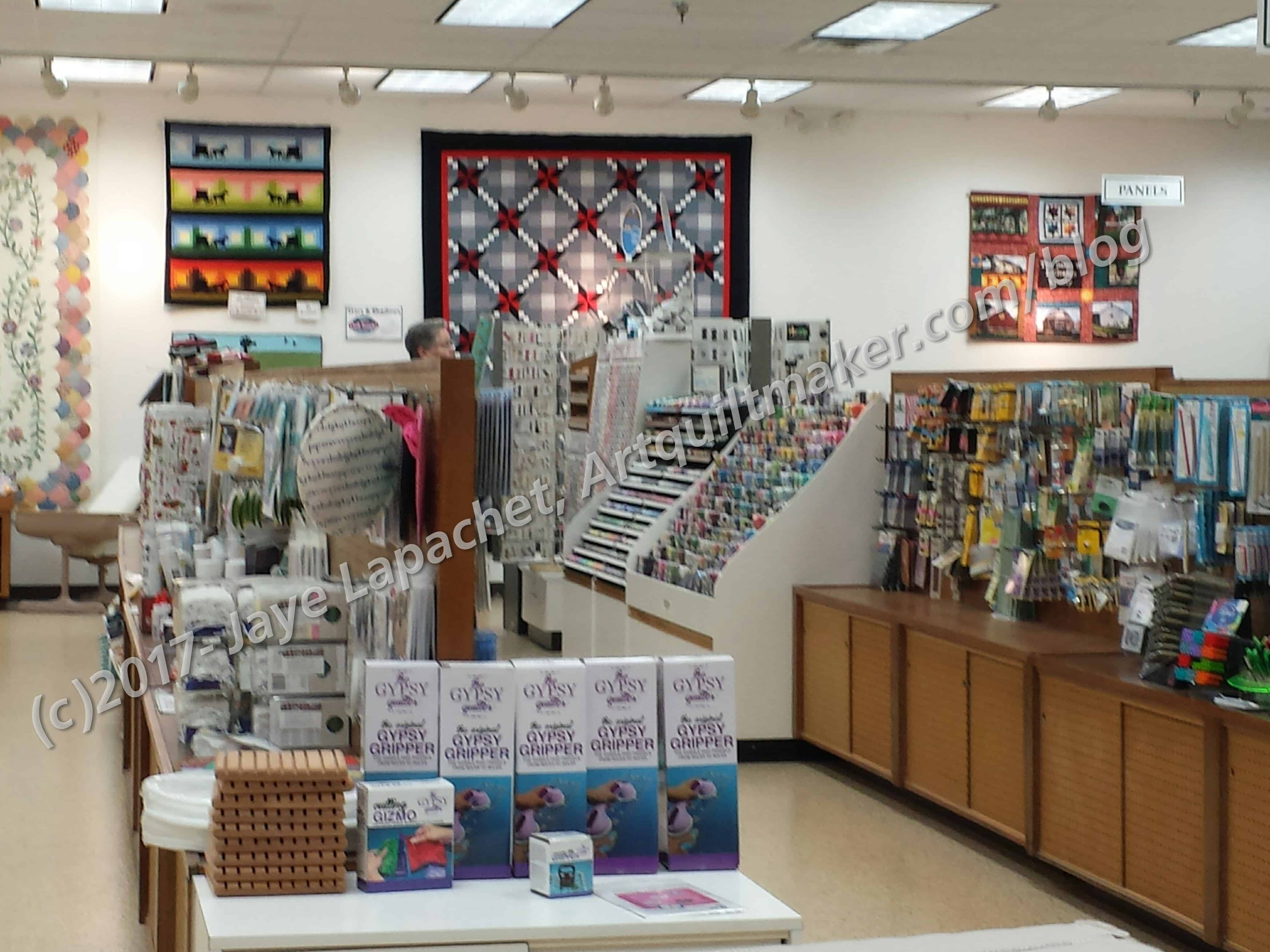
As with most quilt stores, there were quilts hanging everywhere with kits available for all of them. I found many of them to be quite appealing. Everywhere I went I saw notions, as well.
There was a whole large area with Creative Grids rulers. They had everyone I have ever seen including my favorite the 4.5″ x 8.5″ and the one on my list, the 20.5″ square. I bought a cut loose project sheet from this area to make a scarf hanger using a coat hanger, fabric and large WonderClips. Stay tuned for more on that project.
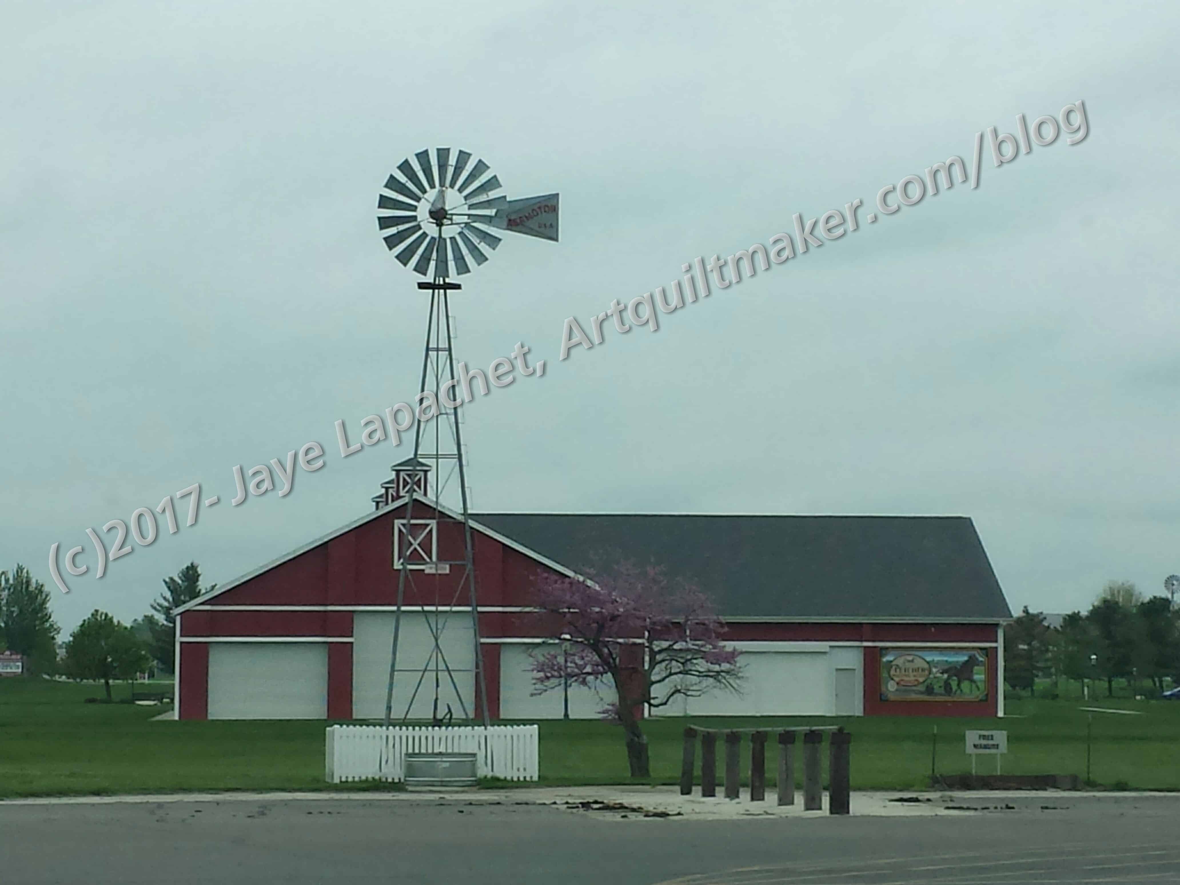
Indiana view
Outside Yoder’s was a farm and there was a great view of the barn. I love this view and would, theoretically, love to have my own version. I probably wouldn’t like the work, though and would need a superb farm manager like Patrick in The Beekeeper’s Apprentice.
My friend said there were at least 20 fabric stores within an hour drive from her house. I think I’ll have to come back. I am going to try and get a contract at her university so I’ll have a reason. 😉
This is not the first book by Louisa Smith that has intrigued me. She has an interesting style. This one wasn’t on my list, but it intrigued me and I bought it on impulse at Stitch in Ferndale. The first thing that attracted me were the bright colors on the cover. In looking at the cover again, I can imagine using Dale Fleming’s circle technique to make it.
This is a ‘normal sized’ C&T book which includes 94 pages, 11 projects, a gallery and lots of technique information so readers can make the projects their own. After the detailed table of contents (pg.3) and a short introduction (pg.4), the book begins with a section called “how it started” (pg.5-6). Smith discusses her idea, her inspiration, all the while implying the importance of doodling. She goes on to discuss how changes in her design led to other versions and the second section, “Working in a Series” (pg.6).
Working in a Series is all about the ‘what if’ of the creative process – those spin off ideas that pop into your mind as you work on one piece. As you know, I often work in a series because of this reason. See more about my series quilts.
The colors throughout the book continue to be a huge draw for me. As I page through the book, I am kept interested.
In “The Layered Approach” (pg.8-10) she talks about how layers improve/make these quilts. Layering fabric is something I have played with on and off, so I can appreciate the value of such an approach.
This book has basic construction techniques. I don’t mind it because the instructions are related to this specific technique, for the mist part. There is a very brief section on quilting (pg.85) – just commentary. It is not a how-to. She also talks about her method of piecing a back (pg.35). The instructions are brief, but useful. She covers blocking (pg.36), binding and facing (pg.36-38), displaying using stretcher frames and making a sleeve (pg.39).
If you are a beginner expecting full instructions for every step, you will be disappointed and will need another book with basic instructions or check out my quilt class tutorials. The security tips given are specifically dedicated to help you make these quilts.
The 3 methods of construction described are “Using a Grid of Blocks with 1/4 KISSes and No Fusing” (pg.11-12), “Using a Grid and Fusing” (pg.13), “Using an Invisible Grid with Multiple Layers of HUGs and KISSes” (pg.16). Method 2 is split into two parts, thus you see four methods listed.
“Color” (pg.17-25) is a long and valuable section. The author discusses value (pg.17-18), finding a color scheme (pg.19-24) as well as balancing color (pg.24-25) and using a proportional color wheel (pg.25). The section on choosing a color scheme is well developed and includes examples. The examples really help to improve the reader’s color knowledge.
The section on “Machine Applique’ ” (pg.26-29) includes examples of stitches (pg.27), basic applique’ techniques (pg.26) and has a lot of pictures. She suggests experimenting with your machine before starting on your Double Vision quilt. I agree I always do a test of the satin stitch (or whatever applique’ stitch I am using) to figure out the density, whether I like the thread and sheen, etc.
Smith defines Embellishing, another section (pg.30-32), as “…adding something to the quilt top to make it better” (pg.30). I think of embroidering or beading as embellishment. While she talks a bit about machine embroidery (pg.32), most of the section refers to layering on shapes.
“The Gallery” (pg.40-46) is fantastic. The section shows a lot of quilts, tells what method was used to make than as well as the artist. It is a feast for the eyes!
Finally, comes the “Projects” section (pg.47-88). Each pattern has a picture of the quilt on the section’s main page as well as a larger picture on the main project page. As you would expect, the pattern shows fabric requirements. These are a little different because the fabric requirements are divided up into layers. Fabric is followed by cutting and assembling directions. Applique’ and embellishing are included, if applicable to the pattern. The colors throughout the project section are phenomenal. Finally, the book has full sized templates coded to the relevant pattern (pg.89-94).
This book is interesting. It is definitely not the same-old, same-old. It will really stretch the reader, both in skills and in fabrics. This book is definitely worth a look.
Yes, the past 2 or so weeks have been an embarrassment of riches in terms of fabric shops. Shockingly, I have just returned from Indiana. Despite being from California, I have lived to tell the tale. Everyone was actually very nice and nobody judged me for being a Californian. Of course, my friend, Natalie, didn’t let me out of her sight.
Zinck’s Fabric Outlet
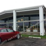
Zinck’s Fabric Outlet shop
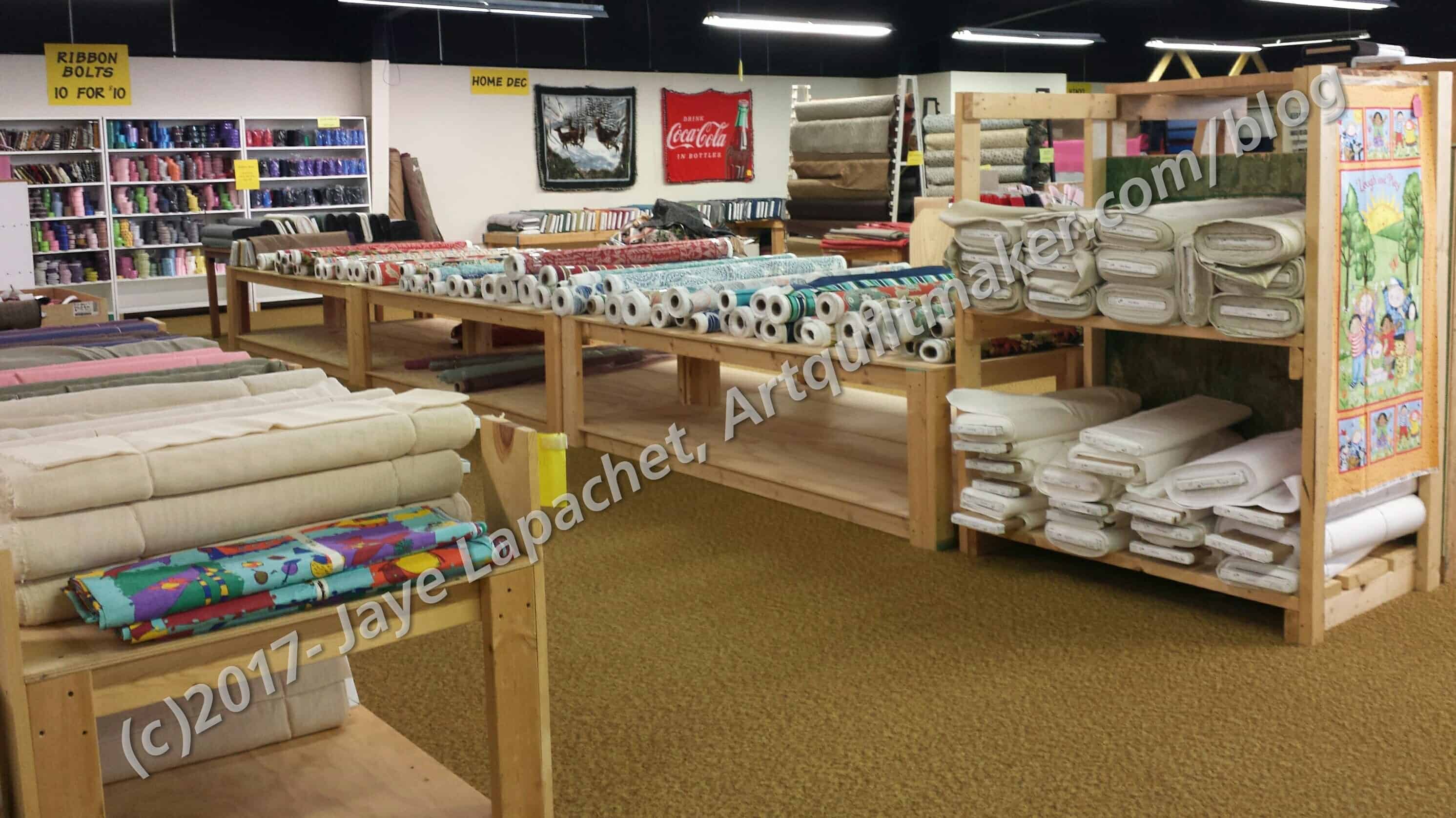
Zinck’s Home Dec
Zinck’s is housed in a former furniture store, so it is LARGE. They have all kinds of fabric including a large selection of quilting fabric. I saw fleece for $1.99/yard and thought of BAM‘s pet bed project. There were a large number of home dec fabrics for $5/$6 per yard with sale home dec fabrics at $1.99 a yard. Can you say Priced To Sell?
Zinck’s quilting cottons
They had a large number of quilting cottons. I wasn’t overly impressed with the quality, so I stuck to fabrics that had a selvedge I could find and recognize. There were lots of different designs, many of which I did not recognize. Lots of calicos and ‘interesting’ novelty prints.
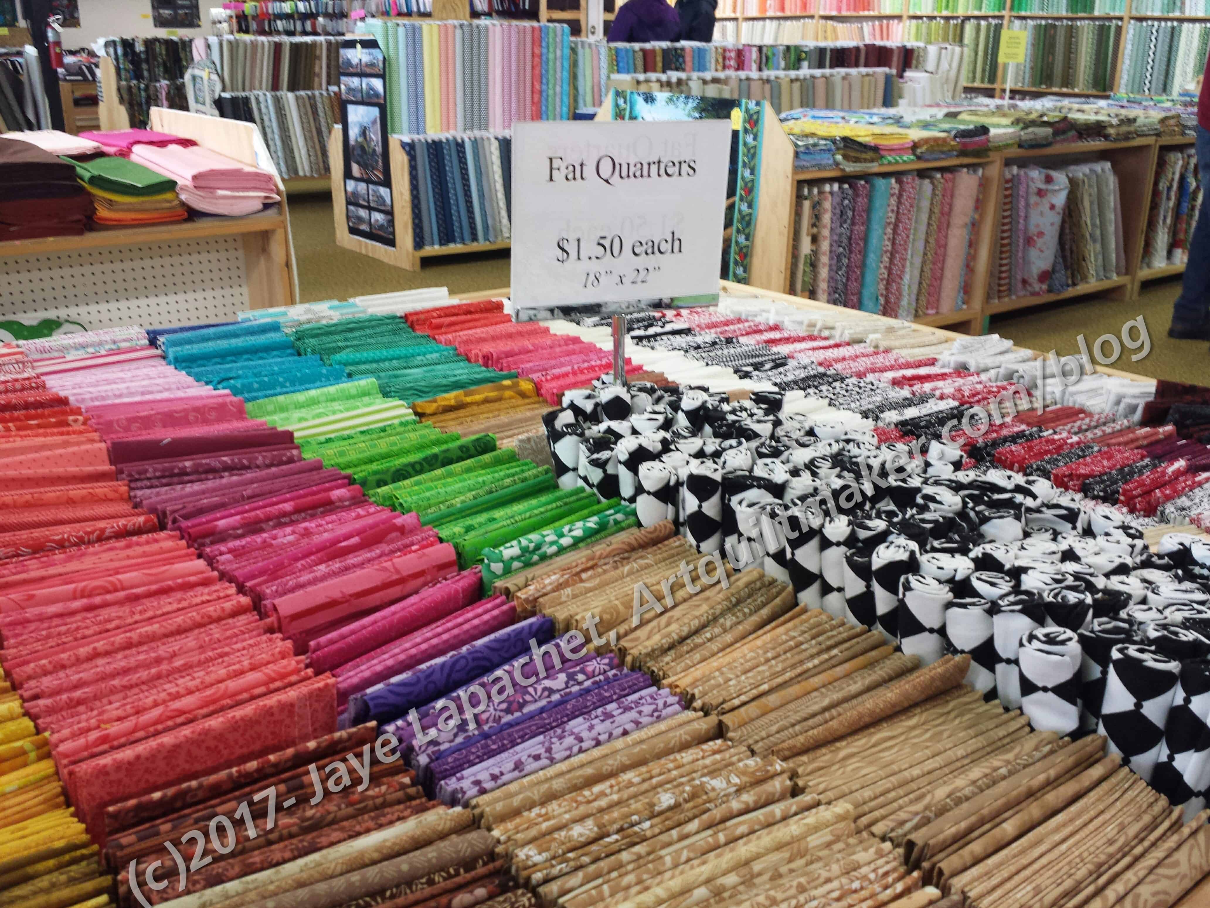
Zinck’s Fat Quarters
There were a large number of fat quarters at $1.50 each. I was determined to find some. When I went over to look, I found that a lot of them were the flat packs. Flat packs have a piece of cardboard inside and a sticker that says made in China. While there were some cut prints, I didn’t end up buying any. The fabric felt like Joann or Walmart fabric and I didn’t like the feel.
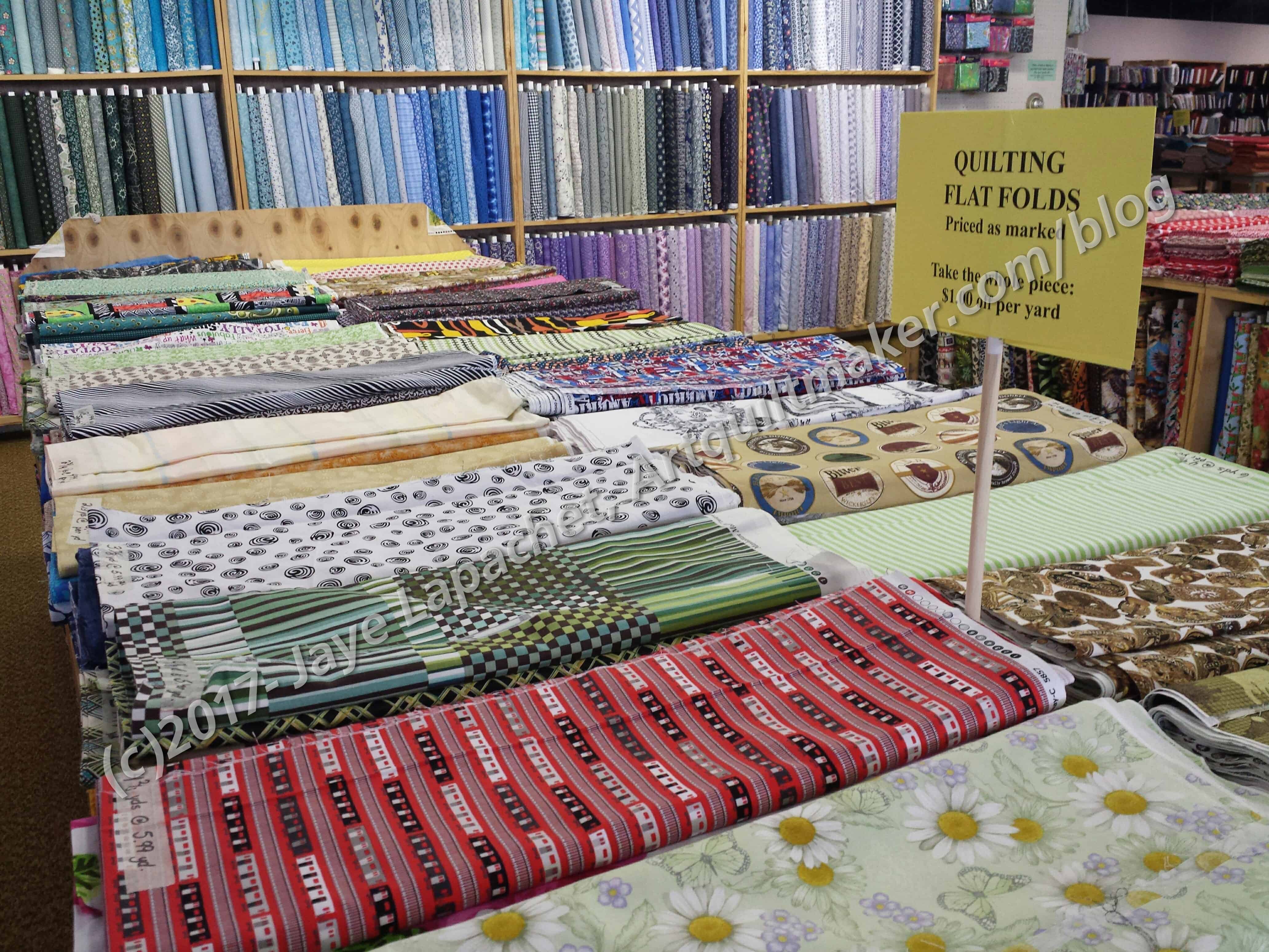
Zinck’s Flat Folds
One interesting aspect of the shop was their flat fold quilting fabric. There were pieces laying on tables consisting of 2-6 yards of fabric. They would cut pieces off, so if you wanted only a half yard, you could get that. If you bought the whole piece, however, they would give you a dollar off PER YARD! If you need backs, this is the place to go.
The store had knits, flannels, various polyesters, suiting fabrics and basically anything any sewist would want. If you are on a budget, you should definitely visit.
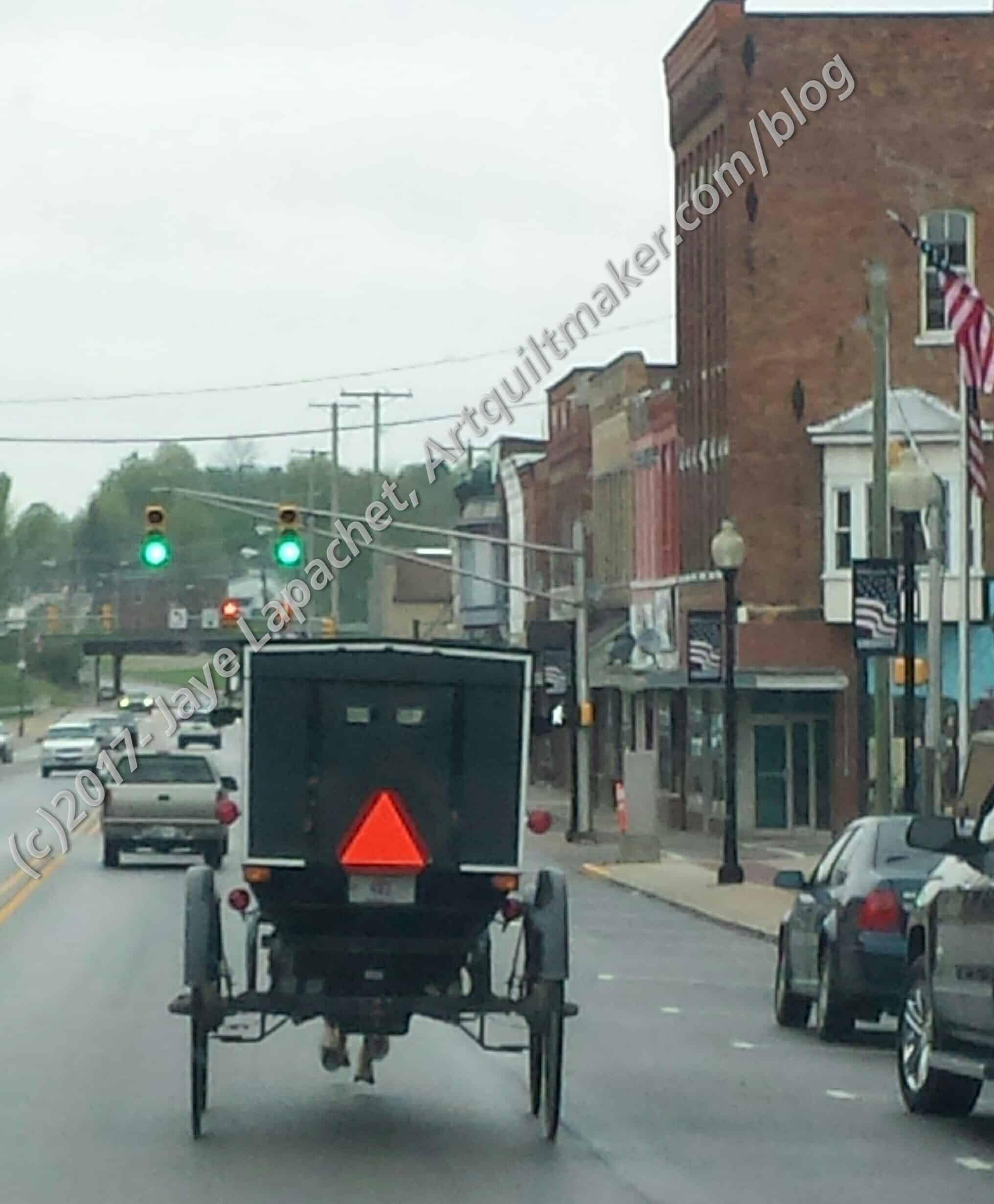
On our way to the next store, we got a little Amish Country ambiance.
Shockingly, the above along with donation blocks and tops is about 50 yards of fabric this year and I am only a little bit in the black in terms of usage.
In Process
The ‘In Process’ is used to denote projects on which I am actively working or pretending to stitch. I try not to put away projects, because that will ensure I never work on them.
Carpenter’s Wheel blocks – The blocks are completed, as you know and I am well into putting the blocks together.
City Sampler – blocks all made. Need to sash the blocks and finish putting the top together. I have the fabric I will use and I have no washed it, so nothing is stopping me from getting going.
English Paper Piecing Project– half hexies – I am still making stars. I am still using the big stack of fabrics I cut over Thanksgiving to make more stars. This piece is a weird shape otherwise I would just finish it and move on. I still a month of traveling with DH and he has plans for other trips where he has no duties, though there is still some negotiation to made on that.
En Provence – Second clue is finished. I have decided to use blue where the purples are in Bonnie’s version. The blues are cut and I just need to sew.
FOTY 2016 – It is still time to start arranging it. I wanted to do it immediately after finishing the Peacock top, but with my design wall issues, I don’t think I will.
Lobster – have more stitching to do and then I need to quilt it.
Octagon 9 Patch: ready to put together. Not sure what I am waiting for. Another leaders/enders project or do I want to lay out the blocks more carefully?
Under the Sea: class project; like the design and am happier with the colors. I haven’t worked on it since February.
Still WIPs
I still have WIPs. Who doesn’t, after all? A project in the ‘UFO’ category means I am stalled. A nicer way of saying UFO is a WIP. The list is a lot shorter and the projects are newer, for the most part.
Aqua-Red Sampler – I need to lay the blocks out and put the piece together.
The Tarts Come to Tea: I still haven’t worked on this since April 2011, though, I did bring it to the 2017 CQFA Retreat as a potential project. It is still in a prominent location so I have easy access.
Pointillist Palette #4: Fourth is a series of 6 quilts; needs tiny square patches sewn together. No progress.
Pies and Points from Victoria Findlay Wolfe class. No further progress. I did wash the background fabric I found when I went to Portland, so I am ready to cut. I need to focus on this and it is not up high enough on the list yet.
Self Portrait: started in 2006 at a class at Quilting Adventures in Richmond, Virginia. My career counselor breathed new life into this project for me. She asked a simple question and the end result was inspiration for this piece, but I kind of lost steam again after printing images on paper to try out different designs. Lately, I have stopped feeling like I need to finish this piece. I am not ready to give up on it yet. I think it really needs major surgery.
Thanksgiving tablemat – I started quilting this piece at the 2017 CQFA Retreat. I made good progress, but it isn’t finished yet.
Theoretically, the Tarts Come to Tea is in the quilting process, though I haven’t worked on it in a while. It did come with me to Retreat and almost made it high enough on the list to get some love.
Binding
None
Hunting and Gathering
30 Something: I am still cutting 1.5 inch squares. I am pretty sure I have the 800 I need, but I am not ready to sew these yet, so whenever I have a chance I cut more. It will give me choice when the time comes. I’ll have to think up a new name, too.
Blue Gradation Quilt: cutting 2.5 inch x 4.5 inch blue rectangles
Blue Lemonade: cutting blue, green, purple 2 inch squares. I am going to use these squares for En Provence, so I will need to cut more, I think.
Pink Gradation Quilt: cutting 2.5 inch x 4.5 inch pink rectangles
Spin Wheel: really not started, but supplies gathered. I probably have enough fabrics and just need to decide to start.
Windmill quilt: Still hunting and gathering. I am supposed to be cutting a variety of greys for the background. I bought a new template, so I should be able to get going again
Other
Stepping Stones #3 using the Macaron pre-cuts from Hoffman. I have all the fabric in pre-cuts and am just waiting for space (and desire) in my schedule.
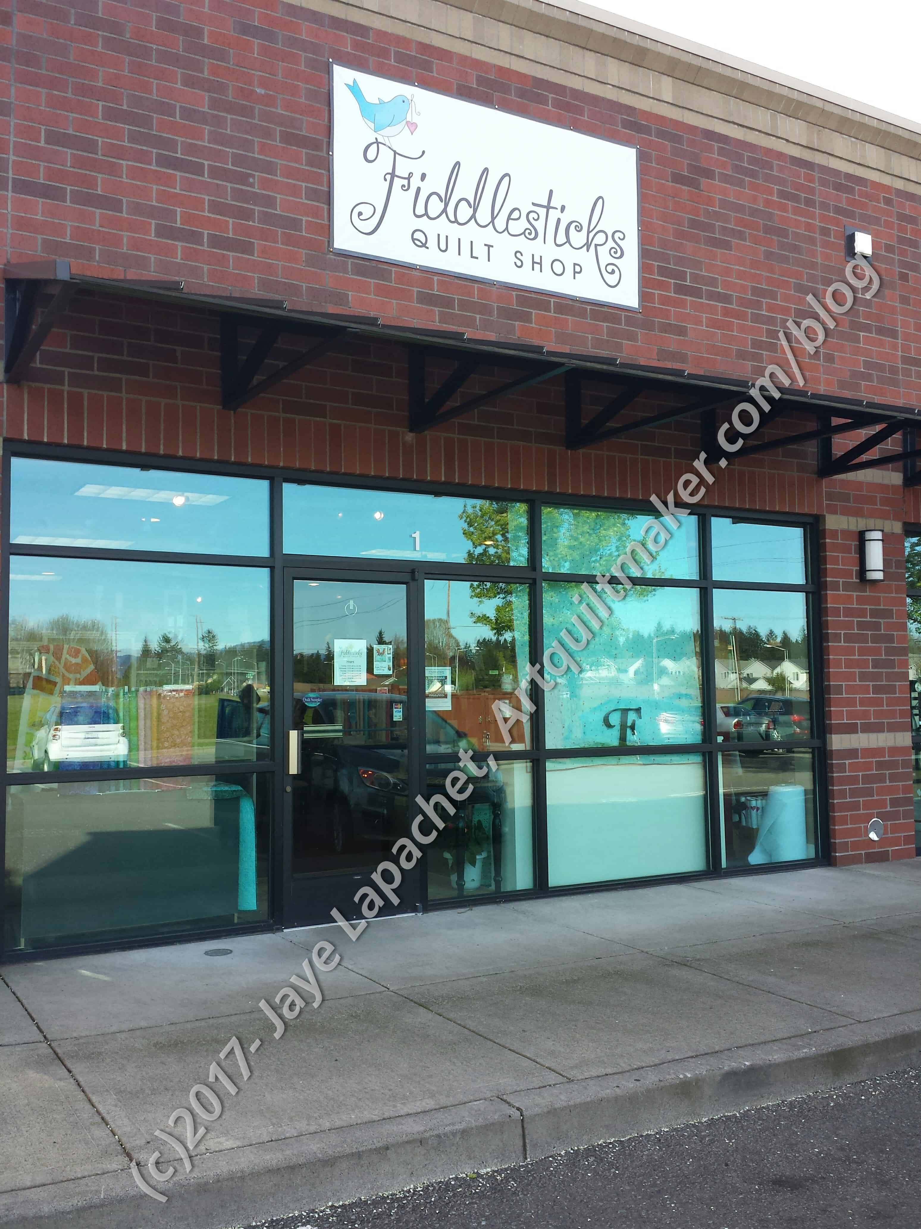
Amanda and I didn’t feel like we were quite done with our day of fabric-y goodness, so she suggested that we head to Vancouver. I always think of British Columbia when I hear Vancouver, but, of course, Amanda meant Washington. The shop we visited was called Fiddlesticks.
Fiddlesticks Quilt Shop
We actually stopped at another store first, but it was closed, though all signs, including Google, suggested that it should be open. Not closed forever; just closed that day. It didn’t matter, regardless of how much I would have liked to see another store. Fiddlesticks was a great stop. I bought a couple of items, specifically text fabric for the Carpenter’s Wheel backgrounds.
Fiddlesticks: repro area
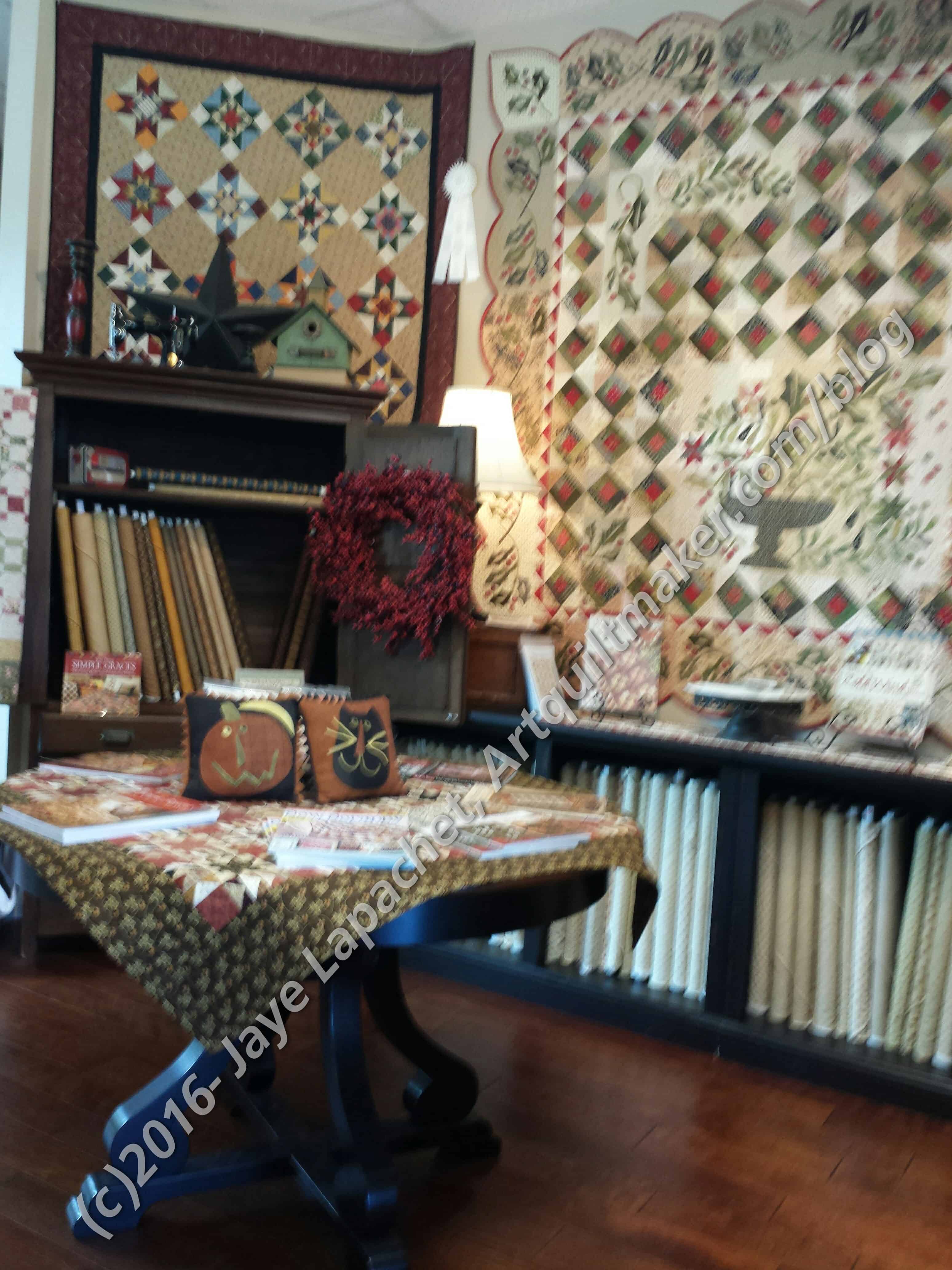
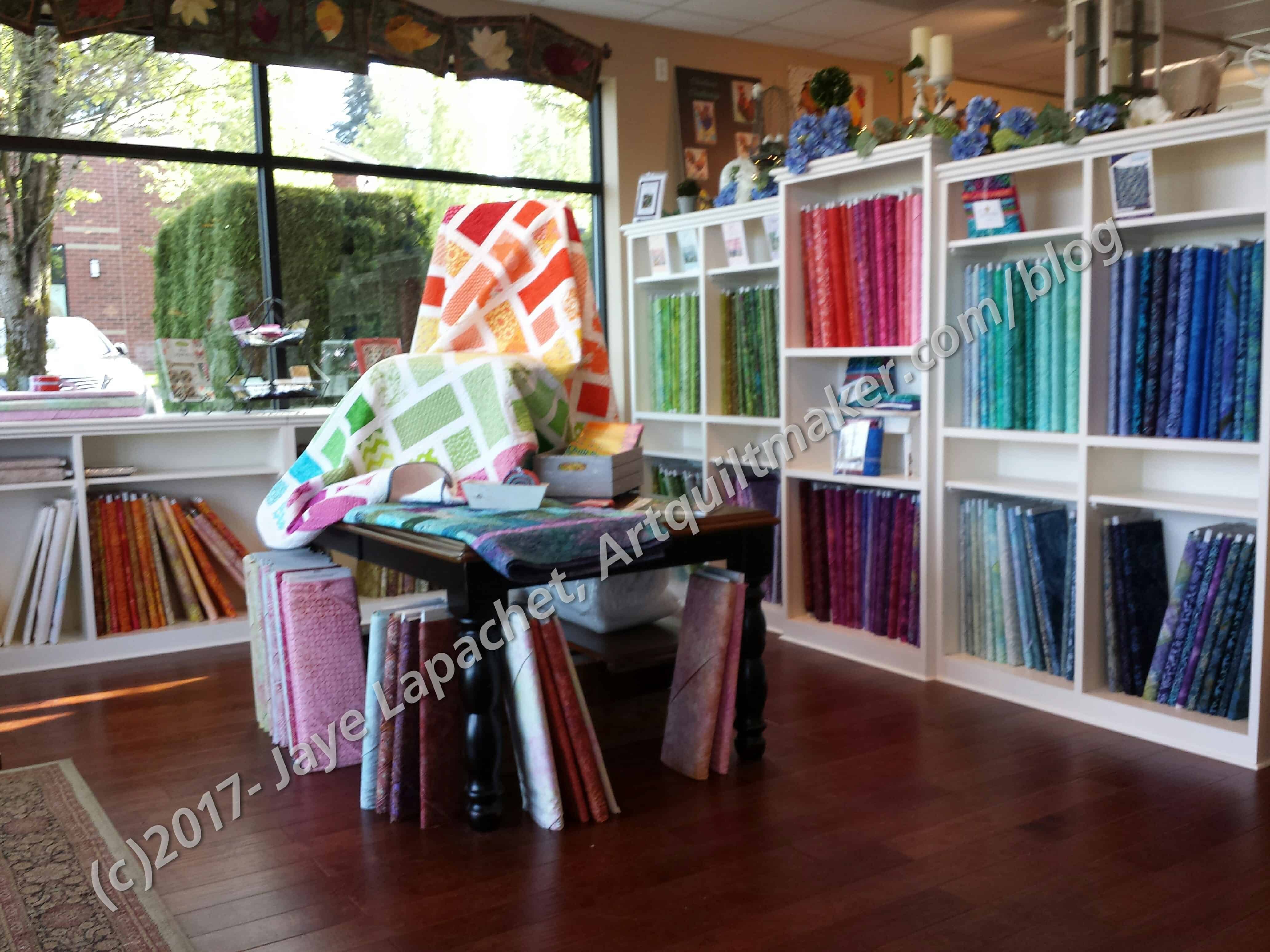
The store was light and airy. Some of the shelves were white, which is very appealing to me. I also liked it that the shop catered to a lot of different types of quilters. Modern Domestic was fantastic, but quiltmakers specializing in reproduction quilts would find nothing of interest there. There was a small area highlighting these types of quilts, catering to these quiltmakers at Fiddlesticks.
There were other areas that catered to specialty interests of quiltmakers.
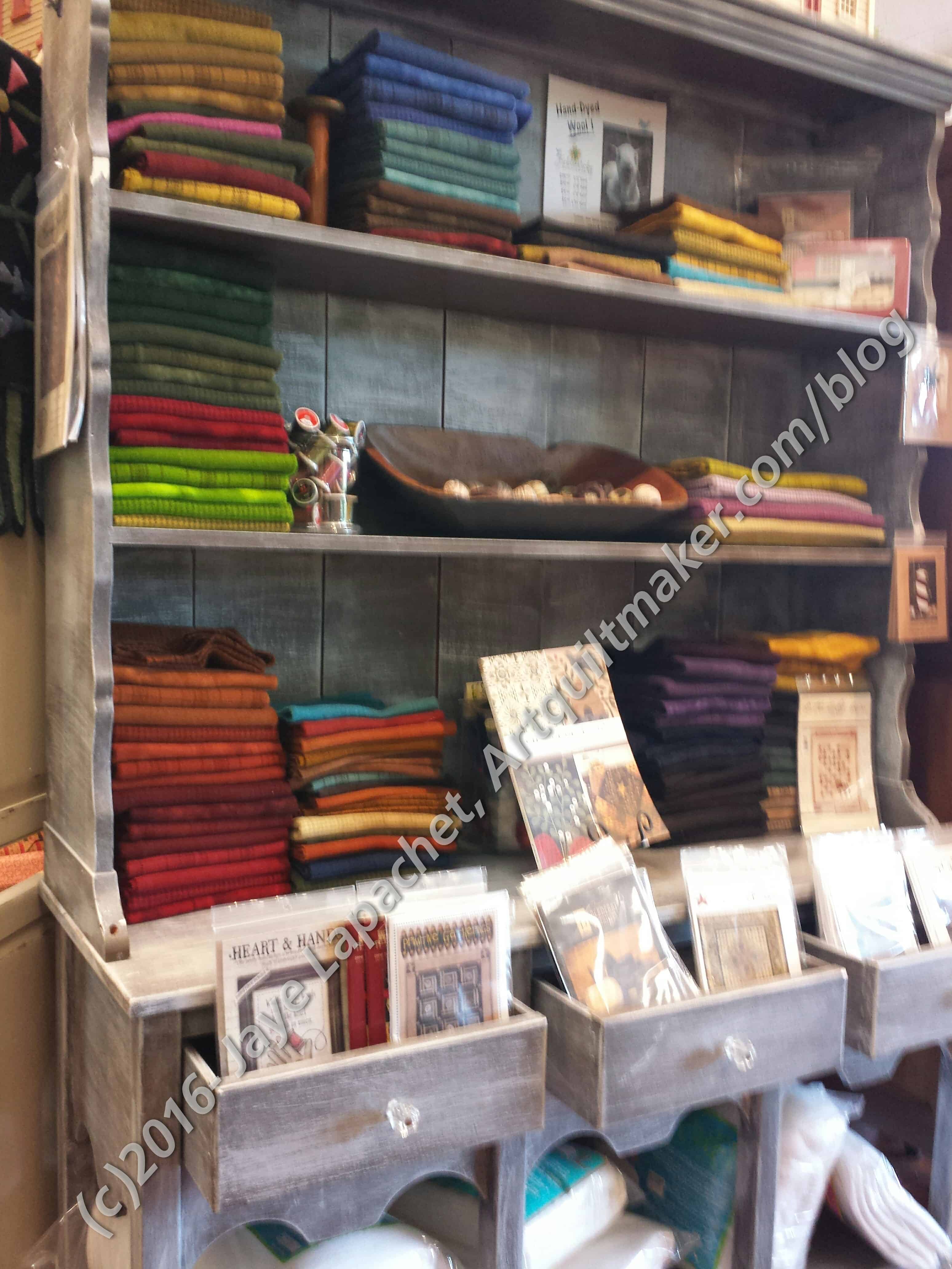
Fiddlesticks: Wool Felt Project AreaFiddlesticks: Front of the Store
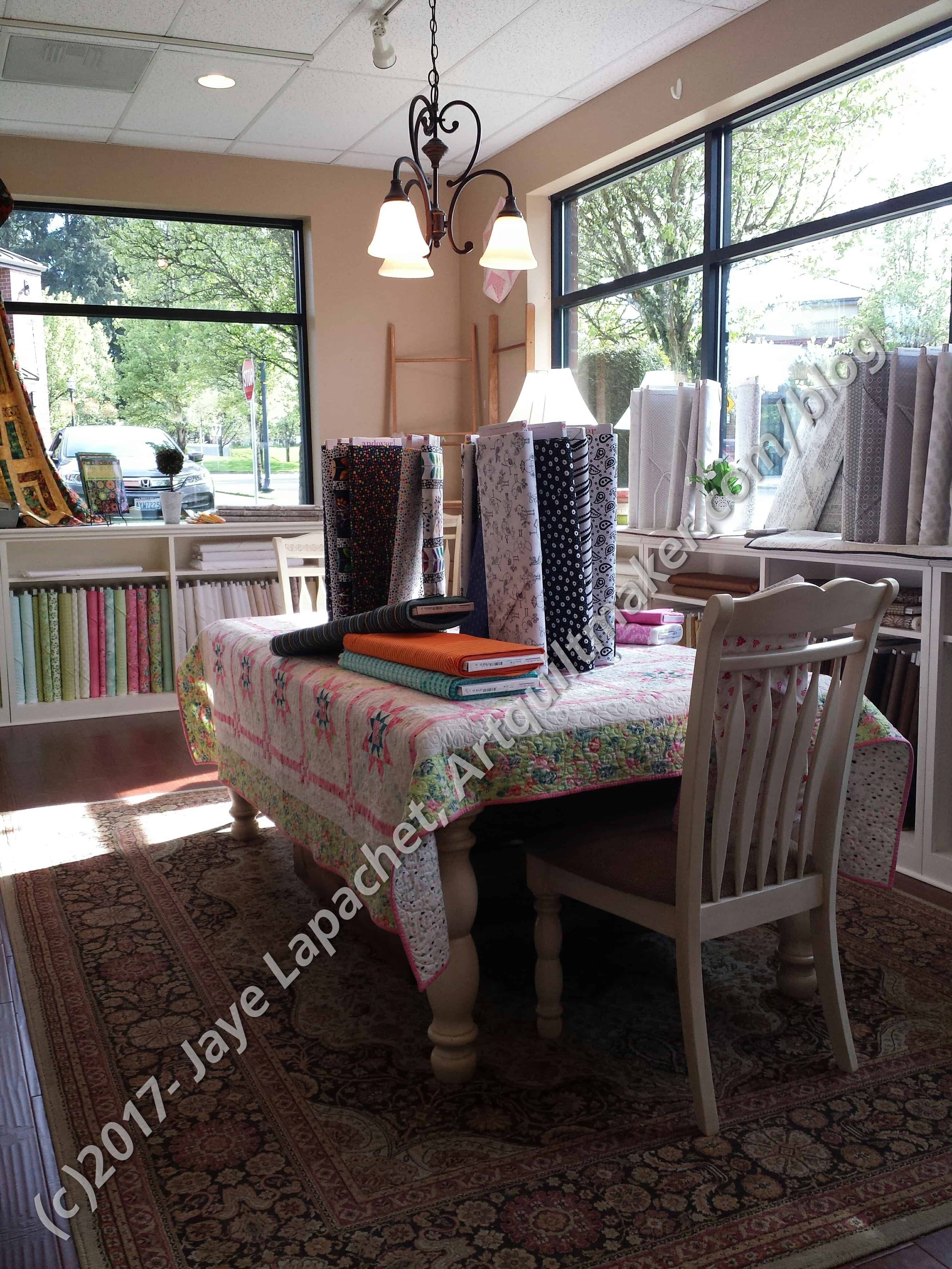
As I said, the shop was open and airy. This came partially from large windows and white paintwork, but also from the apparently new building. The shop was in a strip mall, but not a nasty, low rent strip mall. It was a nice, clean brick building across from a lovely open green space (probably slated for redevelopment, but nice and green right now).
Fiddlesticks: Catch-all Area
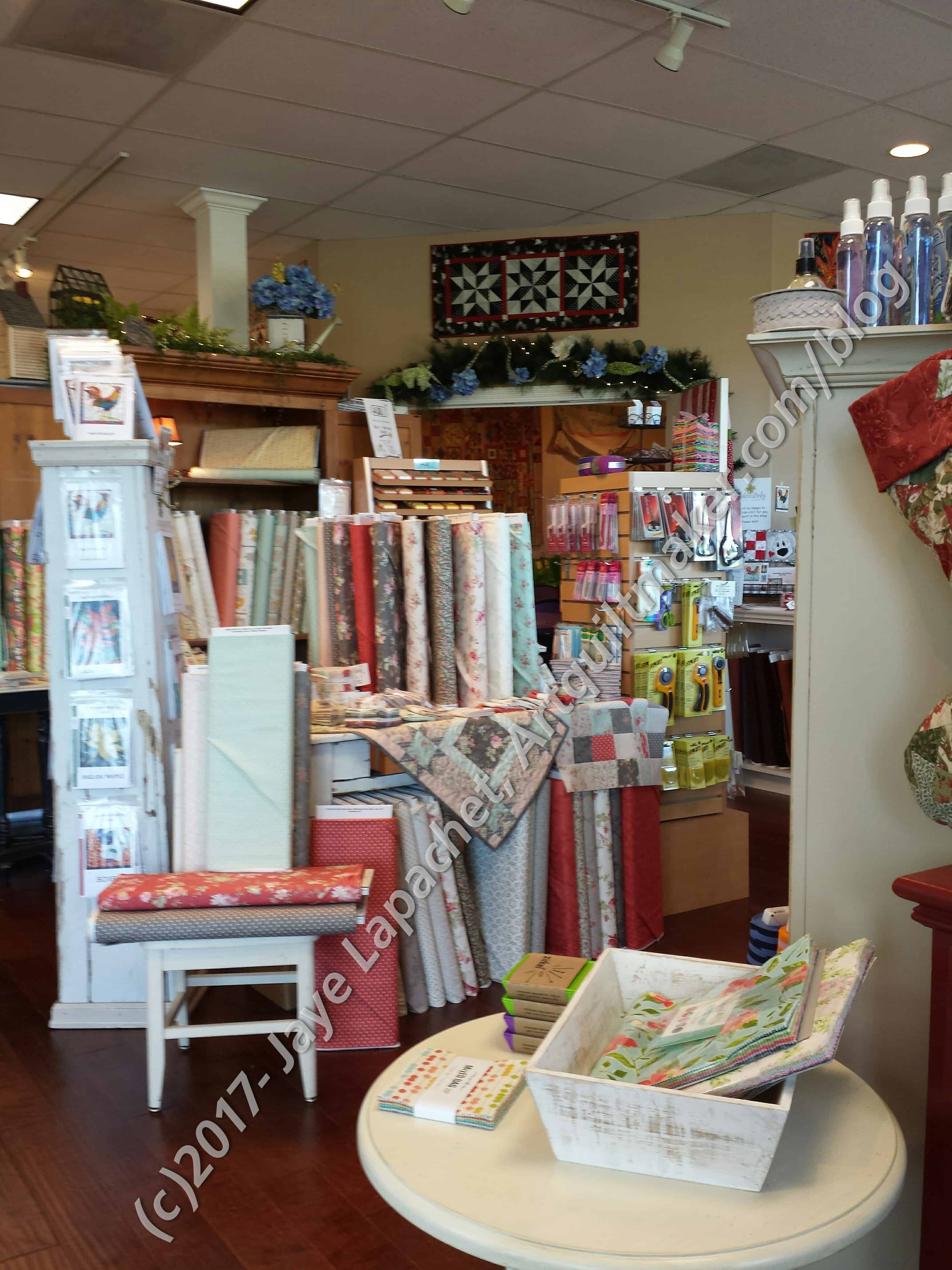
They had a lot of bright and cheerful fabric. I found lots of batiks and other current fabrics. There was a great catch-all area with charm packs, current tools and notions. Fat quarters, layer cakes and charm packs were everywhere.
I looked at the Lulu Love by Cory Yoder charm pack at several different stores, including this one. I didn’t end up buying it at this shop, but I did eventually buy it in Indiana (more on THAT later). The Lulu Love colors and Moda fabrics were very much in evidence at Fiddlesticks.
The other thing I liked about Fiddlesticks was that it was very clean. They seem to move their merchandise, which I can appreciate.
Fiddlesticks: Back Area
My favorite room was in the back. It had the Kaffe Fassett fabrics and the text prints. There was one Kaffe Fassett print that I almost bought for another tunic or a dress. I have a few pieces at home waiting to be sewn, so I held off. I was sorely tempted, however. I love those large flower prints!
Fiddlesticks: Back Area 2
I saw the Moda text prints that I originally got in mini-charm format for the first time as yardage on bolts. As weird as it sounds, it was interesting to see the various designs that way. Yes, I bought a few pieces for the Carpenter’s Wheel backgrounds.
Fiddlesticks: Longarms
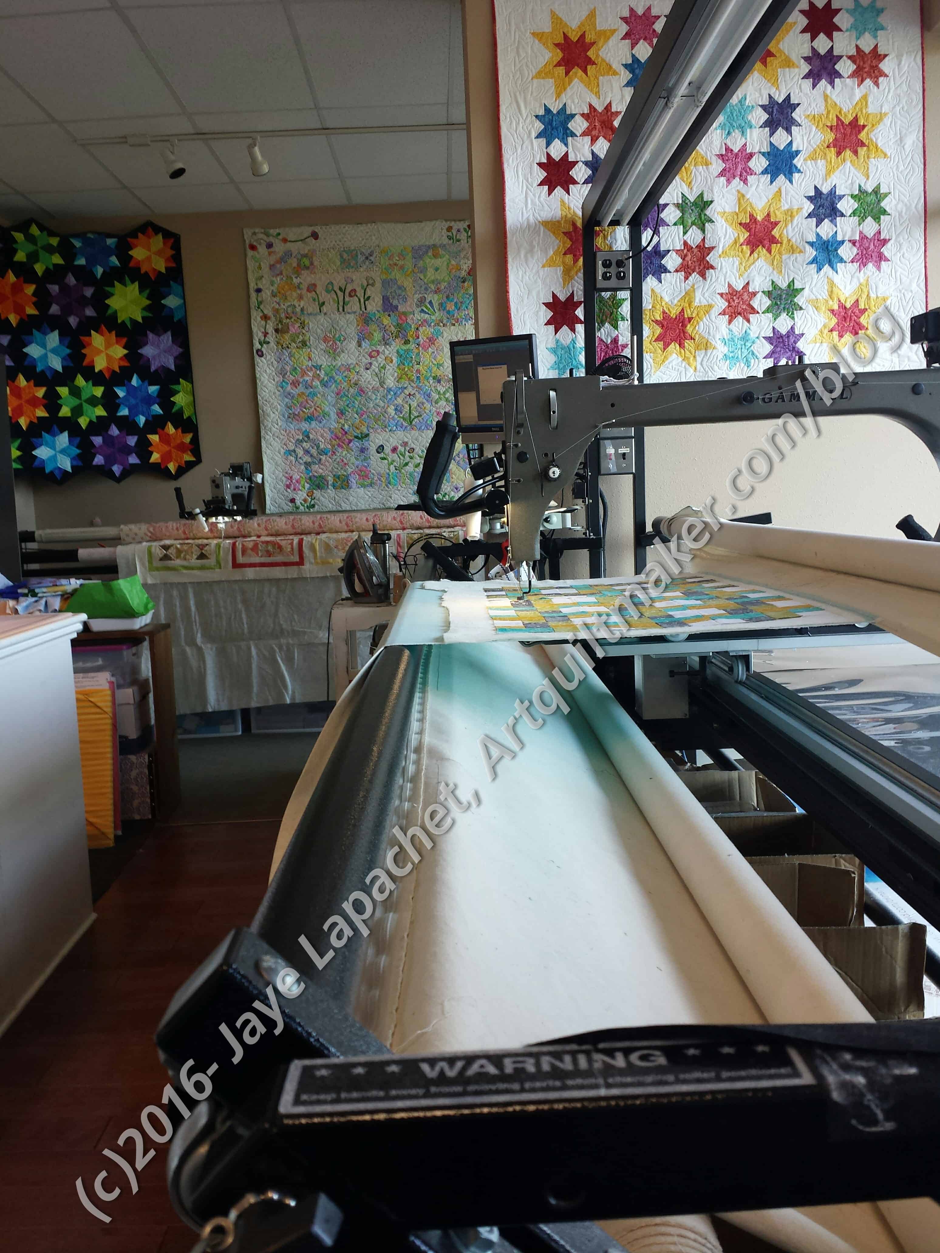
The amazing thing about this shop was that they have 2, yes TWO longarm machines. It was interesting to see them in situ. One was working while we were there. I didn’t ask any details, but it looked like the machine was doing some kind of pantograph.
I liked this store and I would recommend a visit. It is an easy drive from Portland.
Modern quilt block library by AnneMarie of Gen X Quilters can be found on her block. Great and interesting block ideas.
Have you seen Yuliya Reshetnikova’s work? I found her on IG and then went to her website to look around. Her website is in Russian, so it is a good thing images are universal. What drew me to her first was her Oddfellows blocks. She chooses fabulous fabrics and does a great job fussy cutting. It has a lot of pieces (which you know I can’t stay away from) and reminds me of my Carpenter’s Wheel blocks. I might need to make some of these blocks. 😉
THEN I saw her Dear Jane blocks. She is making them from Kaffe Collective fabrics. YES! Including my man Phil’s fabrics. Oh what a great idea. I have often thought of making a Dear Jane quilt using modern or more up to date fabrics, but never had an idea that made me really excited. This does, though I would be copying someone else’s idea. Good to know I can still get excited about Dear Jane.
Judy Martin is still one of my favorite quiltmakers. She has such great patterns and her advice and pattern writing is supreme. She may not be considered a modern quiltmaker or au courant, but she keeps putting out patterns and books that are suitable for all levels and all fabrics. Her Celtic Squares Deluxe quilt pattern would be gorgeous in modern fabrics and has a lot of background space for quilting. She has a new venture: e-books and patterns, which means you can order and receive your purchase immediately. Check out her new site. You can also get a sneak peek at her new Lone Star book. Some of the variations she shows are fantastic. Not stodgy at all.
Pat Bravo is hosting an EPP Party and it starts today. Check her blog for all of the details. It is a good way to dip your toe into English Paper Piecing without committing to La Passacaglia. The EPP Party will run for 24 weeks providing 1 block each other week, so plenty of time to learn and finish your blocks. This post also provides a list of supplies and says that the first block comes out May 1. Of course there will be prizes.
Moda is having a challenge called the Moda Bella Challenge. The idea is to celebrate Mark Dunn’s love of color and passion for textiles. The piece must use certain Bella solids and have a contemporary feel. Full details are in the PDF. There is also a blog post written about the challenge on the Moda Cutting Table. I wasn’t that enamored of the colors. Some are okay, but the primaries are a bit too nursery-ish for me and the selected fabrics are the only ones that can be used. I have a idea in my mind, but since the selected fabrics are the only ones that can be used, I am not interested in spending the time. The first prize is $5000. All the prizes are purchase awards.
Fabric, Notions & Tools
Jennifer Paganelli is a fabric designer favorite. I see her designs as consistently appealing. Her latest offering is Sunny Isle, which is so pretty and definitely goes with her other lines, such as Queen Street (the fabric I used to make the Improv Round Robin).
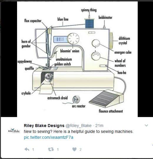
I just started following Riley Blake on Twitter. They post very clever tweets, also useful tweets. One recent one was a yardage card.
Inspiration & Other Artists
As you may have seen, if you have spent any time in my Gallery, I have a small series of political quilts. Politics are hard, because people feel differently about politics and very strongly. I am politically active, but in a quiet and personal way. I don’t talk much about politics, not because I don’t want to talk about them, but because I don’t want to get in a fight with people. I don’t think, in general, we know how to have a civilized conversation about politics. Lately, I have been feeling the urge to make another political quilt expressing my concerns. I haven’t quite figured out what to make. Then I saw my friend Sarah’s quilt. Sarah Ann Smith made the quilt that I want to make for this year. She wrote about Speak Up, Speak Out on her blog a couple of days ago. It is a homage to our right to demonstrate peacefully. It also has messages that are relevant. I really like it.
I saw an ad for beautiful cards on Instagram. One was a lovely in bloom cherry tree. Another was a wonderful cherry pie. So clever. They also have a 5 pack in case you have need of five Mother’s day cards. 😉 The cards are pricey and I would use them more for inspiration than sending one to someone who would just toss it out.
I saw a photo on IG and immediately translated it in my head to a quilt design. What do you see?
I have been thinking about a Jack’s Chain quilt for a long time. I remember seeing a sample at the Cotton Patch when I first started quilting. Recently I saw a super upgraded and upsized version on IG that really excited me. It made me think of my recent review of the New Hexagon.
Friend Mary turned me on to Sotak Handmade. The site has a great look and lots of interesting projects, tutorials, links and fabric. I haven’t had much of a chance to surf the site, but do like the Olivia pouch and the grocery bags.
Feedback & Surveys
If you want to have a say in what videos Sara from Sew Sweetness, creates, now is your chance. She has a short survey that allows you to do just that. All I could think of was techniques she uses in her patterns such as sewing inside pockets. I also said that she would do well to think of producing the videos in such to help us think about using the technique for other patterns.
I talked about my trip to Portland in a previous post. I went to a couple of shops for a second time and I want to give brief updates. I went to Bolt again. It is a very sharp contrast to Modern Domestic. It is small, more jammed with fabrics and their aesthetic is really different. i didn’t enjoy as much as I did last time, but I don’t think it is a bad shop. I think I was coming down off of a different aesthetic high. I found some great text fabric I plan to use as the inside of one or two Poolside totes.
I also went back to Cool Cottons. I love the neighborhood it is in and the house where it is housed. The fabrics were also really great, though not as fresh as I was hoping for. I found some more text fabrics and a Blueberry Park I couldn’t resist.
It is hard to know what is a good expectation and what is unreasonable. when I go to shops out of town, I really want to see fabrics and notions I haven’t seen before. I want to take a advantage of the different perspective of a different location. I feel like that expectation might be too much. Still, I don’t want to see the same old-same old. I guess the thing is that shops have to move their fabric through and out and that requires some marketing savvy, knowing the customers and increasing foot traffic. It is hard for a small business owner to be all things.