I was thinking about my WIPs last Sunday as I tried to adjust to the horror that is Daylight Savings Time. There is a lot of chaos in my head about projects lately. I couldn’t figure out why until I realized that I had too many leaders and enders projects and not enough front burner projects.
At the moment my leaders and enders projects are:
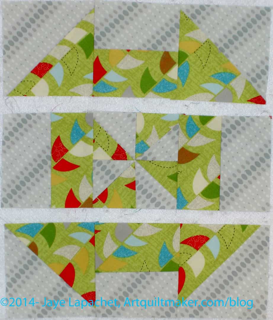
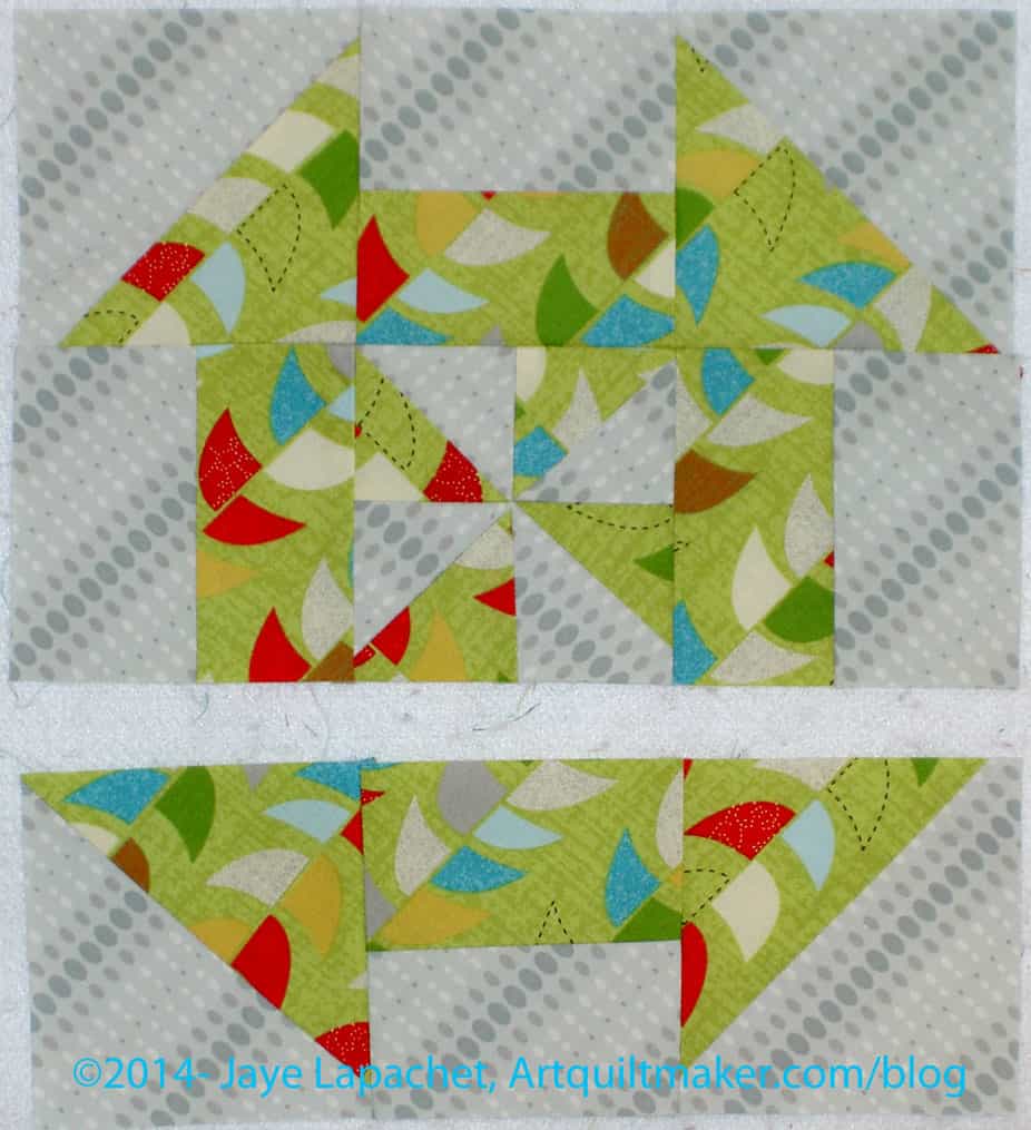
The Disappearing Pinwheel
Black/grey donation quilt
Brown mosaic piecing
I really was quite happy with the progress I was making on each of those projects when they were the only leaders and enders project on which I was working. Then I finished Scrapitude and all I had with a quarter inch seam allowance were leaders and enders projects. Now none of them are looking very appealing.
To make matters worse, the Scrap Lab Backpack, as I mentioned, uses a 1/2″ seam allowance which requires a different foot, so there is no progress being made on the leaders and enders projects.
I tried to work on the DPW as a front burner project and I just wasn’t as happy. I like that project, but it isn’t exciting enough to be front burner project. This is the moment when projects get derailed. I don’t want to replenish my UFO list so I need to power through these projects and get them done.
Some weeks ago, I saw a backpack in the Scrap Lab article in an issue of Quilts & More. The pattern is also on the web on Allpeoplequilt.com. It captured my attention in a “hhmmmm interesting” kind of way. After meeting a young friend at one of DH’s events, I decided to sew it for her. I wanted to make it, but I didn’t want to keep it, so this was a great solution. The Fat Quarter Shop, at that time, had a fabric kit (no hardware), which I bought.
Scrap Lab Backpack Bag Body
Last weekend I started on the project. It has a lot of steps and the directions were not always completely clear *to me*. I know magazines have limited space.
The pattern calls for fat quarters to create the bag body. That is what came in the kit. The pattern also said that I should cut 2″x21″ strips from the FQs. The problem turned out to be that the FQs were not 21″ wide even before I squared them up. It made no sense to me since that is what I understood the whole point of the Scrap Lab is – to use a small amount of fabric. I worked at adjusting all the measurements to accommodate this problem.
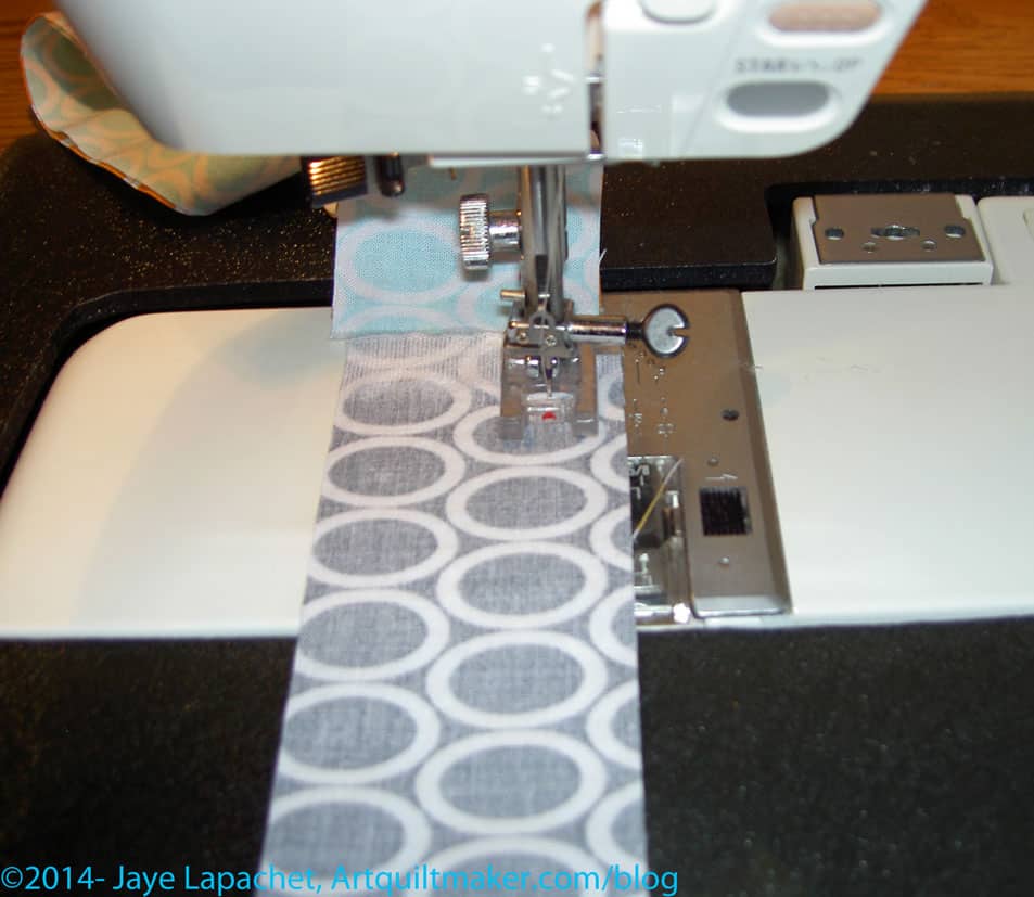
Sewing Strips
The backpack requires two panels, like the one made from strips (shown above). In order to keep the strips in order, I laid them out on my design wall and sewed them in order. I found that, in order to keep them in the same order, I had to sew them in the same order, but upside down. For example, I always placed the strip I wanted to end up lower on the panel on top to sew it.
I was further disappointed when I also found that the half yard of background was not enough for all the pieces that needed to be cut. I am not sure if I cut wrong. I didn’t see a cutting layout (like they have in garment sewing), so I cut the largest pieces first, but still did not have enough. Shifting gears deftly, as I did not what a ‘lack’ of fabric to derail the project completely, I chose a different fabric for the pocket, which will look nice and will solve that problem. All in all these fabric problems were unexpected and, as I said, disappointing.
I worked on it on Sunday this past weekend. It has a 1/2″ seam allowance, so I couldn’t really make progress on my various leaders and enders projects without the 1/4″ foot on the machine. That was a little frustrating.
I did make good progress on the backpack, though. I have the straps and drawstring done. I have the bag outside and the lining done. I wasn’t able to finish it, because I didn’t have a slider buckle/triglides. I also didn’t really understand what they were even after searching out a photo on the web.
The slider buckle/triglides turned out to be pretty hard to find. I found some nice ones in the UK and Australia. Amazon has packs of 50. My local Joann and Beverly’s had none. ERGH! Monday, after work, I went to Britex and they had them there. They usually have weird stuff like this. With bags being so popular, I was surprised that these were so hard to find.
It was good that I went to Britex, though, as the people there actually know something about what they sell. We looked at our own bags and the pieces I was thinking of buying and kind of talked through where the parts went on the bag. It was a good experience.
I think I have said before that I prefer to make all the fiddly pieces first – straps, pockets, etc. This pattern is not written that way, so it was a little hard to backtrack and make the straps and drawstring when I was on a roll with getting the larger pieces of the bag done.
There were some directions on the pattern that were confusing or poorly explained. I was able to figure out making the pocket, even though I wasn’t familiar with the type of pocket. Once I figured out that it was a 3D pocket, I thought the method was clever. The pattern leaves the inside edges raw. The method could have been improved somewhat by finishing the inside edges, which I did even though the directions didn’t say to do it. The location of a 3D pocket is a little odd, I thought, as whatever you put in it will pull the whole bag down from the shoulders.
I had some trouble applying the pocket to the bag. The directions just say to topstitch the pocket on to the body of the bag. They do not take into account the corners which are multiple layers thick. Since the pocket is 3D, I could have used some more detailed directions and additional photos on going around the corner.
I also thought the pattern on the web did not use the web to maximum effect. I would have had the PDF, as they do, since it is easy to print. I would have also linked out to videos showing how to apply the pocket, how to add the grommets and other handy hints. These videos could be used over and over for many different patterns and would drive traffic to their site.
It could be that this pattern was perfectly written and the problems were all user error. I am a visual person and learn better with lots of pictures and when people show me how to do something.
I was determined to make the Scrapitude back this past weekend. In order to do that I had to finish the label. I had some time on Friday night and used it to make the label and order some rotary blades.
Rotary blades, you ask? What do they have to do with making a back? There are some tasks that are not hard, but they can interrupt the flow of sewing if you have to stop and do them. I have been trying to identify these tasks and put them into slots of time that are not suitable to sewing.
Making labels, making bindings and ordering rotary cutter blades are three of those tasks, which I have identified so far. I figure that if I put them into these odd slots of time, I’ll get more sewing done. It’s a theory anyway.
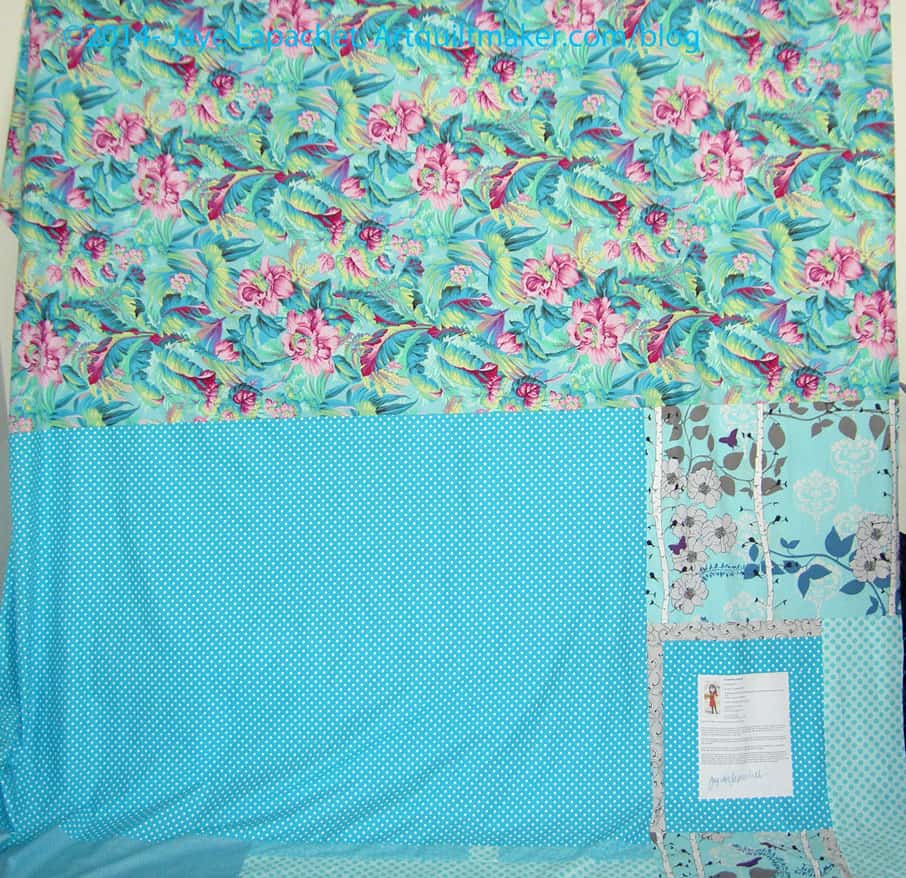
I wasn’t up to sewing a lot of small pieces together, so I tried to find some larger pieces of yardage. I found the large piece of Philip Jacobs. I knew I had a large dot piece that I liked with it, so I found that as well and went from there. I always have to piece a bit around the label, but I found that bird and tree print, which was perfect, because I didn’t have to cut it up too much. The trees show up pretty well and I was pleased to see the butterfly. There is something nice about that print and this turned out to be the perfect use for it.
I made the binding last weekend, so this baby is ready to go to the quilter. Yippee!
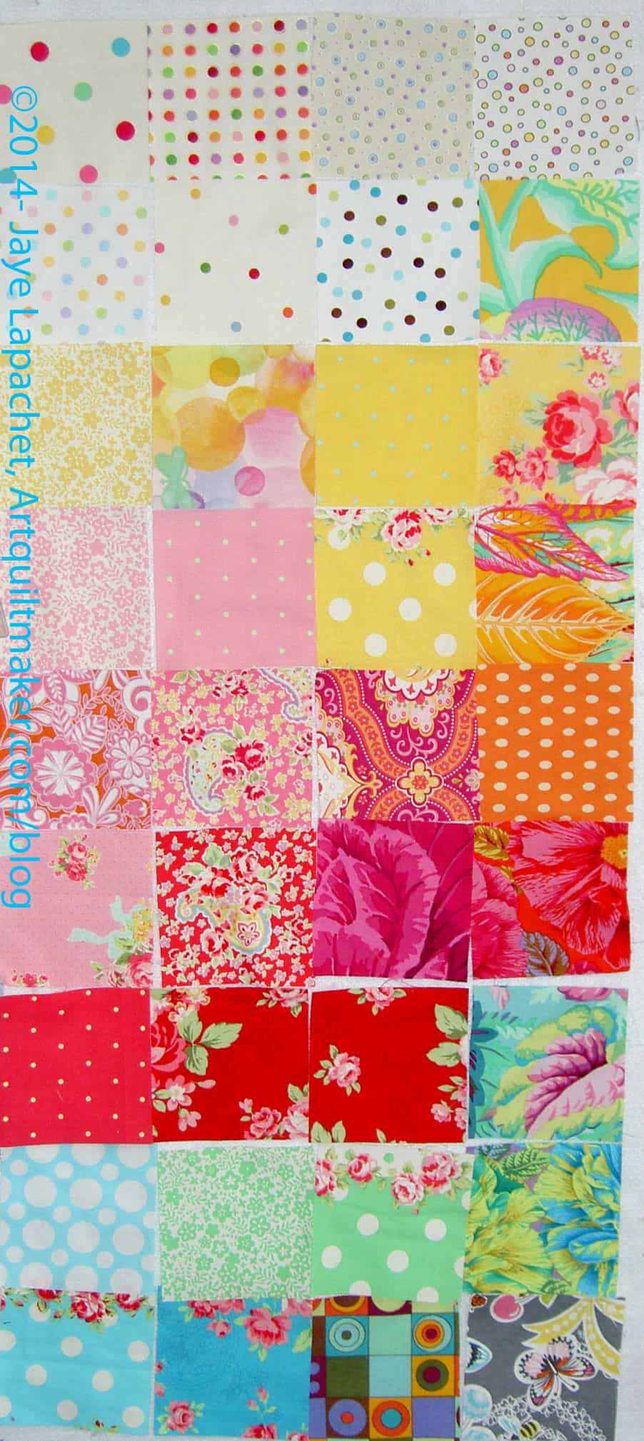
I picked out more colors for the Russian Rubix last week.I’m nearly there. I seem to be inspired to make progress all of a sudden. Perhaps my mind is freeing up from the rigors of other projects. I am not sure why that would be true since I seem to have three projects actively going all at once.
I can’t remember, offhand, where I bought that dark blue. It isn’t quite navy, but it definitely tends towards navy. It is darker and more primary than the other colors I have selected so far, but somehow I like it. I think it goes well with the selection of colors already in the pool.
It has taken longer this year to get to this point. I didn’t have the Retreat as a firm deadline. I decided that I had to create a deadline and few pieces of fabric I had washed, but not pressed provided the deadline. As soon as I took care of those, I closed the collection.
I haven’t sorted the squares, but I have an idea of how I will sew them. I think I need to finish a couple of projects before I start sewing this one. That doesn’t mean that I will put it off forever, but I have to clear my mind so I can spend time on arranging the squares.
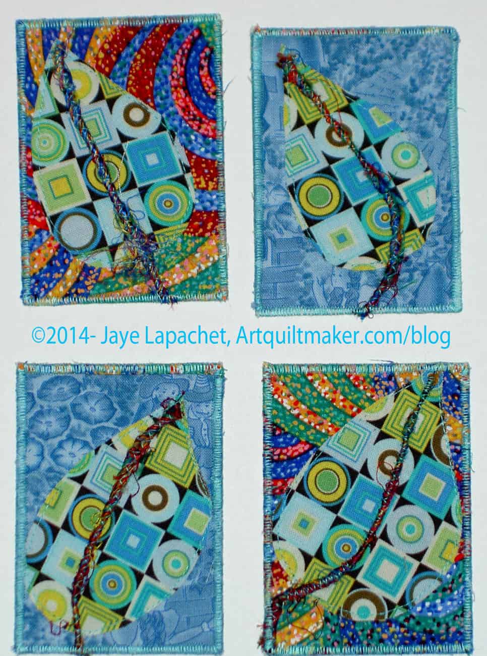
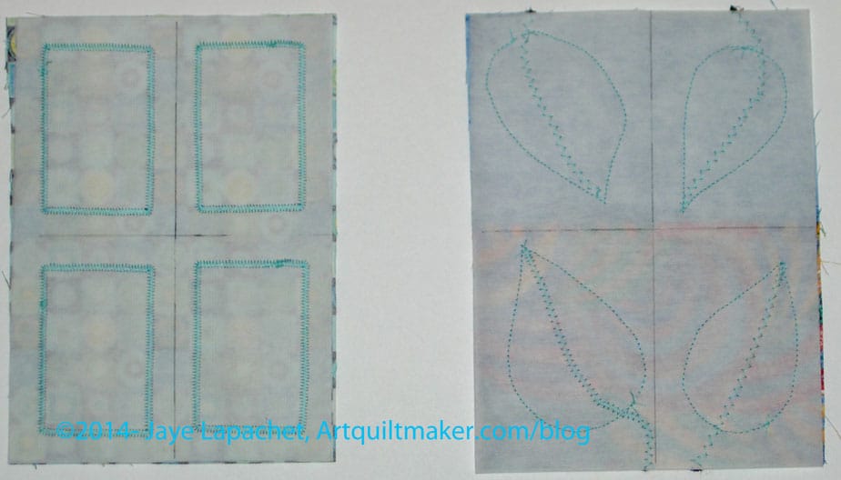
I made some ATCs for the CQFA meeting, leaving it, again, until the last minute. I worked on them on Friday in between starting the process of renewing the Young Man’s passport and some other chores. I really didn’t have an idea, but then I hit on the idea of a leaf and the design went from there. I ended up with something with which I was very happy.
The step is a piece of thick thread or yarn. I only had about a yard of it and now I have, perhaps half a yard. Maureen thought the thread was sari thread. I hadn’t heard of that before and she explained that threads from saris are wound together to make the thread. It is colorful.
I couldn’t find my couching foot, so I used a zig zag to keep the thread on the ATC. It worked pretty well, but I need to practice more.
The background is from the Infinity quilt. It is leftover from the quilter cutting off the sides of the backing. I am sure you will see a journal cover or two along the way as well. 😉
ATC guts
Inside the ATC, I use 2 layers of tearaway stabilizer on both sides. This allows for no wrinkling when I zig zag.
First I make the backs and put the labels on. I do this first, because it doesn’t really matter what the back looks like. It gets me in the mood and gets everything cut. In this case, I used the same fabric – or group of fabric – for the back, front and leaves. You might be thinking that you see different fabrics ont he finished ATCs and you would be right. When I say ‘fabric’ I mean that which has been cut off the sides of the backing of my quilt. Even though there are different fabric designs, technically, it is one piece of fabric to me. I used what was on the end of the leftover backing fabric.
ATC fronts in progress
I tried, really hard, this time to make the corners of the stitching around the labels look really nice. I had to slow down.
They are a little easier to work with when I make them in a group and then cut them apart. I had to take care when lining up the motifs for the front and the back.
ATCs are 2.5″ x 3.5″. You don’t have to make them out of fabric. Some of the ones the CQFA people trade are partially paper. I like mine stiff, thus all of the interfacing.
The Fireplace Project in East Hampton, New York, is a contemporary art gallery that features solo and group exhibitions, and artistsí projects.
Definition: “A fireplace is an architectural structure designed to contain a fire. Fireplaces are used at the present time mostly for the relaxing ambiance they create. Historically they were used for the practical purposes of heating, cooking, and heating water for laundry and domestic uses. A fire is contained in a firebox or firepit; a chimney or other flue allows exhaust to escape. A fireplace may have: a foundation; a hearth; a firebox; a mantelpiece; a chimney crane, used in kitchen and laundry fireplaces; a grate; a lintel; a lintel bar; overmantel; a damper; a smoke chamber; a throat; a flue. On the exterior there is often a corbeled brick crown; the projecting courses of brick act as a drip course to keep rainwater from running down the exterior walls. A cap, hood, or shroud serves to keep rainwater out of the exterior of the chimney; rain in the chimney is a much greater problem in chimneys lined with impervious flue tiles or metal liners than with the traditional masonry chimney, which soaks up all but the most violent rain. Some chimneys have a spark arrestor incorporated into the crown or cap.
With valuted ceilings, exposed beams and a large wood burning fireplace, the Fireplace Room in the Wirth Chalet offers the ambiance of a rustic lodge. An adjacent stone terrace creates the opportunity for your guests to enjoy both the inner elegance of the Fireplace Room and the peaceful wilderness of Wirth Park.
The Girl in the Fireplace is the fourth episode of series 2 of Doctor Who. It was first broadcast on 6 May 2006 and was written by Steven Moffat.
outdoor fireplace
Pixel Fireplace is a cozy, interactive simulation. Type words to interact with the fire or just sit back and enjoy while the logs burn down in real time.
The song Fireplace by R.e.m.
Post the direct URL (link) where your drawing, doodle, artwork is posted (e.g. your blog, Flickr) in the comments area of this post. I would really like to keep all the artwork together and provide a way for others to see your work and/or your blog.
We are also talking about this on Twitter. Use the hashtag #CPP
The Creative Prompt Project, also, has a Flickr group, which you can join to post your responses. I created this spot so those of you without blogs and websites would have a place to post your responses.
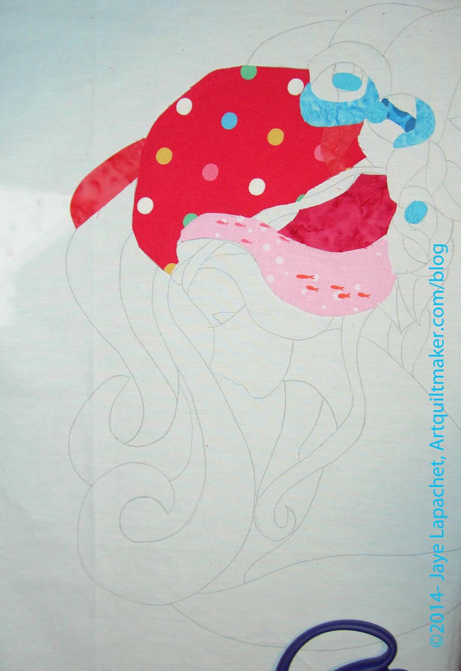
I didn’t think I would actually start with fabric, but last week was a challenging week and I did! I had about an hour before life started in again, so I stood at my cutting table, cut fabric and glued it to my pattern. Having a limited amount of time was good, because I didn’t get overwhelmed with the thought of starting.
I know she looks like a big helmet haired weirdo, but I promise she will get better. I am putting all the dark pinks on parts of the hair that are supposed to be farther away and lighter fabrics on hair that is supposed to be closer. That is what my research told me to do, so hopefully it will look ok.
I am making the roses (perhaps some other flower, but I think of them as roses) blue and am working with the same principle.
So far all of the fabrics are from my scrap bin.
Two products you MUST try: Karen Kay Buckley Perfect scissors and Sewline Glue Pen. DH bought me the scissors for Christmas. I don’t do much hand work and thought this would be a great project on which to use them. It is! They are a fabulous tool! They are sharp and precise and you absolutely need them. I recently spoke about being interested in the Sewline Glue Pen. I came across one and bought it. Again I thought it would be good for this project and, again, it is perfect. The glue is just sticky enough to keep the pieces down. It is also very smooth, so it doesn’t pull as much as a glue stick. I feel like I got a lot done in a short amount of time and these two tools really helped.
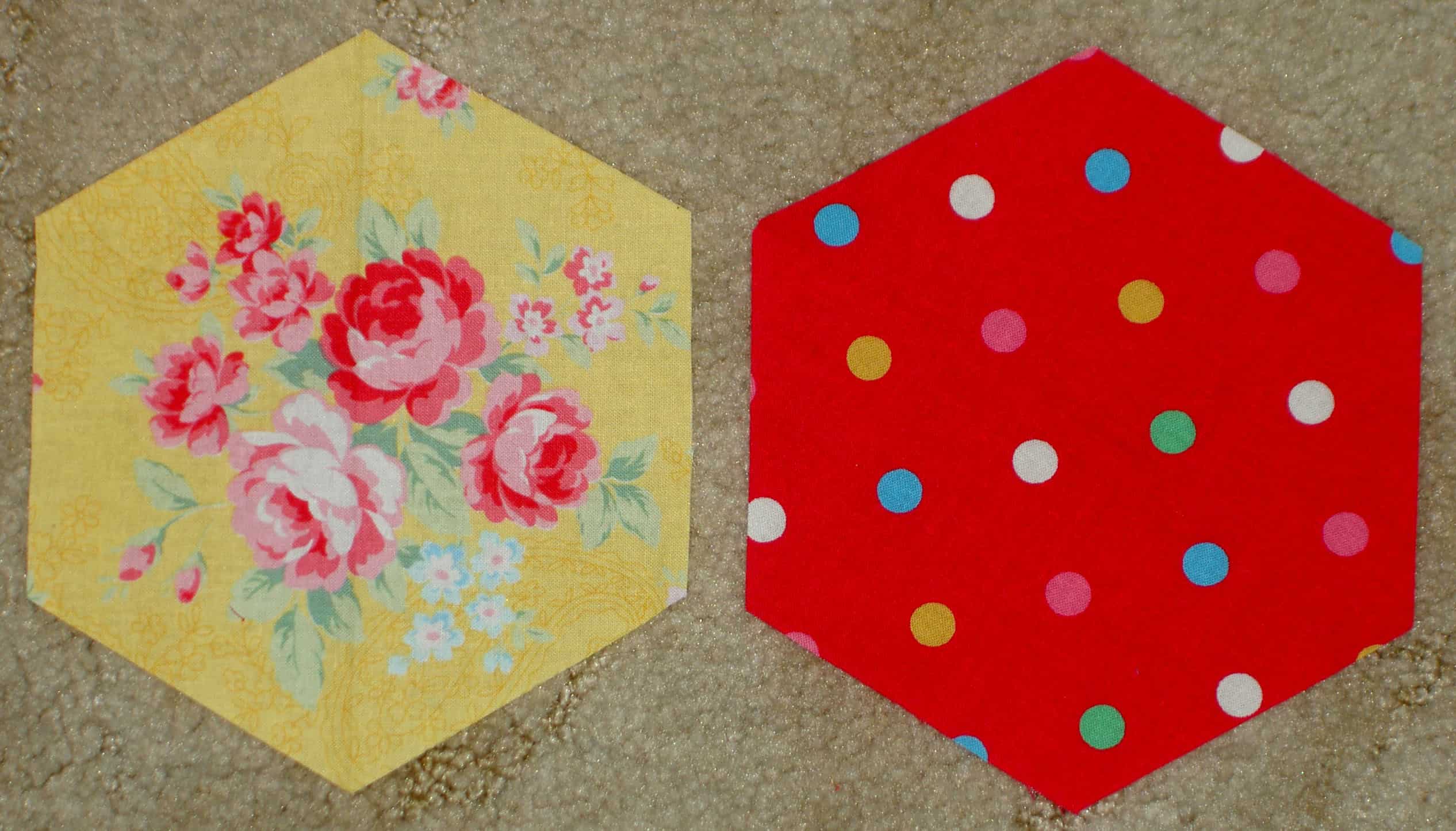
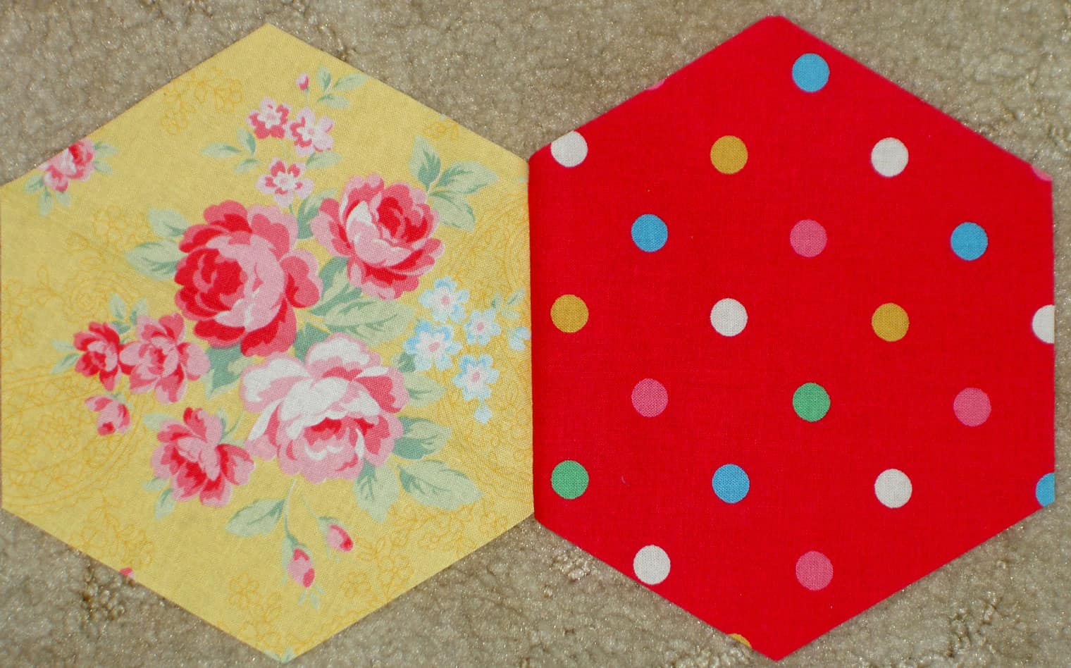
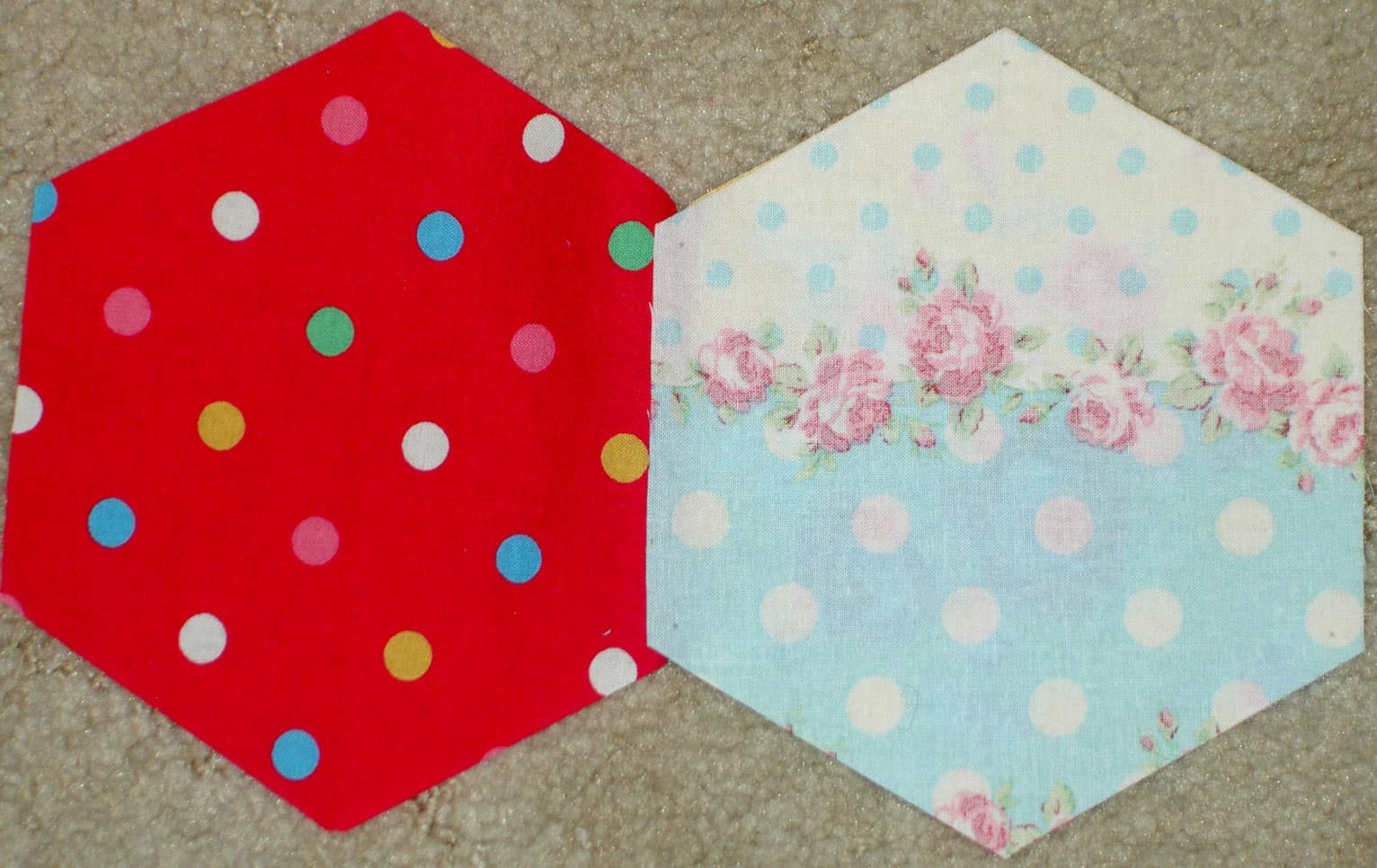
This method is a great way to rotary cut large hexagons. You might be able to cut smaller hexagons, but I think it would be really fiddly. It is also a great way to get practice with Y seams as well as impress your friends with your machine sewing prowess.
I decided that I would do a more detailed post for those of you who might want to use this shape for a project of your own. That is not to say that you shouldn’t go and look at Little Bluebell’s blog. She has a lovely blog with lots of creative ideas.
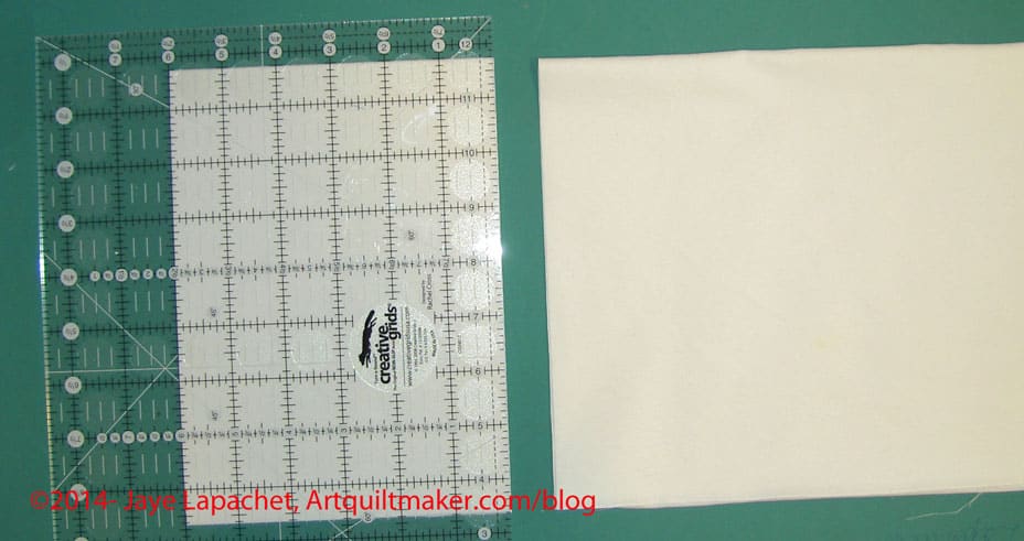
Next, unfold the strip, turn it so the long way is horizontal. Fold it so the crease is longways along the bottom (closest to you). In the picture above, you can see the curve of the fabric on the left hand side of the picture, which indicates where the crease should be.
Place ruler
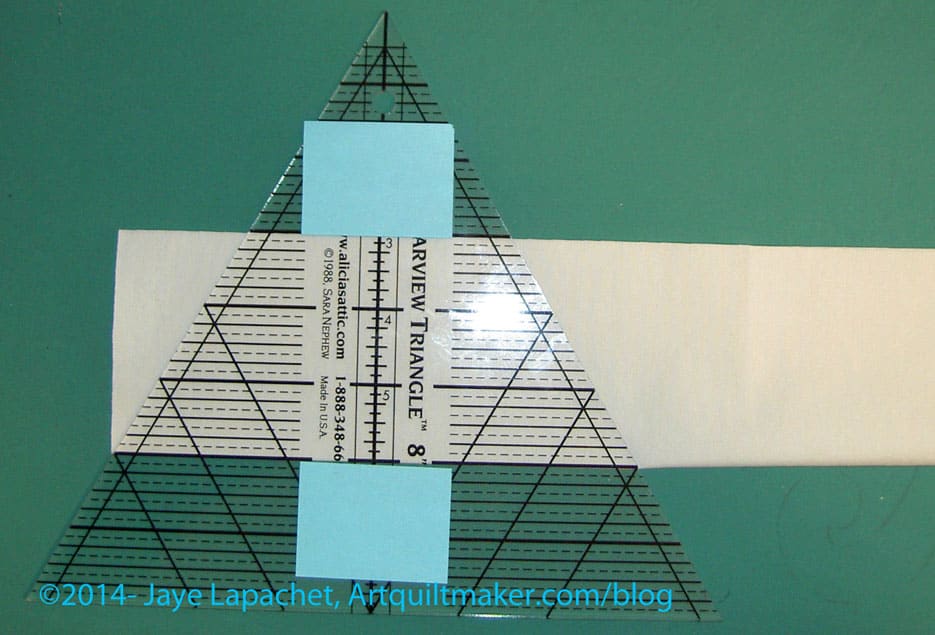
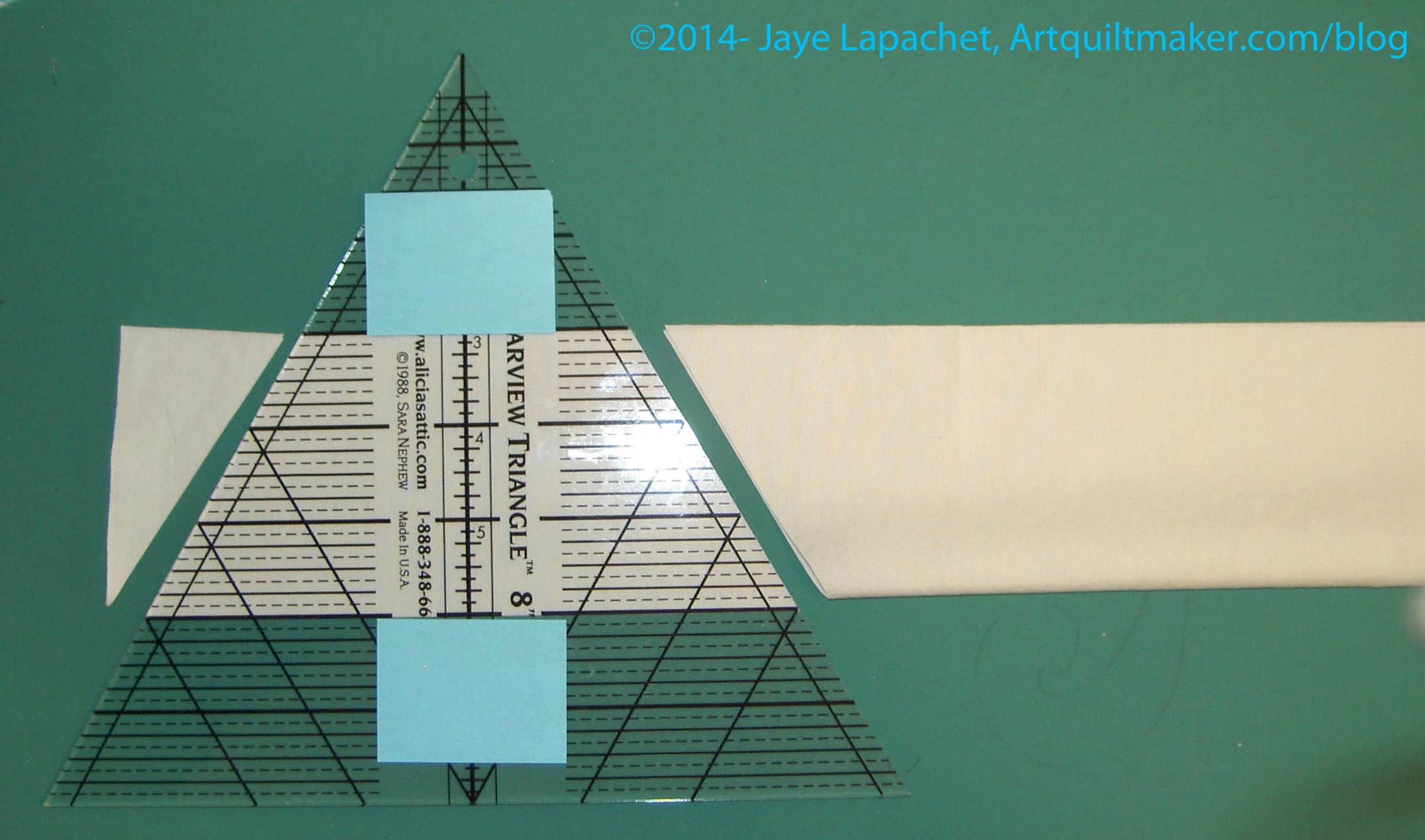
Follow the above step up with cutting. Place the Clearview Triangle ruler on the crease using the lines you have marked (using the technique described in the Kay Wood video). You must have this type of ruler. For example, I tried the Fons & Porter Pyramid ruler and that did not provide the right shaped hexagons.
In the photo above, I have marked my ruler at 3″ and 8″ using Post-it notes. You really only need to mark the bottom line, that which you place on the crease. I marked the top just to help me line up my ruler. Painter’s tape is another way to mark your placement line(s).
Nota bene: the above Clearview Triangle ruler does not have anything to help grip, so I recommend you add True Grips or something similar to the back of your ruler.
Cut
Now it is time to cut. If you are right-handed, line your ruler up on the left. Make two cuts to form your half hexagon shape.
Line up your ruler
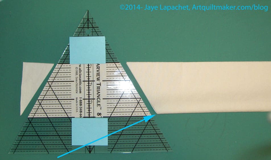
Next, line up your ruler to make the next cut. The left side of the ruler, at the end of your marked line should be placed where the arrow indicates. Cut along the whole strip. Do not turn the ruler upside down. You will end up with a weird shape that looks more like an hourglass. Little Bluebell has much better pictures of this step in her tutorial.
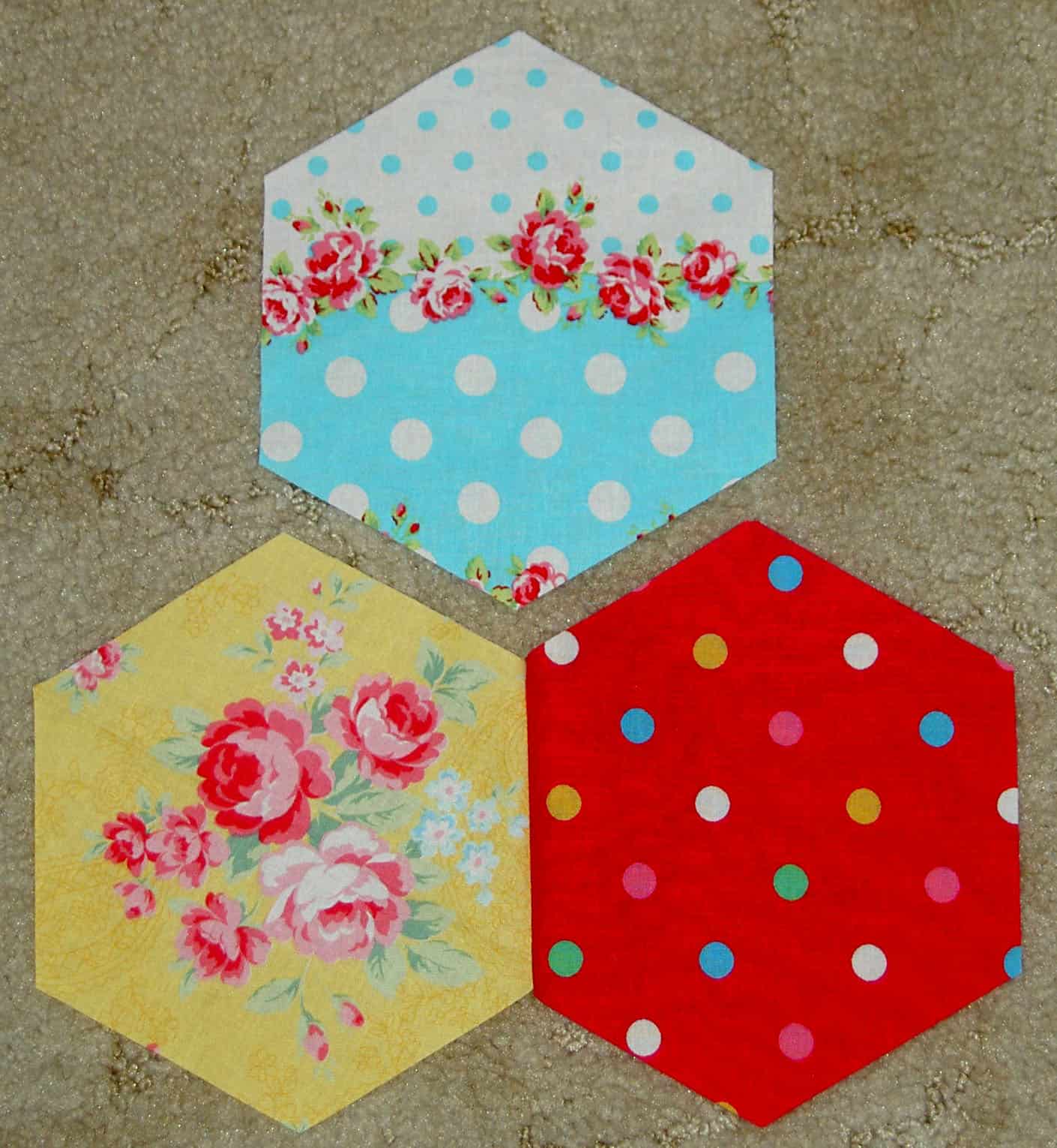
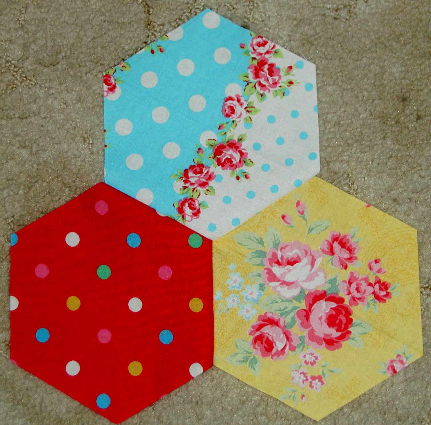
I am going to show you how to do this with 3 hexagons to start. Once you sew three hexagons, you can just sew the rest in groups of 3 then sew them to the other groups, sew them in rows or sew one hexagon to the group you have made. Let’s start with 3.
3 hexagons
Put them on your design wall or on your floor and gaze at them. See the V formed by the top of the 2 bottom hexagons? Pay attention to that. You will need it later.
Start with 2 hexagons
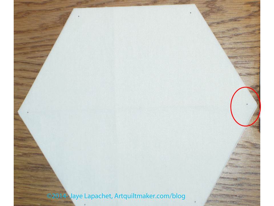
First, you sew two sides together. These will be two separate hexagons that you have already marked. Remember, you can mark with the Jinny Beyer Perfect Piecer and a Sewline pencil or with your favorite ruler and marking tools.
Put one Hexagon right sides together
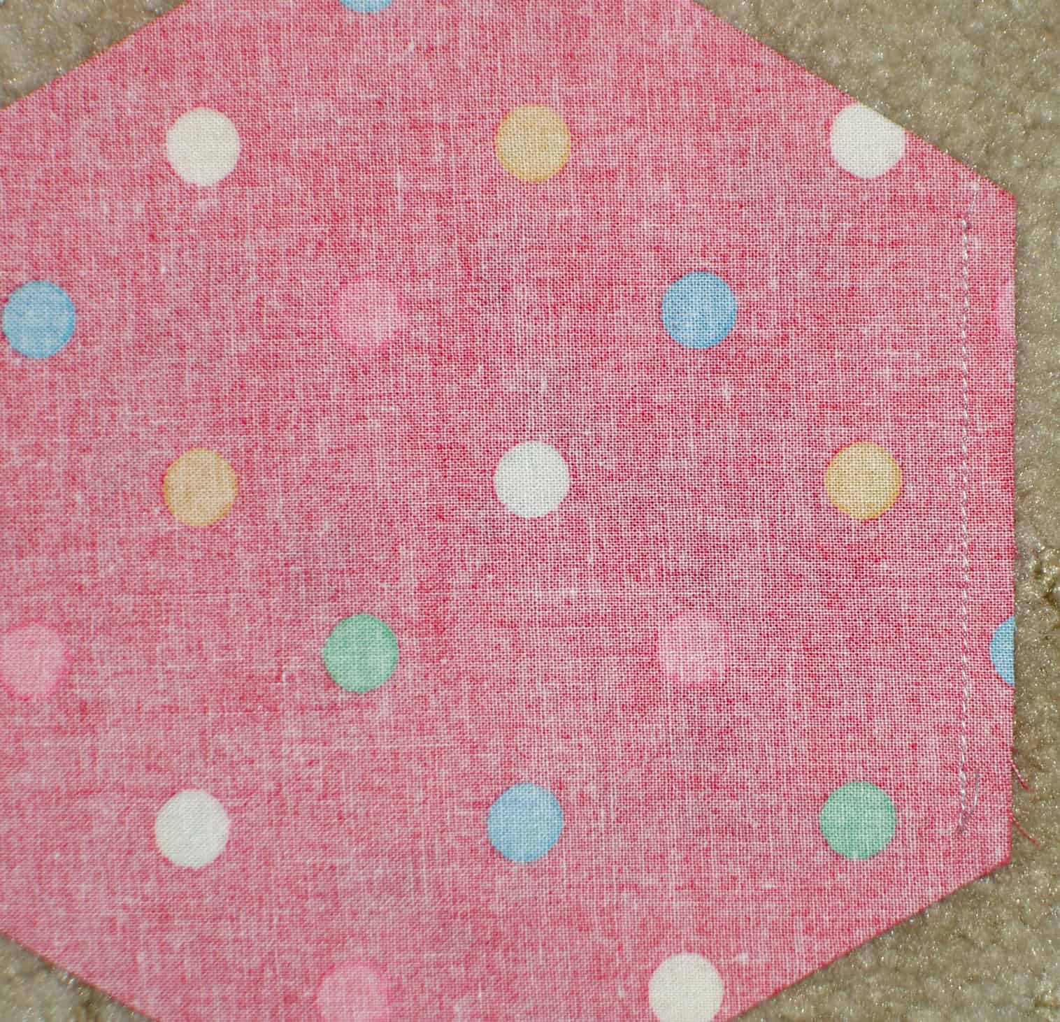
Put the first 2 hexagons right sides together and sew between the marks. Don’t sew into the seam allowance. If you did sew into the seam allowance, rip out the stitches outside of the marks.
2 hexagons sewn together
When you open those pieces you will have 2 hexagons sewn together. YAY!
3 hexagons
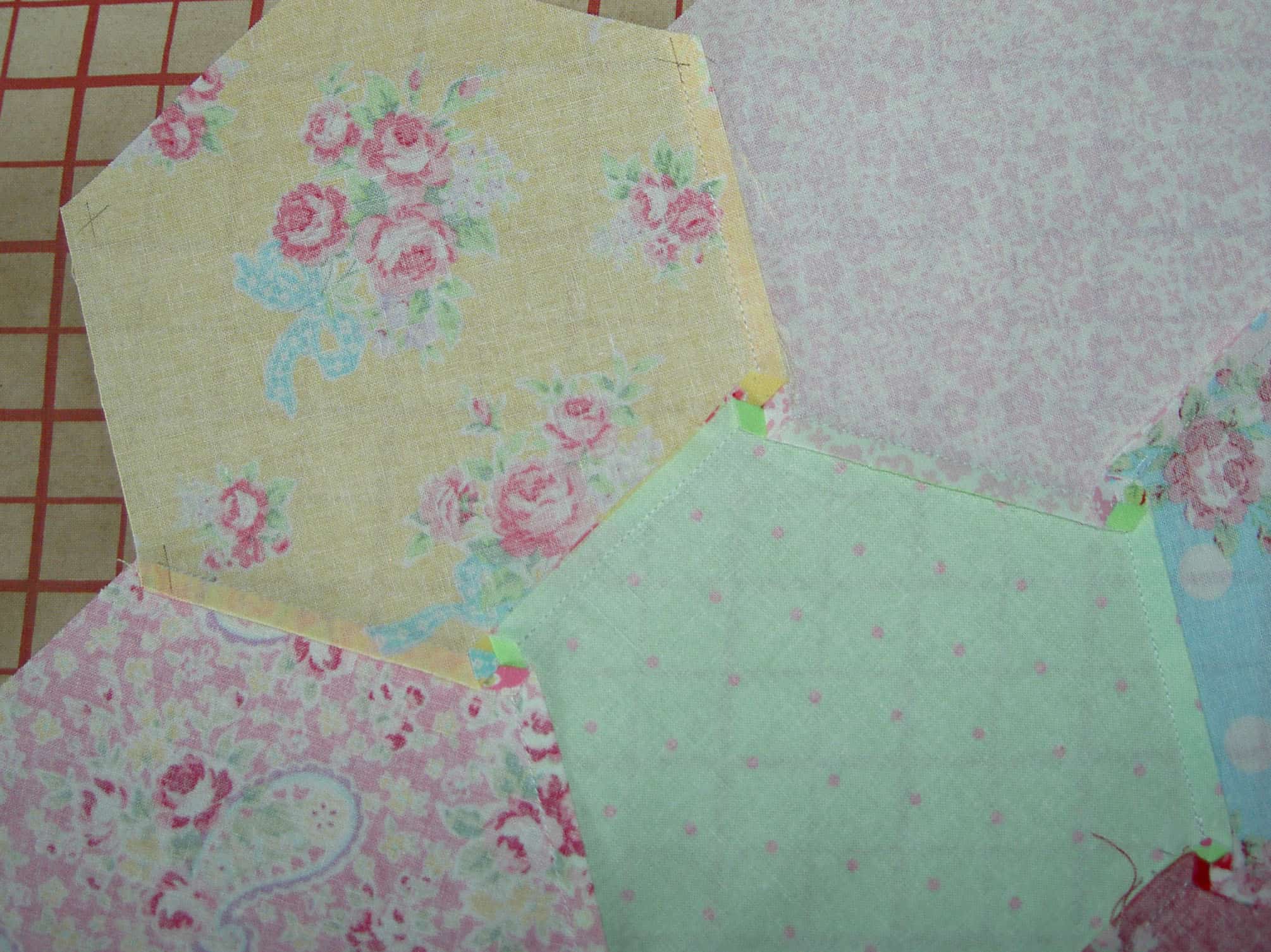
Second, for the third piece, you have to do a Y seam. Remember that I told you to pay attention to the V? There will be a V where the two already sewn hexagons meet and that is where you will place the 3rd hexagon.
You will need to sew 3 seams total to completely add the third piece to the first 2 already sewn pieces.
Adding 3rd hexagon
Third, you line up the third piece with piece 1, right sides together, so that one side of piece three will be sewn to one side of piece 1. The side of piece one to which you sew should be one part of the V referenced above.
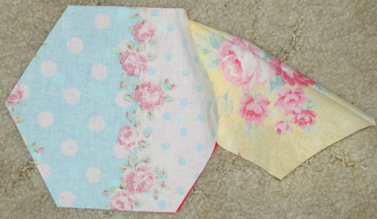
Fold over Hexagon 3 to hexagon 2
Fourth, once you have sewn one side of piece three to one side of piece one, you fold the neighboring side on piece three right sides together to the adjacent side of piece two. You will fold it on to the other side of the V. It looks awkward, but should line up exactly if you have not sewn into the seam allowance.
Fifth, sew the second side of piece three to the second side of piece two.
3 hexagons sewn together
Now you have 3 hexagons sewn together. AND you did a Y seam. That wasn’t scary, was it?
Hexagon Flower
Sixth, press from the back so all of the seams twirl in the same direction.
Last week, I posted about finishing the Scrapitude top. I also talked about the Adventures in Arting podcast in a recent Various & Sundry post. I was listening to it while I was piecing and the discussion they had made me think that I needed to document a problem I came across.
I had problems with this quilt, as I do with many of my quilts.
It wasn’t the pattern.
It wasn’t the difficulty level.
It wasn’t the fabric or other supplies.
The problem was simply the process of being human. Often I will sew to get away from issues in the rest of my life with which I am struggling. I pieced the rest of Scrapitude as we finalized the sale of Super G’s house. It was a tough weekend. Piecing Scrapitude kept my mind on a task on which I needed to focus, but one where my mind could wander.
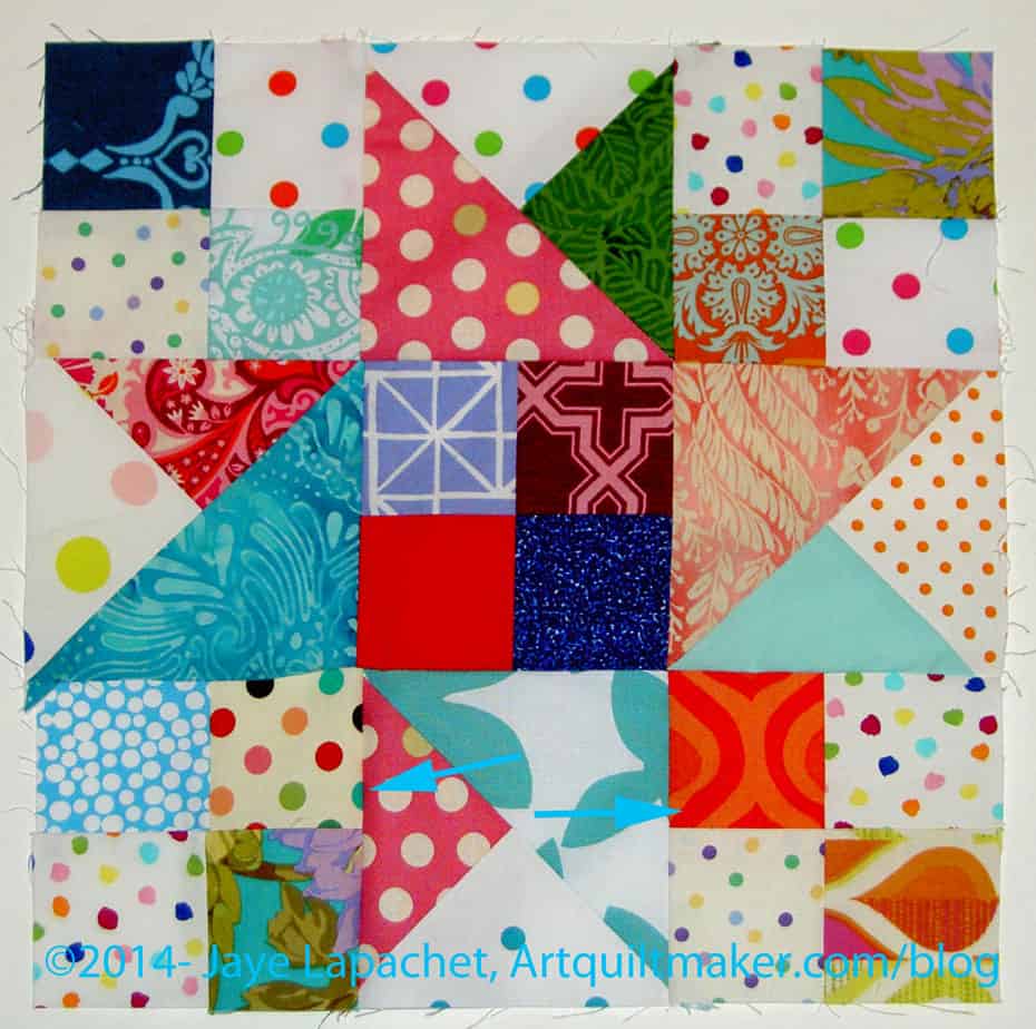
Scrapitude Error
In the course of piecing, I found mistakes I had made earlier when putting the blocks together. One of them I had already pieced into the quilt and that one will be there for eternity, but I removed several others and fixed them before I pieced them into the quilt.
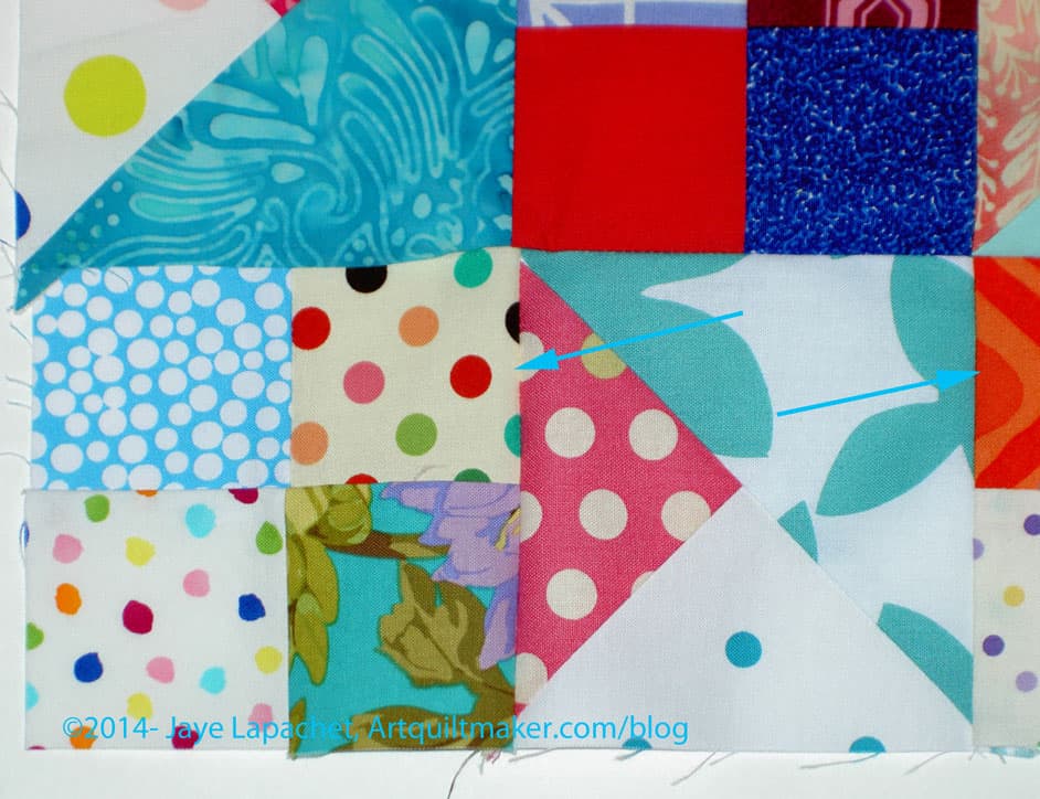
In the picture to the left, the bottom left hand four patch was set in incorrectly. The foreground white on blue dot square should be in the upper right hand corner of that section in the block, not in the upper left. It isn’t a major error and with all that is going on in the quilt, nobody would notice.
Scrapitude Error detail
I noticed and cared enough to rip it out. The question I always ask myself is whether I can live with the mistake or if I need to fix it. In this case, I could have lived with the mistake, but decided to fix it anyway.
There are issues with the finished top, but the quilt is very cheerful and I like it. I don’t think I will take up mystery quilts in general, but I am glad I did this one.
I had 14 items on my February To Do List. I have removed four that I completed prior to that post and have crossed off the ones I completed since January 4. I also added at least 3 new ones, so it doesn’t look like I made much progress.
This list is in no particular order.
To Do List:
Sew green and red striped 8 pointed star (probably should include an item called “find background template for 8 pointed star!)
1. Select a layer cake or cut 10″ squares of foreground fabric.
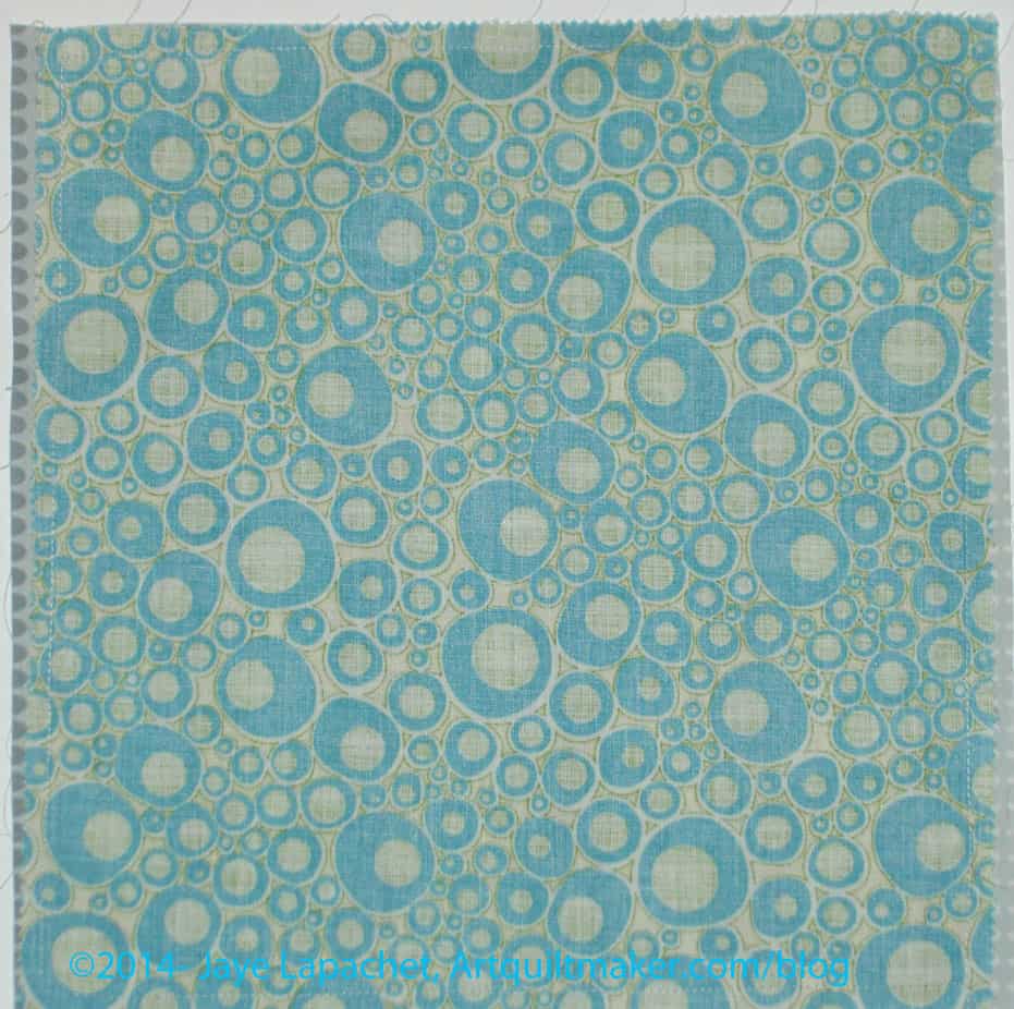
2. Cut 10″ squares of background fabric. Make sure it is a good contrast to your foreground fabric, unless you want a blendy-low volume look.
Pin foreground & background squares together
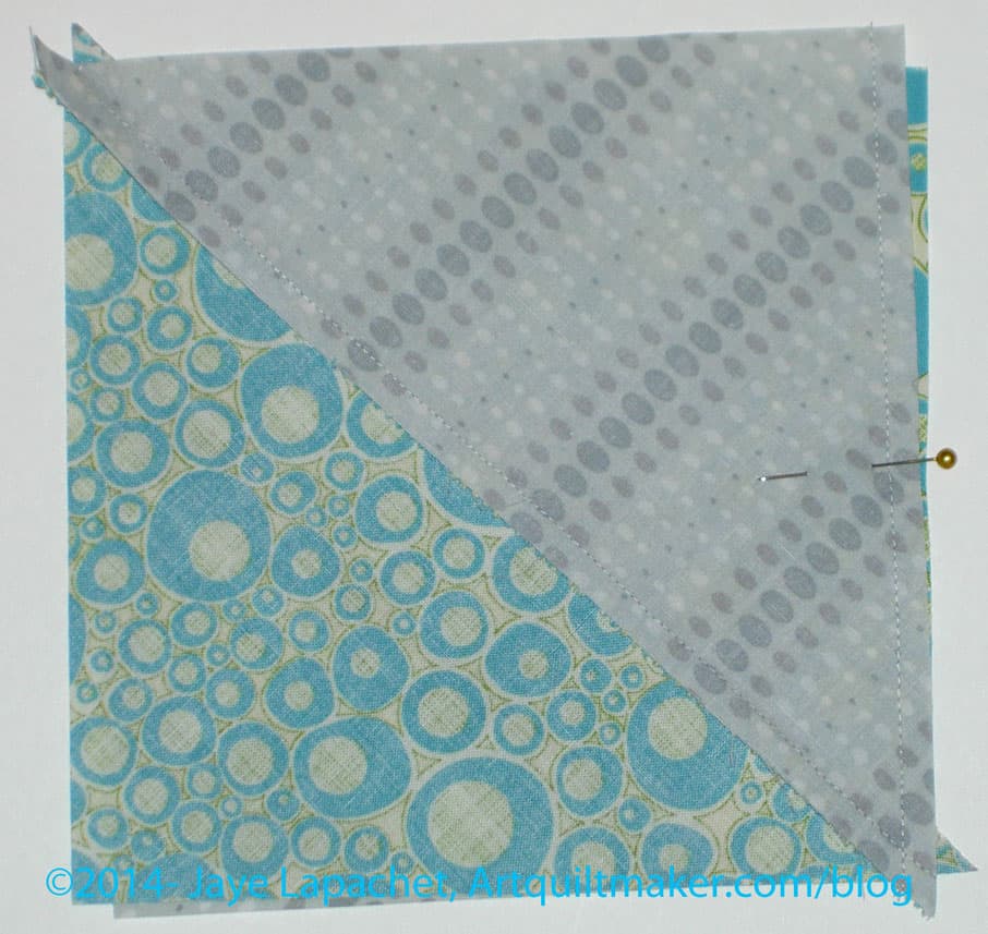
3. Place 1 foreground square and one background square right sides together.
4. Sew around the outside 1/4″ from the edge. No openings are needed.
5. Starch two squares heavily. I use Mary Ellen’s Best Press. Once I have sprayed the starch, I change the setting on my iron to dry.
Nota bene: the project takes a lot of MEBP to keep the bias edges under control, so have some refills on hand.
Cut sewn foreground & background on the diagonal
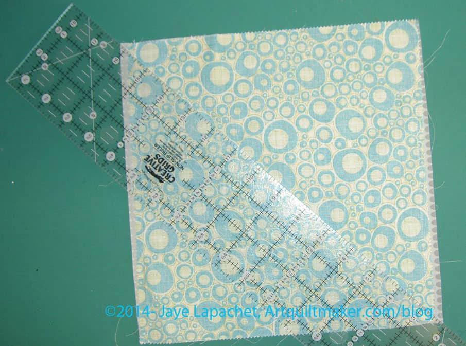
You will not always be able to cut exactly corner to corner. I found that when I starched, the layer cake fabric shrank. Trimming later helps square things up, so just cut to the corners of the background if you can, or line the ruler up with the sewn corners.
Cut on the diagonal
6. Cut sewn 10″ squares on the diagonal.
Nota bene: pay no attention to the different fabric in the photo above. The steps are the same.
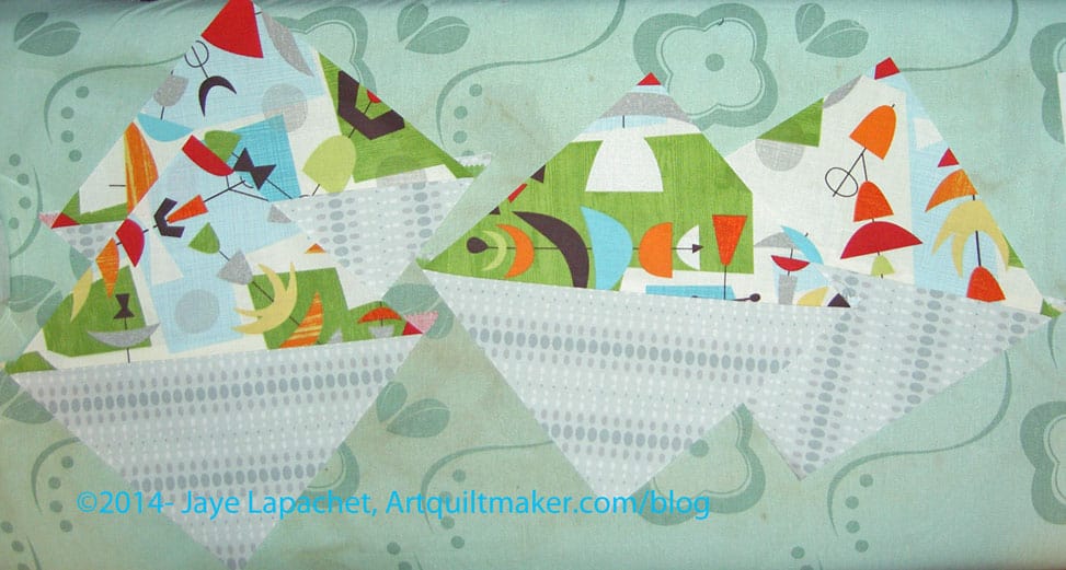
HSTs
You will end up with some Half Square Triangles (Triangle Squares)
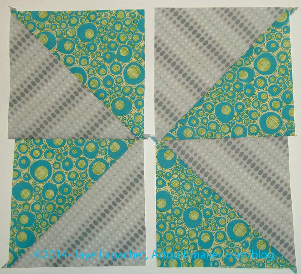
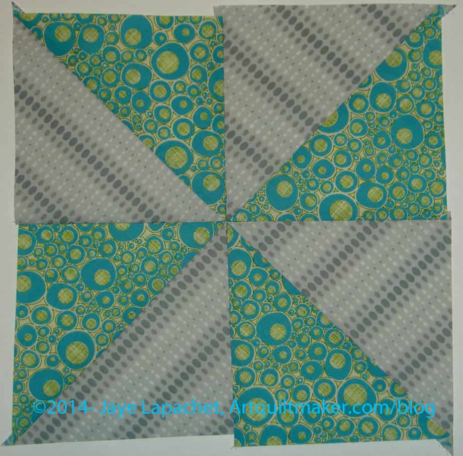
Layout HSTs to form a pinwheel
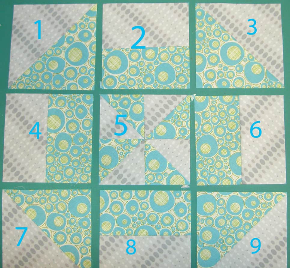
7. Lay the HSTs out so they form a pinwheel.
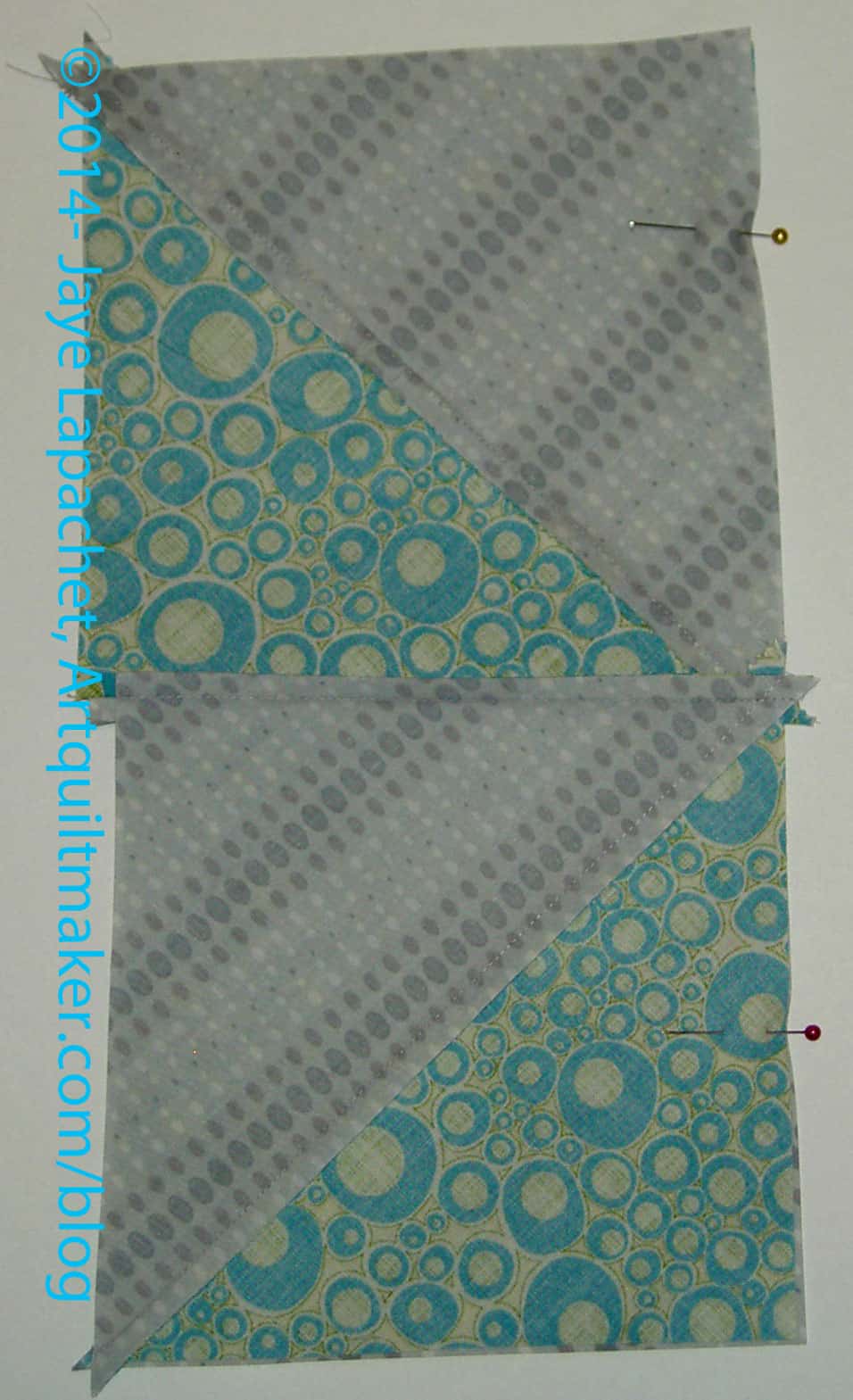
Pin HSTs to create Pinwheels
8. Put half square triangles together to make the top and bottom half of a pinwheel block. Pin the side you will sew as a reminder.
You can see from the photo above that my HSTs were not lining up with each other. I did worry about that, but finally decided that trimming later would solve a lot of sins. I nested the middle seams together to help make the point in the center of the final pinwheel.
9. Sew the HSTs together to make two halves of the pinwheel block.
10. Lay the piece down so the foreground fabric is on top.
10a. Press. I press from the front towards the foreground fabric. It doesn’t matter as long as you are consistent.
Prepare Pinwheel
11. Put squares together, once again, in a pinwheel configuration. Pay special attention to getting the center to line up.
Pin 2 halves together
12. Pin so that center nests together nicely.
13. Sew all the pieces together so you end up with a block in the Pinwheel configuration.
Press
14. Press.
14A. (Optional) Add more starch (I use Mary Ellen’s Best Press), if desired. I like my pieces and parts to feel a bit like cardstock. I get assurance from that feeling that the bias edges will be under control.
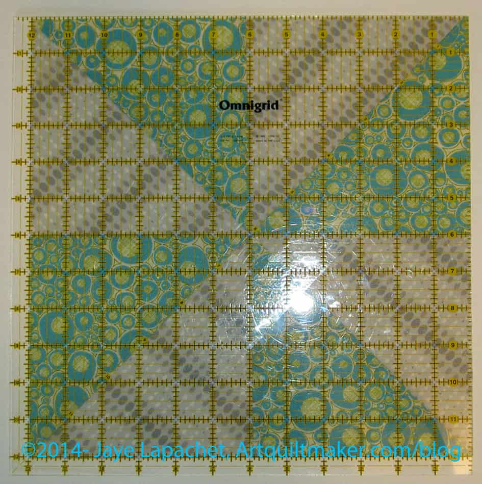
Trim to 12″
15. Trim to 12″. This will get rid of the uneven edges seen in the previous photo. I don’t know if others do this, but I decided to do it to keep my pieces square.
Cut into 9 Pieces
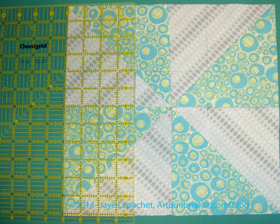
16. Since I trimmed my blocks to 12″, I used the 4″ line on my ruler to cut the block into 9 pieces. I started from the left and cut the vertical lines first.then moved my body around my cutting cutting table to finish this step by cutting the horizontal lines.
Cut into 9 Pieces
Photo above shows the pinwheel cut into 3 equal parts – 4″ each, but not yet rearranged.
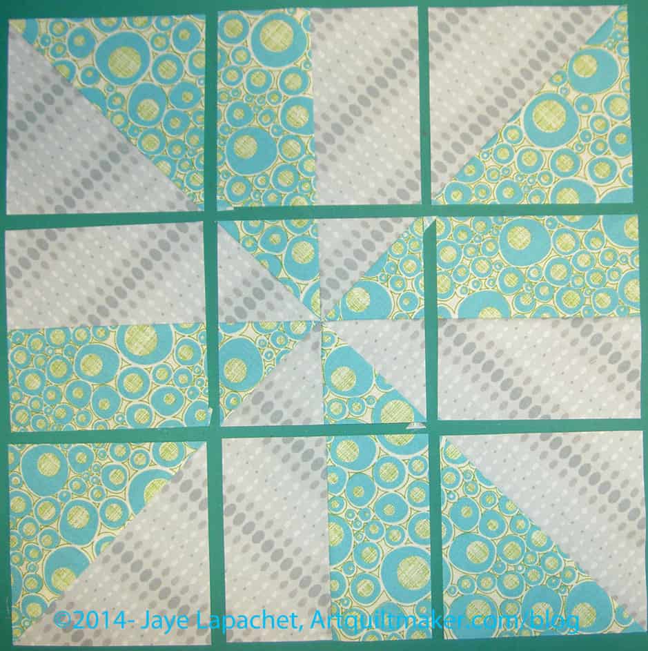
Rearrange to Suit your Tastes
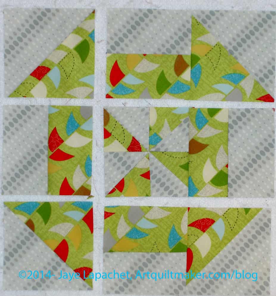
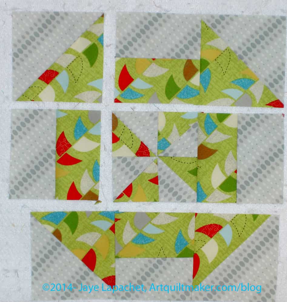
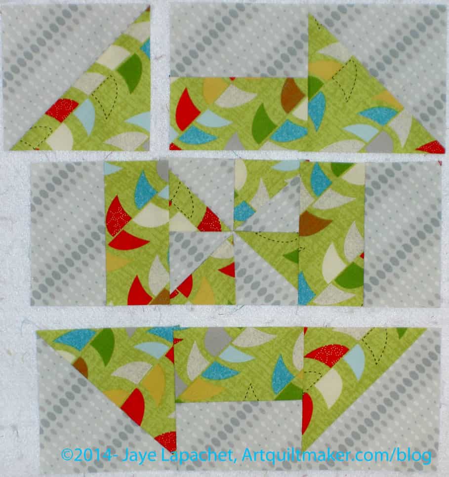
17. Rearrange the 9 parts to suit your aesthetic. You can create a look of the Churn Dash block configuration above or you can switch the corners and the centers in the opposite direction (foreground on the outside) for more of a flower/circle arrangement.
18. This block is now a 9 Patch and you can sew it together like you would a 9 patch. If you do not know how to make a 9 patch, see my tutorial.
Fold part #3 onto part# 2, from chart above, on top of each other and sew inside seam. do this for the rest of the parts, like you would a 9 patch, to create the rows.
Sew like a 9 PatchSew like a 9 PatchSew like a 9 PatchThree Rows Sewn
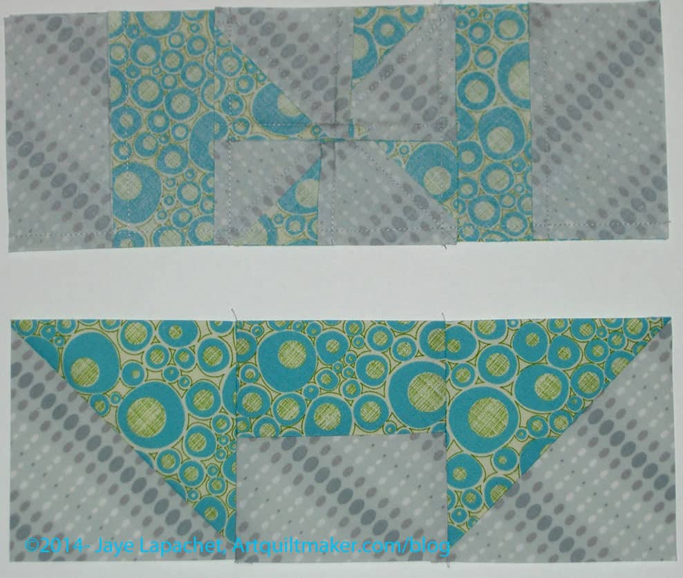
19. Finish the rows by sewing the final part to the two parts already sewn together. You will have 3 rows of 3 parts each.
Two Rows Sewn TogetherSew 3 Rows
20. Sew three rows together like you would a Nine Patch.
In the above photo, the bottom row is not involved. Place the center row right side down on top of the top row (right sides together) and pin at the intersections, along the seam closest to the bottom row in the picture.
21. Press to the “bars.”
22. Once the two top halves are sewn,place the bottom row on top of the middle row. Pin as needed and sew to the center row.
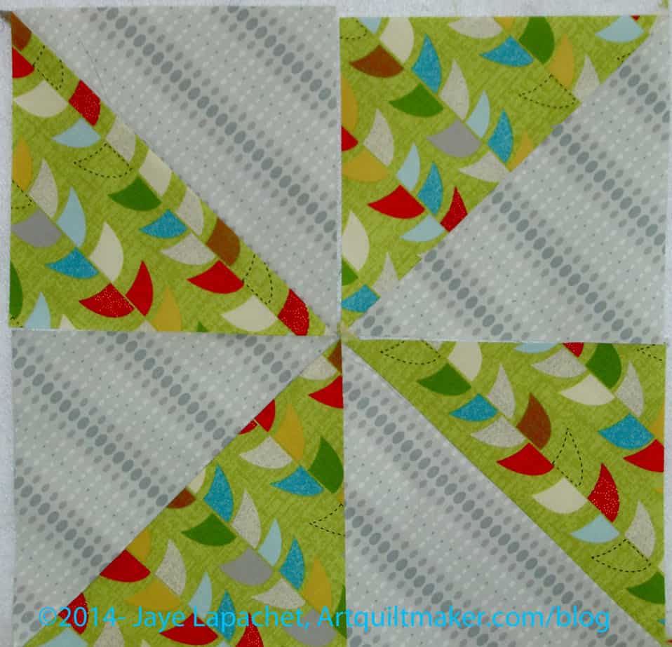
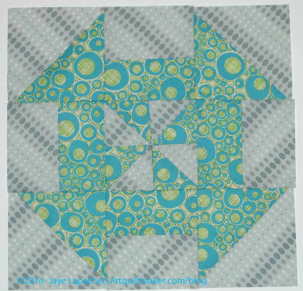
Finished Disappearing Pinwheel
23. Voila! Good job!
I didn’t make this block up. I first saw it in a video put out by the Missouri Star Quilt Company. The tutorial above is how *I* make the block.
Other Resources
You might want to take a look at the post I wrote a few weeks ago. Included in that post is a link to a video that shows how to make a Disappearing Pinwheel by the Missouri Star Quilt Company
Nota bene: I may update this tutorial or make clarifications, changes as necessary
In a effort to stay the chaos, I used some of the parts and pieces of the Russian Rubix as leaders and enders in between the Scrapitude project pieces.
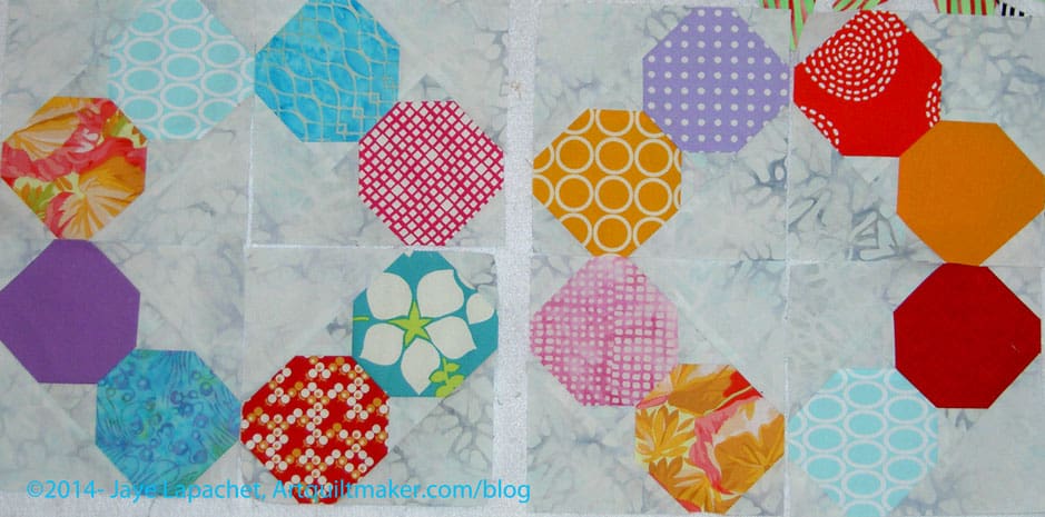
The blocks pictured are still in 4 pieces each. I am not quite ready to sew them together. I want to contemplate the combinations of the colors for a while longer. There is a lot of blue in the left and a lot of orange in the right configuration. On one hand, one skews cool and one skews warm. On the other hand there is a lot of repetition. I haven’t changed them because I will use a lot of blocks in the quilt and I am still deciding whether, in the end, anyone will notice or care. I am also thinking about whether or not having some cool and some warm will benefit the look of the project.
Post the direct URL (link) where your drawing, doodle, artwork is posted (e.g. your blog, Flickr) in the comments area of this post. I would really like to keep all the artwork together and provide a way for others to see your work and/or your blog.
We are also talking about this on Twitter. Use the hashtag #CPP
The Creative Prompt Project, also, has a Flickr group, which you can join to post your responses. I created this spot so those of you without blogs and websites would have a place to post your responses.
I still really only have two “really old” UFOs left on my list – the Pointillist Palette and the Tarts Come to Tea. The others are old, but they have a different feel to me. I may be kidding myself, but that is what is in my head right now.
I am still kind of on a high about the Attack of the Hexies top. It is at the quilter and I feel like it will get done soon.
Aqua-Red Sampler – Frances and I started up again! We talked about the New York Beauty and I promised to start the hexagon tutorial. I did start it, I just haven’t done much since starting it.
The Tarts Come to Tea: I still haven’t worked on this since April 2011, though, periodically, I think about working on it.
Pointillist Palette #4: Fourth is a series of 6 quilts; needs tiny square patches sewn together. I still haven’t worked on this, though, every once in a while I think about using some of the squares as leaders and enders. I also want to find my notes for the others and see if I want to do them.
See: needs satin stitching. Small, also a possibility for finishing before the end of the year, though with all the cutting I have done recently, perhaps not so much.
Self Portrait: started in 2006 at a class at Quilting Adventures in Richmond, Virginia. I like the piece, but don’t know where to go from where I am. Mouth? Hair? The attitude I need to have is that I can’t ruin it; there is always more fabric. Possibility for abandonment.
Under the Sea: class project; like the design, but not the colors much. Possibility for abandonment. I have to face reality.
Ready for Quilting
New:* Wonky 9 Patch: needs quilting and binding. I am still thinking about quilting this myself and I am thinking about it more and more. I am wondering how far apart I can quilt it so that it has some drape. (Not on original list)
New:* FOTY 2012: top, finished. Back and binding are complete; at the quilter.
New:*Star Sampler: Top finished, back and binding finished; at the quilter. (not on original list)
New:*Fresh Fruit: Top finished, back and binding finished; at the quilter. (not on original list)
Flower Sugar Hexagons / Attack of the Hexies – Top finished 1/12/2014: at the quilter.
In the Finishing Process
Infinity blocks: Back from the quilter, sewing down binding.
In Process
I decided that I had better put in an ‘In Process’ category. The difference, at least in my mind, between ‘In Process’ and ‘UFO’. The difference is that I am actively working on a project that is “In Process.”
Spin Wheel: really not started, but supplies gathered. I probably have enough fabrics and just need to decide to start.
Windmill quilt: Still hunting and gathering. I will use a grey for the background, because if I use more of the cut fabric patches, the pattern will be lost. The pieces are too oddly shaped and I don’t want to lose the pattern in a mass of scraps.
Stepping Stones #2 using Bonnie & Camille fabrics Bliss, Ruby, Vintage Modern: made two test blocks, but still in the thinking stage while I decide on the background colors. I want the contrast to be good.
Super Secret Project #3: working on color choices.
Abandoned
Nothing so far for 2014
You can find the latest update for the Current Projects list provides a good comparison to this month.
I thought you might want to take a look at the first list I made, the one with the 26 Projects. I started the list in October 2011. I have made progress. I am still planning to stop this post when I have no more projects from the original list to write about, but it is so useful to keep track of all of my projects.
*New – Project started after I started working on the 26 Projects list