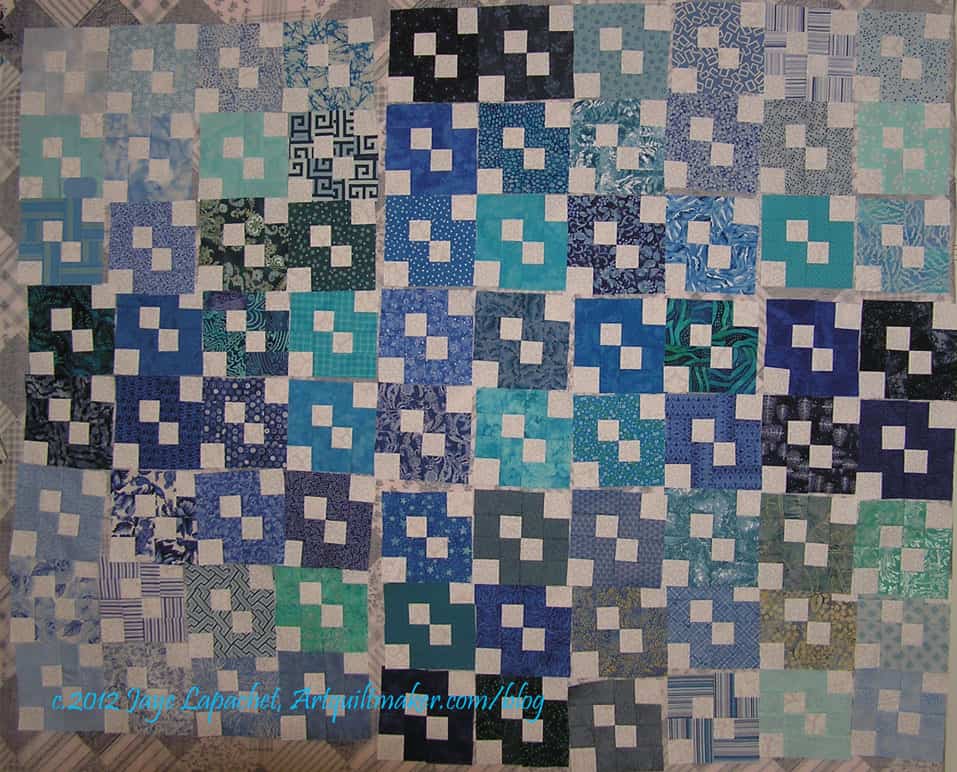
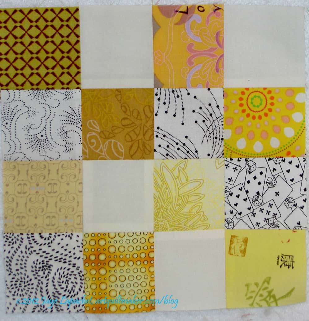
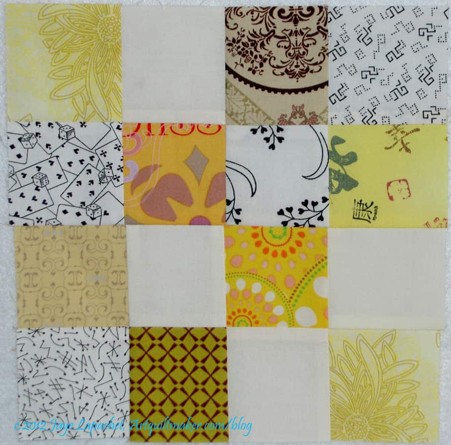
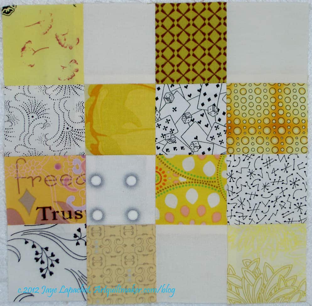
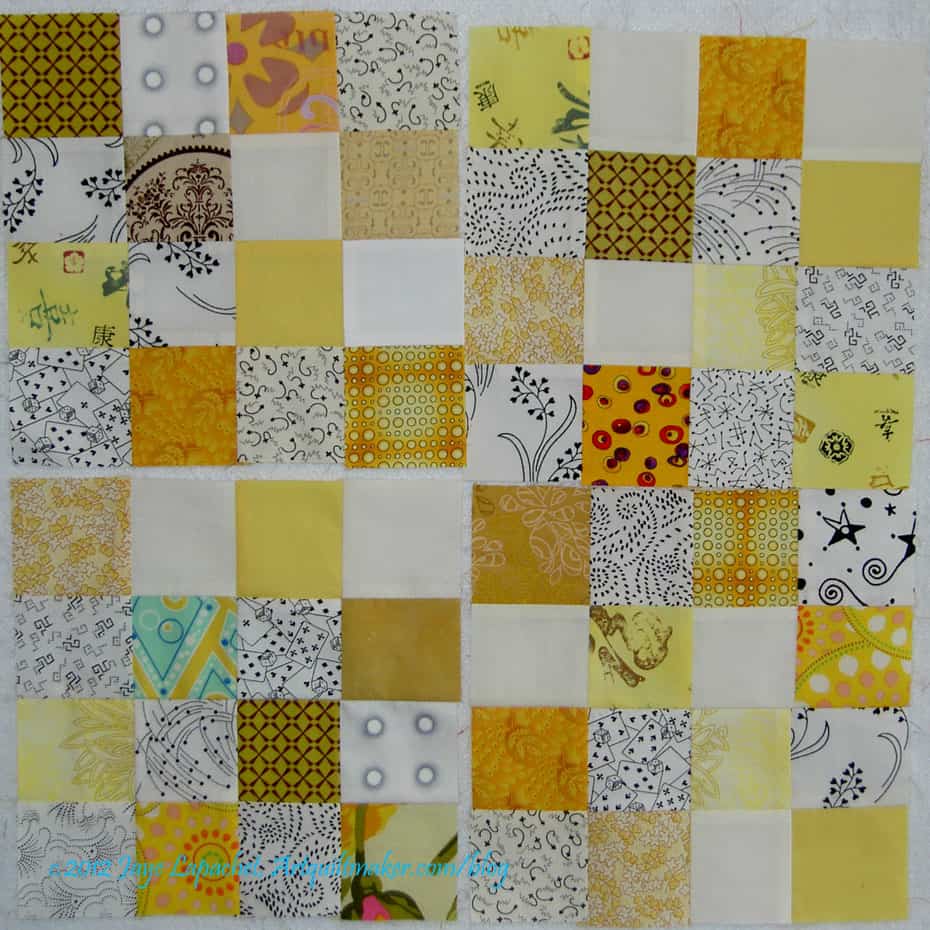
My SIL kindly sent me some photos of the layouts she tested before putting her Infinity blocks together. It is interesting to see the use of color to create the layout. This type of layout did not even occur to me. I was thinking more about the wreath effect of the piecing.
CLW’s Infinity Layout #2
I am really glad my SIL sent me these photos so I could be reminded of the other ways to layout blocks.
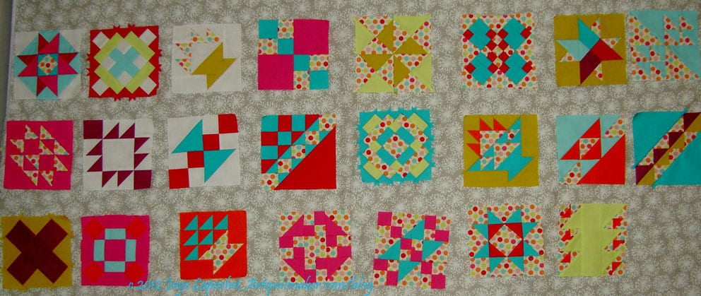
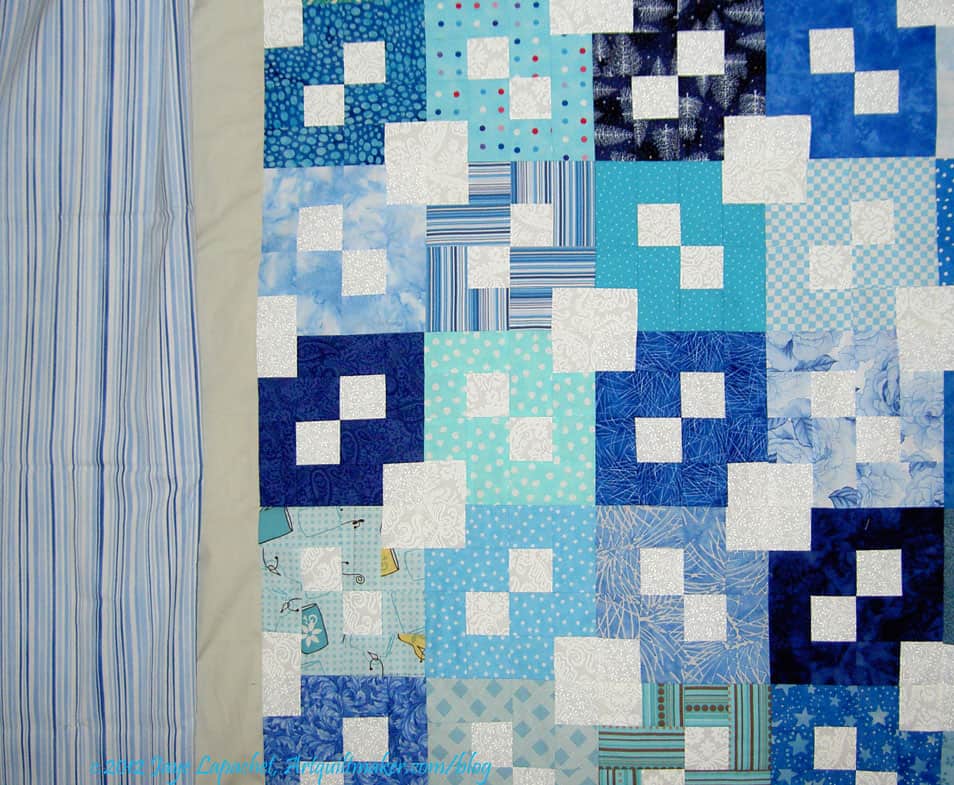
This is a fabric I bought at Quiltology. I didn’t have the blocks with me, but I thought it might work. In the end, a person has make visually decisions visually. Looking at it with the blocks on the design wall, I am not so sure. I think the grey has too much beige or brown in it, but it isn’t terrible.
Grey circles sashing
I have to make a few more blocks, but the more important thing I need to figure out is this sashing thing.
I thought the grey Half Moon Dot would work, but looking at in the photo makes me think that the dots are too large and it makes the piece look too busy. It’s too bad. I do like those dots, but not for this piece. I do have to think of something to do with the Half Moon Street Collection, though. Soon.
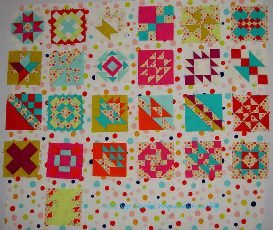
Large dot sashing
The dots were a good idea, though, so I looked at some other dots I had. No shortage of dots, of course.
I have to use a fabric of which I have enough (one of the bad things about stashing fabric is that you might have the perfect fabric, but not have enough of it: design challenge, I think, yes.)
I like the large dot a lot. I like it because it looks cheerful. I also like it because it showcases the blocks better than the grey does. I do worry that the white will run into the white of some of the backgrounds I used. I also worry about the colors of the dots not being the same, but I think the colors of the dots are similar enough, so that is not so much of a worry. I don’t think the Zoe Pearns Sweet Nothings dots don’t conflict too much with these large dots.
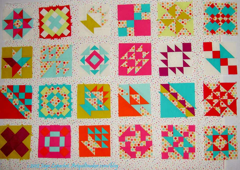
Small dot sashing
This small dot works, I think, but the dot might be too small.
Click to make the last photo larger to see how the small dots look against the blocks. The small dot works well with the Zoe Pearns Sweet Nothings in the blocks. It is also bright enough, but the white doesn’t seem to suck the life out of this piece.
This is the fabric I thought I would use for a border first. I have it in my fabric closet already, but I only have a yard, so I don’t think I would be able to add it lengthwise (the stripes running parallel to the edge of the quilt). I guess I should have taken a picture of the fabric oriented in the way I was thinking of using it.
Oh well, use your imagination.
I do like the color of it – actually the color feel of it. It has the right feel to go with the rest of the quilt. It is a very restful border. I am concerned that I don’t have enough yardage and I don’t want to be fumbling around trying to make it work. I usually buy enough of a striped fabric for bindings and not borders. A yard is usually enough for a bias binding and if it isn’t, I have no business making a quilt that big.
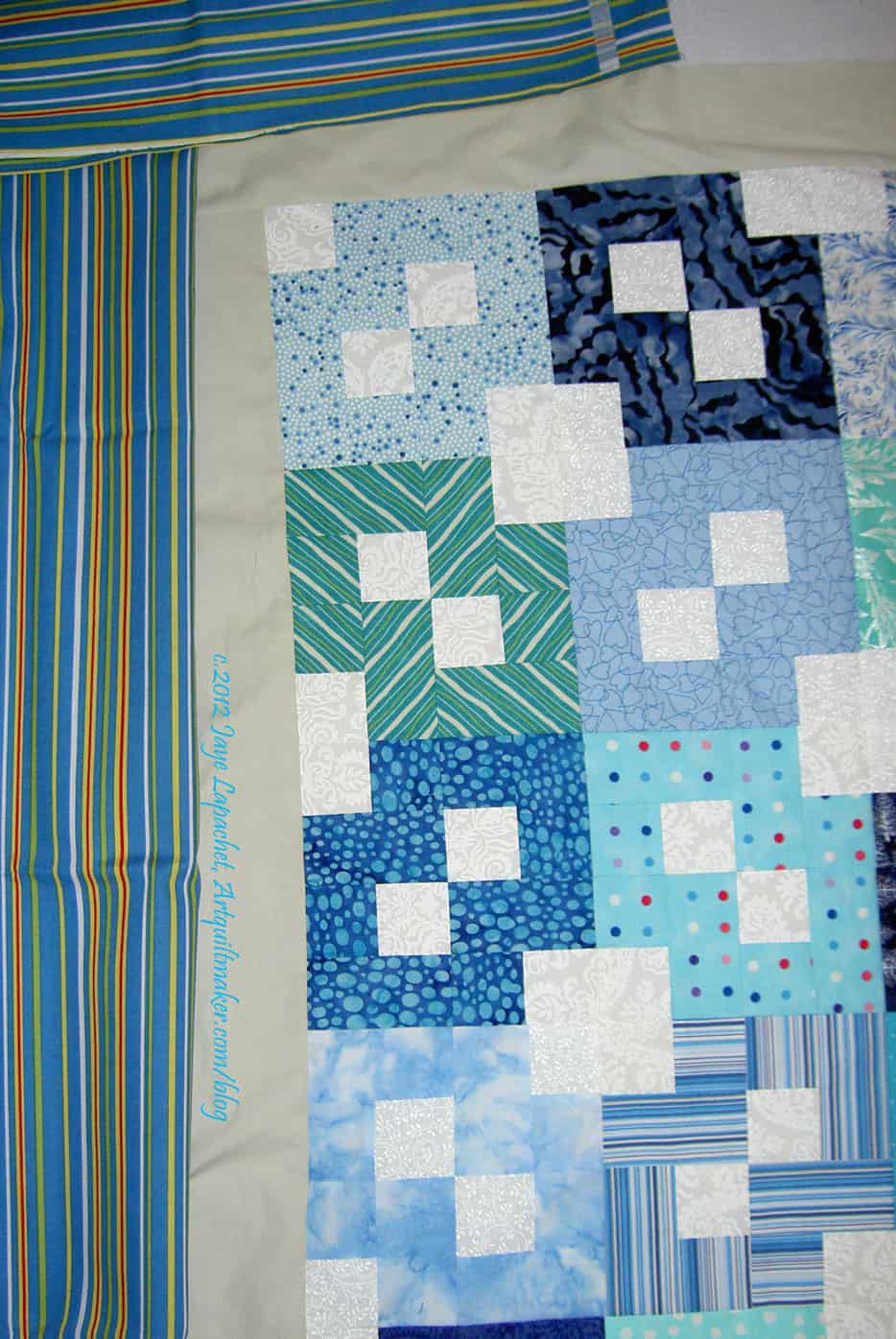
Blue & Yellow Stripes
I bought this piece at Quiltology. I tried to drape it so that you could see how it would look if I added it to the quilt as a border. How did I do? The colors aren’t quite right, but I do like adding a bit of yellow. One thing about adding these types of colors brings out some of the fabrics in the blocks that tend towards green.
I have to say that I am bit concerned about the grey border I added. I thought it would be the final border of the quilt, but then decided that the quilt needed to be finished off with something a bit darker.
My concern lies with the grey. It is very different from the white in the blocks, which is why I added it. I wonder, though, if it isn’t so different that it doesn’t work. I kind of like it, but I don’t want people snickering behind their hands at my poor judgment.
Blue & Green Stripes
This piece, also purchased at Quiltology, has much more green it. I didn’t realize that it had so much green until I got it home. I think that this is an issue of the type of light I live in. When I saw it in my workroom, I thought it had much too much green, but seeing it in the photo makes me think that it also brings out the blocks with green in them.
Frankly, in the end, I don’t care that much. I would like to be done with this project and I don’t want to spend much more time agonizing about border fabric. alternatively, I don’t want to look at it after it is finished and wish I had done something different.
Again with the artistic angst! I hope this isn’t becoming a habit.
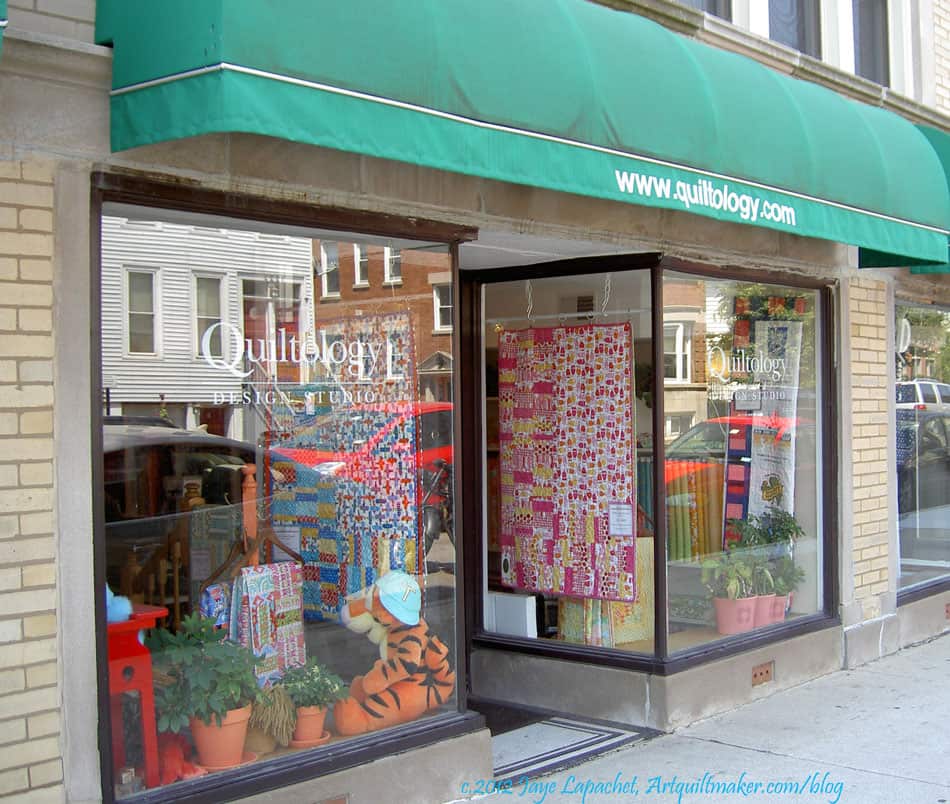
I went to a quilt shop while in Chicago called Quiltology. I got myself there via the El, which was fun, though, I thought it was a bit noisy. I was able to get myself there by reading the shop’s website. They have a nice page detailing how to get to the shop via a variety of modes of transportation.
The shop can be found at:
1221 W Diversey Pkwy
Chicago, IL 60614
Tel: 773-549-6628
Email: info@quiltology.com
You might recognize this shop from the Quilty show. They film the show at this shop. I was shocked when I walked in, because the shop is very small. Much smaller than it looks on TV.
I had to admit that I was disappointed and made a snap judgment that I would escape with my wallet intact.
Oh, how wrong I was.
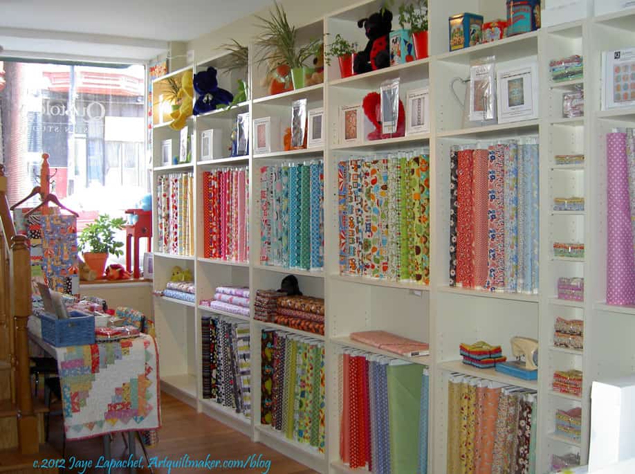
Colette, the owner, is a delightful person, but also seemed strong and a good business owner. She has filled the shop with a good variety of fabrics. Not only does she have many modern fabrics, there are plenty of solids and dots as well. I was surprised, and delighted, to see that she also had a good collection of batiks and 1930s prints. Quiltology also had a number of Minkee fabrics, which she said she suggested for backs, especially of baby quilts. The modern prints are more of the medium-large prints than the really large prints. I think they are easier to use. I thought the batiks and 1930s prints were a bold choice for a modern quilt shop (my assumption). Though she didn’t say, I think they were added to appeal to different types of quiltmakers and expand the horizons of some of the young mothers that patronize the shop.
Right side of shop
Colette seems to be the type of person who I would invite to be in a mini group. She learned to quilt before me and we have some of the same sensibilities about how quiltmaking should be taught and the problems with learning via pattern rather than by sampler quilt. We also discussed the lack of interest in drafting quilt blocks.
The second photo to the right shows some of the batiks and many of the solids available in the shop. The photo also shows the selection of books and notions. The black and white quilt to the left of the quilt. Colette is using this as a cover for the doorway to the back. You can see a corner of the cutting table, middle left.
Front left of shop
The shop is bright and filled with light. The shelves are white and the wooden floor is a lovely honey color (Kastanianhonig – chestnut honey, specifically).
I would highly recommend visiting this shop if you are in Chicago. You won’t be disappointed.
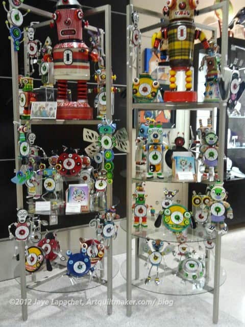
It was sort of a clock week last week. I went to Chicago for work. I don’t like sleeping in hotels as I never sleep very well. I do love looking at the sights and sounds and details of new cities. I tend to take lots of photos of details. I saw several displays of clocks on this trip, which was very interesting to me. I really liked the angles and colors of the display at SFO.
One appealing aspect was the repetition. There are so many of the robot clocks that the arrangement is interesting because of the repetition.
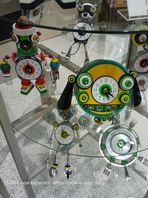
Robot Clocks in SFO detail
I became more interested in the design of clocks when my son was small. He was fascinated with clocks and always pointed them out to me. He also dragged one around for a year that just fell apart in his 2 year old hands.
Clocks are, to me, the epitome of something that can be useful and beautiful. Because of the way we live, we all need clocks. They also can be small, so they are easy to buy or make and the design possibilities are endless, as shown in the detail photo, right.
While in Chicago, I visited the Art Institute of Chicago. Regardless, I was determined to do that. I didn’t have a lot of time, so I kind of wandered through and I found my creative juices start to flow. At the Art Institute, they had a lot of clocks, which was interesting to me. I love looking at items from Decorative Arts collections and don’t remember seeing so many clocks in other displays.
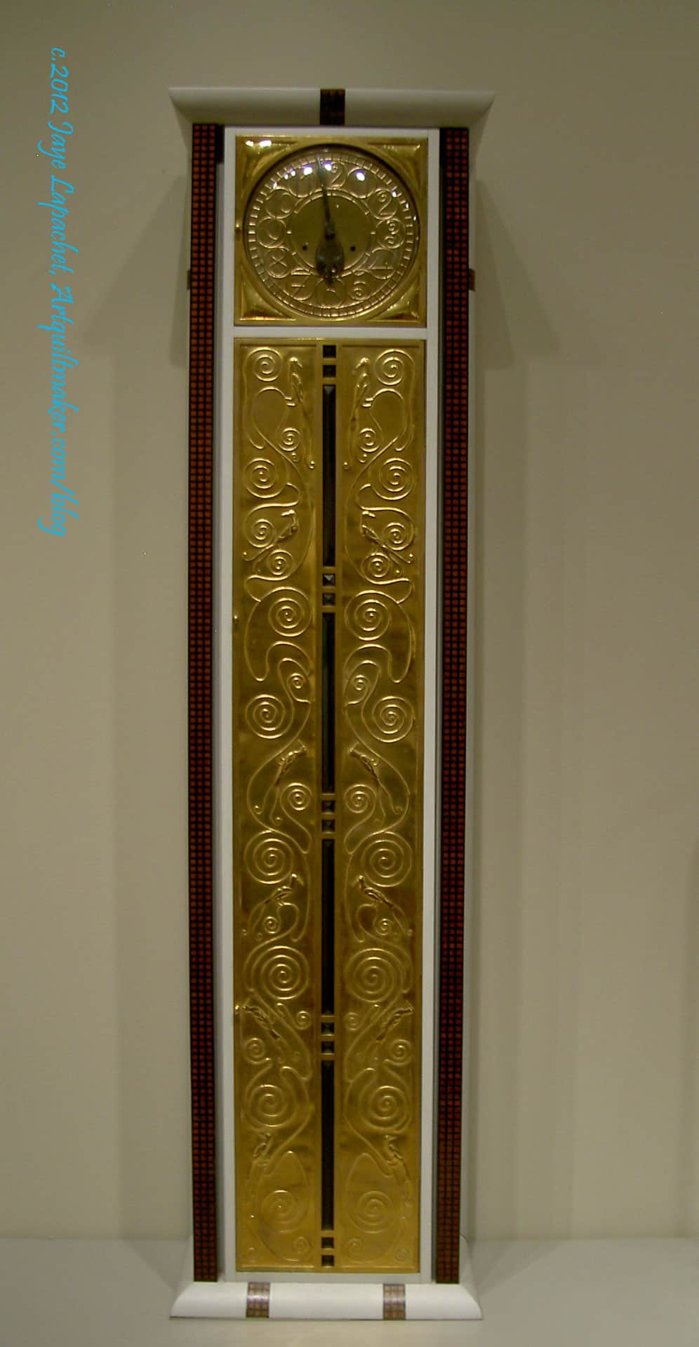
Tall Case Clock, c.1906, Vienna
The gold is quite a lot in this piece, but I really liked it. It reminds me of the Klimt painting the Kiss. Klimt was Austrian, or worked in Austria, too. The AIC has more information about the clock online. I wish all museums did this.
I always wanted a tall clock like this in my house, but we don’t have the appropriate scale of house. Perhaps in my mansion when I win the lottery? 😉
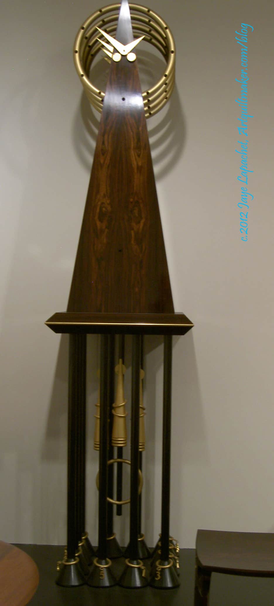
Art Deco Clock (?)
I cannot guarantee that this last photo is actually an Art Deco clock. I forgot to take a photo of the description. It has a kind of 50s look to it, too.
Definition: Growth refers to an increase in some quantity over time. The quantity can be:
Physical (e.g., growth in height, growth in an amount of money)
Abstract (e.g., a system becoming more complex, an organism becoming more mature).
It can also refer to the mode of growth, i.e. numeric models for describing how much a particular quantity grows over time. (Wikipedia)
tumor
development from a simpler to more complex form (freedictionary.com)
growth of a city
trade growth
personal growth
growth economy
exponential growth
cell growth
smart growth
growth hormone
Growth chart
Make your response simple. It doesn’t need to be a masterpiece. Take 5 minutes. Just respond and create a creative habit.
Please post the direct URL (link) where your drawing, doodle, artwork is posted (e.g. your blog, Flickr) in the comments area of this post. I would really like to keep all the artwork together and provide a way for others to see your work and/or your blog, and how your work relates to the other responses.
The Creative Prompt Project has a Flickr group, which you can join to post your responses. Are you already a member? I created that spot so those of you without blogs or websites would have a place to post your responses. Please join and look at all of the great artwork that people have posted.
I have been in Chicago for work for a week and have had no opportunity to sew. I thought about bringing some handwork, but, in the end, just brought a book, my journal (especially to do studies for the Creative Prompt Project) and my iPad.
Prior to leaving, I saw a clear theme in my work style which manifested in me by picking up a UFO-type project and intensely working on it until it is finished. I don’t know if that strategy will work for me long term, but right at the moment I am getting projects completed.
I am, however, sick of this list. It feels a bit tyrannical to me. I really think these feelings come from the fact that I am mostly just finishing, e.g. only doing specific tasks and not working through the whole process. I am not not doing much designing of new projects.
This list, as mentioned before) wasn’t part of my plan for the year. It just evolved, which makes me tempted to bail. Alternatively, I could scratch items off of of the list, but I really want them to be completely finished before I do so. It is a good exercise, however, and provides good focus for my work. There isn’t a lot of down time when I have a list staring me in the face. though, without downtime, I don’t get to dream about creativity and new ideas. I have made a lot of good progress, but perhaps I need to take a break from these projects and make something fun that I want to make? Perhaps I need to remember that there is value in taking my time and doing good work? I have made more good progress since last time, which is good.
I am thinking that I may need to abandon another project or two that are languishing and going nowhere. There is no shame in being realistic, right?
Enough with the existential art angst, here is the list, again, still in no particular order, except that I have put some of the “mostly finished” projects at the end. This time, like last, I have moved the finished pieces off. Still 23 WIPs left, but only 17 that need intensive work to get them to the quilting stage. I am making progress. Really. I am.
Original Bullseye: needs border, backing, quilting and binding, which are all hard to do if you can’t find the project. It is lost. I know it is in there somewhere. As I mentioned, I did a test and found that my original idea didn’t work. I think a plain border will set off the blocks fine IF I ever find the top. Bleah!
Spin Wheel: really not started, but supplies gathered. Cutting fabrics as I go
A-B-C (A-Z) BAMQG Challenge – I am actually not sure if this should be considered a WIP (Please say no!), because I just barely have enough blocks with which to make something. I am making good progress. S and T blocks are done and now U and V blocks are next on the list. I am really thinking about just making all the blocks, putting sashing around them and then trimming the sashing a bit so the blocks are all a uniform size. It occurred to me today that the grey Half Moon fabric with big white polka dots might be an interesting sashing for this piece. They are not wildly off, but they are a bit off… I could bring them to BAMQG as the blocks are due. We’ll see.
Aqua-Red Sampler – steady progress has stopped and the class more than the quilt is really weighing on my mind. As far as I know Frances has finished her Dresden Plate, so perhaps we will start up again soon. The next class was going to be fusible machine applique’, but I haven’t gotten past cutting out the templates. Perhaps I should skip to machine piecing curves?
The Tarts Come to Tea: I haven’t quilted on this since April 2011. I need to work on the quilting. I was making good progress and then got sidetracked. I have been quilting another quilt and that is getting me back in the swing of quilting. Now that my machine is happier, perhaps it is a good time to take this piece out again? I would like to finish it.
Garden: I started this piece in a class with Pamela Allen in 2006. As mentioned, I used this piece for my beading demo for the 2012 EBHQ Voices in Cloth show (March 17), which means that I added some beads. I finished machine quilting this piece, removed some of the beads and have started to put beads back on to it. YAY! Handwork!
Flower Garden: I still find the ‘flowers’ too spiky. I think I need to soften them up a bit. I was thinking of putting larger petals over the spikes to soften them.
Moon and Stars: need to finish hand quilting. This quilt is not interesting. This is month 2 that I have thought this is a candidate for abandonment.
Pointillist Palette #4: Fourth is a series of 6 quilts; needs tiny square patches sewn together. Bits of this quilt keep falling off the shelf on which I have them stored. While I was machine quilting the Garden quilt, I kept finding bits of piecing stuck to various parts of my clothing. This is a good leaders and enders project and perhaps the patches jumping off the shelf was an omen.
Spiderweb: need to make sure that I have the right number of blocks for the size quilt I want to make. Need to make sure I have the border pattern and start sewing border blocks.
Under the Sea: class project; like the design, but not the colors much.
Flower Sugar Hexagon: sewed more hexagons together. Sewing Y seams is a bit of a chore, so I get tired of doing it after awhile.
Young Man’s t-shirt quilt: have cut up the t-shirts and am still in the process of applying fusible. He cleaned out his drawers and found some more t-shirts to add to the quilt. Oh Yay! <– just a bit of sarcasm
New: Super Secret Project: top, back and binding made. Ready to go to the quilter. Stayed tuned.
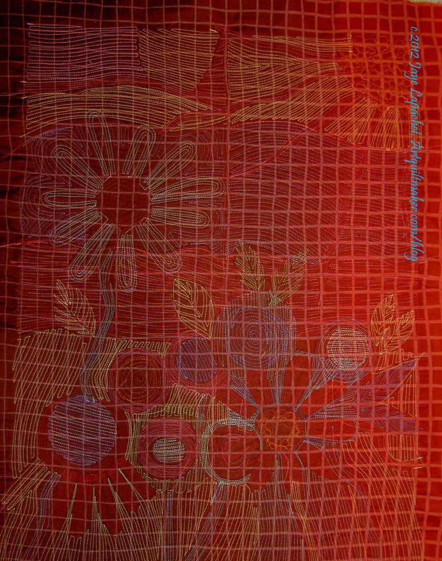
A few weeks ago, I spent a whole weekend, essentially, machine quilting the Garden quilt. I spent so long quilting it, because I am somewhat obsessive and like densely quilted quilts. It takes forever, but it looks great.
I thought I would get this piece framed like the Kissy Fish piece. On Kissy Fish, I didn’t pay much attention to the back, so the back looked fairly terrible: knots all over the place, long stitches joining sections, etc.
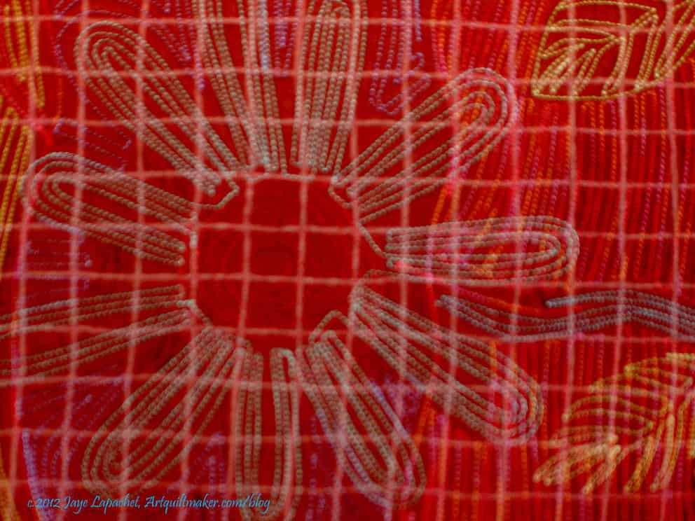
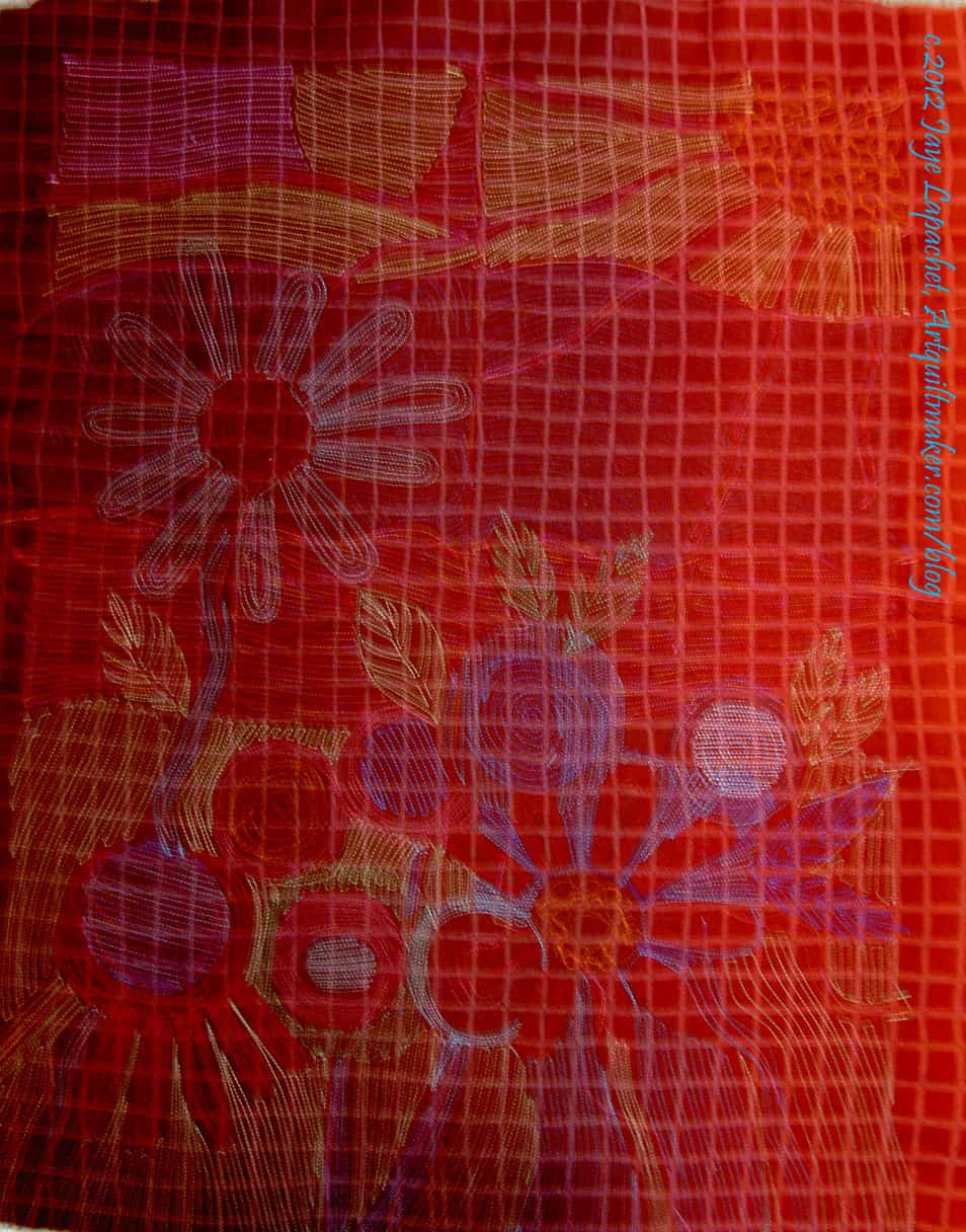
However, I took at look at that back after I quilted it and thought it looked really interesting. I quilt with different colors so the stitches blend into the fabric on the front. I don’t really care about the thread color on the back, because I didn’t think anyone would ever see it. I am in the habit of using the same thread color as bobbin color, so as a happy accident the colors of the quilting on the back look very cheerful.
Garden Back detail
In looking at the detail, it occurs to me that I now know why people like whole cloth quilts. In a way the back of this piece is like a whole cloth quilt.
BAMQG is having a challenge making a whole cloth quilt and I wasn’t really interested in doing the challenge, but looking at these photos makes me think that I might have an idea for a challenge piece.
Garden Back – Another View
A lot of the quilting I do, when I actually quilt, uses a regular foot rather than a walking foot. I haven’t felt confident in the last few years of my free motion quilting skills, so I have taken to using the regular foot. It works pretty well.
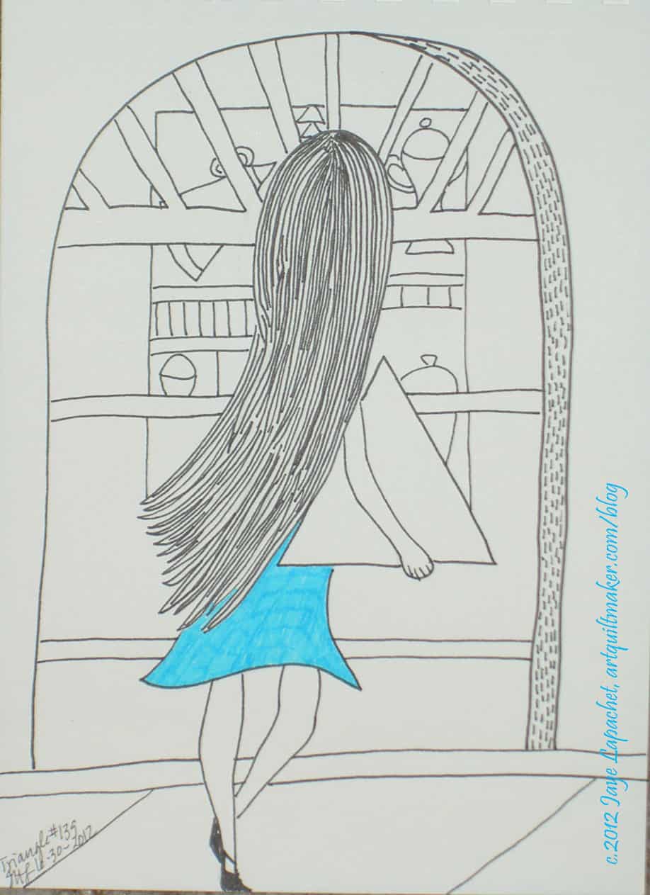
Yes, this is the second in the series of “the girl that carried shapes.” This response is related to the Parallelogram response. I am not sure why I think this is a good idea, but I do feel quite proud of the swing of her hair.
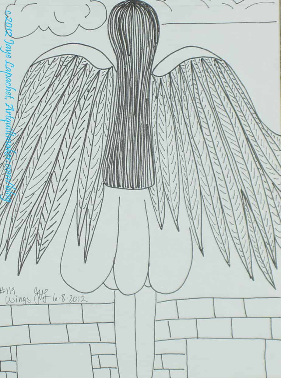
I think there will be some more wings in the future of these responses because I need more practice with wings. I do find that looking at the thing helps. Unfortunately, I do not have the opportunity to look at wings very often.
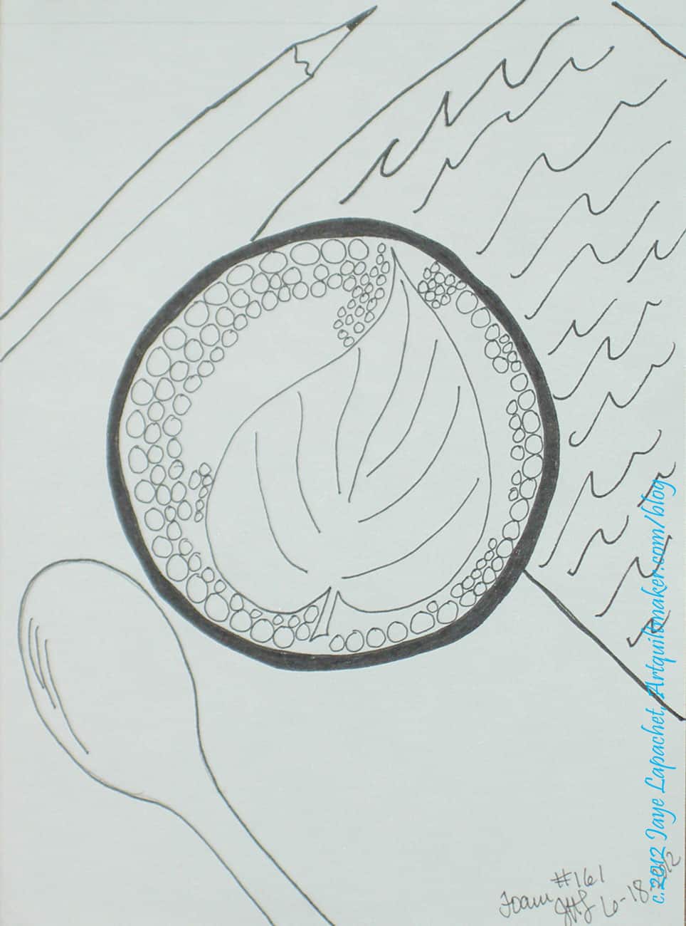
There is a shop downstairs from my work that does art in the foam on the top of their lattes and cappucinos. The art is much more diffuse than what I have drawn. The pens I use don’t blur very well.
As mentioned last week, I am working on the yellow donation quilt and it is going well. I made several more blocks while I was off over the Fourth of July holiday.
I was spurred on by seeing the finished blue donation quilt. Jennifer finished it on her longarm machine and did the binding as well. It looks so great to see it done.
It made me think that this Yellow quilt is an even better exercise for me, because the yellows are really different than what I have done with yellow before.
Yellow Donation Block
The brown-y yellows are a challenge, but I like the prints, so I am working with them.
I still have a few more blocks to make, but already have cut some pieces for sashing in hopes that I will get this top done before the next BAMQG meeting.
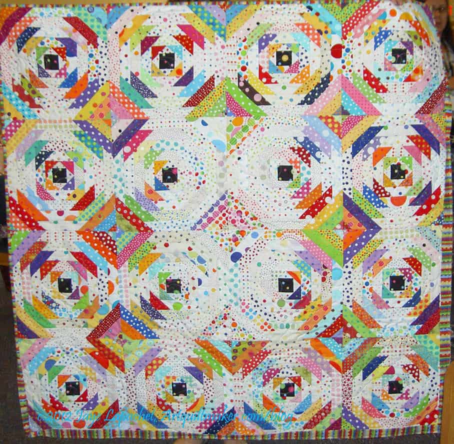
This is what the awesome BAMQG Charity girls made from my disappointing Pineapple blocks. I was so thrilled to see this quilt made from the blocks that I thought were a hopeless loss.
In addition to being happy that the blocks were usable, I also learned that a few mismatches wouldn’t detract from the overall look of the quilt.
This makes me feel like I could make new blocks and make a quilt out of those blocks. I still want to work out the measurements of the blocks, row by row so I can try and figure where I went wrong on the first series of blocks.
I just feel so much better about my original idea and about my technique.