Seeing as how I never have the right sized bubble mailers and have copious amounts of fabric and bubble wrap, it is a possibility that I might actually make a few. I don’t usually have time to put together something like this when I want to get a package off, but I can see the uses. Something to consider, regardless. I love the web and how you get to see a lot of different types of creativity.
1000 Journals Project Visits SF Weekend of August 1, 2008
You are probably wondering why it took me so long to get to this post.
Life.
Travel.
Back to School.
You know how it goes.
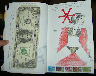
Still, I wanted to post some photos from the actual journals. The Roxie in SF showed the 1000 Journals movie. It was the first commercial showing in the country.
The 1000 Journals project is coming to the SFMOMA as an exhibit starting in November and the exhibit will be open through ~ April 2009.
I think that the images I was able to snap are from the most photographed journals (because they are in possession of Someguy), but I thought I would post some images anyway.

Some entries are homages. Some entries look like a mess, but that is one of the beauties of the project: everyone can express themselves anyway they want regardless of age or ability.
 The artistry of some of the pages is remarkable.
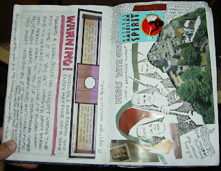
I like the way these entries were created in landscape format.
WARNING: Political images next. Stop reading if you may be offended.
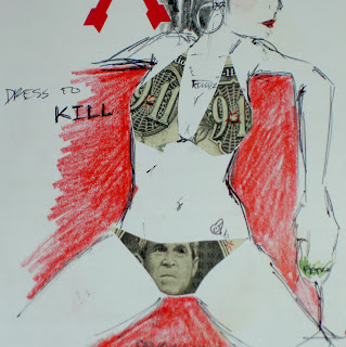 I am not exactly sure what these images are saying (remember the journals went out right around the time of 9/11 so there is a lot of 9/11 imagery included), but I admire the creativity and thoughtfulness (especially the double entendre) regardless of whether you think it is positive or not.
Parakeets’ Expression

This is a quilt that TFQ and I saw at the APNQ show. It has been on mind because of the expressiveness of the little parakeets. I think that this quilt tells a story because of the implied movement of the birds. I can appreciate realistic quilts, but don’t always see the point in reproducing a photo in quilt format. This one, however, tells a story.
Towards Final Bullseye Arrangement
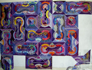 After magnificiently struggling with the layout for the Bullseye, I believe I have settled on a shape I can live with and one that is successful. The difference between this and the others I have done is that the ‘knots’ I have created are self contained. I keep thinking of them as Lovers’ Knots, but I know that term may confuse people who know the actual Lovers’ Knot quilt pattern.
I have more patches on the wall and am finalizing fabric placement now. I hope to get to sewing today as I would like to have this piece ready to take to the quilter with the Chocolate Box. I am itching to get back to the Pineapple (amazing, but true). I need to move a couple of projects forward first.
Next up in the Tote Bag Department
As you may recall, I made this lining for the Cupcake Tote, but ended up not using it.
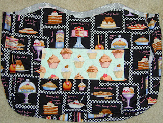
After finishing the Eggplant/Lemon tote and embellishing the Chocolate Flower Tote, I, once again, turned my attention to this troublesome lining. It wasn’t intentionally troublesome, but the colors turned out to be a problem.
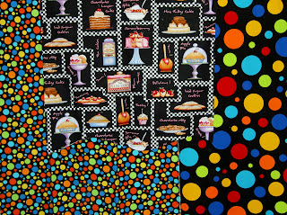 I looked through my fabric, not really sure what to pick. I pulled out these dots from the Timeless Treasures Basix collection. I love these dots, though I love the ones with the white backgrounds more. I thought I would use them, but when I looked at the three pieces together, I decided that making visually decisions visually was a good idea. The colors in the cake fabric didn’t go with the dots. No purple or pink in the dots and no turquoise or orange in the cake fabric. Too bad, because I have a lot of black dot fabrics that I haven’t used at all. The outside fabrics had to go with the lining, though.
After looking carefully at the focus fabric and looking through my black and white fabrics, I found this red batik and this violet dot.
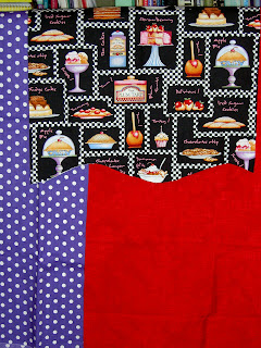 This is the grouping that I picked. I wanted the fabrics to all go together without being too matchy-matchy. I also wanted to use some dots. The violet dot is very thin and I don’t like it forpiecing. I don’t have much of that red batik, but think it will be nice as an accent. I completely ignored the aqua pockets that I already sewed to the inside of the lining. Nobody will see them much except the owner.
Stay tuned.
Out of the Mouths of Babes
Here is the latest update to the Flowering Snowball (Cross Blocks).
 As I have mentioned, I am nearing the end of the project. I am not sure what the end actually is, but am thinking that it is 10 more of the middle blocks and then a round of border blocks. I haven’t designed the border blocks, but will design them to complete the colored areas with the rest being white. I was also thinking of a black border. I need to play around with what I am thinking because it is much easier to show a photo/image than explain.
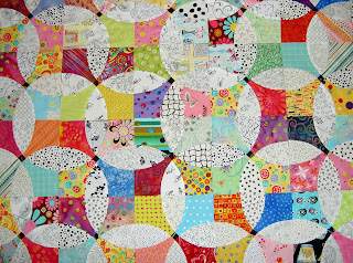 Here is a detail.
The Child came in and joined me while I was looking at the blocks. He said that it looks too chaotic and I need to put some solids in it. HUH???
I do think he is right. I don’t know if I will use tone-on-tones or something like low contrast batiks, but I think I need to add some resting spots for the viewers eyes. I will try it out and see what I come up with.
Weeks Ringle Color Workshop
|
|
Latest Fashion in Tote Bags
I worked on some totes this weekend. The Chocolate Flower tote was completed this summer (wrote about it on July 26), but something was missing. In general, I am also not liking the big blobs of fabric that the big outside pockets tend to become. I found a random piece of ribbon with the perfect colors. I used it to embellish the tote’s outside pocket last night. When I auditioned it, I thought the ribbon made the green in the flower print stand out.
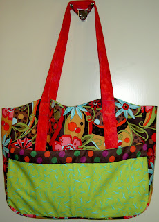 In future totes I want to work on making the outside pocket less of a big blob.
My newest tote is the eggplant/lemon tote. I started it on my summer vacation, but didn’t work on it again until this weekend, .
 The lemon flower fabric is from a recent Moda collection (Fresh Squeezed by Sandy Gervais??). I love the colors in the vegee/eggplant fabric. It is a very fun fabric that I would, probably, never use in a quilt.
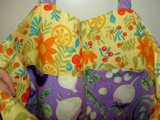
Here is the inside of the bag. I have started to put large pockets on the insides of all the bags in addition to the small pocket. They are very useful.
Quilt vs. Art
This is a giant piece of art made from found objects – large found objects – that is displayed at the American Gallery of Art. It is by Louise Nevelson and is described as an assemblage of found objects.
As you can see from the detail, this piece is about texture. I say that because the color is very flat and the artist does not use color to move your eye around the piece.
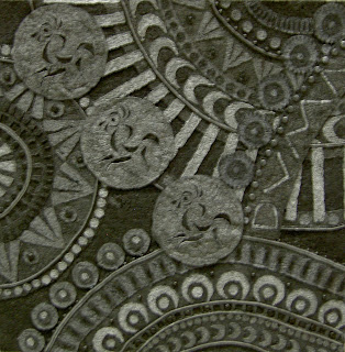
Above is a quilt we saw at APNQ, which reminded me of the art above. I don’t know if the quilt artist was informed or inspired by the piece above, but they are definitely related.
Metal Penguins and Exciting Eating Environments
Pacific Place in Seattle is a mall downtown with shops, movie theatres and restaurants. They also have cool art – public and to buy.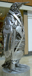 I like this penguin, because from far away it actually looks like a penguin. Up close it has great texture.
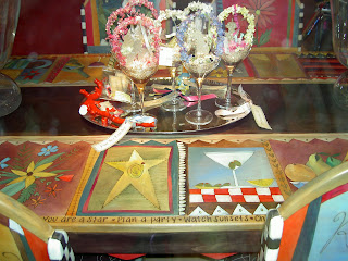
This is a wonderful set of table and chairs that are painted with lovely designs. They had other pieces such as a chest (like a cedar chest or toy chest).
Pink Flamingos in Mosaic
Cupcake Tote
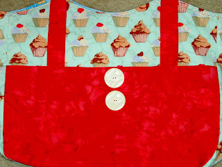
Here is the finished cupcake tote bag! The cupcake fabric is that which I bought from Clemetine’s Dry Goods a few months ago. I originally thought I would use a black cake fabric for the inside and I went so far as to construct it, but decided that it really didn’t go with the delicate aqua of the outside and changed the lining to this lovely turquoise cake with stands fabric. I bought that fabric at Capital Quilts AND at one of the shops in Connecticut while I was there.
Since I have not been able to figure out how to use the buttonholer on my machine, the buttons are decorative only. I put them there to break up that large expanse of pink. I have to go and get some more of these buttons as I love them. They have some style! They are vintage buttons from Britex and there are a couple of different styles available made out of the same material.
 Before I put the large white buttons on, I tried these pewter teapot/coffee cup buttons. They were ok, but the bag required some bolder embellishments.
 This is the original lining for the cupcake bag. I decided, eventually, that it just didn’t go with the light aqua and abandoned it for the turquoise gateau fabric lining. I’ll use this for another bag. Not sure which yet.
Next bag is the eggplant/lemon bag. 😉
Bullseye Progress?
I can’t really decide if I am making progress on this project. It has been on my wall for awhile and all the ways I have tried to arrange the pieces have not been successful or satisfactory. I want to finish it and get it off my wall, because it is a dark quilt and doesn’t make me feel happy when I look at it. I like the quilt, it is just the wrong time of year to have a dark quilt on the wall.
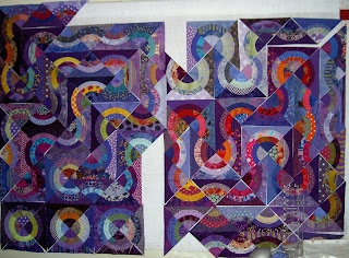 Until yesterday, the above photo shows the most recent design. It had been on the wall for awhile and I knew it wasn’t working, but was considering sewing it together just to be done with it.
Sadly, this layout looks like two separate quilts, which is not good. I suppose I could put one on the front and one on the back. Not happening. I want a cohesive/unified design. I seriously like the snaky bit highlighted with the warm colored (red and pink) fabrics, but I couldn’t figure out how to include it and all the other patches. I like the half block wedges (see photo below) that end up, often, in the corners, s, in this iteration, I tried to replicate those on the left side of this layout. It doesn’t solve the problem of two quilts in one and the wedges don’t show up very well in the overall piece.
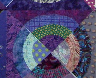 Wedge detail.
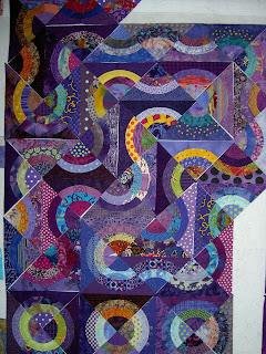 Detail showing my attempt at the wedge design.
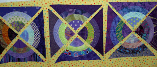 I saw a quilt of Kerr/Ringle’s called XO in the Modern Quilt Workshop book. The blocks had patches the same shape as my bullseye wedges, but Bill and Weeks had added a thin strip of fabric in between. Above shows my attempt at using their idea. I considered trying a purple/violet fabric, but ultimately didn’t choose this option, because I was too lazy to find the right fabric and think I came up with a better idea.

Yesterday morning, I had a brainwave and the above layout is it. Is isn’t finished and there are still a couple of problems to work out, but so far I like this layout the best of all. The red/pink snake is gone, but so is the two quilts in one problem. Some of the problems I have to work out are:
- fabric placement
- how to work with the many more pieces I have than are shown with a small design wall.
- getting the whole piece to be cohesive while using all (or most of the blocks)
- Making the piece fit in a square or rectangular format without adding blank pieces of fabric. I added blank pieces in Feelin’ Blue and don’t want to do that again.
None of these are as insurmountable as the layout. I think I have a good one here and will move forward with until such time as it is finished or I decide it was a bad idea.
Teacher Pillows 2008
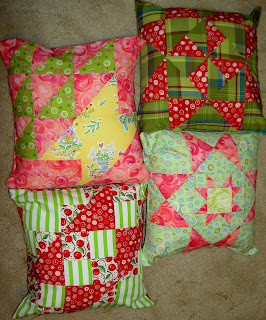
Yes, I made Teacher Pillows again. I know I am going to get flak for reprising the project that made me so insane last year. This year my timing was off (summer, which, as you know, happens NOT to be before the end of school) and they turned out to be a lot easier. Spring was just too crazy with work to be able to get to this project in time for the end of school. I think doing them while I was on vacation and not worrying about regular life was a really good thing. The first day of school is Monday, so the teachers will get a little boost from a gift then.
I decided to make them on vacation so I could get my SIL to give me some pointers. She has 3 boys, two of which are out of the house and college, and a lot of Teacher Pillows under her belt. I thought that if she couldn’t give me some pointers to make the process easier, I would really give up the tradition.
These are 12″ square pillows. That size choice made the whole process easier, because I didn’t have to change the size of the block or add a border and could just use the directions straight out of Around the Block. I have EQ, so another idea is that if I want to make 14″ pillows in the future I could resize one of their blocks and use the directions. They have great rotary cutting directions. (note to self).
SIL also suggested that I made the back two panels 10″ x 12″ each. This size is to prevent gaposis. It was hard to get the pillow forms into the pillow cover, but once they were all in, there was no gaposis.
The only thing I don’t like about this group is that the pillow forms are too puffy in the middle, so the corners aren’t filled out. I am ignoring that this time around. Once the teachers lean on them, I am hoping they will squish down. I will look for squishier pillow forms next time. Last time I got feather pillow forms on sale and those filled out the pillow cover nicely.
Tag You’re It
Bill Kerr is now on my list of best quilt lecturers of all time. I left the Peninsula Quilters Guild meeting last feeling excited and inspired and that I needed to sit down and make something fabulous. I ended up looking through and reading the two Kerr/Ringle books as soon as I got home. What a lovely experience!
I thought both Kerr and Ringle would be there, but it turns out that they have a 7 year old who is traveling with them and Ringle was on kid control. Bill said having a family and your won business was a challenge (definitely!) and they solved the issue with a lot of ‘tag, you’re it.’ Weeks is teaching the class today, which I am, sadly, missing.
I am particularly sad to miss the workshop, on color, because he said that they are so busy with their design work that they rarely visit guilds and hardly ever teach. I am hopeful that I will get to work with them, because he mentioned that they teach a week long, intensive design course. It is now on my list of things to do when the work situation simmers down. It is not listed on their workshop page, so I will have to inquire.
Peninsula Quilters
I have never been to a Peninsula Quilters meeting before, though I have been to a couple of their shows. In general I found the meeting interesting. They start the meeting at 7 pm and have guild business: reports of the board and committees, announcements, all of which is followed up with show and tell. There was lots of show and tell, which was fantastic. Lots of cheerful quilts. Not too many depressing quilts. Some of the show and tell quilts they hang around the room, a la the clothesline at CQFA, but others are just held up as the presentor reaches the front of the line. Each person presents very briefly. Some of them were so fast that if you looked down and wrote some notes, you would miss the quilt! Some of the quilts were the product of their mystery quilt program, which was a Sawtooth Star with another Sawtooth Star in the middle and an Irish Chain/Jewel Box-like alternating block. Get the idea here. Donna Allard made one with a yellow background and soft, but clear colors for the stars and chains that made me really happy. It reminded me of the Jewel Box pattern TFQ and I started.
The business portion of the meeting was followed by a break until 8pm at which time they introduced the speaker and Bill Ker started his talk. From the one hour+ lecture, I really like Bill Kerr. He was cheerful and confident and delighted in the guild business as well as all the show and tell. I liked his forthcoming attitude and cheerful manner with which he approaches quiltmaking.
His way of picking out fabric is to find an idea then express that idea by choosing colors that evoke what you are trying to express. For example, if you want to make a quilt that evokes a hot fudge sundae, the colors you would choose:
- white white (ice cream and whipped cream)
- scarlet (cherry)
- toasty brown (nuts)
- brown-black( chocolate sauce)
I might add this idea to my Basic Quilting Class notes as well as their Quiltermaker’s Color Workshop book.
Bill said a lot of interesting things related to visual arts. He suggested that people think you are born Picasso or doomed to mediocrity. He believes this to be wrong and that visual arts take work, like anything else, and that you can be successful if you work at it. I like this sentiment, because it is hopeful. I wasn’t born Picasso, but I think I have some ideas to contribute to visual arts world.
On Collaboration
Kerr said that he and Ringle collaborate completely and that the quilts that come out of their studio are the product of a combined effort. One may start with the idea, but as the idea gets tossed around and changed, it gets reshaped. He also said that the collaboration in visual arts is undervalued. Other art forms/artists such as dance/dancers and music/musicians have a long tradition of collaboration, but the visual arts don’t. I am not sure this quite true. I think a lot of artists like Rembrandt and Chiluly have people that they work with. However, this may be more a master-apprentice relationship than a true collaboration and not quite what Bill was getting at. His feeling is that the right collaborator can make the work very special.
When he talked about working with someone else, I immediately thought of the collaborations that TFQ and I have done. We haven’t collaborated as much lately, but, perhaps, bouncing ideas off of each other about the tote bags is also a kind of collaboration. there is always a possibility of starting something new.
FunQuilts/Their Work
FunQuilts is the design studio Weeks and Bill started 10 years ago. Before that both worked in the corporate world. You can find a bio and photos about Bill and Weeks at AllPeopleQuilt.com.
Most of their work is in design. They do commissioned work for clients, design fabrics and write books. It is only recently that the quilt world has found them. They have been published in Time, the New York Times, O: the Oprah magazine and major design publications. The April 2007 and April 2008 issues of the American Patchwork and Quilting have also had articles on them.
Until recently they designed fabrics for FreeSpirit, but have recently moved to RJR. Not all of their fabrics are still available, but you can order some from Kerr and Ringle directly. their newest line, Wild Bunch should be out this week.
Vision
I think they have an interesting vision. They look at the icons of the era (usually current) and make their quilts evoke their era. They often start with the questions: what are the icons of daily life around us? Some of their quilts reflect this:
- Tankini (a popular new type of bathing suit available for the past 10 years or so)
- Great American Roadtrip
Tankini, which is by Weeks only, is an example of this. Tankini (sorry, I couldn’t find a pic online-check the QN ’07 catalog) was accepted into Quilt National 2007.
Bill thinks that if you can articulate your idea it will inform the piecing, the quilting etc.
They like to cross-polinate their quilts with other types of images and visuals. He recommends susbscribing to some non-quilt magazines in order to see non-quilt images and be inspired by those images. I’d like to know the non-quilt magazines to which YOU subscribe.
Other
Zanzibar, pictured on the cover of the Quiltmaker’s Color Workshop, the quilt that TFQ and I admired at Black Cat, was inspired by the spice markets in East Africa, where Kerr lived for many years. I thought the fabrics were dull and boring in the book*, but the backstory makes the color choices more understandable. He, also, gently reminded me that color choices are very personal. I have never been to a spice market, but I don’t imagine that there are fuchsia and turquoise spices?
Kerr and Ringle are also not in the habit of slapping on long strips of borders (hooray! kindred spirits!). Actually, they cut off parts of the quilts/blocks in order to assist the viewer’s eye in travelling around the quilt. They want to engage the viewer by enabling, through design, the eye to travel all over the quilt discovering different parts. This idea kind of validates my self-bordering practice.
Kerr’s quilt (Ringle told him to make it himself), Some Settlement May Occur, started as a large piece of black fabric. Kerr cut circles out of the black and inset the colored circles. If nothing else, this endeared him to me, because I love the idea of insetting circles and have ever since I heard about it from Ruth McDowell. I haven’t actually tried it, but will someday. I think of this kind of piecing as a type of freedom.
Kerr continued to cut out fabric and inset colored circles until he was happy with the design, then he cut off pieces from the edge to make the design pleasing. What Kerr things makes this technique work is that they press their seams open so that the quilts are really flat. He didn’t want to applique’ because he didn’t want the black to change the color of the circles. Kerr acknowledged that he could have cut out the back, but thinks that the quilts are flatter if the circles are inset.
They use the very lightest weight cotton batting by Quilter’s Dream, because they like the drape. they do most of their quilting by longarm machine and use rich tone-on-tones or solids for much of their work. They use the tone-on-tones because of the way the seams are easily hidden.
All in all, it was fabulous to hear him and I can’t wait to get the opportunity again.
*Kerr what shocked when he saw the cover of my book because of how dull the color reproduction was. We, then, had a long-ish discussion of color reproductions in books.
