Thinking about Borders v.APNQ

Quilt shows are a good place to try and work out a quilt puzzle because there are, generally, more quilts at a quilt show than any other place you normally inhabit.

I wasn’t really trying to work out a problem, but the idea of borders was rumbling around in the back of my mind.

I sincerely dislike borders t hat have no good DESIGN reason for being there. I don’t like borders that are just slapped on because the Quilt Police say you need a border or the quilt wasn’t quite large enough. I have engaged in this behavior, much to my chagrin, and endeavor not to do it anymore.

Thus you can imagine my delight when I saw this light and airy border on a Mariner’s Compass quilt. I LOVE the idea of giving the Mariner’s Compass some boundaries without hemming it in with a heavy and long piece of fabric. While it is not as cohesive as the self bordering technique can be to the design, I still find it to be very successful.

Cleaning up the Junk Drawer of my Blog

The title is paraphrased and re-imagined from a phrase that DebR uses on her blog, Red Shoe Rambling. I have a lot of little bits to pass on and thought this would be a good time to do it.

More on Gabrielle Swain

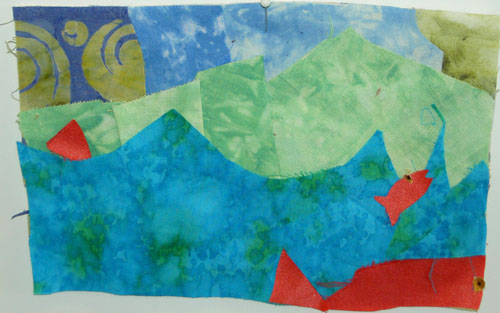
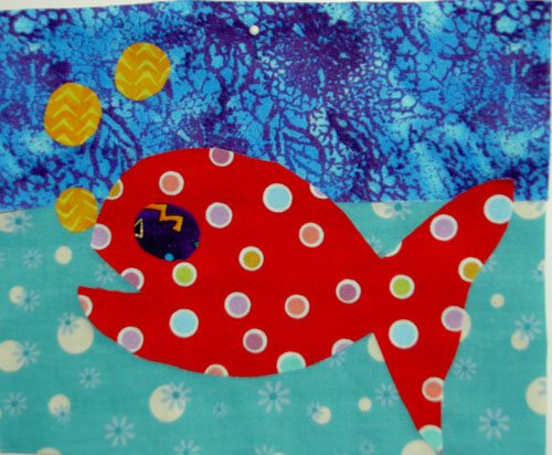
I forgot my camera on the second day of class. Karen, a fellow student in the Gabrielle Swain class, was kind enough to share her photos with me. We had a little session on features of her camera, which was fun and then we took some pictures. Karen let me look over her shoulder while she took photos.


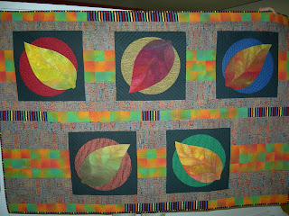
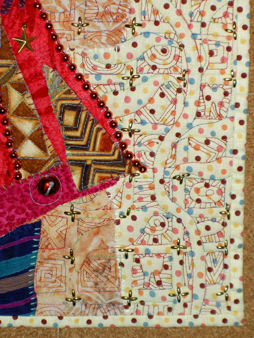
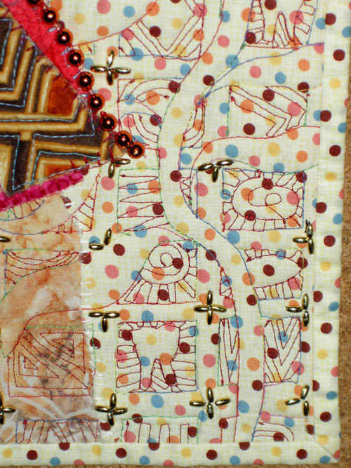
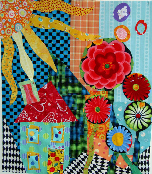
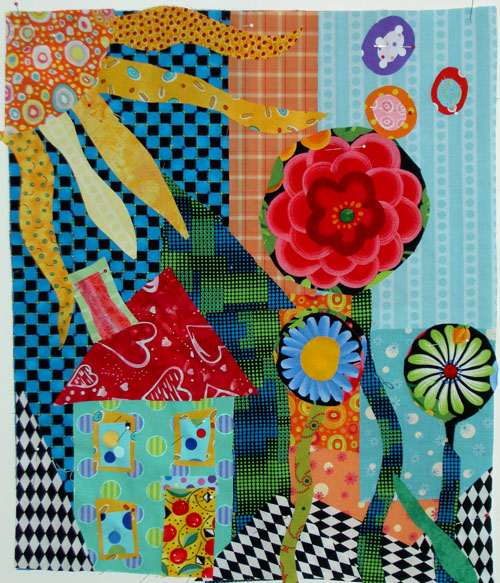
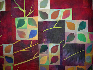
In the above piece, you can see the color placement issue that I described in Gabrielle Swain Class, Day 2. The leaf is made up of separate pieces. If you can see how the veins divide the leaf, know that each of those sections is a separate piece of fabric. In placing the fabric, Swain explained to us how to fussy cut the fabric (using the light box) so that there are no huge breaks in the color of the leaf. I think the above leaf has more color breaks than I would expect there to be in a piece, but since GS did it, there must be a reason.

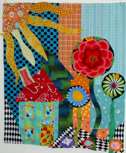
You can also see the quilting pretty well in the above photo. All of this quilting is done by hand.

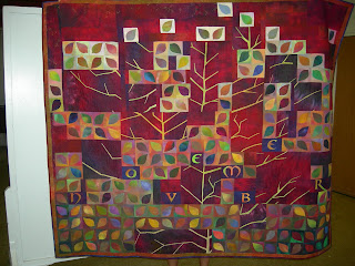
I liked this quilt, because of the way she breaks up the leaves and the branches. I also think the few letters add a lot of interest.


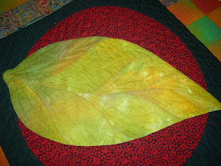
My favorite quilt of Ms. Swain’s was called Even Change (not above, click the link). I think the one on her website might be different than the one she brought to class. Still, I like the idea of temperature that she used in this quilt. The idea was that if she used a cool tone on the background, Swain appliqued a leaf (piece of fabric) in a warm tone on top of that background, then she used a cool tone for the veins. Very successful.

Thinking about Proportion

Periodically, some technique that has been rumbling around in my mind as I try and understand it, clicks into place. What is rumbling around in my mind lately is proportion.
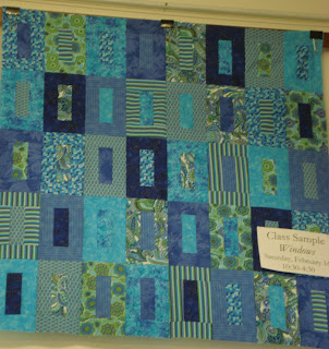
TFQ and I saw this class sample at Black Cat Quilts when she was visiting in April. It is from the Weeks Ringle and Bill Kerr book, Quiltmaker’s Color Workshop: the FunQuilts’ Guide to Understanding Color and Choosing Fabrics. Gretchen was out of the book so I had to buy it from somewhere else. That meant that we couldn’t look at the book or the directions for the quilt.The pattern is pretty easy, so it doesn’t really require a class or a pattern.

I was shocked when I did buy the book, because 1) the colors were a shockingly ugly combination (TO ME). I have little to no appreciation for the colors in quilts made from reproduction fabrics; 2) they put that ugly quilt on the cover; and 3) how small the blocks actually were in the pattern in the book. The above picture shows blocks that are approximately 8″x4″. It was high up on the wall and there wasn’t a ladder available for me to climb and measure the blocks. Also, I forgot my tape measure. Anyway, in the book the pattern directions tell you to create blocks that are about 3″x5″ (the size of an index card). Huh???

Well, obviously, the maker of the class sample was perfectly able to enlarge the pattern. This where I started to think about proportion. I find that the proportion of the blocks in the picture above to be good. I haven’t made one of the smaller blocks, so I can’t say whether I would like that size.*

My thoughts about proportion, which started with this book/class sample encounter, have to do with how to figure out how to find the right proportions (without a lot of complicated math, thanks) of a block. It is easy to say “ok, the pattern says to make this block 3×5, so it would be easy to blow the block up to 6×10”, but what about if I want the block to be 8x something. I have a little fraction to decimal cheatsheet and I want a proportion cheatsheet as well. Let me know if you know of one.

I do have EQ6 and will probably work on it there.

Note we did get permission to take the photo.

*Aside: the smaller blocks might be a good FOTY project.

Prismacolors

At work and personally, I am doing a lot of self examination. In the course of this, we were talking about Myers-Briggs types and how some types don’t like opening gifts in front of people. That brought up a discussion of gifts and how I would really like a super large set of Prismacolors. Gabrielle Swain suggested getting the large set so that I would have every color I ever needed. I have been using a set of colored pencils that were part of my school supplies list when I lived in Austria. They are a few years old, but they have great names like hellgruen and dunkelblau and they do the job. The friend subsequently mentioned that Aaron Bros was having a monster sale and I could get a set for half off. I went to Aaron Bros last night while I was running an errand at Target and looked.

First, I was shocked at how few art supplies Aaron Bros actually has now. Their whole upper floor was filled with framing services and ready made frames. I had no idea frames were such good business.

Anyway, I didn’t buy any Prismacolors, because the 40% off sale was over. Dick Blick has the set of 132 pencils (list $190.00+) for $89. That seems like a good deal.

Swain also mentioned the Prismacolor Art stix. She made them sound like they were some special/new kind of pencil. I looked at them at Aaron Bros and they looked more like pastels to me. I am not into messy, so I don’t know if they are for me. I think I bought a couple last week and will try them out.

I am also interested in the Derwent Inktense pencils. I suppose I should learn some techniques for colored pencils, so I can really test the various pencils in an informed manner.

Making Many Bags

I figured out why it is a GREAT idea to have multiple tote bags hanging around. To date, I have made 6 bags and have 2 or 3 cut out and the fabric ready for at least one more. I have been thinking, and discussing with TFQ, the point of making many bags. The obvious answer is that it is fun to make bags. It is great fun to use large pieces of different fabrics than I wouldn’t normally use for quilts. It is also fun to buy fabrics, such as the cupcake fabric for a purpose. I came across the true answer last Friday, as I prepared to go on a trip.

The true answer is that you need extra bags so you don’t have to clear out the other bag you haven’t unloaded!

Yes, life has been crazy and I haven’t unloaded the dot/flower bag, so when I went to pack for the trip to the lake, my choices were to unload the bag or do something else. I was, as usual, in a rush and late, so I just grabbed the Alexander Henry bag, filled it up and left. Right now, I have two bags laying on the floor of the workroom full of various activities. I guess I am already packed for another trip!

The dot/flower bag also needs to be fixed. I didn’t catch all of the hem when I hemmed the top, so I need to resew that. I started to unsew it and resew it, but haven’t finished.

Gabrielle Swain Class Day 1


Another teacher to add to your ‘must take’ list. This woman knows how to teach! She knows her stuff, has confidence in her teaching and has an opinion, which I like. I don’t have to agree with the opinion, but wishy-washy “well, what do you think, dear?” kind of comments from a teacher, make me crazy.

Above are the fabrics that I brought to class. Not being a hand-dyed girl, I chose batiks in a palette that I like. Her suggestion of 3 yards was a wild shot in the dark, IMO. I would improve the supply list by asking for 20-30 FQs evenly divided among all the colors. In this case, I was able to find some fabrics out of my small batch to work with, but other people were having a really hard time. Even people who had brought a lot of fabric with them.

The first part of the class was all about design. No sewing. Some people were completely mortified. I was thrilled. I actually got to spend time on my design and try out a couple of different things. One thing that Swain said, which resonated with me, was that people find their materials first and then try to find a design to fit the fabrics. I Think it is true in a lot of cases, but I don’t think it is true, mostly, for me. It is definitely something to consider and keep in mind.


The theme of the class was leaves. Mom went through my inspiration file and pulled out many of the pictures containing leaves. Talk about a hero! I went through the pictures a few times before I started the design and whittled down the group. I finally settled on a Georgia O’Keeffe postcard of a painting called Yellow Leaves (bottom left). Apparently the real painting is at the Brooklyn Museum of Art. In surfing the web, I found an image of another of her leaf works that has to be in the same series called Pattern of Leaves.

Swain gave us large format patterns, which we could have also used, but I don’t think anyone did.


This was my first attempt and , frankly, it is pretty much a copy of the O’Keeffe work. Swain said to add another leaf (rule of odds) and turn the leaves so they were going in different directions. I had a hard time understanding what she was suggesting. She ended up explaining it by saying to align the leaves so they hit various points on the letter C. Finally, I got it and set to work.

This was my second attempt. After finishing the draft, I was concerned that not enough of the two upper leaves were showing.
I traced my second attempt, but shifted the paper slightly to modify the spacing. It ended up with too much spacing.


Above is my fourth attempt, which I liked. Again, I modified the spacing.

This is the final design for my project. It is the third drawing, which Swain thought was better than the fourth.

I think the above process is a good example of why spending the time on the design is worthwhile.

My first thought was hat I would make each of the leaves out of a variety of different fabrics. Above is my first pass at fabric selection. I was thinking that more fabrics would add interest.

Here are my choices with the background.

This group is good, but Swain was concerned about the strong print on the middle fabric. She thought, when cut up, the petals of the sunflower would draw the viewer’s eye in an unintended direction. She is very much about careful choices in both fabric and seam lines. There were a lot of things she said that reminded me of Ruth McDowell’s work with seam allowances.

Here is my final selection. I guess it is ok. I may work on it a bit more later just to make sure I am happy with it. I like the fabrics, but the combination as leaves is a bit of a stretch. I am, however, willing to work with the colors to see how Swain’s advice works. Here is one example Swain had for a design principle. Think of a tic-tac-toe board. Put an x in the middle, because you don’t want to put anything exactly in the middle. The Os at the intersection of the squares are where she suggested we place our images, if doing this kind of a design.

Julie’s fabric selections and pattern. Julie is Swain’s star student as Julie took her 6 month creativity class earlier this year. Sadly, none of the glow is rubbing off on me. 😉

Visual Journaling


I have been thinking and talking about visual journaling for several months. I have finally put my money where my mouth is and done it. I don’t know why this view, but something about the 24th Street sign and the fact that I had time called to me. Some things I will consider for next time:

  1. Practice looking. I don’t think I am really looking.
  2. Choose a smaller bit of the view.
  3. Eliminate detail. Just work with the essentials.

I think I am past the hump and hope that I will do more.

Quilt Block Indexes

I know that quilt blocks are not in vogue at the moment, but I love quilt blocks and the possibilities that they provide for creativity. I am particularly enamored of older blocks that have oddly shaped pieces and provide interesting opportunities for coloration and settings.

To that end, Rose Lea Alboum has created a variety of indexes to older quilt blocks. She now has created a website, which means that you can see her offerings at: http://americanlegacyquiltindexes.com/index.htm. The website shows the cover of each book and along with a few pages. They are organized by designer or publication and have a small picture of each block along with some basic information such as name and number. Not only do these books provide an organized method of accessing old blocks, but they also provide a look at how quiltmaking fits in with history. The names of the blocks provide ties to history, which show how women connected their art to current events. A great addition would be to add dates to the blocks.

I bought the Index to Laura Wheeler Quilt Blocks, which I mentioned in a post last year. It is a slim, self published volume with a spiral binding. I bought this one because I was interested, at the time, in a block called Snowball Wreath, which I discussed in a post in June of this year.

There is a brief introduction to the book. The blocks are listed in alphabetical order. Each block has a hand drawn picture along with the name and number. The pictures of the blocks are approximately 3×3″. There are no templates. This is a reference tool and not a pattern book (though it is possible to redraft the patterns). The work also contains an index of names and a list by number (e.g. Laura Wheeler Number Sequence).

Now to get the Electric Quilt Company interested enough in these materials to create the blocks they have not already created! Although quite comprehensive, not all of the information that Ms. Alboum has is in EQ6 or Blockbase, but it is easy enough to add. This series is a great addition to anyone’s library who enjoys quilt blocks.

The Trees

Some time ago, I talked about organizing my quilt photos on Flickr. For a number of photos, where I saw themes emerging, I used sets. This means that a variety of quilts from different shows might end up in the same set because they have a similar theme. I meant to talk about each set and highlight them for you and haven’t yet gotten to it.

Since I haven’t been sewing much (though I do have a few things to show you and talk about), I thought I would show you the trees. Trees have been on my mind lately, because they, IRL, are all nearly naked, though there are a few that still have some straggling red leaves on them.

When I was organizing the photos, I didn’t set out to have a set of trees. As I was looking through the photos, I saw a number of trees and thought there were enough to create a set. Mostly there are quilts, but there is one inspiration for a quilt photo as well. I thought it was really interesting to see the different interpretations of trees. Some of you are probably remembering that I pointed you to these photos already. You are correct. I am really not being lame. I just have trees on the mind. If you have a quilt photo depicting a tree that you would like to include, let me know.

Wallpaper as a Design Resource

While I was stumbling around my other life, I read ResearchBuzz. At ResearchBuzz, Tara reviews a variety of different sites, tools and features that the Internet throws at us. In today’s newsletter, she reviews a historic wallpaper site called Wallpaper in New England. Ever on the hunt for design sources, I took a look.

There are lots of flowers and border prints. The thumbnails are small. Many are muted colors, but design and layout inspiration abound. I took a look at Accession Number: 1985.26.685, which would be a good layout for a quilt. Take a look and get inspiration from a new place.

Sharing with Like Minded Creative People

Today was the CQFA meeting. There are six meetings per year and they are held in Santa Clara, which is about an hour from my house. It is always a big effort (I usually stay up too late the previous night and am tired from the week of racing around) for me to get the to the meetings and I have missed a number of them this year. I was richly rewarded by attending today as the show and tell was fantastic. Also, nobody was being an attention hog or annoying me. Everyone was wonderfully supportive of one woman who is experiencing a series of losses in her life. Not only was the work wonderful, but inspirational as well. Check the website for the meeting and I am sure the photos will be posted soon.

The workshop was put on by Virginia Schnalle, who is a wonderfully creative quiltmaker. I admire her work, her fearlessness in art and her quiet manner. She has taught a couple of workshops for the group and they always yield wonderful results for me. It was in her class that I made the Eye of God. That quilt is now in the collection of another quiltmaker, but I consider it to be one of my most successful quilts.

Today we worked on getting started when your muse has gone on vacation or your well has run dry. First VS gave out a basket of words, from which we each chose three. We weren’t able to tell what the words were before we chose them. From these words we had to draw simple drawings that came to mind when we saw the words. My words were:

wisdom
release
freedom

I thought the words were good choices for me at this point in time and space. The drawings I made were not very satisfactory, but I think if I were stuck, I would be able to use them to get the muse.

The good thing about this exercise (and my lack of organization) is that, in looking for supplies on the supply list, I found two wonderful pencils. They are very smooth and easy to use. They are called Berol Karismacolor. I have no memory of buying them, but must have sometime in the distant past of my art days. I am putting them in the pile of possible supplies for my visual journal.


After discussing different kinds of balance: symmetrical/formal, assymetrical/informal, horizontal, circular or radial balance and crystallographic balance and the Rule of Thirds, we went to work on our own pieces. My first one is above. It is made out of cut up magazine pictures. I didn’t pay attention to the subject of the pictures…much, but concentrated mostly on the color and the pattern. The first one wasn’t terribly successful IMO.

I didn’t pay attention to the Rule of Thirds direction and just made the one above because I was inspired to do so. Very symmetrical.Same as above. I didn’t have any red to start out with, but scrounged some from the garbage pile and made this piece. Again, very symmetrical. I can see working with this design to make other pieces.
And TA DA! Here is the piece d’resistance. I think this one came out the best. I added the words (see first exercise) at the end on a whim as well as the #1. I like to mix characters and imagery. I am not sure what I would do with this, but I can see tracing the main lines and going on from there with it.

During show and tell and the announcements, I also worked on this piece from the Laura Wasilowski class. I worked on the handwork using Laura’s hand-dyed thread. Adding the thread is similar to Pamela’s techniques. I like the process, but I also like making progress. I have a few too many handwork projects in the pipeline right at the moment and would like to move a couple of them out. Goals are good!

Quilting Arts "Too Hot" Tips

Quiltings Arts recent e-mail newsletter had some great ideas for quilting when it is too hot to actually put needle to fabric. I am reproducing them here, but the ideas belong to Quilting Arts.

Too hot to quilt? Design!

  • Photograph. Take pictures of your (and others’) gardens to use later as inspiration for landscapes, color combinations, and abstracts or for digital manipulation and photo transfer.
  • Sketch. Draw flowers or vegetables up close, paying attention to seeds, stamens, leaves, and veins.
  • Gather. Beach glass, shells, interesting sticks, outdated maps, seed pods, and so on can provide inspiration and materials for your next quilt.
  • Shop. Now is the time to take advantage of end-of-season sales on fibers and fabrics or to get a jump on the new fall colors and innovations.
  • Plan. Just like gardeners plan their gardens in winter, quilters can get organized for the next “season” of quilting at the end of the summer. Make a schedule of shows to enter and due dates; list gift projects and deadlines for finishing them; take inventory of your tools and supplies, and replenish them, so when inspiration strikes, you’ll be ready!

I don’t see a link to back issues of t he eNewsletter, but you can subscribe to future issues on their site.

Happy Designing

Reflections on Pamela’s Class

I know I overloaded myself with photos posted to Artquiltmaker blog on Saturday after the class with Pamela, so I must have overloaded you all as well. This post is about focus and reflection on the class.


Here is my first draft, so to speak. I had looked at my previous effort, from the first class with Pamela, before this class and had an idea that doing a related quilt would be a good idea. I was also looking at Collaborative Quilting by Freddy Moran and Gwen Marston last week, which made me think about houses. The sun and the flowers are in common, I think.

One thing I realized is that I have not been working with scale much lately. The Pineapple, the various square pieces including Thoughts on Dots did not require me to work with scale in any meaningful way. I did pay attention to dots were in the various prints I used for Thoughts on Dots. I didn’t have to worry about scale overall in terms of the elements of the quilt. So, this piece made me stretch. When Pamela came around to help me the first time, scale was what we focused on. I needed larger flowers and larger rays of the sun.

Final piece (sans quilting)

It wasn’t quite so easy as making some elements a little bigger, though, because I had the previous garden quilt (below) on my mind as well. Some of the intermediate “drafts” of this piece had many more flowers. You can see the various drafts in Saturday’s post.

I brought scraps per the directions, so I didn’t have a lot of choice of background. I had a lot of variety in fabrics, but not a lot of variety in size. My scraps are relatively small in general, so I put some darks in (per Pamela’s instructions) and really had trouble working with them, as I also mentioned. I have not been working with black and the checkerboard is interesting, but it doesn’t read as a cheerful fabric to me. I have gotten some feedback that it isn’t too dark, so I am considering it stretching and moving on.

Pamela’s technique of cutting directly into the fabric is a very freeing way to quilt, however, and I think it is good for me. Now that I have two of these garden type quilts, I might try to make two more and have a quartet. We’ll see.


I enjoyed her handstitching techniques with Perl Cotton as well. One of the things about this is that it doesn’t have to be perfect. The stitching adds to the charm, but I don’t think it looks like the fake folk art kind of look. I could be wrong, of course!

My 2006 Pamela piece. I am more excited about getting back to it now. I machine stitched some of it down, but plan to go back and work some more with the Perl Cotton on the flowers, especially.

I highly recommend Pamela’s classes. She is a quilt teacher, but she has been trained in art and knows about design principles. That is the focus of her class with fabric as the medium. She seems to truly want people to do good work. I am glad she directed me, in her gentle but firm way, to scale, because that is what I needed to work on.

A Day with Pamela

I made it to the Pamela Allen class at EBHQ.

This is all the stuff I took to class, except my sewing machine is not in the picture. (above). The pieces you see are pieces that I made in a previous class with her at Quilting Adventures.

Pamela’s work (below)


Tooth Fairy


Tooth Fairy (detail)


more Tooth Fairy detail


This is what it looks like when I work in a class. (above) What a mess!


My background for the House & Garden quilt. I really can’t help starting new projects in her class.


First draft


Pamela working on my piece


Lots of flowers and flying dots.


Not so many flowers and flying dots.


Not so many flowers and no flying dots.


Final composition. I like it, but I have to admit that I had a very hard time working with the darker colors (the black around the flowers and the blue/black checkerboard. All I could think of was that I wasn’t used to it. I haven’t been using much black lately and, as you know, have been trying to make cheerful quilts. This quilt-let seems a little dark to me.


Pamela working with Julie


Julie’s piece. I love the line up the left hand side.


Group Sampler project. We had 15 minutes to make our part of this piece.


Julie’s two fish. Can you find the second one?


My fish – with dots, of course!

I am tired and about to sign off, but I thought I would put up some photos for all of you to drool over while I go recover from a FAB day. More tomorrow.

Design Ideas for Coffee Quilt

After writing the post about the Coffee quilt, it occurred to me that a row quilt might be the way to go.

When my computer is idle, it scrolls through various quilt show photos I have taken. While it was scrolling through the PIQF 2005 photos, I saw a row quilt that might work for the coffee quilt.

This one is done with 4Patches, which wouldn’t really work, but I could fussy cut the squares with motifs in them instead of making a four patch. I could also make the squares different sizes to accomodate the motifs. Sue Nickels has a row quilt that I liked. I am pretty sure I took a picture of it when I was in her class and will have to dig that out.

I am not starting this quilt, just mulling.