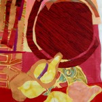
Julie decided to have us use paper instead of fabric and I think that got us to be a little freer. Julie was a great teacher! She gave clear directions, kept us on track and guided us skillfully.
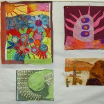
The first exercise (upper left) was composing with line (pg.26 in Ms. Masopust’s book). Julie had us cut lines and choose a design from the “Nine Patch of Compositions.”
The second exercise was to break up the negative space with diagonal lines (upper right).
The next exercise allowed us to use curves (lower left). This is a design that reminds me of a quilt I have had on my inspiration board that is made of large feathers. I’ll make it someday.
Finally, we were allowed to use any of our scraps to create a final composition (lower right). The great part of this workshop was to work with others people and to see what they were making. It is fine line between seeing what people are doing and being influenced by what they are doing. I don’t think I was and I really enjoyed working with everyone.
I just heard the announcement for the new version of the Electric Quilt software, EQ7. This is an update to Electric Quilt 6.
I have used EQ since the dark ages of EQ3? EQ4? I can’t even remember. There are a number of things I like about the product, but the most important one to me is their customer service. I deal with bad customer service all day every day at my job. The EQ folks respond INTELLIGENTLY and TIMELY to emails. They even call if the email string is getting to complicated. I love good customer service and theirs is awesome.
I use EQ for designing a number of different projects: Flowering Snowball, Sorbet, 2009 Teacher pillows, the Pineapple, etc. I am not a very advanced user and have always wanted to take a class. It is still on my to do list.
I have tried out pattern/color keys using EQ6 and have had some trouble with the size of the file. I was successful with a Sorbet Color Key and I never really followed up to figure out my problem.
EQ7 Upgrade
The other thing I like about the software is that there are marked improvements in the software with each new release. I buy some upgrades of other software and think “brother, what is so new and great about this release?” Not with The Electric Quilt. I often think I don’t need the new version and then when I see the list of features, I have to buy it.
I am pretty excited about the new version’s features, especially since my EQ6 copy is on my dead computer and I just haven’t wanted to deal with the activation process. There have been multiple times recently when I wanted to do something and have been disappointed not to have dealt with the reinstallation.
Quilts, Blocks and now PHOTOS!
Digital cameras will become a quilter’s best friend. EQ7 has dozens of ways to turn everyday photos into quilt art images. Or crop and edit scanned fabrics right in EQ7 in minutes. And that’s just the start!
New Activation Policy
You’ll never run out of EQ7 activations! Activation and deactivation is as easy as two clicks of the mouse. Install on as many computers as you like and quickly transfer activations from computer to computer. This new policy gives you complete freedom to manage your own activations — and no dongle to worry about!
Easier than ever for new users EQ7 is the most user-friendly full-featured quilting software yet.
Complete user manual
22 printable full-color PDF lessons (115 pages)
Point-and-read info on each tool – now linked directly to Help topics
10 videos targeted for beginners
67 “How do I?” topics: printable stepped-out instructions for doing everything from printing English paper-piecing templates to drawing a New York Beauty
Built-in Help buttons are everywhere, targeted to the task you’re doing
New block tools for creating original blocks instantly without drawing
Blocks size themselves – just drag and drop on the quilt
Users upgrading from EQ6 will feel right at home
Exactly the same friendly interface, plus loads of new user-requested features.
5000 copyright-free blocks
5000 new scanned fabrics, plus grayscale textures
120 new pre-designed quilt layouts
Snap blocks to a Quilt grid
Instant border blocks with greatly expanded Auto Borders
Print multiple photos on fabric
Create original fabric designs from photos, then print on fabric
Mirror and use myriad symmetries on photos
Use dozens of artistic effects, making everyday photos look like watercolors or Impressionist paintings
79 new features in all
Netbook compatible
Works on netbooks as well as laptops and desktop computers.
I am sure there are a dozen more cool features. I love the digital / scanning possibilities.
You can find out more information at the Electric Quilt website or by calling: (800) 356-4219. No, I am not being paid to write this. Yes, they sent me a press release.
When will The Electric Quilt Company begin shipping EQ7?
We will begin shipping June 7, 2010.
What are the EQ7 and EQ7 Upgrade system requirements? ELECTRIC QUILT 7 Minimum system requirements: Windows® XP, Windows® Vista, Windows® 7 (32 or 64 bit), Internet access, 750 MB of available hard-disk space, CD-ROM drive. Netbook compatible. Internet required for activation, deactivation, and periodic validations. Recommended: Monitor with screen resolution of 1024 x 768 or greater, Adobe® Reader®, sound card for demo videos. Activation: Internet access is required for activation and deactivation. Unlimited installations. Activations can be easily transferred between computers. Two (2) computers may be simultaneously active.
EQ7 UPGRADE Minimum system requirements: Windows® XP, Windows® Vista, Windows® 7 (32 or 64 bit), Internet access, 750 MB of available hard-disk space, CD-ROM drive. Netbook compatible. Internet required for activation, deactivation, and periodic validations. Recommended: Monitor with screen resolution of 1024 x 768 or greater, Adobe® Reader®, sound card for demo videos. Activation: Internet access is required for activation and deactivation. Unlimited installations. Activations can be easily transferred between computers. Two (2) computers may be simultaneously active.
UPGRADE VERSION of Electric Quilt 7 This upgrade version of Electric Quilt 7 will install only if you are a licensed user of Electric Quilt 6 (EQ6). Visit www.electricquilt.com for other upgrade requirements.
What is the activation policy?
EQ7 has a new activation policy, created as a result of user feedback.
Activation: Internet access is required for activation and deactivation. Unlimited installations.
Activations can be easily transferred between computers. Two (2) computers may be simultaneously active.
I have been thinking of row quilts on and off for a long time. I wrote about a row quilt idea back in April of 2007. I have seen a number of them that I really like. One I remember was from a Sue Nickels machine quilting class I took a number of years ago at an EBHQ workshop. The quilt was called Blue Tulips on Pink Skies and you can see it in her gallery. She is a great teacher, by the way. I would highly recommend one of her classes.
I haven’t actually made one as I have plenty of other UFOs! Still, I cannot help being inspired when I see patterns and motifs that might work.
As I was walking to the Courthouse from the parking lot on Tuesday for jury duty, I noticed that the walkway would make a great pattern for a row quilt, especially if you wanted a simple one.
I took this with my phone so there isn’t much that you can see. The basic idea of the paving was that they had laid three rows of 4patches (right of photo) by the width of the sidewalk. I was late so I didn’t count. Those four patches were interspersed with many, many (perhaps 20?) of rail fence blocks by the width of the sidewalk.
I would have to figure out how to make the proportions look like the sidewalk without making a quilt that was 1/8th of a mile long! Perhaps really small blocks? This particular idea might also be a good idea for a monochromatic quilt. Hhhhm lots of food for thought.
I have been thinking about fabric design a lot lately. I think it is something that I would love to do. Well, the finished product with my name on it would be great. After hearing Anna Maria Horner talk about the process, I am not sure if I am motivated enough to do all the work entailed for an actual fabric collection. If a fabric manufacturer came knocking, I would definitely find the motivation!!
One of the things I have been thinking about is must-have motifs in a collection. What parts of a collection do I always buy? Stripes and dots, definitely.
Eliza Stripe by Westminster
I like the above stripes, which I bought during my week away at Fabric Crush in Magnolia, because they are relatively bright and regularly spaced. I also like the ratio of white to color. In my regular fabric psychosis mind, I keep thinking “oh dear! I didn’t buy enough! I should have bought 2 yards!” despite the FACT that I haven’t used any of them and they were just washed over the weekend.
Ta Dot/Michael Miller & Emmalynn's Days of the Week
Above are a couple of the dot motifs that I like. Both are regularly spaced, but have slightly different sized dots. The Emmalynn’s Days of the Week by Susan Osborne are on the top and the Ta Dot is below. There are some scatter kind of dots that I like as well. I find myself gravitating towards the regularly spaced dots lately. I think I need something to count on in my life lately. 😉
Perhaps in my mythical fabric collection I would have a couple of regularly spaced dots (smaller and larger??) as well as some scatter dots or spots.
Barbara Brackman brought a new thought in this vein to mind in a post where she talked about how paisleys were must have motifs in a certain era (Civil War??) of fabric design. I haven’t noticed many paisley type prints lately so I don’t know if they are modern enough to go along with the popular prints today. I haven’t been looking, so they could be out there. I have bought a few paisleys in the past as I recall. I definitely won’t be a designing fabrics in Civil War era colors! Still paisleys are an interesting shape and have a lot of opportunity for designexploration. I’ll have to play around with some paisleys and see what I come up with.
I’ll have to think about what else I would include. I am not sure if I would want a focus fabric as I have no idea what I would design for a focus fabric. Flowers? Trees? Snowflakes? I don’t know. A collection without a focus fabric may be a total non-starter for the mythical fabric company that comes knocking on my door, so I’ll have to think about it.
I have always thought that ‘basics’ collections were very appealing. You can buy a lot of them in many colorways (regular stream of income for the company!) and they are useful for a variety of projects. They tend to stick around in terms of being able to buy them, which is an added bonus for those of us who don’t manage to finish projects very quickly. 😉
I would love to see basics types collections be expanded upon rather than just dropped because the Color Council issues new colors. I think Moda Marbles are an excellent example of a successful basics collection. Not only do they have their basic tone-on-tone version, but they expanded out to the Moda Marble Dots and the Moda Marble Stars. Very clever of Patrick Lose to expand in that way. How about Moda Marble Stripe, Patrick?
P&B New Basics was fabulous as well. I have linked to their current colors, which are very dark and not as interesting to me as the previously issued brighter colors.
So, I wonder if I should include some tone-on-tones in my fabric collection? It might be easier to coordinate them with the Moda Marbles or another basics type collection? Hhhmmm…
So, you can see what wanders around in my head as I navigate the rest of my non-quiltmaking life. What do you think your must haves are when you consider purchasing a whole fabric collection?
This is the piece of pie and whipped cream, which you have seen four dozen times. I am forced to continue to show it to you until you scream for mercy. Only because you asked for it. 😉
Okay! Okay! I am not so mean. This is actually a slightly larger drip than before. I took your advice and decided to make the drip a little larger. I don’t think it is large enough here. When I stand back, it still looks like a speck. I don’t want people to think I made a big boo-boo on the applique’.
Tarts, Big Drip
Here is the big drip. It looks like something! I used the same shape; just made it a bit bigger. I like it and it will probably be sewed down this weekend.
Sewing it down would be very nice, because then I can get it off of my design wall and put something else up.
Oh. The back. I still have to make the back. Sigh.
I know you thought I forgot about the Tarts. Or, perhaps, you thought I abandoned the piece for another 3 years?
Oh ye of little faith!
Non quilt parts of my life have been busier than usual. I have still taken the time to diligently test your ideas for the whipped cream on the second piece of pie after I posted some thoughts in a previous blog post. I thought it would be easy and fast. HA! When will I ever learn?
Another issue is that the 9K is back in the shop. It is fixed now, but I won’t be able to pick it up (80+ mile round trip) until Friday since I am going out of town on Tuesday and the shop is closed on Monday. I tested an approximation of a satin stitch on the Jem. The Jem is a great machine, but the satin stitch it makes doesn’t compare to the 9K’s satin stitch. I need to wait until the 9K returns from his/her vacation. I’ll get everything ready, however.
Below are the candidates:
Whipped Cream #3
I liked this one, but didn’t think it was enough. I thought it needed more of something. Someone mentioned a drip in a comment, so I started working on that.
Whipped Cream #4
The drip above is too small. I want it to stand out a bit more against the plate.
Whipped Cream Test #5
The one above is pretty good in terms of having more than just an element on the top. However, the indentation in the top of the dripped whipped cream on the plate looks strange. It may be realistic, but it doesn’t look fun or interesting.
Whipped Cream #6
The one above is the option I have decided to use. I like the more engaged shape of the drip. I don’t think that is how drips really look, but this quilt isn’t reality.
As you can see, I take Lorraine Torrence’s admonishment to “make visual decisions visually” to heart.
I’d like to baste the Tarts at the next CQFA meeting on Saturday. In order to accomplish that goal, I need to get the whipped cream on the pie. I made the pattern and have been auditioning it in slightly varied locations all over the pie.
Pie Cream #1
The above photo shows the crust stitching (see below), but I still don’t like the placement.
Pie Cream, in context
The above shows the whipped cream on the pie from a little further back, so it can be seen in context. It does look better from this distance.
Pie Cream #2
The above location does not work. I am rather proud of that crust and the location of the whipped cream covers up my lovely stitching.
I am thinking that the ultimate problem is that I made the pattern too big and it should be a smaller mound of whipped cream, like on the cupcake. I am also thinking about adding a cherry instead of whipped cream.
I have a box of Recchiuti that I have been slowly savoring as I work on the Tarts project. The box is almost empty and, TA DAH, I have reached a major milestone in the work on the Tarts project!
Tarts Top Complete, August 2009
Your eyes do not deceive you. The Tarts Come to Tea top is completely sewn together. I had some bits of time over the weekend and used those bits to work on the Tarts. I really need to get this piece off my design wall and work on something easy. I resisted the urge, especially after all this time, to just throw the thing together. I really looked at it as my last opportunity to fix any despicable design decisions.
My first order of business was to replace the yellow cup.
Yellow Print Cup
I like the cup itself and am pleased with the fussy cutting and satin stitch quality. As part of the complete Tarts Come to Tea design, it didn’t work. My eye kept jumping to it. While I want the viewer’s eye to move around the piece, I didn’t want it to be glued to the yellow cup.
New Pie, August 2009
TFQ suggested pie. Since I was thinking along the lines of a pastry or tart as well, I appliqued another piece of pie. I used the same design as the original piece of pie.
Old Pie, August 2009
The problem was that they were too similar. I didn’t make enough changes to the design, even though the colors/fabrics are different. The similarities are highlighted because the two elements are close together in the piece.
I resolved the issue in my mind, however. I am going to applique’ some whipped cream on top of the new piece of pie, and perhaps a cherry. It will overlap on to the blue block above it. I planned to do it before the entire piece was sewn together, but I got caught up in the excitement and focus of the sewing and forgot. I’ll add it later this week or on the weekend.
Upper Left, August 2009
I had already started to sew sections together last weekend when I tried to tell myself I was finished. Still, there was a lot of piecing to do, so I got too it.
Upper Middle, August 2009
One thing I forgot about improvisational piecing is that one has to add bits and pieces in between. I really didn’t want to do much of that, because I liked the look of the blocks being next to each other. That meant some trimming and adding little bits, which I did, and which will, hopefully, be mostly hidden once the piece is completed. I couldn’t avoid adding some bits and I had to pay attention to the checkerboards, because I didn’t want to cut them off in the middle of a square.
Lower Left, August 2009
There were a few places where I couldn’t trim and augment. Those spots should be readily apparent from the photo. In general, I am pleased with the way the piece turned out.
Quilting is next, of course. As I mentioned in the last post about the Tarts, I seriously thinking about quilting the piece myself. I want it to be done a certain way. I don’t think I am good enough yet on the longarm to quilt the detailed design I have in mind. I really want the cups and pastries to stand out. More thinking on this is required.
I can’t really believe that it is together. It has been such a long process!
The picture is of wrapping paper covering the door windows of a studio space. I saw the paper and thought the design would make a good quilt layout.
I noticed the four patch-like red block alternating with the slightly tilted asterisk. I think that once could alternate the asterisk with a star block or some round design.
I have been staring at this quilt on my design wall for months. I am glad it is progressing; the end is finally in sight. I will be very glad when I get it sewn together and off my design wall!
I made one tiny change to the arrangement of the Tarts Come to Tea. Can you identify the change? You can see the previous iteration on the June 4th, 2009 post. What do you think?
OK. I won’t keep you tortured in suspense. I moved the china cups up. I am still considering their new spot. It is less fabric and seams next to the twirly handle coffee pot. Also, it is fewer cups next to each other. The heart makes a bit of a break for the eye for the middle cups. My eyes were looking at all of those cups in a row and wondering if they would fly off the quilt.
Most of the work on the Tarts has been mental lately. Those of you thinking mental case, may be right. 😉
With all of the rote sewing I have been doing lately I haven’t made the time to sit down and do the next drawing, which will be another pastry.
I am liking this layout. I think it adds a bit of movement at the top, though I am not sure why. I like the vertical checkerboard next to the tea kettle and will put a piece of it above the tall frothy drink as well. The orange squiggles between the red cappucino cups and the tall frothy drink will probably be replaced by some vertical silverware. Onward!
I realized that when I am in a class with Pamela, I do think outside of my own quiltmaking box. I also realized that if I just listen and do what she says I succeed. I also feel a bit freer in my work. I really have a strong feeling that I need to make a much larger piece in Pamela’s style.
Pamela gave us tips and I interpreted them as:
make lots of art because not all of it will be good; small is good
your first idea will be crap, so don’t cling to it
put the big shapes down first
move things around; try a new view
if you are bored by your piece everyone else will be as well
We talked a lot about art quilts at our dinner out together. I feel strongly that all quilts need to have a good design. Block type quilts have a basic structure which helps with good design. Most art quilts do not have a basic, inherent structure and some go astray because the quiltmaker doesn’t care, doesn’t know how to initiate and then evaluate a design or doesn’t have the technique foundation. I think it is easy to find out about these things. There are a lot of good principles of design type books, such as Pentak and Lauer’s Design Basics. The basic thing concerning technique in art quilts is that they don’t fall apart upon hanging. Pamela doesn’t have the classic quilt background that many quiltmakers have, but she has learned what she needs to keep the quilts structurally sound and then applied her art and design training. This is the best of both worlds and this is where I really want to be.
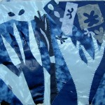
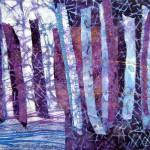
You can see from the gallery above how she inspires great and different work. Diane is a wonderful silk painter. She normally paints a whole cloth piece on silk and then quilts it. Her blue trees piece is really different from her normal style and really, truly wonderful. Kristen is very busy with her family and doesn’t have tons of time to sew, but made some fantastic pieces that her children would enjoy. I love that space alien monster! Kristen’s pieces are also cheerful and imaginative and wonderfully creative. Mrs. K’s sauguaro cactus/Suspicion Mountains piece has a calmness to I that I love. I hope she finishes it and hangs it somewhere where it can inspire other people. Everyone really did fantastic work and I am sorry I didn’t take more photos.
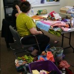
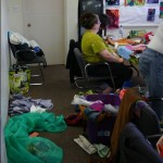
Creative Mess #2Creative Mess #1
We made a creative mess. Mess is the wrong word; we had supplies and we needed to use them. When you only have 15 minutes to make a piece of art, the fabric will be flying and it was. I brought my scraps which kept ending up on the floor. People would stop by, pick up some bit of fabric and ask to whom it belonged. It became quite hilarious. We really couldn’t have done the workshop without Mrs. K. She brought tubs of fabric which allowed us to actually have backs and batting and such things. I seemed to conveniently forget those supplies when I go to Pamela’s workshops! DUH!
Summary: This post talks more about how the Pamela Allen class with CQFA will inform the Tarts Come to Tea.
I find that a good class will inform my work in a way that other experiences don’t. I don’t see quiltmaking in a vacuum. I see it related to other art and that is one of the benefits of taking a class from Pamela Allen. She really brings her training in art to the quiltmaking/fabric collage world. Her comments about artists in other media really enrich my quiltmaking experience.
After sleeping on my class experiences I went up this morning to look at the Tarts. There are things I like about it and things that really need improvement. I actually wonder if I should just start over and make the piece in the style I worked in over the past couple of days? I am loathe just to toss all the work I have done, so I came up with a different solution.
When working with Pamela, she suggests putting a background down (which has already been layered with a back and batt) quickly and then cutting pieces to put on top of the background. One of the things that I liked about this method is the layering. I have had layering and the way it creates textures on my mind lately and the class experience solidified some of what I was thinking about.
With the Tarts, I think I will finish my plan so that I have a solid top. Instead of, then, sending it out to be quilted, I will put some kind of stabilizer, or additional stabilizer on it and then add another layer of fabric to the top in the Pamela Allen style. I think that will add movement to the piece and make it more interesting.
Tarts Kettle
I have always wanted to add some stitching and embellishments and will do that after I get the piece quilted.
The Tarts, as they are now, reflect my A type personality and I want to move the piece beyond that buttoned up feel to the piece. The motifs are interesting and the fabrics are fun, but it really needs movement. I took another photo of the entire Tarts and plan to print it out. Once I do that I can take notes on how I want to add layers.
I have been in class for the past two days with Pamela Allen. Pamela is much more than a quilt teacher. She is truly an art teacher who works and encourages work in fabric. I had THE Aha moment in her class today and it really thrilled me. I could feel the difference in my work after that moment.
As you may have read, or noticed, I felt crappy all week. Barely any blogging got done even though I have a pile of sticky notes with reminders of things to tell you. My house is a wreck and my to-do list is still long. A cold was really beating me down and I was doing everything I could to conserve energy so I could go to class. A good move on my part was to take Thursday off of work rather than working straight through and then going directly to class.
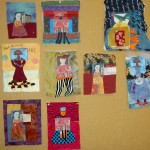
I have taken several classes with Pamela. The first one I took was in Richmond, Virginia at Quilting Adventures. I actually took two different classes in one weekend. The first was a self portrait class and the second was on composition. I started one piece in each class.
Self PortraitGarden
Pamela also came to California in 2008 to teach at EBHQ. I took her class there as well. I don’t think I ever wrote a blog post about that one, but Julie wrote one, which is probably what I would have written anyway. 😉
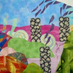
The quiltlet, House and Garden, that I did at EBHQ has been worked on more since the class and I am almost finished with it. Maureen sent me a link to facing directions from Jeri Riggs site and I plan to use them to make a faced edging as soon as I finish the beading.
House and Garden
I brought all three of these pieces to the workshop with the intention of working on them and not starting anything new.
The first exercise was a monochromatic exercise. I didn’t do it. Don’t worry! I warned Pamela that I was planning to bring projects from previous classes. I did enjoy the pieces that others in the class made.
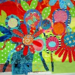
I worked and made progress on the Garden. I am actually ready to handstitch on it, though I do still have a bit of piecing to add. I am really pleased with the work I did on the Garden. I think it looks very different from what it was when I started. I also think it looks a lot better.
Garden (after)
I am really pleased with the petals that I added. I wanted to create a little more interest in the space where the blue petals are now.
Garden (detail 1)Garden (detail 2)
In the bottom part of the piece, the flowers were all middle ground. Pamela helped me create a foreground by putting some darker blue behind the red flower with the petals. I also created a little bit of a different foreground with the flower in the bottom right hand corner. I was thinking of it as kind of a coneflower, but some people said that it also looked like the petals had dropped off. I have a little work to do on the bottom. During the critique, Pamela and the other students suggested that I extend some of the stems to the bottom of the piece and make the bottom of the piece longer as well. They also like the brown border. That brown is currently the back, but I will cut it off and add it to the new front, but only on a couple of sides.
I didn’t succeed in doing my own thing. Pamela is such an engaging teacher that it just wasn’t possible for me to ignore her completely. She did help me with the projects I was trying to work on, though.
After a quick litle quiltlet exercise (15 min), she gave us a piece of fabric and we had to make something with it. My piece was brown. No other colors. None of my colors. Bleah!
The exercise was about accentuating or extending existing lines in the fabric she gave us. I liked the idea of the exercise.
Line Exercise
This is the piece that came out of it. The colors aren’t me, and you can see that I injected quite a lot of blue into the surface.
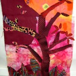
Today, we worked on critiques and one piece using stripes and prints to create movement.
Final piece, stripes and prints
This piece brought the AHA moment for me. The AHA moment was a point where I finally got all that I have been learning from Pamela. I finally understood about the background and how to put stripes and prints on the piece in different ways in order to achieve movement and the illusion of something. I am really pleased with this piece and think it is very strong.
I can see how some of what I learned today will help me with the Tarts. I am going to use some of the techniques and thoughts to get that piece finished.


")
")

