I needed to take some of the Field Day prints to the store to pick out a good background. I am still working on pressing the reds and snuck Field Day into the wash, so I had even more fabric to press.
I am torn between sewing and pressing. Right now sewing is winning.
I has been nearly a month and a half since I posted new rectangles I have cut for the FOTY 2014 piece. Before the past weekend, I felt like I haven’t been in my sewing room much in the past month. I know I have been in there, at least a little bit, since there have been no shortage of posts to prove it.
I didn’t press and cut very much in that time, though, so the wall where I keep new rectangles has looked the same all this time. Then Friday I started pressing fabric and cutting some new rectangles with a vengeance.
I went to put them away and found my container full, so I have to figure out what to do about that. The work room overfloweth, that is for sure.
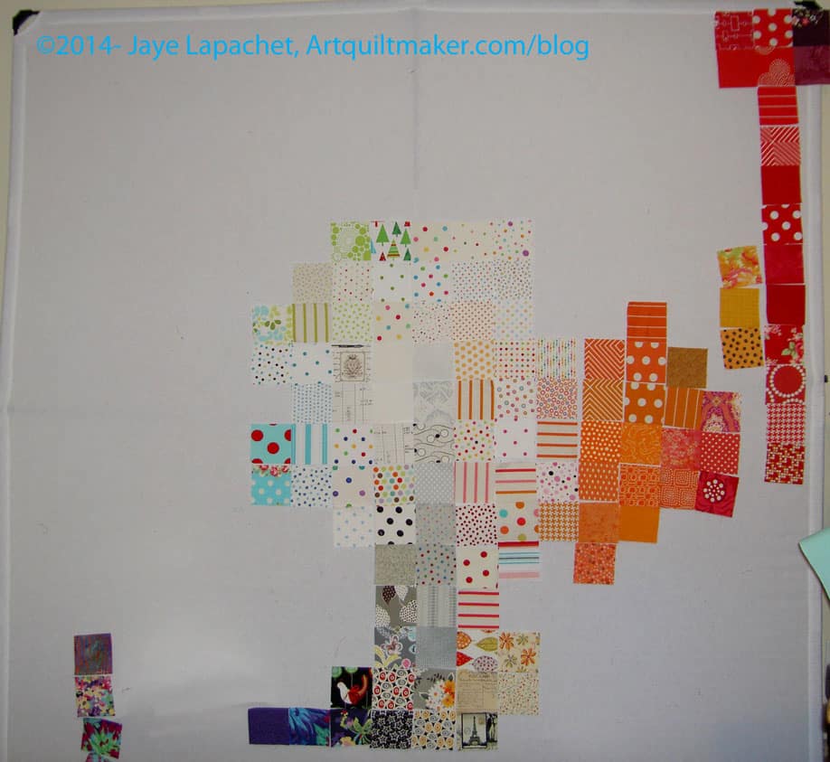
I am slowly, painfully, making my way through the FOTY 2013 piece. I am nearing the end of the arranging.
Nearing the end.
Not there yet.
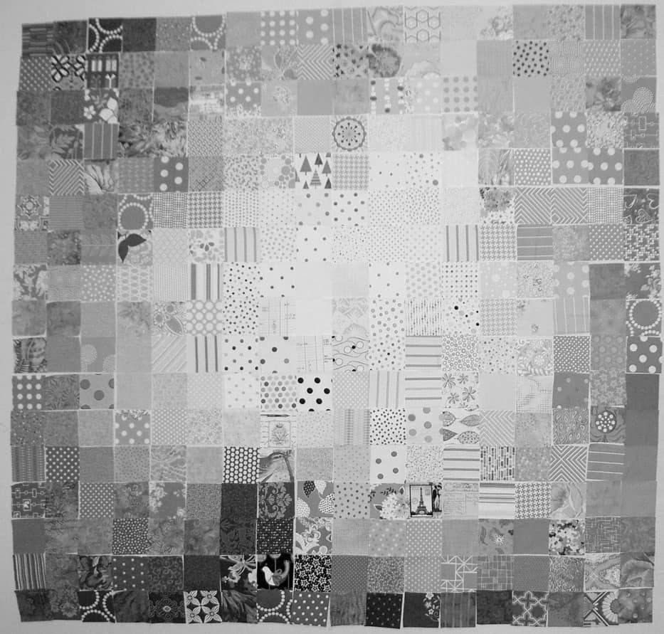
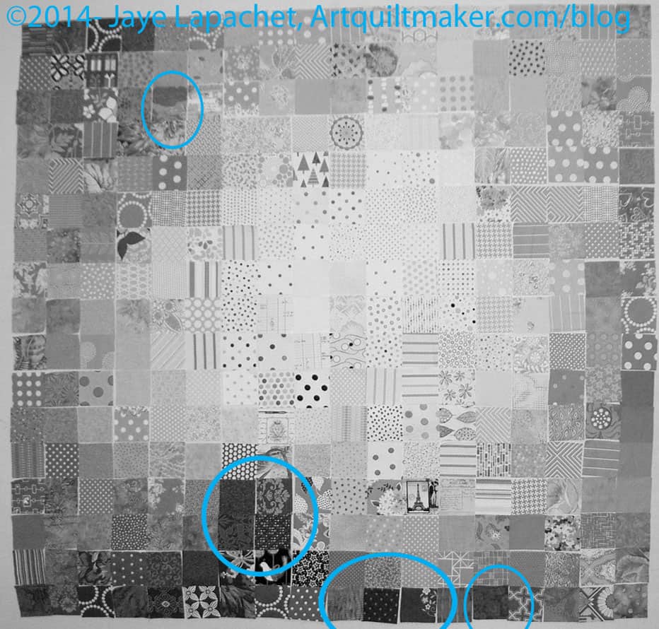
I have been looking at the quilt project through the green and red films that come with the Ultimate 3-in-1 Color tool (if you don’t have this, click on the link and buy it RIGHT NOW**). It hasn’t been working out that well for me, so I decided to switch a photo to black and white to see areas that could use improvement. This was a great idea, because 1) it shows me that I am doing pretty well and 2) it shows me areas that I might be able to improve.
I am trying to stick to the idea that the darkest fabrics will go on the bottom because they have a heavier feeling.
I also want the like colors to be mostly together and there to be a smooth-ish gradation between colors.
Annotated FOTY 2013
I thought I would share with you areas that jumped out at me and see what you think.
The areas I have indicated are too dark or too light for where they are currently placed OR do not make a smooth transition. I have not moved anything yet, because identifying a problem creates another problem: where to put the problem fabrics and what to put in their place.
This is where you have to look at the piece and at the colors to make sure that if you move it to the ‘obvious’ location, it doesn’t ruin the smooth transitions between colors.
Once I make the changes, I have to go start the process over.
**You should buy the Ultimate 3-in-1 color tool because it is a quick reference for color work. You can look at the relevant page see the complement, the analogous colors, triadic and split complementary. There is also a long list of colors that would work in a monochromatic quilt. It is a sampling of tints, shades and tones.
This is probably the basic layout of Fabric of the Year 2013. It needs some tweaks in terms of where specific fabrics are placed, but I feel like I have a basic layout. I have found that taking photos and looking at them helps me figure out the placement. I am not sure why I didn’t do that more for the previous quilts in the series. It could be that I am taking more time with this one. Others have been put together in, essentially, one weekend.
It also occurred to me that I could also use the green and red films that come with the Ultimate 3-in-1 Color Tool by Joen Wolfrom. I am going to try that next.
One issue I have found troublesome in the past is not seeing the individual fabrics for the predominant color. I am really trying to make the transitions smooth this year. It is hard to see which colors predominate in a fabric with multiple colors, but I know it is a process. I have to work at it.
I know many of you liked the progress I was making on FOTY 2013. I didn’t like it, so I talked to Maureen and her son and started over.
This project is killing me and I have to get it done. I have to get it done for my own piece of mind. I also want to get it done, but the other layout was not achieving the goal I wanted to achieve. I was having a hard time gradating the colors horizontally and thought that I would need too much background.
I also didn’t want to do the same thing as FOTY 2012 despite the success of that quilt. I don’t want to do the same thing over and over.
Maureen and Andy suggested starting in the middle. I went home and started, which is what you see in the picture, and I feel like the process is going a lot better.
Some theatre we visit occasionally has a “First Look” feature. It is one of the half hour’s worth of ads that plays before the movie actually starts! This is your first look at Fabric of the Year 2013.
I want to stress FIRST look. I have a long way to go to get this quilt top pieced. There is a lot of rearranging that needs to happen.
The first step to get to the first look was that I had to get the squares out of the Fabric Closet. That was pretty easy, so I sorted them into rough color piles, e.g. ROYGBIV plus grey, black and white.
Pink Chalk Fabrics sends a post card with an order. It has some gorgeous piece on the front and sizes of quilts on the back. I saw the lifestyle shot on a post card I received from them. After getting FOTY 2012 back, I knew I needed to do something a little different. How could I compete with that quilt? At some point in the FOTY 2013 cutting process, I put the squares and the image on this postcard together in my head and decided to arrange the piece in a similar fashion.
Then I got out the post card that is inspiring this piece and started putting them up on the design wall. I just slapped them up, only further sorting roughly into light, medium and dark.
First observations:
The picture above may not even begin to resemble the finished quilt.
I couldn’t fit the pinks on the design wall
Even though the Basic Textures by Patty Young (used on Fresh Fruit) are all the same value, they can’t all be next to each other.
This group of fabric is a lot of what I got on my road trip. Not all, but a lot.
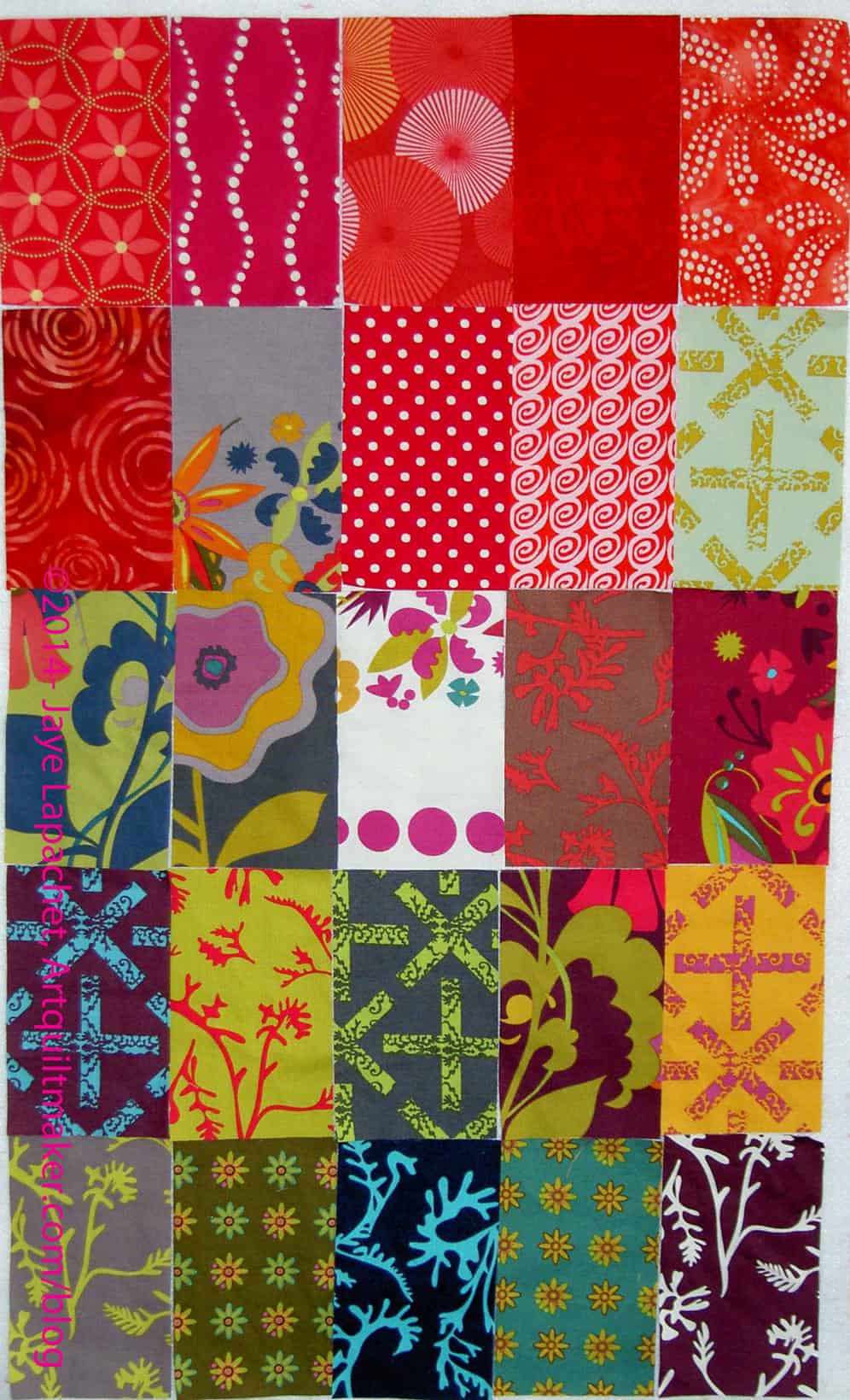
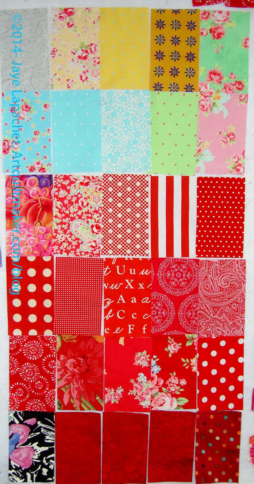
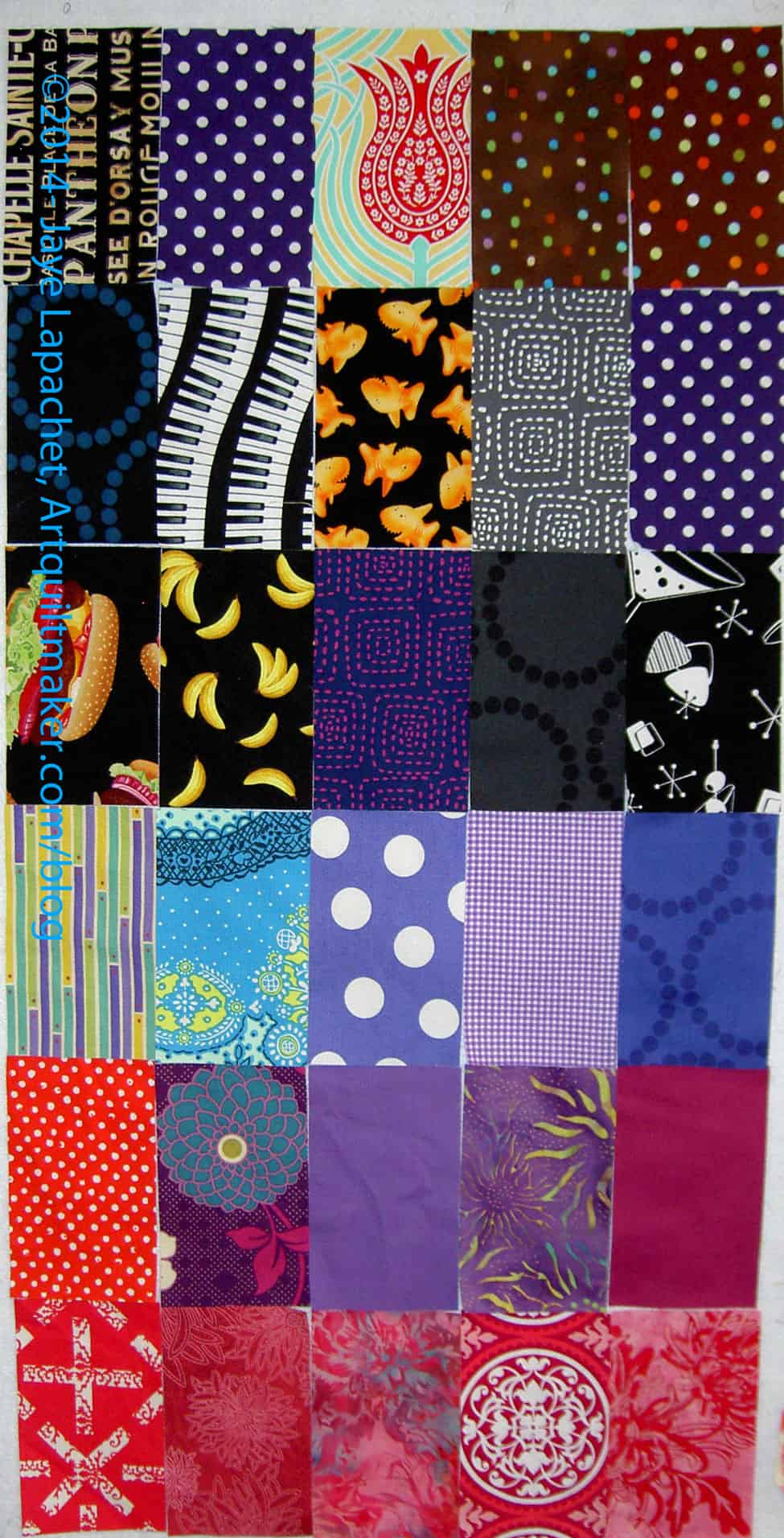
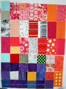
Someone suggested setting the rectangles like subway tiles, so I thought I would post them like that here so you could see what you think.
I really like the charcoal grey circle stitch fabric (last row, 2d from the top on the right). I am very tempted to buy a bunch of it and use if for a background for something. I don’t know what, though. I don’t know whether I am following a trend with all this grey or whether I am shying from other light colored backgrounds.
Do you like the crazy dip to the right? I can’t believe I didn’t see that until after I took the photo. Hopefully I won’t piece them like that.
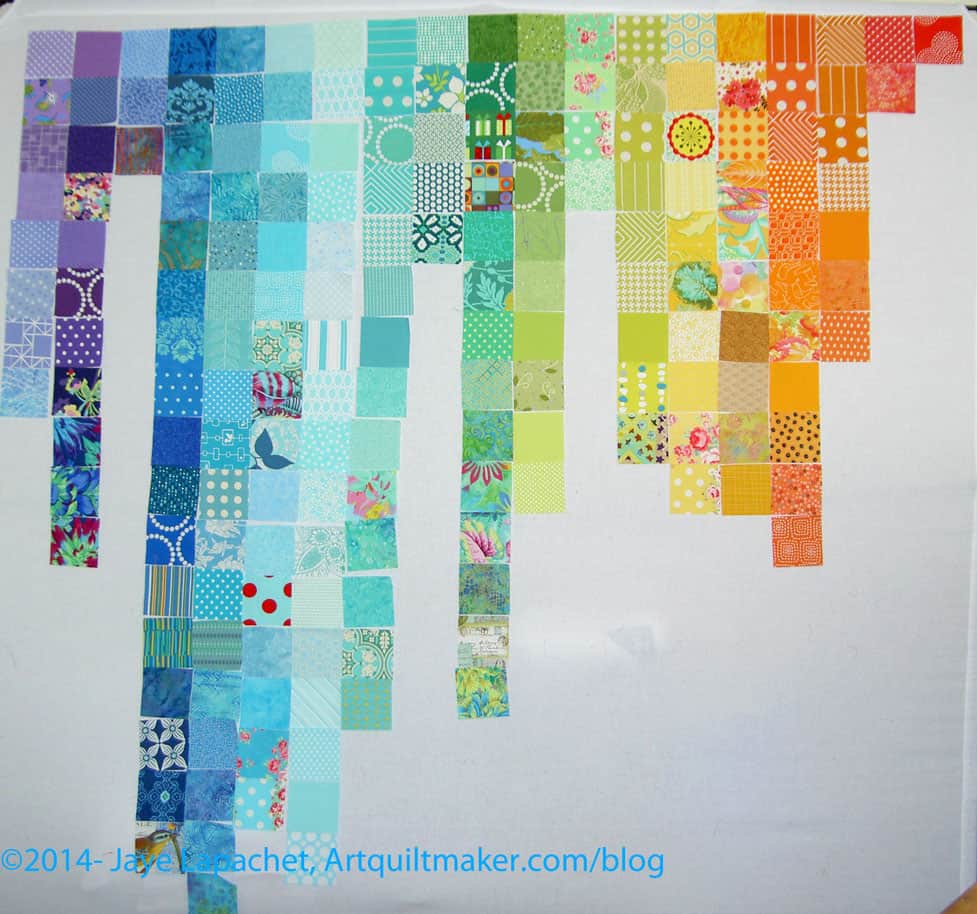
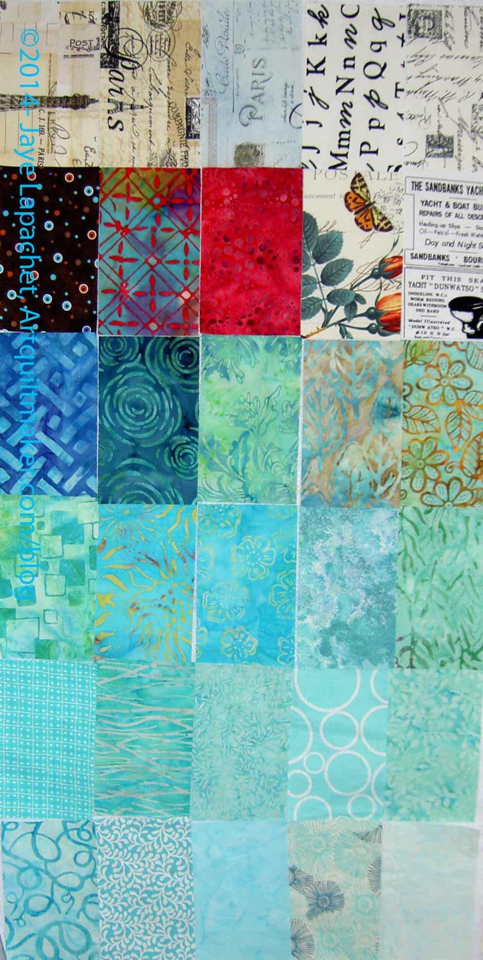
I have a couple of projects in mind that require blues, so I have been washing and pressing blues, greens and light purples/violets lately. This is a nice little collection that I am really looking forward to using. I have already cut some pieces for projects that are still in the Hunting & Gathering stage.
I found a sense of peace and not frustration when I was cutting these pieces. It is satisfying to see a little pile of cut patches grow. That was a nice change.
There is something I like about this 2013 Fabric of the Year project. I like having a piece of each fabric. Once the quilts are finished, I love walking by them and thinking “that fabric would be perfect for this project” or “OH! I remember that fabric. It was such great fabric.” It is like looking at a scrapbook.
I am afraid I am getting tired of it, though. Perhaps I am just tired. I know I am tired, but having the feeling seep over into fabric is scary.
These are blues from the end of the Star Sampler project. Mostly, I made the 4″ Sawtooth Stars from these fabrics. Yes, I did arrange them purposefully to be only a blue batch. I have a whole additional group that I’ll photograph later that is all different colors.
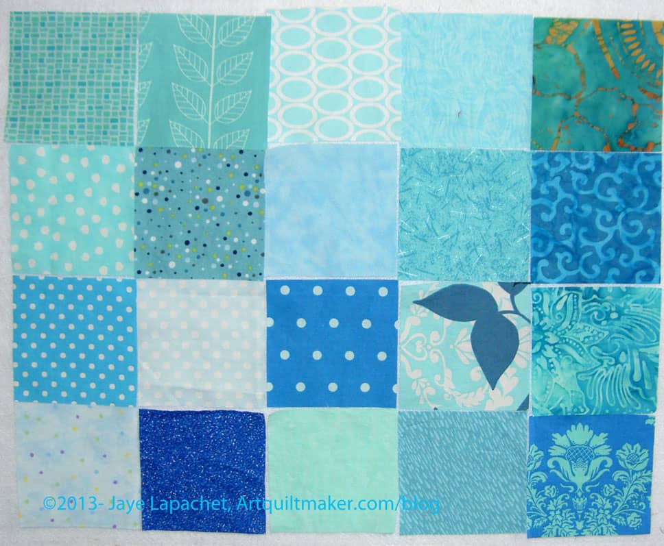
I have cut more pieces for the Fabric of the Year 2013 quilt. Many of the fabrics in this group turned out to be more greyed… or not as bright perhaps as I thought. That is the problem with buying fabric online. The colors just don’t reproduce as well our eyes see them.
Still I am pleased with Texture Basics pieces (dots, stripes, diamonds & houndstooth). They are not ugly and the red and teal are particularly nice.
I am already cutting them up for a project, which is great as well.
I am still plowing through the piles of fabric to iron. I iron fabric when I need to think and when I am under stress and it it calms me. I suppose the tactile nature of the fabric helps, but, as I probably don’t need to say, the color and design help, too.
This year’s shape is a 3.5″ square and I have an idea to do a kind of waterfall effect. Stay tuned to see what actually happens!
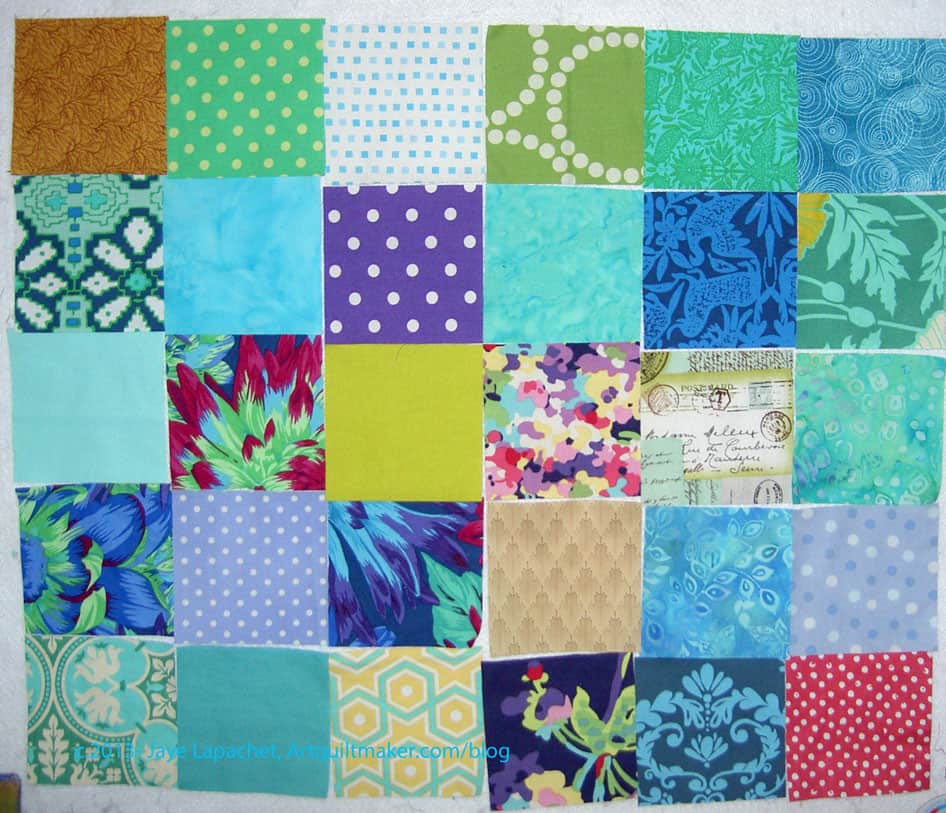
I had two fabri-lanches in the past few days, so I finally started pressing fabrics and cutting the squares for Fabric of the Year 2013.
There are fabrics for projects in process and also fabrics that just came up on the ‘to press’ pile. I might need to take a day off work that I dedicate to pressing fabric.
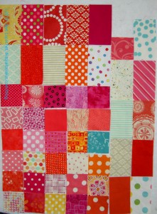
I may cut a few more, but these are probably the last patches for FOTY 2012 you will see until I sew. I made an effort to press and cut some more pieces. With TFQ’s help I made a little progress.
I sorted all of the patches I cut into color groups, so I am pseudo ready to place the patches and then sew. I may not get to sewing this weekend, though I do hope to do enough placement to make some progress sewing.
I had a good amount of time off over the holidays. I was able to spend some time pressing fabric and cutting pieces for this project. It is a meditative process and was a good way to transition from the difficult last quarter at work to vacation.
The end is drawing near, so I need to speed up the process or work with what I have.
One thing I like about this is that looking at the fabric patches and thinking about the projects on which I am working as well as the new fabrics.
I haven’t taken any kind of inventory of pieces that I have. If I do I can fix any problems, if I don’t it will be a design challenge.