After recent events keeping me away from my machine and last weekend’s fiasco of sewing and ripping, I decided that I would make progress this past weekend. I decided I would sew and make progress.
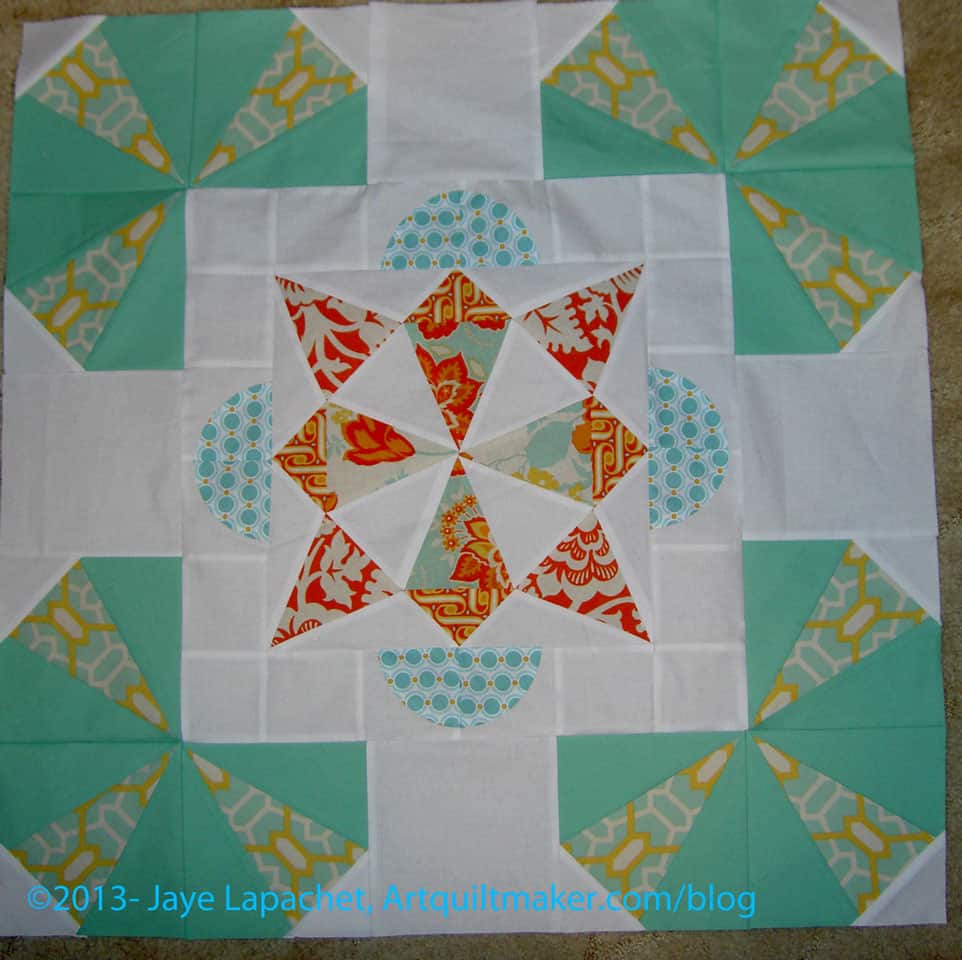
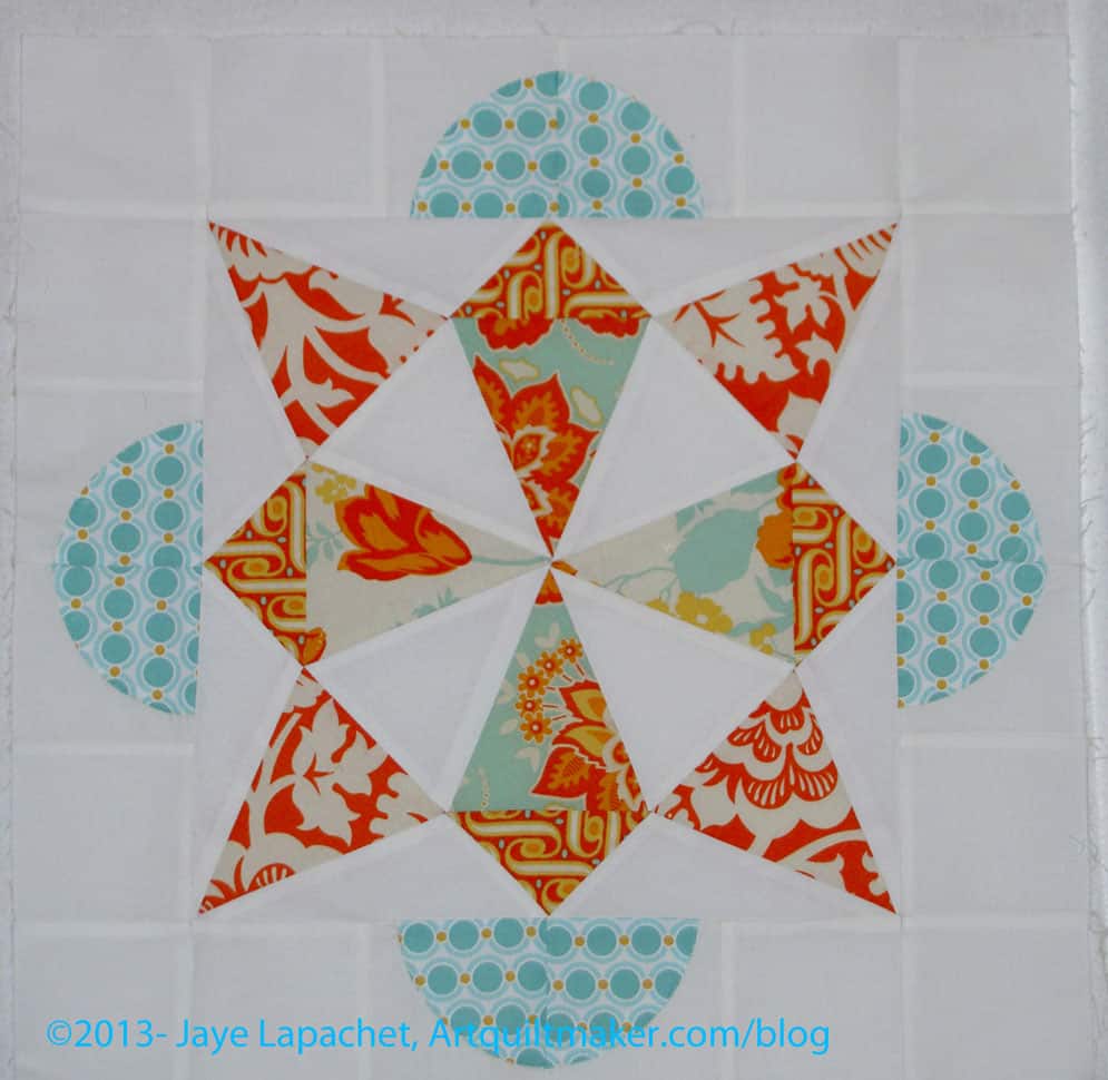
I did make progress. Small progress, but we have to rejoice in the small successes, right? I finished my part of Kathleen’s Round Robin piece. I am really pleased with how it looks. For one, I am pleased I was actually able to do something. Two, I think I did a good job echoing the shapes from the center.
I hung the piece I got from Chris up on my design wall so I could look at it. It spent a few weeks up there and as I was looking at it, the Kaleidoscope shape in the center stood out, especially those long thin triangles. Also, the fabric with that jade green in the Kaleidoscope in the very middle caught my attention. From those two thoughts, I worked on my design and fabric choices.
Kathleen’s Round Robin in Progress
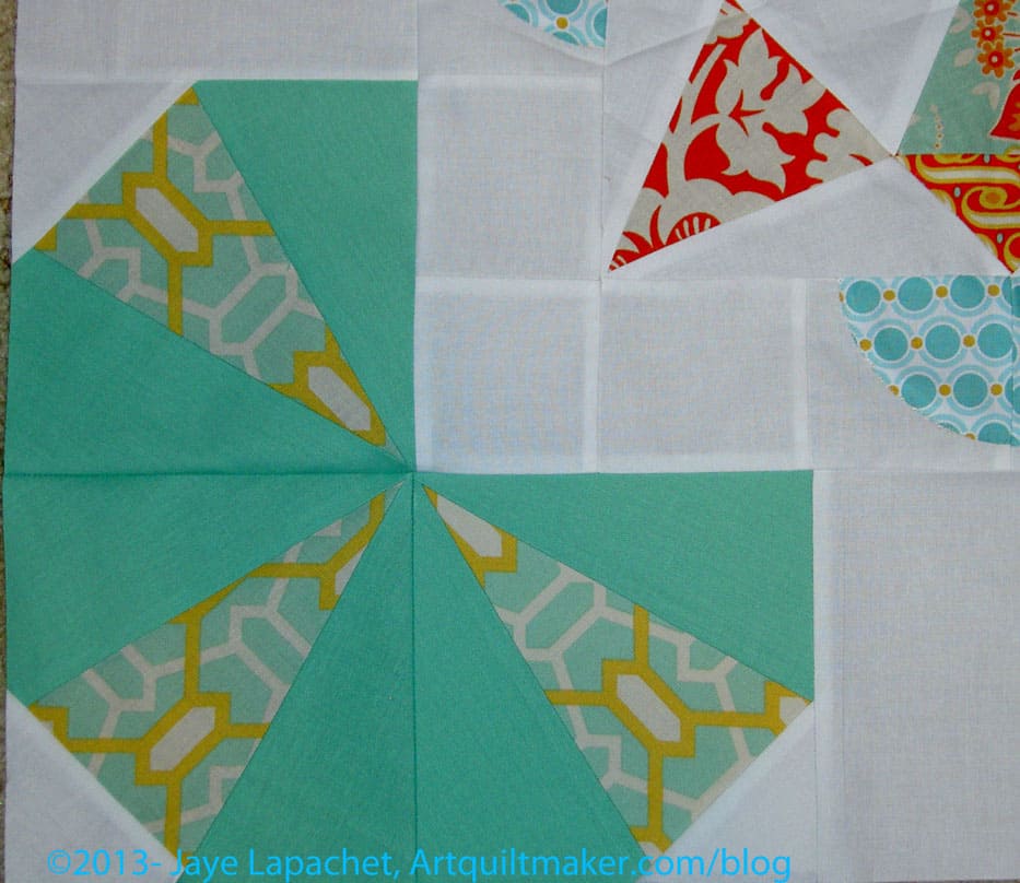
I used foundation piecing for the blocks for the corners in my round. I designed the corner blocks using EQ7 and then printed the foundations out. The Carol Doak paper I got some time ago is great. I printed right on to it and it worked like a charm. I was able to rip out paper with a minimum of torn stitches. It might not be the most cost effective (I don’t know) but for the limited foundation piecing I do, it worked great.
You can see from the ‘in progress’ photo that I used three blocks to make up the corners and then filled the middles of each side in with white. I had a hard time figuring out the measurements. They weren’t standard so the center white piece is different than the blocks. Not everything lines up nicely either, but I think that can be the nature of round robins. I think it will look fine once finished and quilted. I don’t think Kathleen will mind. At least I hope she won’t
Kathleen’s Round Robin detail
The detail shows the fussy cutting of the green, gold and white fabric very well. After I finished, I thought that replacing the green (closest to the white) with white might have kept it fresher, but I think it would have had the problems I mentioned above.
After doing all the piecing, I decided I like the way, viewed from some angles, the center piece looks like it is on top of the part that I added. I also think the corners look a bit like stylized flowers.
I think that the next person will need to get back to the orange – well, I should say that if I were doing the next round, I would use some more orange. I can’t tell you how tempted I am to add some orange.
It didn’t turn out exactly as I imagined and I am thinking that that green makes it look a lot more 1930’s than anticipated. I also think that more white might have been better, but I paid special attention to fussy cutting the alternate fabric in my corners and I wanted it to show. If I had added some white to the corners, that gold, green & white fabric would not have stood out as much as it does. I am pleased with the way it came out.
I am terribly behind on podcasts and I don’t know when I’ll be able to catch up. This means I haven’t heard whether any of the podcasters are organizing a Black Friday Sew-in.
BFSI Giveaway?
I will not be shopping on the 29th, so I will be tweeting while I am, hopefully, sewing.
I have a couple of gifts I will be giving away and I will be working with Lark Books to see about giving away some books as well.
As with my other giveaways, my request will be substantive. In a way, I guess this is fair notice about the potential quilt games I may be playing with you. One thing I will probably do is ask you something about your UFOs. That means that you may want to count up your UFOs, think about the status of them, how you might be stuck, etc.
FQ Pack
This is not completely selfish of me. Yes, I am interested in what your are doing, but I also think that your comments could start a discussion that could result in renewed interest in your project.
I apologize for being MIA last week. It was a tough week. I am back in the saddle, so get your paints, colored pencils, crayons and needles out!
The bloom is off the rose
Definition: “Bloom, one or more flowers on a flowering plant” (Wikipedia)
algae bloom
Bloomberg Business, Financial and Economic news (a stretch, I know)
blooming garlic
Post the direct URL (link) where your drawing, doodle, artwork is posted (e.g. your blog, Flickr) in the comments area of this post. I would really like to keep all the artwork together and provide a way for others to see your work and/or your blog.
We are also talking about this on Twitter. Use the hashtag #CPP
The Creative Prompt Project, also, has a Flickr group, which you can join to post your responses. I created this spot so those of you without blogs and websites would have a place to post your responses.
The Round Robin isn’t going exactly as planned and I have two at my house while Chris has none. I am not sure what Kathleen has. Fortunately, we are flexible and working through it.
Kathleen’s Round Robin
This is a pretty and fresh piece. That white is very stark and helps the other piecing float. As I stared at the piece, I knew I wanted to maintain that bright freshness.
Finally, I came up with an idea. I plan to add some Kaleidoscope-esque bits to the corners.
That was rolling around in my mind from the beginning, but I couldn’t figure out exactly how I wanted to do it. I was finally struck with a technical plan over the weekend and began the process of foundation piecing.
As I mentioned on Twitter, I sewed the same seam 3 times and ripped it out 3 times, then quit. I think I was trying to use a piece of fabric that was too small and my stubbornness (work, dammit!) got in the way. That one foundation is shredded, so, hopefully, I have learned my lesson.
Back in April, we started the Color Group. Finally, we got enough blocks together to put a quilt together.
Color Group: Row Layout
Kathleen and I were at the BAMQG Sew Day/Meeting, so we took all the blocks and laid them out and tried to figure out a way to put the quilt together.
The row layout was the best of the way to use all the blocks at once.
We didn’t think it was great, but it was almost the best of all of the layouts we tried.
Color Group: Offset Row Layout
One of the trial layouts was also a row quilt layout, but, in this version, we offset the blocks a little bit.
We were trying to make it a little more modern while making it look good.
It just looked messy to me. Kathleen didn’t like it either.
Color Group: On Point Layout
Color Group Final Layout
We also tried out an on point layout. I did like the extra whitespace, but the problem was that block patterns didn’t work with the on point layout.
So, we went full on modern. We split the blocks up and used 5 in a row for two quilts. Two blocks will be on the back of one of the quilts.
Color Group Final Layout 2
We will use a lot of the Kona White to make the quilts ~48×60. These will go to a women’s shelter, we think, which is why we are making them the size we decided on.
We might put one column of blocks closer to the edge and on the other quilt closer to the center.
I am in charge of one of the quilts and Kathleen is making the other. I haven’t started yet, but plan on doing so as soon as I remember how to sew. 😉
Definition: “Cream is a dairy product that is composed of the higher-butterfat layer skimmed from the top of milk before homogenization. In un-homogenized milk, the fat, which is less dense, will eventually rise to the top. In the industrial production of cream, this process is accelerated by using centrifuges called “separators”. In many countries, cream is sold in several grades depending on the total butterfat content. Cream can be dried to a powder for shipment to distant markets.
Cream skimmed from milk may be called “sweet cream” to distinguish it from whey cream skimmed from whey, a by-product of cheese-making. Whey cream has a lower fat content and tastes more salty, tangy and “cheesy”.[1] They are also used in variety of food products.
Cream produced by cattle (particularly Jersey cattle) grazing on natural pasture often contains some natural carotenoid pigments derived from the plants they eat; this gives the cream a slight yellow tone, hence the name of the yellowish-white color, cream. Cream from goat’s milk, or from cows fed indoors on grain or grain-based pellets, is white.” (Wikipedia)
Ice cream
Center for Research and Analysis of Migration
ice cream sandwich
Cream pie
Cream of the West, Inc – offering 100% whole grain cereals and other naturally healthy foods from the heartland of Montana, along with heart-heathy recipes.
Strobe Cream from M*A*C* cosmetics
hand cream
sour cream
clotted cream
Crème fraîche (28% milk fat) is slightly soured with bacterial culture, but not as sour or as thick as sour cream. Mexican crema (or cream espesa) is similar to crème fraîche.
Fenton’s Creamery
cream cheese
buttercream frosting
heavy whipping cream
whipped cream
Post the direct URL (link) where your drawing, doodle, artwork is posted (e.g. your blog, Flickr) in the comments area of this post. I would really like to keep all the artwork together and provide a way for others to see your work and/or your blog.
We are also talking about this on Twitter. Use the hashtag #CPP
The Creative Prompt Project, also, has a Flickr group, which you can join to post your responses. I created this spot so those of you without blogs and websites would have a place to post your responses.
Children’s cup is a humanitarian and spiritual aid organization. It has feeding programs, medical treatments, and orphanages for hurting people around the world.
Cup o’Noodles
Stacking cups (toy)
Ryder Cup
Quidditch World Cup
Coffee cup
Definition #1: “The cup is a customary unit of measurement for volume, used in cooking to measure liquids (fluid measurement) and bulk foods such as granulated sugar (dry measurement). Actual cups used in a household in any country may differ from the cup size used for recipes; standard measuring cups, often calibrated in fluid measure and weights of usual dry ingredients as well as in cups, are available.
As a result of the fact that the imperial cup is actually out of use and the other definitions differ hardly (±3%), the U.S. measuring cups and metric measuring cups may be used as equal in practice.
No matter what size cup is used, the ingredients of a recipe measured with the same size cup will have their volumes in the same proportion to one another. The relative amounts to ingredients measured differently (by weight, or by different measures of volume such as teaspoons, etc.) may be affected by the definitions used.” (Wikipedia)
Definition #2: “A cup is any of a variety of drinkware used to consume food or beverage.” (Wikipedia)
Post the direct URL (link) where your drawing, doodle, artwork is posted (e.g. your blog, Flickr) in the comments area of this post. I would really like to keep all the artwork together and provide a way for others to see your work and/or your blog.
We are also talking about this on Twitter. Use the hashtag #CPP
The Creative Prompt Project, also, has a Flickr group, which you can join to post your responses. I created this spot so those of you without blogs and websites would have a place to post your responses.
In cooking:
Measuring cup, a measuring instrument for liquids and powders, used primarily in cooking
Cup (unit), a customary unit of volume and measure
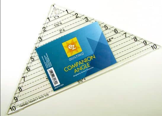
I didn’t, yet, do all the cutting as instructed in the first clue, partially because I wanted to see if I could find a better way, more preferred way to cut. I also didn’t want to delve into my stash completely yet. I still wanted to try and use as many scraps from my scrap bin as possible. Some of the drawers are getting pretty full.
EZ Companion Angle Ruler
In order to cut from my scrap bin, I had to be able to cut from smaller scraps. I don’t have a lot of 5.25″ scraps laying around. It occurred to me, as I was thinking through this process, that I had a ruler that would make cutting the quarter square triangles a bit easier. I found the EZ Triangle Companion Ruler (I think I bought this for the Easy Street Mystery quilt) and the Fons & Porter Half & Quarter Triangle Rulers. Neither had been opened (ooops!), so I examined them and, for no particular reason, chose the Fons & Porter to try first.
I cut one 5.25″ square the way Charlotte suggested so I had a sample. I used that to determine the size I needed to to cut using the HST/QST ruler. The directions on the Fons & Porter ruler tell you to cut a strip size of 2.5″ to get the size QSTs I needed. This cut off the tip of the triangle at the top (see that tiny black triangle at the tip of the ruler in the photo below?). I wasn’t sure why I would want to cut off the tip since it didn’t create the bunny ears. This made me wonder if that ruler would work. I didn’t want a hole at the point where those triangles intersected with other piecing. Nobody was around to answer on Twitter, so I cut the strips 2.75″ and used that dimension as a guide for cutting additional triangles.
“Strips” is a bit of an exaggeration as I was using scraps. I tried to find scraps that were at least 2.75″ wide.
Fons & Porter Half/Quarter Square Triangle Ruler
Using this ruler took a lot longer than cutting already cut 5.25″ squares into quarters would, but I was able to use a nice variety of fabrics and I was able to clear out my scrap bin a little more.
I found that I had to have a nice straight cut line on which to line the correct cutting line.
One confusing thing, which I have found with other rulers, is where to put the fabric under the ruler. Some of the lines, including the one I needed to use, were quite thick. Do I line the ruler on top of the fabric with the bottom of the thick line even with the cut line? Or something else?
I just decided to be consistent. I can always trim.
If you haven’t done the triangle step of Scrapitude, I hope you’ll try using one of these rulers to vary your fabric selection.
Do people use the word magenta anymore? It doesn’t come up that often, but I really felt an Autumn-ish word was required. Since we are scraping the bottom of the barrel on words magenta was the closest I could get. Orange, Autumn and leaf have all been used. Even stem, branch and tree have been used. What’s a girl to do?
Definition: “Magenta (ma?gen?ta, /m??d??nt?/) is a purplish-red,[1] purplish-crimson,[2] or purplish-pink color.[3] It is a primary color in color printing which, combined with cyan, yellow and black in various combinations, can be used to create all other colors. The name comes from the dye magenta, originally called fuchsine, discovered in 1859, and renamed after the 1859 Battle of Magenta near Magenta, Italy where the French army defeated the Austrians and helped secure the unification of Italy.[4]” (Wikipedia)
The color magenta means universal harmony and emotional balance. It is spiritual yet practical, encouraging common sense and a balanced outlook on life. (Empower Yourself with Color Psychology.com)
Magenta -samples from Google
Magenta – The leader in Pro AV signal switching, extension and distribution over category cable and fiber.
Magenta Labs
Magenta – character from the Rocky Horror Picture Show
Magenta Theatre Company – Vancouver, Wash
skateboards
Magenta Boutique – Leavenworth’s newest fashion boutique specializing in the latest goodies for the fashionista at heart.
Hotel Magenta, Florence Italy
Magenta Agency is a social strategy and marketing agency based in Los Angeles California.
Magenta is Blue’s best friend from school who serves as a recurring character in Blue’s Clues.
Post the direct URL (link) where your drawing, doodle, artwork is posted (e.g. your blog, Flickr) in the comments area of this post. I would really like to keep all the artwork together and provide a way for others to see your work and/or your blog.
We are also talking about this on Twitter. Use the hashtag #CPP
The Creative Prompt Project, also, has a Flickr group, which you can join to post your responses. I created this spot so those of you without blogs and websites would have a place to post your responses.
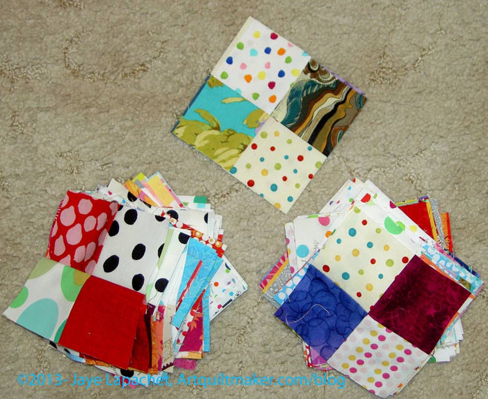
I spent the day Saturday doing laundry and working on four patches. I had really looked forward to a day in my workroom and, while I got that, I felt out of sorts. I am not sure why, but it just wasn’t the relaxing sew day I thought it would be. I sewed, but I didn’t enjoy it as much as normal.
112 Four Patches
Still, I made progress. I finished the 112 four patches that were part of the first sewing step in Charlotte’s Mystery quilt. I had started them last week or the week before, so about half of the halves were sewn. I needed to do the rest and I had to cut enough pieces to make them.I alternated cutting and sewing. It works better for me.
I have to figure out how and where to store these. I don’t have a good sense of when the next step will happen.
Example Four Patches
As you can see, my background fabric is dots. I figured I would use some of the dots I have been collecting sinc they are just sitting there waiting for a project. As I mentioned, I had to cut much of the background from yardage. I rummaged through my scrap bins as much as possible. Now, I am pretty much left with weird shapes and smaller than 2.5″ squares in many of the colors.
I have to say that part way through making the 4 patches, I was ready to make some larger blocks and see where I was going. I got a little sick of 4 patches, which is sad, because I really adore the simplicity of four patches. There is a lot one can make with a four patch as a base. I think part of what is going on is that I am not organized in my sewing room right now. I don’t have a good handle on the projects I have going. I know what they are, but I don’t have the steps in my head.
If you haven’t been following along, I went down to SoCal for a week and that trip, along with problems with my machine, kind of ruined my flow. I’ll get back into it; it is tough, though. Learn from me: sew or pet fabric every day.
Since I finished the 25 4 patches already as well, I think I am ready for the next step. I don’t see it posted on Sandy’s blog, so I guess I’ll get back to some cutting, of which there is plenty left to do.
Why Should You Care: You can see that it is possible to get work done even if your machine is out of commission and you have a loaner. You can also see that it is possible to create some organization, even in a scrappy quilt.
In reading Oliver Twist, the phrase ‘stow that gammon’ is uttered by the character of Mr. Sikes
Post the direct URL (link) where your drawing, doodle, artwork is posted (e.g. your blog, Flickr) in the comments area of this post. I would really like to keep all the artwork together and provide a way for others to see your work and/or your blog.
We are also talking about this on Twitter. Use the hashtag #CPP
The Creative Prompt Project, also, has a Flickr group, which you can join to post your responses. I created this spot so those of you without blogs and websites would have a place to post your responses.
Sara of Sew Sweetness kindly asked me to participate in her Purse Palooza, as I have mentioned. Today is my day. Find my review on the Sew Sweetness blog TODAY! Go leave a comment so Sara knows how popular I am. 😉
A Day in the Park Backpack
I decided to, finally, make and review A Day in the Park Backpack Tote by Liesl Gibson. It is a few years old and I was relieved to see the pattern is still available at the Oliver+S website. I was pretty excited when I bought the pattern and I didn’t want you to get excited and then not be able to buy it. Also, it is about time I made it.
One of the reasons I bought the pattern in the first place is that I liked the verticality of this bag. Vertical bags are good for commuting as they don’t hit people when you walk up the stairs from the train. The size ended up being good-not so large that I would hurt my shoulder, but a nice size for commuting with a snack, a book, and a few odds and ends. Lunch wouldn’t fit unless it was bills in your wallet. 😉
First off, the look of this pattern reminded me of the Vogue and McCall’s patterns we buy to make clothes. I am not surprised as Liesl Gibson designs children’s clothes. I don’t think she has created many bags or small accessories.
The pattern is in a paper envelope with newsprint instructions. The pattern pieces are printed on tissue-type paper. I am always a little scared of the tissue paper patterns as I am afraid they will rip and be useless. I find it interesting how pattern expectations (plastic envelope with folded 8.5″ sheets inside) have changed since I bought this pattern.
Sara suggested a couple of ideas to get the review started. I don’t have any problem finding things to say, but I thought these were good ideas, so I will include them. Sara asked:
What fabric/supplies were needed to make the bag?
What did you think of the illustrations and instructions?
Did you make any modifications to the pattern?
What Difficulty Level did you think this pattern was at?
Fabric and Supplies
There is a complete fabric and supply list that includes 11 items. You will use all of them if you make the bag as directed. I didn’t find this to be a bag you can decide to make at 11pm on Saturday night and finish to take to brunch with friends on Sunday morning. There are some specialty hardware items that I don’t keep around. I made a special trip to Britex to purchase most of them and Britex is not open at 11pm on Saturday night. 😉 I am sure they are also available online.
I found it difficult to find the O rings required for the pattern. I ended up buying two key rings that were on sale at Joann just in case. After visiting 3 stores and multiple online sites, I ended up using them. They were a little small so make sure you buy O rings on the large end of the spectrum described on the package instructions.
O Ring Option
I found this package in the beading aisle at Michael’s, which was another option. I didn’t really want to buy 20 O rings, though. I don’t plan on making 10 of these bags.
In the finishing process, DH was helping me with the rivets. I told him about the O ring problem and he suggested a hardware store. He said Home Depot and Lowe’s are more home improvement and don’t have much hardware, but a real old fashioned type hardware store where you can buy individual pieces of metal thingy-ma-bobs might be a good source. I’ll have to check it out. I have heard of other quiltmakers finding supplies at hardware stores, but I never think of it.
Additional Supplies I Used
Aurifil 2250, a red, for the top stitching.
Free Spirit/Joel Dewberry Notting Hill Midnight Poppies (this is home dec weight)
Soft & Stable (instead of the canvas for the interfacing)
Good Morning by Me and My Sister for Moda (same fabric I used in the Star Sampler) for the lining
Pellon #100R Vinyl Fuse for the base
Shape Flex fusible interfacing
Saral paper to transfer markings from pattern to fabric. You might need two colors if you use a light and a dark. I wrote a post about Saral Paper that gives more information.
Directions
My first thought about the directions were that they were long and confusing. I always think that, though, because it is hard for me to read through the directions of something and understand what they mean until I start working through the steps. I am much better at figuring things out or being shown techniques BUT the former strategy doesn’t work for bags and the latter wasn’t available.
In the end, I thought there were a few things that could have been improved on the directions, but, in general, the directions were good.
There is a nice little chart that tells what to cut out of which fabric. In the chart, they list Primary Fabric, Contrast Fabric, Lining, Canvas. One immediate problem was that I didn’t know what pieces of the bag were going to be made out of which fabric. The section titled “Materials Needed” cleared that up a bit, but I was still unsure how the canvas (used for stabilizer) would be used until I read much further down the directions. I would have liked more of an explanation of the whys and wherefores of the fabric/supplies choices as well as a list of possible substitutes. For example, I would have liked to have known why the designer chose canvas rather than another kind of stabilizer. Look and feel? Weight? Availability? Cost?
It occurred to me that the pattern might not have been appropriate places for the whys I needed, so I went to Flickr and searched for “A Day in the Park” backpack. I found a Flickr group of these bags. You can get a good idea of the placement from the random photos and the photos in the group. I got a better idea of what pieces belonged in which fabrics. Hooray for Flickr! Nota bene: Please note that I said a better ideanot that I knew exactly. There was some variation in the way pieces and fabrics were referenced, or, at least, in the way I understood them to be referenced. I would like to see the different supplies referred to in the same way on all of the pieces, the chart, the supply list and the instructions.
I didn’t find much on the Oliver+S blog through web searches, but there was a post about why she created the pattern (sewing class). I did see that shops who are teaching classes could, at the time (don’t know about now), purchase packs of the hardware along with the pattern. While that would not have worked for me, I could have called to see if the packs were available for purchase by non-wholesale customers.
I also saw one forum post, which had some helpful information about making the straps. I didn’t explore to see if there were more posts.
Joel Dewberry Notting Hill Pristine Poppy (midnight)
Once I decided which fabric to use (Joel Dewberry Notting Hill Midnight Poppies, home dec weight), and after I washed it, I got started on the cutting. The cutting was a bit daunting, like the Petrillo Bag, simply because there are a lot of pieces involved. [Nota bene: when I cut out the second one, I cut the main fabric, then the lining and stabilizer fabrics that went with that main fabric piece and the cutting seemed less daunting.] I persevered and found the chart of how much of each fabric, etc. to cut to be very helpful. I was able to use it as a check to ensure I had enough of everything cut properly.
Making the Petrillo Bag was still fresh in my mind, so I decided use some of the supplies from that project. Since I didn’t have the canvas and don’t like floopy bags, I decided to use Soft & Stable instead of the canvas. I knew I was taking a risk. I usually like to make things as per the instructions the first time through, then start making changes if I make the bag again. I have enough bag making experience and I wasn’t doing anything completely crazy, so I decided it wouldn’t be completely crazy to use Soft & Stable.
The other thing I did was use iron-on vinyl for the base. I have been wanting to do it for the bottom of bags for awhile and this was a good opportunity. Pam did it first and gave me courage. The Base pieces on the A Day in the Park Backpack tote were small, so it was a good test. They came out pretty well, but, mid-process, the vinyl was stickier than I expected. I used Pellon #100R Vinyl Fuse. I used an applique pressing sheet on my ironing board and the vinyl release paper on the top. If I had been able to find my second applique’ pressing sheet, I would have used that on top. Nothing came off on my iron. Remember to cut the Base piece a little large, apply the vinyl, then trim the fabric with vinyl to the size of the pattern. This will avoid any issues with shrinkage.
I lined all of my lining pieces with Shape Flex fusible interfacing,to help prevent floop. Floop is bad on the lining also, because it means that the inside pockets aren’t strong enough to hold your stuff, and pens, etc can flip out of your bag. I felt that having iron-on interfacing would work fine and give the pieces some added body. It also saved me time and used a product I already had on hand.
I also didn’t want to baste all of the pieces I needed to cut. I used the WonderClips to help prevent the need to baste. They are too thick to sew over, but keep all the layers together with no problem.
I don’t think the main fabric really needed interfacing since I was using home dec weight fabric, but I put it on anyway. I haven’t used a lot of home dec fabric, so I was not 100% confident. As I said, there is very little out on the web about this pattern so I didn’t have a lot of information and experience to choose from when looking at what other people did. FreeSpirit and Joel Dewberry both replied to my question about washing the home dec fabric, which was GREAT!
Instructions
I thought the instructions were detailed enough. The way the pattern is written makes it clear that there is a certain level of knowledge expected. I would make several bags, including something as complicated as the Petrillo Bag before tackling this bag. In the blog post I referenced above, this pattern is designated as an advanced beginner pattern. I think that is optimistic. Not to discourage beginners, but there are a lot of steps, a lot of supplies, including a zipper, and sewing through many, many layers. I’ll defer to Liesl Gibson, but would categorize this pattern as Intermediate.
The instructions were a little hard to follow. I think they needed a bit more testing by random makers with a variety of intermediate to advanced experience. The more I got done, the easier it was to navigate through the pattern, but the designer should revise it for consistency with terminology and add some additional explanation, especially at the beginning.
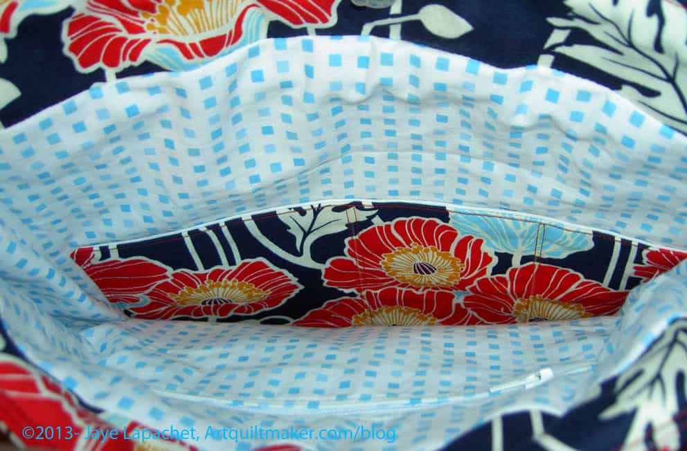
Inside A Day in the Park Backpack Tote
The instructions didn’t say how to put in a zipper (I don’t necessarily think they should), so make sure you know how to do that before starting the bag. Instead of making a zipper pocket, you could make two of the lining panels with the appliqued pocket. I do think that the directions for the appliqued pocket don’t tell the maker how to apply it in a nice way. The finishing isn’t very nice looking and I went around the pocket twice to make sure that it stayed on, if I put something heavy in it.
The fabric I used for the interior wouldn’t necessarily be my first choice again. I like it, but it frays. Definitely use a light colored fabric for the inside of your bags when making your own. A light colored lining makes it much easier to find things in the bottom of your bag. I am using a black on white for the second version.
Finished A Day in the Park Backpack Tote
I am pleased with how the bag came out.
Things I Liked
No errors in the pattern
Shape of bag
The directions on how to make the zipper pocket. It came out really well
If I Made this Bag Again
I would try it with the canvas as the stabilizer
I would eliminate the facing and magnetic closure at the top and add a flap instead
I would add a larger pocket, such as a file folder pocket on the back
I would add a messenger bag type strap and not make the backpack straps
I would use a slightly larger seam allowance on the lining as cutting it per the instructions make it a bit large for the size of the outside of the bag. Alternatively, I could cut the pieces a little bit smaller
Leave a larger opening in the lining to turn the bag, especially if I used the Soft & Stable again. The Soft & Stable takes up more space and was kind of a problem to turn using the opening size indicated in the pattern
The lining bottom is made of two pieces sewed in the middle. I would try to cut one entire piece rather than two pieces. It is the lining, so who really cares, but I think it would look better and be one less step
Modifications to Materials
Iron-on interfacing (Shape Flex) instead of basting on interfacing
Soft & Stable instead of canvas
WonderClips instead of basting
I have already started a new version of this bag with the modifications described above. I am not very far along, so stay tuned.
Thanks to Sara for inviting me to join Purse Palooza. I really appreciated the opportunity to make a bag that had been on my list for awhile and write about it. Check out the other bags that will be shown in the next two weeks.
I am happy to be participating in Purse Palooza this year with a special bag sewing pattern review! Here’s how the event works:
1. Every weekday from September 30th – October 25th, there are at least 2 amazing guest bloggers on the Sew Sweetness site scheduled to share with you a purse sewing pattern review. None of the purses reviewed from the event last year are being reviewed again, so these will be fresh sewing pattern reviews! Each review will contain detailed information about what the reviewer thought about the sewing pattern, modifications made, what kind of interfacing used, and more! There are a few technique and product review posts sprinkled in as well.
This is a great way to get inspired to make the bag you have always wanted to make. Having a buddy really helps. Remember when Pam and I did the Petrillo Bag-Aong?
Aeroplane Bags
2. Even more exciting…THERE WILL BE A GIVEAWAY EVERY WEEKDAY DURING THE EVENT! That’s right, 20 GIVEAWAYS!
3. At the end of the event, you will get a chance to show me your purse in order to win some amazing prizes! Of course, international entries are welcome too!
1. Check out all the purse pattern reviews throughout the month and get inspired to sew up a purse of your own!
2. Link up your completed purse on the Purse Palooza 2013 pageBETWEEN SEPTEMBER 30th AND NOVEMBER 11th. Your purse must be created and photographed between those dates; purses made prior to September 30, 2013 will be disqualified. The purse may be of your own design, or made from a sewing pattern. You can link from Flickr, your blog post, or wherever else you host your photos.
3. There is no limit to how many purses you may enter, as long as they were made between September 30th and November 11th. Only one link-up per purse please.
*Note: Besides bags and purses, for this event also acceptable are clutches, backpacks, wallets, etc.
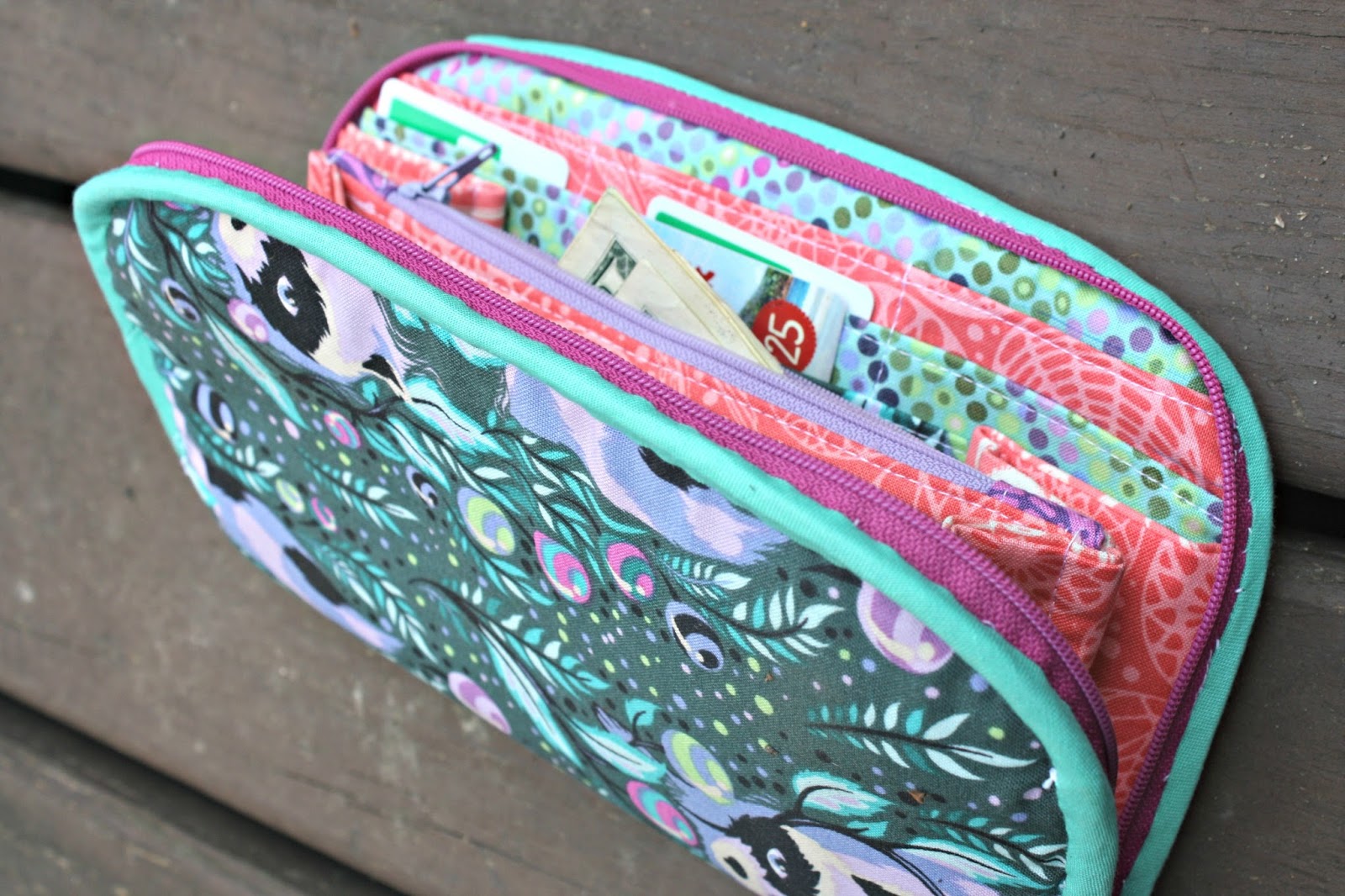
Greenbacks Wallet Trio
Prizes
This year, there will be 1st-4th prize winners chosen from all those that submit a purse during the event. There will also be a randomly-drawn winner out of everyone who enters!
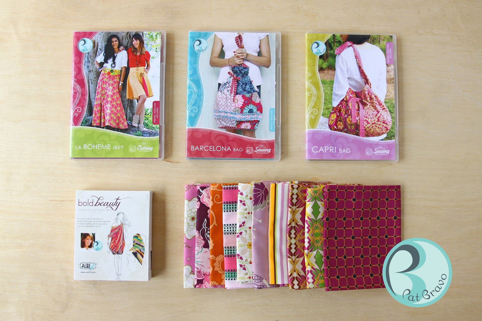
1st prize – 4th prize will receive an AWESOME prize pack courtesy of Pat Bravo, genius fabric designer extraordinaire! The prize packs will each include 3 Pat Bravo sewing patterns (La Boheme Skirt, Barcelona Bag, and Capri Bag), a pack of Pat Bravo Aurifil Threads (thread pack may vary, as there are 3 different packs), and 10 Pat Bravo fat quarters (fat quarters may vary).
In addition, the 1st prize – 4th prize winners will also receive a copy of Sara Lawson’s new book, Big-City Bags!! The book releases November 5th, and you can pre-order your book now!
Retail value of each prize pack: $127.
There will also be one randomly-drawn winner out of all purses entered, and this winner will receive a $50 gift certificate to Sara’s publisher, Martingale (as well as a copy of her new, not-yet-released book, Big-City Bags!).
Retail value of prize pack: $77.
Judging
Purse Palooza will be judged this year by Kay Whitt of Serendipity Studio. Kay writes the most stylish and fun-to-sew clothing patterns and bag patterns out there.
Thank you to all of the wonderful sponsors that are supporting this event!
Blossom is a non profit charity organization that empowers youth by providing important and meaningful volunteer opportunities.
The Blossom by William Blake
Merry, merry sparrow!
Under leaves so green
A happy blossom
Sees you, swift as arrow,
Seek your cradle narrow,
Near my bosom.
Pretty, pretty robin!
Under leaves so green
A happy blossom
Hears you sobbing, sobbing,
Pretty, pretty robin,
Near my bosom.
watching someone blossom
National Cherry Blossom Festival
Post the direct URL (link) where your drawing, doodle, artwork is posted (e.g. your blog, Flickr) in the comments area of this post. I would really like to keep all the artwork together and provide a way for others to see your work and/or your blog.
We are also talking about this on Twitter. Use the hashtag #CPP
The Creative Prompt Project, also, has a Flickr group, which you can join to post your responses. I created this spot so those of you without blogs and websites would have a place to post your responses.
Definition: “In botany, blossom is a term given to the flowers of stone fruittrees (genus Prunus) and of some other plants with a similar appearance that flower profusely for a period of time in spring. Colloquially flowers of orange are referred to as such as well. Peach (including nectarine) blossoms, most cherry blossoms, and some almond blossoms are usually pink. Plum blossoms, apple blossoms, orange blossoms, some cherry blossoms, and most almond blossoms are white.
Blossoms provide pollen to pollinators such as bees, and initiate cross-pollination necessary for the trees to reproduce by producing fruit.
Blossom trees have a tendency to lose their flower petals in wind-blown cascades, often covering the surrounding ground in petals. This attribute tends to distinguish blossom trees from other flowering trees.” (Wikipedia)
You are probably wondering why this is on yellow paper. Well, I am almost at the end of my drawing book and in the back they have “conveniently” placed different types of paper. There is a sheet of lined paper, there are some other sheets and this piece of yellow paper. I was drawing at Starbuck’s and the lighting wasn’t good, so I didn’t realize the paper was yellow until I had started. I actually realized that the pens weren’t dealing well with the paper before I noticed the color. Derrrr, as the Young Man would say.
I was thinking Touchdown for this response.
What did you think when you saw the prompt?
I hope you have done a response. If you have, please post the direct URL (link) where your drawing, doodle, artwork is posted (e.g. your blog, Flickr) to the comments area of this post. I would really like to keep all the artwork together and provide a way for others to see your work and/or your blog.
We are also talking about the Creative Prompt Project on Twitter. Use the hashtag #CPP