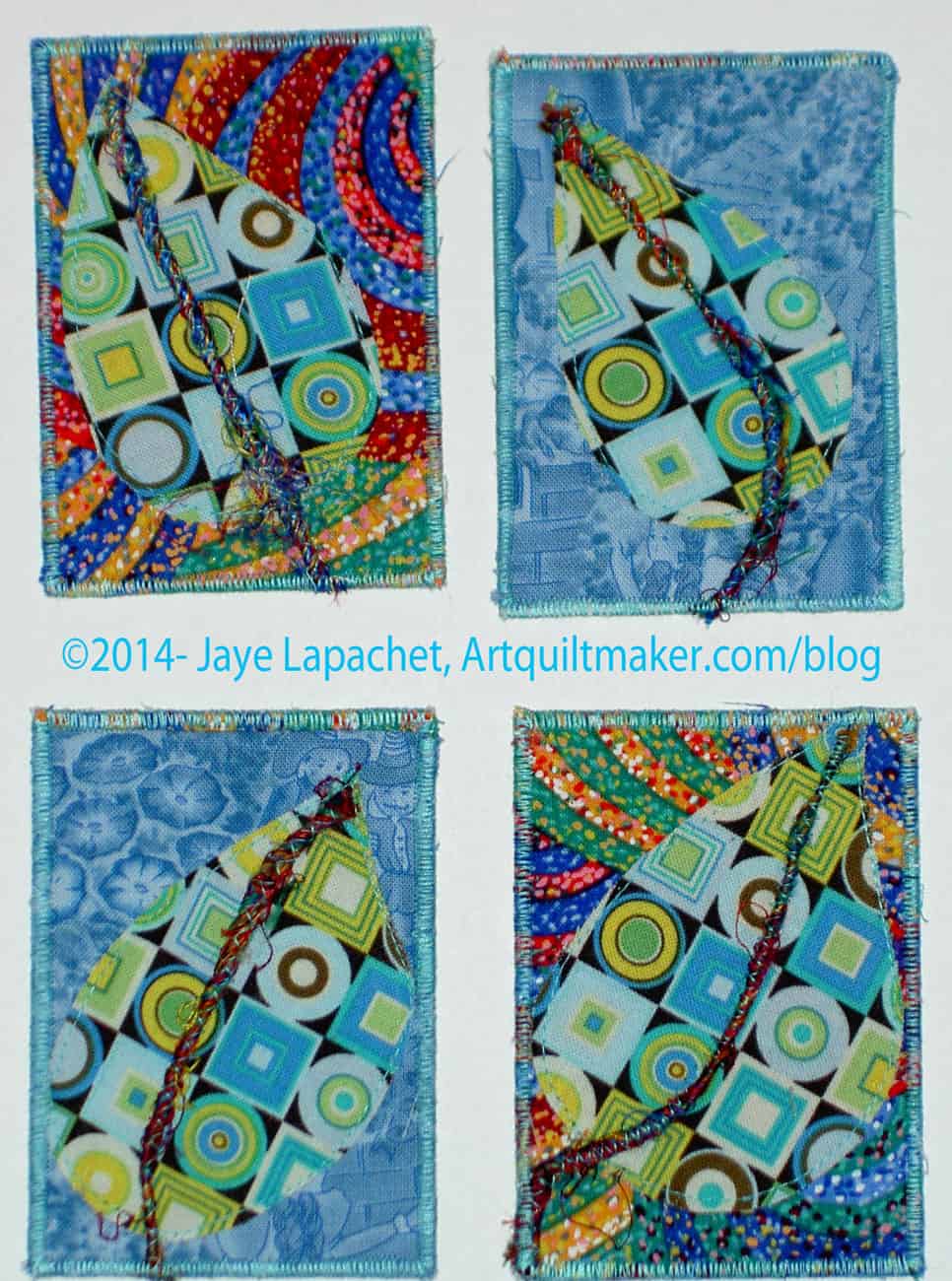
Creative Prompt #242: Rain

Purple Rain by the Artist formerly known as Prince (or does he have a name again?

acid rain

Definition: “Rain is liquid water in the form of droplets that have condensed from atmospheric water vapor and then precipitated—that is, become heavy enough to fall under gravity. Rain is a major component of the water cycle and is responsible for depositing most of the fresh water on the Earth. It provides suitable conditions for many types of ecosystem, as well as water for hydroelectric power plants and crop irrigation.

The major cause of rain production is moisture moving along three-dimensional zones of temperature and moisture contrasts known as weather fronts. If enough moisture and upward motion is present, precipitation falls from convective clouds (those with strong upward vertical motion) such as cumulonimbus (thunder clouds) which can organize into narrow rainbands. In mountainous areas, heavy precipitation is possible where upslope flow is maximized within windward sides of the terrain at elevation which forces moist air to condense and fall out as rainfall along the sides of mountains. On the leeward side of mountains, desert climates can exist due to the dry air caused by downslope flow which causes heating and drying of the air mass. The movement of the monsoon trough, or intertropical convergence zone, brings rainy seasons to savannah climes.

The urban heat island effect leads to increased rainfall, both in amounts and intensity, downwind of cities. Global warming is also causing changes in the precipitation pattern globally, including wetter conditions across eastern North America and drier conditions in the tropics.[citation needed] Antarctica is the driest continent. The globally averaged annual precipitation over land is 715 mm (28.1 in), but over the whole Earth it is much higher at 990 mm (39 in).[1] Climate classification systems such as the Köppen climate classification system use average annual rainfall to help differentiate between differing climate regimes. Rainfall is measured using rain gauges. Rainfall amounts can be estimated by weather radar.

Rain is also known or suspected on other planets, where it may be composed of methane, neon, sulfuric acid or even iron rather than water.” Wikipedia

Jung Ji-Hoon (born June 25, 1982), better known by his stage name Rain, is a South Korean singer, actor, songwriter, dancer, model, producer and designer.

no rain on the way

Rain, rain go away come again another day

1932 movie

Who stopped the rain?

Rain is a full-service digital agency, comprised of storytellers, designers, developers and bright minds from every corner of the creative space.

A bank is a place where they lend you an umbrella in fair weather and ask for it back when it begins to rain.
Robert Frost
Read more at http://www.brainyquote.com/quotes/keywords/rain.html#aByE7vxHTy8LBfOh.99

Rain (Registered Trademark) Handcrafted Vodka.

Rainbird

rain delay (baseball)

Rain” is a song by the English rock band the Beatles, credited to Lennon–McCartney and first released in June 1966 as the B-side of the “Paperback Writer.”

It’s raining men

Radio and Internet Newsletter

There is more to sex appeal than just measurements. I don’t need a bedroom to prove my womanliness. I can convey just as much sex appeal, picking apples off a tree or standing in the rain.
Audrey Hepburn
Read more at http://www.brainyquote.com/quotes/keywords/rain.html#aByE7vxHTy8LBfOh.99

2006 movie

Post the direct URL (link) where your drawing, doodle, artwork is posted (e.g. your blog, Flickr) in the comments area of this post. I would really like to keep all the artwork together and provide a way for others to see your work and/or your blog.

We are also talking about this on Twitter. Use the hashtag #CPP

The Creative Prompt Project, also, has a Flickr group, which you can join to  post your responses. I created this spot so those of you without blogs and websites would have a place to post your responses.

Pink Spider’s sister

Amy's Group Project
Amy’s Group Project

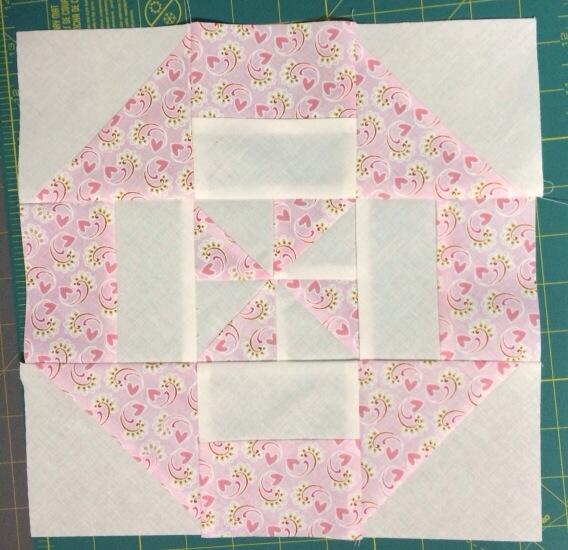
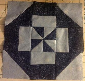
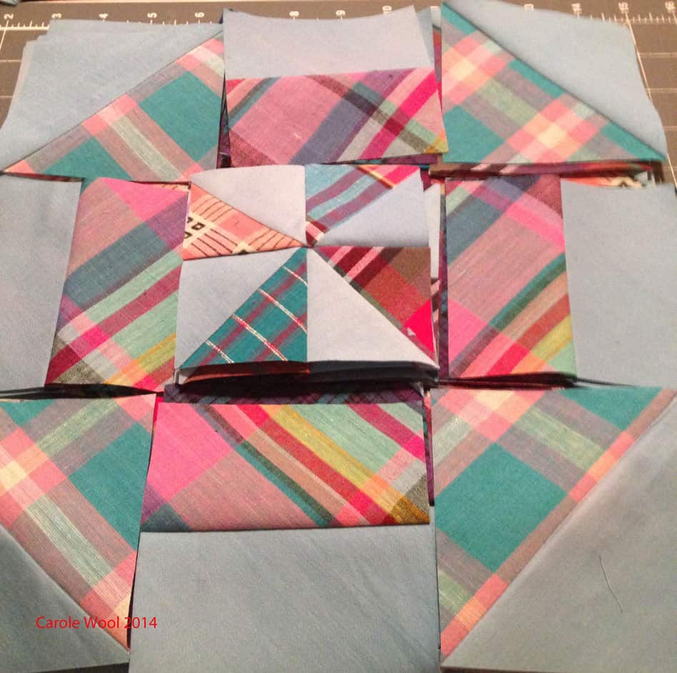
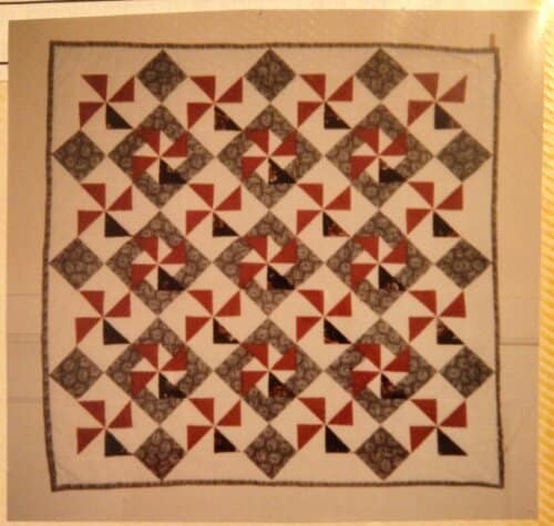
Remember last week when I showed you the Pink Spider Looking at the Stars? Well, Amy and I are friends on FB and she chimed in about her version of the quilt. She was in my quilt group and made another quilt with the same fabrics. She sent me a photo and gave me permission to post it. I am posting it here.

This is a great example of the same fabrics being used in completely different ways. I really like the white background as it gives the quilt a lightness.

Scrapitude Continues Again

I went to Memphis for work last week and really missed sewing. I arrived home on Saturday around 8. No sewing that night, but Sunday, I got to it. Sandy posted the next clue on Scrapitude sometime last week and people were already finishing up their blocks – yes, that clue included the blocks layout – and I was chomping at the bit to sew. As soon as I got some Sunday chores out of the ay, I started laying the blocks out.

Scrapitude: Don't Do This
Scrapitude: Don’t Do This

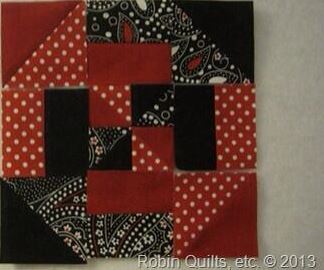
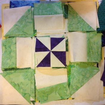
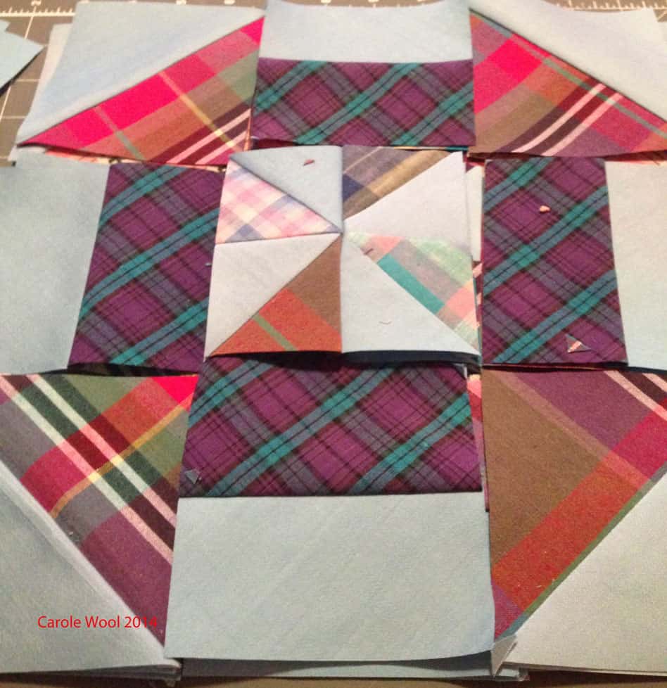
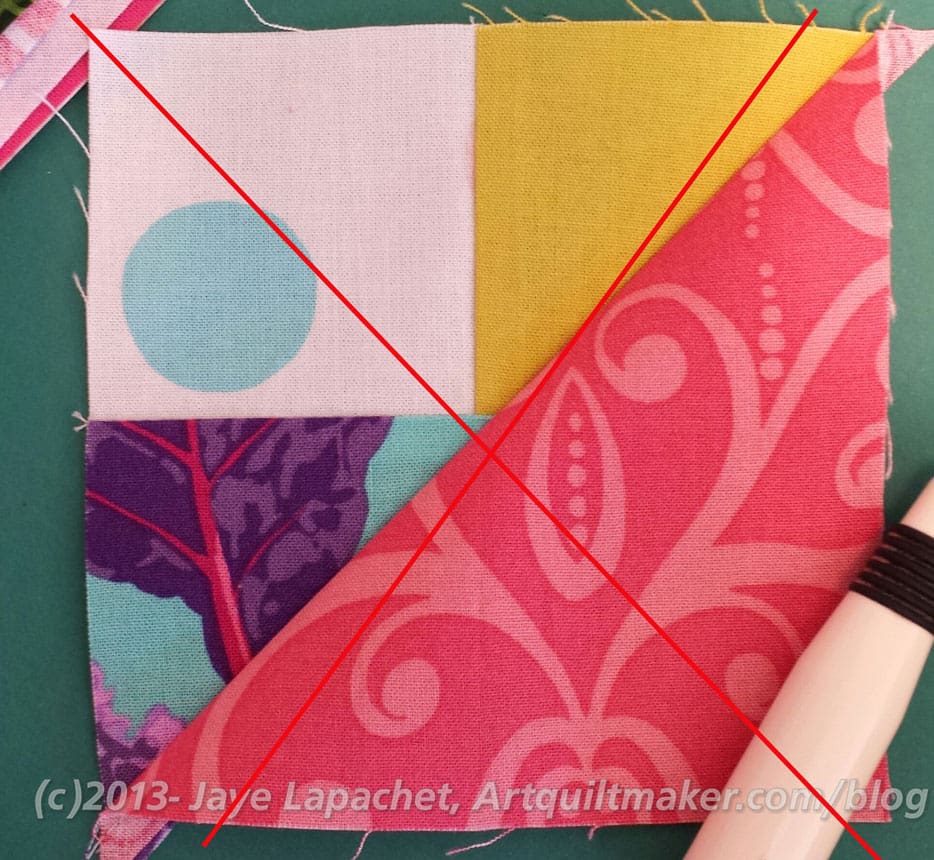
I realized pretty quickly that I would have to rip out the units I had sewn with the large plain triangles and the complex corner units, because that combination was completely wrong. Duh. I didn’t rip them out before, because I was hoping I was ahead and not wrong. Sadly, Charlotte has another plan in mind and I was wrong. I ripped a little and sewed a little and finally got enough of the Jester Hat blocks (I’ll have to look up the real name sometime) to make up 25 blocks. I slowed down on the ripping and started to sew in earnest.

Scrapitude: Missing Jester Hat blocks

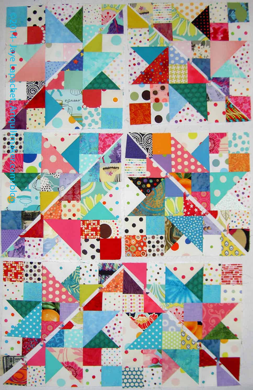
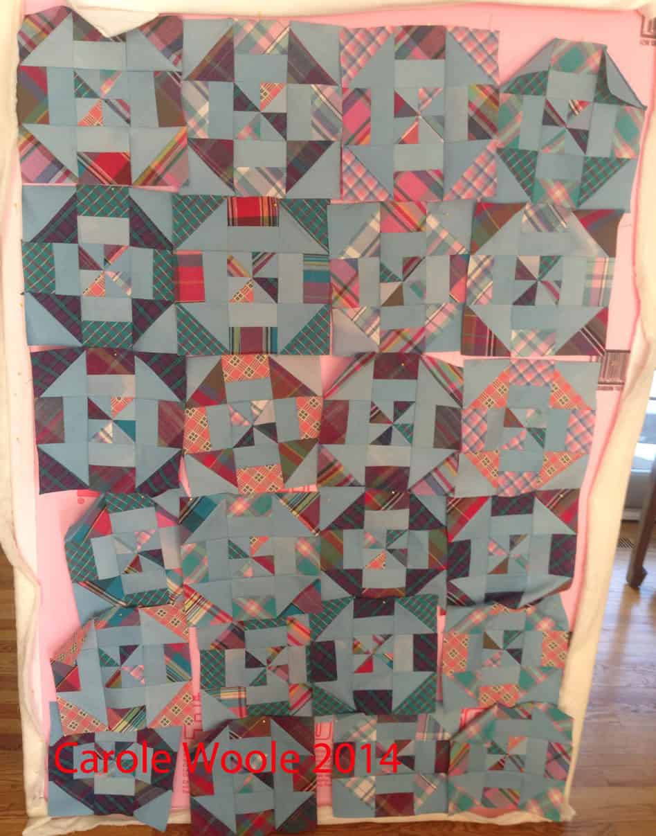
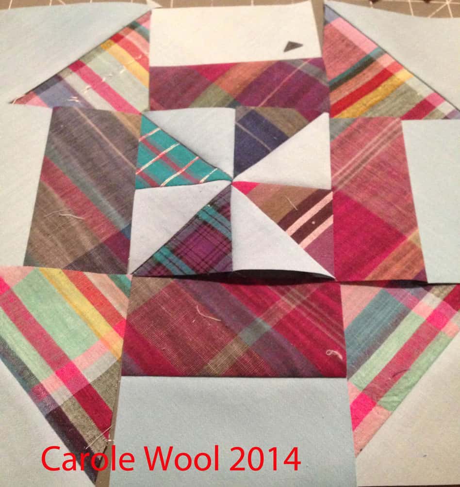
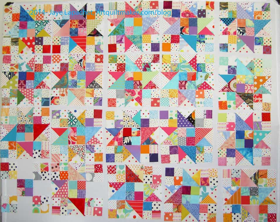
As you can see, I laid out the various parts into blocks. Most of my Jester Hat units are not 4.5″ and that really bugs me. I think it is because of switching machines, what feels like, several dozen times.

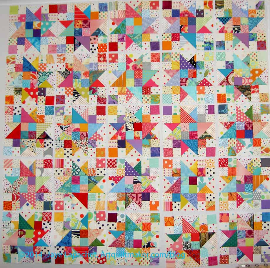
As I arranged the layout, I did a the pieces around to maximize the colors and spread like colors across the piece. Mostly I just laid them out. There is enough variety so, for the most part, no two fabrics are next to each other. Still I thought the piece looked like a bit of a jumbled mess.

I went and got my machine on Monday and used it to make some of the blocks, but after about two hours of sewing, it is acting up, so I didn’t get as much done as I would have liked. 🙁

I can’t be too upset, because I did get quite a bit done. I also had fun on my birthday, got back in the workout saddle AND I was thrilled to be back and playing with fabric.

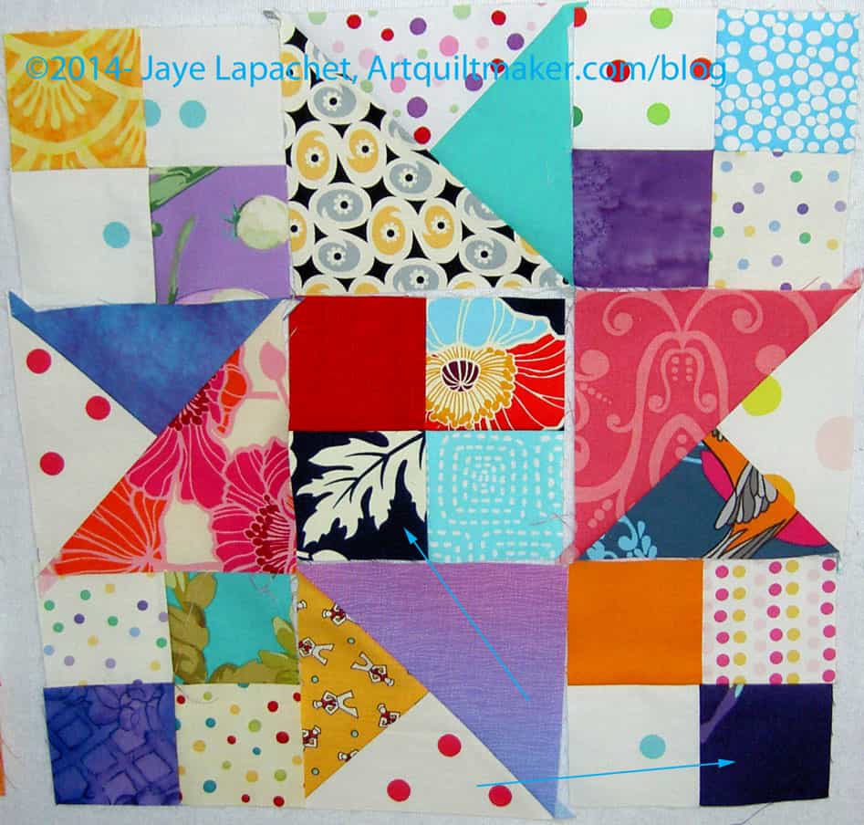
Scrapitude: Too dark?

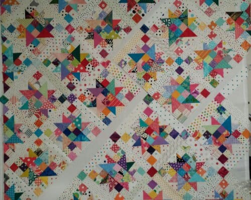
I am still thinking about the piece as a whole. With Mystery Quilts, it is hard to figure out a cohesive look for the whole when you don’t know what the whole will be. I guess that is the nature of Mystery Quilts. Rather than exciting, it is causing me some anxiety. I think, because of the amount of the turquoise and pink that there is an element of cohesion. Or I might be wishing strongly.

In terms of the scrappiness of the piece, I have been concerned all along. It is easy not to be too concerned while grabbing fabrics and cutting them up. What could go wrong, right? There are a lot of different fabrics and, though most are really clear, there are some dull ones (see that yellow with sailors towards the bottom of the above photo?). I think they are ok in the grand scheme, but I would be happy if they were gone.

I think the dots-as-background pull the piece together, even though the background is made up of a lot of different dot fabrics. Still I have some concerns about some of the darker fabrics. I have arrows pointing to the fabrics that are really B List fabrics, in terms of this piece. There are some others. I am going to leave them, because Maureen said they would be ok. I also don’t want to rip anymore. I am trying to spread them out so that they do not clump together to create a dark spot or hole in the quilt.

Scrapitude detail
Scrapitude detail

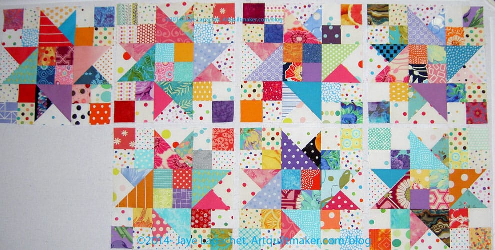
And so, I ended up with these blocks. To the right are the completed blocks. they are bright and cheerful and I am glad I used my dots for the background. I think it needs to be the Year of the Dots, a year where I will use my dots.

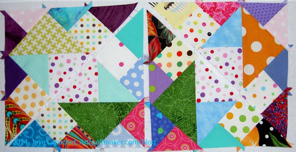
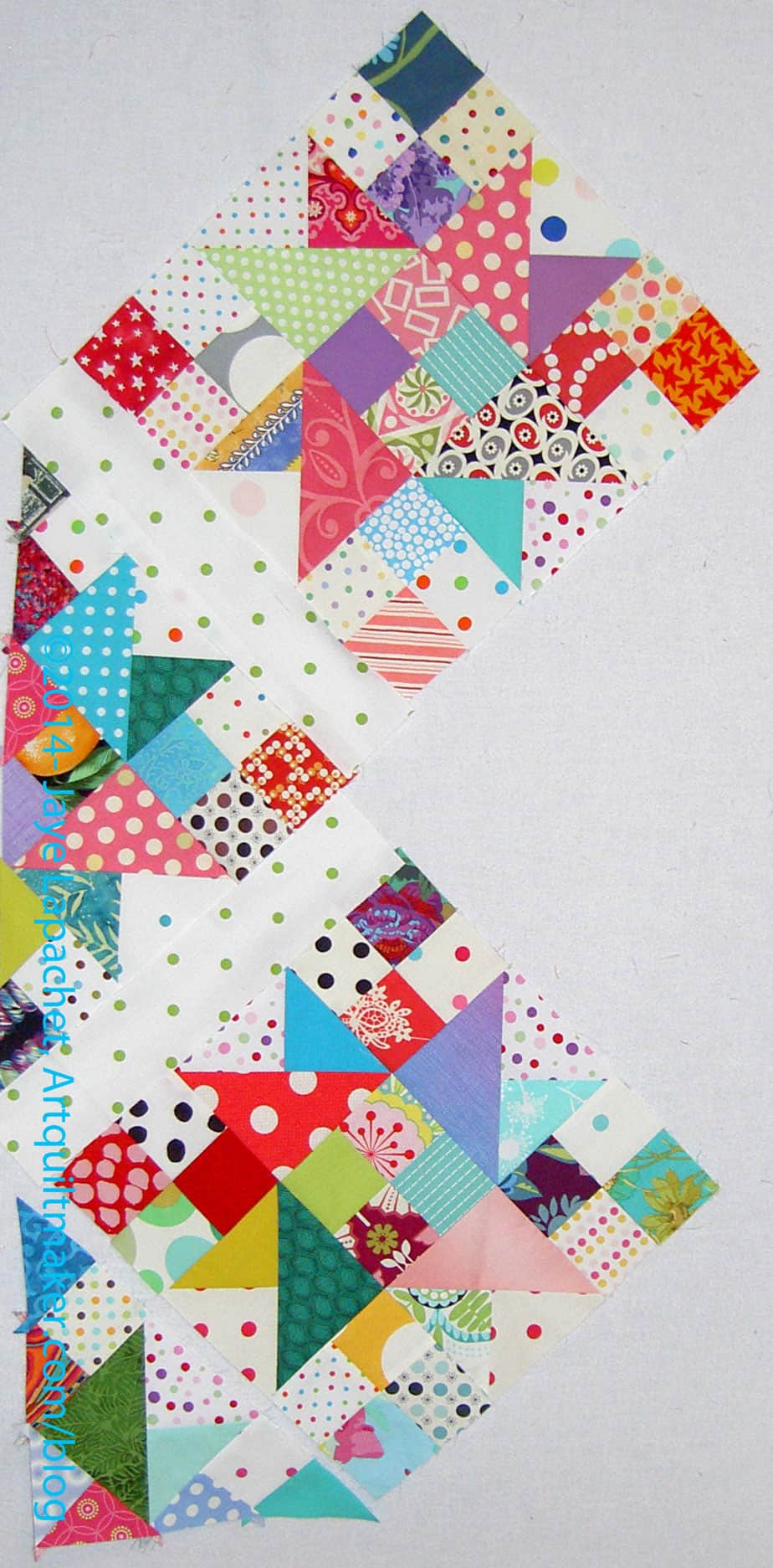
I have also made some of the triangle units designated in Clue #4 part 1 and Clue #4 part 2. I think this piece will be set on point, but I am not sure how as there are still sashing strips. I do like the look of the two triangle (corner??) units.

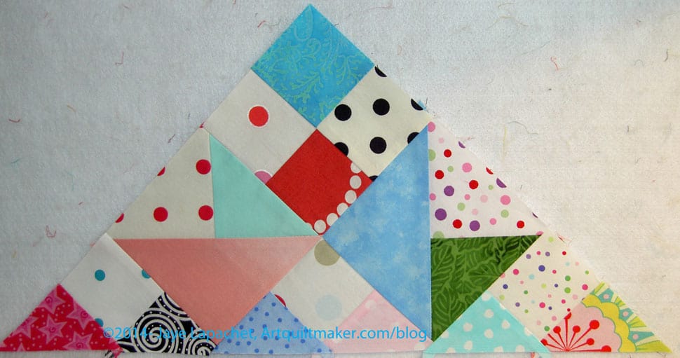
Scrapitude: Large Triangle Unit

I had to finish ripping the rest of the wrongly sewn blocks in order to make the piece above. It looks fairly complex, but is pretty easy to put together.

One good thing about a Mystery Quilt is making all the units upfront. I didn’t like all that cutting, but it really makes this step go fast.

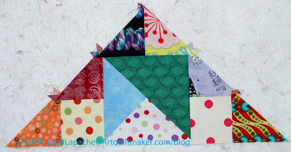
Scrapitude: Small Triangle Unit

These also look fairly complex, but the same applies. I am getting a lot of bang for my buck!

Previous Scrapitude Posts

Creative Prompt #241: Cloying

Don’t hate me. 😉

I have scent on the mind, because I am reading the Perfect Scent: A Year inside the Perfume Industry in Paris and New York by Chandler Burr. This is not my kind of book and there are things I don’t like about it, but it has scent, the sounds around scent, the words of scent on my mind. It will be a challenge, darlings. 😉

Definition: 1, to cause distaste or disgust by supplying with too much of something originally pleasant, especially something rich or sweet; surfeit. 2. initially pleasurable or sweet but wearying in excess. 3. overly ingratiating or sentimental.

sickly

Apparently ‘cloying’ in home brew is not a good thing.

saccharine

syrupy

cloying sentiment

From the Urban Dictionary: The deathbed scenes in the novels of Dickens are famously cloying: as Oscar Wilde said, “One would need a heart of stone to read the death of Little Nell without laughing.”

It was word of the day in the New York Times on Sep 21, 2011. Who knew there was such a thing as the New York Times Word of the Day? I may have to start reading the New York Times!

Post the direct URL (link) where your drawing, doodle, artwork is posted (e.g. your blog, Flickr) in the comments area of this post. I would really like to keep all the artwork together and provide a way for others to see your work and/or your blog.

We are also talking about this on Twitter. Use the hashtag #CPP

The Creative Prompt Project, also, has a Flickr group, which you can join to  post your responses. I created this spot so those of you without blogs and websites would have a place to post your responses.

From the Wine Spectator Website: Dear Dr. Vinny,

I’ve recently started to expand my wine horizons by including sweet and/or dessert wines. I’ve noticed many reviews of sweet wines mention the word “cloying.” It seems some of the best sweet wines are described as “sweet but not cloying”. Can you tell me how I will know if something is “cloying” my palate?

—Tom, Denver

Dear Tom,

You’re correct that “cloying” is most often a negative term, referring to an excessively sweet wine that is lacking acidity. If you’re not certain what cloying feels like, take a tablespoon of honey and swallow it. It’s very sweet, but it’s so sweet it feels like it might get stuck in your throat. The best dessert wines will balance any sweet, sugary or honey notes with a body and acidity that make the wine glide over your palate and linger without being sickly sweet.

Sketching #201

CPP Response #201: Blood Orange

The blood oranges in this response came out purple. I am not sure why, but they are clearly a kind of purple. I know the center is at least partially purple, but the outside is orange and I did not show that at all. I could do this response over, but I probably won’t.

If you have not done a response, you can be inspired by the original prompt.

What did you think when you saw the prompt?

I hope you have done a response. If you have, please post the direct URL (link) where your drawing, doodle, artwork is posted (e.g. your blog, Flickr) to the comments area of this post. I would really like to keep all the artwork together and provide a way for others to see your work and/or your blog.

We are also talking about the Creative Prompt Project on Twitter. Use the hashtag #CPP

Sketching #200

CPP Response #200: Sunset

I am behind, but I have been doing responses. I had so much to say about quiltmaking that I haven’t been posting the responses.

I hope you have done a response. If not, you can see the original prompt to be inspired.  If you have, please post the direct URL (link) where your drawing, doodle, artwork is posted (e.g. your blog, Flickr) to the comments area of this post. I would really like to keep all the artwork together and provide a way for others to see your work and/or your blog.

We are also talking about the Creative Prompt Project on Twitter. Use the hashtag #CPP

Top Complete: Attack of the Hexies

Attack of the Hexies Finished Top

Yes, yesterday I finished the last details I needed to do to prepare the top for quilting. The tasks required were:

  • Finish back
  • Make binding
  • Trim top
  • Stay stitch

Saturday was a busy day, because I attended the CQFA meeting. I stayed after the meeting to sew with Sonja, Angela and Rhonda. It is good for me to hang with others and talk sewing. I am tending to work alone lately and am trying to get out of that rut.

During the sewing time, I worked on finishing some buttonhole stitching on one of the stockings and making progress on applying the sleeve to the Original Bullseye top. When I returned my mind was buzzing with an idea using the technique that Caroline taught based on Susan Carlson’s book, Serendipity Quilts. I worked on getting the design to the size that I wanted. That was about all I had energy for before I needed to go to bed. In the process, I ruined the cropping tool on Photoshop Elements. I know there is something I clicked, but I don’t know what it was and will have to take some time to find it and undo it. Ergh! All this is to say: 1) I didn’t work on the Attack of the Hexies on Saturday and 2) I have an idea for a new, small art piece, so stay tuned.

Yesterday morning, I had big plans to get up early, go to the gym, take a shower and get going on Attack of the Hexies by 10am. Famous last words! I didn’t get up until nearly 9 and I felt creaky. I have been dealing with a cold. While I am on the downslope of it, I am stilling fighting it off. I didn’t sleep well a few nights in a row and am trying to make up for that lack of sleep. I cut myself some slack.

After writing in my journal for awhile, I went upstairs and started sewing. I had to add a bit of fabric to one half of the back before I could sew the whole piece together. I did that and had to trim the whole back so that the piece was essentially square.

Attack of the Hexies Back

The line of bricks on the horizontal in the center of the back used to be hexagons, but I cut the leftover hexies up into rectangles and used them to add a little interest. The rest of the back is leftover yardage from the Flower Sugar line of fabric. I still have at least 5 yards of yardage left from that line. Not sure what I will do with it, but it will go into the stash and will show up again. There are two pieces that I really like.

Next, I made the binding. I used one of the pinky-reds from the line to provide a frame for the entire piece. I also made it a straight of grain binding. A lot of the border is on the bias because of the way I placed the hexagons as I added them to the piece. Basically, I didn’t pay attention to the grain line. I should have, but didn’t. I don’t do straight of grain bindings very often, because they tend to get kinks and near-folds in them as I hand stitch them on to the quilt. I like the ‘give’ that bias bindings have. It makes them very easy to apply by hand.

In this case, I want the edge to be stable. I don’t want it to get out of whack when it is quilted, thus, a straight of grain binding. We’ll see how it goes.

Trimming Border
Trimming Border

Finally, and I don’t know why I did this last, I trimmed the border. It wasn’t straightforward, but I had to trim half of each hexagon one by one. I used the lines on the Clearview Ruler I discussed in the Hexagons Follow-up post to keep the who piece as straight as possible.

It wasn’t straightforward, because of the bias, so I just did it slowly and as carefully as I could. The piece will not be as straight as the Quilt Police would want, but they never made this quilt and I am happy with it. As you can see from the photo above, the border looks a little odd, but I like how it looks different.

The piece is now ready for quilting. I’ll take it to Colleen for quilting as soon as I can. I look forward to getting this completely done.

Hexagon Related Posts:
Little Bluebell’s Cutting Instructions
May 21, 2011 – Hooked on Hexagons
June 1, 2011 – Hexagons Follow-up
June 7, 2011 – Attack of the Hexies
June 9, 2011 – Hexagons tutorial
October 20, 2011- Hexagons Return
November 13, 2012- Blue Chair Blog Hexagon Sewing tutorial
June 28, 2013- Hexagon Clarification
September 5, 2013 – Hexies Return
January 5, 2014 – Attack of Hexies Returns
January 8, 2014 – Attack of the Hexies Border

Design Series: Focal Point/Emphasis

We’re back!!!!

Well, it has been awhile since Sandy and I were able to get together, but we are back in the  saddle. We worked on a new Design Series episode last week. You should be able to hear all about Emphasis/Focal Point today!

You can find the other episodes and companion blog posts by searching the Design Series tag.
_______________________________________________________

Rhonda Ludwico
Rhonda Ludwico

Emphasis/Focal Point is a principle of design.

Emphasis/Focal Point is related to Size/Scale

I have dominance listed separately in my outline for this series of podcasts, but we cannot really talk about Emphasis and Focal Point without talking about dominance, so consider this episode related to the upcoming episode on Dominance.

Definitions:

  • An emphasized element of your design is a focal point (Pentak & Lauer, pg.46)
  • “Emphasis creates a focal point in a design; it is how we bring attention to what is most important. Emphasis is what catches the eye and makes the viewer stop and look at the image. Without emphasis, without getting the viewer to look at the image, communication cannot occur.” (The Elements and Principles of Design, pg. emphasis)
    • This can happen pretty easily with standard block quilts. If you have nothing to draw the attention, e.g. you use the same fabrics for each block and the size of the blocks is all the same, you may have nothing in the quilt to create a focal point.
  • Emphasis can be achieved through the use of color, value, intensity, size & scale as well as other design elements.” (Color & Design, pg. 125)
  • Emphasis gives “interest to one entity or area over others present in a design field, however a focal point is not always formed.” (Color & Design, pg. 125)
  • Focal point: “attracts viewer as a point of emphasis, encourages viewer to look farther.” (Quilter’s Book of Design, pg. 154)
  • “A focal point results when one element differs from the others. Whatever interrupts an overall feeling or pattern automatically attracts the eye by this difference:
    • when most of the elements are dark, a light form breaks the pattern and becomes a focal point
    • when almost all the elements (whether light or dark) are vertical, a diagonal element is emphasized
    • In an overall design of distorted expressionistic forms, the sudden introduction of a naturalistic image will draw the eye for its very different style
    • when many elements are about the same size, similar but unexpectedly smaller ones become visually important
    • when the majority of shapes are rectilinear and angular parallelograms, round shapes stand out
    • the list could go on and on…
    • a change in color or a change in brightness can immediately attract our attention.” (Pentak & Lauer, pg.48)

    Emphasis on Isolation (Source: strose.lunaimaging.com via Jaye on Pinterest)
    Emphasis on Isolation (Source: strose.lunaimaging.com via Jaye on Pinterest)

Using Emphasis/Focal Points:

    • “An unnatural contrast of scale in your quilts can also be used to achieve interesting effects. Surrealists such as Salvador Dali used wildly confused internal proportions to intentionally create uneasiness in the viewer. One element that is purposefully out of scale with other elements within the quilt will attract the viewer’s attention and become a focal point.” (Art+Quilt, pg.65)
      • If you have a large Mariner’s Compass in the middle of a quilt, the Mariner’s Compass will be the focal point.
    • “A problem for the quiltmaker is how to achieve both variety and unity. Just adding different elements to the composition may destroy its unity. Adding elements that are similar, but different from each other, can add interest without upsetting the unity of the whole. If one of the variations of the chosen elements is in high contrast to the rest of the piece, it can create a focal point. ”
      • (as an aside, I don’t mean that you are only allowed to use contrast as a focal point; the author means using something to differentiate that area or section from the rest of the piece) (The Quilter’s Book of Design , pg,27)
    • Emphasis by Contrast: “Very often in art the pictorial emphasis is clear, and in simple compositions (such as a portrait), the focal point is obvious. But the more complicated the pattern, the more necessary or helpful a focal point may become in organizing the design.” (Pentak & Lauer, pg.48)
    • Emphasis by Isolation: an element alone in part of a design immediately gets our attention even if there are many of the same shape in another part of the design. (Pentak & Lauer, pg.50)
      • “…a focal point that is too close to an edge will have a tendency to pull the viewer’s eye right out of the picture.”  (Pentak & Lauer, pg.50)
    • Emphasis by Placement: “If many elements point to one item our attention is directed there, and a focal point results. A radial design is a perfect example of this device” (Pentak & Lauer, pg.52)
      • Imagine a Mariner’s compass with a Fleur de Lis in the center circle.
    • Emphasis by Value: “Value contrast can be used to create a focal point in the composition. High contrast will attract the viewer’s attention.” (The Quilter’s Book of Design, pg.66)
    • Structure: There are four different major types of structure. (you might remember this from a brief overview we did in the Balance segment)
      • Focus Structure: Focus structure has to do with placing elements of a design in such a way that the eye of the viewer focuses on it. You create focus by establishing the difference between the featured shape and its setting. (Adventures in Design, pg.117)
      • Circular Structure: “… a central design is the main focus and everything else plays a lesser role, accentuating the beauty of this central design.” In this structure, the artist must ensure that there is “enough continuity between the inner focus and the outer support so that the eye can move throughout the design.” Circular structure uses a circular design “skeleton to move the eyes around the design in a clockwise manner.” (Adventures in Design, pg.118)
      • Triangular Structure: The basis of your design, in a triangular structure, is a triangle (Adventures in Design, pg.119)
      • L Structure: In an L structure “the major design focus should be along one of the arms of the L.” The best placement in this kind of structure is to place the major focus close to the intersecting point of the L.” (Adventures in Design, pg.119)
      • Horizontal and vertical structure: use a “horizontal or vertical line as your structure. This directional structure can be used over the entire design surface” (Example is Layers of Time by Sylvia Naylor- see it on pg. 38 in Adventures in Design or a Chinese Coins quilt design) (Adventures in Design, pg.119). One of the ‘coins’ in a Chinese Coins quilt would have to stand out in some way (be fatter than the others, be a wildly different color, etc in order for this structure to be used to focus attention on one part of the quilt.


Rule of Thirds (Source: http://photoinf.com/Golden_Mean/Michael_Fodor/Photo_School_-_Rule_of_Thirds/ruleofthirds.jpg)
      • Rule of Thirds:  Joen Wolfrom says “The rule of thirds is an easy way to find a focus range. Simply divide your design into thirds, horizontally & vertically. Four intersecting points will appear. Place your” focal point “in the vicinity of the most appropriate intersecting point.” (Adventures in Design, pg.117) I think you need to place your focal point where it helps you to communicate the message you want to get across to your viewers.

Notes:

      • “A focal point, however strong, should remain related to and a part of the overall design… In general, the principle of unity and the creation of a harmonious pattern with related elements is more important than the injection of a focal point if this point would jeopardize the design’s unity.” (Pentak & Lauer, pg.54)
      • “Giving dominance to, or emphasizing one design element or area will counteract confusion or the risk of monotony.” (Color & Design, pg. 125)
      • A definite focal point is not a necessity in creating a successful design. It is a tool that artists may or may not use, depending on their aims.” (Pentak & Lauer, pg.56)
      • “How does the designer catch a viewer’s attention? …Nothing will guarantee success, but one device that can help is a point of emphasis or focal point. This emphasized element initially can attract attention and encourage the viewer to look further.” (Pentak & Lauer, pg.46)
      • “You create focus by establishing the difference between the featured shape and its setting.” (Adventures in Design, pg.117)
      • “In past centuries when pictures were rare, almost any image was guaranteed attention. Today,…all of us are confronted daily with hundreds of pictures. We take this abundance for granted,” and have even trained ourselves (sometimes unknowingly) to filter out imagery that is unpleasant or distracting,  “but it makes the artist’s job more difficult. Without an audience’s attention , any message, any artistic or aesthetic values, are lost.” (Pentak & Lauer, pg.46) This is why I rail a bit on drawing the viewer of your quilt into the design field and then rewarding them with small stitches or beadwork as a result of looking closer. At a quilt show, you need to get people to look at your quilt in the midst of hundreds of them.
      • 57625240465184)
        Marie-Hélène Cingal, Bruxelles (Source: http://www.flickr.com/photos/24271543@N03/5120409660/in/set-72157625240465184)

        There can be more than one focal point. Sometimes secondary points of emphasis are present that have less attention value than the focal point. These are called accents.” “…the designer must be careful. Several focal points of equal emphasis can turn the design into a three-ring circus in which the viewer does not know where to look first.” (Pentak & Lauer, pg.46)

        • “…provide a variation in order for our eyes to be attracted to the focus area.” (Adventures in Design, pg.117)
      • “Scale and proportion are closely tied to  emphasis and focal point. Large scale, especially large scale in proportion to other elements makes for an obvious visual emphasis.” (Pentak & Lauer, pg.60)
      • “Emphasizing one element or letting one area dominate others sends an invitation tot he viewer to come in and take a closer, longer look at the work.” (color & Design, pg. 125)

Exercise:

Type “focal point” examples into Google or your favorite search engine and look at the images. As you look at the images, try and figure out what the focal point is.

Resources:
Art + Quilt
Design Basics by Pentak & Lauer
The Elements and Principles of Design, http://nwrain.net/~tersiisky/design/emphasis.html

Creative Prompt #240: Teal

Post the direct URL (link) where your drawing, doodle, artwork is posted (e.g. your blog, Flickr) in the comments area of this post. I would really like to keep all the artwork together and provide a way for others to see your work and/or your blog.

We are also talking about this on Twitter. Use the hashtag #CPP

The Creative Prompt Project, also, has a Flickr group, which you can join to  post your responses. I created this spot so those of you without blogs and websites would have a place to post your responses.

Definition: “Teal is a low-saturated color, a bluish-green to dark medium, similar to medium blue-green and dark cyan. It can be created by mixing green with blue into a white base, or deepened as needed with a little bit of black or gray color.[3] The complementary color of teal is coral.[3] It is also one of the initial group of 16 HTML/CSS web colors formulated in 1987.

The first recorded use of Teal as a color name in English was in 1917.[4]” (Wikipedia)

Its name is derived from the Middle English tele, a word akin to the Dutch taling and the Middle Low German telink.[5] As a color, its name is believed to have been taken from the small freshwater Common Teal, a member of the duck family whose eyes are surrounded by this color.[5]

In the TEAL project, Belcher teamed up with Co-Principal Investigators Peter Dourmashkin and David Litster to reformat the teaching of freshman physics at MIT. Technology-enabled active learning is a teaching format that merges lectures, simulations, and hands-on desktop experiments to create a rich collaborative learning experience.

Blue-winged teal (bird)

Teaching Excellence in Adult Literacy

  • Movies
    • Teal (and blue) with orange are frequently used with digital color casting in movies, aiming for a more dynamic and contrast-rich image.
  • Music
    • The DCI drum corp, Teal Sound uses teal as its primary color and obviously as part of its name which has become an icon of the group.
    • Teal is the signature color of the virtual singer Hatsune Miku.

Attack of the Hexies Border

As I mentioned, all of a sudden, I am working fast and furiously on the Attack of the Hexies (Flower Sugar Hexagon). I spent all weekend trying, in vain, as it turned out, to finish the top, back and binding of Attack of the Hexies.

Attack of the Hexies border - in process
Attack of the Hexies border – in process

As I have said, Y seams are not hard, but they do take time. I decided to put a border on the piece and I needed to do it using hexagons. I don’t know another way to piece fabric into a hexagon piece without using hexagons. I could have cut off the hexagons on the edge, but I have always disliked that look for my own quilts and didn’t want to do that for this piece.

I also didn’t want to buy new fabric. Fortunately, I had enough of the Art Gallery solid Linen to use for the border. I didn’t even use all that I had, though my stock is significantly diminished.

The border is on the piece. I intend to trim it so the edges are square and still need to do that. I am all for wonky borders (Case in point: the Zig Zaggy Quilt), but not in this piece. I want the border to be square and subtle so that the center looks like it is floating on the border.

I am partway through the back as well. I lounged around for a long time on Sunday and didn’t have enough time to finish it. I had big pieces left over, so I didn’t have to piece a lot of small pieces together.

Almost there!

Round Robin Round Four Complete

Kelly's Round Robin
Kelly’s Round Robin

I spent some time with Kelly’s Round Robin over the past week. I finished my portion on January 1 and was pleased to be able to move on to the Attack of the Hexies.

I saw Camille Roskelley’s Round and Round quilt and liked the basic block so much that I wanted to make it. The version from Around the Blocks blog really inspired me. I love the way the triangles seem to flutter or twirl on the background. The basic component is a Friendship Star, a block that I always thought had potential, but never quite liked. Now I know that making it smaller and combining it with others like it was the ticket. Camille Roskelley is a genius.

I didn’t think the block was the right size for the piece, but I decided the piece could use something bold. I resized the block and worked on the whole piece in EQ7. I could only get an idea of the outcome. The piece has special fabric and I didn’t feel like scanning and uploading it. From what I could see, I thought it would work.

Round and Round - one block
Round and Round – one block

The block has 85 pieces. I reworked the piecing as well as resizing it, because some of the pieces didn’t need to be small squares. Also, I didn’t want, for example, to piece 4 squares together to make a larger square.

Chunking Round & Round

This made the final piecing of the block a little different than just piecing the block together in rows. I was able to chunk it. Once I was able to see how to chunk the piece, the piecing was no problem. I used the Triangle Technique to make all of the triangle squares (half square triangles).

Fussy cutting in Round & Round

SIL suggested that I fussy cut the special fabric and use that for the center rectangle in order to echo the original focal point of the piece. I thought that was a good idea and fussy cut different portions of the special fabric for the centers.

Kelly's Round Robin
Kelly’s Round Robin

I think it came out well and I hope that Kelly is happy with my work. I was really pleased with the block. I can’t make it to the meeting in January, so I sent it off to Kelly.

Related Round Robin Posts

Attack of the Hexies Returns

Hexies - January
Hexies – January

For months I didn’t work on the Hexies project, then on the first I just dove in and added rows. I am not sure why except that it didn’t require cutting. The hexagons were there, the piece was there and I needed something to sew.

I got my head around the Y seams and did it. I didn’t want to sew one hexagon on at a time and I had a row started, so I finished the row and worked on sewing the whole row on at a time. It was a lot of stopping and starting, but I just did it. I developed a system and kept at it.

Things I have to figure out:

  • How big to make it. It seems small now, but I know that if I fill my design wall it makes a pretty big quilt.
  • Whether to unsew a section where I sewed two of the same fabrics together.
  • How to finish the border – to square it off or leave it jaggedy. I am not sure I can face all those mitered binding corners

I  plan to just work on it until I am done with the top.

Hexagon Related Posts:
Little Bluebell’s Cutting Instructions
May 21, 2011 – Hooked on Hexagons
June 1, 2011 – Hexagons Follow-up
June 7, 2011 – Attack of the Hexies
June 9, 2011 – Hexagons tutorial
October 20, 2011- Hexagons Return
November 13, 2012- Blue Chair Blog Hexagon Sewing tutorial
June 28, 2013- Hexagon Clarification

September 5, 2013 – Hexies Return

Creative Prompt #239: Gold

All that glitters is not gold

white gold

black gold (oil)

Definition: “Gold is a chemical element with the symbol Au and atomic number 79. It is a dense, soft, malleable, and ductile metal with an attractive, bright yellow color and luster that is maintained without tarnishing in air or water.” Wikipedia

Congressional Gold Medal

Gold’s Gym

World Gold Council

“WE BUY GOLD!”

gold bars

gold coins

gold bullion

pure gold

Gold Rush

pot of gold at the end of a rainbow

Microsoft Gold Certification

Gold Beach: ”

Gold, commonly known as Gold Beach, was the code name for one of the D-Day landing beaches that Allied forces used to invade German-occupied France on 6 June 1944, during World War II.

Gold lay in the area assigned to the 50th (Northumbrian) Infantry Division commanded by Major General Douglas Alexander Graham, and the 8th Armoured Brigade. These were part of XXX Corps, commanded by Lieutenant General Gerard Bucknall, which in turn was part of Lieutenant General Miles Dempsey‘s British 2nd Army. Gold had three main assault sectors – these were designated (from west to east): Item, Jig (split into sections Green and Red), and King (also in two sections named Green and Red). A fourth, named How, was not used as a landing area.[1]

The beach was to be assaulted by the 50th Division between Le Hamel and Ver sur Mer. Attached to them were elements of 79th (Armoured) Division. The 231st Infantry Brigade would come ashore on Jig Sector at Le Hamel/Asnelles and the 69th Brigade at King Sector in front of Ver sur Mer. No. 47 (Royal Marine) Commando, attached to the 50th Division for the landing, was assigned to Item sector.”

Gold fever

gold chain

Gold Panda

The Gold Card provides unemployed post-9/11 era veterans with the intensive and follow-up services they need to succeed in today’s job market.

Fool’s gold

Public television series with Huell Howser provides history and travel information about a range of California locations.

Gold fields

pan for gold

gold mine

Venturing Gold Award

red-gold

Gold Award (Girl Scouts)

mining for gold

Gold Eagle Co. has been an industry leader in the production and distribution of aftermarket fluids and additives since 1932.

Post the direct URL (link) where your drawing, doodle, artwork is posted (e.g. your blog, Flickr) in the comments area of this post. I would really like to keep all the artwork together and provide a way for others to see your work and/or your blog.

We are also talking about this on Twitter. Use the hashtag #CPP

The Creative Prompt Project, also, has a Flickr group, which you can join to  post your responses. I created this spot so those of you without blogs and websites would have a place to post your responses.

A Little More Scrapitude

image

I finally finished the square blocks for Scrapitude. The above photo shows a sample if the two kinds of blocks required for the project. I still have some pressing to do to completely finish this part.

I worked on them on and off using Bonnie Hunter’s leaders and enders method while I worked on other projects over the past few days.

There is quite a bit of pink, which is a little worrisome. I hope it work out.

I think they look cheerful.


Previous Scrapitude Posts

Creative Prompt #238: Gaggle

This is the last post of 2013! Take 5 minutes and enjoy!

Gaggle of geese

gaggle ofhttps://artquiltmaker.com/blog/wp-admin/post-new.php girls

Gaggle is a SAFE cloud-based Learning Platform for the real K-12 classroom.

Gaggle is a Vario & GPS for hang glider, paraglider and sailplane pilots. GPS based flight information such as logging, mapping, IGC file upload and glide calculations.

a new book called “The Gaggle: How to Find Love in the Post-Dating World,” by Jessica Massa

Gaggle reinforces keyboarding skills every time it’s used. A teacher can send different writing prompts to differently leveled groups of students

Gaggle is a safe web based email solution for schools and students.

http://The-Gaggle.com is a website that explores modern romance.

Gaggle buggy

Press Gaggle by Jay Carney and Ben Rhodes aboard AF1 en route Washington, D.C..

The Gaggle’s Official Tumblr page, where we navigate the relationship between love, technology, ambiguity and modernity through filtered photos


Definition: “A gaggle is a term of venery for a flock of geese that is not in flight; in flight, the group can be called a skein.

In terms of geese, a gaggle is equal to at least five geese.

In terms of salt, a gaggle is equal to eight fifty pound bags of salt. Usually one layer on a skid.

In military slang, a gaggle is an unorganized group doing nothing. In aviation, it is a large, loosely organized tactical formation of aircraft.

In certain regions of The Netherlands, a gaggle can also refer to a group of adolescent females.” Wikipedia

Gaggle Workshop 2012! Bringing software developers and scientists together to promote interoperability in software for systems biology.

In the field of systems biology, The Gaggle is an open source software framework for exchanging data between independently developed software tools and databases to enable interactive exploration of data.[1]

Post the direct URL (link) where your drawing, doodle, artwork is posted (e.g. your blog, Flickr) in the comments area of this post. I would really like to keep all the artwork together and provide a way for others to see your work and/or your blog.

We are also talking about this on Twitter. Use the hashtag #CPP

The Creative Prompt Project, also, has a Flickr group, which you can join to  post your responses. I created this spot so those of you without blogs and websites would have a place to post your responses.