Art Institute of Chicago Samplers

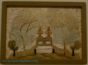
AIC Mourning Sampler

At the Art Institute of Chicago, while I was in Chicago, there was a very small exhibit of textiles called Fabric of a New Nation: American Needlework and Textiles, 1776–1840. It is in Galleries 57–59 from Thursday, July 12, 2012–Sunday, November 11, 2012.

The exhibit included some quilts and several examples of needlework. One type of needlework I like are samplers. I like them because they are so personal. They often include initials or names and dates. The ones I know best are cross stitch samplers. I have made a few, including one I posted here previously. The ones at the Art Institute were different. These were not cross stitch, but more emboridery/needlework samplers and they were mourning samplers.
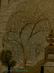
AIC Mourning Sampler

At a certain point in time and space, I guess there was no way to remember people unless a woman stitched a mourning sampler. I felt odd staring at this sampler, it felt indecent for some reason. I couldn’t stop, though. The stitches shone, glittered in the harsh fluorescent light. The thread was silk and it was like a whole bunch of puzzle pieces clicked into place in my mind. The thread was gorgeous and it made me realize that I need to get some of this thread and try it out on one of my pieces.

I also liked this tree. I like the curves of the limbs and the shape of the leaves. The colors are very soothing, but I always wonder whether the colors have faded?

I enjoy looking at older textiles because I always get inspired. I see something that sparks a thought in my mind. I also like thinking about the women who made them. It always makes me sad when I read a tag next to a beautiful Sampler and it says ‘unknown.’ I am glad we have blogs, because we won’t be so anonymous in the future.
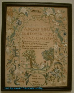
1791 Sampler by Lucy Potter

I thought the Sampler by Lucy Potter was very fine. It isn’t exactly my style, but the stitching was exquisite. I like the writing, but it is hard to see.

Nota bene: we were allowed to take photos as long as they were taken without the flash. That is why these photos are so dark.

Elizabeth Bogfholder Towel, 1831

The Bogfholder Towel is a cross stitch sampler. I like the simple shapes and bright colors of this sampler.

I have trees on the mind, too, so I was particularly interested in the way the artist stitched the trees.
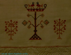
Elizabeth Bogfholder Towel, 1831, detail

I know that thedetail of the towel isn’t exactly a tree, but I thought the motif had an interesting shape. It is, perhaps a candelabrum? The birds or griffins on the top intrigue and I wonder about the symbolism for all of these motifs.

I also think I could make a good argument that the smaller motifs on the left and right are stylized trees.
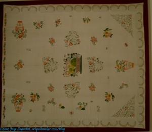
Stencilled bedcover
Stencilled bedcover

When I first saw this piece the exhibit was transitioning from needlework to quilts and I thought this was a quilt or an embroidered bed cover. It is a bed cover, but it is stenciled. The stenciling was very fine and detailed. I was amazed when I got up close to it, because I really couldn’t tell from even 3 feet away.

I had no idea that stenciling was done in the covered by this exhibit. I always think it is a good day when I learn something new.
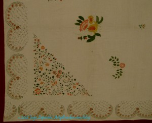
Stenciled bedcover, detail

I think some of the motifs of the stenciling could be enlarged and used as applique’.

The description of the exhibit is “Featuring over 45 bedcovers, coverlets, needlework, printed handkerchiefs, and other household textiles from the permanent collection of the Department of Textiles, this exhibition explores the evolution of an American textile tradition as home creation, cottage industry, and commercial production developed between the years 1776 and 1840. While some needlework and textiles during this period were born out of necessity, others evoke refinement and sophistication, reflecting the overall growth, ingenuity, and prosperity of a new nation.

Traditionally textiles, whether made in the home or commercially, were considered prized possessions, but their value was not merely monetary; they often held special significance for the makers and their descendants. Many such textiles bear the maker’s name, and as treasured heirlooms were passed from one generation to the next serving as family record.

The sewing of textiles was also vital to the maintenance of a household. This important female skill not only provided the necessities of clothing and bedding but also a socially acceptable activity for women. The sewn and embroidered textiles in this exhibition represent the work of schoolgirls and women who had the means and time to pursue the needle arts. The works’ highly skilled execution and complex designs are evidence of the artistic and personal expression they provided.

A bridge from home to commercial production can be seen in the exhibition’s woven coverlets. Coverlet weavers in homes and separate workshops formed a cottage industry that would eventually grow into a full-scale commercial business by the mid-19th century. Printed textiles, on the other hand, were a product of the innovations and technological advancements of the Industrial Revolution, part of the commercial manufacturing industry that disseminated affordable textiles to a wider audience. With the mechanization of production and printing, textiles were able to keep pace with fashion and current events.

Whether sewn, woven, or printed, the textiles in this exhibition trace the development of an American textile tradition—one in which industrialization played a dominant role transforming raw materials into finished products but one that was also impacted by changes in the American home from creation out of necessity to a burgeoning consumer economy. Within these diverse textiles and their development, one can witness the innovation and progress of an early but thriving new United States.”

I was thrilled to see some textiles and hope that you enjoyed this review.
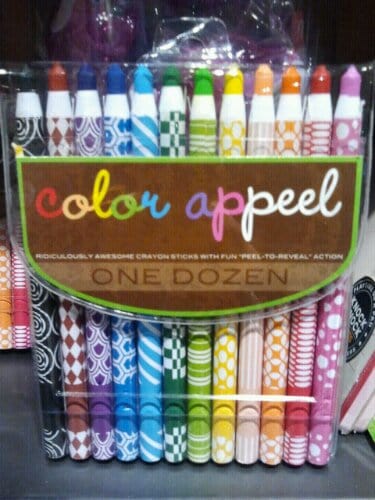
Creativity and Fun

image

I saw these in a shop today and they made me smile. Of course, they were in the kids section. Kids get all the fun stuff. If I ever have that sort of shop, I’ll designate a section labeled “creative people”. Could be fabulous or a disaster. Would you be more creative if you had these crayons? I might be tempted to just look at them and not use rhem. Note to self: get over that!!! 🙂

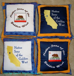
NSGW Pillows

NSGW Pillows
NSGW Pillows

I was back in pillow hell on Monday, except that it wasn’t really hellish. I made four pillows using embroidery panels my SIL and I created on her embroidery machine when I was in Maryland/DC last year. My part in that was saying yes or no to colors of thread and whether the letters should be curved or not. She is the embroidery queen and I was just her humble assistant.

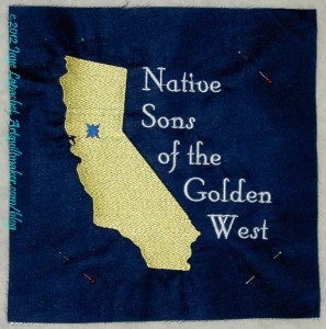
Embroidery panel (1 of 4)

While I was in Maryland, we made a few pillows for the Native Daughters, of which we are both lurker members, but I took the embroidered panels home to make the Native Sons pillows later. As I have mentioned, my DH in on the Board of Trustees of a non-profit. When they are running for off their parlor (e.g. chapter) sponsors a hospitality suite at the Grand Parlor (e.g. annual conference). In the hospitality suite, they play cards, offer liquid refreshments and raise money for their Cleft Palate charity using raffles. For the past year or two, since DH has been running, I have made pillows for him to raffle off. They were wildly popular the first year and he raised a record amount for the charity.

Guess what?

“Later” is this weekend! Can you say last minute? I wasn’t planning on spending my day off making pillows, but this coming Saturday would be even more last minute, so I did the job. I was prepared for drama and there was none. I think I only had to rip out one seam. I measured correctly, counted properly and generally made 4 pillows in record time.

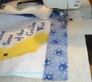
Batting Foundation
Batting Foundation

The big difference was that Cathy, my SIL, suggested using batting as a foundation. It makes the block look nice and gives the maker a goal. You cut the batting the size (including seam allowance, so if finished is 14″ you cut the batting 14.5″, etc) you want the pillow and then sew on top of it. I don’t know how this would work if you didn’t have a flip and sew friendly pattern, but I am sure there is a way to figure that out.

Anyway, the pillows are done and packaged ready to head to NSGW Grand Parlor. DH was pleased and I am going to the dentist and then am going to work on something fun that doesn’t feel like “quilt work.”

The Sunday Stash Report (a la Pam at Hip to be a Square podcast) is 2 yards. More on that later.

Nota bene: if you think there are photos missing, there are. I am having trouble uploading some pictures to the blog. Check back later. It will be resolved eventually.

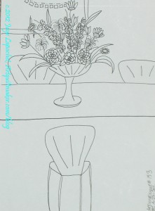
Sketching #153

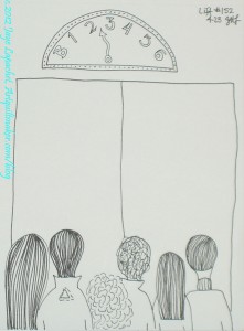
Creative Prompt Response #153: Arrangement

A big urn of flowers was the first thing that came to my mind when I went to respond to this prompt.

One of the biggest regrets I have for not being born a princess is that I don’t have anyone whose job it is to make sure the flowers are fresh, have enough water and don’t stink. I don’t have anyone to replace the flowers when they are old or to take care of the cutting garden.

Oh.

I don’t have a cutting garden either.

I guess a drawing of an arrangement is as good as it gets.

Post a link to your own response on the original page for this prompt.

The Creative Prompt Project, also, has a Flickr group, which you can join to post your responses. Are you already a member? I created that spot so those of you without blogs and websites would have a place to post your responses. Please join and look at all of the great artwork that people have posted.

Book Review: Showcase 500 Rings

Showcase 500 Rings: New Directions in Art JewelryShowcase 500 Rings: New Directions in Art Jewelry by Marthe Le Van

This is another book I received from Lark Crafts. Thanks, Lark! This particular book is another gem from the Lark 500 series. I love this series, because it is pure eye candy – no patterns, no basics, just fabulous photos of amazing pieces.

As I have mentioned many times, I am not a jeweler, however, I always love the opportunity to review shapes and motifs in a different format. I think it can inform my quiltmaking.

As the title advertises there are photos of 500 rings. I should say ‘rings’ because some of these pieces are more sculpture than the conventional idea of a wearable ring. I believe that artists in this medium are not making wearable art; they are making sculpture just as quilt artists are not making bed quilts. As I paged through the book, I was immediately struck by different shapes and motifs on the pieces: circles, drops, leaves, shells, confections and many others.

I also noticed the variety of materials. I see felted wool (??), knitted fibers, broderie perse type fabric pieces, paper, photographs, glass, silk, a clothespin, along with the normal metals and stones.

The contents page sports a photo of a ring that looks like a series of cross sections of colored pencils (also on pg.268), which drew me in right away. It is called 11 Ring 4 and is by Maria Cristina Bellucci. There is a piece that is morphing from ring into a glove (pg.80), which I think is an interesting evolution of this medium.

One of my favorites is Links Ring by Uranit Bar-Nes (pg.220). Of course the color (a sea blue) is one of my favorites, but I also like the color’s combination with silver and blue zircons. I also like Garden Pond Ring by Aurelio Castano (pg.216), which is a purely beaded piece with a huge stone in the middle. Another duo was Tangle Rings by Bridget Catchpole (pg.212). They are my aqua (tending towards turquoise), light green and white pieces where the shapes look like something that would be on top of a cake. The circles squished next to each other in Vina Rust’s Ring #1: Stained Cell Series (pg.171) is also a very appealing design.

If you need some inspiration, regardless of your primary medium, this book will provide you with some shapes, motifs and textures that will reinvigorate your artwork.

View all my reviews

Book Review: Heat, Color, Set & Fire

Heat, Color, Set & Fire: Surface Effects for Metal JewelryHeat, Color, Set & Fire: Surface Effects for Metal Jewelry by Mary Hettmansperger

This is another free book for review from Lark Crafts. Thanks, Lark! It is a large 8.5″ x 11″ book with gorgeous violet-lavender endpapers. In flipping through the tome, I noticed that earth tones dominate. Every once in a while there is a spark of color, which is used effectivelyl to catch the reader’s interest. I also noticed a lot of spiral motifs in the book.

After the introduction, which mostly sells the book and doesn’t introduce the author much, the book launches right into a section on materials (pg.8-27). This section is well illustrated and I particularly liked the subheading fonts. The section is also LONG and includes photos of items such as Liver of Sulfur, gloves and earplugs, disk cutter & punches, tripod for firing and a bench grinder. Interspersed with these scary looking tools are photos of jewelry, presumably to soften the blow for a new jeweler.  😉 The Basic Techniques section is also quite long (pg.29-51). Each part of the Basic Techniques section gives step by step instructions for creating a new texture or applying a technique and then shows an example of the end result. I am pleased the author and publisher thought it was worthwhile to document and illustrate these foundation sections so thoroughly.

There are 21 projects included, each spanning about 4 pages. Lots of illustrations and drawings are included with each project. Templates are frequently included as well and variations are shown in photos to spark creativity. I like the Colored Tin Collection project, the Mixed Metal Bracelet project, especially the variations, and the Orange Enamel Choker, though I might want to put the pendant on a different chain.

This seems to be a great book for adding texture to your metal projects.

View all my reviews

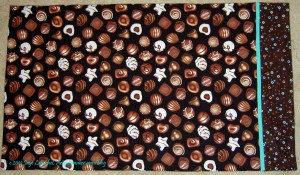
Chocolate Pillowcase

Chocolate Pillowcase

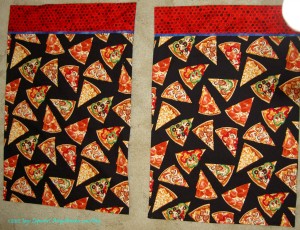
Here is another small project FINISHED!I don’t buy much conversational fabrics, so I knew this was slated for a pillowcase.

I really liked the Sweet Dreams pillowcase I made for my mom. This fabric is from the same line and made me smile every time I looked at it.

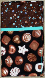
The problem for me with pillowcases is finding the cuff and trim fabric. While I was tidying up the fabric avalanche, I sorted fabric and found this chocolate dot. I seem to be buying a few chocolate fabrics (I will not say brown) now and again, but not using them. The dot fabric gave me the idea  for using a strip of one of the Pat Bravo solids for the trim and within a few minutes I was on my way to having a new pillowcase.

Chocolate Pillowcase - detail

I read about a Grandma who made a fun pillowcase for her granddaughter every month during the first year she was at college. I can’t commit to that with all of the nieces and nephews who are in college at the moment. I can come up with a pillowcase or two every now and then, though. I think this will be sent off to one of the nieces as a little treat. I have a couple more fabrics for one of the other nieces and just have to find the cuff and trim fabrics. Soon.

Blue Belle Fleur Journal Cover

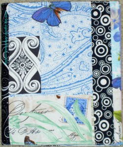
Blue Belle Fleur Journal Cover - front

I know that I am going to start the FOTY 2011 quilt next week, so I have been working on smaller projects. I have, either, been finishing projects in process or making items I have had on my mind.

Here is the Blue Belle Fleur journal cover that I finished this week. I started it some time ago and the pieces ended up in a pile on my old cutting table while I worked on the Stepping Stones quilt.

I set up my new cutting table and found them in the process.

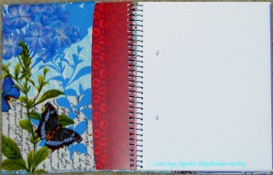
For this journal cover, I worked on putting pieces of the fabric (stamps, postmarks, writing) that I liked where I could see them. You can see, in the top photo, left, where I have done that.

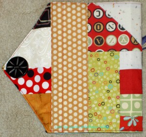
Belle Fleur Journal Cover - inside

The inside ended up with a really nice full piece of the Belle Fleur fabric. I am not much of a butterfly person beyond the norm, but in this context, they look really nice.

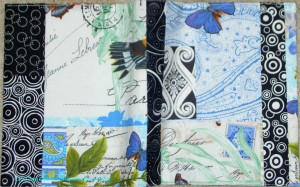
I am not sure why I decided to pair this fabric with black. I think the black works well with the Belle Fleur, but I don’t remember why I chose it. Perhaps it was handy. I was using those black fabrics for the Food Quilt, so I have a feeling there strips available.

Belle Fleur Journal Cover - outside

The only part of the fabric I didn’t get was a bird head. Oh, well. I have some bits and pieces of the fabric left, so I will keep trying.

You can make your own journal cover by checking out the tutorial. If you are not using the Miquelrius journals, you will need to adjust the size to the size of your journal.

Frustratingly, I had trouble with the size. The size of the journals hasn’t changed so I don’t know what the issue is. Perhaps not measuring? I had trouble getting the cover to fit the journal. I think this is why I want to finish a project rather than leaving it lie for a long time.

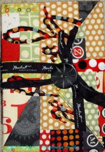
Well Done & Good Job

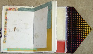
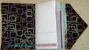
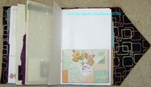
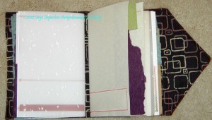
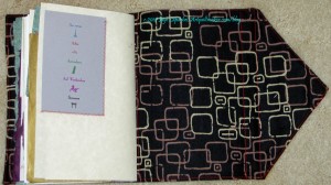
Good Job Journal open

For a long time, I had an idea in my mind that I would make two pencil rolls for some friends who worked with me on the Primal Green show. Somehow the pencil rolls never got made. Then, the idea morphed into journals as I worked on the Purple Journal and I got in the groove of making the pages. I ended up just kept making more and more pages until I had enough for the two additional journal.

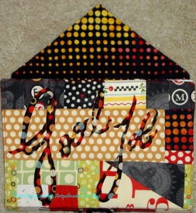
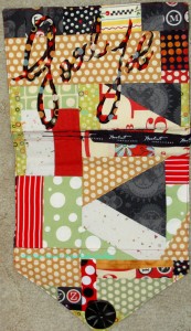
I used the Circa 1934 mosaic piecing pieces that I had started when I got off track for Julie. The words are appliqued on to the cover using raw edge applique’ (straight stitch down the center of the letters). I started out with a freezer paper template using my own, slightly stylized, handwriting. I am not much of a calligrapher, so I reworked the design of the letters until I was happy.

It took me a long time to cut out the freezer paper templates. The letters were thin and I didn’t want to rip them. It was meditative. I wanted the words to be subtle so I chose another fabric from the group I used in the Stepping Stones quilt.

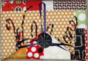
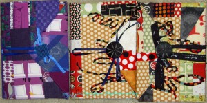
Good Job Journal - back
Good Job Journal closed

I might have put the words on the back so that the closure wouldn’t cover them when closed, but I didn’t think of it. That is one reason why I like to work in a series (which sounds so much more arty than “make projects over and over”) – so I can learn and do better the next time.

On the other hand, it kind of looks like a surprise. You get a little peek of something else, then you open the closure and see the words.

Good Job Journal - signatures

The signatures are the same or similar size to the signatures in the Purple Journal. I left a little more space to write and draw on these pages and thought about the Design Series Sandy and I have been working on while I embellished the pages. This project gave me the opportunity to get a little design practice in without starting a new quilt.

Well Done Journal - closed

These two journals are really twins: cut from the same cloth and made at the same time.

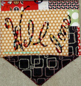
I didn’t pay a lot of attention to the design while I was piecing, because I knew it would be ok. One thing that encouraged me on to add the words was the large expanse of that mustardy dot that ended up on the front. It is really too big of a piece for the front. One large piece of fabric in this mosaic piecing technique does get the piece to the right size faster, but also looks boring. It is, however, a great background for words.

Well Done Journal - open

Shocking as it might seem, I stitched on the words AFTER I put the cover together. That means I stitched through the manilla folder which provides the base and gives the journal shape.

The ‘Well’ word was more tricky than the ‘Good’, ‘done’ or ‘Job’ words. I think the fact that they are taller and thinner were part of the issue. My second ‘l’ is leaning a bit more than I intended, but I think it looks ok. If I had thought of it I might have used a light fusible to keep the words in place while I sewed them.

Well Done Journal - signature 1

I made a big effort in these two journals to vary the types of paper and put more blank pages in.

I didn’t realize until I started on the signatures for Good Job and Well Done that I was making mini art pieces as pages rather than embellishing pages to add interest and providing space for the recipient to write.

Well Done Journal - signature 1

Andrea, at A Work of Heart, where I took the original class, had a lot of great ideas about embellishing pages and adding interesting things to them. She also has a huge supply of all different types of items that could be used for pages, in addition to interesting paper.

I have a smallish bag of paper to use. I found an envelope in it, so I added that to one page so the owner could tuck bits into it. In some cases, I also sewed down only two sides of a piece of paper to embellish so that something could be tucked behind that embellishment as well. I like to tuck things into my journals and imagine that others might, too.

Well Done Journal - signature 2

On the left, which is the last part of signature 1, you can see that red strip of paper. That is the kind of embellishing that I was trying to do.

In signature 2, on the left, you can see how my stitching shows up on the first page of the signature, but embellishments are actually on the back of the page.

I also try to position the edges of the pages a bit unevenly. I wanted to highlight the handmade nature of the piece and also draw attention to some of the handmade paper I used.

Well Done Journal - inside back

The inside back cover isn’t terribly interesting. I put a pocket on the Purple Journal, but forgot to do so on these two journals.

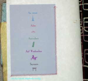
I thought the card with printed words saying good-bye in different languages was appropriate to put on the last page. I am sorry that I don’t remember where I got them, because I would like to get a few more. I had a few so I think each of these recent journals got one.

Well Done Journal - Good-bye detail

I also like the small images printed in between each of the words.

In this photo, you can also see that I used a zigzag stitch to adhere the paper to the other pieces of paper. I used the same color thread and the same stitch throughout both journals. I played around with the setting a little bit to get a width and length that I liked. I remembered to not make the stitch length too tight or close together (like a satin stitch) otherwise it would have  torn the paper.

I think that little bits can be tucked behind the Good-bye card.

The bad thing about this project is that it makes me tempted to save much more paper than I really should save. I really don’t have any place to keep paper and A Work of Heart is too far away to depend on for a ready supply of paper. I guess that is another reason to use a lot of blank paper and embellish it slightly.

Well Done Journal - back

Mosaic piecing is not only good for journal covers, but it is a great way to get something done that you don’t have to think about too much while working on another project. Remember leaders and enders? Mostly, when using fabric, I sew like colors together, but in this case, I used a group of fabrics I had used for a quilt, the Circa 1934 + fabrics. You can see that my cover includes a half square triangle piece. I didn’t use it in the quilt, so why not give it additional life?

The Red Journal cover had a lot of super tiny pieces, but not all mosaic quilting needs to use super tiny pieces. Larger pieces become larger faster. In some way, Pieced Backs are a larger version of mosaic piecing. Of course, a cover can be made much more simply from two pieces of fabric. Piecing like I have done is not required.

Things I would like to try for next time (not that I know when next time will be):

  • use Timtex or similar for the base. I kind of want to see how that works and whether using a more fabric friendly base would be better.
  • use batting for the cover and see how a softer cover works.
  • push the limits on how many pages I can fit into a journal this size. One problem is that the sewing machine needle gets dull, so I have to make all the pages at once or keep track of a “for paper use only” needle and keep switching out the needle. It would be great to use the leaders and enders technique for making the pages.
  • try to put more blank (or nearly blank) pages in the journals. I want people to be able to use these as a journal, so more blanks would be one way to do that.
Three Journals, 2012

So, above are the three journals. I am really pleased.


First Finish

Young Man Pillowcases

A la Crafty Garden Mom’s Thursday Thoughts, here is mine:

  1. I like to finish a project on New Year’s Day.
  2. I think it sets a good tone for the year.
  3. Of course, some years it is fruitless.
  4. Still, I do it.
  5. It has to be a small project.
  6. Last year it was a bag.
  7. Not the bag I thought it was, but a bag.
  8. We all know how that turned out. 🙁
  9. The photo above is probably one of the worst photos I have taken in the right conditions – well, my normal conditions.
  10. Not sure what happened.
  11. Still I post it.
  12. I would take another photo, but the recipient changed his sheets (shock, horror!) and they are no longer available for your pristine viewing pleasure.
  13. Have a great day! You don’t need to call the looney bin.

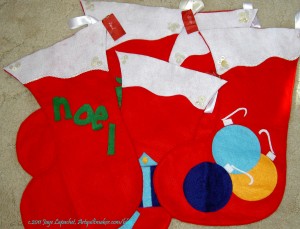
Stockings were not Hung

Felt Stockings
Felt Stockings

A few years ago we remodeled part of our house (bleah! what a process). In the course of that months long nightmare, which was worth it in the end, much of our non-essential stuff went to storage. Since the contractors promised the project would be finished by Thanksgiving, our Christmas stuff went, too. HA! The Christmas stuff returned, but the original stockings have never been recovered. I have no idea what happened to them. I suppose they will turn up eventually.

As stockings are part of our Christmas tradition, I whipped up some felt “beauties,” which have become what we use.

As you know, my quilter is out of commission and Kissy Fish is done. I find myself frequently without handwork to do in the evenings. When I saw the stockings, I remembered the embellishing I had done on the card holders a few years ago and was inspired to embellish the stockings a bit.

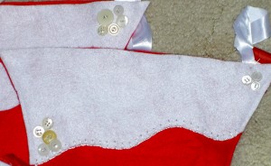
Felt stockings detail

I started out with a few buttons, though I did use all the good and interesting white ones on the cardholders. I used some Oliver Twist silver thread to sew them on. I also started to do a buttonhole stitch around the bottom edge of a couple of the stockings to make that edge look more interesting. One of the stockings has a tree on it and I definitely see some sequin ‘ornaments’ in its future! I think, as Anne Shirley would say, “there is a lot of scope for imagination.”

Of course, I have a lot of cards to write and gifts to assemble, but I see this little project as a nice respite between the craziness. It could be ongoing as I am inspired to add more. It is also a good way to try out different techniques, stitches and embellishments.

Grand Revival Bag

Flea Market Bag #2
Flea Market Bag #2
Flea Market Bag #2
Flea Market Bag #2

This is a bag that I started at the same time I started the Innocent Crush version. The point I was at in sewing this bag together was cutting the lining and sewing.

After finishing the top for Stars for San Bruno #3, I was ready for some smaller projects. I think I mentioned that in a previous post. I decided that I didn’t have that much work to do on it and I should just get it off the to do list.

Amazingly, this bag went together much easier than the Innocent Crush version. The part I didn’t like was the corner directions. Very messy. I don’t know that I will make this bag again, but if I do I will round the corners a bit more, so that the corners will be a bit neater.

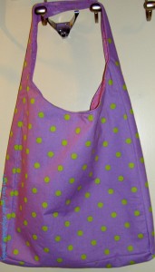
Last of the Jane Market Totes

I am not sure I will make these bags again. I might, but I have made enough to last me a lifetime. I have taken making more than one from the same pattern to new heights of crazy.

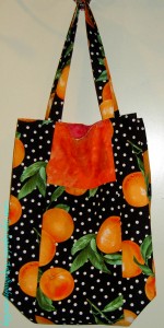
Orange Jane Market Tote

The funny thing about making the same pattern over and over is that I get used to making it. For this version, I cut the pieces out at the last BAMQG meeting. Cutting is a good thing for me to do at the meetings.

On Sunday I spent the day finishing up some smaller projects. I didn’t want to start another project just yet and I had some blocks to make and bags to finish.

This bag was one of them. I bought the fabric to make a bag, but I think I bought it to make the Eco Market tote. Somehow I never got around to it, but I thought it would be good Jane Market tote. I think it turned out well.

One of the annoying things about the pattern is that I always forget to cut some part of this pattern out. This time it was the lining. This is such a pain and totally my fault.

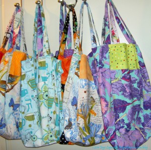
2011 Jane Market Totes

These are all the totes that I have made this year. Lots of nice fabric, don’t you think?

Actually, I might make one more. I have a lot of miscellaneous parts from various bags that didn’t work out for some reason and I might just put them all together in a mish mash kind of bag. We’ll see.