I don’t know when I first saw the term “color stories.” In one way, the phrase sounds a little bit like keeping up with the Joneses – everyone is saying it, so you might as well say it, too. But after sitting with the words and rolling them around on my tongue and through my head for awhile, I decided that I like what they imply. I like the two words together. I like the pictures they create in my head.
In thinking about the words in our society, it seems to me that there are ‘standard color’ stories that we all understand*. Red and Green generally implies Christmas. Pink and blue denote girls and boys. Red, white and blue usually means patriotic in the US. The French, UK and Australia flags are red, white and blue as well, but I don’t know how they feel about the color combo. Red, orange, brown, when combined, tell us Autumn is upon us. Avocado green, gold and orange [shag carpeting] tell us the story of 1970s remodels. Black represents death here and white represents death in China. Barbie’s color story is pink even with Barbie showing up in stores dressed as a doctor, astronaut and other professionals to counterbalance all drama about her bust size and high heel shoe feet. Apparently, wedding planning includes developing a color story rather than just picking your colors. Seems like a lot of extra pressure. There are other standard color stories that we understand in our society. Which come to mind for you?
To me, color stories mean a group of colors that are saying something (ahem, telling a story). I have always made up stories, so if I let my mind go, what colors say becomes a story. In my head, the story may have characters, plot, the whole 9 yards. If I don’t take the time I just get an impression of a story that can become more later.
I wonder what happens when standard color stories are disrupted? For example, I have seen Christmas change to turquoise, silver and pink in some circles. Does that mean those still using the standard red and green are old fuddy-duddies or will they be laughing when the turquoise, silver and pink color scheme goes out of fashion and looks dated?
If you look around there are color stories everywhere. That is one of the reasons I like Instagram. Joyce and Phoebe posted a picture of bowls that I saved, because of the sunshiny-ness of those yellow-orange bowls. They say happy, sunshiny weather to me.
One of the easiest color stories is the rainbow, like the Confetti Dots that Quilting Adventures posted the other day. Rainbows are, basically, easy to use as a color scheme. Perhaps they are not as challenging, because we can get gradations of fabrics, like the Confetti Dots, and we don’t have to put a color story together ourselves
I also think that we have vague color stories to which we default. Bright or reproduction, for example. You know me, I am always encouraging you to make cheerful quilts. What kind of color story is ‘cheerful’? The word makes me think of bright and happy. I never really set down on paper what I thought about making cheerful quilts, beyond no brown and not depressing. I can see that it might be time to move on to more of a story because of some of the questions running through my mind.

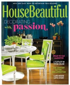
House Beautiful, yes the magazine, has a small feature called “This Month’s Paint Index”. It is a thin visual list of the colors used in the month’s issue. Looking at that tells the color story of the issue. The November 2014 issue has bright lime yellow-green upholstered chairs set on a bold Blue-Green-Teal cover. It is eye-catching to say the least, but these colors are meant to attract a potential reader’s attention. The colors in “This Month’s Paint Index” seem to be much more subtle, more realistic for use in a real person’s house.
When I see blue and gold, I think of my alma mater, UC Berkeley. When I see red, green and yellow, I think of summer and picnics. When I see pink and white, I immediately think of the colors of my sorority.
In the end, for us quiltmakers, I think that ‘color stories’ are no different than color schemes or a color palette or anything that denotes the interplay of colors in our quilts. The phrase does go a bit farther, though, if we want to add plot, characters and scenery.
*Nota bene: ‘understanding’ is different than agreeing with. Also, color stories may be understood by many people, but not universally. Also, color combinations vary by culture.