In every version of the Fabric of the Year concept, there are problem fabrics. Every year I have crammed them into some place, usually a place that didn’t quite work. This year might be different.
The problem children this year have varying degrees of problems. all of them should get into the quilt, to be faithful to my rulers. Some of them will get in to the quilt, perhaps all. I am not making myself any crazier than I already am this year.
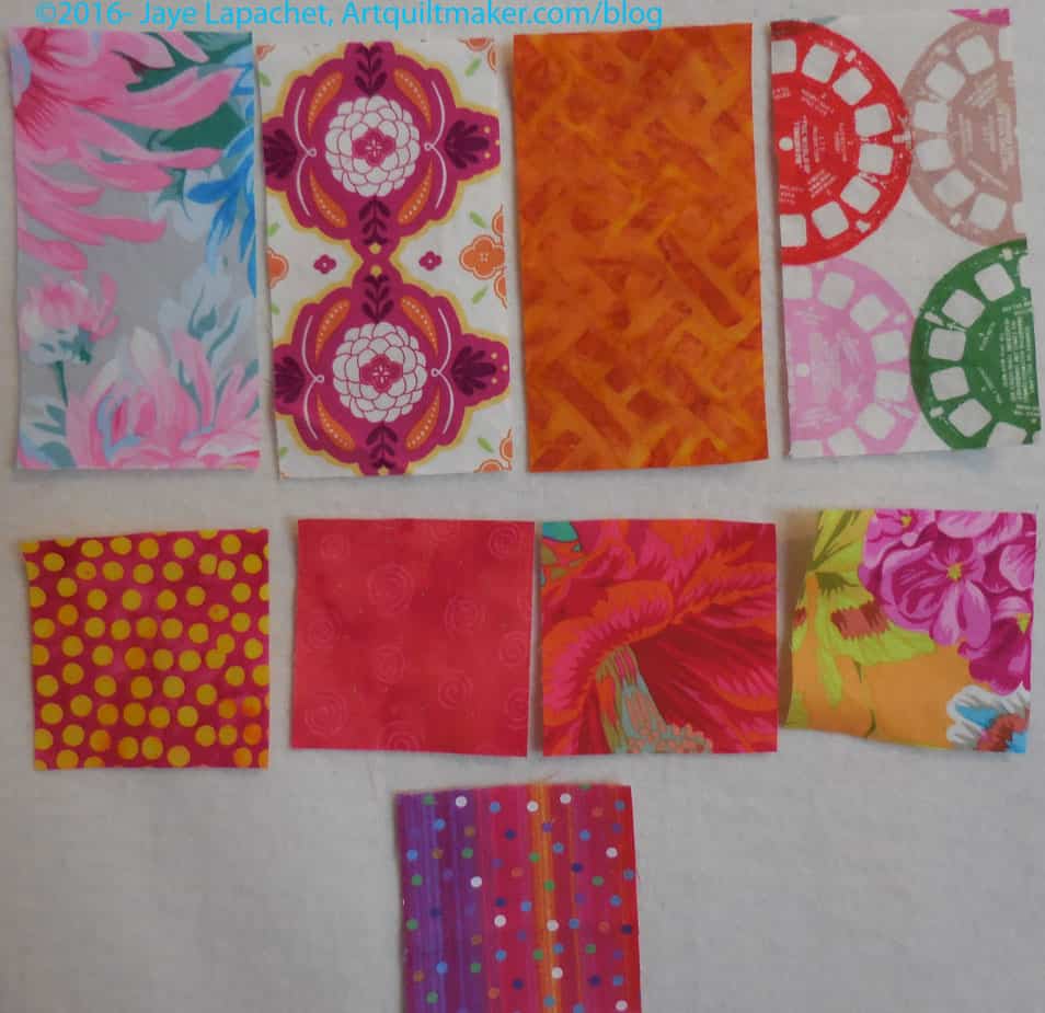
You might look at these fabrics and think I am a wimp. In some cases, I might be. The Philip Jacobs print (2d row, 2d from right) will probably fit nicely between the reds and pinks. The pinky red next to it should, too, but it is just off enough to have no compatriots in either pink or red.
The top row’s fabrics are the real demons. What color is that gold (top row, 2d from right)? Yes it is gold, but is it more brown than yellow? ERGH!
The big prints and modern prints like the Cotton & Steel Viewmaster fabric are real problems. They do not lend themselves to being blended in with any other fabrics. I constantly move them from white to color and back.
I will put as many of them on the front as I can, but the rest will go on the back. I just cannot make myself crazy.
It’s hard to know how the light changes fabrics in a photo, but I would try putting the gold in the second row second from left in place of pinky red.
Put the 3rd row orphan in place of the gold in the first row.
Now the pinky red can slide in there somewhere.
I thrive on crazy-making.
Sometimes you have to choose between rules and a good design…. I vote for good design. It will be more satisfying in the long run.
Yes, that is my default. I have taken out some of the problem children and put others in when I found an appropriate spot. The duplicates and problems will go on the back. My quilt, my rules, right?
Actually that “gold” fabric looks more like orange to me. If I had to chose between brown and yellow, I’d say it’s more brown. Hope it helps! 🙂 And there’s nothing wrong with the back! I don’t blame you for struggling with the large print, they are totally my weak point.
Yes, sometimes it looks orange, but mostly more browny gold. I think the real problem is that I don’t use these types of colors much so when I have one it is a loaner. If I did more Civil War style quilts it wouldn’t be a problem.
I like the gold and it seems to fit nicely with some of the other fabrics. Don’t make yourself crazy. Rules are made to be broken, though I am a rule follower so it would be especially hard to break my own.
I am erring on the side of good design, so some may end up on the back.