I took this picture on one of my daily walks. This plant, which has become very popular as people convert to more water friendly gardens, is more and more prevalent.
The bottom of the plant is quite ugly, but the flowers are really gorgeous. This particular photo was taken outside of a restaurant where they have recently redone the landscaping. A large-ish area of these plants are in bloom and make the area look like a field of magenta.
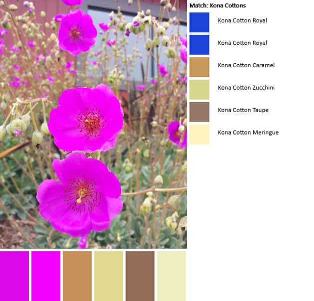
Unlike previous palettes, I was disappointed in the outcome of this one. the neutrals seem ok, but the beautiful fuschia/magentas are not represented at all correctly.
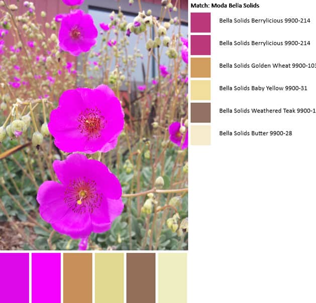
I redid the palette, switching my option to Moda Bella Solids. This palette is better in that the fuschia/magenta tones are represented. However, the line must not have enough in that value range to accommodate the slight variations in color.
Finally, I pulled out my Kona color card and checked with my eyes. Indeed, the colors in the flowers are not adequately represented. Cerise (#1066) is close to the darker tones, but that lighter shade of purply fuschia is not included.
I find that playing with the PlayCrafts Palette Builder to be a fun and useful exercise. It really makes me look at the colors in a picture and analyze them.
I found trying to find quilt fabrics with the magenta and fuchsia colors quite difficult. I know they are out there, but they usually are listed with different names. The dictionaries say that magenta is more reddish and fuchsia is more purplish, but they are often used interchangeably. Also, the word fuchsia is often misspelled as fuschia, and other names must be used for them as well, as they are just hard to find good ones online even. I like those colors so well, it’s kind of frustrating. BTW, those flowers are really deeply saturated and vibrant. I’ve never seen any like that. I used to have some hibiscus that I thought were deeply saturated pinks/reds, but they were not quite as vibrant. Here is one: https://www.flickr.com/photos/kittiesandsomeofmyfavoritethings/5972496807/in/album-72157622937796064/
Thanks, Penny, for all the great information! I agree that it is hard to find these colors. I don’t k now what these flowers are, but they have suddenly become very popular as our drought persists and people do more xeriscaping.