As I said yesterday, I finished the binding and back of the Food Quilt #3 and it is ready to go to the quilter. The top was already finished. I was trying to decide what project to work on next when I realized that I wanted to look at the blocks and projects I had been working. I started putting all of the projects up on the design wall and taking a look at them.
Pulling out a bunch of projects and putting a zillion blocks up on the design wall is a lot of work. I am exaggerating. None of my projects have a zillion blocks, though the Peacock and the Octagon 9 Patch do have a lot.
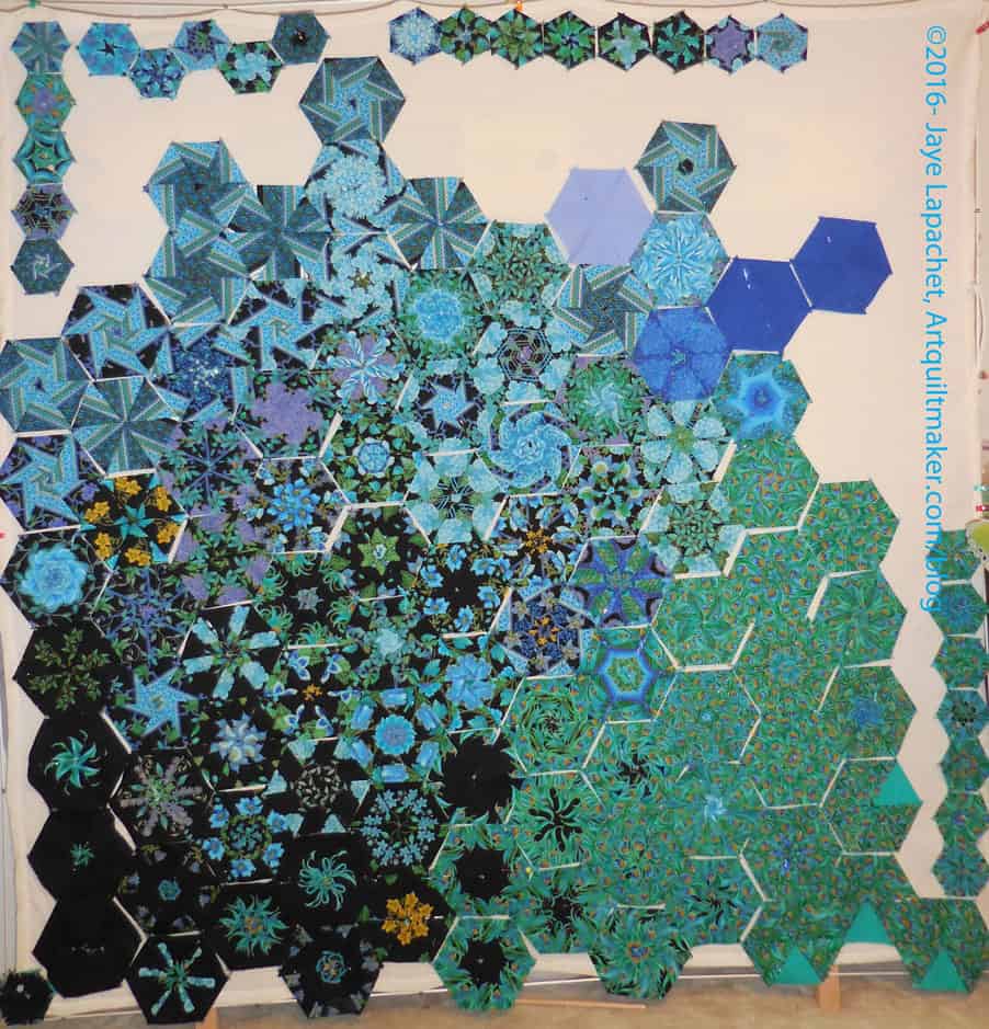
I could spend all week going through the projects with you until I made a “big reveal” and told you what I would work on, but I think you should know immediately that the Peacock blocks excited me most when I put them up on the wall. I am not sure why. Perhaps my eye is liking the dark colors?
I also realized that this is the first time I have seen these quilt blocks on the design wall.
The above photo shows a pretty raw layout, but not terrible either. I am still in that gradation mode, so I put the darker blocks towards the bottom. I don’t have a lot of the small blocks, so they will make an asymmetrical border.
I only have a couple of solid blocks, which I talked about adding as tests. The lavender definitely doesn’t work in the current location. I kind of like the way the top of the quilt (without the small border blocks) is not straight. That begs the question of what I would put to make the edges straight. I am definitely not making an edge like that.
My other immediate thought upon stepping back was that the gradation was nice, but that blocks needed a bit of space between them. I might be backing off that thought, but I will put some black behind and in between the blocks to see.
This quilt requires more work, so I may quilt one of my projects while I look at it, try things and rearrange.
This is looking really amazing!
I am pretty pleased especially since I barely did anything in the arrangement.
I love the way this looks already, Jaye! Although for some reason in my mind I’d put the black and mostly black block on the bottom right. Also, for me (since I’m not a huge green person) I miss some red or orange. Or one of the blocks have yellow, what if you put a few solid blocks matching that yellow? Decisions decisions:)
I had thought about putting in more solids, but haven’t done it yet. Stay tuned.
This looks as if the quilt elements have naturally decided to arrange them selves this way. I think the addition of black, or more black could be interesting, at least worth playing with. However, part of this piece’s appeal, to me at least, is how the elements play next to one another.
I can tell you what draws you to this – the glitzy gold. Well, that and the gorgeous colors! If I were in your shoes, I’d consider adding some gold fabric to this to play up the gold, but that is just me and we all know how much I love metallic fabrics.