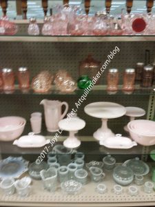
The latest ColorPlay photo is another of the pressed glass photos from May. I thought it would be fun to play with some pinks and whites to see what I came up with. I really do like the actual items, especially those white cake stands. I might have bought one if I hadn’t been flying home from Indiana, and I had space in my cupboard at home. I also like the variety of items they had. You can see bowls, pitchers, salt & pepper shakers, candy dishes and more in addition to the cake stands.
While manipulating the first one, I realized that my dreams of creamy whites and blush pinks were going to come to nothing with this photo. Again with the preponderance of neutrals. Sigh.
I know. I know. The lens doesn’t see the world as our eyes do. I just have to find a photo that creates beautiful palettes.
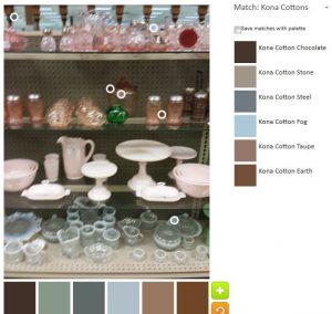
So the default palette was dark. I think the palette would be good for an on-the-market/for sale house interior, but not for a quilt. At least not for one of my quilts.
Cynthia W made a comment on another post about a pop of color, which made me think. While looking at the default photo, I looked for the pop of color. I think, in this case (right, default palette) it is the light blue – Kona Fog. I don’t really consider that a *pop*, but in this context it is.
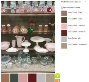
Of course, I tried again. I really tried to get some bright colors in the palette.
I sort of succeeded.
The Primrose and Cinnamon are fairly bright and the Primrose is definitely the *pop* color in this palette with Cinnamon doing some propping up. I have to say that the Moss does nothing for me. I think of the Ash as a background color. I really don’t know what to think about the Cobblestone or Taupe. They are too beige for me and not my colors.
Yep. You guessed it. Around a I went again for another try.
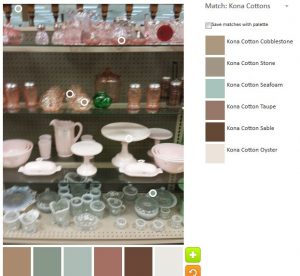
This palette is even worse in terms of dead. If I had to pick a *pop* color, I would be hard pressed to do so.
Perhaps the Seafoam? It is such a wimpy color, how can it pop? The Oyster is the background in my mind with the Cobblestone, Stone, Taupe and Sable boring me to death.
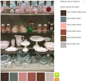
I decided on one last try.
I didn’t make much of an effort. I was tired of this photo, so I just went for an easy palette.
Funnily enough, this one is much better than any of the others. There are a couple of reddish/pink tones plus the Steel works very well with them. It isn’t great, but I do think that working with the photo made me get to this palette.
The Palette Builder is a great and fun tool. Try it out! Let me know if you make anything with any of these palettes.