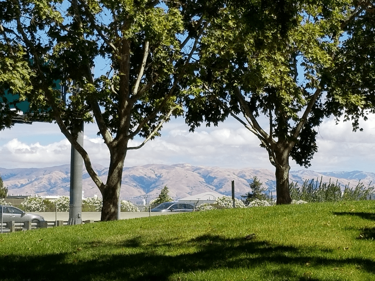
The weather this week has been good. It has not been deathly hot and there have been some lovely clouds. I took a photo while out on a lunchtime walk, which I decided to use for this week’s ColorPlay.
We are using Bella Solids instead of Kona Solids this week.
I tried to click the shutter when there were few cars, but you can still see them through the trees. I liked the green in front with the hills in the back. I prefer green hills, but still thought this was a lovely view.
The default, as we have discovered is normal, was heavily neutral. This palette looks like a 1970s decorator showcase house palette.
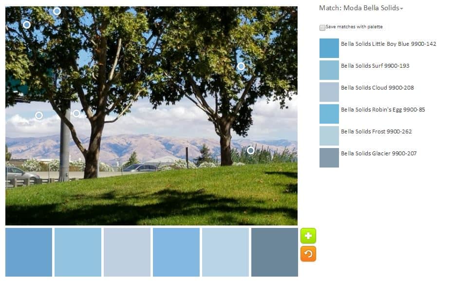
I decided to try a monochromatic palette next. I was able to find six different blues in the photo. None of the colors are the bright turquoise I love, but the Little Boy Blue and Robin’s Egg aren’t bad.
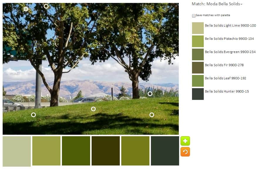
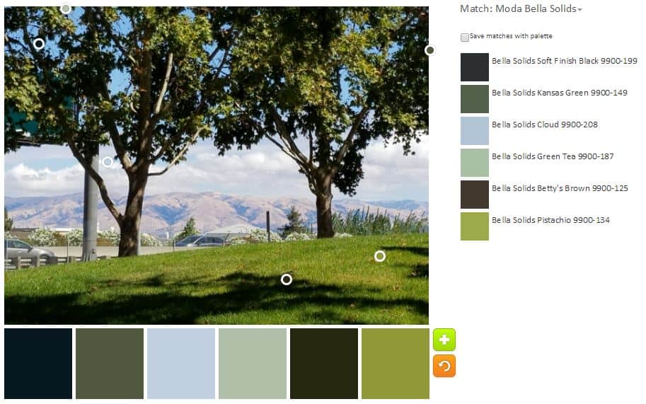
I decided to see if I could create another monochromatic palette and was mostly successful with green. I find the greens to be good greens for nature, but not bright enough for my quiltmaking.
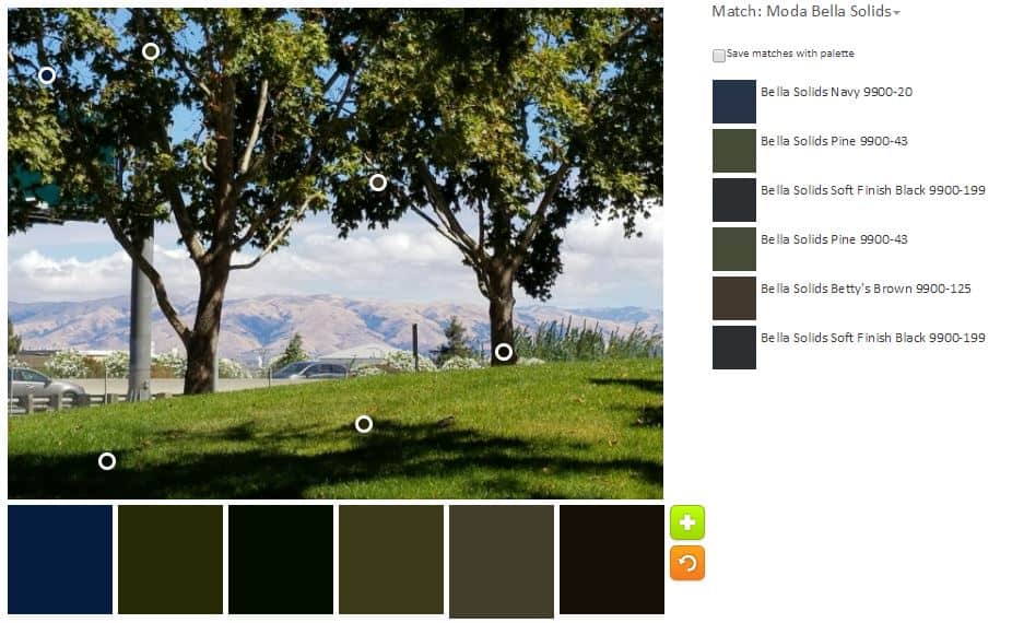
While really not my thing, I decided to try and make a palette with darks. I think I succeeded and I do like that dark blue. Otherwise, the palette looks more like the dresser of teenage boy than a palette I would use for a quilt.
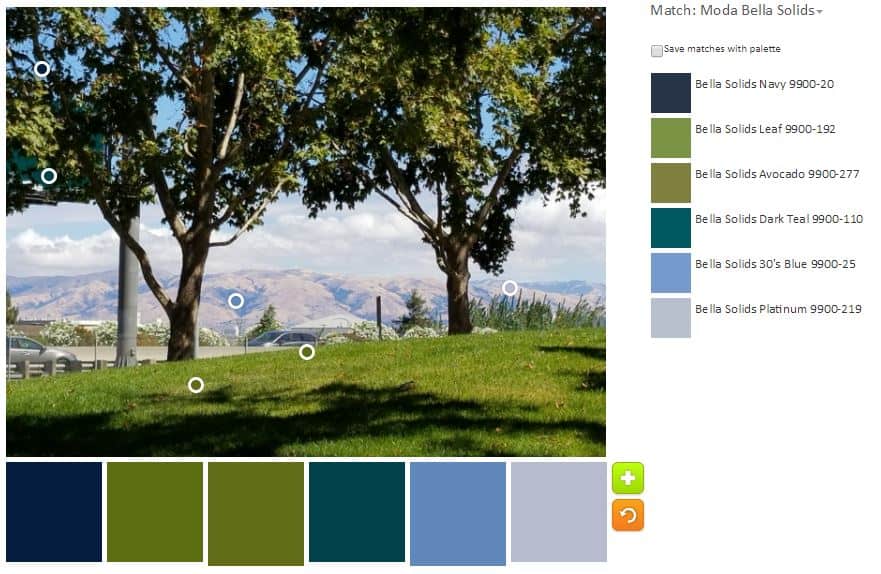
Next, I looked at combining the two monochromatic palettes to see if I could get something that I might actually use in a quilt. This is a nice palette. I really like the Dark Teal color. That makes this palette for me. I am still not much of a fan of the Avocado. The Leaf color is ok, though it takes on some of the qualities of the Avocado when sitting next to it.
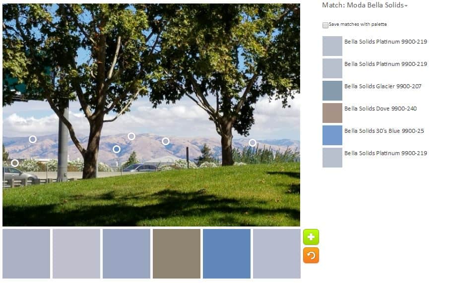
Finally, I wanted to see what I could do with the hills that wouldn’t produce a deadly beige palette. There is that Dove, which looks more beige than grey to me. This might make a nice soft boy baby quilt. It doesn’t have the contrast that people insist babies want/need, however.
Have you made any interesting palettes lately? Please share.