I actually went to a museum the other day. I am fully vaccinated, wore a mask, stayed away from people and the place was almost empty. This trip contained a lot of firsts: first time in a museum in over a year, first trip across the Bay Bridge in over a year, first time in a car with a friend, first time wearing a mask for 5 hours or more (health care workers: I salute you!). Milestone day!
I went with my friend from CQFA, Nancy. Nancy is much more in tune with what is going on in local arts than I am and let me know that the Rosie Lee Tompkins exhibit was on for in person viewing. She got us tickets and I drove us over.
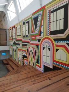
I used to live next door to BAMPFA, but hadn’t been there in years. The space is gorgeous. The entrance is made human by the mural you see when you walk in (above). The mural is part of an auditorium/amphitheater (??)/performance space. The walls of the museum are tall and white, so the mural grounds visitors as they come in – at least it did for me.

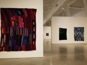
We went straight into the exhibit, which was on the ground floor near the entrance. There is not a lot of information about the quilts and most of them are untitled. I love to hear about inspiration, so this was disappointing, but not surprising. I don’t think people think about the making of their quilts as much as I do. In writing this, I realize that I think a lot more about placement of individual pieces and don’t write each of those comments down.
The brief description of the show says, in part, “…And while most of the Tompkins’s textiles are referred to as ‘quilts,’ this term technically only refers to works comprising pieced tops, insulating material, and backing that have been sewed together – a process she rarely undertook herself, instead leaving this finish work to other local quilters.” I love this, especially the last part, because it means that my quilts could someday end up in a museum!!

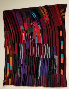
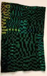
My two favorite quilts were from her older quilts. They were mostly made of velvet, crushed velvet and velveteen (I don’t really know if these are the same).
One of the things I like about this piece is the not so obvious improv piecing. Current improv piecing comes across as contrived to me sometimes, though you know I am not a huge fan. This piece looks like it was designed so that the pieces lean to the left. I am not sure I could make a piece with so much movement using improv techniques. This piece does not scream improv to me. It looks like Ms. Tompkins designed it that way. The color and sheen, which do not come through very well in the photo really add to the success of this quilt.

My second favorite is a piece that is jewel-like in its success. The various greens show up with some contrast in the photo. In real life the darker greens are much more subtle in their shading. This makes the chartreuse line of squares in the center-left stand out. Even though those four squares are the only green of that color, the design element seems to work. There are a couple of places where four squares show up and perhaps that is the reason. Again, the color and sheen really add to the success of this quilt.
Look for part 2 of my thoughts about this exhibit soon.