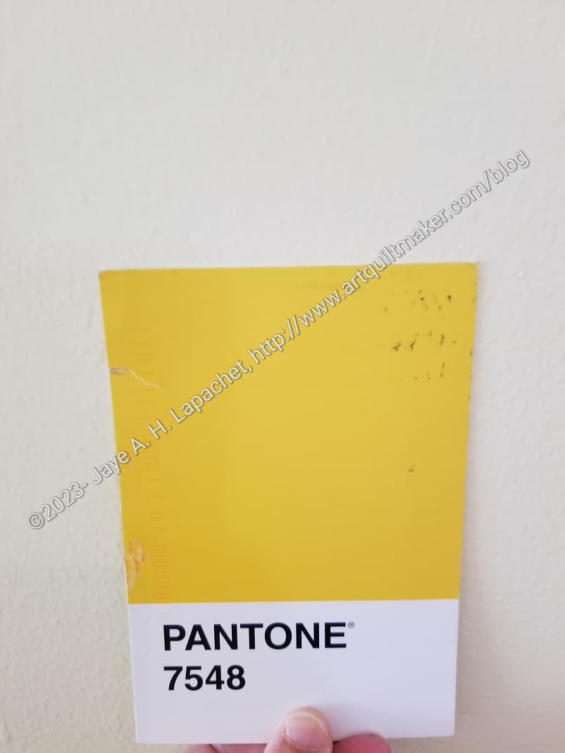
Friend Julie sent me another Pantone Project color postcard last week. On the reverse she wrote that she thought of the color as ‘butter’. I completely lost my mind. I started thinking I was in line for cataract surgery or something, because to me the color looked more like margarine.
As a result, I started running around the house taking photos. I know that all sorts of things -lighting, weather, etc – affect how the camera sees the color, but I have to say that the color in the photo (left) looks pretty true to the color on the postcard.
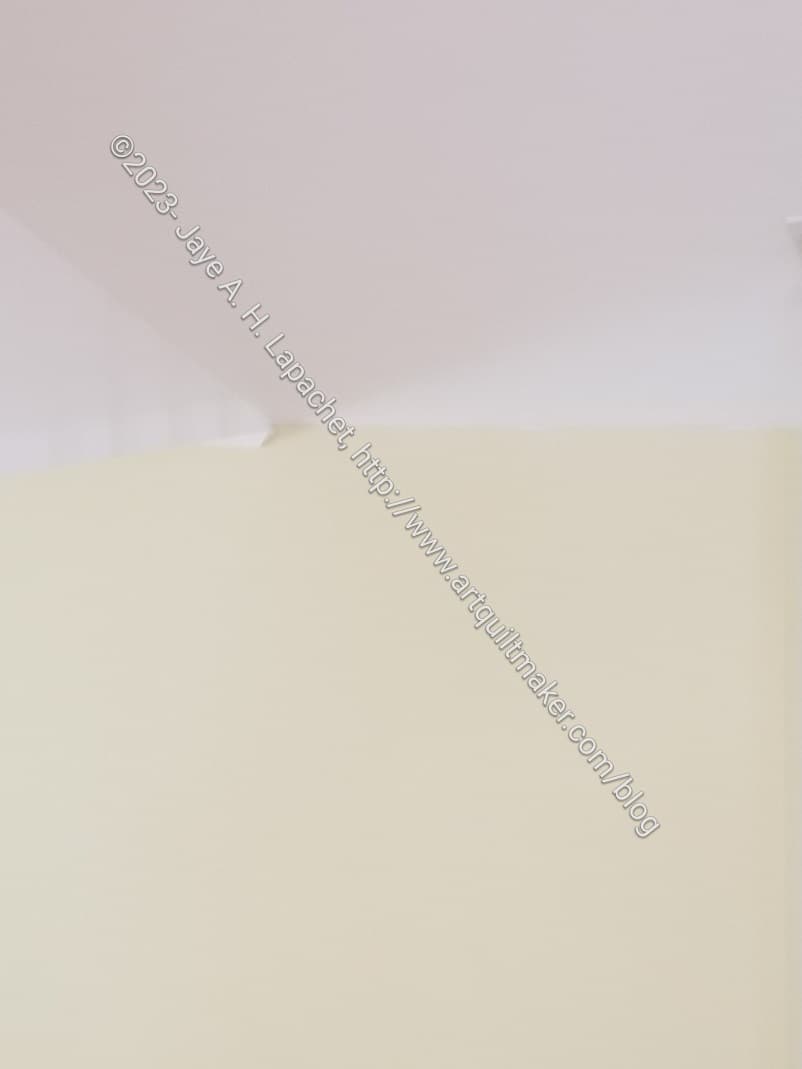
My living room has, what I think of as, butter colored walls. It was hard to tell unless I took a photo of the ceiling (white) and the wall (butter yellow). I was pleased to see that I could see a contrast.
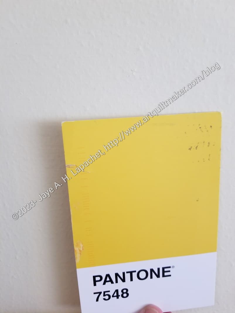
Then I took a photo of the Pantone postcard against the wall. I wasn’t thrilled with the way the paint looked in the second photo. The yellow/butter paint looked white compared to Pantone 7548, but what can a person do? I wasn’t about to set up studio lighting.
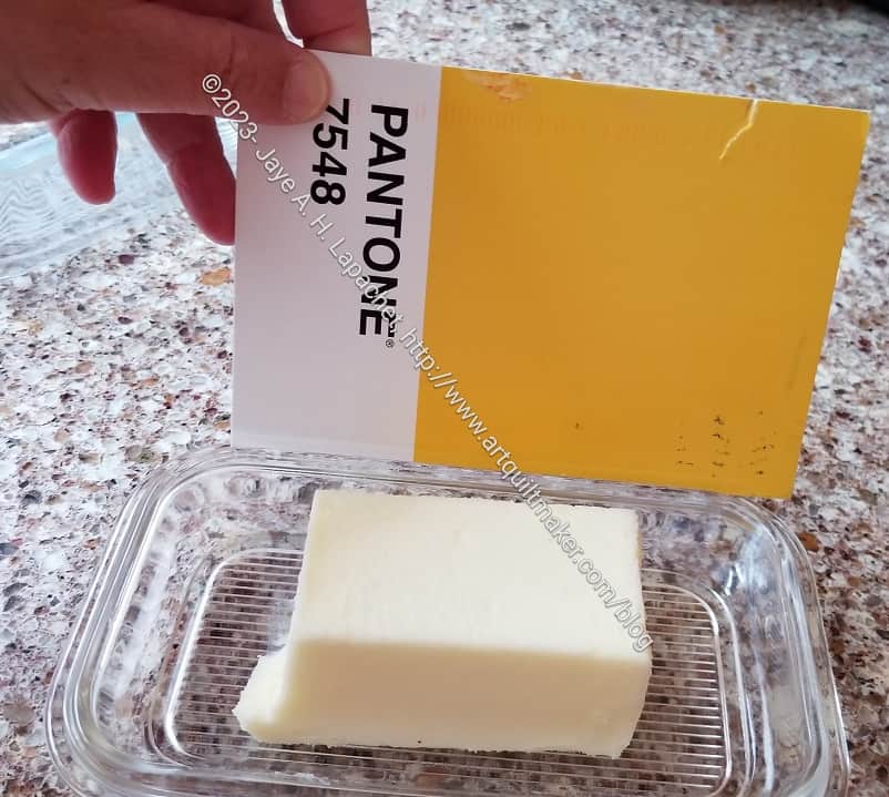
I actually have butter (as in the food), so I went into my kitchen and compared the postcard to actual butter. Unless I am in need of cataract surgery, I think the yellow in the postcard is brighter.
I don’t mind Friend Julie calling this butter. I am just glad I don’t have any eye problem at the moment.
Oh no, you’re absolutely right! I probably should have said “Buttercup” as in the cute little yellow flower which is just about exactly that color. https://en.wikipedia.org/wiki/Ranunculus_californicus