Definition: verb (used without object) 1. to move along a surface by revolving or turning over and over, as a ball or a wheel. 2. to move or be moved on wheels, as a vehicle or its occupants. 3. to flow or advance in a stream or with an undulating motion, as water, waves, or smoke. 4. to extend in undulations, as land. 5. to elapse, pass, or move, as time (often followed by on, away, or by ).
Rolling Stone (magazine)
rollcall
Rock ‘n Roll
roll the dice
The Rock and Roll Hall of Fame
Congressional Roll Call votes
Let’s Roll!
Cinnamon roll
Easter Egg Roll
Tootsie Roll (candy)
take roll
drum roll
Rolls Royce
Rolling Stones
Make your response simple. It doesn’t need to be a masterpiece. Take 5 minutes. Just respond and create a creative habit.
Please post the direct URL (link) where your drawing, doodle, artwork is posted (e.g. your blog, Flickr) in the comments area of this post. I would really like to keep all the artwork together and provide a way for others to see your work and/or your blog, and how your work relates to the other responses.
The Creative Prompt Project has a Flickr group, which you can join to post your responses. Are you already a member? I created that spot so those of you without blogs or websites would have a place to post your responses. Please join and look at all of the great artwork that people have posted.
This is a new book I got from Lark Crafts to review Tuesday and I have to say that I love this series. The last one I reviewed was PUSH Stitchery. I like the size, shape and feel of the books. I also like the edgy nature of the pieces they include. I probably wouldn’t make any of these pieces (not that there are patterns, because there aren’t), but I can definitely get inspired from looking at them. They are really different from things that I normally look at and looking at new stuff always fires my brain.
I have to admit that the linear part of my brain was in charge when I started looking at this book. I thought that many of the pieces were quite ridiculous, but then I started look at them in terms of creativity, shape, form and some of the other design elements and principles we have been exploring in the Design Series. I kicked the linear part of my brain to the curb and started thinking about them in terms of originality and WOW factor.
The books in the PUSH series highlight several artists and give a few pages to each artist, so the reader can see more than one work by each contributor. This part of the series includes 30 artists. Each section includes a picture of the artist and a selection of their work as well as an artist statement in Q&A format.
This book has really interesting forms. Many of the pieces are quite sculptural.
Some of the pieces I really like:
Li-Chu Wu, of the UK, has a piece that looks like a sea urchin.
Allyson Bone, of the US, shows some necklaces that look like cat eye glasses or masks.
Joe Wood’s pieces, also of the US, are quite sculptural and would be appropriate 50 times larger and installed at the SFMOMA.
Dr. Tina De Ruysser, UK, has some very interesting folded paper necklaces.
Mirjam Hiller, Germany. She has feathery, layered pieces. Some of my recent CPP responses have had feathers and I see myself gravitating to those shapes and layers.
These pieces really push all sorts of the boundaries and even the display photographs are provocative. Many of the pieces are large. There are a number of the pieces that do not fit my definition of delicate or pretty. The artists use interesting and unusual materials as well: acrylic, dollars and Euros, fur, rubber, and porcelain, to name a few. The processes used to create the works are equally as interesting: folding stainless steel, adding powder coats, a process like origami, if it isn’t origami along with normal jewelry techniques such as stone setting and metalsmithing.
I think that you would get a lot of inspiration from this book and wouldn’t be sorry if you took a look.
Julie posted about her Windmills/our joint Windmill project and it occurred to me that I hadn’t post anything about this potential quilt.
I am still very much in the Hunting and Gathering stage at this point and I don’t know how large it will be, what the background color will be or anything about it yet. It is not yet up on my radar, which it why it never occurred to me to post about it.
Julie and I went to lunch last week and she gave a bunch of windmills she had cut for me. The photo shows some of them. Lots of lovely and luscious batiks!
We are cutting windmills for each other and we are using a Come Quilt With Me rotary cutting template/ruler. It is a piece of Lucite thick enough to use with a rotary cutter. It was very slick, so I put True Grips on the bottom to keep it still while I cut. True Grips are expensive, so I use the background as well as the dots. I think they work better than the sheet of plastic that can be adhered to rulers. True Grips are easier to put on as well.
I cut Windmills whenever I am cutting into a new piece of fabric or pull out a piece of fabric from the fabric closet, so there is quite a variety. Lots of dots, pinks and turquoises. 😉
For the moment, I am just going to continue cutting. I have other projects on my plate that are higher up on the list.
I have to say that I find it very frustrating not to be able to show every little detail of the progress of this piece. I couldn’t stand it any longer and wanted to give you a little peek.
I worked on it on and off all weekend last week. I also put in a few hours during the week, especially on Tuesday, when I was off, and in the evenings last week as well. Yes, I was on a mission to finish this piece by the deadline.
Whole Cloth – Mostly Vase
That was my plan again this past weekend since it is due next Saturday. When I started stitching on Saturday, I had all of the spirals done, and had, mostly, straight stitching to finish.
There is a lot of starting and stopping and thread sinking required, but I am enjoying this project for some reason.
I was able to finish the top on Saturday after working on it all day. I spent Sunday trimming it, making the binding, machine stitching the binding. After I folded the laundry, I started to hand stitch the binding down. I was pleased that it going very quickly. In an hour or two, I had more than half of the binding stitched. I was too tired to work on it last night, but, perhaps, tomorrow.
I have a slim hope of making the sleeve this week as well. We will see. I can’t forget to prepare the Renewed Jelly Roll Race for the show. It is due on Friday.
In two dimensional art forms, such as quilts, an illusion of space is created using different techniques such as size, overlapping, vertical location, aerial perspective, linear perspective, one-point perspective, two-point perspective, multipoint perspective, etc. (Pentak & Lauer, pg.171)
“…the space around the object can distract, focus, or alter our impression. A cluttered background tends to diminish the importance of the object, while a plain background draws attention to it.” (Art Design & Visual Thinking http://char.txa.cornell.edu/language/element/form/form.htm)
“Two-dimensional design is concerned with the flat space” on which the design takes place “and the illusion of three-dimensional space. The major methods of controlling the illusion of space are:”
Overlap
objects in front of one another
Shading
modeling with light and dark
Linear perspective
the relationship between apparent size and space
Atmospheric perspective
how the atmosphere affects the appearance of objects in space
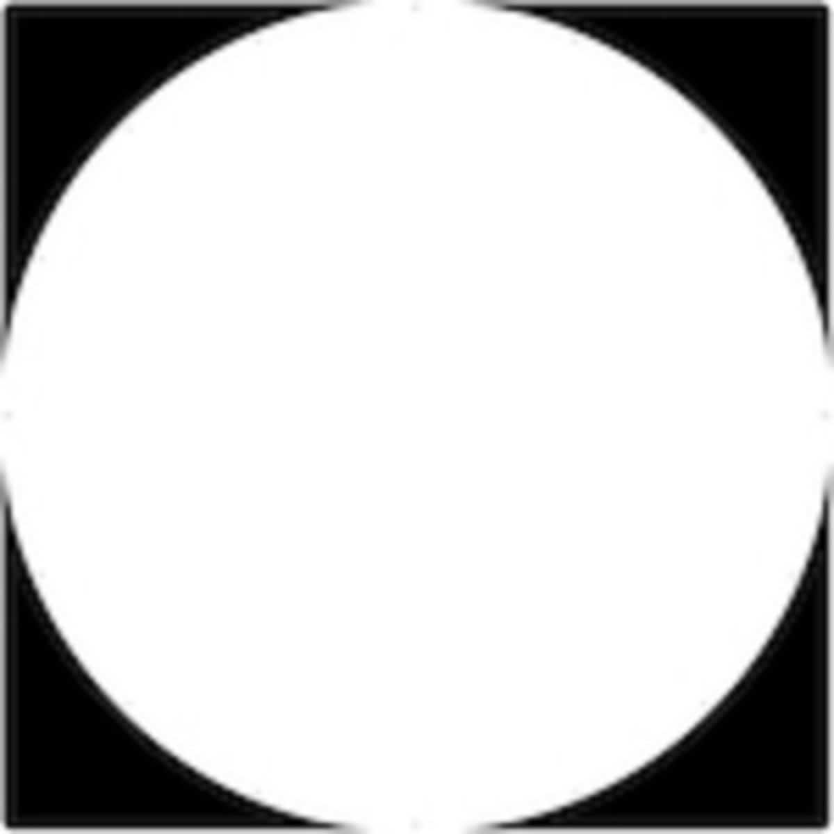
“Each composition is filled with positive and negative space. Design elements usually occupy positive space and are surrounded by negative space. The amount of negative space within a design field can greatly impact a composition.” (A Fiber Artist’s Guide to Color and Design, pg.130)
White Space (https://tomrobb.files.wordpress.com/2011/04/whitespace.png)
With three dimensional art, such as a sculpture, one can see how the object occupies space by walking around it, looking from above, below or from the side. Three dimensional objects have height, width and depth. With two dimensional art [like a quilt], the arrangement of objects on the design field can be crowded with lots of objects or nearly empty with very few objects. These design elements have height and width, but no depth. (A Fiber Artist’s Guide to Color and Design, pg.130)
“Forms and shapes can be thought of as positive or negative. In a two dimensional composition, the objects constitute the positive forms, while the background is the negative space. For beginning art and design students, effective use of negative space is often an especially important concept to be mastered. [An] exercise in cut paper require[s students] to work with the same composition in black on white and white on black simultaneously. This makes it difficult to ignore the background and treat it as merely empty space. The effective placement of objects in relation to the surrounding negative space is essential for success in composition.
Some artists play with the reversal of positive and negative space to create complex illusions. The prints of M. C. Escher … often feature interlocking images that play with our perception of what is foreground and what is background. Other artists take these illusions of positive and negative images to even greater lengths, hiding images within images. Perception of form and shape are conditioned by our ingrained “instinct” to impute meaning and order to visual data. When we look at an image and initially form an impression, there is a tendency to latch on to that conclusion about its meaning, and then ignore other possible solutions. This may make it hard to see the other images. Training the eye to keep on looking beyond first impressions is a crucial step in developing true visual literacy.”(Art Design & Visual Thinking http://char.txa.cornell.edu/language/element/form/form.htm)
Other:
“PICTURE PLANE Two-dimensional design takes place on a surface called the picture plane. The picture planes” you use your quilt. We have also been calling this the design field”For a painter it is the canvas, for a muralist the wall.The significance of the picture plane becomes apparent when you think of the image on picture plane as being like what you would see if you were looking through a window. A flat image, like one of your figure/ground projects, appears to be pasted to the window (picture plane) with no space extending beyond it. A photograph or any image that shows the illusion of space appears to extend beyond the picture plane. In rare instances it is possible to make the image project in front of the picture plane.”
Quilting
Ruth over at Pippin Sequim posted a great tutorial on Orange Peel quilting. She demonstrated how to do it at our last BAMQG meeting.
Quilt World News
Quilt Week Oct 2012
The National Quilt Museum in Paducah, Kentucky will host an exhibit called Themes and Variations in Judy Martin’s Quilts, featuring 25 of Judy’s quilts. It will run from December 12, 2012 to March 11, 2013. I love her quilts and most of her books (recent ones have been too project based for me) because the designs are unique and interesting and her directions are impeccable. Go see the show and report back if you are in the neighborhood.
Remember a while ago I went on a bit about the Modern Quilt Movement and what it meant? One of the students wrote her thesis on this issue for the University of Nebraska (presumably at Lincoln?). Read it and let me know what you think.
The San Jose Museum exceeded their fundraising goal by raising over $46,000 at their most recent event. Due to a small deficit at the end of their fiscal year, the Board of Directors of the San Jose Museum of Quilts and Textiles has unanimously voted to close the Museum on Tuesdays beginning October 1st . This closure is in addition to the long standing Monday closure. They said that it was not an easy decision and they will be cutting some overhead costs, and allowing existing staff to focus on programs and services to enhance our outstanding exhibition schedule and other Museum activities. The board charged the new Executive Director to analyze our resources and it was decided that the Museum was over-extended by being in operation for six days a week. The Board has made no decision as to how long this Tuesday closing will be in effect. The Board hopes that their supporters and community members will continue to visit Wednesday through Sunday, from 10am to 5pm beginning October 1. Any questions or concerns should be directed to Christine Jeffers, who can be reached through the website.
Around and About the Web
Carrefour du Patchwork was held recently and I was pleased to find that there’s now a slideshow of quilts on their website. If you’re interested, you can find it here: http://www.patchwork-europe.com/
Inspiration
My friend, Kathy, over at Bliss Habits is hosting a book group using The Artist’s Way by Julia Cameron as part of her Bliss Habits Book Club. Chel Micheline, of Ginger Blue Studio and Tuesday with Chel on Bliss Habits will be the hostess. She writes about the concept of the book group for this book in a blog post from a week or so ago.
I make about one of these stars per night depending on whether I have basted the half hexagons beforehand or not.
Faye did hers with rows of light and dark stars, as I mentioned, but my plan is to use dots on white as the alternate rows. This is a long term project. It is so I have something to do in front of the television when I am out of bindings to stitch down. I don’t know if I will ever finish this quilt, but I might get sick of it and just decide to finish it once I have made thousands of the stars.
I am still kind of working out how large to cut pieces and what pieces to cut. I have decided to leave out blacks and also dark greys, though I do have a medium grey that I will leave in for the time being.
My little sister (taller than me, BTW) is back from France. With her came some presents. I have a nice sister. 😉
The black Eiffel Tower print is the one I picked out when I bought my Kindle cover off of Etsy. I like it.
I have an idea for a quilt that I want to make for Lil Sissy, but haven’t found the right fabric. I don’t think Eiffel Tower fabric would work, but we will see. I almost used Hello Luscious, but she is not much of a pink girl and that line has a lot of pink.
Make your response simple. It doesn’t need to be a masterpiece. Take 5 minutes. Just respond and create a creative habit.
Please post the direct URL (link) where your drawing, doodle, artwork is posted (e.g. your blog, Flickr) in the comments area of this post. I would really like to keep all the artwork together and provide a way for others to see your work and/or your blog, and how your work relates to the other responses.
The Creative Prompt Project has a Flickr group, which you can join to post your responses. Are you already a member? I created that spot so those of you without blogs or websites would have a place to post your responses. Please join and look at all of the great artwork that people have posted.
Definition:?[pawr, pohr] verb (used with object) 1. to send (a liquid, fluid, or anything in loose particles) flowing or falling, as from one container to another, or into, over, or on something: to pour a glass of milk; to pour water on a plant. 2. to emit or propel, especially continuously or rapidly: The hunter poured bullets into the moving object. 3. to produce or utter in or as in a stream or flood (often followed by out ): to pour out one’s troubles to a friend.
pour cement
when it rains it pours
pour wine
Pour Wine and Spirits Boutique
pour me a drink
pour – for, in French
If you desire to drain to the dregs the fullest cup of scorn and hatred that a fellow human being can pour out for you, let a young mother hear you call dear baby “it.” T. S. Eliot
I have to admit that I was kind of shocked when I opened the package that held this book. My immediate thought was Shrinky Dinks? Jewelry? Really?
I had some Shrinky Dinks as a kid, but not many. I think they must have been too expensive and, perhaps, messy. We made some shrink plastic Christmas ornaments a few years ago, but I don’t remember the circumstances. Apparently, Shrink plastic is back and you can wear what you make to work!
There are about 30 jewelry projects in this book and they are quite interesting. They range from earrings and necklaces to cameos! Remember those? The book starts off with a history of Shrink plastic filled introduction. My favorite part of the beginning of the book was the very funny “Shrink Plastic Basics” (pg.10). She gives the scientific name, which sounds scary, but has some potential for entertaining wordplay in it. She also reassures us about the safety aspects of the plastic.
Lark books all have comprehensive materials lists and this is no exception. This is a fun list, because you can use a lot of different art supplies to decorate your projects including and inkjet printer, colored pencils and rubber stamps! The same tools you used in your other jewelry making projects can be used here. There is also a lot of talk of sanding the plastic, which scares me a little bit.
The Basics section also covers decorating your project, using scrapbook punches and coloring the designs. Ms. Sheldon covers my anxiety of the pieces curling as well.
The projects start on page 27, so you know that the “how-to” section is quite substantial. The projects come from different artists and crafters as well as Ms. Sheldon. While most of the projects were not my style, I didn’t see any that I hated. I liked the colors and styling of the Mexican Oilcloth Necklace (pg.48-49) by Jalene Hernandez. The simple look of the Simple Circle Neclace (pg.52-53) was very appealing. I really liked the idea of the Not-Your-Grandmother’s Cameo (pg.57-59) project as well. There were a few 3D projects, which shows the flexibility of the materials.
There are templates and patterns in the back as well as short biographies of the project artists and (YAY!) and index.
This whole book – colors, page layouts, style- has a fun feel to it and that made it pleasant to read.
A few weeks ago I wrote a blog post about Saral Transfer Paper. Frances mentioned it on her podcast (Episode 96), but still seemed unsure, so I thought I would write about the other tools I use for quilting (sewing 3 layers together not making an entire quilt).
I am liking the Saral Transfer Paper as I work on the whole cloth quilt. It does come off easily, so I have to darken the lines a bit as I move through the quilting process, but that is ok with me.
I don’t think it is possible, at least I have not found a way to mark and entire quilt and keep the markings on through the entire quilting process. If I want special designs, I will draw them on one block at a time with one of the 3 methods that work for me. Yes, this can be a bit annoying, but it is good excuse for me to stop, take a rest and stretch.
I am not much of a quilter. I send most of my quilts out, but every now and then I get a wild hair (as Pam says) every once in a while and quilt a quilt. The Nonce pencil is a little hard and flaky. It is easier to use on a hard surface (e.g. NOT fabric), but that doesn’t really work for me. I use it with stencils. It works on most colors except for the very light ones.
The Roxanne pencil is much softer and works for a lot of colors from light to dark. I use this for lighter fabrics. Sometimes it doesn’t show up on the mid-range colors.
I have been using the Sewline pencils, primarily, to darken the Saral lines that have faded a bit. I could use this tool for marking a whole quilt as well, but I would need a stencil or a good idea in my mind and confidence. This works for me.
The Chalkoner is also good for darkening up lines right before you quilt them.
I mostly do not wash my quilts, so washing out paper or whatever isn’t an option. It also makes my head hurt to think about the damage to my washer. I have enough handwork and don’t want to use tweezers enough, so I would avoid sewing over paper.
I have always been afraid of the blue washaway pens, so I haven’t tried them. I haven’t tried the Dritz paper and I am allergic to everything so try and minimize chemically smells in my house. I don’t use Pounce either, because I want to avoid particles floating around the air. I am concerned about the Glad Press & Seal method, but I don’t know anything about it, so will have to reserve judgment.
Sometime ago I wrote a generic post about organization in my workroom. My workroom is somewhat organized considering it isn’t large enough and I don’t have enough bookcases. 90% of the time I can find what I need and I am less and less surprised by things I come upon serendipitously.
One of the major things I do is, what I call, hunting and gathering. I prefer to make quilts, usually, that use a lot of fabrics. I think many different aquas will be more interesting than just one. This means that many projects, I need to cut a lot of patches from a wide variety of fabrics. It doesn’t work for me to decide to start such a project, open up a fabric bin and start cutting. I can’t stand that long, I get bored and the whole situation results in me hating the project or just stopping about halfway through. Also, if I use that strategy, I get tend to have too many of one color and not enough of others. None of this is good for my stress level and definitely not they way I want my quiltmaking to be.
Also, I don’t know of a way to really randomize this type of fabric selection. Cutting from fabrics I buy new or pull out to use seems like as good a way as any. Also, as an added bonus, I use fabrics that I like right now immediately.
Another problem I had was that I would take fabrics out of bins and NOTHING would be cut from them. Not one square or anything. Shameful! This problem was alleviated by the Fabric of the Year project, which TFQ thought up and I ran with. You can read about the beginnings of that project for me in a post from 2008. Doing this kind of started the solution to my Hunting and Gathering.
As I got use to cutting one shape, the Fabric of the Year shape, out of new fabrics, it became easier to cut more than one shape. I thought it was a good idea and it became easier to use this new system to make progress on projects I was not yet ready to start sewing. Pretty soon I was up to the number of pieces I am cutting now. The other thing is that the fabrics became less precious. I started not to save them for a better project. I also knew, which I have talked about in terms of the FOTY projects, that I knew which fabrics were going to work for other projects so I could go and buy more before it was 3 years later and too late to go and buy more.
Cutting Chart
In addition to the above I also cut 2.5″x4.5″ pink rectangles, 2″ red squares and 2″ aqua or turquoise squares.
The idea is that after I identify a project I want to make that requires a ton of cutting, I figure out what kind of cutting I need to do (coordinated fabrics or scrappy fabrics as well as size). Either can work with my system. Then I put the shape and color on my list. I keep the list near my cutting table so when I have a new piece of fabric (after washing and ironing) I know exactly what to cut. By now I have a sense of how much fabric these shapes will need (now approximately 5″x18″) and I know by the size of the hole in the fabric whether I am finished.
The bonus result of this cutting is that fabrics became less precious to me. There are many fewer fabrics that are free from any kind of cutting. I make progress on projects that require a lot of cutting and I get to see new fabrics appear in projects I was making immediately.
One of the great things about cutting pieces from new fabrics is that it is a great warm-up. Sometimes when I need to get started, pressing fabric and cutting new pieces from new fabrics is a good way to get started. If I have 10 minutes, I can cut, feel like I made progress and got a little stress relief in.
When Amanda had the new kits out at the BAMQG meeting earlier this month, I wanted to take them all. There were about 6, but I restrained myself and just took one. These cat beds are really easy to make and as an added bonus, I get to dump my schnibbles into the center as filling when I am done.
I had to do a bit of unsewing on this cat bed, as I put the wrong tail on the outside when sewing. You have to put the end you want to hide on the outside when sewing the middle strip to the ovals so that when you turn the cat bed right side out, the hemmed end will be on the outside. I started to unsew the entire thing and then realized I only had to unsew the ends. I did the unsewing then re-sewed and have another great cat bed for Amanda and the Homeless Cat Network.
Cat Bed #2 Side-ish View
One of the things I like about this project is that I can put my schnibbles in it.I save, as I have said, the bits that are really too small to save. I used to throw them out, but putting them inside cat beds is better. I had the ends of a quilt (that get cut off after machine quilting) that I also cut up and put inside this one.
The second photo shows more of the frog fabric used for the side. I hope the cat likes it.
I like the cover. I can see the texture even though I can’t feel it.
I like the colors of the pages and variety of illustrations. The styling of the book is wonderful.
I like the interesting tools the author uses such as crochet hooks and clothespins.
The book is well illustrated with lots of little photographs sprinkled throughout. Even the table of contents is illustrated. Using this table of contents means that the reader gets an idea of what they will be looking at when they turn to the project page. I think this is one of the most entertaining tables of contents I have ever seen.
Like many of Lark’s books, the first section talks about materials and tools, types of beads, clasps, headpins and jump rings, as well as different types of chains. Non-metals are covered as well in the stringing materials section under ribbon & silk cording and yarn, hemp & nylon. It is nice to have options.
I really like the definitions of the lengths of chains. This is perfect to include in a book of necklaces and something that I have never seen. I have heard of opera-length, but never knew the exact length. I am now glad to know that an opera-length necklace is 28-34″ long. These are really good definitions. We all wear necklaces at some point and may have heard some of these terms, but the book spells them out for us.
Metal finishes, tools, adhesives and a brief section on abrasives and polishing compounds are also covered. Many of the techniques uses in the projects are covered in the ‘Techniques’ section. Lots of clear illustrations guide the reader through the words.
There are 40 projects in this book, which makes me think we quiltmakers are getting ripped off! 😉 I really like Roccoco Ribbon (pg.30-31), mostly because of the ribbon used, but also because of the color. Chronos (pg.32-34) also looks like a necklace I would wear. The beads in the Marie Antoinette (pg.) project really make that piece. I am not sure if those particular style of beads are prevalent, but the necklace would have to be re-imagined a bit if the beads are hard to find. I love the hot pink of those beads, though. The styles are so diverse among these projects that I think most people could find something they would enjoy making.
Many of the projects show variations, which is a great way to use the patterns/directions as jumping off points for your own creations.
Thanks to Lark Crafts for sending this book along. I appreciate your faith in my writing skills!
Yes, Sandy and I are on a roll! If you have not listened to the previous podcast on shape, you might want to do so. Shape and form are related and listening to shape will help you when you listen to form.
Forms “can be defined by both depth and perspective. Forms have a top, bottom and sides. They occupy space and are capable of casting a shadow.” (A Fiber Artist’s Guide to Color & Design, pg.89)
Example: fabric bowls and vases (see books from C&T Publishing)
Just to confuse things further, the word Form is also used to describe a higher level of the design of art pieces, e.g. “Content implies subject matter, story, or information that the artwork seeks to communicate to the viewer. Form is purely visual aspect, the manipulation of various elements and principles of design. Content is what artists want to say; form is how they say it.” (Pentak & Lauer, pg.5) This is not the kind of form we are discussing in this podcast.
Architecture is the art form most concerned with three-dimensional volumes. Architecture creates three-dimensional shapes and volumes by enclosing areas within walls. (Pentak & Lauer, pg.138)
Susan Else creates quilt related architecture/forms.
“Volume and mass refer to the three-dimensional shapes of sculpture and architecture. Even though quilts have dimension in the relief created by quilting and embellishment, they are usually considered two-dimensional because the angle of viewing doesn’t critically change the image.” (The Quilter’s Book of Design, 2d, pg.58)
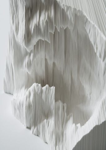
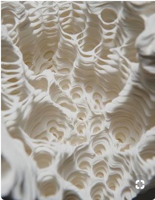
A Piece of a Flat globe n.6 Sculpture by Noriko Ambe (http://www.norikoambe.com/works/2008w0009p02.html)
With three dimensional art, such as a sculpture, one can see how the object occupies space by walking around it, looking from above, below or from the side. Three dimensional objects have height, width and depth. With two dimensional art [like a quilt], the arrangement of objects on the design field can be crowded with lots of objects or nearly empty with very few objects. These design elements have height and width, but no depth. (A Fiber Artist’s Guide to Color and Design, pg.130)
The Form vs. Shape Conundrum
A shape is also sometimes “called a form. The two terms are generally [thought to be] synonymous and are often used interchangeably. ‘Shape’ is a more precise term because form has other meanings in art. For example, ‘form’ may be used in a broad sense to described the total visual organization of a work, including color, texture and composition. Thus, to avoid confusion,” and because we are going to use form in a different way for our purposes, the term ‘shape’ is more specific. (Pentak & Lauer, pg.136). Refer to the previous podcast on shape.
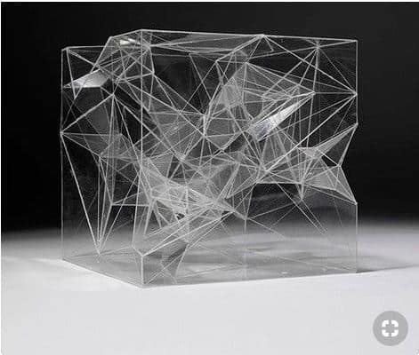
Sou Fujimoto – Inside/Outside Tree ”
Source:Sou Fujimoto – Inside/Outside Tree ” Inside Outside, Inside Art
Notes:
“A flat work, such as a painting” or a quilt, “can be viewed satisfactorily from only a limited number of angles, and offers approximately the same image from each angle, but three dimensional works can be viewed from countless angles as [the viewer] moves around them.” (Pentak & Lauer, pg.138)
There are various ways to categorize form and shape. Form and shape can be thought of as either two dimensional or three dimensional. Two dimensional form has width and height. It can also create the illusion of three dimension objects. Three dimensional shape has depth as well as width and height. (Art Design & Visual Thinking http://char.txa.cornell.edu/language/element/form/form.htm)
“Forms and shapes can be thought of as positive or negative. In a two dimensional composition, the objects constitute the positive forms, while the background is the negative space. For beginning art and design students, effective use of negative space is often an especially important concept to be mastered. An exercise in cut paper required the student to work with the same composition in black on white and white on black simultaneously. This exercise makes it difficult to ignore the background and treat it as merely empty space. The effective placement of objects in relation to the surrounding negative space is essential for success in composition.
Some artists play with the reversal of positive and negative space to create complex illusions. The prints of M. C. Escher … often feature interlocking images that play with our perception of what is foreground and what is background. Other artists take these illusions of positive and negative images to even greater lengths, hiding images within images. Perception of form and shape are conditioned by our ingrained “instinct” to impute meaning and order to visual data. When we look at an image and initially form an impression, there is a tendency to latch on to that conclusion about its meaning, and then ignore other possible solutions. This may make it hard to see the other images. Training the eye to keep on looking beyond first impressions is a crucial step in developing true visual literacy.”


