Quick post, because my sister asked me to share this with all of you: http://fly-tribe.blogspot.com/2012/08/givingflight.html. The basics are:
The Fly Tribe came together as a bunch of individuals looking to learn a bit about what it meant to run a creative business. We came together to take Kelly Rae Robert’s Flying Lessons. Along the way, we made some friends, we supported one another’s dreams, we lifted one another up when difficulties (in business and life) threatened to get the better of us. We didn’t just learn to “Take Flight” (as Kelly Rae’s course suggests). We learned to Give Flight to one another.
Now with one year of soaring under our wings, we want to share the love.
Welcome to the Summer of 2011 Flying Lessons Alumni’s
Giving Flight Blog Hop and Flying Lessons Give-Away.
It’s our Anniversary Celebration.
This is a HUGE celebration that is broken up into two parts….
Go to http://fly-tribe.blogspot.com/2012/08/givingflight.html to read the rest and take advantage. Why not?
Here is the top. It took me all weekend to get it done. I have been sewing slowly lately and it took me all weekend to get it finished.
I am pretty pleased with how it came out, but I wish I hadn’t used the darker batik strips. I do think they stick out more in the photo than in real life.
Still, I think some child will enjoy this quilt.
Pink Donation Top Back #2
I made the back as well. I used some nice fabrics that I thought I wouldn’t use in a quilt. I think it looks cheerful. I especially like the fabric in the lower left hand corner.
My friend Natalie sent me a link this quilt/map site. I have to do some more investigation, but it looks like they will make a map of a variety of spaces using quiltmaking techniques. they describe themselves as “Haptic Lab is a small design studio in Brooklyn that creates products, spaces and situations to promote embodiment.” They also make Jell-o molds.
Of course there is a Flickr group for the QuiltCon block challenge. I shouldn’t have looked. I feel embarrassed about sending mine in. There is some really great work there. I need to up my game.
Ebony Love, die cutting queen, has a Kickstarter campaign to produce a book on die cutting tips. Tomorrow is the last day, so click NOW, if you want to support. Even $5 helps. I don’t know Ebony. Patti turned me on to her. This is a project I supported because I haven’t seen a book like this and it doesn’t have EASY in the title. Ebony seems to be doing something unique: creating a book that will tell you how to use your dies in existing patterns. There are all different levels at which to pledge. Her ultimate goal is $12,000, so she can attend Quilt Market and market the book. She is at $7700 as of this writing. I guess I need to get my act together and review my Accuquilt Go!
SewedExcitedQuilts has a great post about quotes she heard at a recent Quilts of Valor Sew Day. They are typical quiltmaker quotes you will recognize. Read them and have a laugh. You are not alone!
Projects
I like this shoulder bag – both the shape and the fabric – over at Moda Bakeshop.
I get the Sew Daily newsletter – I wanted a free eBook and this was part of the package. Mostly, I don’t read it, but recently they wrote about using vintage (think of your special stash) fabrics in pillows. They show, what looks like, upholstery fabric (local folks: think Fabmo!) and talk about using vintage hankerchiefs. I still need to recover my living room pillows. I just haven’t found the right fabrics, but this blog post puts the project back on my radar. I have had a lot of pillow drama, but pillows and pillow covers are still good projects for small amounts of fabrics or to try things out.
Stars for San Bruno Again
I received a call from one of DH’s cousins. She is the sister of the cousin to whom Stars for San Bruno #1 was given. She went on and on about how they had received a quilt and it turned out it was made by me. I could not make her understand that I had coordinated the making of the quilt and actually sent it to DH’s cousin. It was a very strange conversation.
I was sitting in a meeting dreaming of being on a beach with my dearest and a drink looking out at the sea. I needed a vacation and this was my response. It is a lot more detailed than the others I have been drawing lately.
I have finished all of the blocks for a second pink donation quilt. I started putting the sashing on, but the whole process seems a bit rote. I have about a zillion pink squares, so I have to keep pushing forward on the pink version of these quilts.
I have done two with the black on white background and am a little bored with the look. I am going to change up the next one and include some green or use the pink as the background. We’ll see what happens.
I still think it is fun to make up the blocks using different fabrics. I also wonder if using a non-traditional background color will make the pink less interesting. No way to know until I try it.
2 Pink Donation Blocks
In these two blocks, I took a couple of color on white fabrics and put those on the background. This idea might be another thing to consider for a background.
I think I am not using enough dots in general. I really like that dot in the upper right hand corner of the left block.
2 Pink Donation Blocks
These blocks also have some color on white backgrounds as well. I have to say that I don’t like the batiks in these blocks. In the overall look, they are ok, but I think I also might stick to light or medium pinks as the group of fabrics in another version of pink and neutral.
2 Pink Donation Blocks
As you can see I spread the color on white fabrics throughout the various blocks. I didn’t want them to stand out as odd in the overall look of the quilt top.
A few days ago, I gave a little sneak peek at my newest hand project.My quilter is quilting very slowly so I don’t have a lot of bindings to do and it is very hard for me to sit in front of the TV and not have something for my hands to do. There is only so much laundry a person can fold in this world.
I wasn’t really interested in doing anything using the English Paper Piecing technique until I saw my friend Faye’s stars. They look like the above stars, but hers are a bit bigger (I bought the wrong size patterns). When I saw what she was doing, I thought it might be a good project for in front of the TV, in the car, etc.
Like Faye, I bought my patterns from a company called Paper Pieces. They have GREAT customer service and a wonderful catalog that really opened my eyes to the possibilities of EPP.
TFQ is working on a hexagon paper piecing project, so when she was down, she gave me a little tutorial on how to put the pieces together. I was confused until she showed me that you sew straight through the cardstock patterns. Once I knew that everything fell into place. I also have Lisa at BAMQG and Faye via email as resources.
Faye’s Half Hexagon Top
Faye’s piece is getting quite large. Her idea is to use darks and medium-lights in alternating rows. She said the longest row is 15 stars. I am thinking of using dots with light backgrounds as my alternate rows.
I also want to use some of my newer fabric that has not been earmarked for a project.
The last bit of my trip that I really wanted to talk about were the grates and grilles and other metal work. The Art Institute has collected pieces, parts and sections of buildings around Chicago that were being renovated or torn down. As you may have noticed from some of my inspiration photos, I have always enjoyed architectural details. Making a building beautiful (as opposed to striking or memorable) seems to be the greatest gift an architect can give a city.
I never really thought much about grates and grilles until I was standing in the second floor stairwell/lobby area of the AIC. For those of you who know the place, it is outside the Impressionist gallery. There, the curators have displayed a variety of pieces, many of which are metal. I know I have seen them as I have walked by buildings and there have even been a few times when I have ridden in one of those elevators where you have to close the door, but I didn’t really think about them as a source of inspiration until I saw them hanging on the wall. It is interesting how a museum will do that to me.
The Fisher Building Elevator Grille, above, is only the upper portion. I don’t think they had (or maybe I just didn’t photograph) the lower portion. I do think the round part looks like some kind of serpent. Not so great for quilty inspiration, but I could go with the general shape and proportion. What really grabbed me was the background. Those lines and curls would make great background on a quilt.
Manhattan Building Elevator Grille, 1889-91
This is a really elaborate elevator grille. Sometimes I wonder if the artisans or designers felt like they got one chance and went all out. Do you every do that?
I like the spirals in the middle, but in general I think this piece is top heavy. Stand on your head, look at the picture and tell me what you would think of it if the bottom were the top.
I think the spirals would be good quilting designs. I like the way there are different sizes of spirals and they go in different directions.
Manhattan Building Elevator Grille, 1889-91 detail
The close-up shows even more detail within the spirals and you can see the heavy part on top very well. I think it would be a good idea for me to take some kind of architectural history class so I would know what the official names of the various shapes are called. Dohickey isn’t very descriptive or precise.
The other thing about this detail is that it shows one thing I try to do in my quilts: the viewer gets a reward by getting close up. See the little dots and divets in the spirals? Do you see the wing shape in the largest spiral?
Window Keystone, 1872
I don’t know what a window keystone is, but the design would make an interesting piecing challenge. The way the piece is made makes the design seem like there is no ‘block’. I think this would probably be a similar piecing issue to the Spiky Stars piece I designed and created a number of years ago.
Window keystone, 1872, detail
I also like the slight curve of the motifs. I wonder if this is one of those motifs that could be sewed using straight lines, but would look curved? I don’t think so, but I also haven’t put much thought into it since I took the photos. Looking at the detail makes me see real curves in the piecing. I also like the interlocking knot look of some parts of the design. I think I would like a job where I designed useful items that would add to the beauty of everyday surroundings.
Schiller Building Block of Stringcourse
I am kind of partial to ovals, though I haven’t done anything with them in quiltmaking yet. These are really interesting pieces, partially because I have no idea what they were used for it and it fascinates me to think about these being added to a building because they were beautiful.
I really thought there were beautiful buildings in Chicago and it made me lament the dearth of classic (IMO) creativity in building today. Of course, things are a lot more expensive and these types of details may be prohibitively expensive, but I think their lack also makes us poorer.
These pieces would definitely make for interesting quilting designs and some complicated, but interesting piecing challenges.
Definition: Painting is the practice of applying paint, pigment, color or other medium[1] to a surface (support base). The medium is commonly applied to the base with a brush but other objects can be used. In art, the term painting describes both the act and the result of the action. However, painting is also used outside of art as a common trade among craftsmen and builders. Paintings may have for their support such surfaces as walls, paper, canvas, wood, glass, lacquer, clay, leaf, copper or concrete, and may incorporate multiple other materials including sand, clay, paper, gold leaf as well as objects.
faux painting
Fine Art Paintings
painting contractor
Textile painting
painting a room
painting furniture
watercolor painting
painting supplies
oil painting
Rock painting
Painting magazine
car painting
Make your response simple. It doesn’t need to be a masterpiece. Take 5 minutes. Just respond and create a creative habit.
Please post the direct URL (link) where your drawing, doodle, artwork is posted (e.g. your blog, Flickr) in the comments area of this post. I would really like to keep all the artwork together and provide a way for others to see your work and/or your blog, and how your work relates to the other responses.
The Creative Prompt Project has a Flickr group, which you can join to post your responses. Are you already a member? I created that spot so those of you without blogs or websites would have a place to post your responses. Please join and look at all of the great artwork that people have posted.
As I said in my previous post, the quilts were really great.
I like the name of this quilt -Cockscomb, Rose Tree & Pineapple. The words evoke an English garden for me.
I think the quilt, in general, evokes a slightly wild garden. I have to say that I see the Pineapple as more implied than a true rendition of one. I won’t quibble too much, though.
Star Variation Quilt, 1831
I am partial to 8 pointed stars, so this quilt really attracted my attention. This quilt is attributed to Margaret Blean, 1811-1887. The best design aspect of this quilt is the border around each of the blocks. That little border really makes the stars stand out. There could be too much with the border, but the plain blocks really give the blocks space to shine.
Star Variation Quilt, 1831 detail
In looking closely at the blocks, I can see that the border adds a couple of extra diamonds to the block, which, I know, makes some quiltmakers sweat. As I said in the distant past sewing slowly and using the Jinny Beyer Perfect Piecer ruler to help with the inset seams really makes them doable. By the way, Jinny Beyer has a video and a guide to using the Perfect Piecer, which you can look at before you buy. I have been using the Perfect Piecer for awhile and learned a new trick watching the video.
Once you have done a few inset seams a few more make little to no difference. 😉
In the detail photo, the quilting is clearly visible, which looks looser than other quilting in the exhibit.
I would be doing the quilt a disservice, if I neglected to mention the fabric. There are a lot of nice plaids and I like the blue grey colors as well. The other thing I noticed was that the quilt is made from browns/earth tones/neutrals. Not always my favorites, but I like them in this quilt. Of course, I wonder how the quilt would look in brights with hot pink or lime green as a background.
Whole Cloth Quilt, 1819
I had whole cloth quilts on my mind after attending the July BAMQG meeting. Ruth spoke eloquently about the latest challenge – a whole cloth challenge. When I heard about it, I immediately said NO WAY, but I couldn’t get the idea out of my head. Visiting the Art Institute fed the inspiration fire. Don’t Ask.
This is a beautiful example of a whole cloth quilt by Ursula Whittlesey, 1796-1875. Think about Ursula for a moment. She was born just after the Revolutionary War, saw the War of 1812 and the Civil War as well as untold US expansion. And I was at a museum looking at her quilt. Just thinking about that makes my mouth drop open. I wish these women kept journals. If you don’t keep a journal, even just to chronicle your creativity, start. Start NOW.
Whole cloth quilt, 1819, detail
I thought the border of the whole cloth piece was nice. It is not an edge border, but a center border, like the mat of a framed picture. It is elaborate, but also simple with the repetition of the flowers and the wreath-like leaves. Of course, I had to take a photo of the corner. As I have mentioned, corners can be tricky, so I be sure and take note of them so I don’t have to make something crazy up myself. Looking at the corner detail made me notice the pineapple in the corner. I believe that pineapples symbolize hospitality. I carefully took photos and notes and did sketches, thinking that it might work as inspiration for a piece of my own sometime.
Whole cloth quilt, 1819, detail
One thing I like about the frame is that the flowers are simple. Of course, If I tried to machine quilt them, they would be complicated enough, but they are not complicated flowers. They are simple daisies (I guess).
Also the wreath-like leaves are complicated in front and simple behind, which probably made the quilting easier, but also make the front leaf stand out. If you look at the design one might think that the simple background part of the leaf could be attached to the flower. Who knows? It is fun to look at it and speculate.
Whole cloth quilt, 1819, detail
Finally, I have to go back to the pineapple. This is one of the best pineapple designs that I have seen. It is a bit stylized, but not a lot. A person can really tell what it is.
I also notice that it is its own design. The leaves are different from the wreath-like flower-leaf border, but it is connected to the cornucopia by the suggestion of abundance.
I guess the lesson is: go to a museum, get inspired there and pay homage to the woman who made these works and, probably, never thinking that their work would be in a museum.
If you have not already sent off your blocks for the QuiltCon block design challenge, it is too late. I sent mine in earlier and wanted to share what I created with you.
I bought a set of fat quarters from Pink Chalk fabrics. I bought FQs from Pink chalk, because they were a bit cheaper than the other vendors (did not include the white) and I like the Pink Chalk customer service. It is ridiculous for me to try and save a few bucks. I buy enough fabric to insulate my house, but I have my moments of sanity.
The colors, which were selected by Elizabeth Hartman of ohfransson fame, are:
Kona Cotton Cyan
Kona Cotton Azure
Kona Cotton Candy Green
Kona Cotton Lime
Kona Cotton Chartreuse
Kona Cotton Buttercup
Kona Cotton School Bus
Kona Cotton Tangerine
Kona Cotton Medium Grey
Kona Cotton Coal
I wasn’t very fond of the yellow. It is too wishy washy for me. The orange in the upper left hand corner shows up very red on my screen, but it is orange.
QuiltCon block entry #1
I thought some of my Block-a-Long blocks were pretty modern, so I entered some of those. The first one was a block I named Four Columns Squares (Block-a-Long #52). I did rearrange the columns a bit from my original post, because I wanted to take advantage of my perception that the modern quiltmakers like assymetrical quilts (blocks) as a general rule.
I found the 12.5×12.5 unfinished size to be unwieldy for me. Most of the blocks I make are much smaller. I didn’t have to make them 12.5″x12.5″. I could have made them 12.5″ by whatever width I wanted, but I didn’t do that.
I also thought it would be a good idea to make the same block in two different colorways. I also included a printout of how the block would look in a quilt.
QuiltCon block entry #2
I wanted to make several, but read the directions and found I could only make 3. At the time I found that out, I had already made two, so I thought I had to select the third carefully. Instead what I did was send in the two as the same pattern in two different colorways. Clever, eh?
Well, it won’t be very clever, if I get disqualified.
I was thinking about the rules saying that blocks could be any width. I kind of wanted to try a different width than 12×12 finished, so I reduced one of the Block-a-Long blocks by not making all the pieces. I think it looks very similar to the block I used for FOTY 2009.
QuiltCon Block entry #3
If you remember, that is a block I found in a book by Bill Kerr and Weeks Ringle. Not sure which one anymore. 2009 was pretty long ago, especially in the number of quilts I have finished.
I am pretty pleased with this one. I added one print, as you can see just to add a bit of interest.
I found that a fat quarter pack ends up being a lot of fabric. If I count up, what I bought was 2.5 yards of fabric. That is a lot of fabric and I really didn’t want it hanging around, so I made more blocks.
3 is the limit, you say? Yes, you are correct, but what I did was count QuiltCon entry block #1 and #2 as the same block in different colorways. I sent them off as such and then finally got around to making more blocks towards the end of June. I didn’t post this back then, because I didn’t want anyone copying my work. Shocking, I know, but it happens.
QuiltCon Block Entry #4
This one is more asymmetrical, but is not wonky in the Gwen Marston style. I just couldn’t do it.
I was glad to get this out of my hair. I don’t expect anything, but hope the judges will choose one of my blocks. If not, they will go to a good cause.
I have been looking for flowers for my front flower bed. I want something drought tolerant, but pretty. I saw these at Disneyland. Not only did I think that they might work for my garden, but I like the shapes-that usher hat shape in the middle, especially.
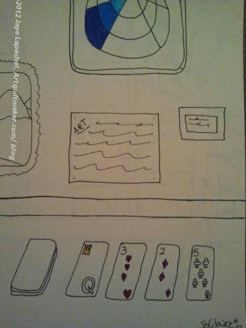
I tried to create a drive-in movie showing the James Bond movie with Jane Seymour as Solitaire. It didn’t work out, so I looked through my completed drawings and was inspired to draw this. I need some practice on faces and proportion of bodies. I’ll get there some day!
As I said in my previous post about the Samplers, the textile exhibit was small. Despite being small the quilts on display were excellent. Perhaps not excellent in the that they were the best of the best, but excellent in that they were interesting. There were interesting choices of fabric, interesting corner treatments and interesting block variations. We all seem to go for perfect, especially when we run out of fabric and, yet, I find that antique quilts with an odd patch of fabric are more interesting. I often think “why would she choose that particular fabric?” and that thought leads me into a whole day dream about the woman that made the quilt.
The Star of Bethlehem was a stellar example of a quilt. The museum called it a bedcover. I wonder why? I’ll have to ask a curator friend and see if she knows.
Star of Bethlehem, 1830 detail
The colors are a really good combination. The red, green and yellow are a combination I used to use a lot when I drew and colored with felt pens. The viewer is rewarded with the fabrics when viewing close-up. They are interesting and add a lot of movement to the quilt
The borders are another excellent part of this. In reality, the whole quilt is about the borders. It is kind of a border round robin idea.
Star of Bethlehem, 1830 detail
The detail of this quilt is great. The photo (left) is a detail of the center. I love it that this quiltmaker sewed so many inset seams, not only in the center, but in the whole quilt. I would love to know the maker (or makers).
The other thing is that the points are really well done. I know that points matching is not the be-all-end-all, but when the points matching is well done, it is a joy to behold.
Again, in this detail, you can see the nice combination of the red, yellow and green. I think the tones of the colors are interesting. Not greyed, not bright. Not sure what I am seeing, but it is interesting.
Star of Bethlehem, 1830 corner
One thing I like to do is pay attention to the corners of borders. It is sometimes hard to know now to make a corner meet, especially if your piecing is a bit off. In this example the corner is a bit off where the two parts of the border meet, but the quiltmaker really did a nice job making that flower shape. I really like it. I also like that it is a bit off. It gives the quilt humanity, soul.
Keep in mind that I had to take photos of these quilts with no flash. Thus, the colors in the photo of the corner look more yellow than they were.
Pincushion & Burrs, 1830
I have never heard of this pattern with the name Pincushion and Burrs. It is also, according to the information card, called Square and Swallows, which sounds familiar, but not very much. I am pretty good with blocks, but I haven’t paid a lot of attention to quilt designs that have an all over name. Something to put on my bucket list, I guess.
I really like the border on this quilt, but the overall quilt is a great blue and white quilt. The little bird feet add movement and interest to this piece. I am not a huge fan of two color quilts; I don’t hate them, but I just think there is so much good fabric, why stick with just two? However, when I see a quilt like this, I think about making a two color quilt.
Pincushion & Burrs, 1830, detail
In addition to showing you the birds’ feet in this photo, you can also see the quilting. The quilting includes bunches of grapes, which are difficult in the best of circumstances. These are well done. The thing I like about this quilting is the double row of stitching that border the plain blocks. You may have to enlarge the photo to see them.
I also like the slight curves in the center of pieced blocks (applique’). I think this could be made, partially, like a Drunkard’s Path is made.
Pincushion & Burrs, 1830, corner
Again, here is a border corner. this is an interesting treatment-Flying Geese border and then a kind of Double Four Patch with Half Square Triangles. I like. It works, even if it isn’t perfect. It does look a bit like a butterfly.
National Association of Miniature Enthusiasts promoting the hobby.
Holy Names
Definition: A systematic name is a name given in a systematic way to one unique group, organism, object or chemical substance, out of a specific population or collection. Systematic names are usually part of a nomenclature.
A Horse with no Name
Chemical name
Code name
Name and shame
What’s in a Name?
Name That Tune (game show)
Name-Calling
sort by name
name tag
profile name
name attribute
In the Name of the Father
Getty Thesaurus of Geographic Names (TGN) is a structured vocabulary of geographic names for indexing art and architecture.
U.S. Board on Geographic Names, Domestic Names, Foreign Names, Antarctic Names, and Undersea Features.
Definition: A name is a word or term used for identification. Names can identify a class or category of things, or a single thing, either uniquely, or within a given context. A personal name identifies a specific unique and identifiable individual person, and may or may not include a middle name. The name of a specific entity is sometimes called a proper name (although that term has a philosophical meaning also) and is a proper noun. Other nouns are sometimes, more loosely, called names; an older term for them, now obsolete, is “general names“.
Hello! My Name is….
The Name of the Rose
business name availability
What’s in a name?
pen name
Make your response simple. It doesn’t need to be a masterpiece. Take 5 minutes. Just respond and create a creative habit.
Please post the direct URL (link) where your drawing, doodle, artwork is posted (e.g. your blog, Flickr) in the comments area of this post. I would really like to keep all the artwork together and provide a way for others to see your work and/or your blog, and how your work relates to the other responses.
The Creative Prompt Project has a Flickr group, which you can join to post your responses. Are you already a member? I created that spot so those of you without blogs or websites would have a place to post your responses. Please join and look at all of the great artwork that people have posted.


")


 I tried to create a drive-in movie showing the James Bond movie with Jane Seymour as Solitaire. It didn’t work out, so I looked through my completed drawings and was inspired to draw this. I need some practice on faces and proportion of bodies. I’ll get there some day!


