Book Review: Modern Quilts from the Blogging Universe

I am not 100% happy with this review, but at some point, I just felt I had to post it.

Modern Quilts from the Blogging Universe
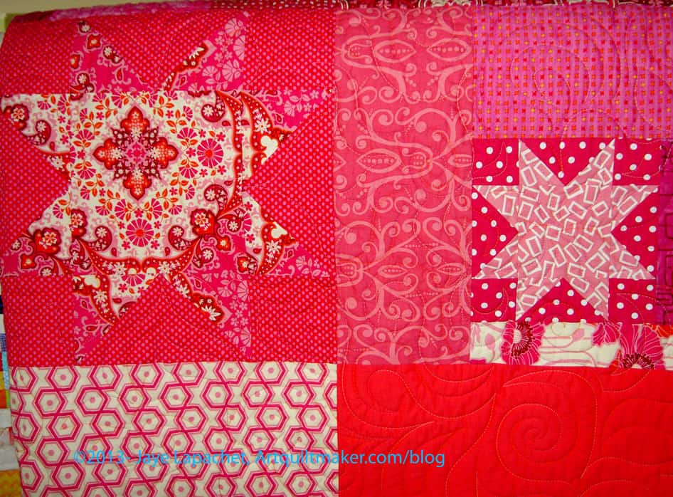
Modern Quilts from the Blogging Universe by Martingale

My rating: 2 of 5 stars

I received this book as a gift earlier this year. I have been carrying it around with me and never seemed to get to reading it until a few weeks ago. I was laying on the couch exhausted and picked it up to leaf through while watching TV.

The book is essentially a pattern book with some thoughts by the popular bloggers. The title is a misnomer. The quilts aren’t from the blogging universe, they are from the popular or well known blogging universe. I don’t think it is possible to include all of the quilts from the blogging universe in one book, but the title does suggest that there could be a v.2, v.3, etc.

The introduction is a page long and tries to categorize this book into the modern quilt milieu by defining “modern quilts.” The author writes “In the context of quilts, “modern” doesn’t necessarily mean contemporary. Although the quilts in this book could certainly be categorized as such, this compilation focuses on a specific aesthetic. Designs touch on ideas such as purposeful imperfections; improvisational piecing; exploring negative space and approaching classic quilt blocks in new ways. That said, one rule of modern quiltmaking reigns: there are no rules.”

Sigh.

I really have nothing against modern quilting except that the above implies that this type of quiltmaking has never gone on before. I blame Marketing departments. Everything has to be new and fresh or it is uninteresting, apparently. In the early 1990s there was a dedicated group of art quiltmakers rethinking blocks, doing improvisational piecing and making their own rules. The joy at that time was the same: rebelling against the Quilt Police. The problem at that time was the same: the “no rules mantra” gave people an excuse to do sloppy work. I refuse to even comment on “purposeful imperfections.”

The quilts in this book are not sloppy and, from what I can see, technique is good. I also think it is good to encourage people, regardless of skill level, to make quilts. More quilts are always better. Still, I think there are rules. Not rules about personal aesthetic, but more about quilts shown in books should be at a very high level of technique. What people make for themselves is entirely up to them and NOT what I am talking about.

I also have to say that there is a value in knowing what good design is and is not. It occurs to me that I do not know what the editor means when she says “…one rule of modern quiltmaking reigns: there are no rules.” I think that there are always design rules. Does she mean that a quiltmaker can make one giant block and make that a quilt? If so, I agree and say more power to the quiltmaker.

The introduction mentions social media. I agree that social media is one of the phenomena that helps to define modern quiltmaking (pg.7). Social media, however, is not the exclusive domain of the modern quilters.

Sadly, the editor or compiler, allows incorrect information to be perpetuated. It is particularly bad in this book. For example, “purposeful imperfections” (pg.7) were thought to be something the Amish included in their quilts. The concept was proved to be wrong, because they actually thought that nobody could be perfect except God and they did not need to add an imperfection into a quilt. There would already be imperfections without trying. [Nota bene: Barbara Brackman talks about this: http://barbarabrackman.blogspot.com/2… or http://www.womenfolk.com/historyofqui…. No references, though, I am pretty sure this was discussed in BB’s book Clues in the Calico. There is a detailed commentary here: http://hartcottagequilts.com/his9.htm, which has icons of the quilt history world named as doing research on this topic].

While not everyone believes in God or goes to church regularly, I think it is fair to say that none of us are perfect. I strive to make the best quilt I can. Despite my best efforts, I have blocks that are a hair too small or points that don’t quite match. I have no problem with design choices where points are cut off or Sawtooth Star legs are wonky. Some wonky-improvisational quilts are gorgeous. I don’t think we should blame design choices on the need to make our quilts imperfect. Be inspired by the imperfections of antique and vintage quilts and incorporate them into your design decisions.

The editor/compiler allows some of the essayists to further perpetuate questionable stereotypes. While many quilts were made using leftovers from sewing for the family, many, many quilts were made using especially purchased fabric or kits. Marie Webster, an icon of quiltmaking in the 1910s and 1920s sold these kinds of kits. It is not a good assumption that all quilts were scrap quilts.

As I said, this is essentially a pattern book. I think the book would have been improved with some information about what inspired the bloggers to come up with the designs. I see a lot of questions and comments about how a person thought of a design and not enough of the answers, though I may not be looking in the right places. Giving the answers to the question of what inspires people to make quilts would go far to give others the confidence to make their own designs as well.

The format of the patterns includes a photo, 2-3 pages for the pattern and an essay by the designer. A lot of the designs are derivative, but freshened up with current, fun fabrics.

The first pattern/quilt that caught my attention was Indian Summer (pg. 27), a pointy Dresden Plate. The designer has included some small appliqued circles around the outside of each plate, adding a bit of interest. She also has clear instructions on making those pointy petals by machine.

Knots (pg.33) is a design of interlocking and layered lines. I like the layering of this design, though I would rather see it in brighter colors.

There are two similar quilts in the book, Juicy (pg.15) and Diamond Crosses (pg.50). There are enough differences to make it worth separate patterns, but enough similarities that you may not want to make both.

I really like the movement in Everything’s Coming Up Rainbows (pg.54) and think she gives good directions for easily creating the wonkiness of the blocks. The designer says to use assorted prints in various colors. I think that the success of this quilt’s color palette is that values of the prints she chose are very similar. That is hard to communicate in a book and, perhaps, the designer’s blog gives more information. If not, be sure to chose prints with all clear color OR all prints that have a slightly greyed color to them.

The Rainbow Stashbuster quilt (pg.60) would probably not need as much attention to whether prints were clear or greyed, etc, though some attention to that detail would make this successful.

One of the things I like about this book is the way some of the designers think outside of the box when making the blocks just a little different. Jessica Kovach does this with her Petal Pod (pg.64) quilt. I love the way she added a simple rectangle to a Drunkard’s Path unit (quarter circle and accompanying background) to make a unit that looks like a flower.

Across the Quad (pg.84) is a quilt I might make. I like the balance. While the cross in the bottom part of the quilt is heavier, the small four patch somehow balances it out.

My favorite quilt in this whole book is Candy Necklace (pg.88). Again, there is a suggestion of interlocking piecing. I also like the controlled scrapiness of the fabric selection. The choice of background fabric is key to the success of this piece. I don’t like that some of the necklaces are cut off and would finish them off at the edges and use some background fabric to even up the edge. That is my little quirk, however.

Martingale has done a good thing by including more on topic and putting the basic quiltmaking information on their website. The editor writes “we wanted to offer you as many step by step patterns as we could fit into 96 pages, so we removed our usual section on basic quiltmaking techniques….you can find the info on our website in downloadable form…” (pg.7) Brilliant.

This book is a good start to what I hope is a series that expands beyond the famous ‘modern’ quiltmakers.

View all my reviews

ATCs

Bay Bridge Printed on Fabric

The Oakland-San Francisco Bay Bridge, a main artery between the East Bay and the City, closed on Wednesday August 28 at 8pm forever.

Well, sort of forever.

They replaced it and they had to reconfigure the onramps or interchanges or navigation whatevers.

I started ATCs months ago. I just wasn’t excited about it, but I wouldn’t face it.

Finished ATCs
Finished ATCs

Somehow, thinking about the Bay Bridge closure made me get excited about ATCs again. I found a historic photo of the Bay Bridge, adjusted the size and printed them on fabric.

I added some stitching, including testing out the Aurifil monofilament.

Voila!

While you read this, I will be at a CQFA meeting. I haven’t been able to attend a meeting in a while.

Creative Prompt #224: Fleet

7th Fleet

The Fleet may refer to:

Definition: “to cause (time) to pass usually quickly or imperceptibly.”

The Lost Fleet series of books by Jack Campbell

Fleet Week

Blue & Gold Fleet

Sweeney Todd: The Demon Barber of Fleet Street

Red & White Fleet

Band: Fleet Foxes

Reuben H. Fleet Science Center, San Diego, California

Post the direct URL (link) where your drawing, doodle, artwork is posted (e.g. your blog, Flickr) in the comments area of this post. I would really like to keep all the artwork together and provide a way for others to see your work and/or your blog.

We are also talking about this on Twitter. Use the hashtag #CPP

The Creative Prompt Project, also, has a Flickr group, which you can join to  post your responses. I created this spot so those of you without blogs and websites would have a place to post your responses.

A fleet is a collection of ships or vehicles, with many specific connotations:

  • Fleet vehicles, two or more vehicles
  • Fishing fleet
  • Naval fleet, substantial group of warships
  • A group of small ships or flotilla
  • A group of racing sailboats. A superset whose subsets are called “classes”. Classes may be non-identical boat types grouped into handicap rating bands or ranges, or classes may be groups of (“one-design“) boat types, identical within their respective class. A class may be further subdivided into “divisions” and/or “flights”.
  • Starfleet, fictional military, diplomatic, and exploration force in Star Trek
  • Ugs fleet, a collection of military ground sensors.

A fleet is a saline waterway found in river marshes:

  • Fleet, Kent, a waterway in the Thames marshes, England

Fleet is found in place names:

Hexies Return

Flower Sugar Hexagon in progress

The last time I seemed to have written about this Flower Sugar Hexagon project was way back in 2011. I didn’t think that much time had flown by, but Pam has made two hexagons, so I guess it has.

My design walls have been empty for several weeks while I work on small projects; the 3D items not needing much design wall space. I also love piecing so much that I didn’t want to be tempted away from the small projects that have been on my list for awhile.

My mom came over for a visit with the Young Man after being on vacation and down with Grama for several weeks. When I arrived home from work she told me that she had raced upstairs to see what was on the design wall and was so disappointed to see NOTHING. She looked a little worried as well. I felt bad.

This hexie project has been on my mind and it occurred to me that I could put it up on the design wall and see what I saw.

The only other photos I have of this quilt is laying on the floor. Laying on the floor is different, for me, than hanging on the wall. I seem to be able to see so much more when pieces are vertical. It must be the perspective or the angle.

I found the piece and put it up on the portable design wall. Looking at it after not having seen it for awhile, I noticed some interesting things:

  1. My balance of different fabrics is pretty good.
  2. The piece is tiny. It is less than half the size of the Swoon. I have a lot of hexies to cut
  3. This piece does cheer up the room.

As I said in one of the previous posts,Adrianne of Little Bluebell, introduced me to the cutting technique I used for these hexies. You can find the cutting instructions on her blog.

I hope I won’t think too much about sewing more pieces together. I still need to work on small projects.

Hexagon Related Posts:
November 13, 2012- Blue Chair Blog Hexagon Sewing tutorial
October 20, 2011- Hexagons Return
June 28, 2013- Hexagon Clarification
June 9, 2011 – Hexagons tutorial
June 7, 2011 – Attack of the Hexies
Little Bluebell’s Cutting Instructions

Pillow Covers

Old and New
Old and New

The last time I recovered our couch cushions was about 16.5 years ago. We were staging our flat for sale and I found some fabric that matched the our futon cover. The futon along with its wine grapes and hydrangea cover were jettisoned last year when we bought the new couch. We use our cushions. They don’t get tossed out of the way when we sit down, so now the current covers not only don’t match, but are worn through in places. See that blue and white peeking through? That is the previous cover.

Pathetic, I know.

It has been time to make new cushion covers for awhile. I needed to make three. The sizes are

  • 20″ x 18.5″
  • 23″ x 18.5″
  • 21″ x 22″.

Several months ago I went to Joann, coupon in hand, and bought some home dec fabric that was suitably grown up. Since I am still in small project mode, I decided that I would work on them over the Labor Day Holiday.

I did it. I made 3 new cushion covers. Making those cushion covers has not changed my mind about what a pain in the neck new cushion covers are to make. You see my various rants about the Teacher pillows, which is where I spent most of my cushion cover making time in the recent past. Suffice it to say, what should be an easy project always has a problem. I am glad I don’t have to do that any more.

Tissue paper on Fabric

The major problem this time was the fabric. The home dec fabric I bought turned out to be a really loose weave. My machine really had a hard time with it and wouldn’t feed it properly. I pushed, pulled, put a new needle in, used a walking foot and nothing worked. Finally I tried tissue paper, as suggested by one of the Twilters. That made the fabric feed through the machine. I’ll have to remember that. I don’t know why I didn’t think of it as I have done that before.

WonderClips & Tissue Paper

In addition, pins wouldn’t work on this fabric. Good thing I had WonderClips, otherwise, I don’t know what I would have done.

This was very strange fabric. The loose weave, which didn’t look loose, meant that I had other problems as well. The fabric raveled like crazy. I know that some of the seam allowances aren’t large enough and I expect these covers not to last for long. I couldn’t poke the corners of the covers out with my knitting needle, because it went right through the fabric. Guess how I found that out? If I had known, I wouldn’t have bought it.

I did try lining the seam allowances with fusible interfacing, but it didn’t help the feeding through the machine problem. It probably would have helped the raveling problem, but I didn’t think of lining the whole cover until it was too late.

Finished Cushion Covers

Well, at least they are done and they match. I can think of my next project now. I think I’ll go for red next time. I’d better start looking for fabric now.

Labor Day Sew-in Day 2013 Report

The Labor Day Sew-in was fun. What can be better than sewing in your pajamas and chatting with your friends?

The first thing I finished was four ATCs.

Bag in Process
Bag in Process

I worked on the bag for the Purse Palooza. Putting this bag together was difficult, because of all of the layers. In some parts there were 7 layers. That doesn’t even count the areas where there were seam allowances. I had some trouble with a needle, so I tried a leather and a jeans needle.

I did finish it. DH had to help me with the rivets. I might make another one with canvas just to see the difference. Not sure I will finish it before Purse Palooza, though if I used the same fabric, I would be a bit  ahead of the game since I cut some extras. We will see.

Hanging Out on Google

Monday, I worked on recovering our couch cushions. The last time I recovered them was when we were staging our old house for sale. The Young Man was a baby so about 17 years ago. One was shredding. Sheesh. What a pain. The fabric was terrible and I had all sorts of problems sewing them. The only thing that made the pillow recovering bearable was the Google Hangout with the other Twilters and podcasters. Look for a post on that project soon.

After finishing the cushion covers, I was a little bit at loose ends. I didn’t have a specific project that was really at the forefront of my mind. I didn’t have enough time to start quilting the Wonky 9 Patch, so I just puttered around tidying up and sewing hexagons together.

I didn’t get as much done as I thought I would, but some of these projects have been on my mind for awhile, so I am pleased with my work.


Other LDSI Reports:

Working Hard

Process
Process

This is my dirty little secret.

I am a bit messy when I work. I kept needing to cut different pieces from the various pieces of fabric. When I started the cutting, I would fold thefabric up each time, but it became ridiculous to unfold and refold every 5 seconds, so I stopped and just threw the fabric on the floor between cuts.

Why didn’t I just cut all the pieces from one fabric at once?

My mind doesn’t work that way. When I make bags, I have a hard time keeping track of pieces. I like to cut all the pieces (interfacing, fabric, etc.) required for a part so I move on the next part. For example, if the Main panel requires main fabric, interfacing and Soft & Stable, then I like to cut all the pieces before I move on to the straps, etc.

I do clean up the mess eventually.

It’s part of the process.

What is your process?

Still Choosing Colors

Bancroftiana n.142, Summer 2013

You might remember a couple of posts I wrote about choosing colors. I am still choosing colors for the Super Secret Project #3. As I said, I want to create my own roll of 2.5″ strips.

After I wrote the last post, I got a recent issue, (Summer 2013) of Bancroftiana, the Newsletter of the Friends of the Bancroft Library. The Bancroft Library is the “primary special collections library at the University of California, Berkeley. One of the largest and most heavily used libraries of manuscripts, rare books, and unique materials in the United States, Bancroft supports major research and instructional activities and plays a leading role in the development of the University’s research collections”. Periodically I give money and, periodically, they send me an issue.

It is amazing that this came right when I was working on color choices. The article discusses an exhibit that recently closed that “featured a selection of Peter Goin’s digital color photographs and Paul Starr’s text from their Field Guide to California Agriculture (University of California Press, 2010).” The color grid “comprises 160 individual color squares, each of which presents the color of a specific crop or agricultural object that Goin photographed. He isolated the colors for the individual squares by sampling his digital photographic files. The upper most left square is the actual color of alfalfa flowers and the last square on the lower right is the color of zucchini blossoms as captured by Goin’s camera. Referencing the work of Josef Albers and Piet Mondrian (Goin teaches art history), this grid is both an elegant abstraction and a photographic representation of the diversity of the crops grown in California…” I looked at the cover and that color grid and thought how much the colors resembled the color choices I was working with. Some of the colors are very similar to the colors I started to choose in the previous two posts. It also made me wonder if I am simply reflecting the colors I see in my every day life spanning all the years I have been alive?

Also, the reason the article was written was about California agriculture. Could that be my color story? I don’t know much about California agriculture and California agriculture wasn’t my intention, but it isn’t a bad color story. It is kind of an interesting story.

Choosing Colors
Choosing Colors

I was kind of shocked at how I was on the same page as the magazine. The photo really helps me figure out what colors I am missing. From the photo, for example, I can see that I need some lighter yellows – like butter yellow, but a little lighter. According to the photo I could add beiges, some blacks and very dark blues as well as a variety of different greens. Thinking about the hues and the fabrics I have already chosen, make me think about what fruits and vegetables and implements are the color of each of those squares. There are 160 different hues in the magazine photo. I don’t need, nor will I choose 160 different fabrics, but the grid gives me a lot of options.

Bancroftiana n.142, Summer 2013
Color Grid Bancroftiana n.142, Summer 2013

The way they named the colors in the exhibit is interesting. They named them after the colors of the plants they photographed. Asparagus (row 1-square 7), Blood Orange (row 2-square 7), John Deer Tractor Green (row 10- square 3), Pinot Noir (row 4-square 15), and Yellow Chard (row 10-square 15).

It kind of makes me warm and fuzzy to think that someone saw the beauty in something that we put on our plates and eat for dinner.

I was thinking that I was off base with the violet, but according to the color grid and this color story, the purples work. The blues in the color grid are a little more grey than I was thinking I would like to add (turquoise, of course). I will look at the color grid and see what I need to add. I still need about 15 more fabrics.

The thing I wonder about is whether I would be cheating.

Cheating?

Yes, cheating on the Bill Kerr system of choosing colors. Would I be cheating if I took some hints from the photo in the magazine? I don’t know. I’ll have to think about that, but I don’t think a little help is a bad thing.

Related Posts:
July 1, 2013 – Choosing Colors
August 20, 2013 – Continuing to Choose Colors

Labor Day Sew-in 2013

In the United States, most of us get Monday off to celebrate Labor Day and all that hard work that we all do every other day of the year. “Off” is relative, of course, because I will be “working” at my sewing machine with my podcast friends, Tweeps and other bloggers.

We are all participating in a Labor Day Sew-in. You can, too. Get those fuzzy slippers and get to your sewing machine. Nowhere to go, no supplies to collect, just get to your sewing machine and sew. In your own house.

Quiltin’ Jenny has a hilarious post (she was first) about the LDSI. Very Lazy Daisy (who is nowhere near lazy, BTW) also put a post up accompanied by the hilarious tweet:

Daisy's Tweet
Daisy’s Tweet

Other pod-bloggers who have posted about the sew in (some of whom are hosting giveaways):

I took yesterday off as I was trying to piggyback an extra day off onto the long weekend to pretend I had a vacation. I still have errands and stuff to do today, but am already making some progress.

What’s on my list?

  • ATCs – I need them for next week.
  • Purse Palooza bag –  don’t want to leave it until the last minute and I am considering making a second one.
  • Color challenge? Possible, but unlikely, though I did make the batiks.
  • Russian Rubix – I’d like to get started on that, but am having trouble selecting a background fabric.
  • There is an idea in the back of my mind to quilt the Wonky 9 Patch quilt. We’ll see how that goes.

Want to follow along?

  • First and FOREMOST: Sew!!!
  • Post a blog post with your list and link back here
  • Use the #LDSI hashtag on Twitter (let’s trend on Twitter, Tweeps!)
  • Not yet a Tweep? Follow along in the LDSI room at Tweetchat

Now go Sew!

Creative Prompt #223: Glass

Drinkware

Through the Looking Glass by Lewis Carroll

Glassdoor – inside look at jobs and companies

fiberglass

Glass Pavilion at the Toledo Museum of Art


window glass

The Glass Menagerie by Tennessee Williams

glass heart

Charlie and the Great Glass Elevator by Roald Dahl

stained glass

Those who live in glass houses should not throw stones

leaded glass

sea glass (also a book by Anita Shreve)

spy glass

glass coffee table

glass recycling

The Glass Lake by Maeve Binchy

Bullseye Glass Co

Ira Glass (This American Life)

glass blowing

glass slumping

Definition: “Glass is an amorphous (non-crystalline) solid material that exhibits a glass transition, which is the reversible transition in amorphous materials (or in amorphous regions within semicrystalline materials) from a hard and relatively brittle state into a molten or rubber-like state. Glasses are typically brittle and can be optically transparent. The most familiar type of glass, used for centuries in windows and drinking vessels, is soda-lime glass, composed of about 75% silica (SiO2) plus sodium oxide (Na2O) from soda ash, lime (CaO), and several minor additives. Often, the term glass is used in a restricted sense to refer to this specific use.

From the 19th century, various types of fancy glass started to become significant branches of the decorative arts. Objects made out of glass include not only traditional objects such as vessels (bowls, vases, bottles, and other containers), paperweights, marbles, beads, but an endless range of sculpture and installation art as well. Colored glass is often used, though sometimes the glass is painted, innumerable examples exist of the use of stained glass.

In science, however, the term glass is usually defined in a much wider sense, including every solid that possesses a non-crystalline (i.e. amorphous) structure and that exhibits a glass transition when heated towards the liquid state. In this wider sense, glasses can be made of quite different classes of materials: metallic alloys, ionic melts, aqueous solutions, molecular liquids, and polymers. For many applications (bottles, eyewear) polymer glasses (acrylic glass, polycarbonate, polyethylene terephthalate) are a lighter alternative to traditional silica glasses.” (Wikipedia)

Post the direct URL (link) where your drawing, doodle, artwork is posted (e.g. your blog, Flickr) in the comments area of this post. I would really like to keep all the artwork together and provide a way for others to see your work and/or your blog.

We are also talking about this on Twitter. Use the hashtag #CPP

The Creative Prompt Project, also, has a Flickr group, which you can join to  post your responses. I created this spot so those of you without blogs and websites would have a place to post your responses.

a surname

psychostimulant of the phenethylamine and amphetamine class of psychoactive drugs

Russian Rubix Templates

You might think that because I teach how to use templates that I think templates are great.

Russian Rubix templates

Templates are not great, but they are useful. I think it is useful to know how to make and use templates, especially for weirdly shaped pieces where adding a quarter inch seam allowance isn’t as straightforward as plopping down a ruler  in the right position and drawing a line. BUT give me a plastic rotary ruler or template and my rotary cutter any time.

I recently talked about Richard and his mini-business making templates for the Russian Rubix pattern. I still don’t have my pattern (long story, but it should be here soon), but I was able to try out the templates over the weekend.

Cutting roundish shapes, e.g. the octagon means that you have to carefully cut one side depending on whether you are right or left handed (I am right-handed and needed to take care cutting over my left hand and arm, which were holding the template in place, when I went to cut the left 3 cuts of the template).

These templates are a smidge thinner than a Creative Grids ruler, but it was an unfamiliar enough feeling to make me notice. These templates are not so thin as to be dangerous.

There is a lot of trimming of pieces in the pattern and the house shape is used for part of the trimming, which is a really nice option. Also, in the pattern, you cut a bunch of squares and then you trim them using the octagon template. Having a rotary template means that you can skip the 1) template making; 2) square cutting; and 3) trimming down to an octagon. Using the rotary template, you can go straight to the cutting of the octagons.

Cutting squares and trimming is not terrible and might make for a good rote sewing task. There might even be an Accuquilt die for the right size of the square that would make the cutting go very fast. Still, I like the rotary template idea and think that it will be useful for cutting from scraps. Again, I am thinking of using all different blues, though not too dark, with a grey background.

All Set for Christmas

😉

Only on one front: napkins. I have started to buy some Christmas gifts, but that job is still majorly in process. I have started, slowly, because I have to spread the cost out.

We use cloth napkins. They may not be more environmentally friendly considering the manufacturing process and that we have to wash them every week. Still, they get a lot of attention when we have guests, which usually leads to interesting conversations, so I keep using them. I also don’t like the feel of paper napkins on my face. My pretty, pretty princess face. 😉

I had an idea awhile ago to make napkins for every holiday. I made napkins for Valentine’s day, 4th of July and Labor Day. I may have made more, but I don’t remember. I never got to Christmas or Thanksgiving. Frankly, I should concentrate on Thanksgiving, because that is when we have the big family party and I would get a lot of compliments. Still I haven’t done it.

Christmas Napkins
Christmas Napkins

However, when I started my ‘small projects extravaganza‘, I got out some Christmas fabric to make gift bags, then I decided to make some napkins instead. It had been long enough since I made any new ones that I forgot how tedious they are to make.

I have to say that the fabric on the right creeped me out the whole time I was sewing it. I love the vintage glass ornaments, but there are a couple of faces on that fabric that look a little too much like horror movie characters for me. I will stick to using the other two types during Christmas for myself.

Still I made 12 – all the fabric I cut – and now I can move on.

Orange & Grey Donation Quilt

Orange & Grey Donation Quilt

Last weekend I finished the Orange & Grey donation quilt piecing. I am so pleased that I will be able to bring it to the BAMQG meeting. I haven’t made as many donation projects this year as I did last year. There is still time to make a few more and I have some ideas, as I have mentioned recently.

I screwed up a little bit when I sewed the blocks together. I intended to the blue squares to be in the same position in block. Somehow they got moved while I was sewing and ending up all over the place. I think it adds a bit of movement to the quilt. In general, I definitely like the blue. I think it adds interest to a very basic (but effective) quilt design. The blue was chosen as a complement to the orange and I think it works very well.

Orange & Grey Donation Quilt Back

The back is very basic, Because of the size I was able to use a few half yards and be done with it. I did use the stitch letters to put my name on the back kind of subtly. I am relieved not to make a label for all of these donation quilts, but I also am kind of sad that there won’t be any kind of record of their maker (me).

I posted the quilt on FB and got a lot of good comments, including one from one of the nephews. Hhmm. I started cutting blue squares from scraps for the next donation quilt.

Finished: Sparkle Pink

Finished: Sparkle Pink

Yes, Sparkle Pink is finished. This quilt and Swoon are both large and have the same binding, so I thought I was binding Swoon. When I was finished, I opened it up and found Sparkle Pink! I am binding the Swoon now, so stay tuned.

I am really pleased. It is a cheerful quilt and the pinks are happy. On the front, the orange is there but pink still dominates.

It is a subtle quilt in that it is mostly monochromatic. It invites the viewer to come closer to see some parts that are more blendy. It doesn’t have the high contrast that quilts with dark on light fabrics do.

Remember that this was a pattern from All Washed Up, lent to me by Mallory. The pattern is called Sparkling Cider and you can order it by calling them. I assume local quilt shops have it as well. Apparently, the company does not update their blog anymore and I don’t see a website that is functional.

Sparkle Pink back
Sparkle Pink back

I said before that I liked this quilt because, though the blocks were large, they were not boring. I do think that the fabric has a lot to do with the outcome. Not just my fabric, but any version. I suppose that is true for all quilts.

The orange shows up more prominently on the back, which is fun. Do you use orange with your pinks?

How do you like that Philip Jacobs rose print. Isn’t it fabulous? If I can’t have loose covers from it for summer, then a quilt back is the next best thing.

I just noticed that the fabrics don’t blend as much into each other on the back as they do on the front. The poppies show up really well and don’t seem to clash much with the roses.


Sparkle Pink detail
Sparkle Pink detail

I am still loving these Joel Dewberry Notting Hill prints. They are bold, but happy and cheerful. Amanda had a zipper pouch made from the tulips in the canary colorway and it was all I could do not to take it home with me. Good thing I am, basically, honest. I have the fabric now and will ask her to help me make a pouch like hers.

Look! I used dots in the quilt as well. No more hoarding of dots.

This is a quilt that I made very fast. I remember making it, but there are very few mentions of it on the blog, aside from the 26 Projects list. You can find the mentions here.