Grace is something that I skitter around when I come across it. Grace is, of course, a name – a name used often in our family, by the way, though not in my branch – but I am talking about the personality trait. It is also a trait, or, perhaps, a series of traits that seems old fashioned in our fast-paced, car driving, mobile phone wielding, kid juggling life.
The definition of grace from Merriam Webster online is 1a : unmerited divine assistance given humans for their regeneration or sanctification; b : a virtue coming from God; c : a state of sanctification enjoyed through divine assistance.
I prefer the American Heritage definition. It is more what was on my mind. It came up when I performed a search for ‘grace definition’: “n. Seemingly effortless beauty or charm of movement, form, or proportion. n. A characteristic or quality pleasing for its charm or refinement. n. A sense of fitness or propriety.” This is more of what I was thinking. I think of well bred English ladies from the Edwardian and, possibly, the Victorian era who were strong, but had pleasing manners, welcomed visitors warmly, etc. I don’t mean this in a judgmental way.
I also think that thinking about grace and striving towards it as individuals is important -right now more than ever. Bloomston writes “we are programmed to think that work has to be hard to be valuable – that we are supposed to struggle in order to yield the most prized outcome….Creativity is a flowing thing. You can’t white-knuckle it into existence. Loosen your grip and give some space to flow” (pg. 41). I find a physical manifestation of this when I am doing balancing exercises in Pilates. If I am standing on one foot and completely tense, I tend to teeter and am more likely to fall. If I concentrate on loosening my muscles one a at a time, not only does the time of the drill melt away, but I am more stable.
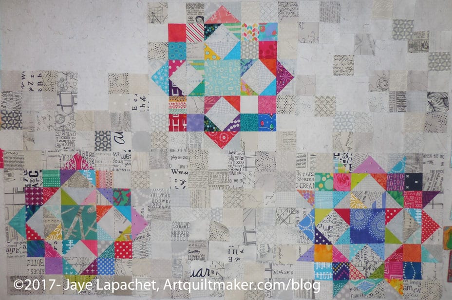
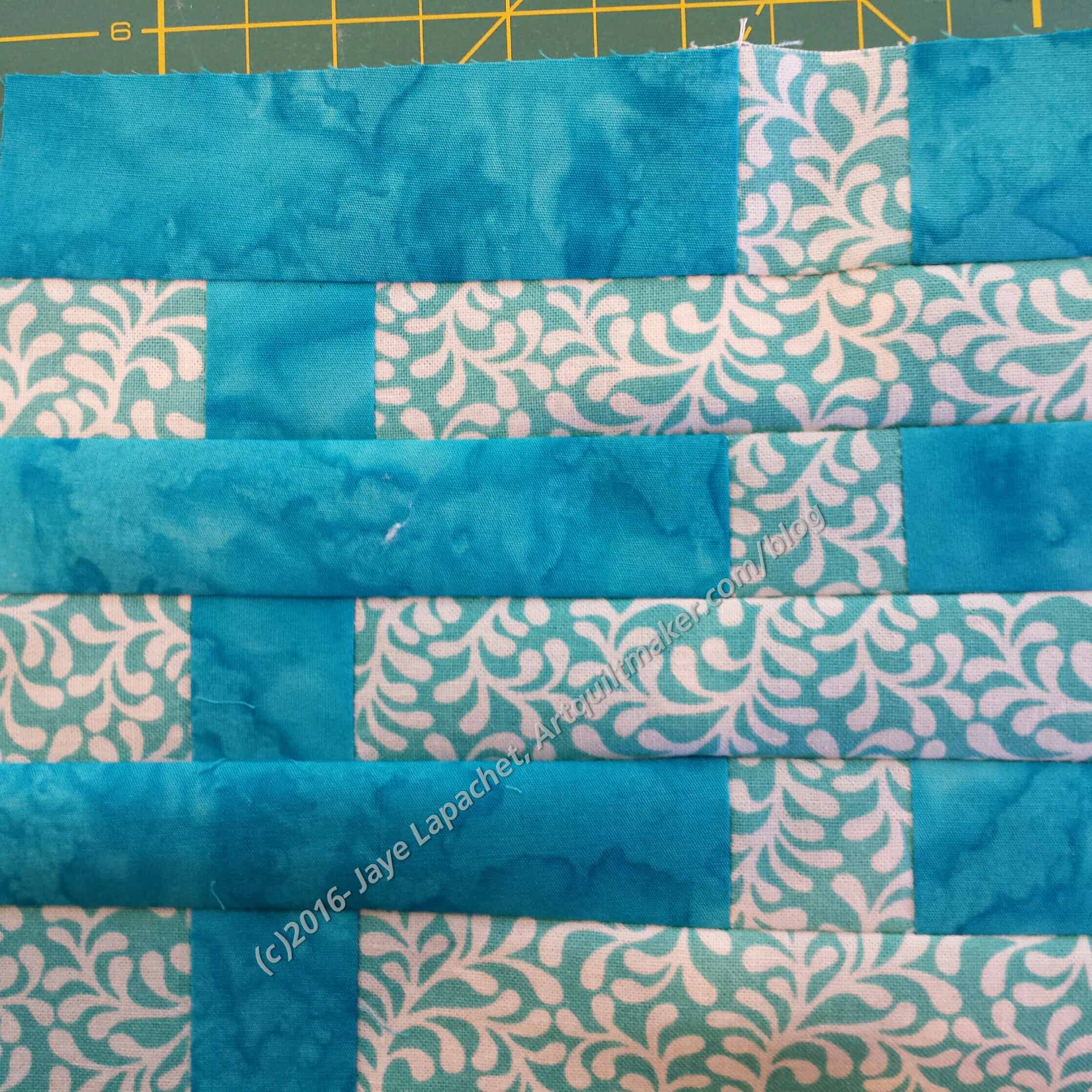
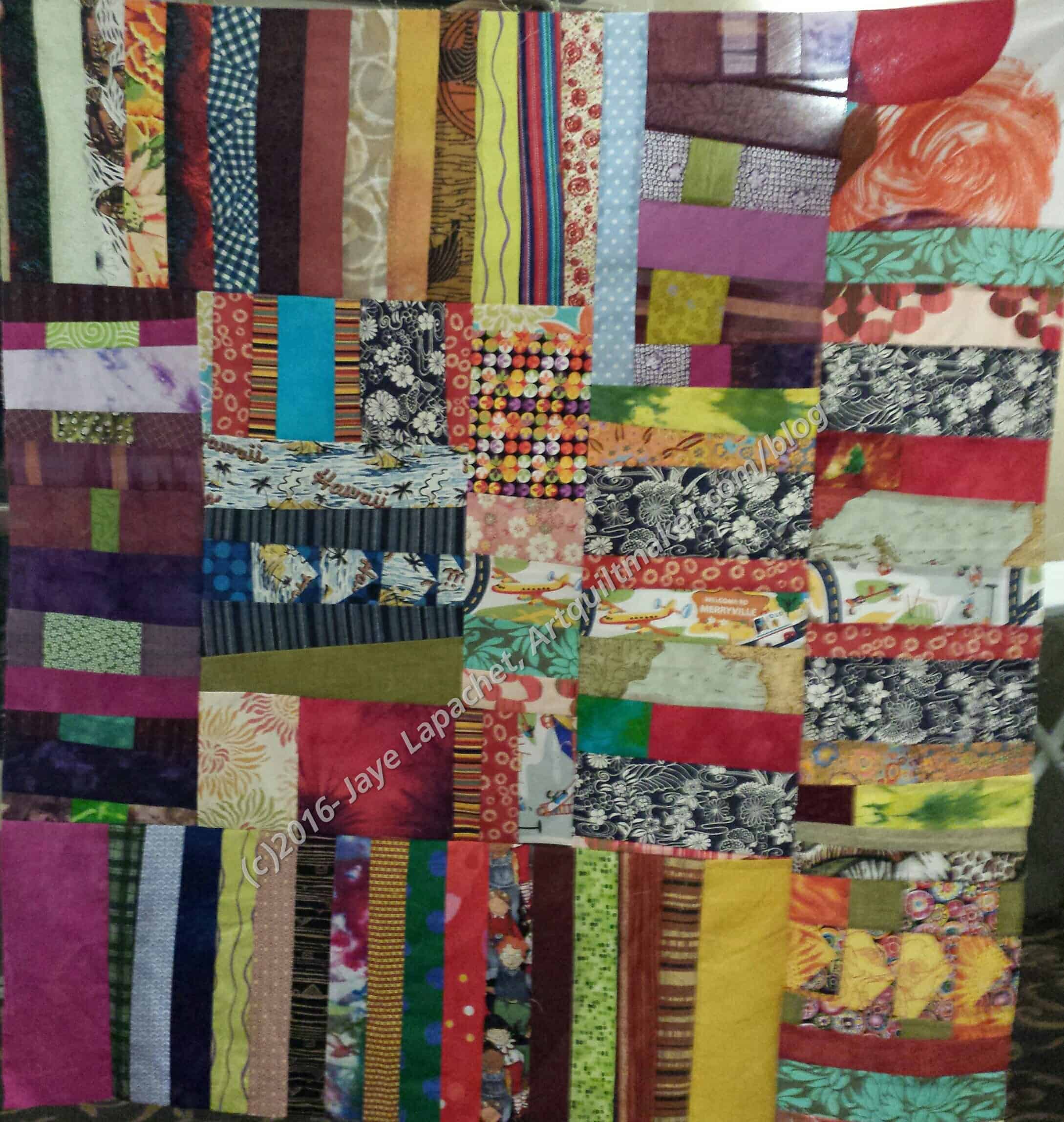
I have felt tense and uptight as I worked through The Peacock. Mostly, I wanted the piece done and off the design wall so I could move on to something else. I was having a hard time giving myself over to the process. I talked a little about working on too many projects at once, trying to make sense of it. Stopping that, and finishing a couple of tops by a self imposed deadline helped a lot. Feeling tense and uptight does not make for good work. After The Morass, I tried to focus on the piece. First, I thought about what I was trying to achieve. Second, I thought about whether I wanted to finish it; whether it was worthwhile. Third, I recommitted to the piece and the process. For me, this was a glimmer of grace.
Bloomston writes “grace comes from not only being filled with purposefulness and spirit as we work, but also enjoying the moment and being present with the process” (pg.42). Of all she says in this spark, this hit me the hardest and has a lot of meaning for me. I often think about what is next, leaving the moment for the future. This makes moments go by unnoticed, which is sad. My interim talk with myself (above) for the Peacock helped me to find the purpose in the piece and be in moment as I worked on it.
I am still trying to get a firm image of grace in my mind. Bloomston provides several metaphors which inch me closer. “Grace is the hinge between effort and effortless. There is a moment in our creative flow in which we are utterly absorbed, content, focused, and present with the moment and everything in it” (pg.42). This is the place I strive for. I do think, however, that we can get snatches of it within each project when the stars align, but that actions we take outside of each project, though including each project help make those moments more and more frequent. For example, how we tidy up, where we find that one scrap we need, etc.
There is also an element of coats in this spark. “I told her that I was afraid to design my first line of fabric (and write my first book) because everyone I spoke to said it was hard when they did it. She looked at me, with her water-clear blue eyes, and said, ‘That’s their story-their experience: Each time someone tells you her story, you put it on and wear it like a coat. Many of those coast don’t fit you and yet you are wearing them. Why are you wearing everyone else’s coat?” (pg.42). This is amazing! How much do we not do because someone else had trouble with it? This reminds me of some of the technique tutorials I have in my quilt sampler class. I worked hard to show how to do Y seams, how to do machine applique’, how to put hexagons together and many other techniques. *I* feel these are valuable and can help when one wants to make a vision into a quilt. So often I hear that they are too hard so the quiltmaker won’t try. I suspect she has heard from her friend, who heard from another friend that Y seams are too difficult. Wear your own coat. Figure out your own story.
Like others, this spark has some worksheets.
Nota bene: we are working through Carrie Bloomston’s book, The Little Spark. Buy it. There is a lot more to each spark than what I am writing and the original chapters will help you. Go buy Carrie Bloomston’s book, so you get the full benefit of the fabulousness! You can see my book review, which is what started this flight of fancy. Also, take a look at Carrie’s website.
You can find the last spark on the blog about a month ago.