Update on Serendipity Puzzle


Here is my last try at figuring out which fabrics to use for the sashing. I decided against the larger print background fabric. The background of that particular fabrics is not as bright as the background on the others. Also, the motifs are so big that they mostly got cut off.


Once again, I am trying to sew it together in chunks (rather than rows) to keep the piece straighter and more manageable.


Essentially, I have two more seams to sew to get this baby done. I can’t avoid them being long seams. Of course, there is the border. I, also, already started the back.

Pineapple Class Review

The class was great.

I had enough dots, but could have used more.

The Pineapple Ruler is totally worth the money.

The above photo shows how to place the ruler to cut the pieces. No foundation.

Here are the blocks that I made:


This is how my one block looked after a couple of rows.

This is how my two blocks look now. I have two more rounds to go: I have to put some strips on the corners and one triangle on each corner then each block is done. I should have cut the strips in advance, so I would have had more sewing time, but I didn’t have the time, so the point is moot.


This is the teacher’s, Katrina Lampken, quilt. She did a nice job teaching. She a little background on the Pineapple block. She talked about different ways of making it and why she liked this method. Then we got started. She was able to answer all of the questions. She was really mild mannered, but go her point across. It was a great day.

These are some of the other student’s work:


Sue

Barbara from San Ramon (we were dot sisters)

Laura worked with gradations

Not Enough Dots?

The Pineapple class, about which I have been talking on and off for the past week, is today. I began packing my supplies and materials and got into a panic that I don’t have enough dots in enough different scales and colors. I want to have a wide variety to provide interest. I rummaged through everything to find more and came up with two that I had washed last week, but needed to be ironed. I ironed them, but the stack still looks pathetic. One of them is a Michael Miller fabric similar to the one below, but with more of a sky blue background than the soldier blue depicted below.

I hope I am just having the last minute jitters and really do have enough fabric.

Critters on Etsy


I saw these plush critters on Etsy. While I like the “wild abandon design,” I also like the color choices. The red and blue critter doesn’t look too Fourth of July-ish and the pink and green is just the right shade not to be too preppy. I am also enamoured with the stitching. I have often struggled with how to put stuffed items (mostly pillows) together and have them look good. This London artist does it very well.

Make Visual Decisions Visually: Serendipity Puzzle

That is a quote (without the Serendipity Puzzle part) from Lorraine Torrence. It is a great ‘rule’ to remember, at least for me. I find that the picture in my mind’s eye often looks better in my mind’s eye.

To that end, I cut some sashing pieces to try and figure out if I was on the right track.


This example was my original idea for the sashing. I am not fond of it, but it is also not terrible. It looks busy and is not restful. Not sure if this quilt can be considered restful in general, but I certainly don’t want to add to the excitement. I may have to sew some pieces together to make sure this is not the right sashing design before I decide.


To me, this screams “look at the cross.” I think the contrast between the light background and dark sashing does not add to the overall design.


Think, so far, this is the best, which surprised me. It gives some space to each block so you can see the design and alleviates some of the busy-ness. I would put pieces of the three different lights instead of just the blue on white.

Pineapple Homework cont’d

I worked, yesterday, on selecting fabrics for the Pineapple class, which takes place next Friday. These are the fabrics that I have selected so far. As I looked through my dot fabrics, I felt like some were missing, but couldn’t find any others, so I guess I just have the impression in my mind that there are never enough dots! I am pretty happy with the selection, but am still contemplating whether or not the dot sizes are too similar and whether the colors are too similar in value.

In this selection, I didn’t include any of the Fusions fabrics by Robert Kaufman, but am considering adding some to add a little motif size interest. Some of the colorways are very light, however, so if I do add them I need to take care. I don’t want the background to bleed into the foreground creating visual confusion. I can certainly bring them with me, so if I need them I will have them, but if not, no harm done. Opinions are welcome.


Ignore the checkerboard, as that is my ironing board cover!


The two pictures above are the same group, so you will see some overlap (e.g. the red).


Value too similar? I might have get rid of the red one in from the right as it seems to read as a solid.

Preparing for Pineapples

I have wanted to make a Pineapple quilt for a long time. With that thought in mind, I have collected various patterns and foundation papers, thought about fabrics and discussed the project with St. JCN. I have also seen some beautiful Pineapple quilts, such as these:

This one was shown at the Marin Needlearts Guild Show a few years ago. I don’t know the maker, but if you are the maker, I will be happy to post your name here.

I don’t remember where I saw this one, but I like the way the maker used black in the actual pineapple blocks and I also LOVE the border. The use of the the black and white print in the border is also very interesting. It reads as grey, but works with the red-orange.

On a whim (talk about impulse shopping!), I signed up for a Pineapple class using the Positively Pineapple book and ruler. It will be held at Black Cat Quilts in a few weeks. This is not the method that I intended to use to make the quilt, but it will give me an overview of this technique. I have long admired quilts made by Lynda Milligan and Nancy Smith, so this will also give me an overview of their patterns.

I have a lot of preparation to do for the class, but have already started. I bought the book and borrowed the ruler from St. JCN. Now I need to gather the fabric. I will use dots again. I am not done with dots and have plenty that I can use. I have decided to to dots with white backgrounds for the “background.”

These are the dots that I have decided on so far. I have enough of each of the fabrics in the group to use for the entire background, but would like to add to the group. The one on the far right is still a maybe, but seeing it with others gives it more of a chance.

Thinking More About Solids

I read a bit more of the Amish-Inspired Quilts book. One thing I noticed, as I was reading, was the picture of the quilt, Lorna’s Vine. You can only see a bit of it, but the thing that struck me is osmething that St. JCN and I discuss all the time: more fabric is beter than less. St. JCN has recently accepted that she prefers making scrap quilts with lots of fabrics. In this picture, the vine and leaves use many different solids, which adds a lot of interest to the quilt. Why in the world should a quilt be boring even if the fabrics are all solids? It shouldn’t. More fabric is better than less.

Piece O’Cake Amish-Inspired Quilts

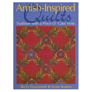
I often look through the Piece O’Cake books at stores, sigh and don’t buy them. I love Love LOVE the photos, the authors’ designs and the layout of the books. I would love it if they just wrote a book with photos of all of their quilts in it. I don’t like the patterns. I don’t need or want to make the exact quilts that they have made. My dear friend, JulieZS, author of High Fiber Content, gave me Piece O’Cake’s book Amish-Inspired Quilts: Tradition with a Piece O’Cake Twist.

Every now and then, lately, I have had a few minutes to sit and read, so I have started to read it. Normally I don’t do this with quilt books. I look at the pictures and that’s it, under the assumption that all the text is basic and repeats from other books. Thus, I was pleasantly surprised when I started to read Amish-Inspired Quilts. First off, I liked the way Becky talked about her sons in the dedication, but mostly I liked the way they talked about using using solid fabrics.

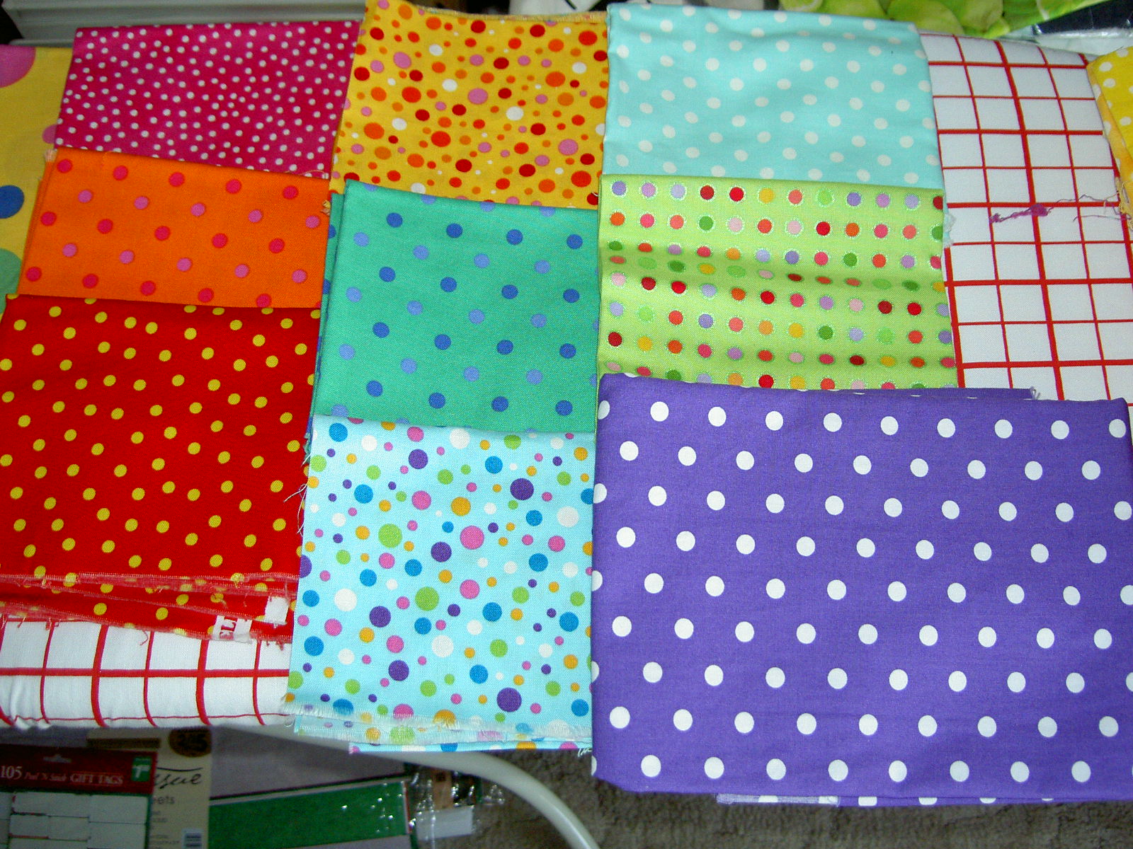
I used to use a lot of solids. I liked the simplicity and the depth they created in quilts. They can be a bit harder to use if something doesn’t make them stand out. I have gotten away from using solids as I have progressed in my quiltmaking.

The authors say in the first section on color “These quilts feel bold. They often feel contemporary, which is a testament to their classic beauty. The design of the quilt itself is very important when working with solids. Solid fabric has no pattern–the visual texture is smooth. The riot of color that comes with prints, plaids, and stripes is not there. When you use only solid fabric in a quilt, each shape is clearly defined. The structure of the pattern is for all to see.”

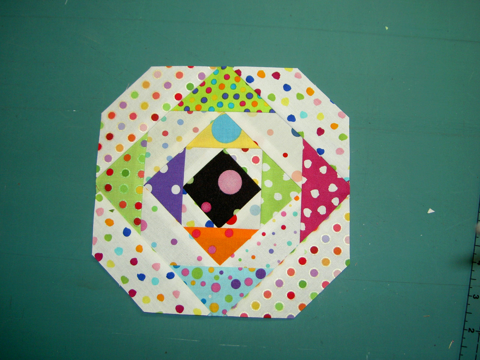
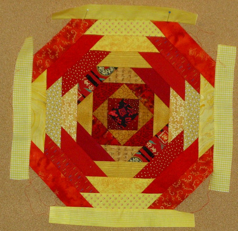
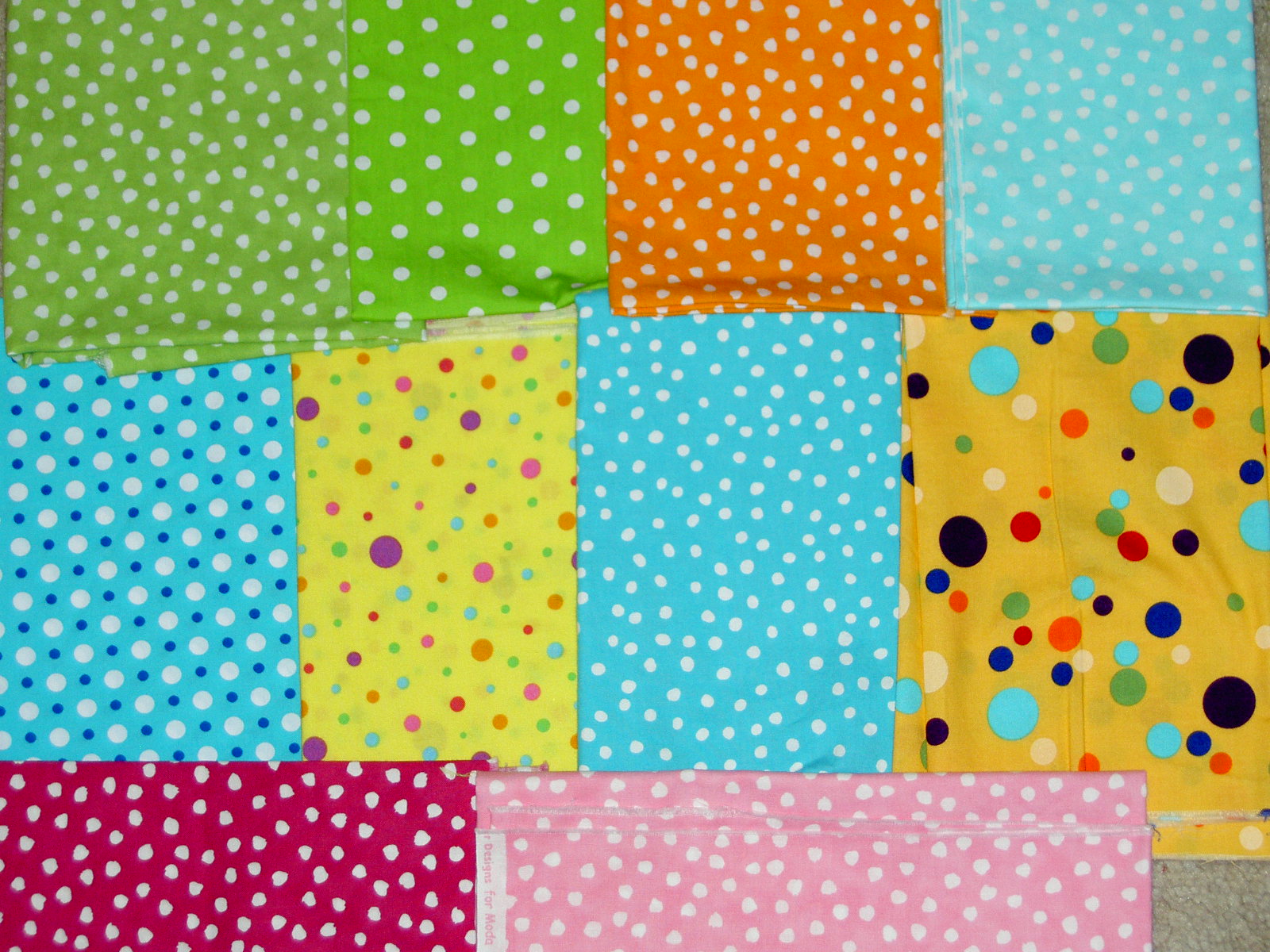
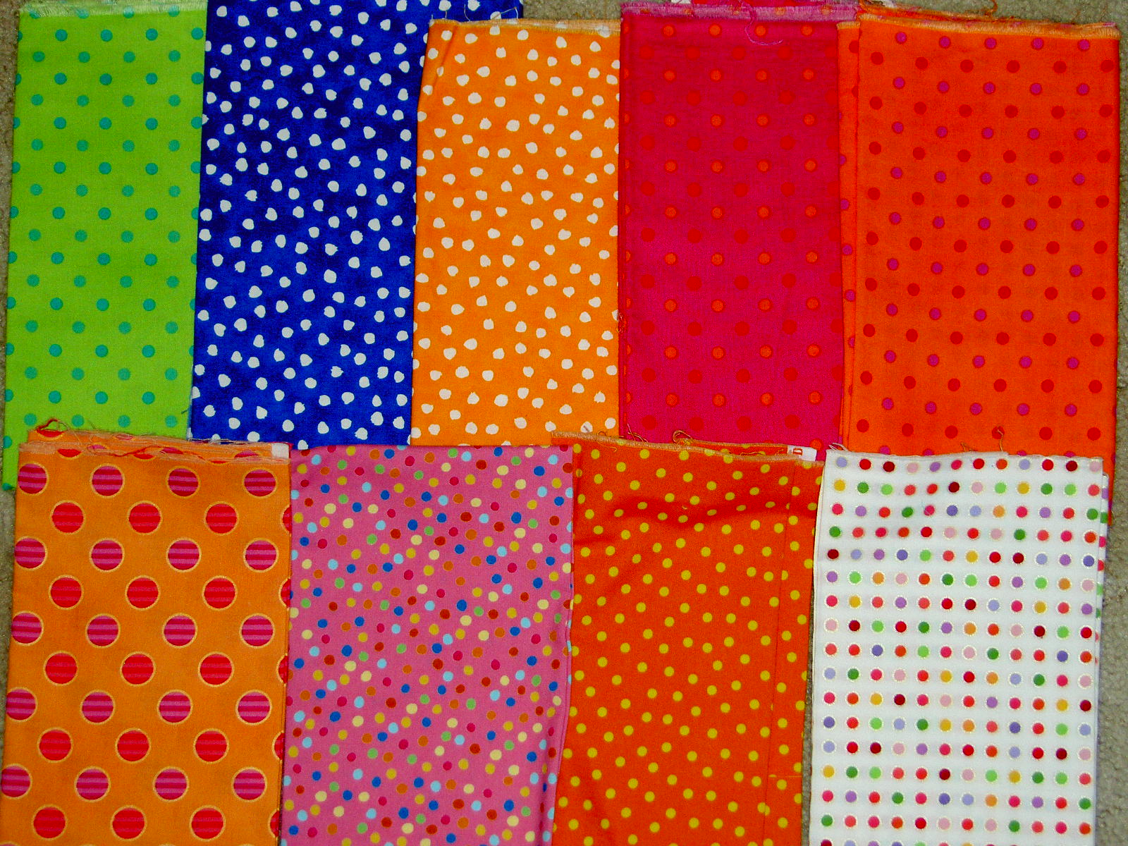
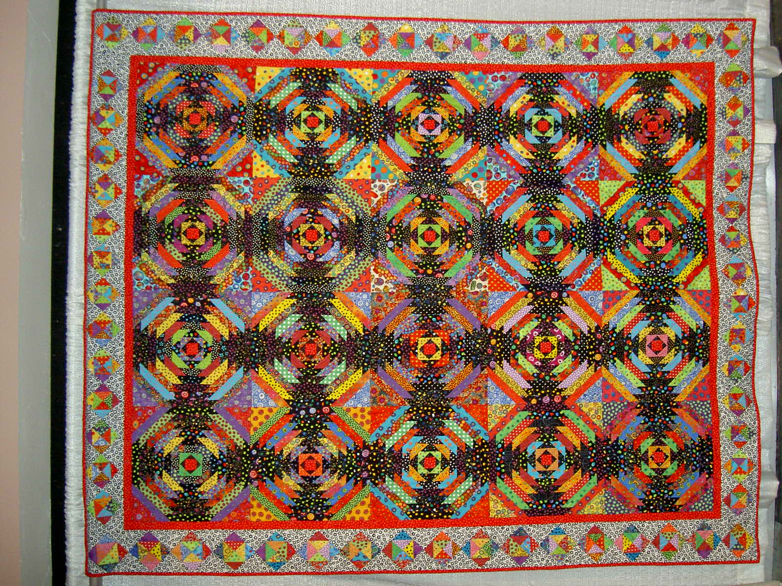
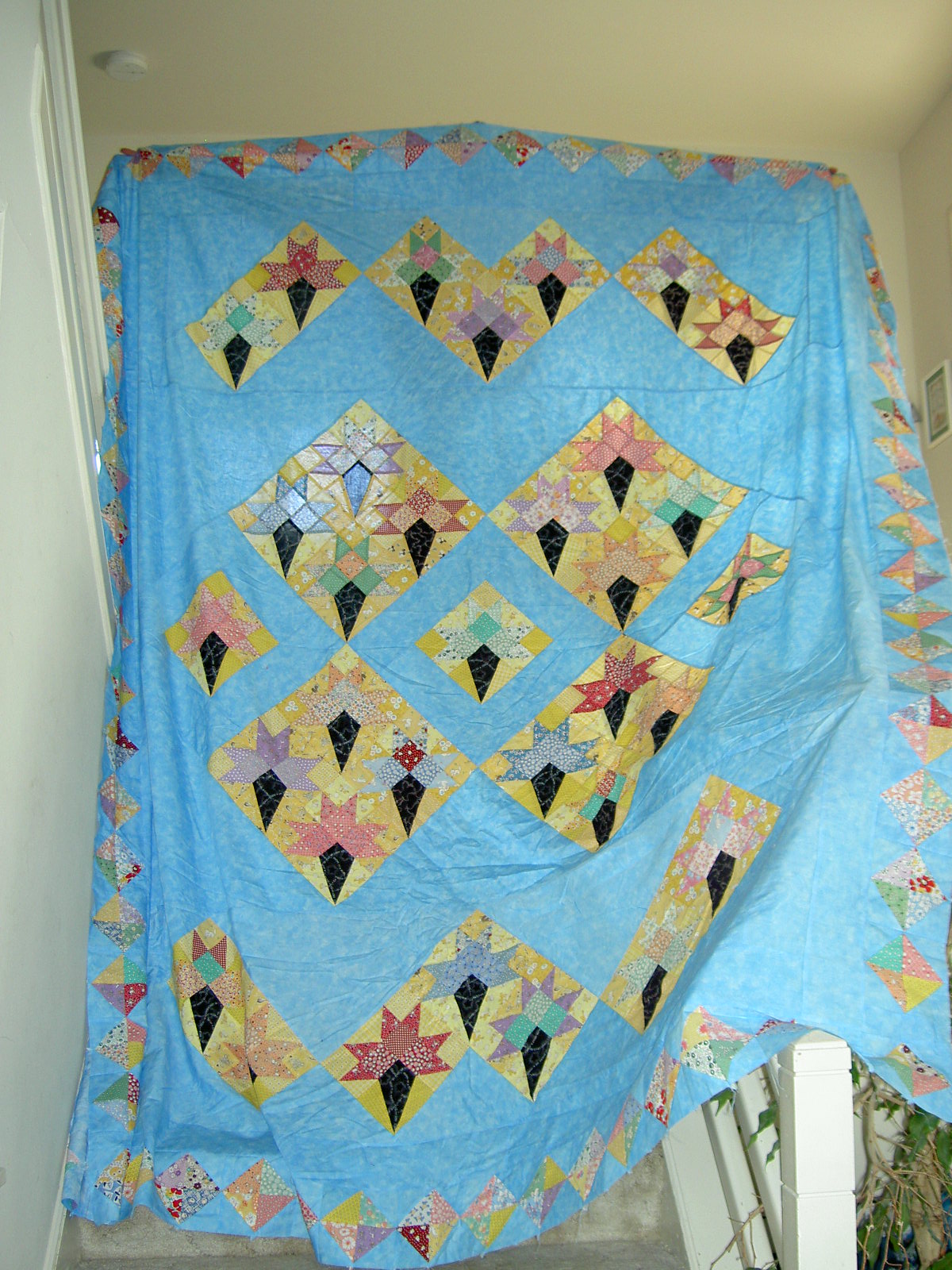
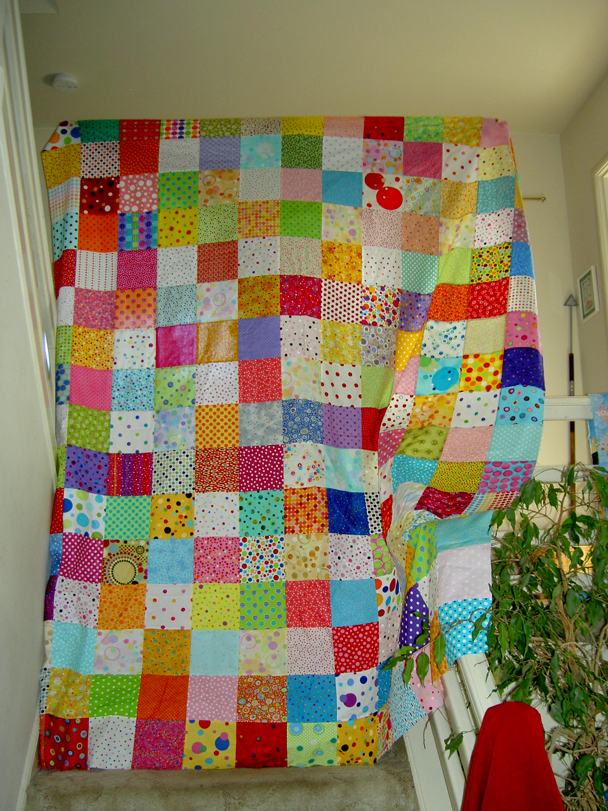
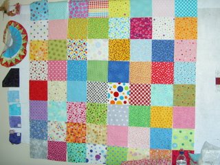
I had a strong reaction to the above statement when I read it, because when I used solid fabrics, I was trying to take out some of the many variables of quiltmaking, so I could understand it. As my skills improved, I got away from the simplicity. Perhaps, lately, I have been trying to regain some simplicity by using simple patterns. Consider Thoughts on Dots.

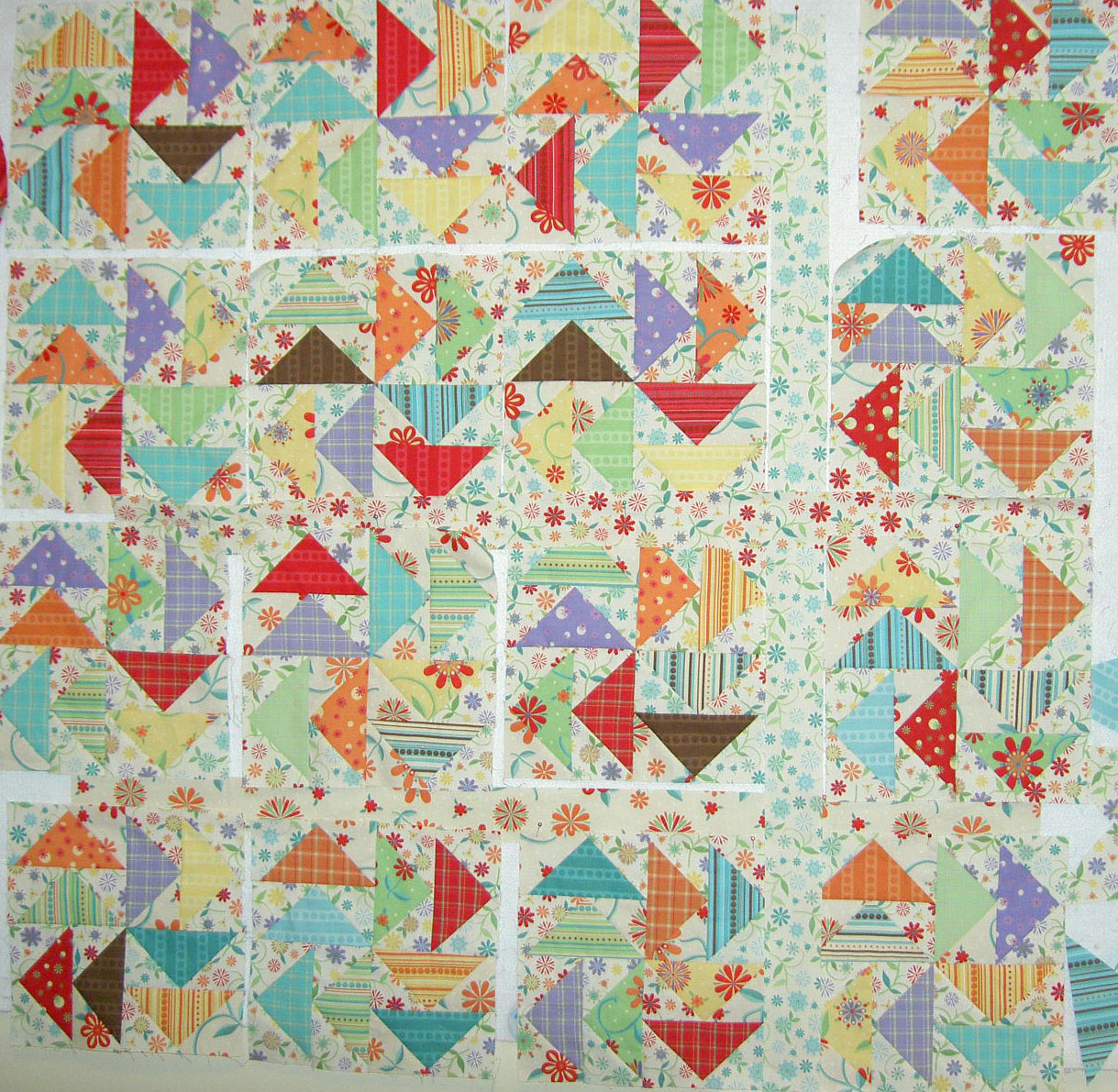
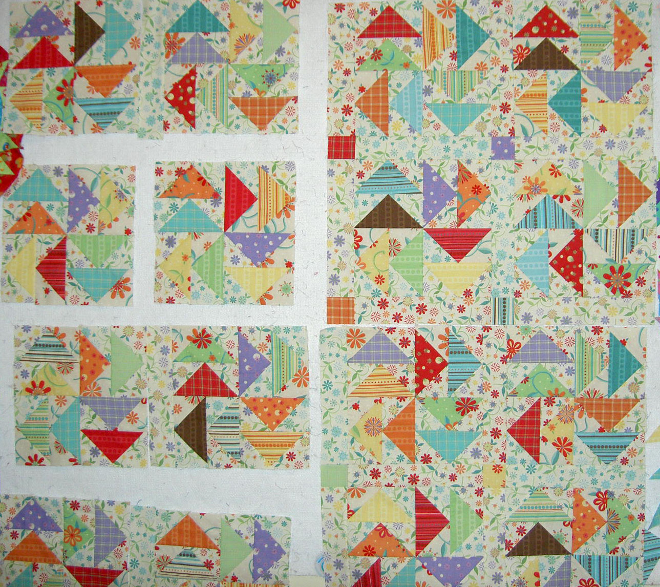
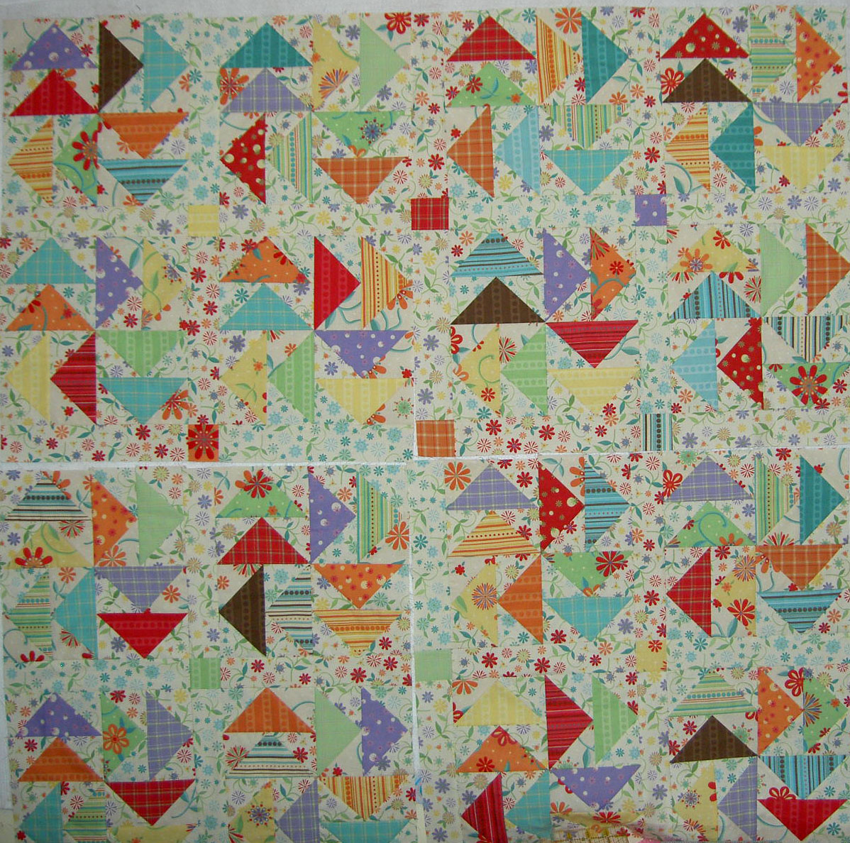
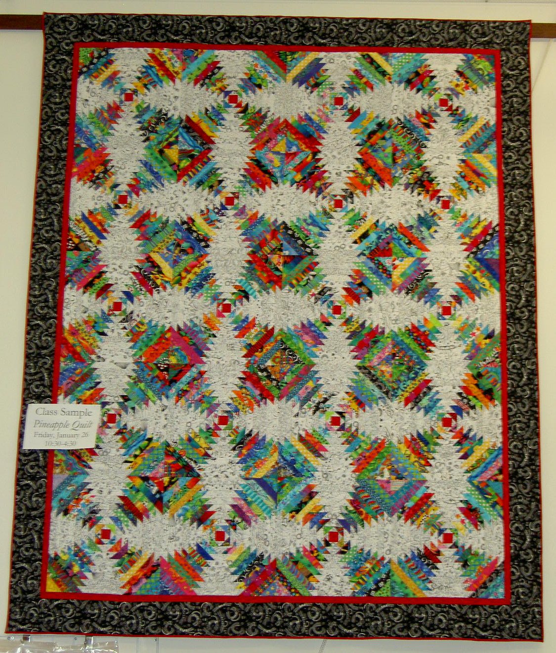
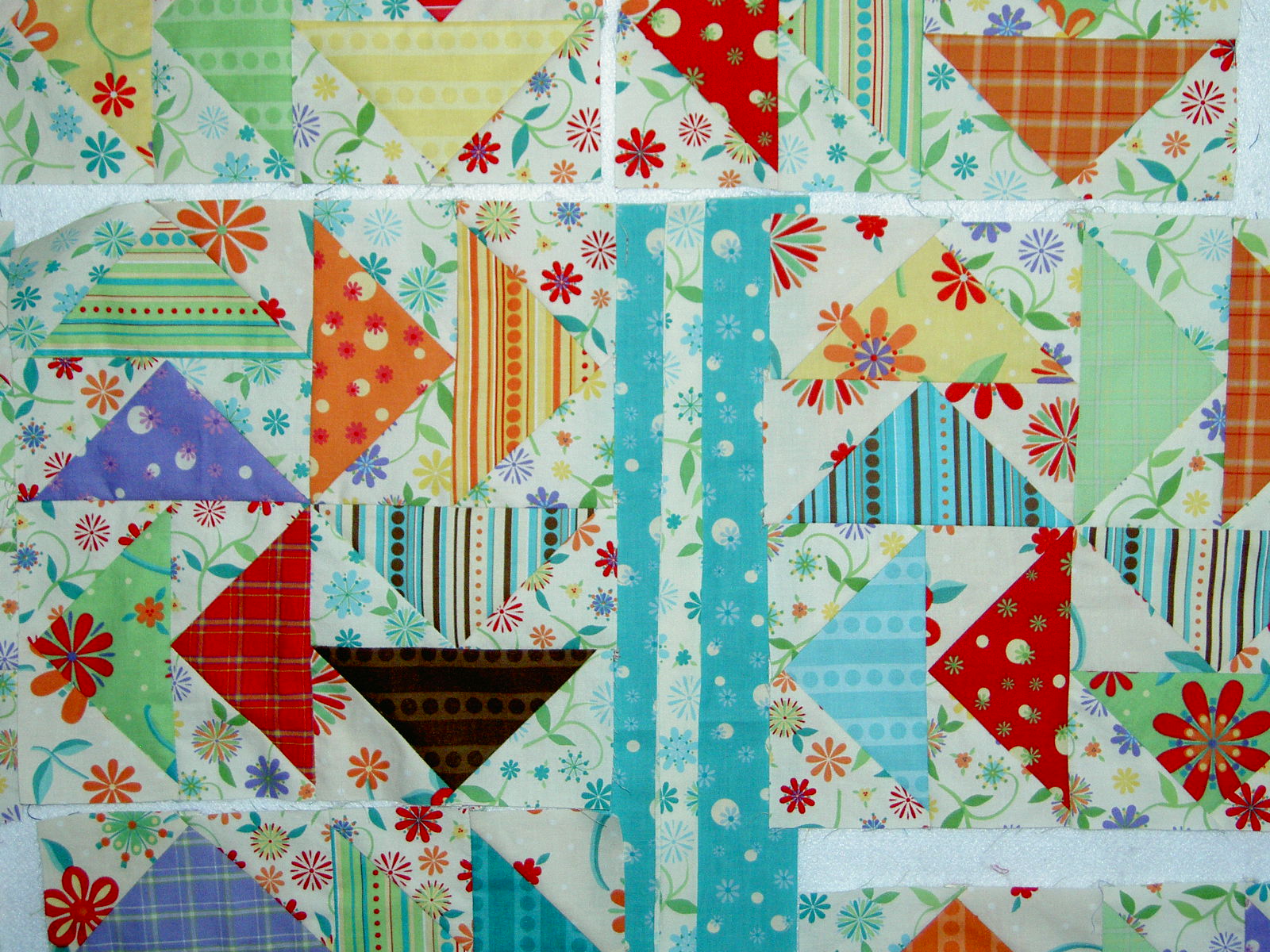
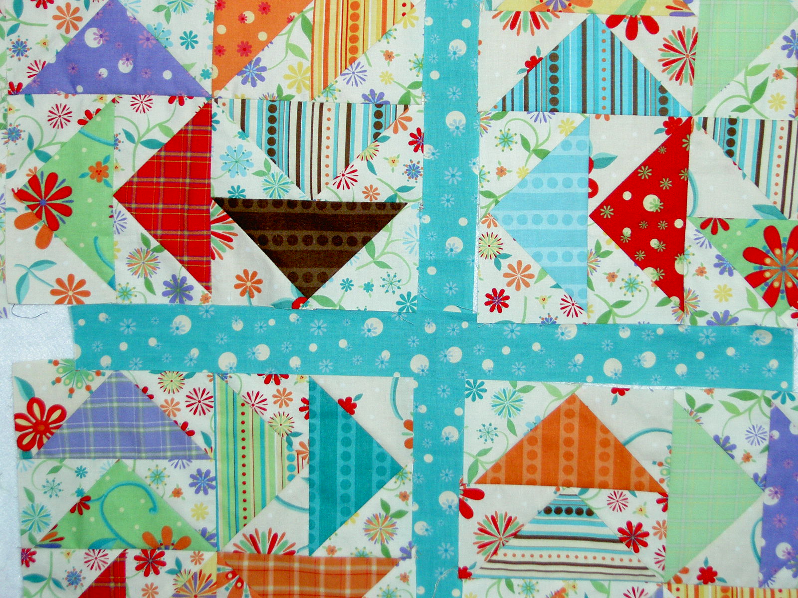
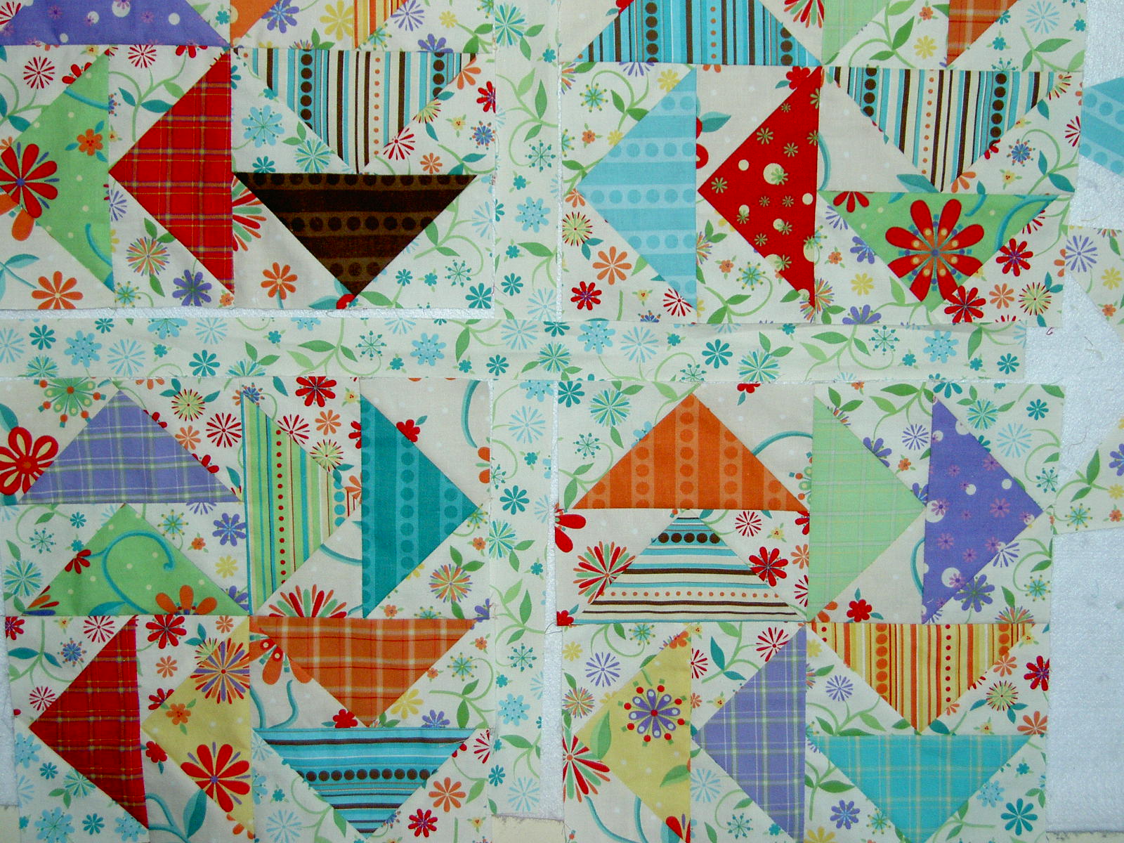
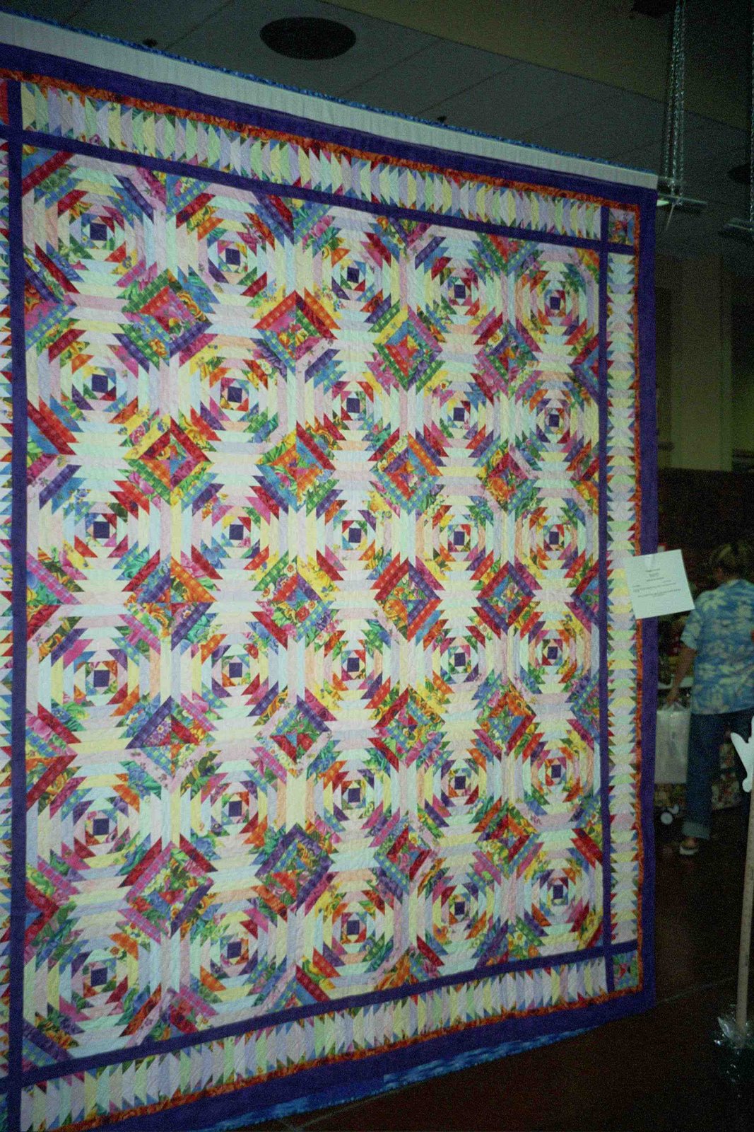
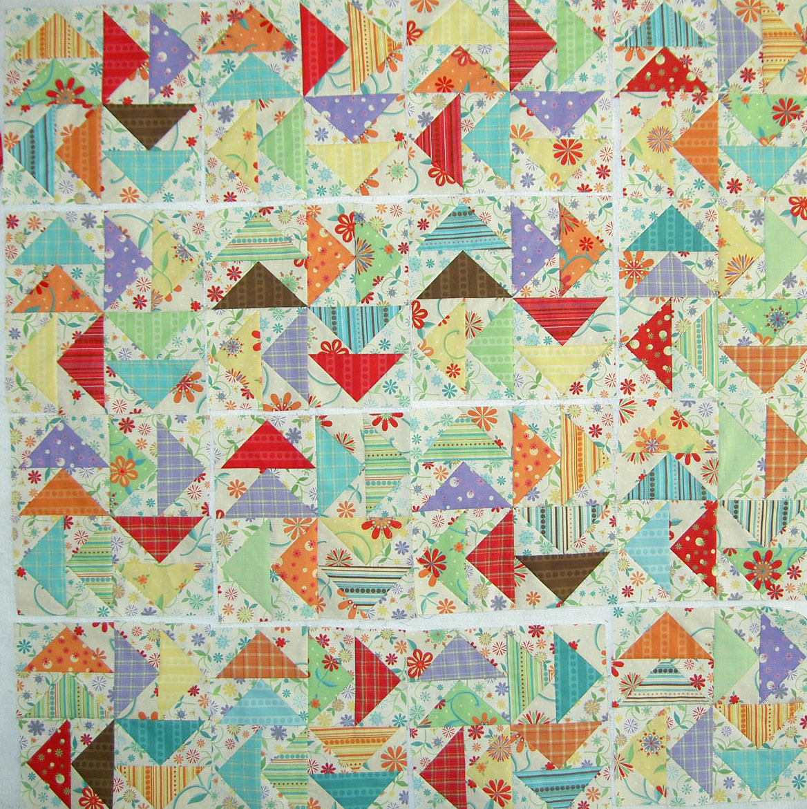
From squares only, I have made it back to triangles with Serendipity Puzzle, but now I wonder if I didn’t go far enough into simplicity. Should I have tried squares and solids? We’ll see. It is never too late.

More Inspiration


This is a group of vases of flowers I saw today at the Ritz-Carleton in San Francisco. It was a wintery arrangement, but not grey or depressing. I like the different heights of the vases and the flowers. I also liked the ingenious use of the citrus branches.


More tulips! I love them, but never grow them.