Revisiting Projects: Peacock Blocks

As I said yesterday, I finished the binding and back of the Food Quilt #3 and it is ready to go to the quilter. The top was already finished. I was trying to decide what project to work on next when I realized that I wanted to look at the blocks and projects I had been working. I started putting all of the projects up on the design wall and taking a look at them.

Pulling out a bunch of projects and putting a zillion blocks up on the design wall is a lot of work. I am exaggerating. None of my projects have a zillion blocks, though the Peacock and the Octagon 9 Patch do have a lot.

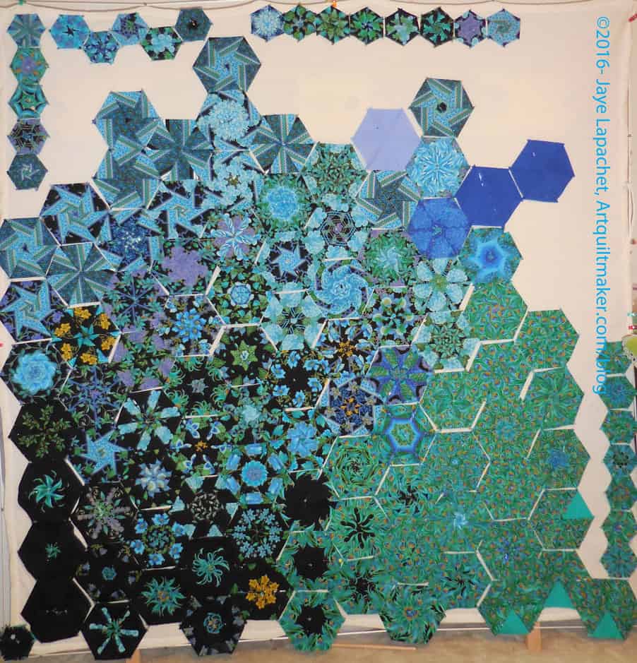
Peacock - July 2016
Peacock – July 2016

I could spend all week going through the projects with you until I made a “big reveal” and told you what I would work on, but I think you should know immediately that the Peacock blocks excited me most when I put them up on the wall. I am not sure why. Perhaps my eye is liking the dark colors?

I also realized that this is the first time I have seen these quilt blocks on the design wall.

The above photo shows a pretty raw layout, but not terrible either. I am still in that gradation mode, so I put the darker blocks towards the bottom. I don’t have a lot of the small blocks, so they will make an asymmetrical border.

I only have a couple of solid blocks, which I talked about adding as tests. The lavender definitely doesn’t work in the current location. I kind of like the way the top of the quilt (without the small border blocks) is not straight. That begs the question of what I would put to make the edges straight. I am definitely not making an edge like that.

My other immediate thought upon stepping back was that the gradation was nice, but that blocks needed a bit of space between them. I might be backing off that thought, but I will put some black behind and in between the blocks to see.

This quilt requires more work, so I may quilt one of my projects while I look at it, try things and rearrange.


Finished: Food Quilt #3 Top & Back

There was a Sew-in this past weekend (4th of July in the US) and I spent most of the time working on the finishing aspects of the Food Quilt #3. I finished the binding on Saturday and the back on Sunday. Even though I have other projects on which to work, this felt like a coup.

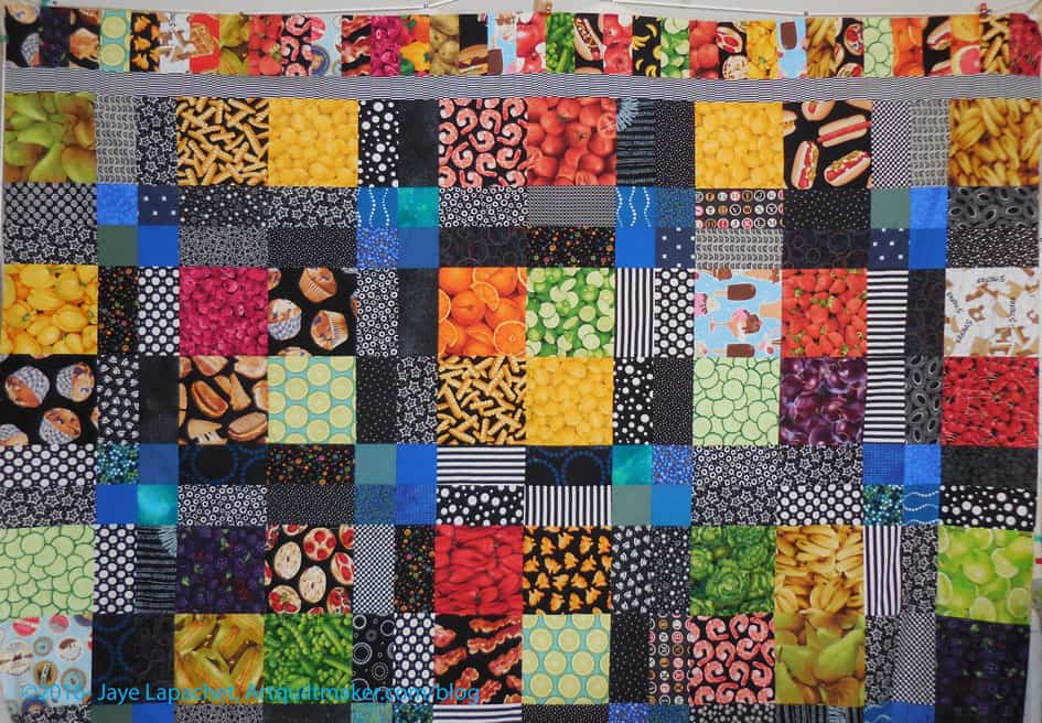
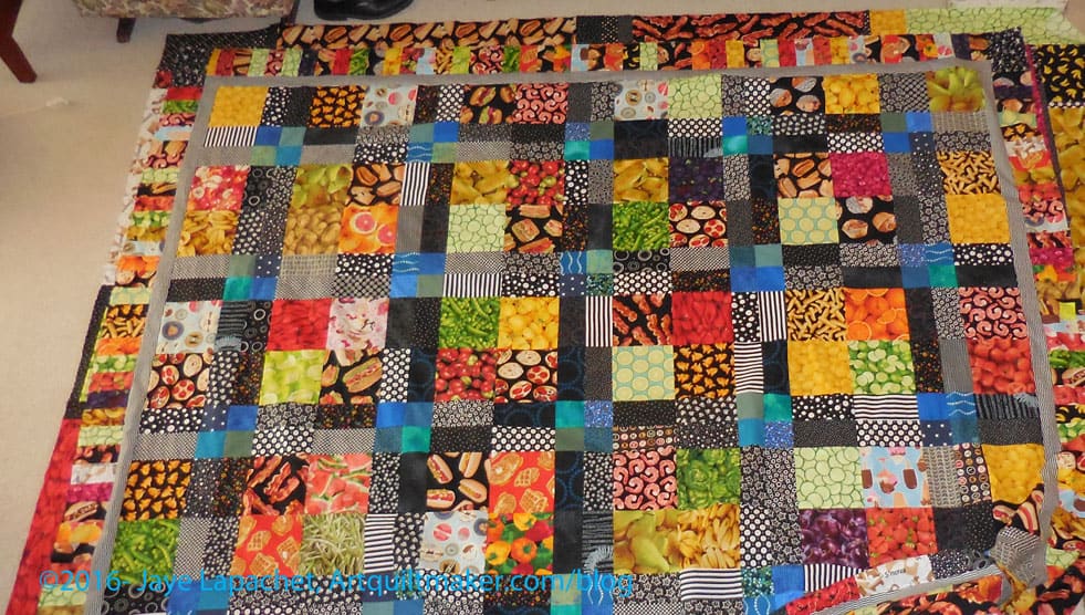
Food Quilt #3: Finished top

The piece is about 101″x 86″. Yes, it is huge, which means that I don’t have a full picture of the top or back. The YM was gone, it was cold outside and I don’t have a room large enough to lay out the back or top. The above photo is part of the top with a bit of the back peeking through.

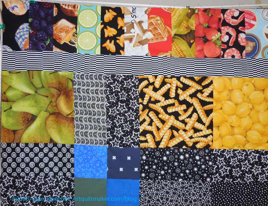
Food Quilt #3: Finished back

Of course the back is larger. Again, I have shown you only part of it due to the size.

I am pleased that this is done and will see about getting this and FOTY 2015 to the quilter soon.

Machine Applique’ for Directional Motifs

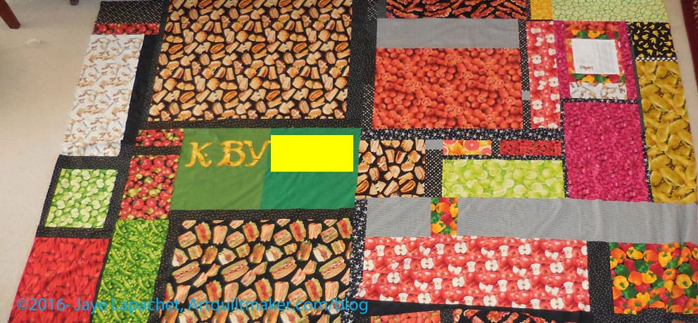
In my previous machine applique’ tutorials, I used designs where the direction of the motif didn’t matter. When I went back to review the tutorial (yes, I do use my own tutorials!) in preparation for doing some machine applique’. I was preparing to applique’ letters, which have a definite right and wrong way. I realized I had omitted directions for using directional motifs (where the direction of the motif matters, such a numbers or letters) for applique’, so I had to figure out how to do them again.

In order to understand this tutorial, you will need to look at How to Applique’-TJW and the 3 Fusible Applique tutorials (pt.1, pt.2 and pt.3). All of these are part of a whole.

Supply List:

Draw out design on a piece of drawing paper
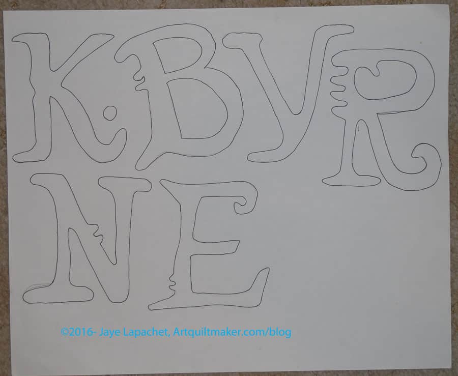
  1. Draw out your design. I used a pattern for the letters I wanted to applique’. You can draw or print your design. There are a lot of free clipart you can use. Since I had a pattern, I laid out the pattern, placed a piece of drawing paper over the letters I needed and drew out the design using a pencil.
  2. Trace over the pencil lines you used to trace the design with a Sharpie. The lines should be dark. Make sure the Sharpie does not bleed through to your table.
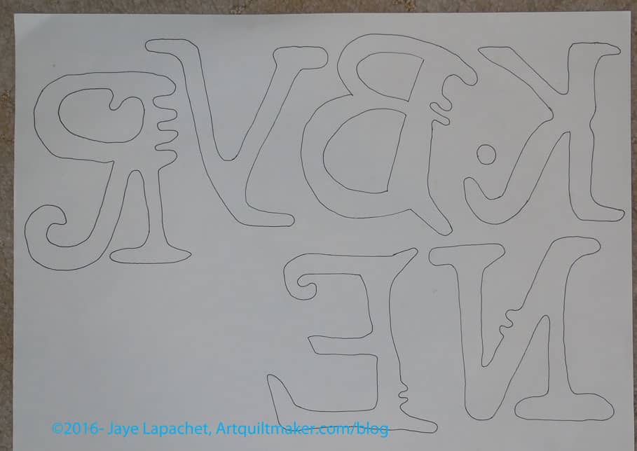
  3. Flip your drawing paper over and put it on your light box. You can also tape it to a window or sliding glass door. The wrong side of the letters or directional motif will show through.
  4. Directional motifs backwards on drawing paper
    Directional motifs backwards on drawing paper

    Using your Sharpie, trace the letters again on the wrong side of the paper. You will be tracing the backwards image of the letters.

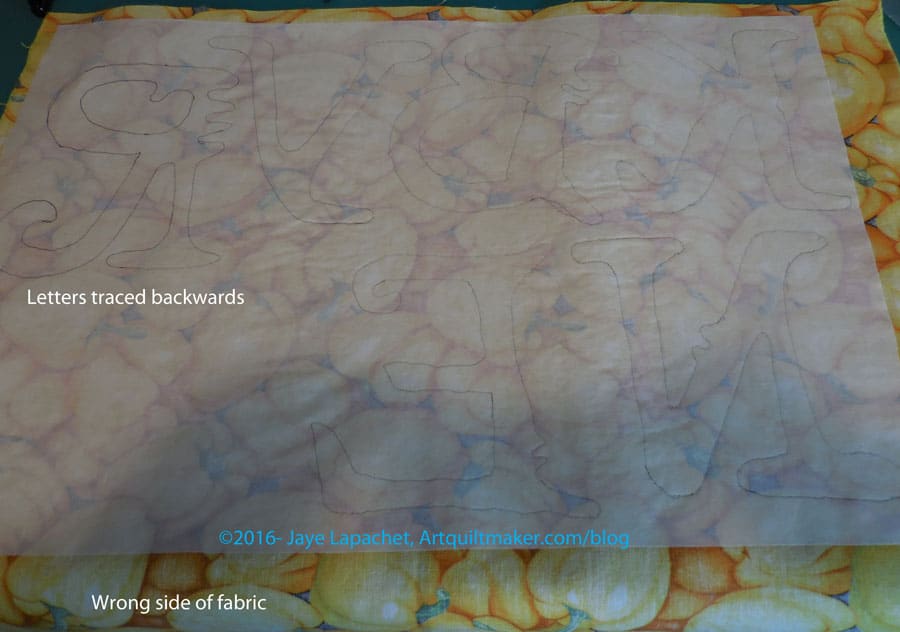
  5. Leaving the paper taped to the window (or laying on the light box), tape a piece of paper backed fusible, paper side UP, over your design which is on the window or light box.
  6. Trace the backwards design on to your paper backed fusible using a Sharpie. **Nota bene: my Sharpie tended to smear on the paper of the fusible. I couldn’t find a pen that worked well, so be really careful to keep your hand out of the way to avoid smearage.
  7. Once finished, remove everything from the window or light box.
  8. Place the fabric you will use for your directional motifs right side down on the ironing surface. The fabric should be sized slightly larger than the fusible.
  9. Place the fusible on top of the fabric with the paper side up. Make sure no edges are over your ironing surface.
  10. Place your applique’ pressing sheet over everything.
  11. Press according to the directions on the fusible package.
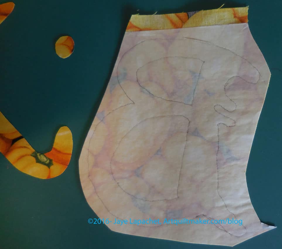
  12. Fusible pressed to fabric
    Fusible pressed to fabric

    Once you are finished pressing, you will have a piece of fabric with fusible on the wrong side. The motifs (letters) should appear backwards and you will see the wrong side of the fabric.

  13. Decide on which scissors you will use. I always have a fight with myself about this. I don’t want to ruin my Ginghers, which are super sharp and great for cutting out detailed types of designs by using them to cut through paper. I also don’t want to ruin the edges of my motif with a pair of papers scissors that will not be sharp enough to cut through the fabric. I have a pair of Fiskars that I end up using for this task. Not ideal, but the best I am willing to do.
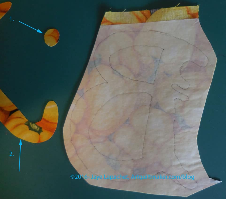
  14. Cut out directional motifs
    Cut out directional motifs

    Once you have decided on scissors, cut out your designs (letters, in this case). First I do a rough cut, then I cut with more detail.

    Cut out directional motifs - detail
    Cut out directional motifs – detail
  15. Layout your background fabric on a flat surface, right side up. I use my ironing board, so I don’t have to move the motifs in order to press. If I have to sew two pieces of fabric together to make a large enough background, I press the seam open.
  16. Take each motif, one by one, and peel off the paper. Carefully place each prepared applique’ motifs in their desired location before moving on to the next one. With motifs such a letters, I use a ruler to make sure they are straight.
  17. You should be able to see your design correctly. If you are using letters they should not be backwards and you should be able to read the word.
  18. Place your applique’ pressing sheet over everything.
  19. Press your applques so that they are stuck to the background fabric.
  20. Set up your sewing machine with the correct colored thread and a foot suitable for zigzag or satin stich.
  21. I set the zigzag to 3.5 (width), 0.7 (density). I like my satin stitch to be a little open, but you can adjust it to your favorite length and density.
  22. Cut a piece of tearaway the width of your motif and twice as long
  23. Fold the tearaway in half.
  24. Pin the double layer of tearaway to the back of the background fabric. Pins should be out of the way of the machine foot.
  25. Satin stitch all the way around each motif, carefully negotiating curves so the satin stitch looks smooth.
  26. Trim and/or tie off all threads.
  27. Tear away/cut away the excess tearaway stabilizer.

HOORAY! You did it!

FOTY 2016 Overflow

FOTY 2016 - Late June
FOTY 2016 – Late June

I mentioned the other day that I haven’t had a lot of time to sew lately. I have had a few minutes here and there, which I have used to press and cut fabric. This means more FOTY squares. There are a few from various projects as well, but the bulk of them thrown together look a little depressing. I’ll have to do a load of oranges or yellows to ensure that FOTY 2016 isn’t heavy on the dark side. 😉

Creativity Color Inspiration

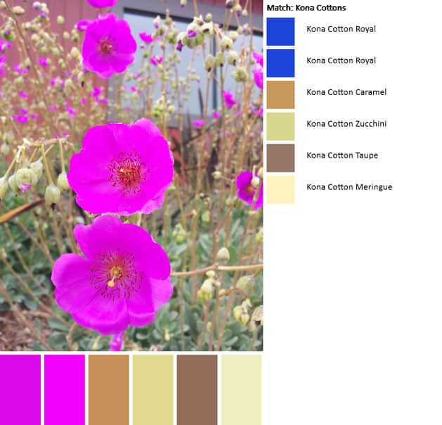
Color palette- July 1

I took this picture on one of my daily walks. This plant, which has become very popular as people convert to more water friendly gardens, is more and more prevalent.

The bottom of the plant is quite ugly, but the flowers are really gorgeous. This particular photo was taken outside of a restaurant where they have recently redone the landscaping. A large-ish area of these plants are in bloom and make the area look like a field of magenta.

Unlike previous palettes, I was disappointed in the outcome of this one. the neutrals seem ok, but the beautiful fuschia/magentas are not represented at all correctly.

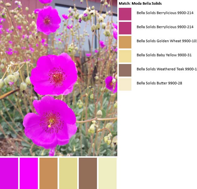
Color palette #2-July 1

I redid the palette, switching my option to Moda Bella Solids. This palette is better in that the fuschia/magenta tones are represented. However, the line must not have enough in that value range to accommodate the slight variations in color.

Finally, I pulled out my Kona color card and checked with my eyes. Indeed, the colors in the flowers are not adequately represented. Cerise (#1066) is close to the darker tones, but that lighter shade of purply fuschia is not included.

I find that playing with the PlayCrafts Palette Builder to be a fun and useful exercise. It really makes me look at the colors in a  picture and analyze them.

More on the Heart Bag

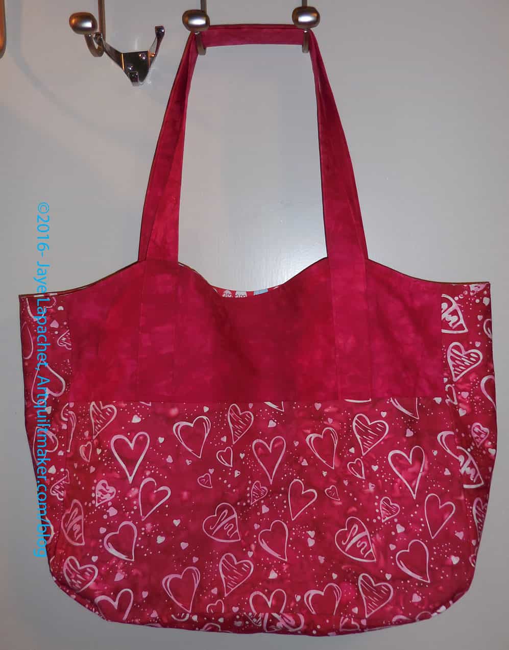
Heart Bag with Applique'
Heart Bag with Applique’

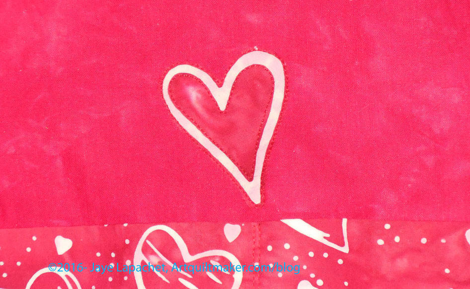
Right before we had to leave for the NDGW Grand Parlor, I decided the front of the Heart Bag needed something more. I didn’t have a suitable button which I have put on other versions of this bag. Finally, I decided (perhaps SIL suggested?) to applique’ a heart on to the front. I cut out one of the hearts from the scrap of fabric I had left. I used raw edge applique to sew it on and an Aurifil thread that matched pretty well.

Heart Bag with Applique' detail
Heart Bag with Applique’ detail

I don’t think the placement will be in the way too much and I sewed it very close to the edge to minimize fraying, though there will be some.

I am pleased with how it turned out. I think it breaks up the expanse of red just a bit.

The recipient really liked the bag, which was gratifying.

Progress on the Food Quilt #3

I have had very little time to work on the Food Quilt in the last weeks. I made some progress, as I reported mid month. I have made a little progress.

Food Quilt, top border

The other week I spent time putting 3 sides of the border on. I sewed the piano key border together while work on the donation blocks.

I was concerned that the black and white fabric I chose for the small internal border would interfere with the other blacks and whites, but I think it looks fine. Yes, that border touches the original blacks and whites, but since I didn’t use it in the original blocks, there isn’t much of a design problem.

Food Quilt Border fabric detail

The border fabric makes my eyes cross a little bit and looks out of focus in the photos. It has the distinct good quality of showing the seams where I sewed strips together to make them long enough to reach across the whole quilt. I didn’t have to sew the strips on the diagonal to hide the join.

So, yes, progress.

Dot Journal

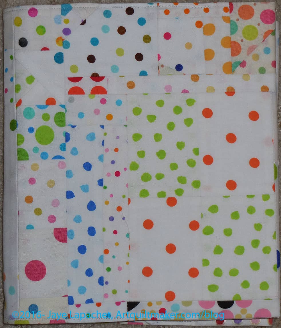
I was working on another project that required a different foot than the quarter inch foot. This made my ability to sew donation patches together with any precision limited. I turned to an idea I had since I made my last journal cover. I had hoped that the CVZ/Paris Journal cover would be more of an exploration of low volume prints with just one bright spot. It didn’t quite work out as I intended. I kept thinking on how to do it differently.

Dot Journal Cover
Dot Journal Cover

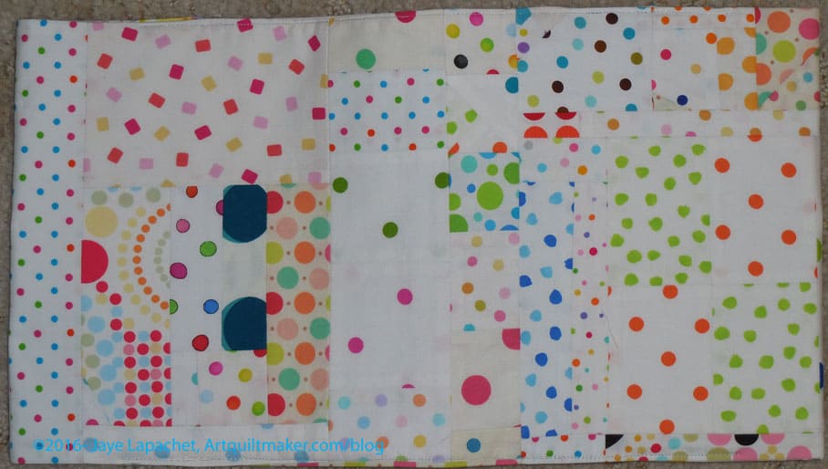
With these two constraints, I started sewing dot fabrics together. I was very strict with myself on the background and the fabric. I stuck to dots on bright white. I think I avoided any creams or ivory backgrounds.

Dot Journal Cover and Back

I was also very strict with myself on getting to the right size (top to bottom)- remember I use the Miquelrius journal #4— and then not being sentimental about cutting off nice bits of piecing. There is always more fabric, right?

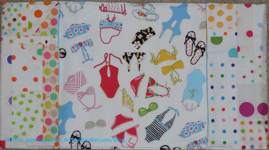
Dot Journal inside
Dot Journal inside

Finally, I used a fun print, that I probably won’t use for anything else, for the inside.

I am pleased to have finished something after so much work on the Food Quilt. This project is also very cheerful and I will need a new journal soon, so I am looking forward to using it.

BAMQG IRR

IRR - June 2016
IRR – June 2016

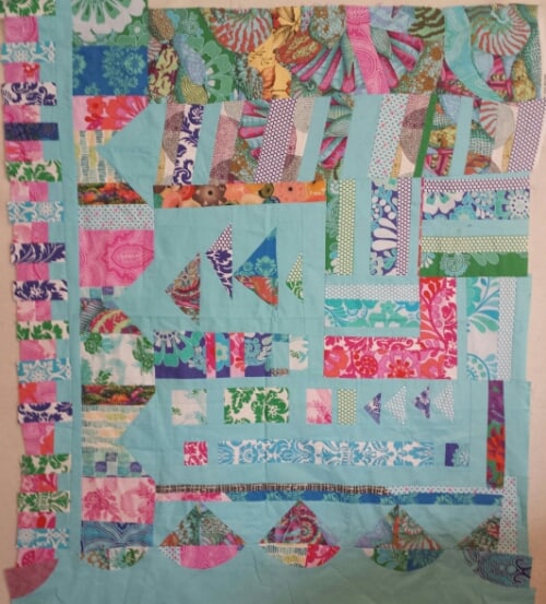
My Improv Round Robin has returned. Ruth had it for a couple of months because I wasn’t at the meeting last month and she wasn’t sure whether to pass it along.
She added the bottom part with the curves. It is an interesting addition.
I am trying to decide whether to try and get more people to work on it or whether I should just do some work of my own and finish it. I have some thoughts:

  • It needs some space around the edges. The outside top and right side might need some of the turquoise solid to provide some breathing room.
  • It is definitely not square and I need to figure out what to do about that, if anything.
  • I want to add more Flying Geese, which I will do myself. Perhaps I will add them on the right.
  • I am surprised that more people did continue the Flying Geese motif. The time constraints were daunting, however, so I understand.

I do need to look at it for awhile.

Feeling Better About the Heart Bag

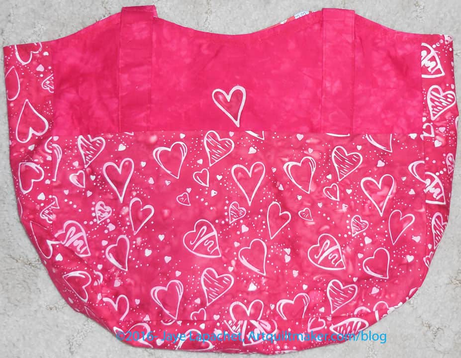
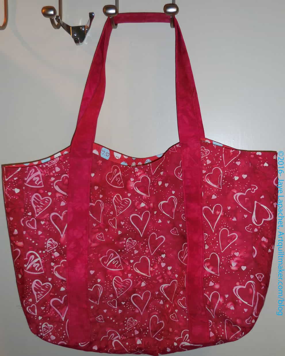
Heart Bag back
Heart Bag back

I finished the Heart Bag over Memorial Day weekend, but since I am friends with people who know the recipient, I decided not to post about it until it had been given. Also, I found out that DH reads my posts. I shouldn’t be surprised, but I was. He read the last post on this Heart Bag and questioned me (not in a bad way) about my whining. I had to explain that I was tired and things went much better after I recovered more from the NSGW Grand Parlor. There is a fine line between wanting desperately to sew and being too tired to sew.

Heart Bag: Finished
Heart Bag: Finished

So, the bag is finished and I am pleased with the way it came out. The ShapeFlex interfacing gives the bag some structure, which I like, though it can still be folded for easier storage. I love that stuff!

I think I felt especially bad about that twisted strap, because I made an effort to ensure it wasn’t twisted when I first sewed it on. I felt like a gremlin had snuck into my workroom and twisted it while I was looking away just to be mean and frustrate me.

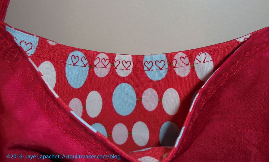
Heart Bag decorative stitch

I thought about leaving it, but didn’t feel right so I ripped it out (good time to focus on podcasts!) and now it is not twisted.

The pattern calls for the edging to be topstitched, so I used a heart decorative stitch. I like the heart stitch on my Janome 9000, but you know that story. The stitch on the DC5100 is much more substantial. The machine goes over the stitches a few times each. Not all of them came out perfectly, especially around the straps, but matters of the heart are never perfect.

I really like that heart batik. It has a good hand, doesn’t fray and the heart motif is not kitschy. I have a bit more left and am said to use it up, but it has been hanging around for awhile so it is good to use it.

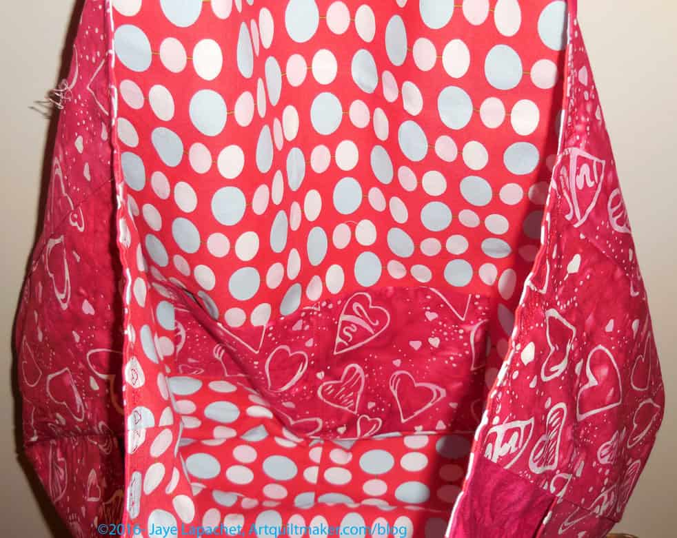
Heart Bag inside
Heart Bag inside

I have to do something better about the pockets on this bag. I always do them wrong, though wrong is relative since they still work. I just don’t do them according to the pattern and I think I need to add more of them. There is always next time.

Saturday Inspiration

After the YM went off to college we got out of the habit of seeing each other, because she was relieved not to have to drive and I was crazy busy. After Christmas, we decided that this would never do so Mom and I have been trying to go out at least once a month.

The other week went to an antique store. It was great! It didn’t smell like old things, the products looked well curated and there were unique items.

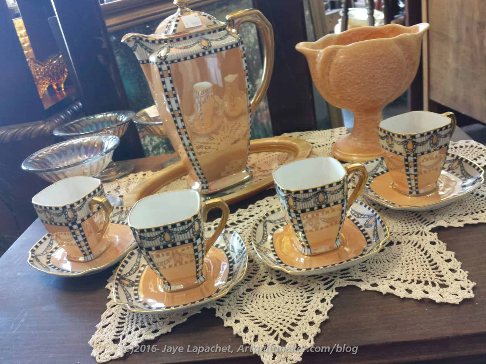
Tea Set
Tea Set

I saw this tea set and thought that it was like no other I had ever seen. I loved the color, again unique. Also the shape was great. No, I didn’t buy it, but I have the photo.

Be inspired!

Creativity: Chapter 1

As I said after the Creative Prompt Project ended, I still want to encourage creativity and creative pursuits in YOU via a regular blog post, but I didn’t want to create any more creative prompts. As I also said, that may change, but for now I am trying different things. I have done a couple of color inspirations as you have seen, but I haven’t found a niche yet. This is probably good as then I won’t get bored. Today, I am going in a different direction, still a creativity challenge, but different than the Creative Prompt Project and the color palettes I have been posting.

Some time ago I wrote a review of the book, The Little Spark by Carrie Bloomston. I just read over the review and the things I wrote at the time were things I still thought were relevant as I reread the book’s introduction and Spark 1 for this creativity post.

I feel it is important to nurture creative endeavors in myself and in others. It is so easy to get sidetracked by work, the housework, kids’ activities and take no time for yourself. It is so easy to think that creativity is not important. Creative endeavors nurture your soul. If your soul is healthy all the other things you have to do in your life are easier and come out better.

Like in the Creative Prompt Project, any kind of art is appropriate. If you are a potter or a cartoonist or a weaver, these reviews and exercises will work for you just as well as for someone who sews, makes quilts, draws or paints.

Housekeeping: I am not going to tell you all of the details of all of the exercises in the book. It isn’t right for me to give away Carrie Bloomston’s content. You will need to buy the book for that. ( <—  It’s easy, just click the ‘buy the book’ link; yes it is an affiliate link**)  😉 That isn’t to say that you will get nothing out of the creativity posts that I am writing. You will, if you read through them and think about what I have written. I am using her material as a jumping off point. Her material is valuable and I am adding my own spin to it.

While we may have more time for creative pursuits in our modern times and we have more time to contemplate creativity, decorating and making things beautiful is in our DNA. Bloomston says “The Spark is your creativity and you were born with it. We all were. Humans have always felt its pull. We see it in our oldest art representations — paintings on the walls in the caves in Lascaux in France from 17,000 years ago.” There are early quilts that are beautifully stitched even though rougher stitching would have been just as warm. We can easily buy soft, warm blankets from the local department store and beautifully knitted throws from catalogs yet we still make quilts and knit throws ourselves.

“…your desire to make things is bigger than you.” I flagged this quote when I initially wrote the review and it is still one that sticks in my mind and makes me think. Bigger than me. I wonder about what that means. Is there a creativity hive mind to which I am contributing? How does what I make fit into the larger continuum of creativity? This is something to which I have no answers and am still contemplating. It is a thought that is almost too big for my mind. What do you think?

These are the kinds of topics that Bloomston’s book makes me think about. What is important is that “it comes from our human desire to make things beautiful and meaningful — not for the sake of beauty, but because each decorative mark on that cake or that pot celebrates our existence.” (pg. 7). What you make doesn’t have to be beautiful. You just have to make it. Making things is the point. Having your project come out beautiful is a fabulous bonus.

Whatever your art is, “it will enrich and connect you. It will give your life depth. It will fill you with purpose and sparkle. It will allow you to shine your light.” (pg.7)

If I haven’t convinced you, with the help of Carrie Bloomston, that you are a creative being and you must exercise your creativity in whatever way speaks to you, all I can say is Just Start. Make a mark on a piece of scrap paper with the pen you have to hand. Twist some string into a fancy knot. Just Start.

You won’t be surprised if I tell you that Bloomston’s first spark is on getting started. I think we can all agree that getting started is the hardest part. It is hard to get started being creative. It can be hard to start the next step and it can be especially difficult to start your perfect project, the image in your mind being so perfect that you feel you can never achieve such greatness. You can.

I have engaged in creative pursuits my whole life,s tarting with dime store coloring books and pieces of paper. Now, my creative muscles are usually warm and flexible. I feel like I never stop. I try to plan my project steps in such a way that I know exactly what to do when I step into my workroom. Of course, I have times where I can’t move forward as planned. If I don’t have an image in my mind of the next step, then I can’t make the next step. The image of my mind has to consist of exactly how to put the next pieces together. That doesn’t always happen. Or I can work on my creative pursuits if I am upset or tired or don’t want to work on the planned project or I have to do a step that is challenging in some way.

All of these things make me pivot and I have to make a new ‘start’. Often, I will do some mind sorbet type sewing. Hunting and Gathering is also a great way to make a new start or work on something in between. I often make pieces and parts or cut patches and then stack them up until I have enough to make the quilt I want to make. Making 4patches and 9patches are great examples of hunting and gathering as well as a project that is great when you don’t know what else to do or you need to make a start.

I am very fond of mosaic piecing (this is called ‘made’ fabric by some teacher whose name I can’t remember right now). I use my scraps, generally monochromatically, to make new pieces of fabric, which I, then, cut up and make something else. Often those projects are journal covers.

You can cut the mosaic piecing into squares and then make some great 4patches. You can do something crazy quilted. The point is that you have to start. What you start sewing (or drawing or painting or molding) and if starting means just pushing fabrics through the machine and worrying about what it will be later, then so be it.

The Little Spark is a great book to energize or start your creativity. Please tell me how you light the spark of your creativity.


**By clicking on an affiliate link and purchasing something, you help support the hosting fees and other blog related costs. I do not purchase fabric with the money I receive nor do I pay myself for the writing. I also only recommend items I like and would recommend. Thank you for purchasing through the affiliate links.
More Thanksgiving Decor

I am on the fence about putting this down as a project, so I’ll have to call it a sort-of project. I have to do some work, but a lot of the actual sewing is done.

The family splits up the holidays because there are a lot of us and it is hard work to feed 24+ people. Thanksgiving is our holiday. I have been wanting Thanksgiving napkins for awhile, but the thought of making napkins is daunting and it has been daunting. Of course, I could have hemmed some fabric quickly and been done with it, but if I was going to make napkins I wanted to make them nice. Such a project would also involve buying a lot of autumn colored fabric. Not my favorite colors.

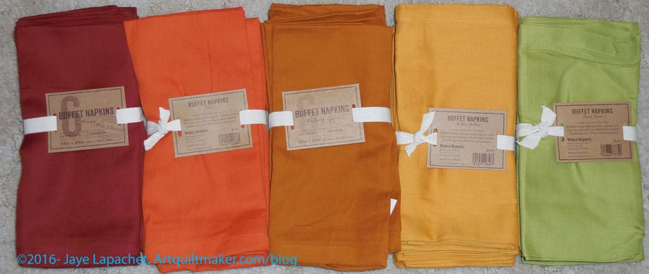
World Market napkins

When I saw napkins at Cost Plus World Market in the right colors and sizes for a great price, I was thrilled. I texted SIL with an idea and went back later and bought them. SIL has a 6 needle embroidery machine and is willing to do some embroidery on the napkins to make them festive. She has several embroidery designs and I will buy a few for her as well.

After we gather the designs and the supplies (I’ll have to buy some stabilizer, though I have a bit from my old embroidery days), then we’ll have to plan the project out. We have several months before Thanksgiving, so the sort of project is doable.

Now back to the tablerunners!

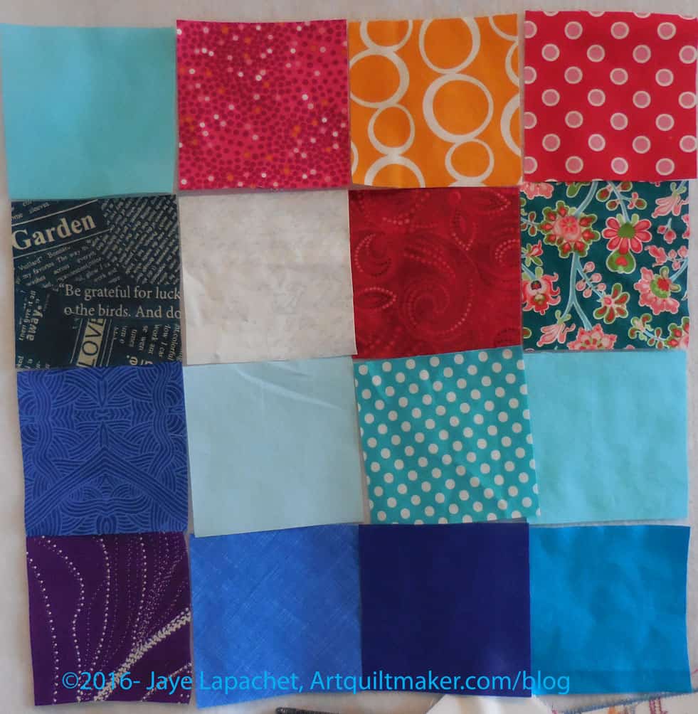
FOTY 2016 – More mid-June Squares

FOTY 2016- mid-June #2

These are a combination of project fabrics and new fabrics. I just keep cutting!

My Mom said that my fabrics look darker this year. I think tht may be the case because I have washed a few loads of blues and the fabrics are in the approximate order in which they were washed.

I have a lot of blues, but also a few whites and lighter colors.