BAMQG May Meeting

A-B-C Challenge: O & P Blocks

I went to the CQFA meeting today, but not BAMQG. 🙁 , I know. Too much family stuff going on and I needed at least a few hours off. We have more tomorrow, so choices had to be made. I miss the BAMQG people. I really thank Angela for bringing a bunch of stuff to the meeting for me.
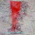
A-B-C Challenge

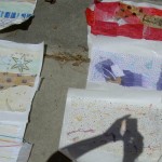
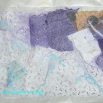
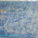
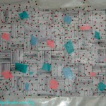
I made the O and the P blocks for the A-B-C Challenge.

Ocean Wave
Ocean Wave
A-B-C Challenge: Peace & Plenty

I am pretty pleased with the way these blocks turned out. They are the first blocks I chose based on what type of blocks I need to finish the quilt. The Peace & Plenty block goes well with the Electric Fan while the Ocean Wave goes well with the King’s Crown in terms of shape and style.

Q and R are next month. I hope there is something good for Q!

Donations

Blue Donation Quilt
Blue Donation Quilt

Angela agreed to drop off the Blue Donation quilt I made so somebody can quilt it.

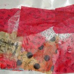
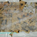
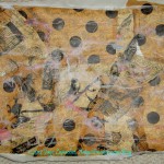
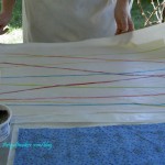
I also finished the back yesterday. I made the back from the cut off edges of the Stars for San Bruno quilts. I could only find enough of those large strips to finish about half of a back, but decided to just bite the bullet, pull from my stash and finish it. I had pulled out some fabrics last weekend, but didn’t think there was enough. There was one big piece that started the finishing process off and that piece made the back nearly large enough. All I had to do was put a couple more inches on two sides and, unless someone plans to longarm the quilt, I was good to go.

The back is one of my usual pieced backs, but not very ‘modern.’ I hope they don’t mind. It is what it is.

Blue donation quilt back

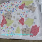
I also had a few donation blocks, but not very many. I felt bad about that until I realized I had put a whole quilt AND Frankenbatting AND back together! Now I don’t feel bad and I am moving forward on the next donation piece!

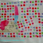
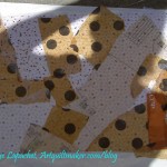
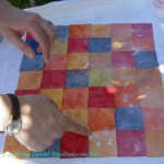
I decided I wanted to work with pink. I actually have been cutting pieces for a pink quilt for awhile, but I want to work with pink for a donation quilt. I am sure there are some girly girls out there who will appreciate it. I am prepping pinks to cut into 2.5″ squares to combine with the black on white fabrics. I am interested to see how those blocks will look. Hope the Charity girls don’t mind my experimentation. 😉

Kona quilts

BAMQG RK Kona Challenge

The group is entering Kona challenge quilts into the Fair as a group, so Angela took my Kona challenge quilt to the meeting as well. Amanda kindly agreed to drop it off for me. I have to do the paperwork, though. AND I need to do the paperwork NOW!

I wanted to enter something into the Fair and this is as good a thing as any. Perhaps I will still get the parking passes.

I am off to sew. I am determined to finish the latest Swoon block today and perhaps get started on those pink donation blocks. Have a great rest of your day!


Creative Prompt #155: Present

I am reinvigorated now that Landscape Lady (@quiltscapes on Twitter) has joined the project.

The Creative Prompt Project has a Flickr group, which you can join to post your responses. Are you already a member? I created that spot so those of you without blogs or websites would have a place to post your responses. Please join and look at all of the great artwork that people have posted.

A good person is a gift to the whole world. – Heidi Wills

perfect gift for the person who has everything

Gift Tax


Fred Rogers

present

creative gift

Definition: A gift or a present is the transfer of something without the expectation of payment. Although gift-giving might involve an expectation of reciprocity, a gift is meant to be free. In many human societies, the act of mutually exchanging money, goods, etc. may contribute to social cohesion. Economists have elaborated the economics of gift-giving into the notion of a gift economy. By extension the term gift can refer to anything that makes the other happier or less sad, especially as a favor, including forgiveness and kindness. (Just so you know my blog is a gift to you!)

gift giving

unusual gift ideas

gift registry

gift the gift of….

gift baskets

gift card

handmade gift


Book Review: Art Quilt Portfolio The Natural World

Art Quilt Portfolio: The Natural World: Profiles of Major Artists, Galleries of Inspiring WorksArt Quilt Portfolio: The Natural World: Profiles of Major Artists, Galleries of Inspiring Works by Martha Sielman

I have been so remiss in reviewing this eye candy book by Lark Crafts! They sent it to me at least a month ago and I waited to have enough to write a review that would do the book justice. HAH! That will never happen, so here I am writing the review, finally. Hopefully, it is a good one.

This is a lush and lavish book. The photos are wonderful and there are plenty of them. The styles of the quilts are all different as well. Anxiety Won, 2006 by Ginny Smith has a folk art feel with the birds and improvisational cutting while I can’t even tell that Martha Cole’s piece, First Turning, 2007, is a quilt because it looks so much like a photograph.

This book is full of texture, paint, quilting, non-quiltmaking fabrics such as taffeta, embroidery, stenciling, which all flows together very well for a united whole. The color is rich and many of the quiltmakers nod at classic techniques and fabrics. There are regular quiltmaking fabrics that you and I probably have in our fabric closets. Piecing and quilting are used frequently by a variety of different artists to convey their message.

I have a love-hate relationship with representational works in the quiltmaking genre. I don’t like the quilts where an image is just printed on a piece of fabric and called a quilt. I believe in piecing and the symbology of some quilt blocks. I want some mystery. If someone wants to take a photo, go take a photo. I know that sounds harsh. Now you know one of my failings. Some of the quilts in this book are like that and I just had to ignore them. In spite of my own fault, there were so many other quilts with excellent designs and amazing imagery.

Unlike the Masters Quilts series, Masters: Art Quilts: Major Works by Leading Artists and book:Masters: Art Quilts Vol. 2: Major Works by Leading Artists, both of which I adored, this book goes into a bit more about the quilt artists, their process and some of the pieces. Judith Trager writes “I had been an avid gardener until about 2004 or 2005, when I discovered that I could no longer do the physical work. So I started making garden quilts” (pg.15). This is one example of a peek into the process. The other artists explain their work in different ways, sometimes talking about inspiration or process or how they got from there to here.

All of the artists’ sections are well illustrated and show a variety of work. I don’t know how any quiltmaker could fail to find something attractive. Cassandra Williams uses pieced diamonds and equilateral triangles as backgrounds in her quilt Dance of the Deep (pg. 81). Elsbeth Nusser-Lampe’s Struggle 2010 has the feel of Marie Webster’s Poppy quilt. The shimmer of some of the background fabrics is one of the elements that the artist uses to bring the feel into 2010.  Aside from piecing, I also see the influence of other quilts in some of the pieces.

Threadpainting, which was mentioned in the Texture podcast from last week, and quilting are both very evident in this book. The photos are so good that they made feel I could reach out and many of the quilts. The reader is able to see the amazing quilting in many of the quilts. Vagabond Song by Elaine Quehl is one example.

This is an excellent book. I love the photos, the imagery and the accompanying text. Run, don’t walk to get this book. I am adding it to my collection!

View all my reviews

Click the image to buy this book

Flowering Snowball – Chunked

Flowering Snowball - Chunked

I thought I would work on the Corner Store as my next project. It was calling to me during the dark time while I pieced the Renewed Jelly Roll Race. As soon as I turned my attention to it, it held no interest for me.

I worked a bit on the Garden, as I mentioned, but  floundered a bit on Saturday. I made a couple of QuiltCon blocks, did a bit of piecing on the Swoon #6, but finally took myself in hand on Saturday night and planned out my Sunday.

On Sunday, I worked pretty steadily on the Flowering Snowball. Aside from some math issues, e.g. not being able to count, the process went pretty well. I had little to no trouble putting the hand pieced blocks together by machine. I do need a few more blocks, so I can’t finish the chunking until those are pieced. If all goes well, and I have counted properly, I should have them done by the end of next week. We’ll see. Don’t hold your breath.

I feel like doing another version of this pattern by machine with pink or aqua background. It has to wait, though, until many other projects are completed.

My camera seems to be taking fuzzy photos. I wonder what that is about?

Garden Progress

Garden in process
Garden in process

This piece was started in a Pamela Allen class in 2009. I dreamed about it this week which encouraged me to pull it out of the closet (it usually hangs on the wall of my fabric closet, so I see it frequently) and I spent some time working on it over the weekend.

Garden detail
Garden detail

Basically, what I did was start machine quilting the background. I have a very straightforward style for quilting the piece: I start outside of the piece and go straight up and down until I am done with the section, then I move on to the next section.

I have the perfect green Aurifil for the green grass section, so I worked on that and got quite a bit done.

I also decided to use a variegated King Tut thread that I have had for awhile for the orange hand dyed sections around the turquoise flower. Really nice thread! I know I have used it before, because the wrapper was off the spool and I had a partial bobbin. I can’t remember which project, though. It gave me no problems and I really liked the look.

I want the piece to look like it was built in layers. At the moment, I am trying to figure out whether to also closely quilt the foreground (flowers, stems, leaves, etc) or if I will just use the Perl Cotton to quilt it. I have quilted the stems separately and at a slightly different angle to see if it looks different from the background.

Garden detail
Garden detail

Another layer of the piece is the different fabrics I used. Some of them are part of the same area, so I need to try to minimize the impact of the change of fabrics.

I should have quilted the foreground before I added the flowers, but in the course of a workshop, that sensible method just isn’t possible.

Book Review: Showcase 500 Rings

Showcase 500 Rings: New Directions in Art JewelryShowcase 500 Rings: New Directions in Art Jewelry by Marthe Le Van

This is another book I received from Lark Crafts. Thanks, Lark! This particular book is another gem from the Lark 500 series. I love this series, because it is pure eye candy – no patterns, no basics, just fabulous photos of amazing pieces.

As I have mentioned many times, I am not a jeweler, however, I always love the opportunity to review shapes and motifs in a different format. I think it can inform my quiltmaking.

As the title advertises there are photos of 500 rings. I should say ‘rings’ because some of these pieces are more sculpture than the conventional idea of a wearable ring. I believe that artists in this medium are not making wearable art; they are making sculpture just as quilt artists are not making bed quilts. As I paged through the book, I was immediately struck by different shapes and motifs on the pieces: circles, drops, leaves, shells, confections and many others.

I also noticed the variety of materials. I see felted wool (??), knitted fibers, broderie perse type fabric pieces, paper, photographs, glass, silk, a clothespin, along with the normal metals and stones.

The contents page sports a photo of a ring that looks like a series of cross sections of colored pencils (also on pg.268), which drew me in right away. It is called 11 Ring 4 and is by Maria Cristina Bellucci. There is a piece that is morphing from ring into a glove (pg.80), which I think is an interesting evolution of this medium.

One of my favorites is Links Ring by Uranit Bar-Nes (pg.220). Of course the color (a sea blue) is one of my favorites, but I also like the color’s combination with silver and blue zircons. I also like Garden Pond Ring by Aurelio Castano (pg.216), which is a purely beaded piece with a huge stone in the middle. Another duo was Tangle Rings by Bridget Catchpole (pg.212). They are my aqua (tending towards turquoise), light green and white pieces where the shapes look like something that would be on top of a cake. The circles squished next to each other in Vina Rust’s Ring #1: Stained Cell Series (pg.171) is also a very appealing design.

If you need some inspiration, regardless of your primary medium, this book will provide you with some shapes, motifs and textures that will reinvigorate your artwork.

View all my reviews

Block-a-Long #53: Four Columns with Squares

4 Columns with Squares

This block is related to last week’s block, #52 as well as Corner Squares in that I am working with squares and tall rectangles. I can really see this one going well with 2.5″ squares in the center. If anyone is interested I will post a pattern for that size (about 8″) as well.

Directions for 4 Columns with Squares are included.

If you have made blocks or a quilt from these patterns, please post a link in the comments section of the relevant block or on the AQ Block-a-Long Flickr group. I would love to see what you have made.

Fabric Papermaking

Last Saturday, CQFAers met at Sue’s house where she tried to teach us the secrets from Stitch Alchemy, a book by Kelli Perkins. The idea is to make fabric paper – a combination of fabric and paper. I hope to use mine for journal pages for journals like the Red Journal.

Rhonda's Raffia
Rhonda's Raffia

I don’t share well, but space was limited and Rhonda (of BAMQG fame – she plays with both teams 😉 )and I ended up next to each other. She is a great tablemate! We shared well and she is extremely creative. I felt like an idea-less boob next to her. She is like me in that we just got down to it. We also had fun.

During the time I thought of texture, because of the podcast I had just recorded with Sandy. I have a lot of schnibbles from pressing fabric so I brought that with me and adhered them to the paper. Sue wasn’t sure if it would work but it was worth a try.

The next step is to paint the fabric. We will do that at the next CQFA meeting.

Fabric of the Year Late April

Late April Pieces
Late April Pieces

The pieces for this project seem to be multiplying by leaps and bounds. It doesn’t seem like I am working with so many fabrics, but I am sewing relatively fast, so, perhaps, I am.

More Late April Pieces

I am trying a new technique for pressing fabric. In between other pressing tasks, I am pressing the fabric I have washed recently. It means a steady stream of cutting and new fabrics to play with. In the second group (left), I was a little dot heavy. 😉

I was also trying to fussy cut bits from the larger floral patterned fabrics. There are also a group of solids for the QuiltCon challenge. I can’t decide whether or not to include a print in that project, so I have started with the solids and we’ll see how it goes.

Book Review: Heat, Color, Set & Fire

Heat, Color, Set & Fire: Surface Effects for Metal JewelryHeat, Color, Set & Fire: Surface Effects for Metal Jewelry by Mary Hettmansperger

This is another free book for review from Lark Crafts. Thanks, Lark! It is a large 8.5″ x 11″ book with gorgeous violet-lavender endpapers. In flipping through the tome, I noticed that earth tones dominate. Every once in a while there is a spark of color, which is used effectivelyl to catch the reader’s interest. I also noticed a lot of spiral motifs in the book.

After the introduction, which mostly sells the book and doesn’t introduce the author much, the book launches right into a section on materials (pg.8-27). This section is well illustrated and I particularly liked the subheading fonts. The section is also LONG and includes photos of items such as Liver of Sulfur, gloves and earplugs, disk cutter & punches, tripod for firing and a bench grinder. Interspersed with these scary looking tools are photos of jewelry, presumably to soften the blow for a new jeweler.  😉 The Basic Techniques section is also quite long (pg.29-51). Each part of the Basic Techniques section gives step by step instructions for creating a new texture or applying a technique and then shows an example of the end result. I am pleased the author and publisher thought it was worthwhile to document and illustrate these foundation sections so thoroughly.

There are 21 projects included, each spanning about 4 pages. Lots of illustrations and drawings are included with each project. Templates are frequently included as well and variations are shown in photos to spark creativity. I like the Colored Tin Collection project, the Mixed Metal Bracelet project, especially the variations, and the Orange Enamel Choker, though I might want to put the pendant on a different chain.

This seems to be a great book for adding texture to your metal projects.

View all my reviews

Creative Prompt #154: Escape

escape paintball

Escape from Alcatraz

By Emily Dickinson

I never hear the word “Escape”
Without a quicker blood,
A sudden expectation –
A flying attitude!
I never hear of prisons broad
By soldiers battered down,
But I tug childish at my bars
Only to fail again!

Escape from New York

a computer game

the Great Escape

escape fate

escape the maze


Definition: [ih-skeyp] Show IPAverb, es·caped, es·cap·ing, noun, adjective, verb (used without object). 1. to slip or get away, as from confinement or restraint; gain or regain liberty: to escape from jail. 2. to slip away from pursuit or peril; avoid capture, punishment, or any threatened evil. 3.to issue from a confining enclosure, as a fluid. 4. to slip away; fade: The words escaped from memory. 5. Botany . (of an originally cultivated plant) to grow wild. verb (used with object):  7. to slip away from or elude (pursuers, captors, etc.): He escaped the police. 8. to succeed in avoiding (any threatened or possible danger or evil): She escaped capture. 9. to elude (one’s memory, notice, search, etc.). 10. to fail to be noticed or recollected by (a person): Her reply escapes me. 11. (of a sound or utterance) to slip from or be expressed by (a person, one’s lips, etc.) inadvertently.

Ford Escape SUV

Her name escapes me

escape the room

escapism: is mental diversion by means of entertainment or recreation, as an “escape” from the perceived unpleasant or banal aspects of daily life. It can also be used as a term to define the actions people take to help relieve persisting feelings of depression or general sadness. (Wikipedia)

prison break

Escape”, a song by Journey from the album Escape

to elude

The Creative Prompt Project, also, has a Flickr group, which you can join to post your responses. Are you already a member? I created that spot so those of you without blogs and websites would have a place to post your responses. Please join and look at all of the great artwork that people have posted.

to succeed in avoiding


Design Series: Texture

Sandy and I had fun talking about Texture, another element of design, a few days ago. It is so interesting to do the research for these segments as I learn so much. Check out Sandy’s podcast episode 89 on Texture.

Texture is an Element of Design

Definition:

  • “The way something feels to the touch or the visual patterns on a surface.” (Art+Quilt, pg.88)
  • Texture: actual or simulated tactile quality (from http://www.wiu.edu/art/courses/design/elements.htm)
  • “Texture is the surface and tactile quality of an object.” (Quilter’s Book of Design, 2d, pg.49)

Texture and Pattern are closely related.

Types of texture:

  • amorphous – organic and curvilinear (looks like nature)
  • structural – rigid and geometric (looks architectural, man made)

Some thoughts:

  • Texture is usually appreciated through our sense of touch. (Quilter’s Book of Design, 2d, pg.85)
  • Architecture and sculpture employ “actual material that have…tactile texture.” You can also see (museums probably won’t let you feel) texture in some paintings with very thick paint usage, such as Wayne Thiebaud’s work. (Pentak & Lauer, pg.160) Examples: Sculpture in Toronto
  • silky smooth satin, roughness of coarsely woven linen (Art+Quilt, pg.22)
  • bold, subtle (Art+Quilt, pg.88)
  • feathery, sharp (Art+Quilt, pg.88)
  • tactile, actual, imitation (Art+Quilt, pg.88)
  • cotton vs wool (Art+Quilt, pg.23)
  • satin vs velvet
  • “It is important to remember when planning a large quilt that its textural qualities will add visual interest to the design at close range and will have much less impact at a distance.” (Quilter’s Book of Design, 2d, pg.86)

Use of Texture in General

  • “…help define the design and contribute to its success.” (Quilter’s Book of Design, 2d, pg. 87)
  • “Use of texture to suggest movement.” (Quilter’s Book of Design, 2d, pg. 88)
    • “…create lines and a sense of movement.”  …spiral quilting lines add swirls and shapes in sky. Long, wavy, diagonal quilting lines can suggest motion and contribute to the idea of flight. (Quilter’s Book of Design, 2d, pg. 88)
    • Size of thread can make part of a quilt stand out as can echo quilting. (Quilter’s Book of Design, 2d, pg. 88)
  • Use of texture to add dimension (Quilter’s Book of Design, 2d, pg. 88)
    • rocks can look rounder (Quilter’s Book of Design, 2d, pg. 88)
    • emphasize cracks (Quilter’s Book of Design, 2d, pg. 88)
    • suggest water in motion by using metallic thread (Quilter’s Book of Design, 2d, pg. 88)
    • give the impression of depth by overlapping a pattern underneath (Quilter’s Book of Design, 2d, pg. 88)

Use of Texture in Quiltmaking

  • “Piecing in and of itself creates visible edges with shadows on a quilt top. A whole cloth quilt will have a much flatter look than one with seams or applique.” (Quilter’s Book of Design, 2d, pg. 89)
    • “In order to sculpt the surface of the quilt, I like to in complete control of the seam allowances. When the quilting is done on the background, close to the seam, the patch under which the seam allowances are pressed can be lifted from the surface of the quilt by the extra padding provided by the seam allowance.” (Piecing: Expanding the Basics, pg.6)
  • Perl cotton stitching
  • embroidery
  • quilting, especially many lines close together
  • applique’ (think of the layers sometimes used to build up a design)
    • raw edge applique’ to have the fibers of the fabric add to the design
    • all the different types of applique’ provide different types of dimension and texture to a quilt.
  • ruching (flowers in Baltimore Album quilts)
  • thread painting (have you every felt the texture of the stitching?)
  • the feel of the quilt if you put your thumb on the back and your fingers on the top of the quilt and squeeze
  • couching (listen to Sandy’s podcast interview with Karen Lee Carter)
  • yo-yos
  • trapunto
  • beading (Kissy Fish as example)
  • Cathedral Window quilts
  • prairie points (Example: Autumn by Ludmilla Aristova from (Adventures in Design, pg.68) )
  • buttons (Adventures in Design, pg.65)
  • paint (Adventures in Design, pg.65)
  • embellishment (Adventures in Design, pg.65)
  • Crazy quilts
  • quilting
    • “The  type of quilting used changes the texture of a quilt: a hand-quilted line looks a lot different than a machine-quilted line.” (Quilter’s Book of Design, 2d, pg. 90)

Notes:

  • “The essential distinction between texture and pattern seems to be whether the surface arouses our sense of touch or merely provides designs appealing to the eye. In other words, while every texture makes a sort of pattern, not every pattern could be considered a texture.” (Pentak & Lauer, pg. 168)
  • Tactile texture is the way the cloth feels when you touch it, the difference between satin & burlap.” (Art+Quilt, pg.22)
  • Visual texture is the way the cloth looks, from the printed or woven pattern such as subtle brocade to a bright and bold Hawaiian print.” (Art+Quilt, pg.22) ” “A bold visual texture will automatically become a dominant feature when placed with a more subdued prints and solids.” (Art+Quilt, pg.23)
  • Visual texture is “that which can be seen and gives the appearance of a texture where no actual difference in the surface of can be felt. Examples of visual texture are printed fabrics that look like rock or sand, but actually feel smooth and even.” (Quilter’s Book of Design, 2d, pg.85)
  • “Visual texture is implied.”  “There is no actual ” tactile feel to it, instead it has a print on it which makes the surface look as though it has a print on it whcih makes the surface look as though it is textured.” (A Fiber Artist’s Guide to Color & Design, pg. 90)
  • Pattern is sometimes thought of as visual texture.
  • Texture “allows subtle changes in the surface design.” (Adventures in Design, pg.65)
  • “Pattern and texture are often used interchangeably because a pattern may give a surface the appearance of texture and because textures have a distinct repeating arrangement that creates a pattern.” (Quilter’s Book of Design, 2d, pg. 79)
  • “You draw a line, close it to make a shape, and then fill it with texture. As quilt artists we work mainly in the opposite direction. We choose the texture of our fabric, cut out shapes, then add line with stitching and thread”  (Art+Quilt, pg.22)
  • “Though many fabrics have tactile texture, most quilt artists use cotton fabrics made specifically for quilting. These fabrics have a polished surface with no tactile texture. …we rely heavily on the visual texture that is derived by the motifs printed on the surface of the fabric. ” (A Fiber Artist’s Guide to Color & Design, pg. 90)
  • You can change the texture of your fabric by manipulating it. Fabric can be “scrunched, wrinkled, pleated, folded, felted, or twisted to add” to what you want your work to say. (Art+Quilt, pg.23) Example: Change of Seasons
  • “Texture provides interest and variety. It can add realism to landscape, portrait and animal quilts.  It also helps delineate space…Simply put, we need to see when the perimeter of one section ends and another begins. We achieve this through contrasts in color and value, as well as contrast of textures.” (A Fiber Artist’s Guide to Color & Design, pg. 91)
  • “Van Gogh was an early exponent of the actual application of paint as a further expressive element.” In his painting Portrait of the Artist, you can see “how short brushstrokes of thick, undiluted paint are used to build up the agitated, swirling patterns of Van Gogh’s images. The ridges and raised edges of the paint strokes are obvious to the viewer’s eye.” (Pentak & Lauer, pg.160)
  • “Texture adds character, can create a sense of age, and provides uniqueness.” (Adventures in Design, pg.65)

Homework:

  • Look at your most recent quilt and see what kinds of texture you can find.
  • Think about how “texture will affect your work. Will the viewer immediately see the weave of the cloth, or is it so smooth and tightly woven that it reflects the light? Can you use those qualities to evoke certain emotions or feelings? (Art+Quilt, pg.22-23)
  • Create “similar compositions executed in solid, plain-woven cottons,” velvet, brocade, satin, etc (Art+Quilt, pg.23)
  • Take a scrap of fabric and give it texture – couch on it, scrunch it, pucker it, embroider on it.
 Koigu Cross Stitch Scarf by DoublePointed Designs (https://www.ravelry.com/patterns/library/koigu-cross-stitch-scarf)
Koigu Cross Stitch Scarf by DoublePointed Designs (https://www.ravelry.com/patterns/library/koigu-cross-stitch-scarf)

Source: ravelry.com via Jaye on Pinterest


The example above has great texture.
Resources
A Fiber Artist’s Guide to Color & Design by Heather Thomas
Adventures in Design by Joen Wolfrom
Art+Quilt by Lyric Kinard
Design Basics by Pentak & Lauer
Leaf embroidery: http://www.duitang.com/people/mblog/19374527/detail/ (note this is an Asian site written in characters. I don’t read this language, so don’t know what it says)
Ludmila Aristova Website – http://web.mac.com/ludmila.aristova/Ludmila_Aristova/Home.html
Piecing: Expanding the Basics by Ruth McDowell
Quilter’s Book of Design, 2d, by Ann Johnston


Flowering Snowball Update

Flowering Snowball Corner

I am progressing well on the Flowering Snowball. I seem to be able to sew about a block a night. These are hand pieced, which is why they take so long.

I am trying to decide how to put the blocks together – by machine or by hand. I am thinking that I will put them together by hand and then go over them by machine. I am hemming and hawing because the hand stitching isn’t as precise in terms of seam allowance, so I have to sew on a line rather than lining up the seam allowance. I’ll try it out and see how it goes.

I am pleased with the progression and glad I took it up again. I am really liking the way the side and corner blocks look. Another good example of self bordering success.