Quilt Exhibit at the Renwick

It pays to read blogs, so you can tell people to go and see this exhibit. It is about QUILTS!
It is at a real MUSEUM!
They have a companion BOOK!

Sadly (I guess it is my day for sadness), I won’t be heading out that way until the summer. Do give me a review and let me know if you liked it. Perhaps I will put the book on my Christmas list. Hhhmm.

clipped from bemused.typepad.com
http://bemused.typepad.com/.shared/image.html?/photos/uncategorized/2007/11/26/100_2995_3.jpg

But the week wasn’t all about turkey and muffins.  Before everyone else arrived at my sister’s, M & I ducked out for a spectacular day in Washington, a city we’ve spent a lot of time in since Molly & K both went to college there.  First stop, the Renwick Museum, where we saw the current show, Going West! Quilts and Community.  I’d wanted to see this exhibit since I read that it had been curated by Sandi Fox, author of two of my favorite books on 19th century quilts, Small Endearments and For Purpose and Pleasure.  Well worth the trip, I’d recommend the show if you’re going to be in D.C. before the close of the show in mid-January.  Sadly (for you,) no photos allowed.  The show’s companion book does include all of the show quilts (and more) with accompanying essays on over fifty quilts brought to or made in Nebraska in the late nineteenth century.

  blog it

San Mateo County Fair 2007

We spent the day at the San Mateo County Fair yesterday. The Fair, in general, seems to get smaller and smaller every year, but they still had a great selection of quilts and other needlearts. I wish more people would take the time to enter one thing.

I attend county fairs for many reasons. I really enjoy it being a coming together of things that people in the county make/participate in. We spent quite a bit of time looking at the bee hive and talking to a beekeeper. The cut flowers and plants were also amazing. My two favorite things are the quilts and frozen bananas. I thought the frozen bananas had gone the way of the dinosaurs after I checked every food vendor and none had them. I finally found them hidden in the ‘international’ area. I never knew milkshakes and frozen bananas were considered foreign food. Oh well, you learn something new every day!


As you may remember, I entered Thoughts on Dots into the fair. It didn’t get a prize, but I was pleased with how it was displayed. I was happy that there were no Sunbonnet Sue stuffed dolls in front of it and it wasn’t folded over anything. You can really see the whole quilt.
I was also REALLY pleased with how flat it hangs (no ripples!) and how well the sleeve looks. No lumps!


While I like, what St. JCN calls, the San Mateo Dotty better, this quilt reminds me of it. I know they are very different, but there is something about it that brought the SMD to mind.

This is a close up and I really like the flower motifs for the quilting.
These were fun! They are crocheted cupcakes.
Detail shots. Do you like the “sprinkles?”
This quilt was tied and didn’t hang very well, but I loved the tree in the middle. That drawing was very well done.

Detail of the tree.

The complete group of photos, unaltered and BIG are here as well as few other needlearts items that struck my fancy.

Gallery Travelogue


St. JCN wrote 10 pages in her journal about our adventures on Friday. I am not sure I will be able to keep up with that!

In the morning, we set off from Denver towards Golden, after carefully planning our adventures (some plans for a special tour had fallen through, unfortunately), so as to maximize what we could see in one part of the area. I did not want to be driving back and forth across the Denver metro area in a crazy way.

I was shocked at how close Golden was to Denver. We have a map of Denver metro the size of a double bed and it made the drive look like an hour. We were at the Primedia Gallery in about 20 minutes.
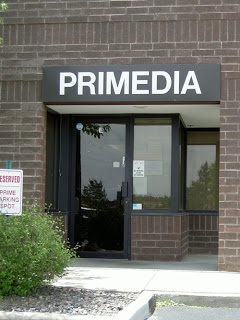
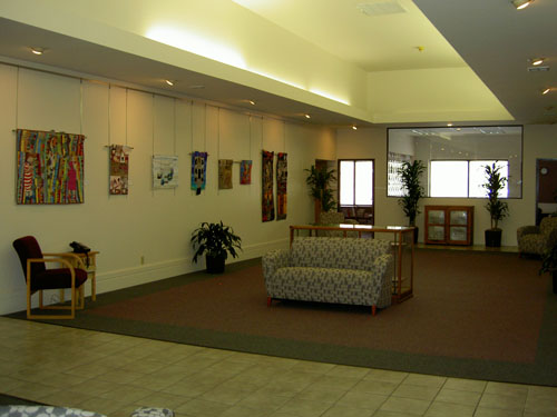
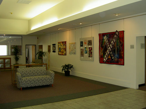
The Primedia Gallery is really called the CK Gallery now, but as you can see, the sign still says Primedia on it. I wouldn’t call the gallery large, but it is a nice open and airy space behind the reception desk. There is plenty of space for a smallish exhibit. Photography allowed, which was really nice.
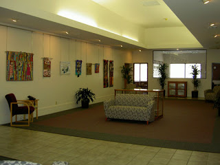
Gallery (back to reception desk) looking left. Conference room is through that glass window.

Gallery (back to reception desk) looking right.

The exhibit was called ARTQUILTImages and was a collection of art quilts. They were good quilts to look at. There was one about the futility of war and it depicted guns. St. JCN and I talked about it and she thought that all the gun imagery kind of celebrated guns. She also pointed out that with the advent of photo transfer, people don’t have to be subtle about their message and, as a result, their message can easily be distorted. In this quilt, all you see is guns. For me, gun imagery does not promote peace. I will be glad when St. JCN gets a blog, because she can explain the subtleties of her argument better than I can.

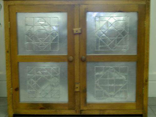
This is a punched tin cabinet. The designs on each door, as you can see, are different quilt blocks. We were each looking at a different one and I was talking about the Ohio Star-ishness of one while St. JCN was saying that it was not an Ohio Star. It turns out we were looking at different areas of the chest! DUH!

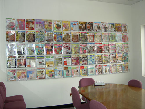
This is the conference room and I liked the way they had their magazines displayed. If I had a big wall that I was willing to devote to something like this, I could see putting books and magazines I wanted to use for inspiration in such a layout.

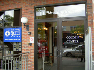
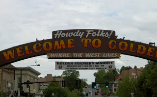
After the Primedia/CK Gallery, we headed up the road to the old part of Golden, where the Rocky Mountain Quilt Museum lives at 1111 Washington Street. I loved the Howdy Folks! sign. I thought it was fun and cheerful. I am sorry I cut off part of it, but I was in the middle of the street taking the picture, so I had to be quick.

If you haven’t been to the Rocky Mountain Quilt Museum, put this trip on the top of your list. Not only were the quilts great, but the staff was fabulous, too. Joanna, after taking our entrance fee (that is her job), gave us a personalized tour. It was interesting to hear about specific points of the quilts. The museum has a start quilt on right now. There are a lot of fantastic star quilts in the exhibit, but, excuse the pun, the star of the exhibit is Irene Berry’s Lone Star. Unfortunately, RMQM doesn’t allow photos so I can’t show the great use of fabric and the wonderful mix of hand and machine piecing.

As I mentioned in my previous post, a great quilt store, the Golden Quilt Company, is located right across the street! This detour would be a two-fer!

Jessica was the highlight of our trip in the people department. She is the store manager of the RMQM. She steered us towards Harriet’s shop. We met her yesterday at the Great American Quilt Factory, too. She is a great personality and totally willing to share her knowledge.

The RMQM also had an exhibit of Ellen Ann Eddy’s works. She is a quilmaker who knows how to use threads and her machine. I heard QA will be reprinting her book.

In the same gallery as EAE’s works, they filled out the space with a few quilts from their permanent collection. I have to say that simplicity is highly underated in quilt design. I think people need to to get back to the basics in terms of design.
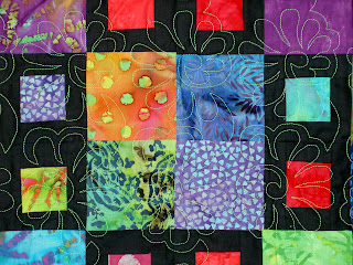
You Can Run, But You Can’t Hide

In years past, I have seen art quilts evolve from linear, grid based designs to organic swirly pieces with blobs (int he best sense of the word!) of design elements strategically placed. It is always a mystery to me why the linear, grid based designs went out of fashion. I suppose block quilts were just not ‘in’; too old fashioned, not new enough or fresh enough, boring. Too bad, too, because a linear, grid based designs make it easy to incorporate many of the principles of design.

-Unity? No problem. Put the same color in each block.
-Repetition? No problem. Put the same type of design element in each block.
-Balance? Put three design elements approximately equal distance from each other in the grid. Easy to measure or eyeball, because you have a grid.

Well, kids, they are back. Many of the quilts at the Quilt National exhibit at the San Jose Museum of Quilts and Textiles, had some kind of underlying grid. Sue Benner’s piece Fugue XI, had a grid of stitching as part of the design. Lisa Call’s Structures #31 was also grid based. These are definitely art quilts and not the classical block based designs, but they also most definitely show that the design features of a grid works well in art quilts.

Don’t get me wrong. I have nothing against the organic, swirly designs. However, I do have problem if the general design is poor. Good design is everything. You can have ugly fabrics, a saggy structure, poor stitching, but if the design is good, fewer people will care about the other problems of the quilt. I also don’t think it is ok to just adhere fabrics to a backing and call it a quilt. You have to think about the design and be deliberate about placement. (Playtime quilts don’t count. If you are just working through ideas, by all means, just adhere blobs to fabric and get it out of your system. When you go to make something for Quilt National, then get your design board and principles out and spend some time thinking about the overall design.

One design book I like is called Design Basics by Pentak and Lauer. They update the edition every year or so so you should be able to easily find a used copy, which is just as good as the latest and greatest edition.

Hands Down

As promised, I made the hand today – mostly. Here is a progression of pictures.
Back of first side:
I did the drawing of my hand before I thought of the wrist. Something caught my eye and made me think of the glove edging, so I added it after I had already cut the Tear-Away stabilizer.

Pieced first side ready for applique’.

When I saw the challenge, I could only think of Hearts in Hands.

Preparing the second side. I wasn’t sure how to do it, but sort of figured it out as I went along.

I decided to put a spiral on the back. It seems to be a powerful sign for me. This side is evolving into the front. I used some glue to keep the spiral down and flat before stitching.

Both pieces ready for quilting.

First bit of quilting. I had to rip it out, because the Libby magic has worn off and the tension was terrible. I wanted to use Glitter, but couldn’t get it to work no matter what I did. I did not have a 90/14 topstitch needle, which is what Libby recommends, so that may have been the problem.

Quilted and ready for binding. I plan to do a blue satin stitch around the edge tomorrow. I hope I can.

Show of Hands by Karey Bresenhan

Karey is always thinking of interesting things to spur us on creatively. I was sent an e-mail about this exhibit, which will be held at Houston. Subsequently, the hands will be sent to the Creative Spirit Center to become part of their permanent collection. It would be great to have a piece in a museum!

I was reminded when Deirdre over at Deirdre’s Sloppy Studio mentioned it again and showed her hand. I decided that I will make one tomorrow. I picked the fabric and have a design. Wait and see!

The Walters

I had a few hours in Baltimore on Thursday June 16, so I went up to the Mt. Vernon District and looked around. While I was there I visited the Walters. I like their tag line: experience 55 centuries of art. I can’t even conceive of 55 centuries. How wonderful it is that people have been making art for 55 centuries!

The Walters is in an interesting space. It is a blend of old and new. The old really appeals to me, but I also liked the new staircase that they have built recently (I understand). The sculpture courtyard, on the first floor, was modeled after an Italian palazzo. It was very light and airy and I enjoyed being in there. I would have liked to have sat there for awhile with some cappucino and written in my journal. Alas, it was not to be. An activity for another day. There were two elderly people sitting and seemed to be enjoying themselves. I will take their enjoyment as my own.

Isis Nursing Horus
Isis Nursing Horus

Hands down, my favorite piece was in the Egypt gallery. It was a statute of Isis sitting with Horus on her lap. It was called Isis Nursing Horus. First, I liked the subject matter. It was very feminine, but also showed what a strong woman Isis was. She was a goddess in her own right as well as being the wife of Osiris and the mother of Horus, two other strong gods. Despite the fact that she was a goddess, she was also a mother, which, on some level, I find very profound. In terms of the actual piece, I like the simple lines, sort of Bufano-esque. There are other pieces that I saw while surfing which are much more detailed and painted. This version is my preference. It looks like I could buy a copy of this statue at The Virtual Khan el Khalili. I’ll have to consider it once the construction is finished.

I also liked a painting near the Impressionist Gallery called The Christian Martyrs’ Last Prayer by Jean-Leon Gerome. While I wasn’t thrilled with the subject matter, (Christians praying right before they were going to be killed for sport at the Circus) the thing I liked about it was the detail. The way the lion was painted, the beard of the man saying the prayer, the stone on the structure. The lion looked like it could have turned it’s head and roared. I was also quite taken with the pad on the lion’s paws. You can’t really see the paw and the pad very well in the ‘Net image, but it is amazing. I guess this is a good reason not to rely completely on the web for everything. We still need to go to art museums.

Another piece I loved was a sculpture of a little girl. It was so realistic that it was nearly impossible for me not to touch it. It was called First Disappointment by Erastus Dow Palmer. This piece is not available in image format on the web, nor was there a postcard of the piece. What a shame.

I really think that museums should make more of their works available either in postcard or image format. I think it would allow more access to their collections. I understand the concept of inventory, but inventory vs marketing…. Frankly, I just want access…

I only had a few minutes to look at the Treasury, which had all of the china, crystal and silver. It was one spot that I wish I had spent more time in, but I didn’t see that it was available until I wandered past it. I love china, crystal and silver. I spent a few minutes looking at a chocolate pot. I know it is a silly piece of dishware, but I love the way the handle is perpendicular to the spout.

Magical Secrets of Creativity

Kathan Brown is a printmaker and author of a book called Magical Secrets about Thinking Creatively. She is also the founder of Crown Point Press. At the de Young, they had an exhibit of Crown Point Press prints. On the legends I noticed some of the magical secrets, which made some sense or were interesting to think about so I started to write them down. I stopped when I found a brochure. The Magical Secrets are listed at www.magical-secrets.com.

Seeing these ‘secrets’ made me think that creativity is a lifetime experience and that you have to work at your creative work.

I like the idea of Magical Secrets of Creativity. It makes me wonder if people have their own ideas about creativity and where people’s ideas intersect. I want to think about Brown’s ideas and see if they work for me.

Art View Day

I spent several hours at the New de Young on Friday. St.JCN spurred me to finally make the trek down there as she is visiting and that is one of the activities that she wanted to do. We are notoriously bad at doing anything remotely touristy when we visit each other, so this was a nice change.

In all, I enjoyed myself. For once, I brought my journal with me and wrote down the pieces of art that I liked. It was a good exercise in looking at things. I, long ago, gave myself permission not to look at all the art. But I looked at a lot of art at the de Young — more than I had really planned to.

The new building took some gettng acquainted with. The entrance was hard to find. Once in, it was a little unclear where to go for tickets. I loved the hominess of the old building, but the new building is definitely built for art and the art is shown at its best.

There is a textile room. They were showing gowns (Fortuny, Dior, Chanel, Balenciaga, etc.). Seeing some of htem was like seeing old friends as I had seen a few them before in a fashion exhibit. I remember making a sketch of a red dress with a big bow and gorgeous back treatment the last time I saw designer dresses.

Here are the pieces that I liked:

Wayne Thiebaud:
Three Machines
I like this one because of hte thickness of the paint and the simple imagery.
Diagonal Freeway
This one is quiltlike.
Park Place
the colors are very attractive.

Richard Diebenkorn:
Ocean Park 116
Quiltlike and pleasing colors.
Green
Red-Yellow-Blue

Bernd & Hilla Becher:
Passau, Germany (Grain Elevator) -photography
This is amazing, because of the shape of the building and the stillness of the pond in front of the building.

Franz Senkinc (Austrian):
Iron, 1931 -photography
I really liked the simplicity of the image and the direction from which it was photographed.

Susanne & the Elders (artist unknown and not available on the web)
Provoking. I am sure certain sectors of society would deem this image pornographic.

I was definitely drawn to geometric shapes. I was not taken with many of the modern art pieces as they looked like a mess to me. I suppose I am not an art sophisticate. As I said, I enjoyed myself and am thinking of getting a membership so I can stop in and bring W.

Signed, Sealed and Delivered!

Feelin’ Blue, Too and The Eye of God are both at the quilt show. I delivered them on Monday. This means that I finished them both! YAY. The quilt show starts tonight with the preview party, so I will get to see all the winning quilts. Aja did not finish hers. She was very upset when I talked to her, but I told her it was no big deal and that we will show all the bullseyes together at some point. I hope the show goes well.

San Mateo County Fair Yesterday

I love county fairs and wish that more people would enter their work. It is not a “highbrow” art organization, but everyone’s art and every entry is welcome. I also wish people would attend more county fairs.

It is great to see the wonderful and unusual items that people make and enter. It is great to see what people are doing in their homes: what they are collecting, the types of Lego and K’Nex constructions they build, the photos they take, the cakes they bake, the jams they cook and table settings they concoct, etc. I think county fairs are such a community event. You can really see stuff by your neighbors…. if more people would enter and attend.

That said, I have to admit that I didn’t enter something this year. I have done every year for the past several years and I just didn’t have (make??) the time this year. I will for sure next year. It is expensive to attend the fair ($32 for admission and parking), so getting the free tickets and parking passes from entering an exhibit is really worth it.

The boys were really interested in the Junior exhibits. They all reviewed all the Lego and K’Nex constructs very carefully and swore to build something for next year’s fair. We’ll see.

I, of course, went to the see the quilts. There were quite a number of them. I was, however, shocked at the California Living Building and the displays. There were no banners hanging outside. The building has been redone. It is not as light inside as it used to be. In previous years, quilts had been hung high up on the walls -near the ceiling, which made them hard to photograph, but made the building seem very cheerful. This year most of the quilts, even the prize winning quilts, were hung low and draped over something else or hung on racks very close together. At first I thought there weren’t very many quilts, but in the back of the hall I found quite a few, once I looked at the racks. There were some very nice quilts, especially a couple of star quilts that were amazingly intricate.