Yokohama Quilt Show Photos

No, these are not my photos. Movinghands, over on Flickr, has graciously shared her photos from the Pacifico quilt show with the world. Be*mused was kind enough to point the posting out on her blog.These have a different look than the PIQF photos I posted last month. More subtle colors and applique’. I have just been looking at Gwen Marston books, so applique’ is on my mind. Enjoy.

clipped from flickr.com

Yokohama 2008

Yokohama 2008
blog it

__________________________________________________________________

Update 3/26/2013:
The photos above are no longer available. You can see quilts from the 2008 Yokohama quilt show here.

PIQF Follow-up


Like everyone else, the economy is affecting our family so I was extremely restrained in fabric purchases at PIQF this year. I tried to only buy fabrics that were really calling my name. As you can see, I still have the turquoise/aqua as well as dot themes going.


I am excited about the fabrics that I bought and I also got the best ruler in the universe. I know rulers and this one totally rocks. It is a 4.5″x8.5″ Creative Grid Ruler. The ruler is great because it is big enough to cut without fear that I will cut off my hand, but small enough so it doesn’t hang over the edge of my small cutting table. It is also the right size for the variety of pieces that I cut. For example, I can cut the FOTY pieces without having to move the ruler at all. One end is exactly the right size. TFQ and I both wanted to use it at the same time, so I may need to buy a second one for when we are sewing together. If you don’t have this ruler, go out and buy one now.


I also bought two new bag patterns. I know I know! I really plan to make them. I have some canvas-type Moda fabrics covered with cupcakes that I bought in Virginia this summer. I think it will be perfect. One is a vertical bag by Liesl + Co called the Backpack Tote. It converts from a tote to a backpack. It requires some hardware that I have never used before, but I can get through it. If not, I will bring the pattern to Seattle in the spring and TFQ can hold my hand while I work on it.

The other is very similar to the Eco Market tote that I have been using. It is by Gail Abeloe, owner of Backporch Quilts in Pacific Grove.
I bought it because of the slightly different shape of the top and the construction of the bottom, which you can’t see in this picture. It has a square bottom and not side panels. We’ll see which one I like better.

I spent a lot of the show really looking at the quilts. We didn’t succumb to trying to take photos at times when there were too many people in the hall. This resolved made me less annoyed and allowed us to really look at the quilts. We took photos on Wednesday evening at the preview and then late in the day when people had left. It worked out well. It was also a joy to see that people are using cheerful fabrics again. There were many, many quilts that were simply wonderful and I know you will see many of them show up in my end of the year roundup of favorite quilts.

Despite the fact that I had to turn around and, virtually, go straight to speak at a conference, it was great to get away, sleep in, not worry about taking care of anyone. I feel like I take a lot of time off, but I seem to need it. I have had several busy weekends in a row, though, so perhaps that is the reason.

PIQF 2008 Day 3


PICT2941
Originally uploaded by jlapac

As I mentioned, the quilts were much more cheerful. I don’t think there were enough of them to think of ‘cheerful’ as a theme. However, I did notice two themes: leaves and hexagons.

I would say there were at least 30 quilts that incorporated leaves – full leafy leaves, colored Autumn leaves and thin, spiky leaves. I found most of the leaf (and by association, tree) quilts to be quite calming.

After breakfast and before we headed back to the show, we went to visit the San Jose Museum of Quilts and Textiles. They had three exhibits on. he major exhibit was a group of Radka Donnell quilts. Many of them were from the 1970s and had been used. They were all bed sized and I think it was hard for me to appreciate what she had accomplished, because there was nothing to compare them with. Many of them look like the backs of quilts I make now. They were all best viewed from far away and that is the good thing about the new-ish space. The galleries were large and enabled us to stand back. My favorite was So Bubbly and Clear. TFQ liked some elements of The Pool of Nazzissos. The other gallery had quilts from a variety of artists including Faith Ringgold (prints) and Laura Wasilowski. A log cabin quilt by Terrie Hancock Mangat kept our attention for a long time as there were lots and lots of interesting fabrics. Finally, the last gallery had 8 Double Wedding Ring or wedding quilts. Most were the normal DWRs, but one looked like a cross between the Winding Ways and the Flowering Snowball. I wasn’t able to find a reference for it yet, but will post it when I do.

Back at PIQF, another theme I noticed was that many quilts used a hexagon shape. I don’t remember any of the traditional Grandmother’s Flower Garden type layouts. I saw one that used the hexagon shape for the base of a Crazy quilt and one that used hexagons to make flowers.

It was really interesting to see themes pop out.

We visited the vendors. I did buy a few fabrics, but passed many of them up. Best vendor award goes to: Erica at In Between Stitches from Livermore. She was friendly, funny and willing to have someone bring us Moda swatch packs of the Fresh Squeeze fabrics from their store. I love vendors who don’t complain and have a great attitude about customer service.

PIQF 2008 Day 2

PICT3124
Last year, after PIQF, I went home depressed. The quilts were so grim. Every year is a new year, however and I am really pleased with the quilts. They are much more cheerful and I am finding lots to look at in many of the quilts.

The quilt to the side is by Carol Stapleton of San Mateo. She did an amazing job! I talked with some people who know her near the quilt and they said that she does a lot of miniatures. This one is well designed/coordinated (e.g. does not suffer from the two quilt in one syndrome), but looks like it could be several miniature quilts on their own. The piecing is meticulous. Many kudos to Carol!

Yesterday was a nice day. We got up in a leisurely manner and went to a ‘difficult’ breakfast. The food was marginal. The difficult part was that the restaurant puts baking mix in their pre-made (!!!) omelette mixture!?! Apparently, the cooks didn’t know how to make an omelette from scratch either. Talk about stupid! I won’t be going there again.

We finally arrived at the show at about noon, right about the time people were going to lunch. We looked at all the quilts in the back of the hall and then took a chocolate break.

I felt much more organized and able to take in the quilts after photographing a bunch on Wednesday eve and not trying photograph right away on Thursday.

After our break, we went back to photograph the quilts in the back hall. There were still people around, but it wasn’t difficult to get in between groups of people enjoying the show to photograph. We ran into Linda and Terri and Maureen. Terri was signing her books at the Always Quilting booth. Her newest book, Old Maid’s Puzzle is available and she was signing those books as well.

We didn’t do much shopping. We visited some vendor booths looking for more background fabrics for the baskets we made last year. It is kind of a buttery yellow and we were finding mostly gold, lemon or banana yellow. There is (was??) a Moda Marble Mate Dot that we used for a couple of the blocks, but we didn’t see anymore of it.

We ended the day, exhausted, at 19 Market in downtown San Jose. It is a modern Vietnamese bistro and the food is excellent. This is our third visit and we really enjoyed the food. The waiter was also cute and just friendly enough to not be annoying. He had a good sense of humor as well.

PIQF 2008 Day 1


PICT2528
Originally uploaded by jlapac

TFQ and I went to the PIQF Preview tonight and it was wonderful. Apparently, most people who attend, attend to shop. I saw two ladies leaving with Jem Platinums! We have started to attend the preview in order to take photos. I barely looked at the quilts, but just shot photos (http://www.flickr.com/photos/artquiltmaker/sets/72157608068541986/) so I wouldn’t have to worry about the crowds. It was great! And I know I will be much less cranky tomorrow when I can just look at quilts.

I am thrilled to say that people entered cheerful quilts. Not exclusively, but my overall impression is cheerful. I am so happy, because after EBHQ and APNQ, I was getting worried about the state of quiltmakers’ psyches. There are also a lot of quilts with a ton of details on them, so I think people have just been sititng in their studios for the past four years waiting for Nov.4. I didn’t look much at the vendors, but will work on that tomorrow as well.

Eddie’s Quilting Bee is about 2 miles away. We went there before the show opened and looked around. I bought an 8.5″x4.5″ Creative Grid ruler and a pattern for a tote bag from Gail Abeloe for Tracey Brookshier Design Studio. It is similar to the Eco Market tote, but has a square bottom and no side panels. It will be interesting to try it out.

The tree quilt above is called Leaves on a Tree and it is, coincidentally, by Gail Abeloe. Gail is the owner of Back Porch Fabrics in Pacific Grove. Nice work!

Weird and Wonderful Wearables

Deirdre sent me a link to these weird and wonderful “wearables”. They are really creative and inventive, but I don’t think that they are truly wearable. I really admire people who think outside of the box in such a way that they can come up with an outfit for a sumo wrestler type. Enjoy the inspiration!

blog it

Parakeets’ Expression


This is a quilt that TFQ and I saw at the APNQ show. It has been on mind because of the expressiveness of the little parakeets. I think that this quilt tells a story because of the implied movement of the birds. I can appreciate realistic quilts, but don’t always see the point in reproducing a photo in quilt format. This one, however, tells a story.

APNQ 2008 Show : the good, the bad and the merchant mall

I spent last weekend in Seattle with TFQ. While I was there, we spent quite a bit of time at the APNQ show.

As usual there were a lot of great quilts. Sadly, however, there were a lot of depressing colors in the quilts. Happily, the jurors really picked quilts with GREAT technique, so there was a lot of fantastic quilting, piecing and embellishing. It is a thrill to see people who care about wonderful piecing and try new techniques.

This slice quilt was very cheerful and joyful. I liked the umbrellas.
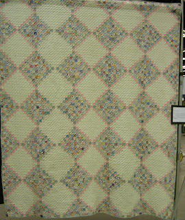
There was a Sharon Yenter/In the Beginning special exhibit of antique quilts. I really liked the exhibit and was glad that they allowed us to take photos (sans flash) on the second day. We looked at these quilts several times and decided that the difference between them and the new quilts was that the antiques had joie de vivre in them. These quilts were not perfectly flat, nor did all the fabrics match exactly and the piecing wasn’t perfect, but the quilts had life in them. They looked like the maker enjoyed making them. It looked like there was a little bit of a twist to the regular pattern in each one.
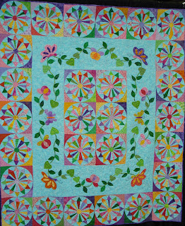
There were a few quilts that used wheel or plate designs and this was one of my favorites. I love the block, but the colors are also very cheerful.

I am drawn to tree quilts lately.There were a few at the show and this one was lovely. I like the fact that it does not try to be realistic. I also like the different fabrics that the maker used.

All in all I was disappointed with the show. I have always liked this show and been overwhelmed when I have attended. This year’s show did not meet my expectations. I am not sure if my expectations are too high or if people are submitting their new and fantastic quilts somewhere else or what else might be going on.


The merchant mall was very sad. There were not enough vendors with fabric. None of the vendors had much, if any of the newest fabrics, such as Heather Bailey or the new Pimatex dots. As you can see, above, I was able to find a few pieces. The fabrics in the lower right hand corner are silks, which I intend to use for another Colorblocks quilt.

I see a trend towards packs and kits rather than yardage as well. I don’t have anything against packs and kits, but I want yardage. I especially want to see the yardage in person since my recent bad experiences shopping online. I heard through the Grapevine that they didn’t let the Quilting Loft into the show as a vendor since the show organizers thought they had too many fabric vendors already. BAH! We went to visit the Quilting Loft anyway and stocked up. 😉


Fabrics from Pactific Fabrics in Northgate Mall.
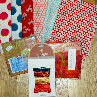
Gifts from TFQ from Seattle.

Fair Photos

This was the last weekend of the county fair, so we took our free tickets and went and indulged in quilts, rides, funnel cakes, lemonade and frozen, chocolate covered bananas.

The cheerful quilts are coming. I saw a definite change in the palette of some of the some of the quilts. There were a few really bright quilts, a number of pastels and fewer in the brown range.

Oak Hall, which normally houses the Home Arts (including the quilts) was closed and they were using a huge tent. Not an ideal situation, but Julie Curry, the Home Arts building director did a great job hanging the quilts. I would have liked to have had more room to take photos and a little more light, but at least the quilts were not 30 feet up on the wall.

I hope to see some of the quilts at PIQF so I can get better photos.

PICT2183 San Mateo County Fair 2008
http://www.flickr.com/photos/artquiltmaker/sets/72157606792927862/

A selection of things from the set

PICT2183 PICT2045 PICT2046 PICT2047 PICT2048


This quilt was my favorite quilt. I liked the black on white print that the maker used for the background. I liked that s/he used a lot of different prints as well. I also LOVED the blue circle. That detail is genius. I think it makes the pink stand out even more, but takes off the sweetness edge.

S/he did this in hand applique

Nice border as well.

Make CHEERFUL Quilts

EBHQ Show April 12-13, 2008

The East Bay Heritage Quilters held their bi-annual show last weekend at the Oakland Convention Center. The best part of the weekend was that TFQ came down to visit and go to the show with me. As usual, I took a lot of pictures. TFQ has a new camera, so her photos are included in the group, which I have added to Flickr.

The show was well hung with plenty of room to look and photograph. The lighting was excellent and while well attended, it wasn’t so crowded that we had to fight with people to see the quilts. The disappointing part of the show was the brown. The overall impression of the show was that there was a preponderance of quilts made from brown or beige or some equally depressing color. These were not the rich chocolate browns of dark chocolate, but the sad, world weary browns of a country/area that is sad.

The above quilt, by Carol Lee Blangsted, a former president of EBHQ, was probably my favorite in the show. The fabric didn’t make my heart sing, but the design was wonderful and the quilt was well executed. Ithought it was a good design for the lovely large print fabrics available now.

The shopping was ok, but there weren’t nearly enough vendors selling fabrics and there were barely any fabrics from any of the new groups that have come out recently. Their loss was Black Cat’s gain.

We spent a lot of time at Black Cat chatting and looking at the fabric. We didn’t get as much bang for our buck, but the fabric choices were fantastic.

I did buy a few fabrics at the show, and one booth, a friend of TFQ’s, had luscious ribbon (see right side of picture above). As you can see dots are still the rage in my life!

I was also on a button kick. The totes require a button and I have been at a loss to find the right ones for various projects. I stocked up at Britex on Friday and partook of one booth’s antique buttons at the show.

The above fabrics were a gift from TFQ. YAY!

Quilt Exhibit at the Renwick

It pays to read blogs, so you can tell people to go and see this exhibit. It is about QUILTS!
It is at a real MUSEUM!
They have a companion BOOK!

Sadly (I guess it is my day for sadness), I won’t be heading out that way until the summer. Do give me a review and let me know if you liked it. Perhaps I will put the book on my Christmas list. Hhhmm.

clipped from bemused.typepad.com
http://bemused.typepad.com/.shared/image.html?/photos/uncategorized/2007/11/26/100_2995_3.jpg

But the week wasn’t all about turkey and muffins.  Before everyone else arrived at my sister’s, M & I ducked out for a spectacular day in Washington, a city we’ve spent a lot of time in since Molly & K both went to college there.  First stop, the Renwick Museum, where we saw the current show, Going West! Quilts and Community.  I’d wanted to see this exhibit since I read that it had been curated by Sandi Fox, author of two of my favorite books on 19th century quilts, Small Endearments and For Purpose and Pleasure.  Well worth the trip, I’d recommend the show if you’re going to be in D.C. before the close of the show in mid-January.  Sadly (for you,) no photos allowed.  The show’s companion book does include all of the show quilts (and more) with accompanying essays on over fifty quilts brought to or made in Nebraska in the late nineteenth century.

  blog it

The Baskets of PIQF

One of the themes I noticed at PIQF was baskets.

There are a number of things I like about this quilt, which I think is unusual. First all of the baskets are unusual. I didn’t examine each one separately to see if they were all different, but I think they might be. In looking at the photo I saw a couple that were slight variations of each other, but different enough to be considered unique. This is the kind of detail that makes quilts great and shows that quick quilts aren’t everything.

Second is the setting. The maker (and if YOU are the maker, I will gladly put your name here). This is a very clever way to setting the blocks. It also gives the quilt a lot of movement without buying into the whole primitive wave that is moving through the quilt world.

Third, is the fabric. Although there is a lot of black in this quilt, it does not look depressing. I also like the fabric that she used, especially the different yellows to sash the blocks. Much more interesting than using all the same yellow. The light colored background in the blocks really makes the baskets show up.

Fourth, the size of the blocks put them almost into the GAL* quilt department, but the details are so finely done and perfect for each block, including not adding them when they weren’t needed, that I think the blocks were done out of love and not because the maker didn’t have anything better to do.

Finally, the quilting is great. I think there is a lot of in-the-ditch quilting to keep this quilt together, but the gentle curves of the quilting that set off the blocks in a subtle way are perfect for the overall design.

This is another basket quilt. As you can see, the baskets are also small, and in this example, very girly. I remember the name being something having to do with girly handbags.

The pinks in this one were definitely the strength of the quilt, but notice the lavender that the maker added as the background for one block. I like it when the maker has the foresight and confidence to add a completely different fabric to the mix in order to add interest to the quilt. I think the brown looks ok, but it makes the quilt, overall, look a lot darker.

*GAL – get a life