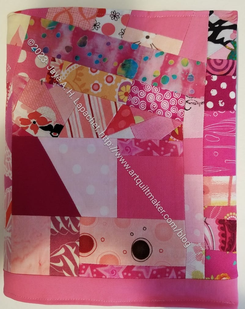
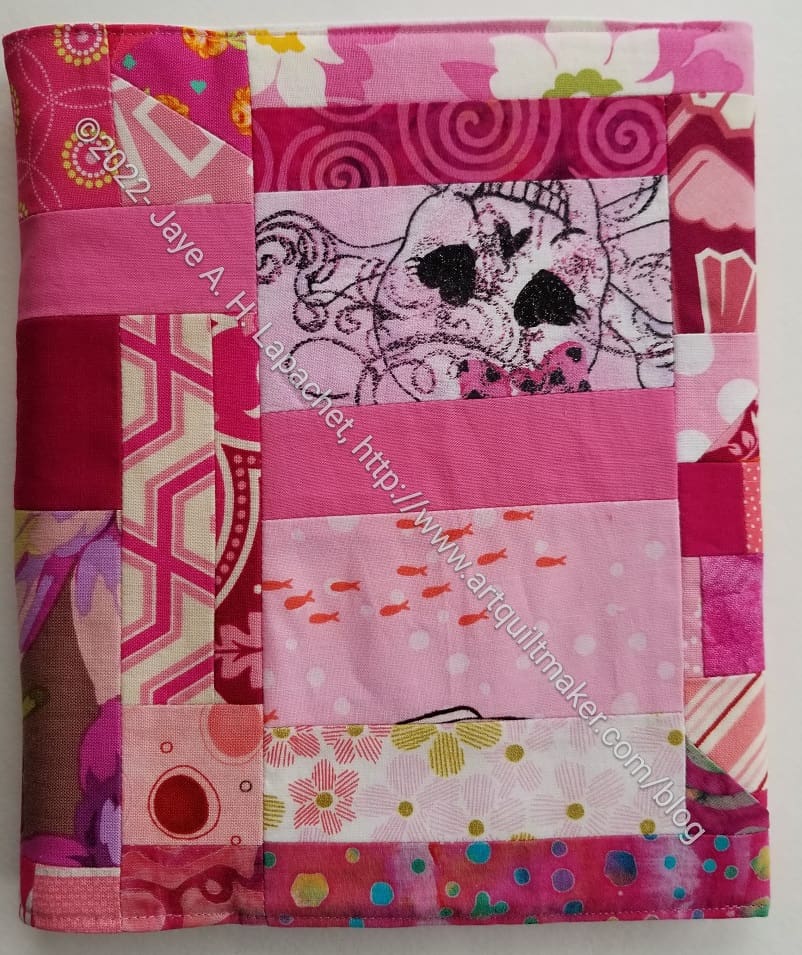
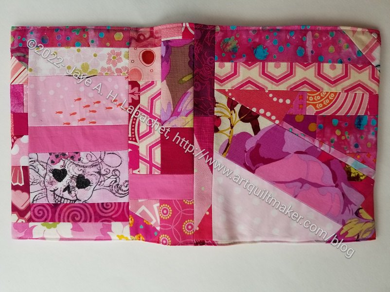
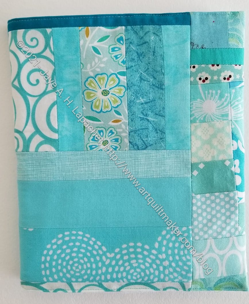
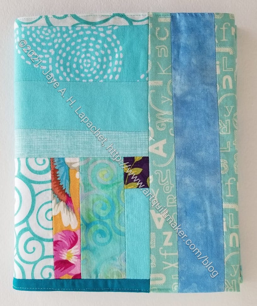
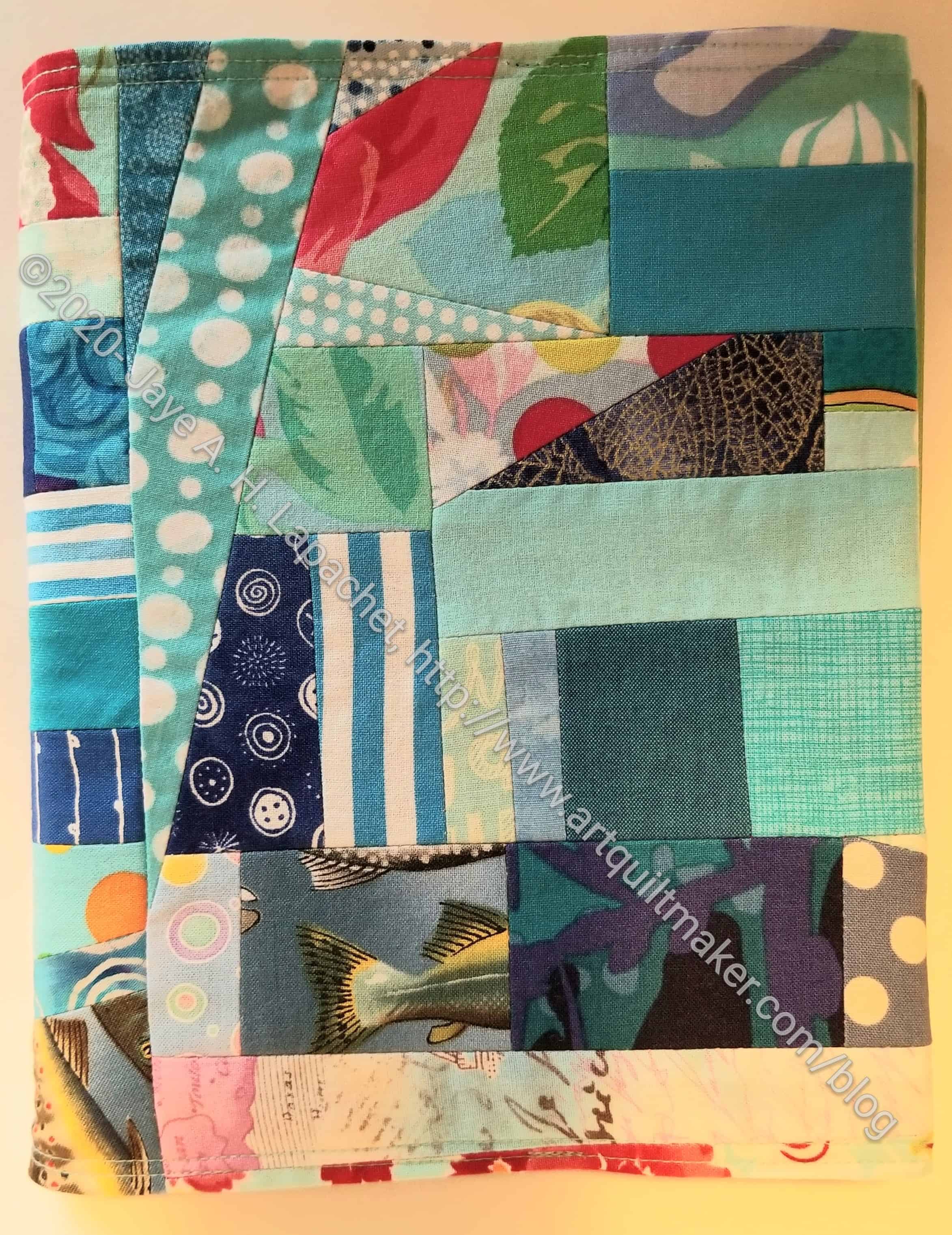
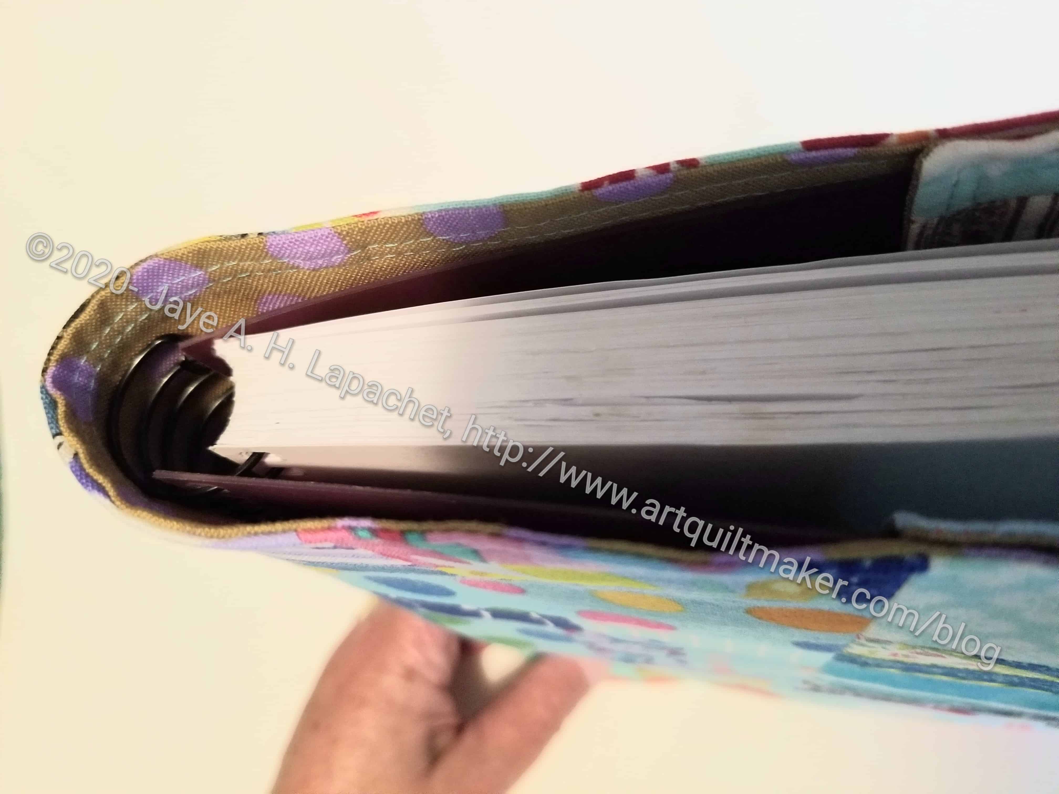
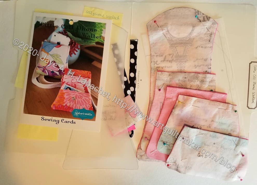
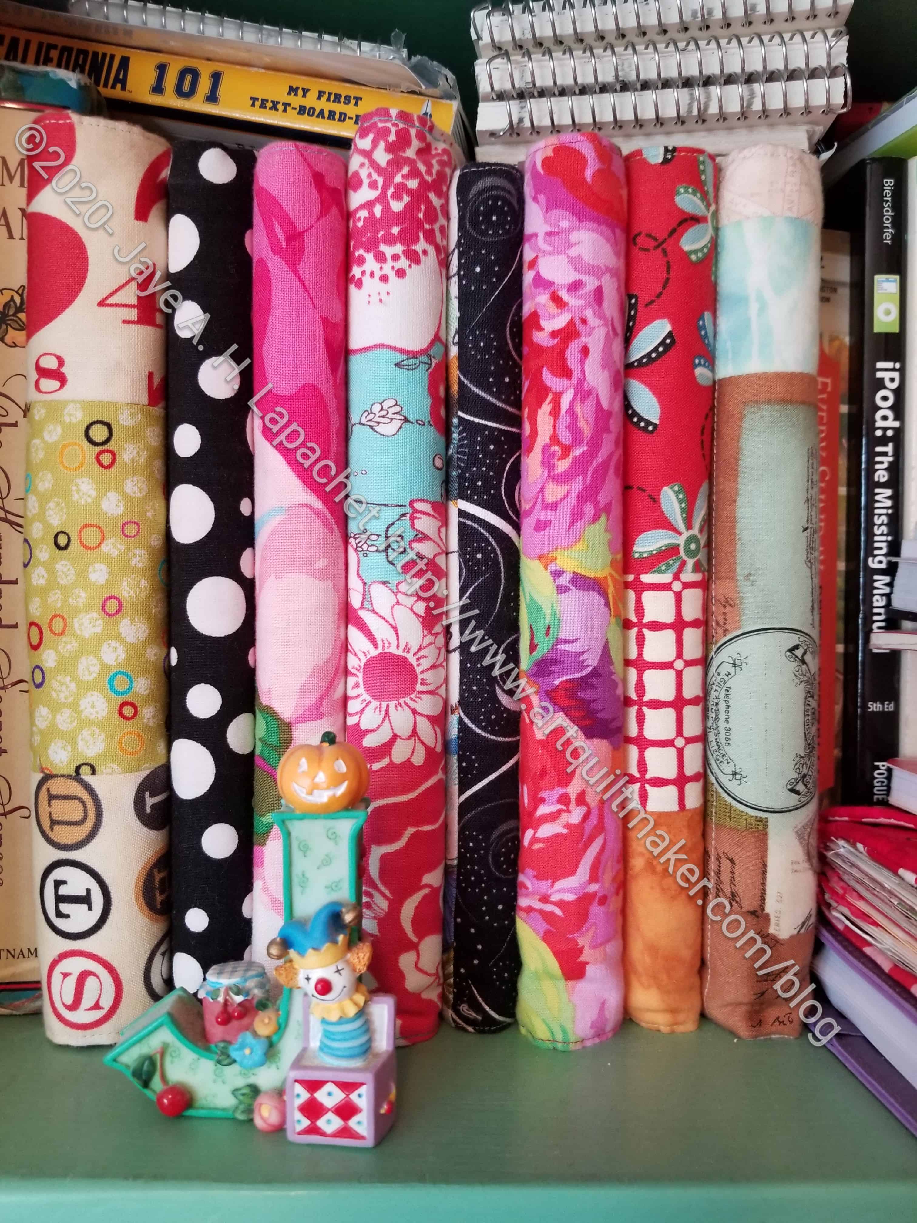
I had some bits of made fabric in my pink scrap drawer and they were getting in the way of me making new donation blocks. I decided to make another journal cover. The project also served as a palate cleanser after I finished another project.
This version isn’t as long as the tutorial demands. Basically, I was lazy and it works fine as is. There won’t be as much security if I were to put things in the cover, but this is a journal from 2009 and I don’t think I will be taking it off the shelves that often.
Another Pink Journal cover – back
I took the opportunity to look through it. I saw a lot of studies for the Creative Prompt project. Those made me smile. I liked doing those drawings. It was a great thing to do while I waited for the YM.
This one includes some fun fabrics.
I am out of practice making them so there was quite a bit of ripping at the assembly stage. The inside doesn’t look that great, but it doesn’t matter.
I made a journal cover for a friend. I meant do this task before she left her job (with the same team I was on) and started her new one, but that was a particularly busy time for me and I just finished last week.
She received it the other day and was totally thrilled. She loved the pink, which was great. She told me she likes pink, but I wasn’t sure if this was too much pink. Apparently not, which is great!
Kristin’s Journal Cover -whole cover
I really like this journal cover and would have kept it for myself if I hadn’t planned to give it to my friend. On the plus side, I made a lot of extra ‘made fabric’ in the process of getting pieces big enough to cover the journal. This means I have almost enough to make another journal cover for one of my journals that doesn’t yet have a cover.
Kristin’s Journal Cover – Inside front cover
Kristin’s Journal Cover – Inside back cover
It is so odd to be in touch with former work colleagues. Somehow we formed a bond and I can feel it is fragile, but still there, which is heartening.
Sheesh! February already! January is never long enough for me.
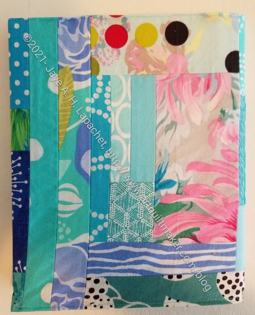
2022 Blue Journal Cover #2 (front)
This is the second journal cover I made the other day when I just needed to sew.
Most of the details are the same as for 2022 Blue Journal Cover #1. Most of the fabric was already made. I had to piece the flannel, but in this case, I used batting tape to keep the pieces together. Yes, that is an unorthodox trick that I haven’t tried before, but seemed to work ok. The older journals (this one is from 2005) won’t get much use until long after I am dead, so I am not to worried about the batting tape failing.
Saturday turned out to be a kind of topsy turvy day. Once I finally got to the machine, I wasn’t really up for working on the A Place for Everything Bag. I felt defeated by it and wanted to just finish something.
I needed some new journal covers and they are relatively easy to make. I found some already ‘made fabric’ in my blue scrap bin and stitched up a couple of journal covers.
2022 Blue Journal Cover #1 (left inside)
2022 Blue Journal Cover #1 (right inside)
It is pretty easy to make these when the fabric is already sewn together, so this one when together really fast. The hard part was dealing with the flannel, which I have been using for the other side instead of regular fabric. I was running out of the yard I have had for awhile and had to piece bits together. After these two I will need to go back to interfacing a regular piece of fabric. Why buy more flannel when I have plenty of fabric?
2022 Blue Journal Cover #1 (back)
I probably should have used the made fabric for another blue donation quilt. I’m not really worried, though. There are always more scraps.
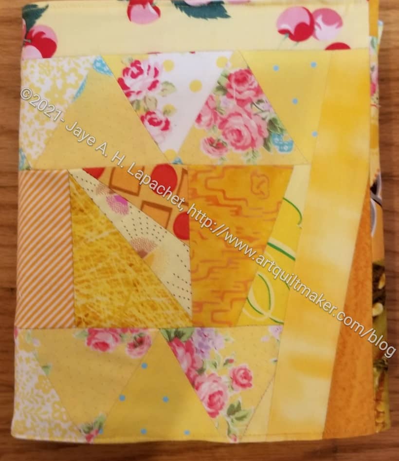
I took some of the made fabric I had assembled for the Yellow Improv donation quilt and made a journal cover.
I felt like I was taking away from the donation quilt, but I’ll be needing a new journal cover soon, so needs must. I figure I have a lot of scraps, so more donation quilts are on the agenda.
This one turned out to be just a smidge small, so I had to stretch it to get it on the journal (Miquelrius 6.5 in. x 8 in**).
Yellow Journal Cover – front and back
I kind of used what I had rather than arranged the scraps because I didn’t think of using the pieces I was working on for a journal cover until I had already made most of the pieces.
I still have quite a few equilateral triangles from the Flower Sugar Hexagon quilt I made a long time ago. I am trying to use them up, but there seems to be a never-ending supply.
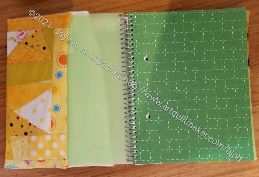
Yellow Journal Cover – inside front cover
I am not very enamored with the inside. That corn fabric doesn’t look great outside of the Food quilts. At least it reminds me of the three food quilts I made and the people who received them.
As I may have mentioned, I have stopped adding fabric to the inside and just let the flannel be the other side of the cover. It makes the project go more quickly and makes the cover flatter. Of course, it doesn’t use as much fabric.
Yellow Journal Cover – inside back cover
I think I have one more Miquelrius journal to use after this one, then I will switch completely to the Leuchtturm journals.
**I use affiliate links and may be paid for your purchase of an item when you click on an item link in my post. There is no additional cost to you for clicking or purchasing items I recommend. I appreciate your clicks and purchases as it helps support this blog.
I am still tidying up after all the work in my workroom. One of the things I found was a piece of ‘made’ fabric (improv piecing) that was just the right size for a journal cover. I sat down and made one!
I am still not completely up and running, so it was good to make something that involved, at least, a little piecing.
I just used flannel for the inside. I didn’t add an inside cover. I did that once before and it seems to work fine.
I am, once again, president of my local library association. Not what I wanted to do again, but circumstances required that I step up. One thing that I did was want people to read my newsletter/”Message from the President”. As an incentive, I offered a fabulous prize, which was a journal cover for a composition book.
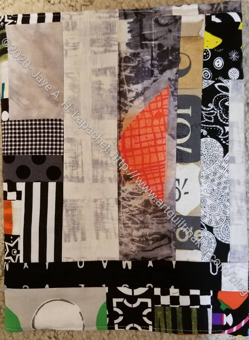
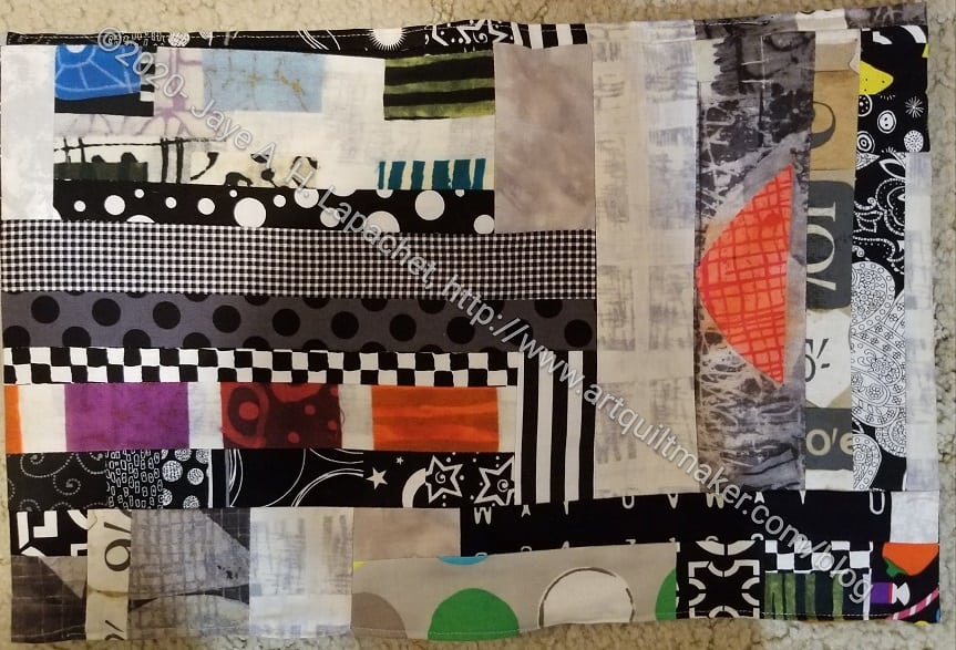
Since I didn’t know if a woman or a man would win, I chose neutrals – mostly blacks and greys, but one piece had that great orange triangle, so I used it as a centerpiece. I wasn’t excited about making something with those colors, but I am pleased with the way it came out.
SLA Journal Cover -open
I picked the winner and now just have to get it to that person.
My blue scrap drawer is finally showing some signs of having some space available. I have been piecing blue scraps together, as I mentioned the other day, in between working on the Red Scribbles quilt. I finally had enough to make a journal cover, so I decided to stop and make a journal cover. I need a quick finish fix and there are more blue scraps for a Color Improv donation quilt.
Blue Improv Journal Cover – inside front cover
As also mentioned, I hadn’t thought of this as a journal cover, so the piecing is pretty random. I didn’t center any motifs for the front. This is for an older journal just to protect the pages, so it looks ok for that purpose.
As I did this piecing, I wanted to save any strips I found for more of the Color Strip donation blocks (quilts). I don’t know if I will find enough to make another quilt. If not, I can make a few blocks for the rainbow strip donation quilt I am planning.
Blue Improv Journal Cover – back
Though I am making space in the drawer there are still a lot of scraps. The scraps still fill the drawer, but are not crammed in. There is hope, in other words, that I will have enough strips for something else-blocks or a quilt.
I am trying to use scraps that are smaller than 4.5 inch strips, because of the possibility mentioned above. This means that there are a lot of small scraps becoming larger slabs until they end up as a journal cover. It feels good to see the blue drawer emptying out.
I forget how much I like some of the fabrics I have used until I see a scrap. I know I always say that there is always more fabric. I do get attached to fabrics I like and want to email the fabric companies too reprint them when I find a scrap and know it is out of print.
Blue Improv Journal Cover -top
I had a problem (or my own making) with this journal cover. It is slightly too large. By the time I noticed, I wasn’t about to rip everything out into order to trim it.
I thought the slab was the correct size, but I think I forgot to think about seam allowance for the last bit of piecing. Oh well. Things happen.
I have a favorite dress that was made for DH’s Grand President events. It is the one dress for which I forgot to make a matching cell phone wallet. I have used others, thinking they looked ok, but I like the matching ones.
I still wear these dresses when I go to certain types of events, so this project was sort of on my list. One problem was that I didn’t have anymore of the fabric and it was so old I couldn’t get anymore. At the January CQFA Mini-Retreat, I saw Marie with some of the fabric and asked her if she had more. She found a little more than a FQ and gave it to me. The fabric has been languishing since then. I was on the phone for an extended call and decided that was a good time to start cutting out the piece.
I didn’t have enough of the fabric for the whole thing so I used an AGF solid pink I really like. The outside will match the dress.
I have a number of the Miquelrius journals** without covers. I want to make covers; I just haven’t gotten around to it. This week I got around to making one.
After making Frolic!’s back, I had some large-ish pieces leftover. I decided that one was large enough to make a journal cover.
After I started, I found that I had run out of flannel. I use the flannel for the interior instead of batting, because it is thinner. Since I won’t be carrying this journal around, I don’t need to worry about the feel of it in my hand, so I just used two pieces of fabric.
I thought about using ShapeFlex, but it is out of stock everywhere and I didn’t want to use it up on a journal cover if I can’t get more at a reasonable price.
Using two pieces of fabric seems wrong somehow and makes me wonder why I think journals need covers. When I am using a Miquelrius journal every day I carry it around. I know that the cover corners can be sharp. Having a cover keeps me from getting cut. Also, having a cover keeps prying eyes away. If I am not really using these journals on a daily basis because they are full, do I need covers. Need? Clearly: no. I think I just want them all to be the same. I guess I’ll have to think about that some more.
**I use affiliate links and may be paid for your purchase of an item when you click on an item link in my post. There is no additional cost to you for clicking or purchasing items I recommend. I appreciate your clicks and purchases as it helps support this blog.
I was ironing fabric the other day and looked up to see my journal covers staring back at me. I had been thinking about making a journal cover from some leftover fabric from the Frolic! back and the journals on the shelf caught my eye. They sit on a shelf at about eye level. Since I have cleared off some of the books on my shelves, I can see things I didn’t see before.
Looking at these journal covers has made me think about beauty and fabric. I am much more careful now about choosing fabrics to purchase. Some of the fabrics above reflect some, if not poor, ill advised combinations of poor fabric choices. Something appealed to me about the fabrics, but the combinations and how they appear on the shelf do not all appeal.
I don’t plan to remake the journal covers, but I do plan on paying more attention to how the new ones come out. I have several that need covers and journal covers are a good use of scraps.
This is part of the process. I probably made the covers I no longer like a long time ago. I have evolved in my color choices and the way I put colors together since then. I also realized that I can see these journal cover, so I need them to be pretty. I need to take more care in choosing fabrics.
I use a medium gridded Leuchtturm journal now, so I don’t need journal covers. I still like the Miquelrius journals. I plan to use up the blank journals I have and to make journal covers for them. I find that the Leuchtturms fit in my purse and seem more compact. I can also put a spine sticker on them saying which month is contained within.
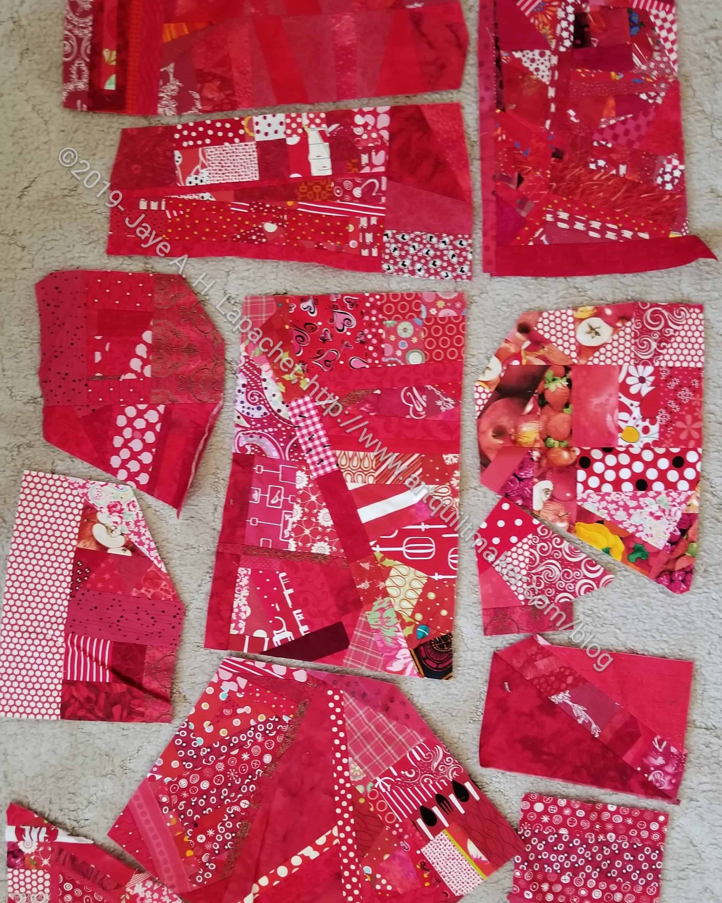
As mentioned, I have been working with red scraps. As I dived into the drawer, I found several pieces of fabric that had already been made from scraps.
Since I have a few Miquelrius journals that need covers, I decided to use some of the scraps to make a journal cover. It was fun to look at all of the made fabric and decide which pieces to use. I felt like I was picking out commercial fabric. It was nice to have a choice.
Red journal cover closed – May 2019
Because I had already done the hard work of making the fabric, I just had to make the piece large enough to fit the journal. (Sizing info can be found in the journal covers tutorial). It went really quick, which was great, because I was in need of a quick finish. I am pleased with the chair print on the front as well as the disbursement of dot fabrics.
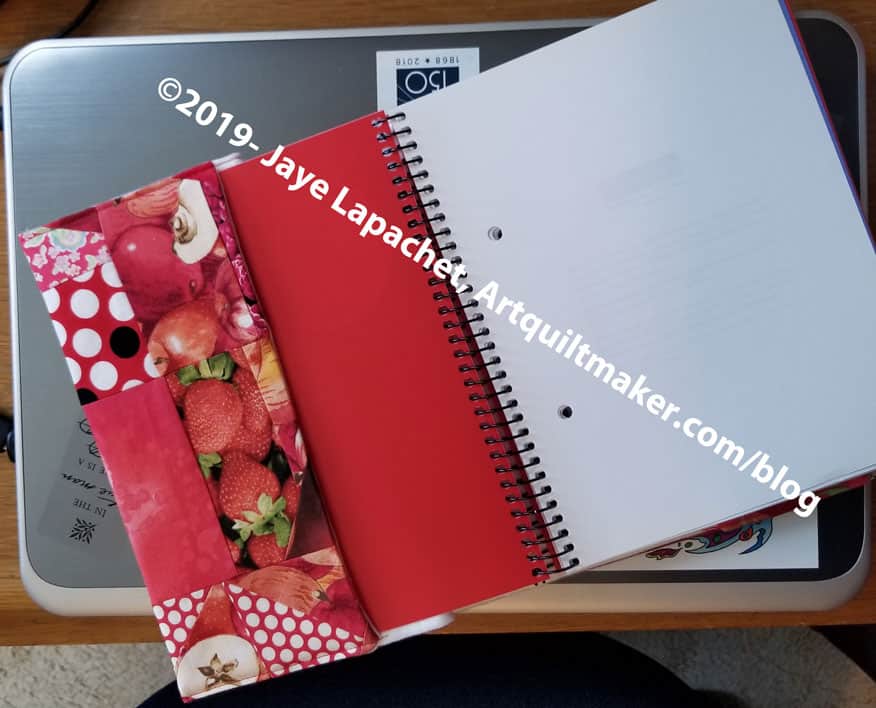
Red journal cover front open – May 2019
I use flannel instead of batting for the center of the journal covers. It gives the cover a little bit of body, but doesn’t make it bulky. I’d like to just use ShapeFlex, but it doesn’t stick very well to made fabric because of all the seams. If I am using a favorite commercial fabric and there aren’t a lot of seams, then I will use ShapeFlex.
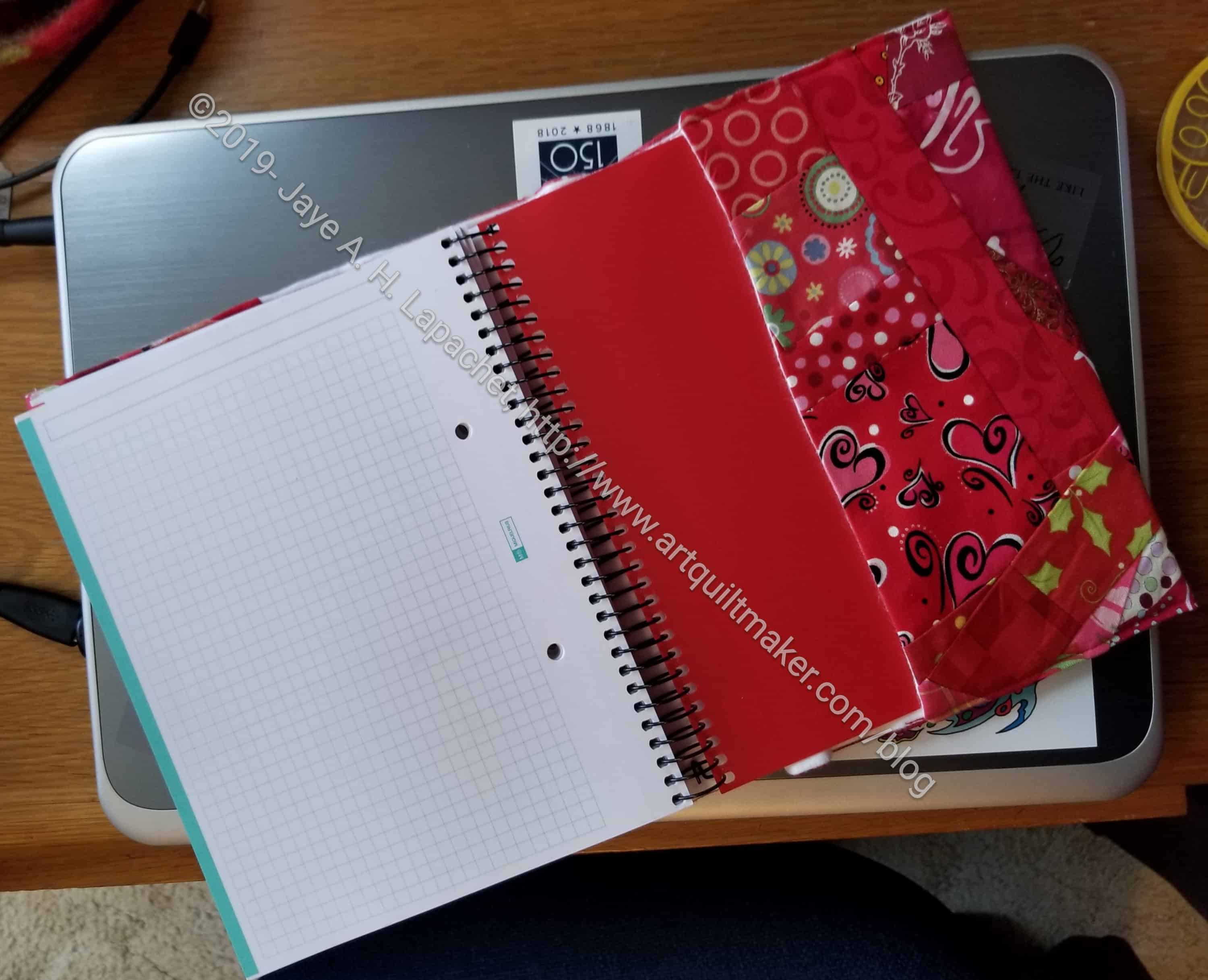
Red journal cover back open – May 2019
I always cover the batting the another cotton fabric, but I forgot to do that this time, so the flannel serves as batting and backing. It is on the inside and doesn’t show much, so I think it will be ok. I haven’t been carting my journals around as much as I have in the past, so I think the flannel will stay clean. I am glad, however, this is just for me. I think I will need to read the tutorial again before I make the next one.
My friend had a birthday yesterday. I have been telling her – well strongly suggesting that writing in a journal would help her work out some issues. Thus, this is my “put your money where your mouth is” gift to her.
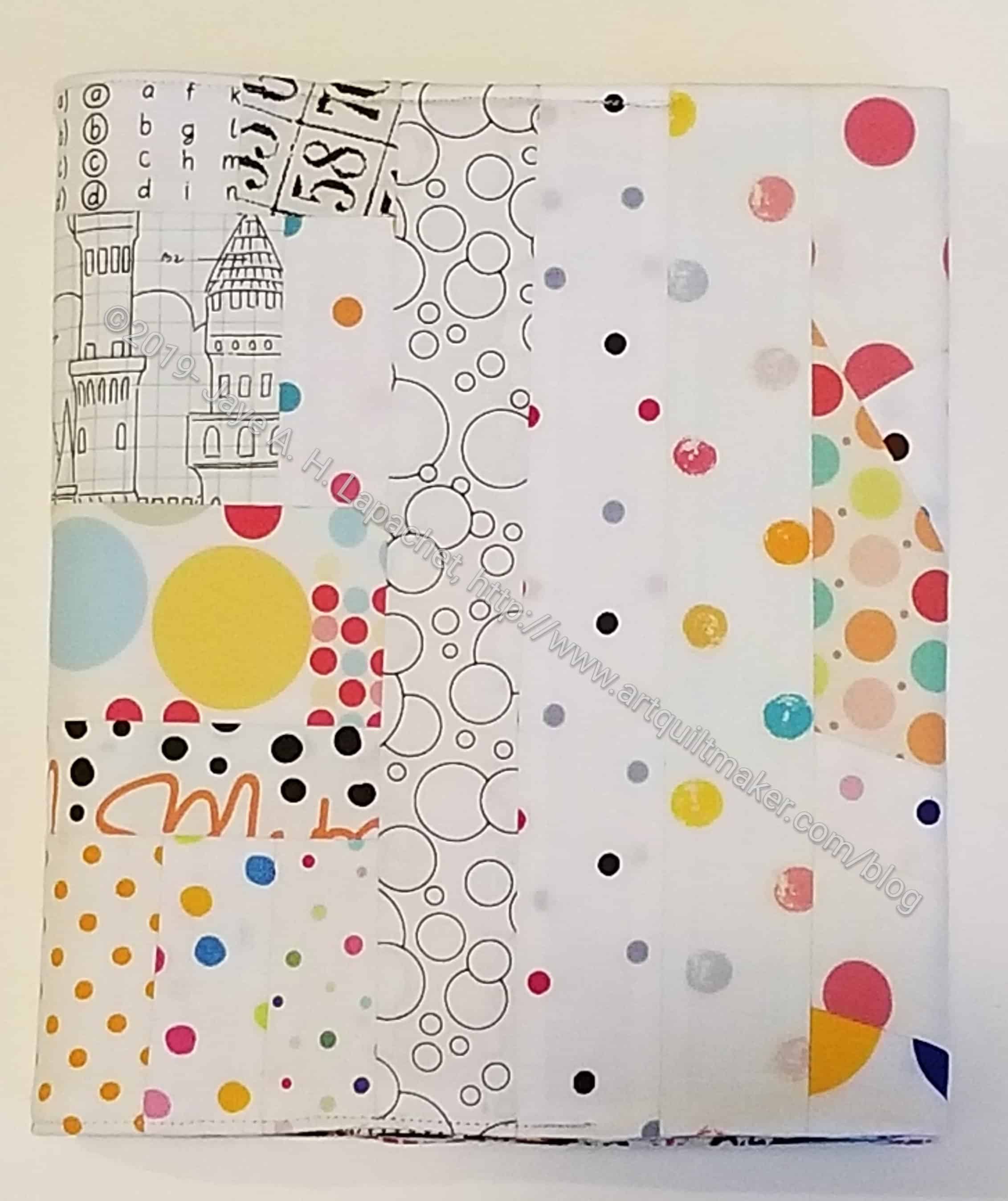
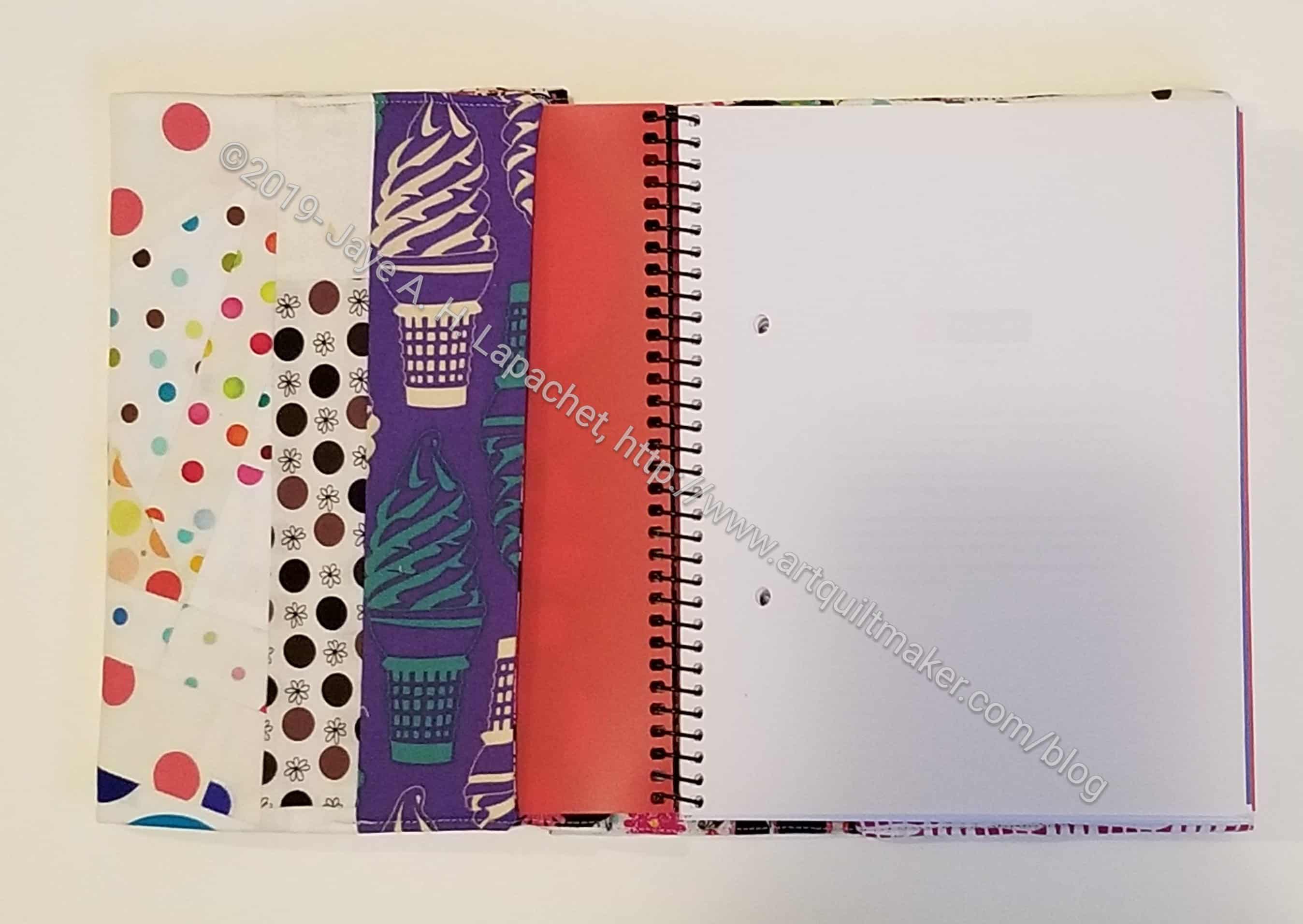
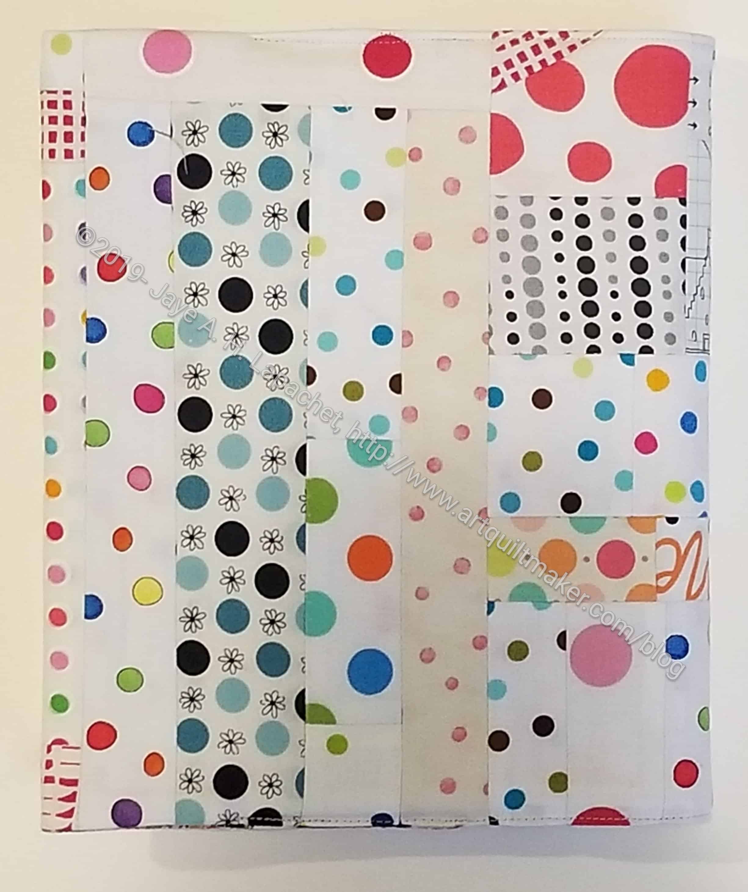
I rummaged through my white scrap bin to make this journal cover. I was going for cheerful and light to counteract the grey weather we have been having. I really tried hard to get that castle fabric (upper left) on the front, but didn’t quite make it.
Gerre’s Journal Cover with front cover open
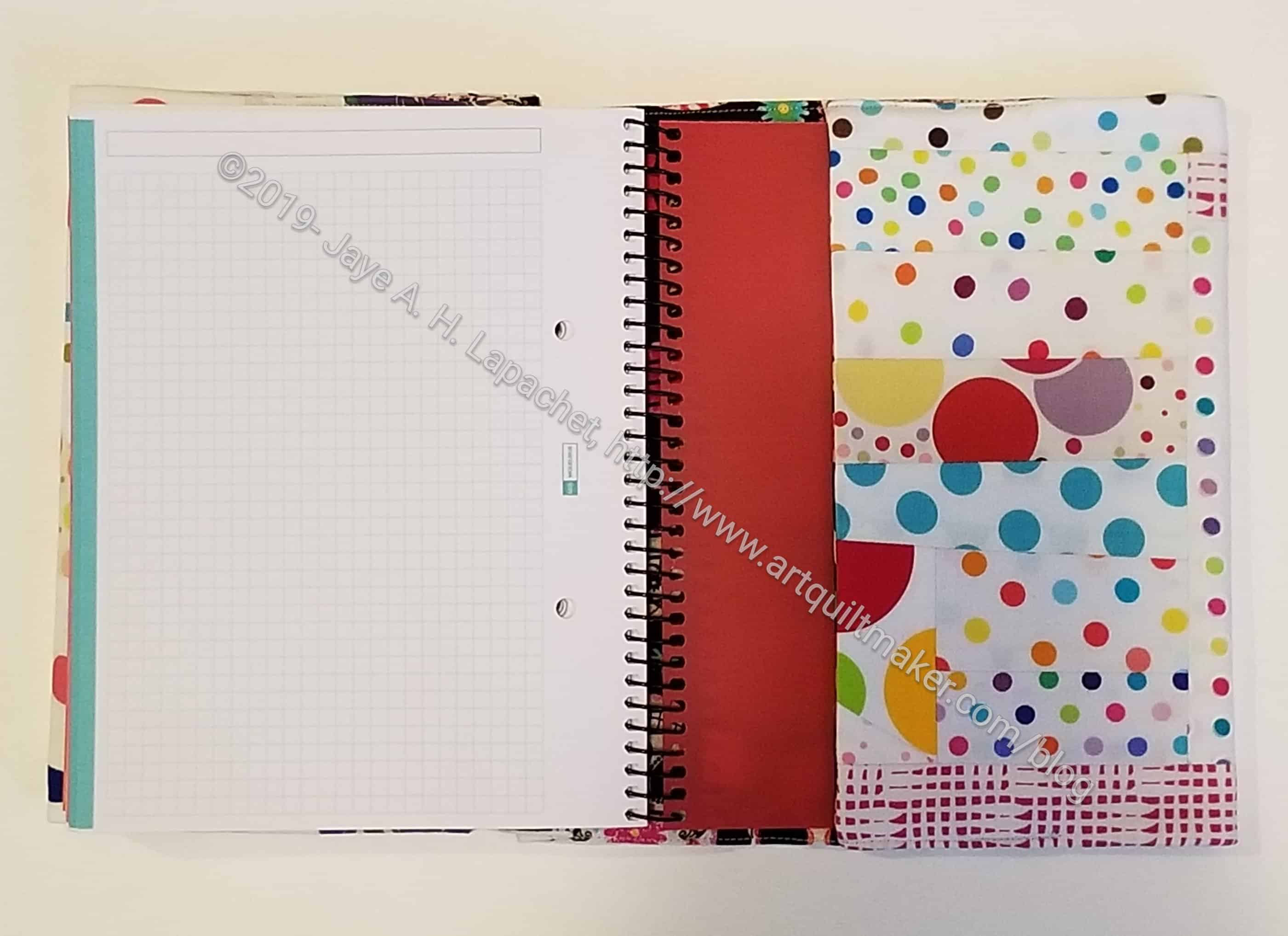
Since I have been making Gerre a few things recently with the ice cream fabric, I wanted to include some in this journal cover as well. I put it on the inside as it didn’t go very well with my light and cheerful look.
Gerre’s Journal Cover with back cover open
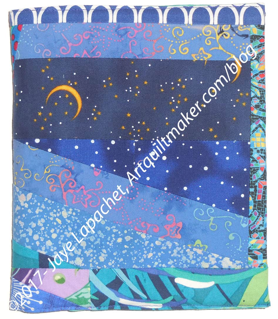
I haven’t made a journal cover in a while. The last one was dark blue and made in 2017. I have been sing a different kind of journal that doesn’t work with these covers, thus I haven’t needed a new one. I still like these Miquelrius journals. They have great paper and ink dries on it quickly. I am just more enamored with the Leuchtturm journals at the moment. I like hte rounded edges and the colors. The Leuchtturm journals also fit in my handbag, which is an added bonus.
Gerre’s Journal Cover back cover
I had fun putting this cover together. I used a number of scraps from the EPP half hexie project and even some scraps from the City Sampler.
I had a hard time sewing it as there were so many seams along the edge, so I ripped the last seams out a couple of times. It isn’t perfect, but I hope she won’t notice. That edge is tricky.
I did get a nice compliment from Angela who has used the journal cover tutorial to make covers for other types of journals. She said it was her favorite journal cover tutorial. 🙂
Gerre’s Journal Cover -whole cover, open and face down
I have to admit to using Leuchtturm journals lately instead of my favorite Miquelrius journals. The Leuchtturm journals are slim and fit in my handbag with all my other stuff. They don’t need covers. I couldn’t figure out why I was leaning away from the Miquelrius journals.
Finally, I realized, on Sunday when I needed a new journal because I had finished the old one what the problem was. I didn’t have any Miquelrius journals with the journal covers already made. As you may have guessed, I like to put journal covers on the Miquelrius journals, because the corners of the covers tend to poke me. I looked back and found that the last journal cover I made was the Orange Soda Journal Cover back in November (November seemed to be a good month for me). That was at least two journals ago.
I actually had a journal cover partially made. I hadn’t really worked on it in a few weeks. It occurred to me that it be an entry in the BAMQG scrap challenge. The donation blocks were giving me a bit of trouble (decision making not sewing), so it was an easy choice to switch projects. I used the journal cover pieces and parts as leaders and enders while I worked out my donation block issues.
Journal covers are not difficult (tutorial is posted -sizes are for the Miquelrius journals). The time consuming part is the mosaic piecing. Of course you can make the cover out of one piece of fabric for an even quicker and easier version. I rarely, if ever, do that, however.
Dark Blue Journal Cover
Frequently, I start pulling out fabrics and stick to certain values in that one scrap drawer. I am not sure which fabric pieces I started with, but the first fabrics often set the tone for the entire piece. This one is a little darker than I usually like. I do like the monochromatic look, however, so I stuck with the darker blues.
Dark Blue Journal Cover – other side
I haven’t decided which side to use as the front. Since I don’t need it immediately, I don’t have to decide for at least three months.
I had some issues with the filling. I have been using flannel, but am just about out. I had some leftover bits of fusible fleece, so I stuck those to the back of the pieced front and filled the rest in with flannel scraps. Some parts are fluffier than I like, but it works and the project is done.
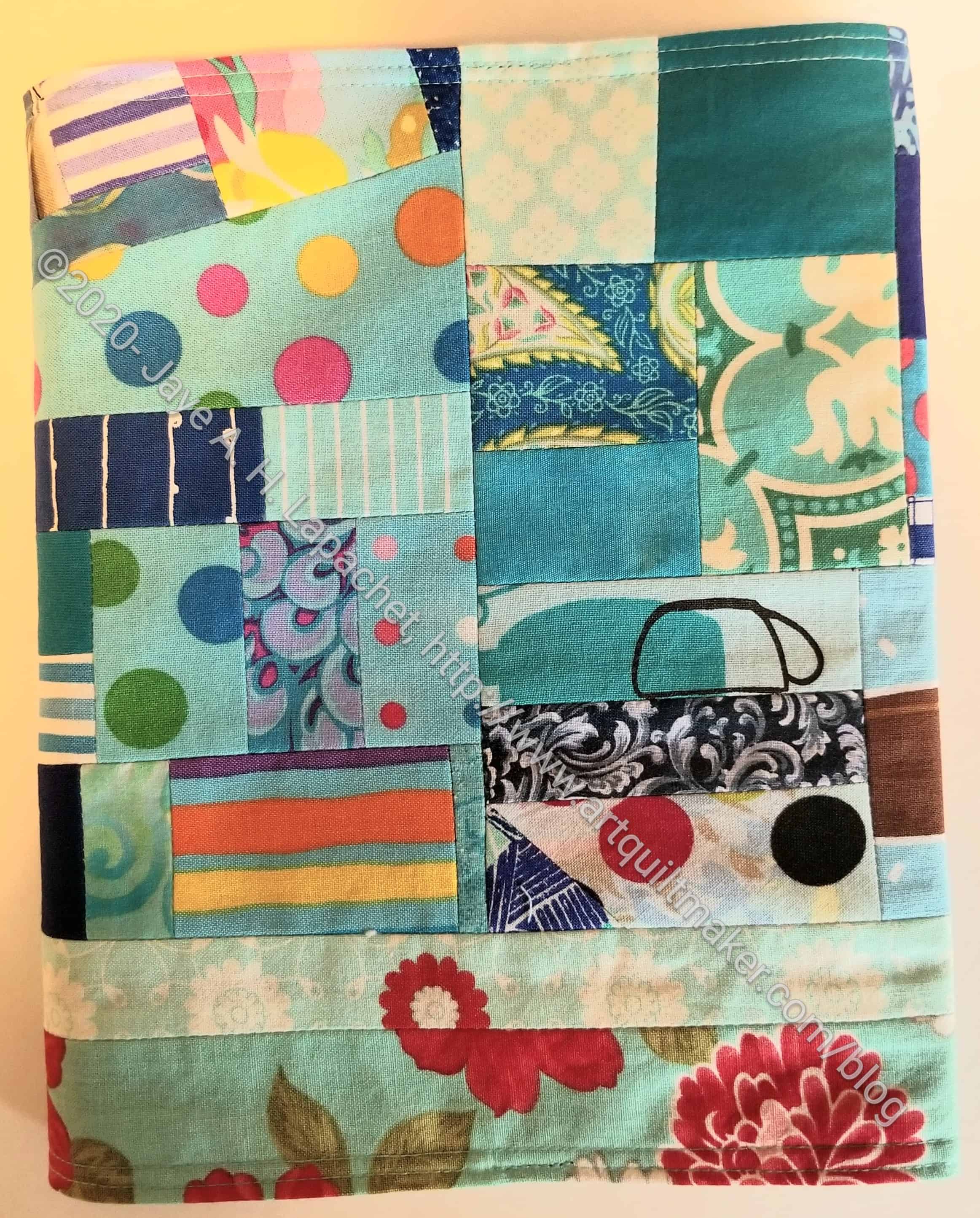
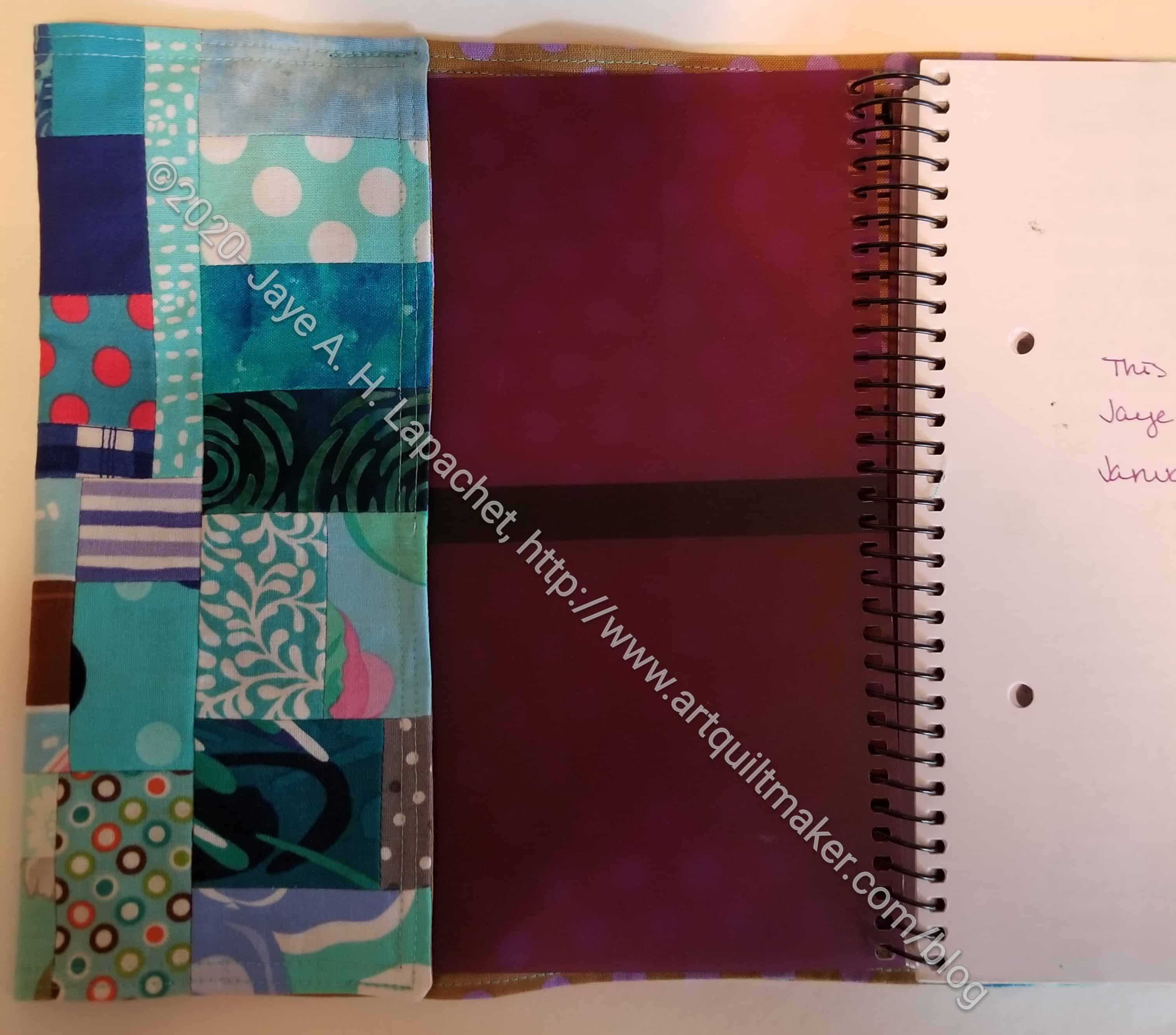
I started another journal cover with turquoise. Stay tuned.
I have been in desperate need of leaders & enders lately. The crisis has passed since I got my order of Northcott Colorworks charm squares, though before it did a lot of weird pieces were sewn.
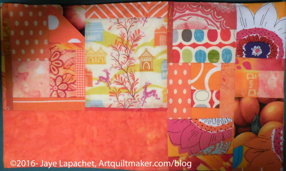
Orange Soda Journal Cover (closed)
I had some orange scraps that I had started to sew together, so I continued to sew and turned it into a journal cover. It is along the same lines as the Orange Crush journal cover and the scraps may have been from that piece.
I am really pleased with how this one came out. The front cover is really well placed. The scraps aren’t too small, which always causes finishing issues. It is also bright and cheerful. I need bright and cheerful right now.