A discussion came up at the CQFA meeting on Saturday about Jelly Rolls. As you know, I used a Jelly Roll for the Zig Zaggy top, It’s a Merry & Bright Wrap and I am in the process of using one for the Frosted Stars. As I mentioned in a previous post, I had been hearing about Jelly Rolls and wanted to try one. Why not, right? It is always good to have an informed opinion.
One member had a few questions about them and so we started talking. Another member chimed in about how using someone else’s color choices took all the creativity out of making a quilt. She kind of went on and on for a bit about it. After she had finished I felt compelled to say that using someone else’s color choices might be a good way to learn to use colors that you wouldn’t normally choose. There is a gold in It’s a Merry & Bright Wrap that I wouldn’t ever pick myself, but works very well with the off shade of blue included in the Merry & Bright Jelly Roll by Sandy Gervais.
This conversation got me to thinking about color choices and how I work with color. I realized that I work in a couple of ways.
1. I choose colors in which I am interested in working. I see a color or a fabric and it gets me thinking about a quilt or a bag or a tote in those colors. At this moment, that means that I am collecting aqua and red fabrics and setting them aside in order to make a quilt in the future. I don’t know what quilt, though am leaning towards a basket quilt.
2. I also like working with whole lines of fabric. I like being part of a creative endeavor that someone else started. In a strange way, it is like a round robin. Like the It’s a Merry & Bright Wrap quilt, for which I made no decisions (pattern, whole line of fabric), I found solace in not making decisions. Also, if I am making a difficult quilt, like the Zig Zaggy quilt, which requires a lot of thought in construction, I find that putting the color choices aside allows me to focus on the sewing techniques and process.
2A. I am also enjoying the groups that Cynthia and her staff at Birch Fabrics/Fabric Worm put together. They are usually not a whole line of fabric from one designer , but fabrics that go together and have a variety of scales and designs. I haven’t actually made a quilt with one of her groups yet, but I am putting them together after washing and cutting patches in order to be ready to go when I start the next quilt. I am finding that I am also adding other fabrics in that I will go well.


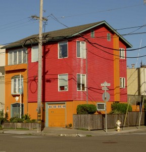
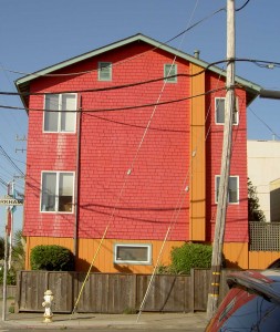
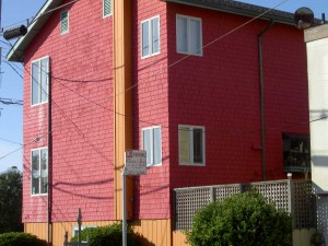
3. Sometimes, I see something that inspires me.I have been driving by the house pictured for YEARS. In the last year or so, they painted it this rose and pumpkin color. I never have my camera with me when I go by, but today I was nearby and did have my camera so I swung by to snap some shots. I think I will make a quilt in these colors, but will add some violet as well. I think violet would look fabulous with the pumpkin and rose. There is an orange tending towards pumpkin dot (like the Ta Dots) that I have seen around. I haven’t had a chance to dig through my collection of dots to see if I have it, but it is on my list. Of course, I have to make visual decisions visually and will have to see.
4. Sometimes color doesn’t matter and I work with light and dark and a certain pattern. The Pineapple quilt is an example of this type of fabric selection. I am not sure if one would call this ‘color’ selection per se. Once inside such parameters, I do make rules for myself such as no like colors next to each other or only complementary colors next to each other etc. It usually depends on my mood.
5. Monochromatic color schemes, like the Blue Janus quilt are also intriguing me lately. I like the monochromatic color scheme, because it helps my eye discern the different types of blues, or reds or whatever color I have chosen for the color scheme. When you have 300 blues together they all look a bit different.
6. Rainbow/color wash type quilts have really been good exercises lately. The FOTY quilts have really been good for this. I have to admit that I am not liking the way I blended the colors in FOTY 2008. I don’t know what I was thinking. I do like the quilt, but in this color wash type of colorwork, the colors should blend more. It could be that my idea of this type of colorwork has evolved since FOTY 2008. I did a much better job on FOTY 2009. Maureen helped and I learned a lot from working with her on the colors. FOTY 2010 with the diamonds is next. We’ll see how that goes. In general, I like trying to blend the colors. I think the quilts are very attractive and they are an intellectual challenge to make.
How do you pick your fabrics?