I talked about the parameters of the Pantone Project in July, then again in early August and mid-August as my attempts to select fabric started. I didn’t feel confident after these attempts and the postcards started to stack up. As the postcards stacked up, the project started to weigh on my mind. As Friend Julie made progress, the project started to weigh on my mind.
I finished a big project on Saturday night and needed something different to work on. I was spurred on by wanting some basic piecing. The blocks for the Pantone Project will be basic piecing, but I had to choose fabric first. I was not excited, because I am getting a little annoyed with Pantone. Piecing starts with fabric, however. I decided that I had the time to pull fabrics for this project. First, I laid out all the cards I had received, so I knew what I had to work with.
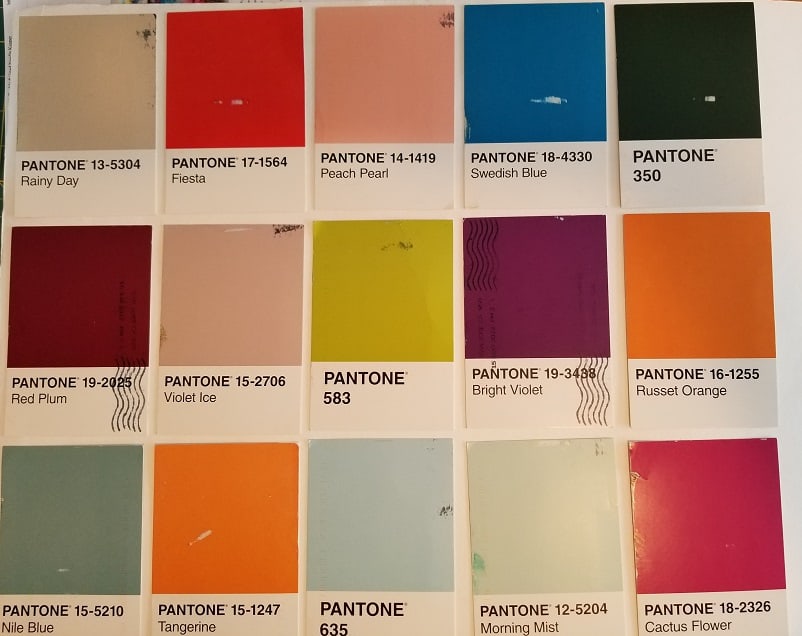
Yes, Pantone 350, in the upper right hand corner is that green with which I started. It was still in the mix. I had the greens I had chosen separated out, but kept it in the mix since I thought I might find something better. I have to say that I made major progress on the Pantone Project on Sunday.

I started with the easy colors such as the reds and pinks. Fiesta and Cactus Flower were pretty easy, but I quickly realized that I had to pull out much more fabric to get more choices.
I even dragged out a bin that includes solid neutrals and found a beige that matches Rainy Day pretty well.
Surprisingly, or maybe not, a lot of my older fabrics are much more aligned to these colors than the newer fabrics. This could be my buying habits as well. I stick to pretty clear colors when I buy fabrics now. After awhile, I had only a few left. I had to not only pull out old fabrics, but I used several hand-dyed fabrics. I haven’t dyed and printed fabric in years so lots of old fabrics are getting an airing.

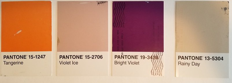
Eventually, I found fabrics that were good matches to the postcards I have received. Some cards span 2 or more fabrics as I am still deciding. Some fabrics were a great match. I was really pleased with the fabric I found for the Swedish blue (2d row, 2d from right). It is a perfect match. The Nile Blue (bottom left corner) is a problem. The three fabrics I chose look better in person than they do in the photos, but are still not perfect. There is also a peachy pink, Peach Pearl, (2d row, 3rd from left) where I found a good match, but only have a little of the fabric. I’ll have to be very careful when I cut it.
I have to say that I have a lot of questions for Pantone, most importantly: why so many beiges? I need to read up a bit on Pantone and get a better sense of their business.
Now, I can get to piecing. I do feel a bit of a sigh of relief that I have made a start and nothing awful has happened when the fabrics weren’t perfect matches.
If you want to play along, you will need:
- A friend
- Pattern Play** book by Doreen Speckmann
- Pantone Postcard Box**
- postcard stamps
- Fabric, Sewing machine and regular Sewing supplies (BSK)
Decisions to Make:
- Size of units (blocks)
- Type of units to make
- Timeframe for making the project
- Timeframe for sending postcards
**Obviously, you should shop at local fabric, knitting shops or quilt shops. However, if you can’t, please know that I use affiliate links. I may be paid for your purchase of an item when you click on an item’s link in my post. There is no additional cost to you for clicking or purchasing items I recommend. I do not recommend items I don’t like. I appreciate your clicks and purchases as it helps support this blog.